Raiffeisen Bank logo history, meaning and evolution

How much do you know about the Raiffeisen Bank logo and its history? While Raiffeisen might not be the biggest bank in the world, its logo is certainly one of the most eye-catching emblems in the industry. The origins of the symbol date back to the 1800s.
Compared to other bank logos, the Raiffeisen symbol is unique. At first, it almost looks like the emblem you would expect to see for a construction company, thanks to the color palette of black and yellow.
However, by going against the trends common in the financial sector, Raiffeisen has managed to differentiate itself and capture the attention of a wide audience.
If you’re interested in the wonderful world of logo design, or you’ve simply found yourself wondering where the Raiffeisen Bank logo history began, we’re here to help. Today, we will discuss the story of the Raiffeisen brand and its unforgettable emblem.
Raiffeisen Meaning: An introduction to Raiffeisen Bank
Raiffeisen Bank International, or “RBI,” is an Austrian banking group. The comprehensive financial network primarily focuses on Eastern and Central Europe, with a few operations in Western Europe.
Subsidiary banks, representative offices, and leasing companies handle about 17 markets that Raiffeisen bank serves. Raiffeisen is also listed on the Vienna stock exchange.
The first iteration of the Raiffeisen Bank was launched in 1927 as a subsidiary of Raiffeisen Zentralbank or the RZB group. By 2010, Raiffeisen was already serving more than 14 million customers worldwide.
At that time, the RZB CEO began announcing a possible merger between Raiffeisen International Bank and RZB. The move was considered to be an effective way of providing greater access to the capital, bond, and money markets.
In July 2010, the executive boards of the two companies proposed the merger to the shareholders, and a new institution was formed under the Raiffeisen Bank International name. In 2017, Raiffeisen Bank International merged with Raiffeisen Zentralbank Österreich.
Raiffeisen Bank logo history: What is the Raiffeisen logo?
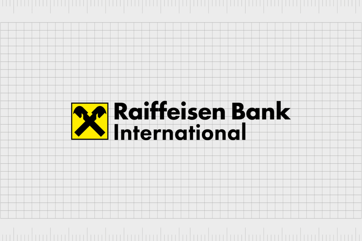
The Raiffeisen Bank logo is an unusual image featuring a gable cross inside a bright yellow square with a thin black border. The gable cross consists of two crossed horse heads attached to house gables.
They almost look like pieces from a chessboard. According to the company, this symbol is intended to represent safety and protection.
The design, though unusual, has remained a component of Raiffeisen Bank logo history from the company’s inception in the 1800s. Let’s take a look at some of the variations of the Raiffeisen emblem that have emerged over the decades.

1877
The initial gable cross symbol created for the Raiffeisen Bank was designed back in 1877, at a time when Friedrich Wilhelm Raiffeisen was designing some of the first credit union systems and cooperative banks.
This symbol was adopted as the core image of the Raiffeisen Bank, although various different designs were also implemented throughout the years.

For instance, a version of the Raiffeisen Bank logo on the company’s website features a bee on a honeycomb. The company may have chosen this design because the bee is often associated with preparedness and “saving.”
Some experts believe the reference to the bee comes from the company’s early associations with the farming industry.

1977
A version of the Raiffeisen Bank logo featured the gable cross in white on a black background was introduced in the 1970s. This design holds many of the same components of the Raiffeisen logo we know today, with none of the colors. The design is bold and confident.
The company’s name also appears in all capital letters beneath the emblem, symbolizing confidence and stability.

1990
In the 1990s, the Raiffeisen symbol was inverted to show the gable cross in black on a white background with a thin circle outline. In this variation, the company’s name has been removed, showing its commitment to its symbolism.

2001
In 2001, the circular frame often associated with the Raiffeisen symbol was replaced with a square. The square is often a highly symbolic shape in logo design, associated with concepts like strength and stability. The organization chose to maintain this shape with its logo design.

2017
In 2017, Raiffeisen introduced the most recent version of its logo, switching the white background in the square with a bright yellow color. This could be a reference to the yellow of the honey bee previously used in the company’s emblem.
Alternatively, yellow could simply be a shade intended to convey ideas of wealth and joy.
The Raiffeisen Bank name also appears in this variation of the logo. The word “International” is sometimes included in the image. In others, we just see the words “Raiffeisen Bank.” The company has chosen a bold but simple sans-serif typeface in both instances.
Raiffeisen Bank logo meaning, colors, and fonts
It’s difficult to deny that the Raiffeisen Bank logo is eye-catching, even if it’s not what we would traditionally expect to see from a bank logo. The image is bright and engaging, thanks to its yellow color palette.
The color yellow is commonly associated with positivity and joy, though it can also be connected with wealth in some parts of the world.
The gable cross is perhaps the most meaningful aspect of the Raiffeisen Bank logo. For decades, this design has been a symbol of protection. Traditionally, people even placed a gable cross on the roof of their houses to show it was protected.
The symbol was believed to ward off danger and help protect the people within the home against evil.
As the symbol of the Raiffeisen Bank, the gable cross stands for protection and security. The company hopes to reassure its customers that their assets are protected. The simple square surrounding the Raiffeisen gable cross helps to further enhance this idea of security and stability.
If you’d like to take a closer look at the Raiffeisen Bank logo, you can find some useful resources here:
What color is the Raiffeisen Bank logo?
The Raiffeisen Bank logo colors are perhaps the most unusual aspect of the emblem. The combination of black and yellow isn’t something most of us expect to see in a financial logo. In this industry, colors like blue and red are more common.
Even green and purple are more likely to be associated with concepts like wealth and luxury.
The yellow and black elements of the Raiffeisen logo certainly help it to stand out and may even connect to the history of the Raiffeisen brand. After all, the company did once use a honey bee as the core aspect of its emblem.
The Raiffeisen Bank logo color is an extremely bright shade of yellow.
What font does the Raiffeisen Bank logo use?
The Raiffeisen Bank logo font is a simple yet bold sans-serif typeface intended to convey ideas of strength, stability, and confidence. It’s similar in style to the Futura font family, created by Paul Renner and published via the Linotype foundry.
The exact name of the font used today is the “Amalia” font, which is an entirely custom typeface.
Learning from the Raiffeisen Bank logo
At first glance, the Raiffeisen Bank logo is quite an unusual symbol for a financial company. While the image used in the emblem might be familiar to those familiar with European folk tales, it’s not something many of us could easily identify.
Despite this, the Raiffeisen logo is an image brimming with meaning and impact. The symbol’s bright colors and unique design ensure Raiffeisen can stand out from many of the other leading financial institutions around the world today.
What’s more, the story of the Raiffeisen cross gable tells customers the brand can protect and support its clients.
Fabrik: A branding agency for our times.
Clarity starts with a conversation.
Thanks—we’ll get back to you shortly.
Whether you're navigating a rebrand, merger, or simply need a clearer identity—we’re here to help. No hard sell, just honest advice from people who know the sector.
Let’s start with a simple question…
Prefer to email? Drop us a line.
Fabrik’s been helping organisations rethink and reshape their brands for over 25 years. We’ve guided companies through mergers, rebrands and new launches. Whatever stage you’re at, we’ll meet you there.


