


The best logos of all time: Your essential guide to greatest logos ever created

Choosing the best logos of all time is no easy feat. There are dozens of instantly recognizable brand images out there, from the unforgettable Nike logo to the golden arches of McDonalds. You may even have your own list of the top logos you love the most.
While there’s more to successful branding than designing the perfect logo, it’s hard to ignore the impact the right emblem can have on a company’s success.
Many of the world’s most iconic logos have become a staple of modern life. We see them everywhere we go, not just on stores and branded products, but on merchandise created by company fans.
Each industry also has its own selection of unforgettable logos. In the pharmaceutical industry, we have the images of GE and CVS, while the automotive industry has a huge range of great designs from brands like Bentley and Rolls Royce.
Today, we’ll be looking at just a handful of the best logos of all time, chosen for their resounding impact on the market.
The greatest logos of all time
Though everyone’s idea of the best brand logos ever created may differ, it’s fair to say some companies have achieved a long-standing place in the hearts of their customers.
Let’s look at just a handful of the greatest logos ever created…
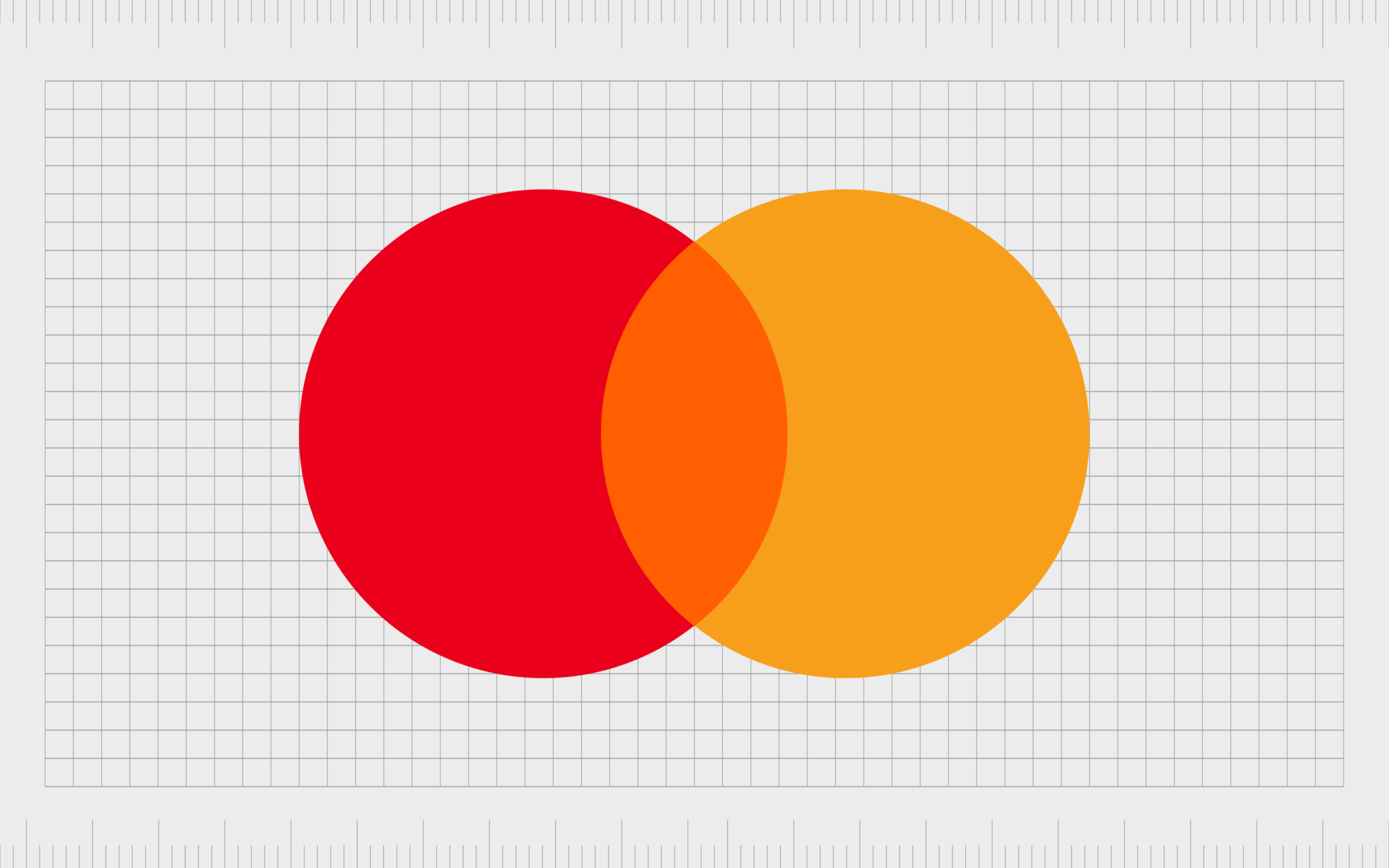
Mastercard
Launched in 1996, Mastercard has changed its logo a handful of times over the years, however, two overlapping circles have always remained a consistent part of the brand identity.
As time passed and Mastercard became increasingly modern, it upgraded its design, embracing brighter colors and simpler components.
Today’s minimalistic Mastercard logo is a symbol of unity, community, and innovation, perfect for a financial brand.

Michelin
Probably one of the best examples of a mascot logo in the world, Michelin has always relied on the iconic Michelin man for its logo. The character, designed to look as though he was made from tires, has changed a few times over the years.
However, today, Michelin’s bulky creation has allowed it to build one of the most influential logos of all time. Notably, the Michelin man was actually inspired by a pile of tires Édouard Michelin thought looked like a man.
Find out more about the Michelin logo here.

Volvo
Introduced in 1927, the Volvo logo has actually caused some confusion over the years. Some people believe the design is supposed to look like the “male” symbol. However, it’s actually intended to represent the symbol for iron.
The design, with its bold circle and arrow pointing upwards and to the right is also excellent for conveying key values held by the company, like community and growth.
Find out more about the Volvo logo here.
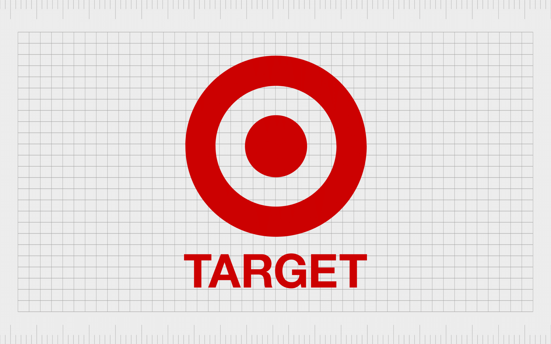
Target
Like many of the best logos of all time, the Target symbol has had a few different iterations over the years. However, this design has always featured the iconic “bullseye” design.
The red Target logo is instantly recognisable anywhere in America, and it’s easy to see from the side of the road.
The shape psychology of the circles also helps to convey a sense of acceptance and community.
Find out more about the Target logo here.
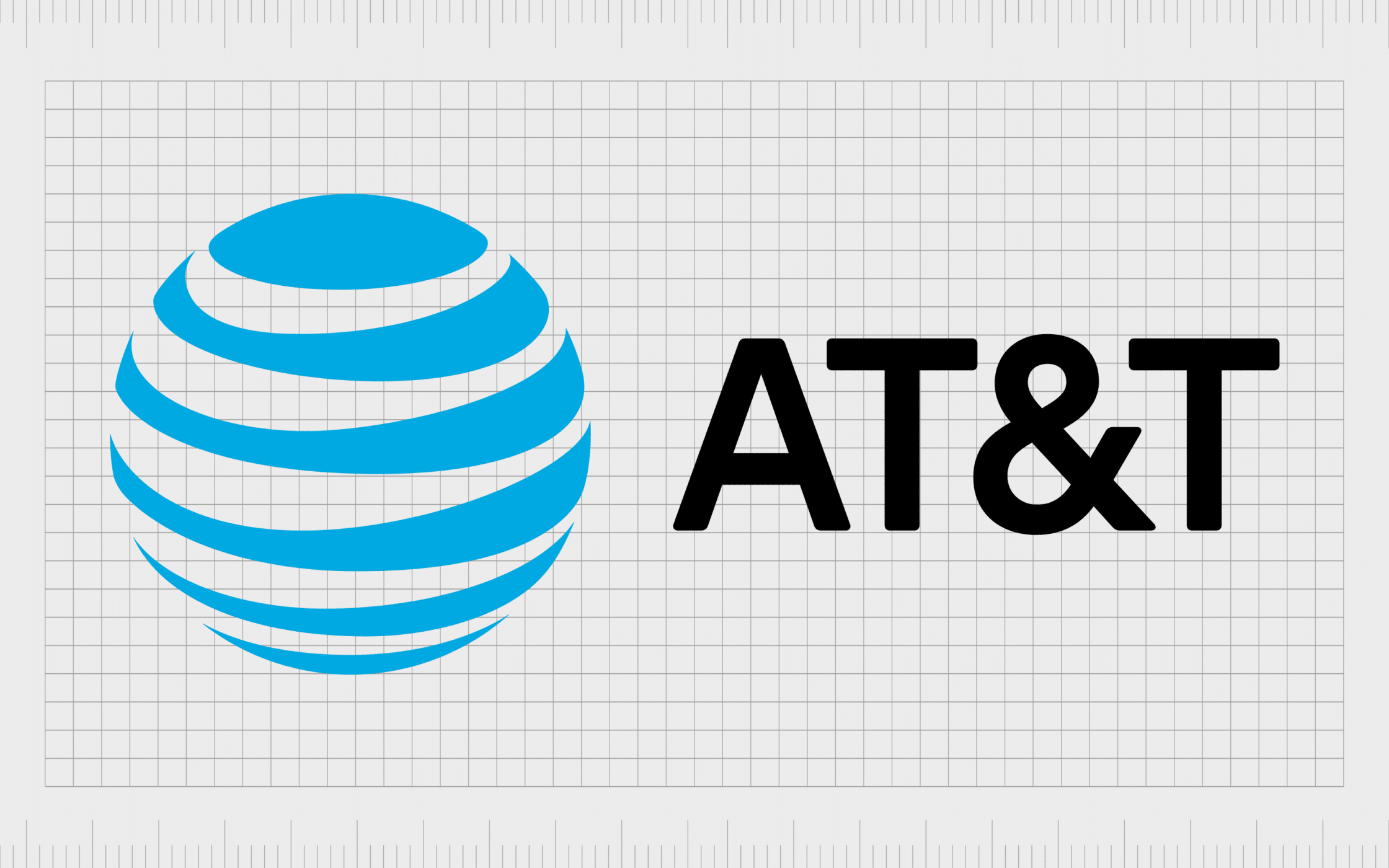
AT&T
Originating as the Bell Telephone Company in 1877, AT&T evolved to become American Telephone and Telegraph in 1885. Since then, the company has been working on its iconic logo.
The layered “globe” design intends to represent the worldwide reach of the company. The stripes through the circular shape also give the image a sense of motion, as though the world is turning.
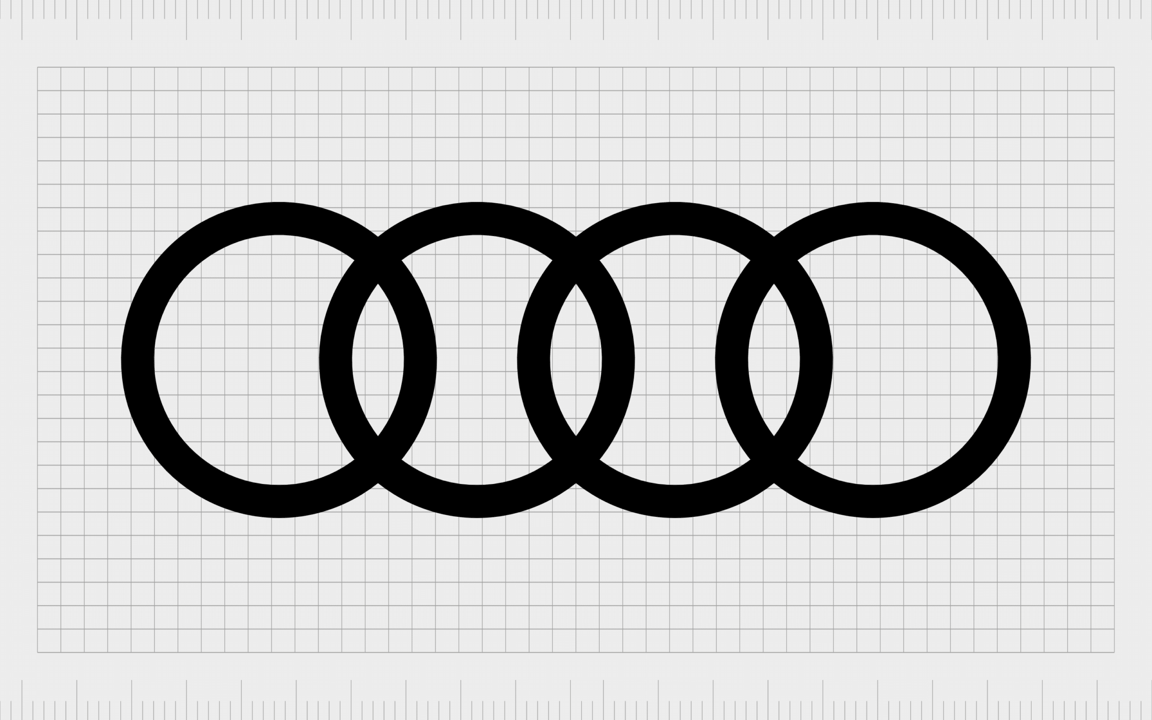
Audi
Easily one of the best logos ever created, Audi’s symbol shows us the right image can convey a significant amount of meaning, without being overly complex.
This influential logo features four connected rings, now symbolic of the Audi brand. The rings are meant to symbolize the unity of the four companies joined together to create the Audi Union brand.
Those companies were Horch, Wanderer, Audi, and DKW.
Find out more about the Audi logo here.
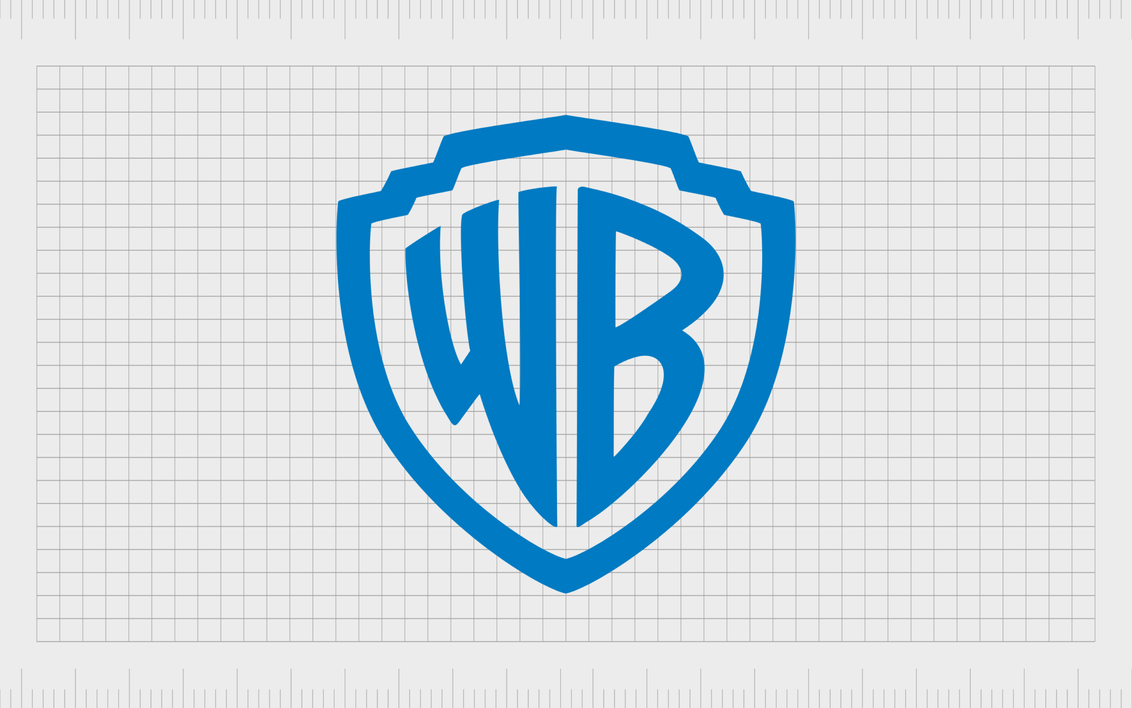
Warner Bros
One of the best logos of all time in anyone’s eyes, the iconic Warner Bros shield has been a part of the company’s identity throughout its lifespan. While a few elements of the design have changed, such as the exact shape of the shield and the typography, the overall impact of the image remains consistent.
The stunning Warner Bros logo is fun and playful, with elements of trustworthiness and credibility built into the shield symbol. The blue coloring adds to this reliable appearance.
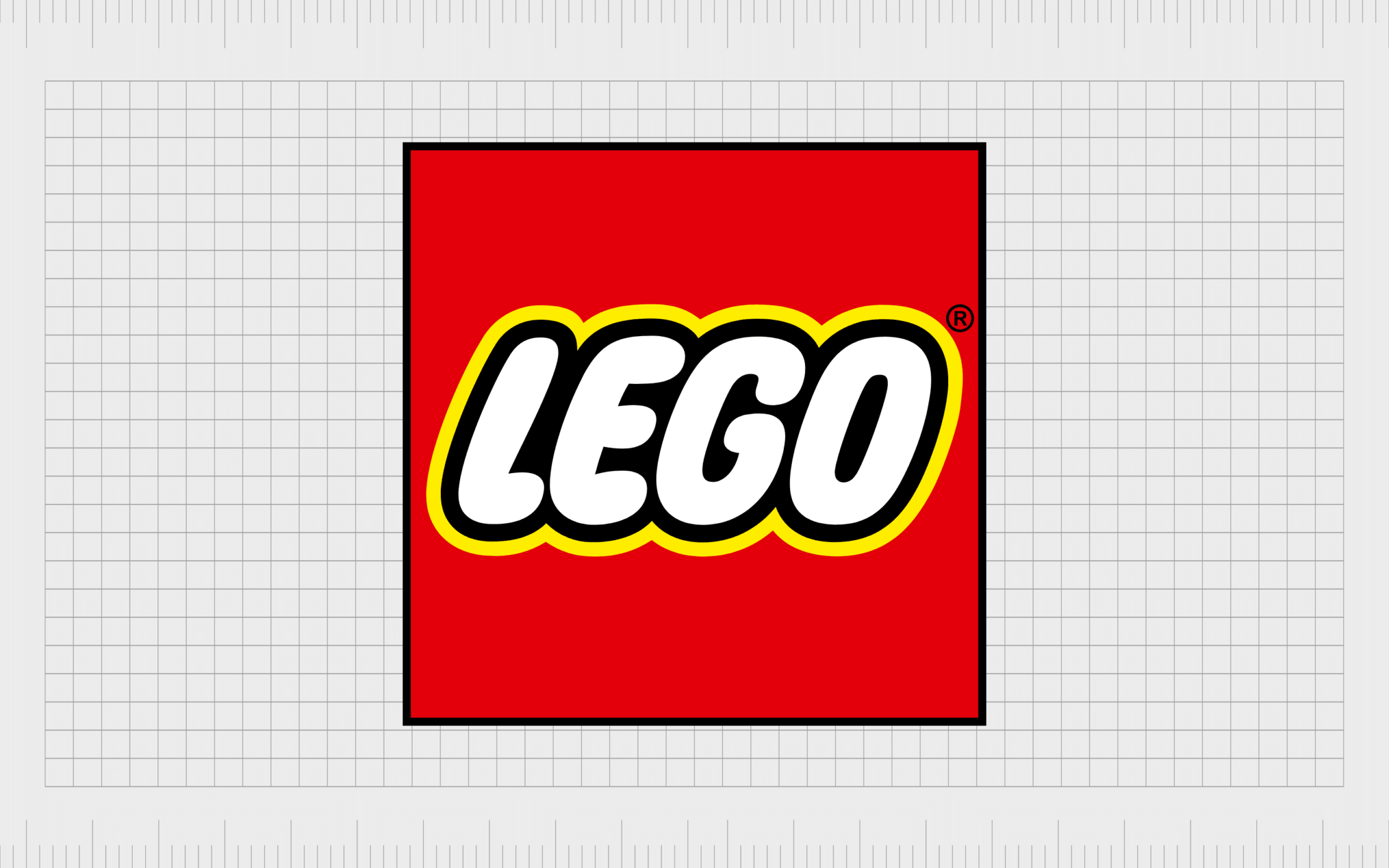
LEGO
Introduced in 1934, a couple of years after the LEGO company officially launched, the first LEGO logo was just a logotype of the company’s name.
In 1936, LEGO updated its icon to include more color, and boxed everything in a cube, to remind us of the modular nature of the brand’s toys. The fun and playful image is a fantastic insight into the company’s personality today.
Everything from the yellow border to the bubbly white letters show us what to expect from LEGO.

Shell
The logo for Shell has always been a reference to the company’s name. Introduced in the year 1900, this design was intended to draw attention to the company’s quest for fossil fuels.
As the business evolved over the years, the image became less detailed, allowing Shell to move gradually towards a more minimalistic image.
The bright coloring of the image today, combined with its bold simplicity, makes it instantly recognizable.
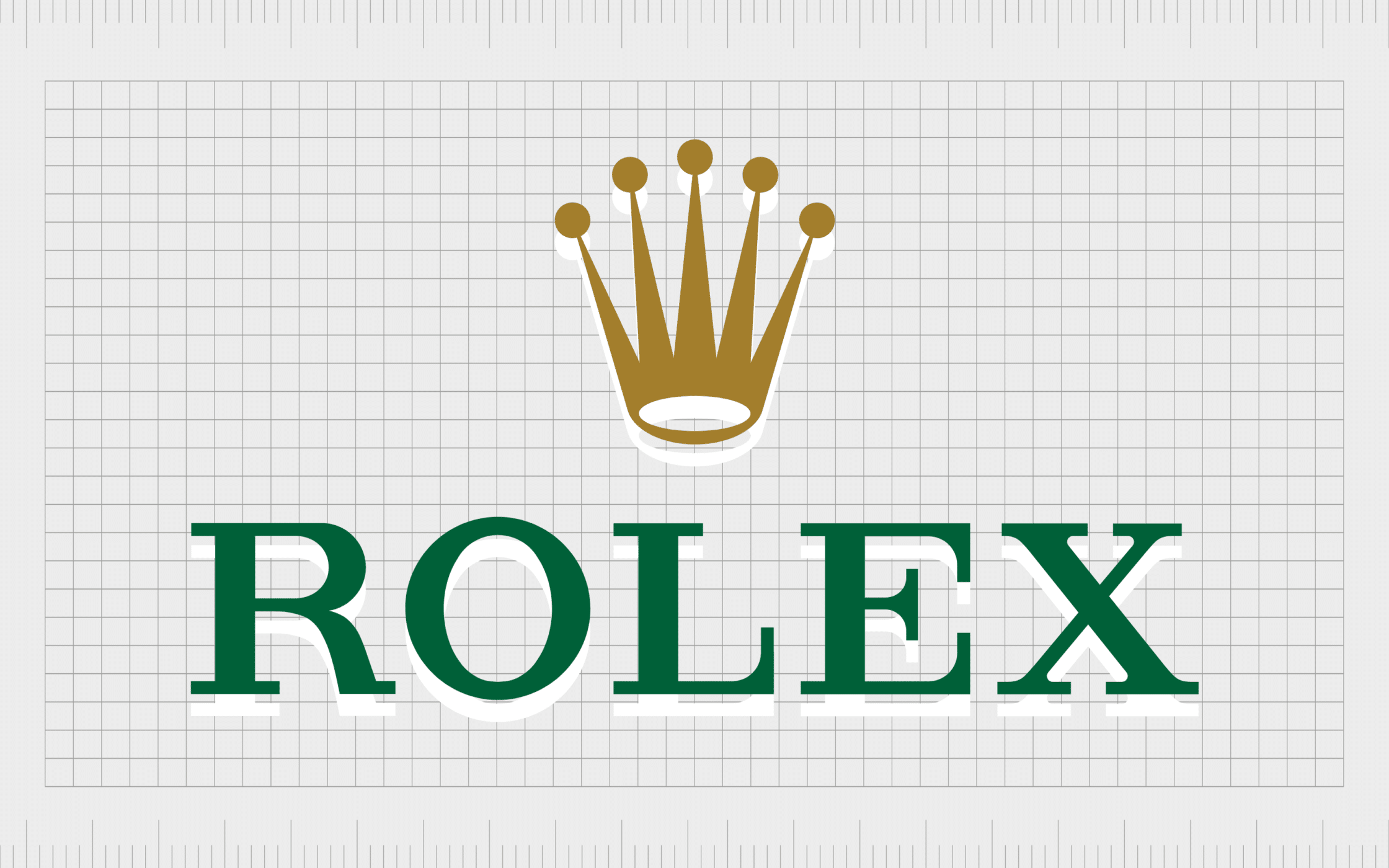
Rolex
Easily one of the top logos of all time for the luxury brand industry, Rolex built its image to draw attention to the prestige, perfectionism, and power of the brand.
Featuring a stunning serif wordmark, to highlight ideas of sophistication and professionalism, and a pointed crown sitting above, this logo tells us exactly what to expect from the brand.
It also builds on the company’s slogan, which is “A crown for every achievement”.
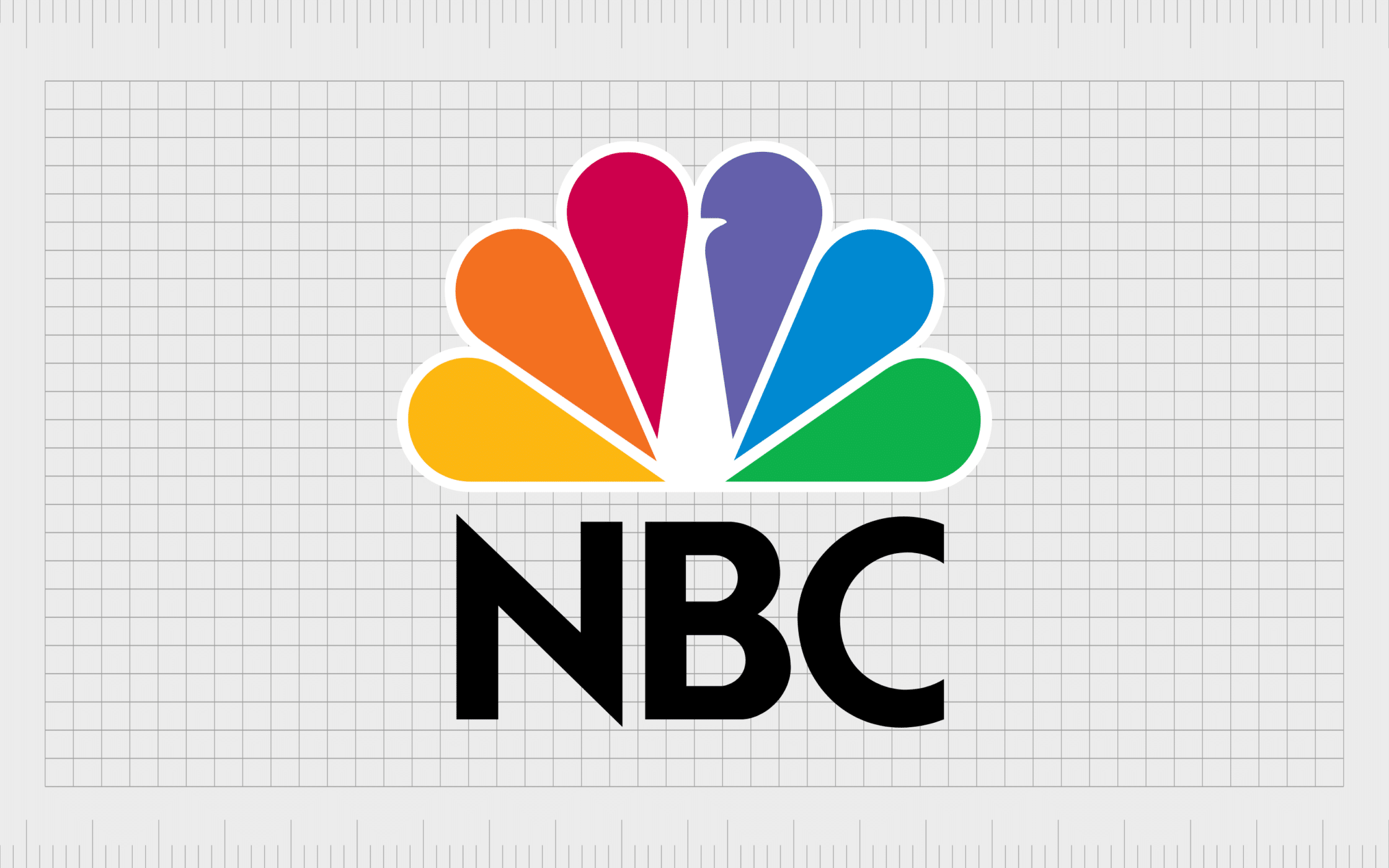
NBC
Easily one of the most colorful designs on our list of the best brand logos ever created, NBC’s image was designed via a stroke of genius from the team. The company chose a peacock to highlight its focus on the color television landscape.
However, there’s extra meaning hidden within the plumage. The colors within the peacock’s feathers are intended to represent the different areas covered by NBC, like sports and news.
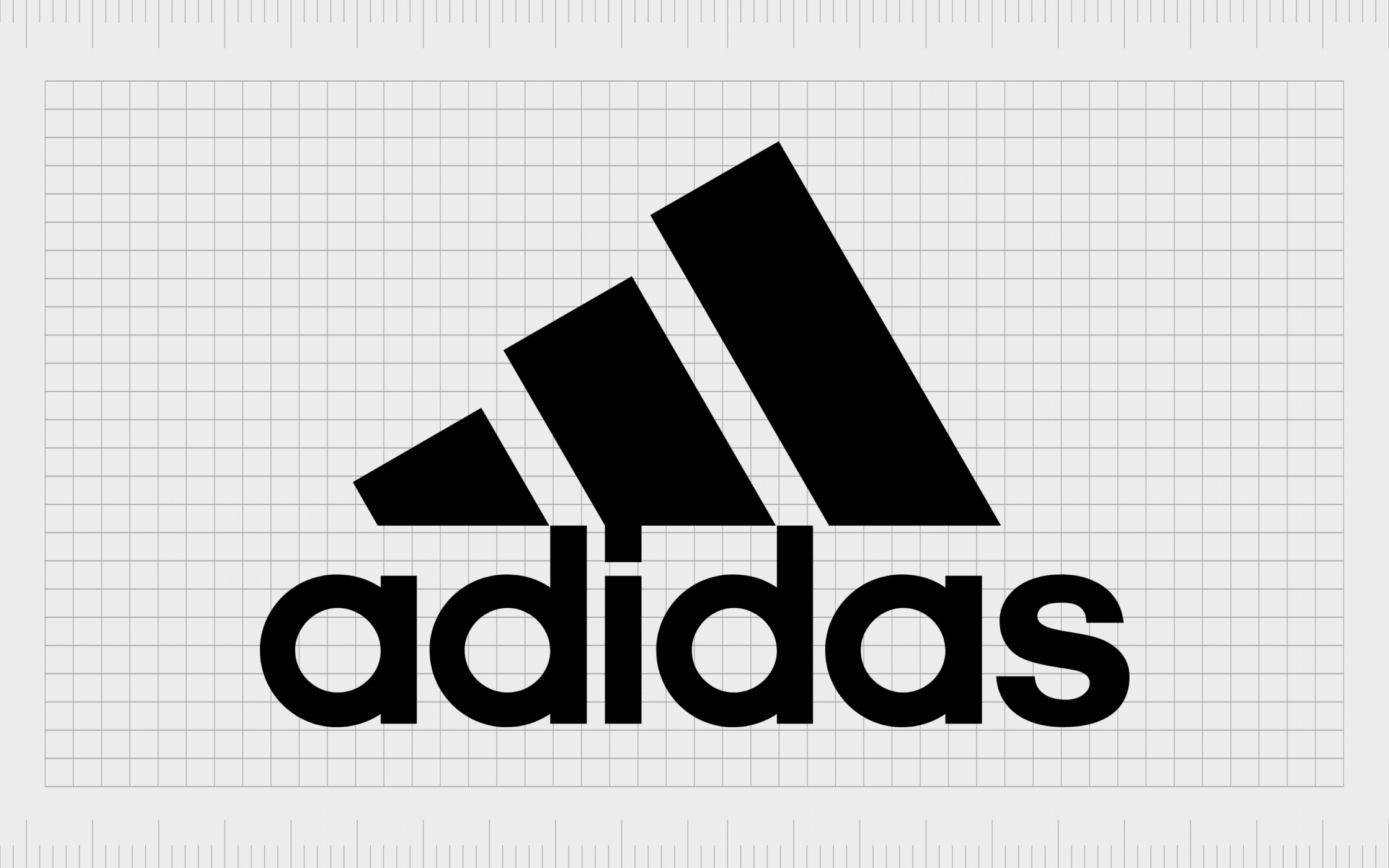
Adidas
The Adidas logo is one of the most recognizable in the sporting industry. In fact, Adidas has had a handful of memorable logos over the years. You may still be familiar with the “trefoil” three-point design introduced by the company in 1971.
The current logo today is a testament to the brand’s focus on helping athletes to achieve their goals. The three bold stripes, gradually increasing in size, represent the path to accomplishment any sporting fan follows.
Find out more about the Adidas logo here.
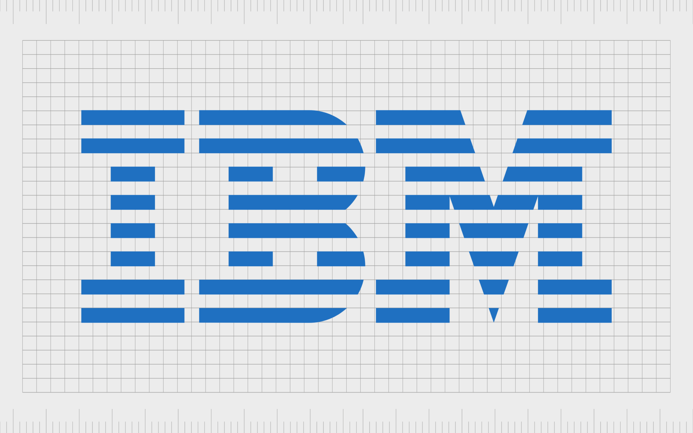
IBM
You don’t need to be a tech enthusiast to be familiar with the IBM logo. Easily ranked as one of the greatest logos of all time, IBM’s logo is simple but effective. The first design was initially introduced in 1924, when the company changed its name to “International Business Machines.
The logo you may know today was produced in 1972, featuring the letters “IBM” created from a series of lines. The lines are intended to show “speed and dynamism” – key values of the brand.
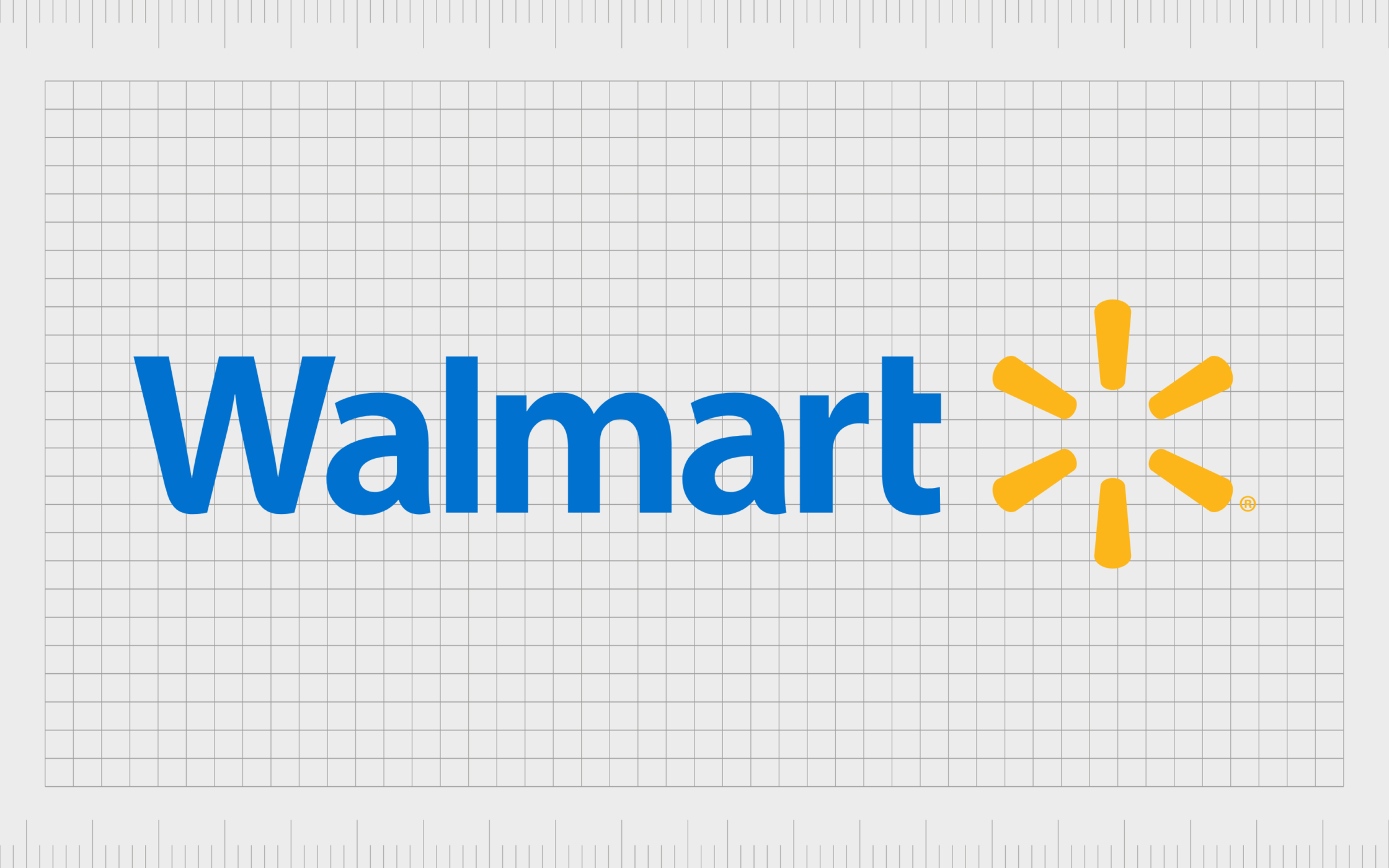
Walmart
One of the most iconic logos in the American landscape, Walmart’s image has transformed numerous times over the years, always to suit a different audience.
Since the original launch in 1962, we’ve seen Walmart’s logo evolve from a more “western-style” image, to something simple and eye-catching. The design today uses a simple sans-serif wordmark in blue to highlight reliability.
The sun-burst style graphic alongside the wordmark symbolizes joy.
Find out more about the Walmart logo.
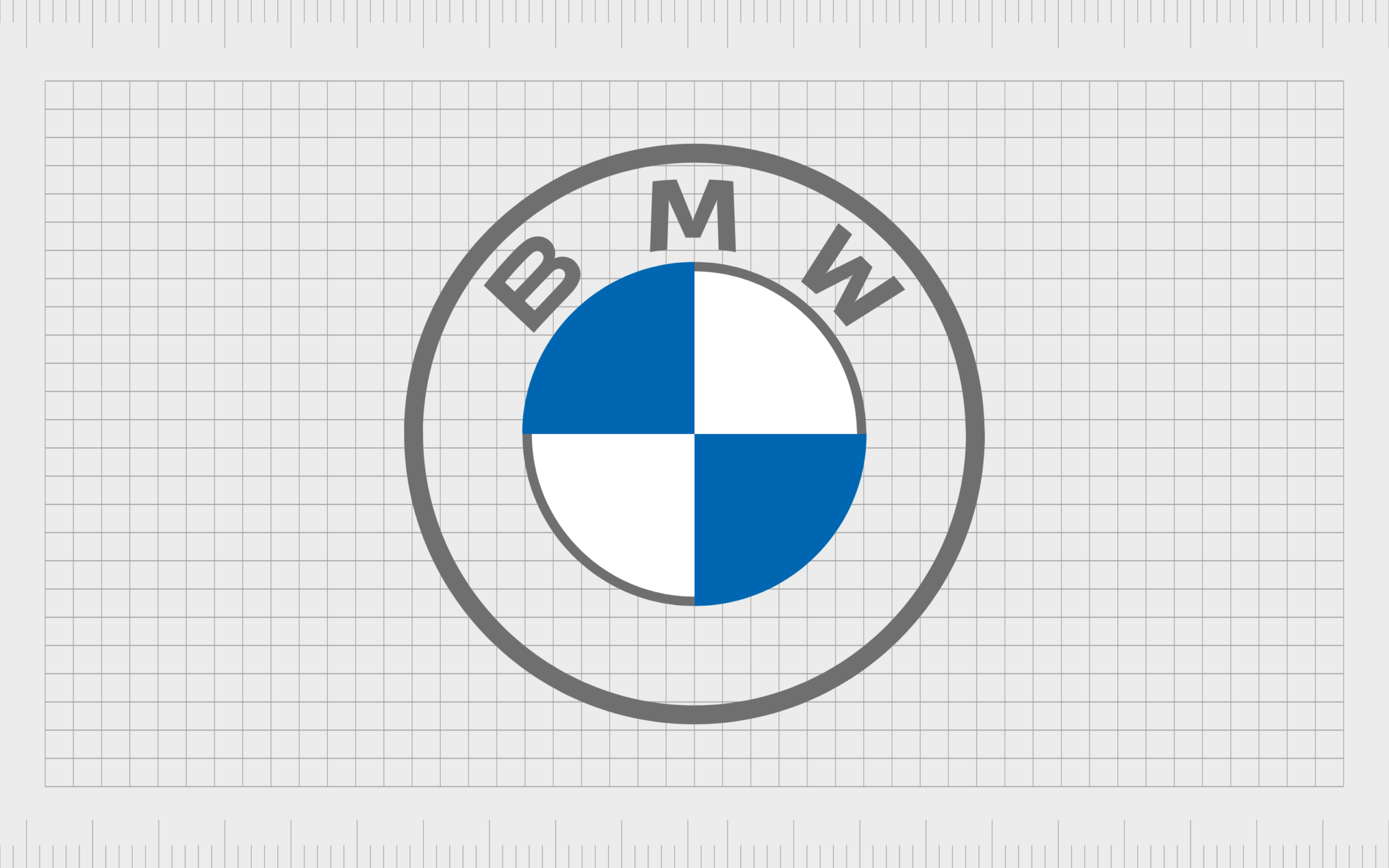
BMW
One of the world’s most famous logos, and a top image in the automotive landscape, BMW’s logo has retained a lot of its central components over the years. The first design was introduced by BMW in 1969, featuring the same white and blue checkered circle we know today.
According to the BMW team, the design displays the state colors of Bavaria, though they’ve been inverted to reduce any problems with trademark law.
Find out more about the BMW logo here.
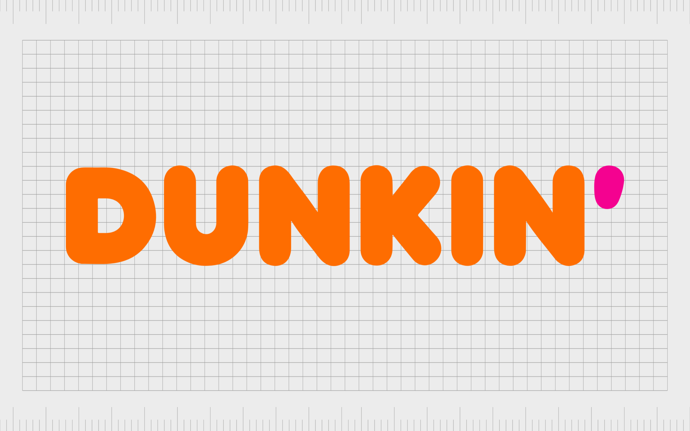
Dunkin
Whether you know them as Dunkin Donuts or simply Dunkin’, you’re probably familiar with this famous coffee and snack company.
Dunkin Donuts was first introduced in 1950, with a logo featuring the company’s name in a script style. Over the years, Dunkin decided to upgrade its logo to something funkier and more modern.
Today, the image is a beautifully colorful and appealing image, intended to remind us of the fun and playfulness of the brand.

Ford
When it comes to listing the best logos of all time, it’s impossible to ignore the influential impact of the Ford emblem.
Introduced in 1903, the first version of the logo is still quite similar to the one we know today. It was based on the handwriting of Henry Ford, who created the iconic automotive brand.
The blue oval behind the “Ford” wordmark is an excellent reference to the company’s reliability, credibility, and honesty.
Find out more about the Ford logo here.
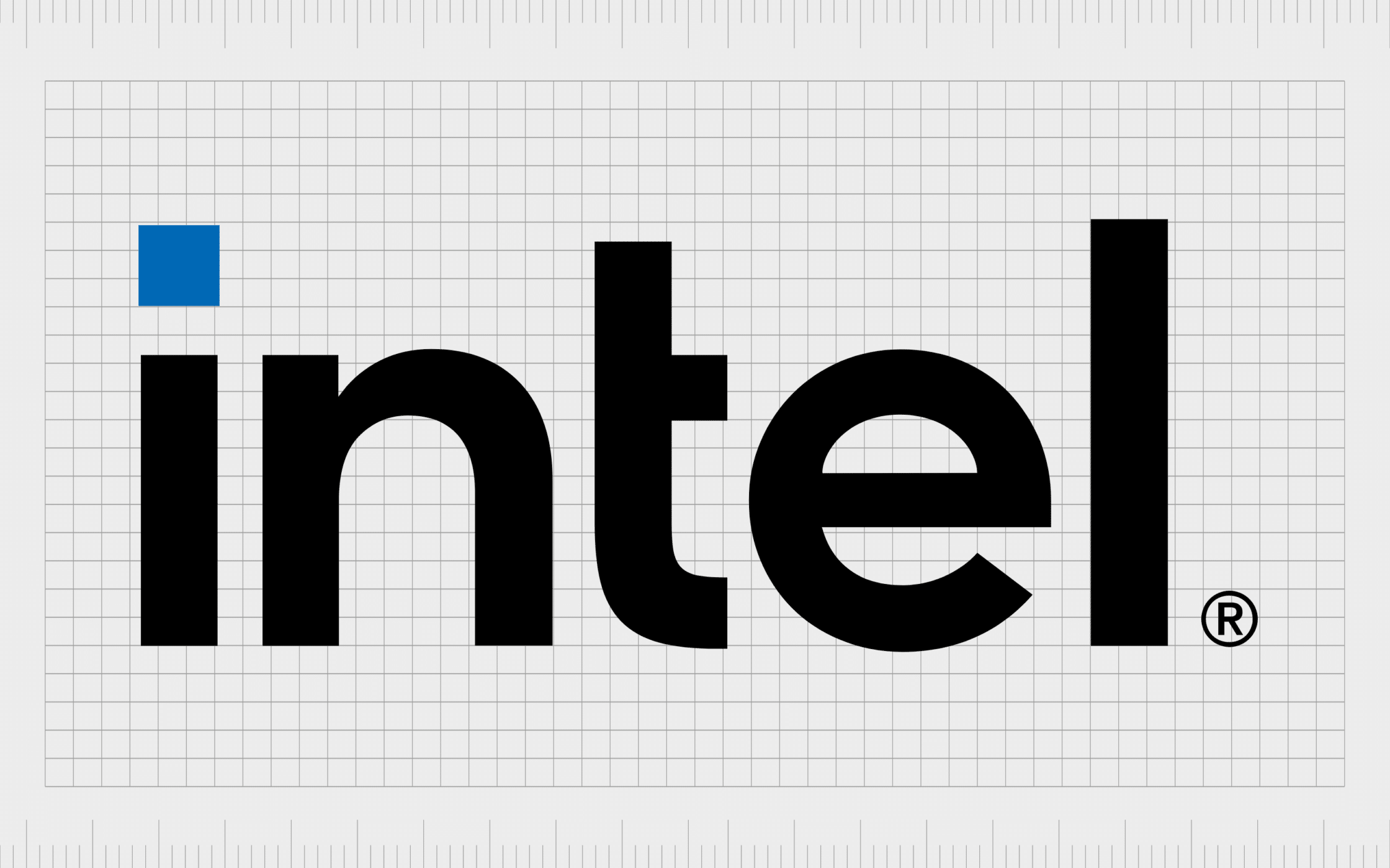
Intel
One of the world’s most famous computing companies, Intel introduced its first influential logo in 1969, designed by Gordon Moore and Robert Noyce. The two founders eventually updated the logo to feature the name of the brand with a swooshing oval circle around it.
The disconnected elements between the two parts of the oval help to showcase movement and innovation. The company wanted to create an image capable of conveying their focus on the future.
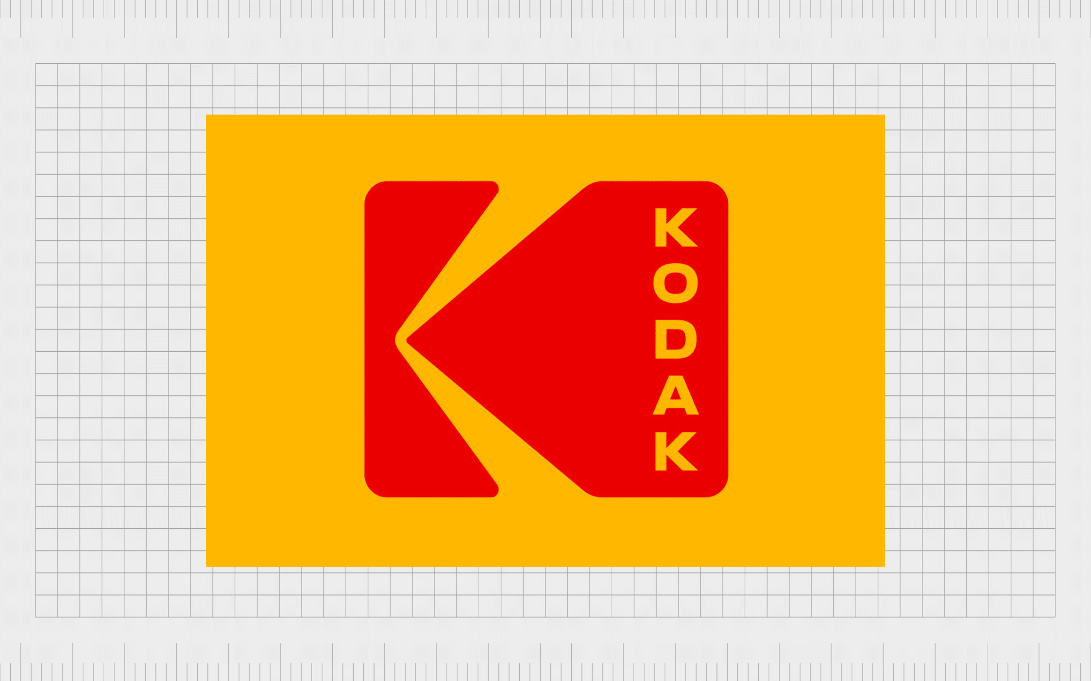
Kodak
The Kodak logo, which was introduced way back in 1907, actually claims to be the first integration of a company’s look and name into the same symbol. While it’s hard to say if this is true, we do know the Kodak symbol is one of the most influential logos of all time.
The image today has transformed quite a bit from its original design, but the simple and straightforward values of the company are still evident.
Today’s Kodak symbol might seem basic, but it makes a lasting impression.
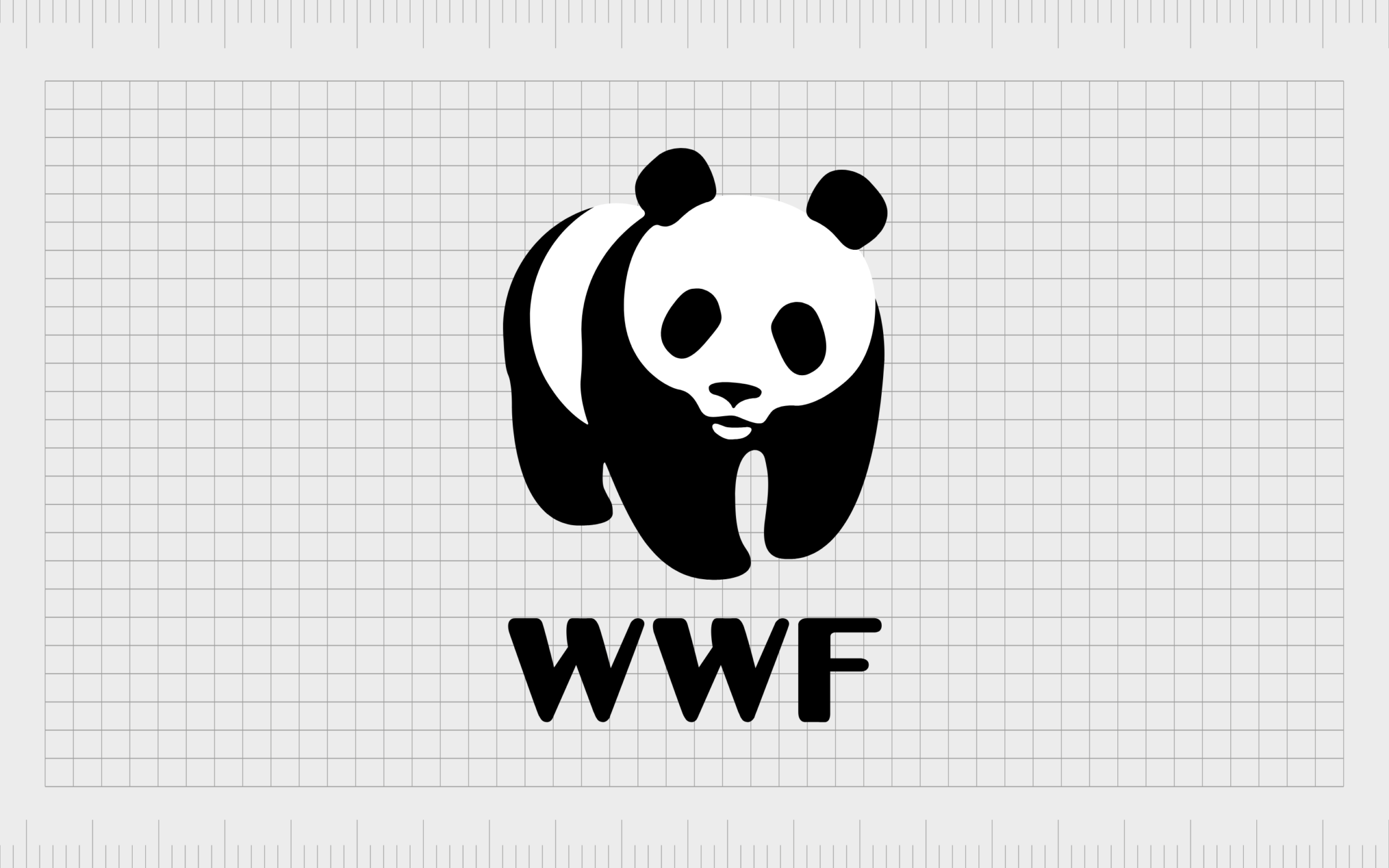
WWF
One of our top choices for the best logos of all time in the non-profit landscape, the WWF logo was first introduced in 1961, though it only featured the iconic panda at this time. Over the years, the panda illustration became simplified, removing some of the furry texture.
Today, the image is an excellent example of how white space can make all the difference to the visual impact of a logo. The WWF wordmark fits perfectly into the image.
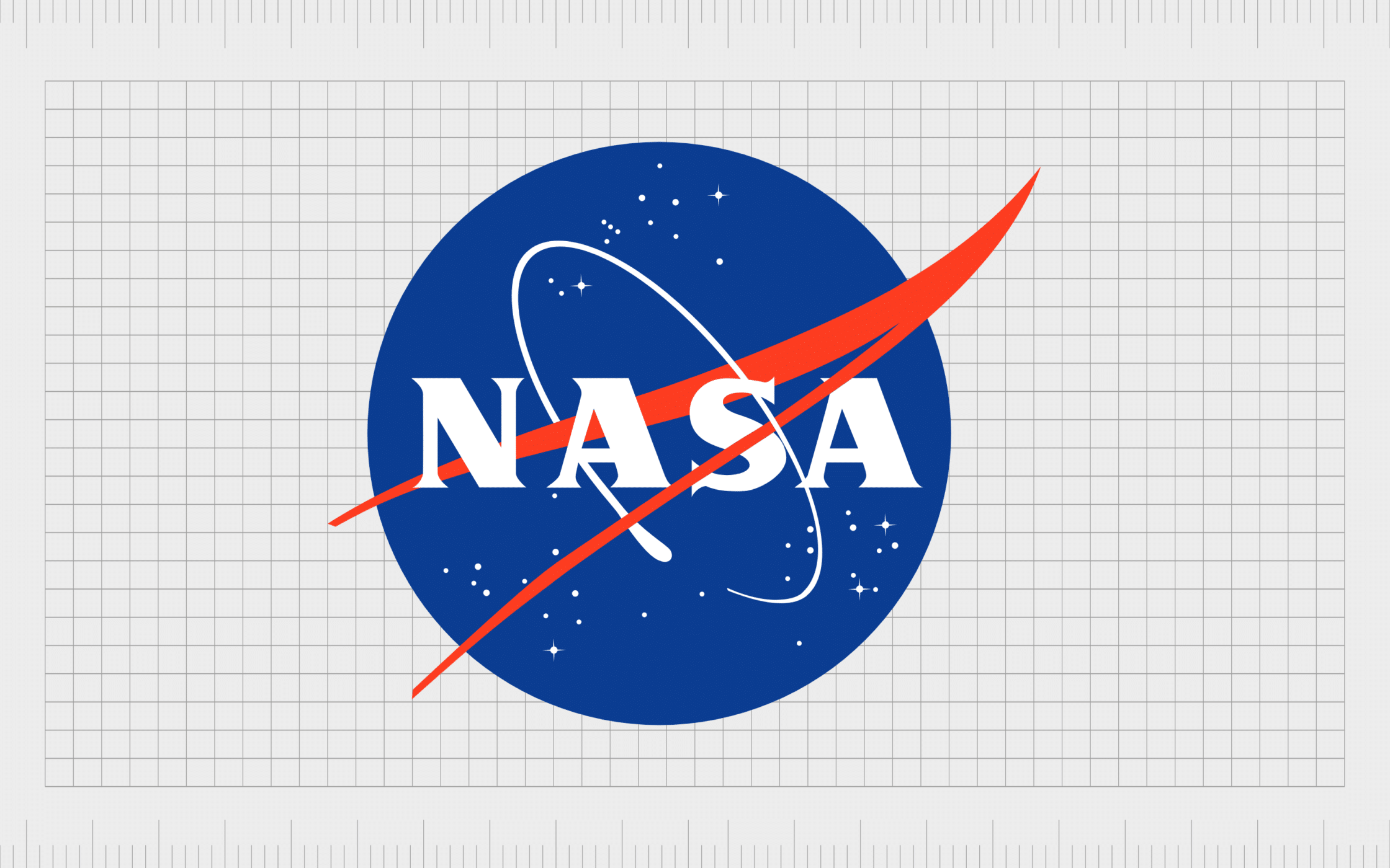
NASA
NASA, the world’s most famous space company, first introduced a logo for its business when the group was initially created. There are a number of variations of the NASA logo available today.
The first is the round red, white, and blue insignia, known as the “meatball”, with its beautiful depiction of outer space.
The second is the “worm” logo, which features the company’s name in a simplified font, with no lines in the “A”s.
There’s also a special seal used by formal agency events.
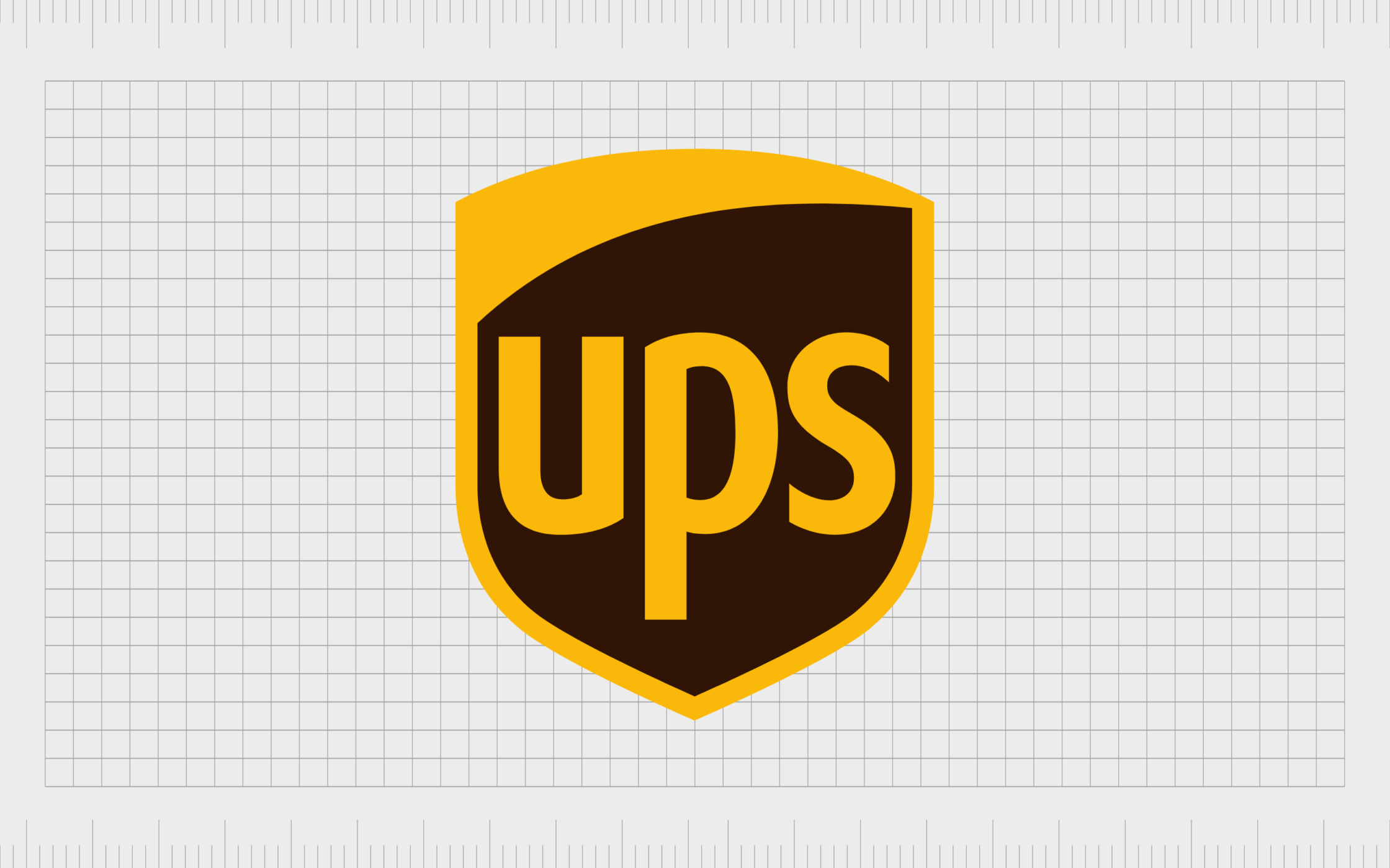
UPS
The unforgettable shield logo associated with UPS was first created in 1916, when Jim Casey combined the brand with a rival local delivery service. The shield shape, intended to highlight the reliability of the company, stuck with the brand throughout its entire lifespan.
The shield image is an excellent insight into the company’s values, particularly when combined with the solid brown and gold color choices.
Find out more about the UPS logo here.
What are the 10 most recognised brand logos?
While there are plenty of great examples of some of the top logos of all time, there are a handful which always seem to come out on top.
Here are our picks for the most iconic, and greatest logos of all time, based on reach and recognition…
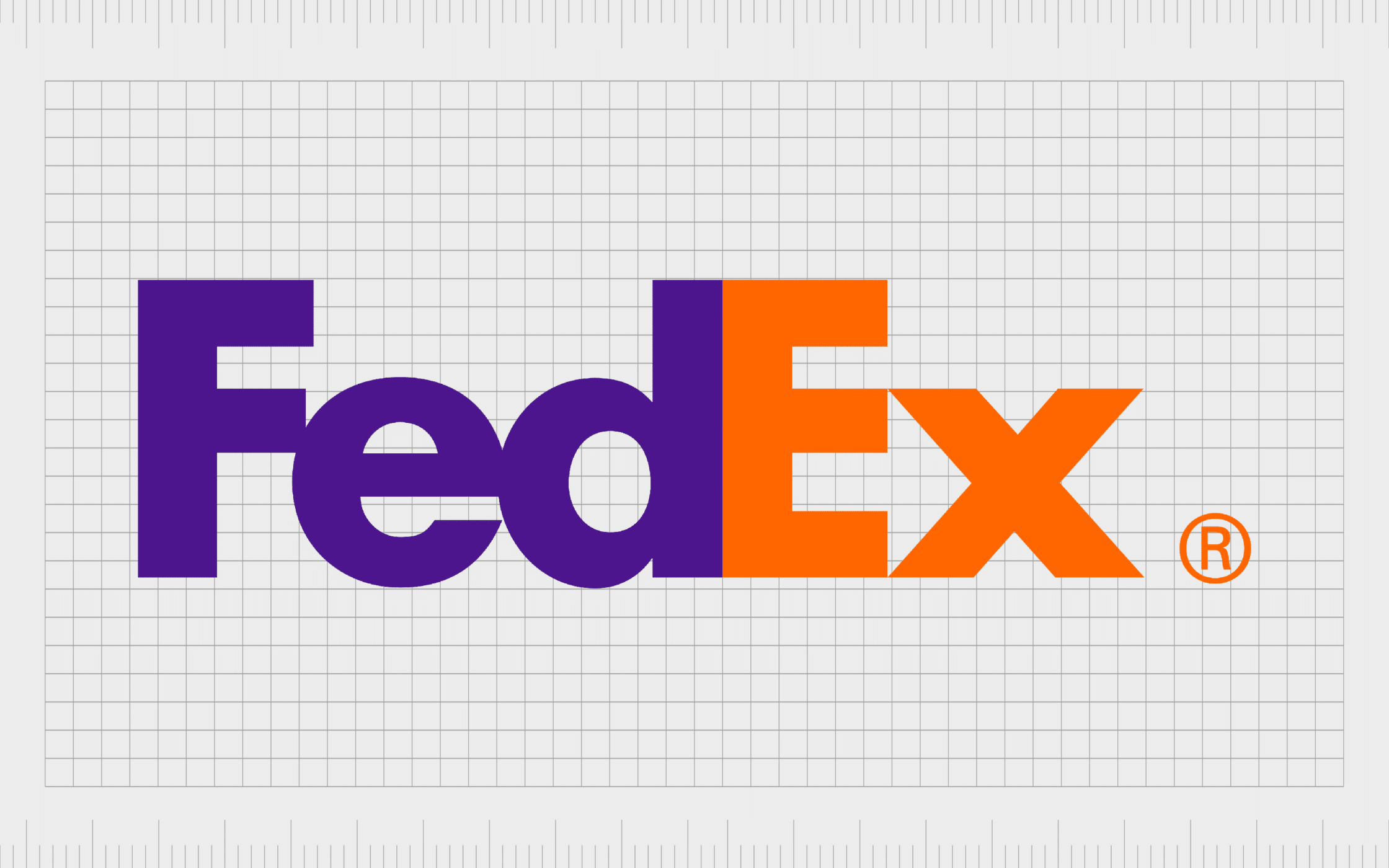
10. Fedex
It’s impossible to deny the impact the FedEx logo has had on the world over the last few years. Often referenced as one of the top logos with hidden meanings, the FedEx symbol fits an arrow into the space between the “E” and “X” of its wordmark.
This is a subtle reference to the speed and accuracy of the company, first launched in 1972.
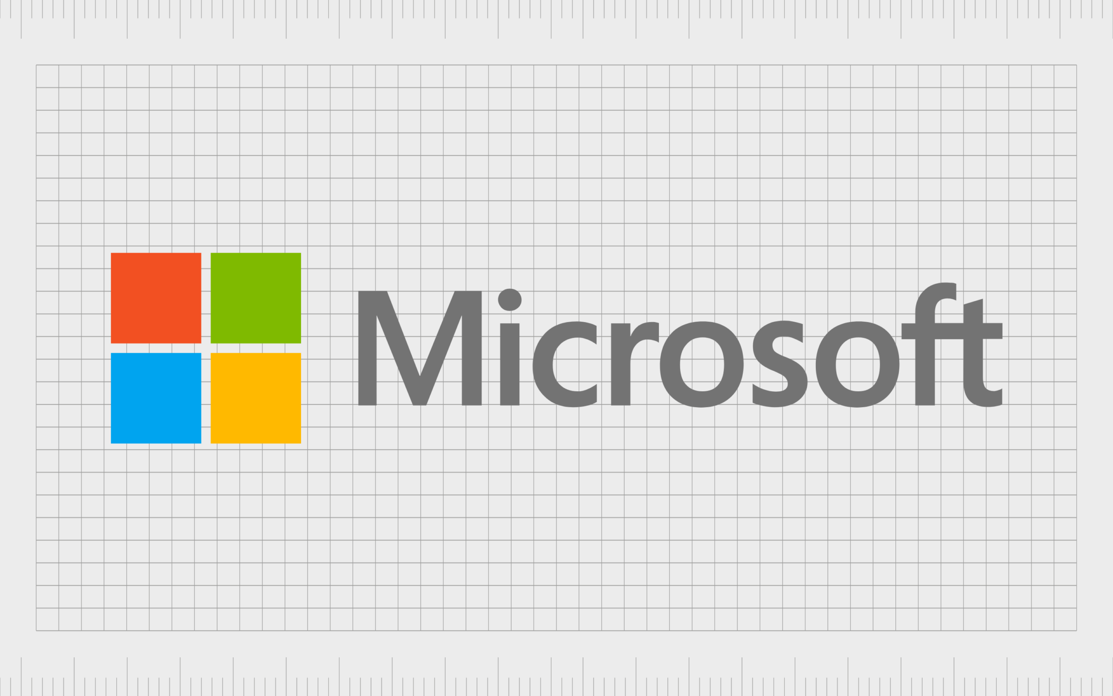
9. Microsoft
Microsoft first introduced a logo for its brand in 1975, and the image remained in use until 1979, showcasing a similar image to what we know today, with a lot more “retro” elements and movement.
Over the years, the image has grown more refined, showcasing a simple selection of four colored blocks placed next to the “Microsoft” wordmark. Each color represents a focus area of the Microsoft company, from Green for Xbox, to blue for Office.
Find out more about the Microsoft logo here.
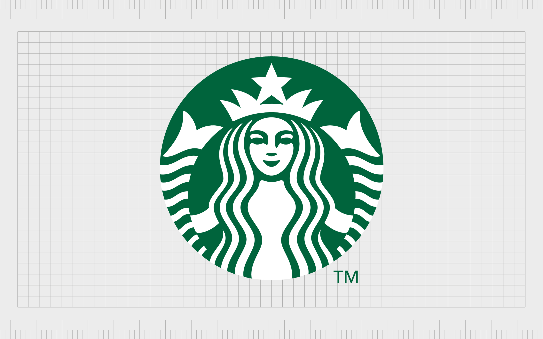
8. Starbucks
It’s hard to find anyone who isn’t familiar with this company’s image. Starbucks has created one of the most influential logos of all time, inspired by a famous two-tailed mermaid.
The Starbucks image has transformed and simplified slightly over the years, but the iconic character remains consistent.
The green coloring of the Starbucks logo is also telling, highlighting the natural ingredients used by the brand, and its focus on innovation.
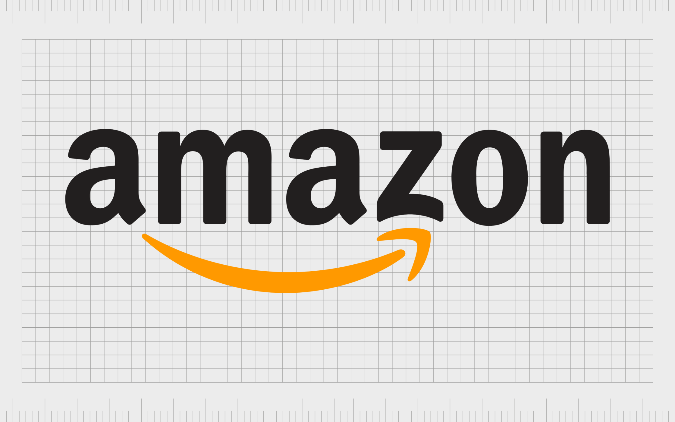
7. Amazon
Amazon has one of the most memorable logos in the world, and it’s surprisingly simple in its design. The image is relatively simple at first glance, featuring a wordmark, with an arrow in orange connecting the “A” to the “Z”.
This highlights the incredible versatility provided by the Amazon marketplace. The slight dimpling at the bottom of the “Z” also makes the arrow look like a smile.
The key elements of the image have also been carried over to the Alexa logo.
Find out more about the Amazon logo here.

6. Google
It’s impossible to have a list of the best logos of all time without at least some reference to Google. The Google logo is a pioneering image in the technology world.
Initially, the design was a little less refined than it is today. However, it has always been a very colorful emblem.
Similar to Microsoft, Google uses its colors to draw attention to the products in its feature set. The image also regularly transforms today, with submissions from collaborating artists.
Find out more about the Google logo here.
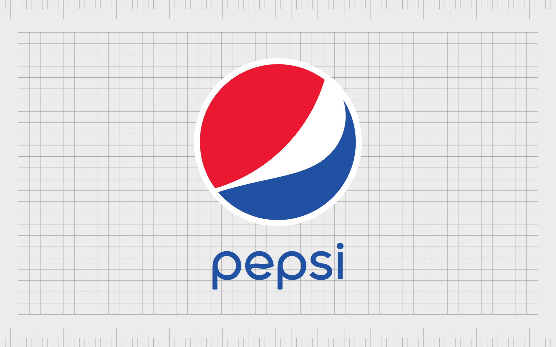
5. Pepsi
Everyone knows the Pepsi logo, but you might not know where it came from. The founder of the Pepsi company, Caleb Bradham, actually scribbled a design on a piece of paper when coming up with an idea for the company’s image.
The brightly colored circle, featuring, red, blue, and white elements is instantly recognizable today, even without the Pepsi wordmark.
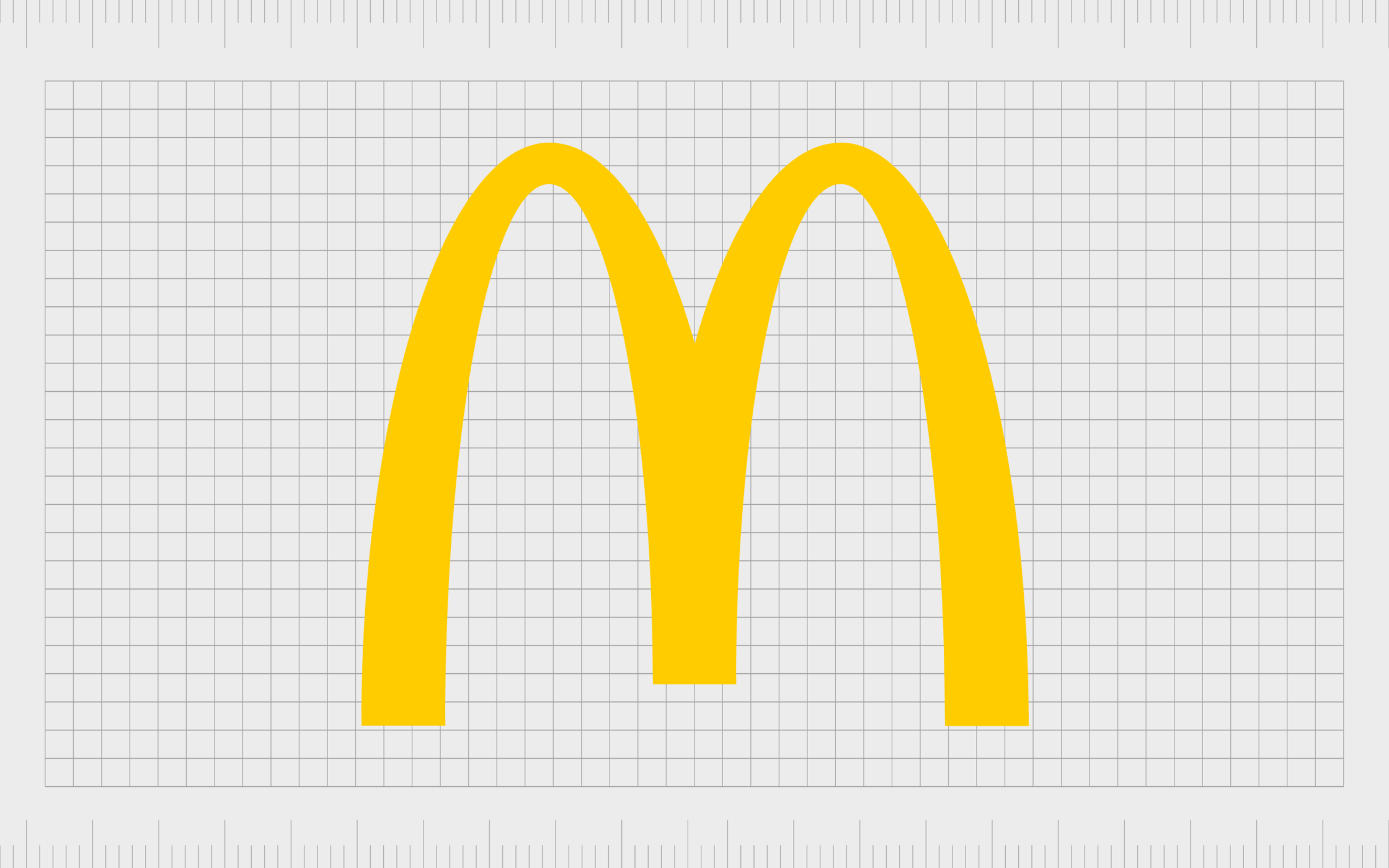
4. McDonald’s
Easily one of the most recognizable logos in the world, McDonald’s has long relied on a stylized “M”, to highlight its brand. The golden arches, as they’re known today, were intended to stand out to people passing by on the road, looking for somewhere to stop and eat.
The bright coloring and the bold design convey ideas of happiness and youthfulness for the brand.
The golden “M” is now present in locations all over the world.
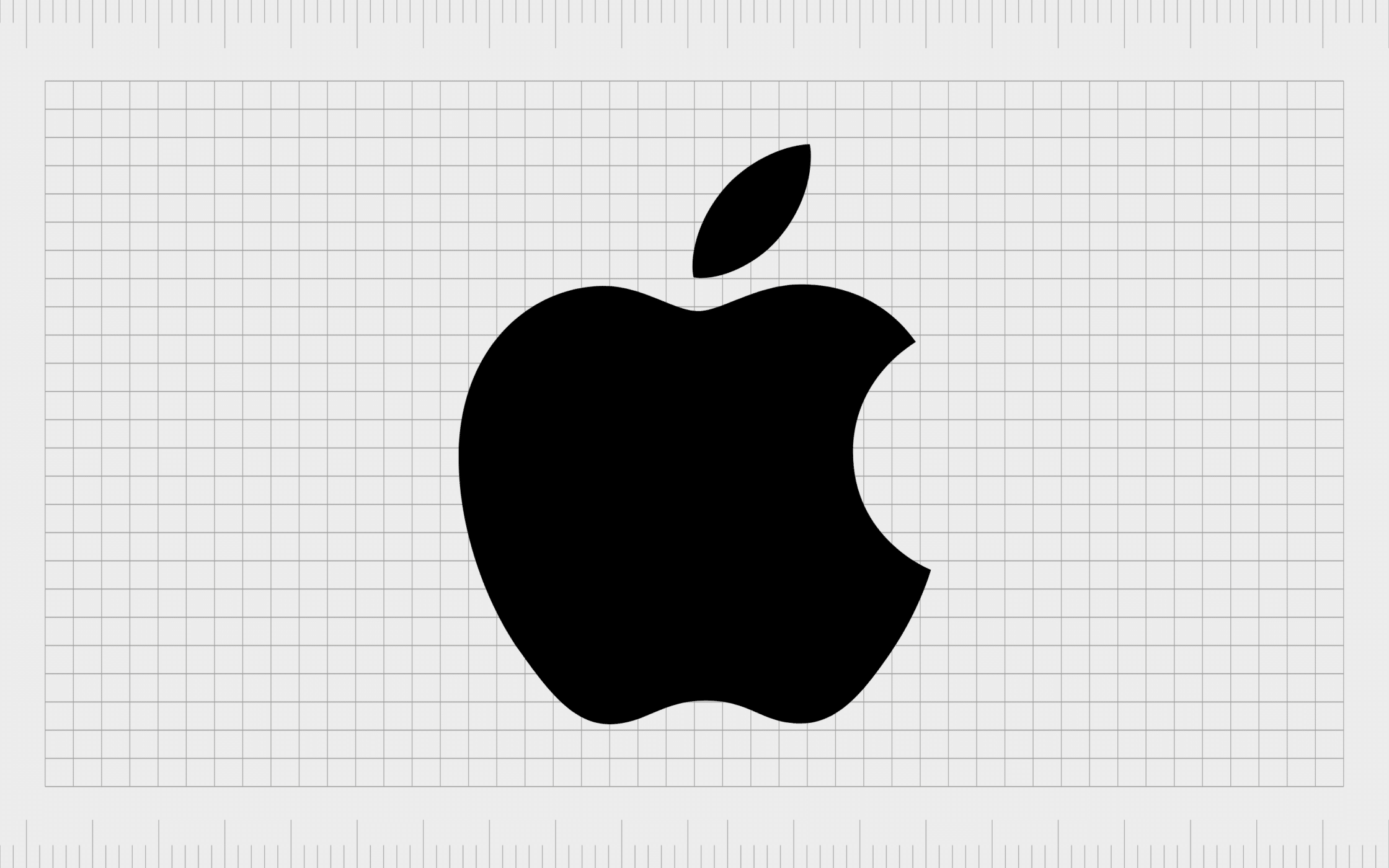
3. Apple
The Apple logo began with an intricate design created by Ronald Wayne, the co-founder for the company. It was intended to showcase Isaac Newton’s discovery of gravity, and help connect the Apple brand to concepts of discovery and innovation.
Eventually, the design became much simpler.
Today, this is one of the world’s best logos of all time, and one of the easiest to recognize. Simple and compelling, the apple with the “bite” mark even reminds us of the tale of Eve and the serpent from the bible.

2. Coca-Cola
Similar to McDonalds, Coca-Cola is one of the world’s most famous brands, with a presence in countries all over the globe.
While the exact design of the Coca-Cola logo has evolved a few times over the years, it maintains its simple flowing texture, and its incredible appeal.
The swirling letters remind us of the flow of water, making us think of a refreshing beverage. The bright red coloring of the logo has also become an iconic part of the brand’s identity.
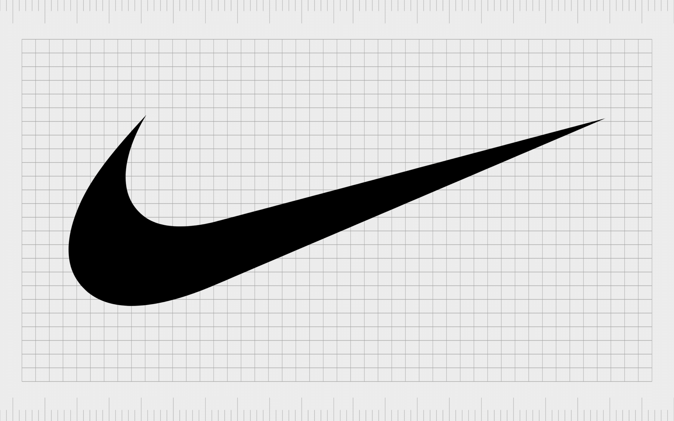
1. Nike
Easily one of the top logos ever created, Nike’s image is simple but meaningful. According to the company, the image is intended to represent the wing of the goddess Nike, from whom the athletics brand got its name.
Of course, we can also connect this shape to the symbol of a “checkmark” which symbolizes accomplishment and achievement.
Overall, the simple but compelling emblem is a motivational and inspirational design for the brand.
Find out more about the Nike logo here.
What is the greatest logo of all time?
When it comes to choosing the best logos of all time, it’s difficult to say which image is truly “best of all”. There are so many fantastic logos out there, each with their own unique meaning and heritage.
Today, we’ve looked at just some of the best logos ever created in our opinion. However, you’re sure to have some extra ideas of logos we should include.
Whether you prefer the simplicity of logos like the McDonalds or Nike emblem, or you appreciate the meaning behind the symbols of WWF and NASA, hopefully this list has given you some of the inspiration you need to create a logo of your own.
Fabrik: A branding agency for our times.

Clarity starts with a conversation.
Thanks—we’ll get back to you shortly.
Whether you're navigating a rebrand, merger, or simply need a clearer identity—we’re here to help. No hard sell, just honest advice from people who know the sector.
Let’s start with a simple question…
Prefer to email? Drop us a line.
Fabrik’s been helping organisations rethink and reshape their brands for over 25 years. We’ve guided companies through mergers, rebrands and new launches. Whatever stage you’re at, we’ll meet you there.