Stranger Things logo and evolution

Even if you’ve never watched an episode of Stranger Things, you’re probably familiar with the iconic logo. At this point, the Stranger Things symbol is almost as iconic as the series itself.
Everywhere you look, you’ll find decorations, clothes, and accessories emblazoned with the famous font. There are even tools to make your own Stranger Things logo.
So, what makes this image so memorable?
Just like any effective brand logo, the Stranger Things symbol evokes important feelings and ideas to drive deeper emotional connections to the show.
From the almost glowing red font to the lines separating the words, everything about this emblem is designed to grab audience attention.
Here’s what you need to know about the Stranger Things logo.
Introducing the Stranger Things logo
As incredible as it may seem, the first season of the amazing Stranger Things launched on Netflix in 2016. Created by screenwriting brothers Ross and Matt Duffers, Stranger Things represented a new era in Netflix-branded shows.
The unique show immediately grabbed the attention of viewers worldwide thanks to its appealing story and throwback theme.
The Stranger Things logo came from a collaboration between Jacob Boghosian, Imaginary Forces, and the Duffer brothers. Since the plot of the show starts in the 80s, the group were careful to go back and research some of the more common styles from the era when crafting their own type-based logo.
Evidently, the Duffer brothers were huge fans of storytelling, evidenced by their ability to create such a compelling narrative for the Stranger Things show. Much of their influences came from the novels of the 80s.
The team wanted the wordmark to be unique enough to grab attention, while still using elements of 80s typography and imagery.
According to the Imaginary Forces team, the resulting font was intended to be a combination of the font for a Stephen King novel, and something pulled from the title sequence of the Alien movie.
The Duffer brothers provided Boghosian with a collection of Stephen King books to explore, and over 20 Stranger Things logo options were produced.
The Stranger Things logo font
The winning Stranger Things logo font was ITC Benguiat, created by Ed Benguiat and designed to have a bold, yet decorative appeal. The serif-style font has a touch of the old-style horror books by Stephen King to it, but it also manages to be modern and highly legible.
According to Netflix representative, Michelle Dougherty, the Stranger Things logo font conveys the atmosphere of the 80s unlike anything else.
There are a few alterations to the ITC Benguiat font in the logo. The initial letters S and T are refined, with an extension on the left. The shape of the serifs is also slightly different. You may notice a few minor changes in the kerning and shape of various letters.
Some experts worried the final Stranger Things logo was too large, but the Netflix owners thought the design was a success. Since then, the Stranger Things logo has maintained the same font, year after year, with a few minor changes to suit each season.

Stranger Things logos by season
The eye-catching Stranger Things logo is a fantastic representation of the show itself. The mysterious 80s style font conveys the mood of the show, and its constant commitment to previous decades.
Notably, Boghosian said he was surprised the Stranger Things symbol did so well. He didn’t think the font was great on its own and believes the image is only so memorable today because of the show’s success.
Let’s look at how the Stranger Things logos have evolved by season.

Stranger Things season 1 logo
The Stranger Things season 1 logo is the simple title mark most fans are familiar with today. The slightly adjusted Stranger Things font is clear here, and the ITC Benguiat typography appears in both block color and outline versions.
The type of choice aims to convey the mystery, horror, and style of the 80s. The fact the words are arranged into two tiers is significant too. The tiered words make the logo more compact, but it also helps to represent the two levels of reality in the Stranger Things show.
The S and R dipping into the level below highlights the interaction between the two worlds in the narrative.

Stranger Things season 2 logo
The Stranger Things season 2 logo is mostly the same as its predecessor. The outline font in this case has more of a glow to it, like the LED signs of the 80s often found above diners. There’s also a soft glow to the “2” behind the font.
The almost glowing lettering is an ideal way to add to the “horror” element the creators wanted for the series.
The atmosphere of mystery is supported by a kind of fog which seems to envelope the outer parts of the logo. The “2” sitting behind the title is similar to the style many 80s movies used for sequels.

Stranger Things season 3 logo
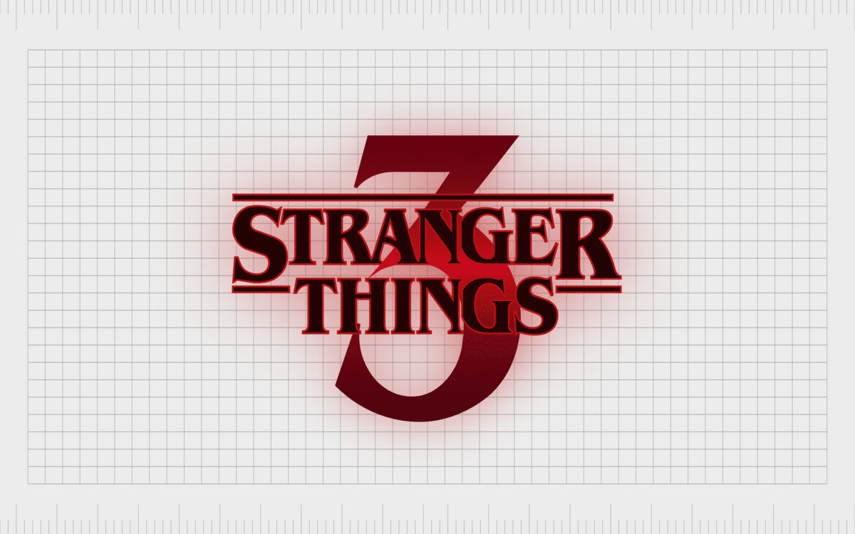
The Stranger Things season 3 logo follows much of the same style aspects of the first and second logos. The emblem is slightly different again, with block black letters outlined in red to emphasize the increasingly ominous plot.
The number 3 appears in a soft gradient, crimson red like the outline, but with darker edges.
The font is once again in the adapted ITC Benguiat typography, but the lines between the words is now solid, perhaps in another reference to the shows fight to separate the worlds.

Stranger Things season 4 logo
The Stranger Things season 4 logo doesn’t introduce any particularly significant changes compared to Season 3. However, the block coloring in the letters has disappeared again, replaced by a translucent outline of the font. The red and black coloring stays the same, here.
The incredible Stranger Things symbol
Logos for television shows rarely achieve the same impact as corporate logos for companies. There are countless iconic logos out there from retail brands and restaurants. However, few people can remember the font of every television show they love.
Throughout the decades, there have been a few exceptions to this rule, from the informal Friends logo to the gothic style of Buffy the Vampire Slayer. The Stranger Things logo is another reminder of how the right symbol can speak volumes about what it represents.
An icon of modern pop culture, the Stranger Things logo is one of the most compelling examples of teamwork in design. By taking inspiration from the past and adjusting elements to suit the narrative of an incredible story, the Stranger Things team created something incredible.
If you’re keen to make your own Stranger Things identity, you can find plenty of resources to do so online. The Stranger Things transparent logo is available here.
Don’t forget to check out our other insights into some of the world’s most famous logos.
Fabrik: A branding agency for our times.
Now read these:
—Explaining the Van Halen symbol
—The story of the Rolling Stones logo
—The Gucci symbol and logo history
—Harley Davidson logo emblem evolution
—Tidal Music symbol and logo story
—Story of the Pokémon logo symbol
—The LA Lakers logo and symbol
Check out these fantastic logo design resources:
Clarity starts with a conversation.
Thanks—we’ll get back to you shortly.
Whether you're navigating a rebrand, merger, or simply need a clearer identity—we’re here to help. No hard sell, just honest advice from people who know the sector.
Let’s start with a simple question…
Prefer to email? Drop us a line.
Fabrik’s been helping organisations rethink and reshape their brands for over 25 years. We’ve guided companies through mergers, rebrands and new launches. Whatever stage you’re at, we’ll meet you there.


