


Pharmaceutical company logos: The world’s most famous pharma logos

Are you familiar with any famous pharmaceutical company logos? There are quite a few options to choose from, ranging all the way from J&J to Pfizer and CVS health. As a $1.27 trillion dollar industry, pharmaceuticals is one of the biggest landscapes out there.
Of course, the size of the pharma landscape also means it’s notoriously difficult for any brand to stand out and make the right impression on their audience. While the connections pharmaceutical companies make with their customers can depend on a number of factors, the pharma logo can make a world of difference.
The right pharmaceutical company logo helps to identify the brand as caring, sophisticated, and professional, creating a sense of trust for customers.
Today, we’re going to be looking at some of the biggest, most memorable logos of pharmaceutical companies, and where they came from.
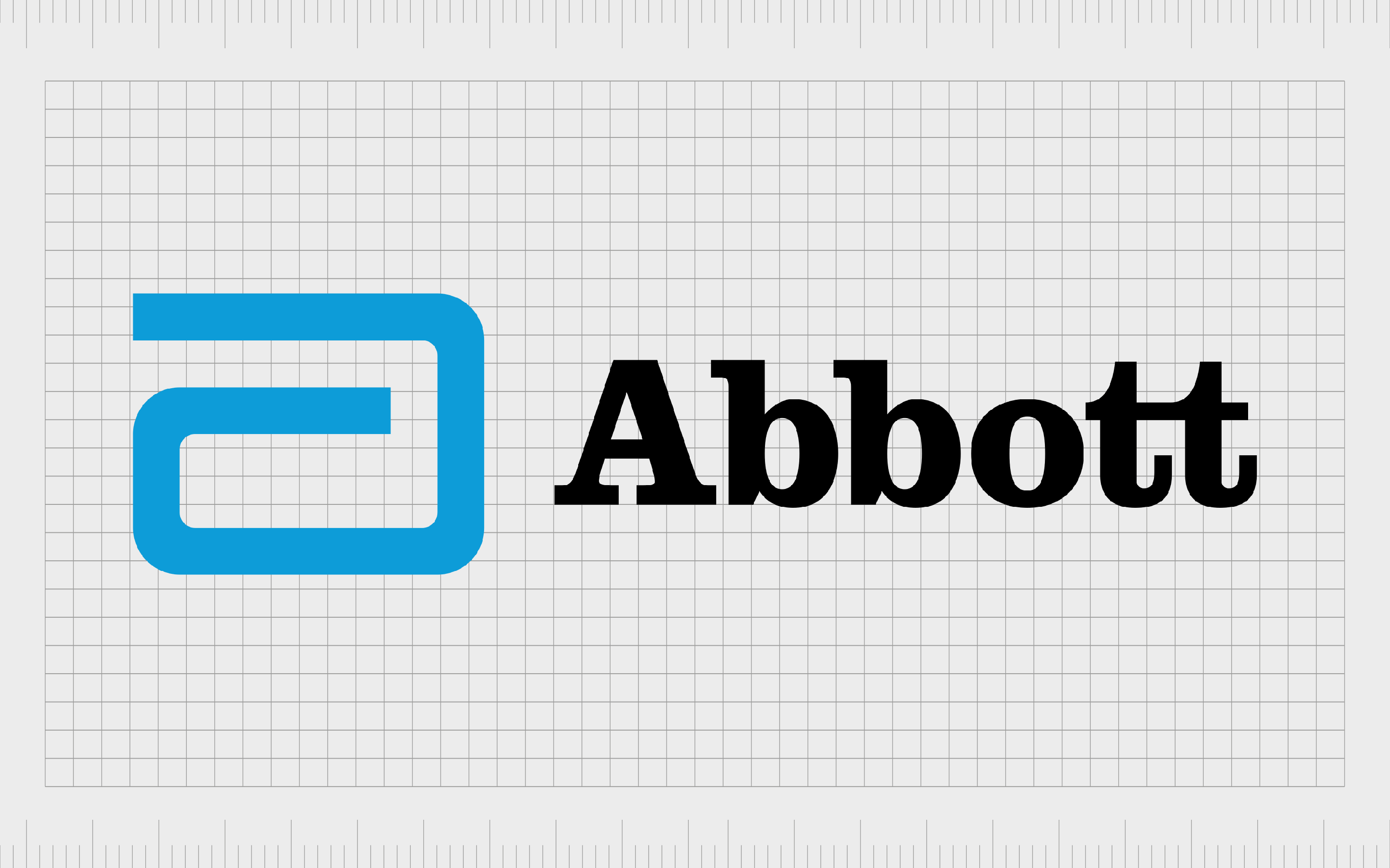
Abbot Laboratories
Abbot Laboratories is a multinational healthcare and medical devices company which first launched in 1888. Despite a long-standing history in the medical space, Abbot’s logo is impressively modern, featuring a swirling symbol similar to a lowercase “A”, with a serif wordmark.
While the serif wordmark conveys the professional and trustworthy nature of the brand, the use of title case prevents the image from being too aggressive or overwhelming. The swirling symbol in the trustworthy shade of blue makes the company seem creative.
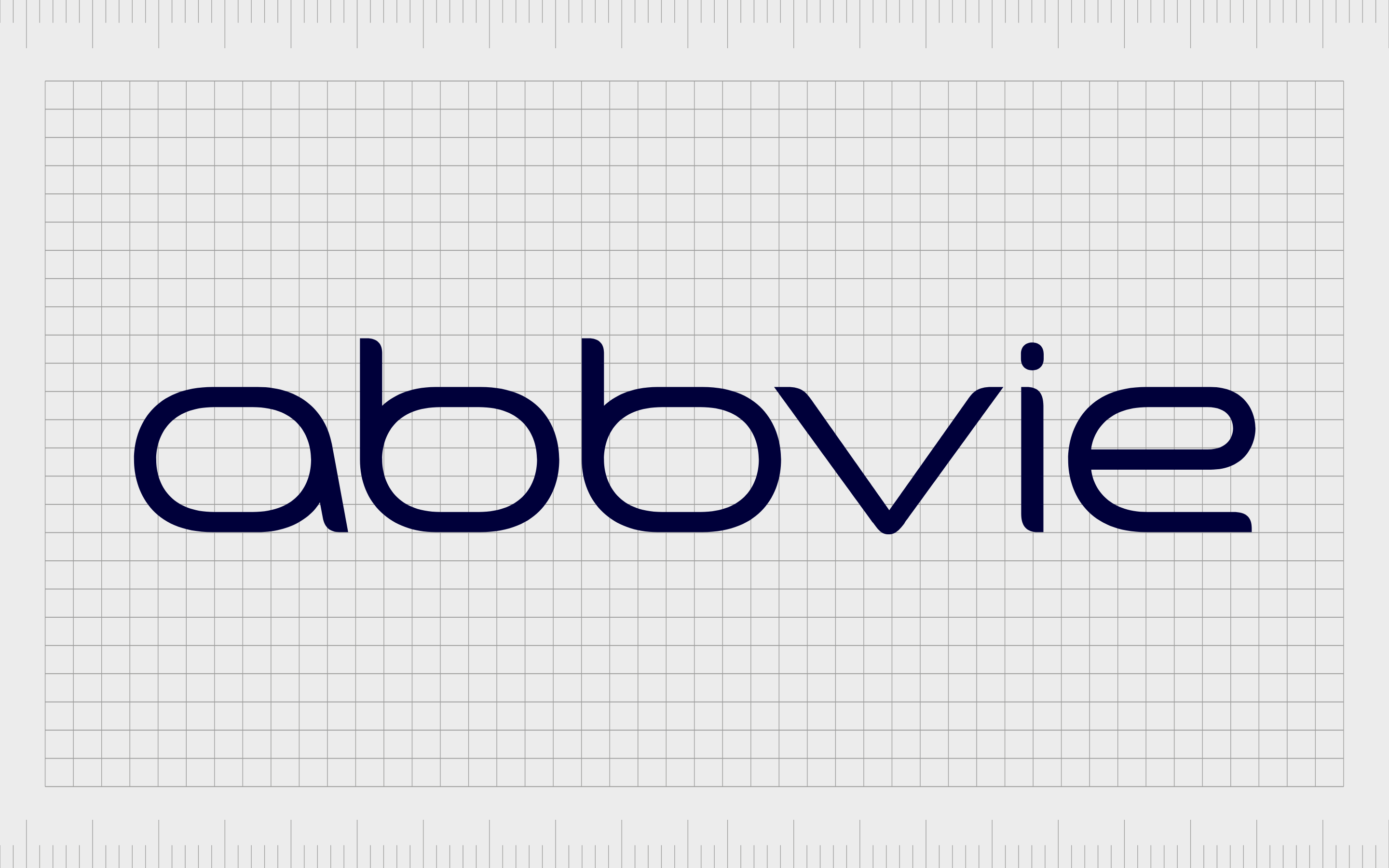
Abbvie
Founded in 2013 as a spin-off of Abbot Laboratories, Abbvie has taken some of the softness and approachability of the Abbot logo to inspire its own design. The company focuses on biopharmaceuticals, while Abbot Laboratories looks more at equipment and medical devices.
Abbvie’s logo is simple, modern, and comforting, thanks to it’s lowercase, sans-serif wordmark design. The image looks straightforward and clear, which helps to create a sense of trust and transparency among Abbvie and its audience.

Amgen
Otherwise known as Applied Molecular Genetics, Amgen is an American biopharmaceutical company based in California. The company launched first in 1980, and is best-known for products like Neulasta.
The word “Amgen” is a portmanteau of the company’s original name.
The Amgen logo is much bolder than some of the other pharmaceutical company logos on this list, featuring all capital letters in a block font. Like many pharma brands, the company uses a wordmark, and the color blue – often associated with calm and trustworthiness.
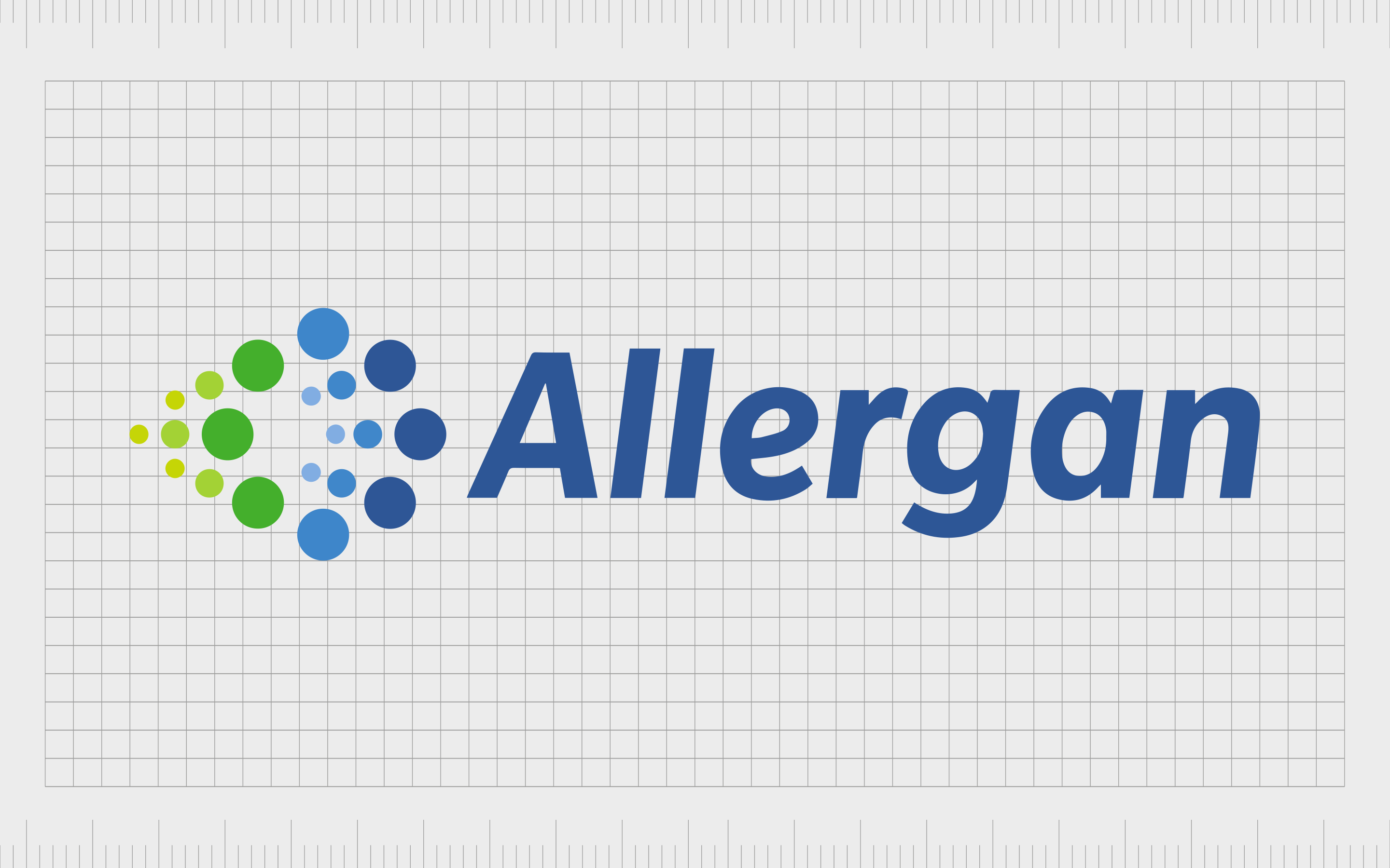
Allergan
An Irish-domiciled company in the pharmaceutical landscape, Allergan develops and manufactures a range of brand-name medical devices and drugs. The company is perhaps best-known for its development of “Botox”, and was formed in 2015.
Allergan’s logo is interesting and eye-catching, featuring the common reliable shade of blue for a sans-serif, title-case wordmark. The design next to the logo looks a little like the liquid bursting from the tip of a syringe.
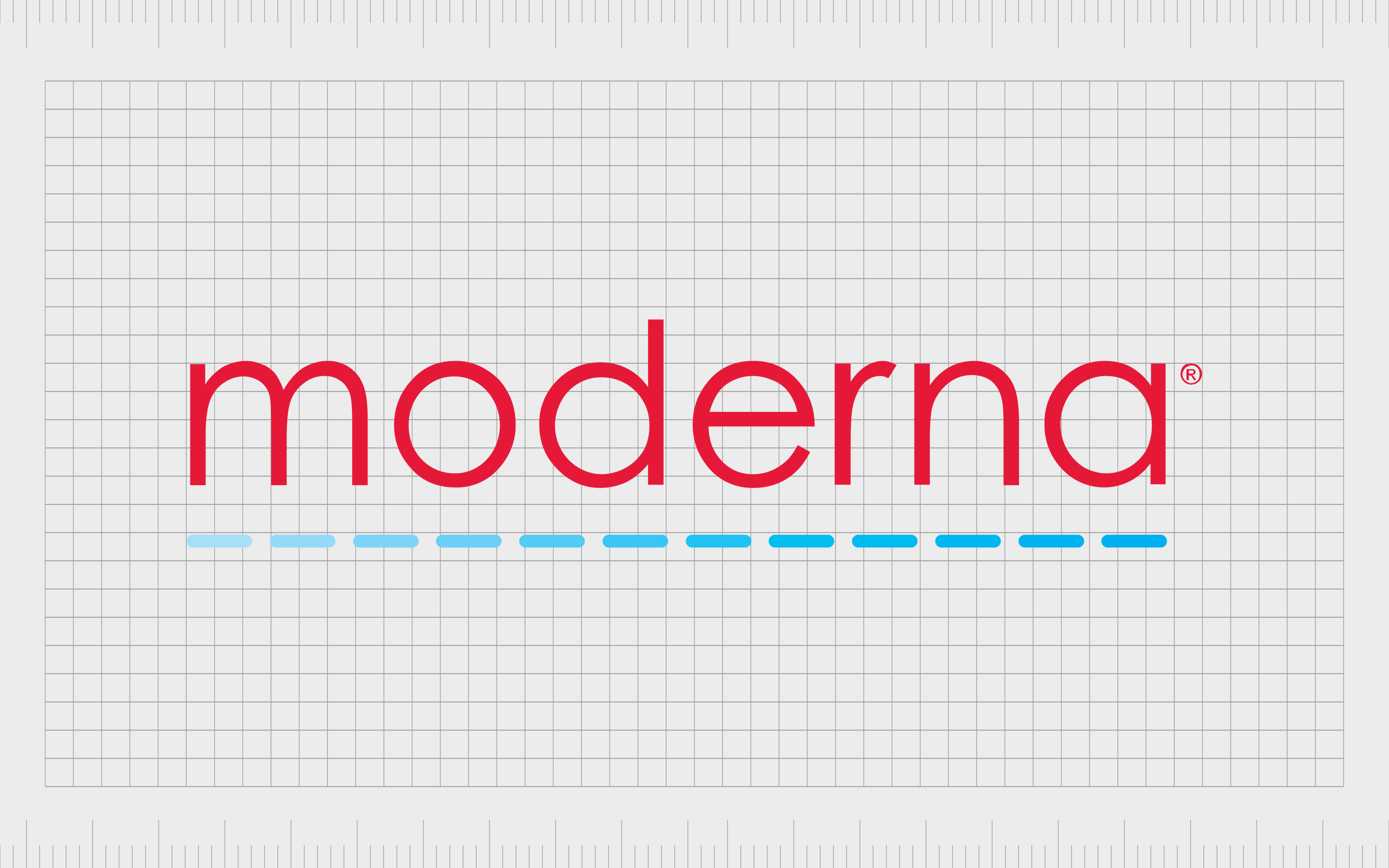
Moderna
Best-known for its contribution to the vaccination for COVID-19, Moderna was created in 2010, in Massachusetts, as a biotechnology and pharmaceutical company. The company has only produced the COVID-19 vaccine commercially, it also has 44 treatment and vaccine candidates.
The Moderna logo is eye-catching, in a bright shade of red. The lowercase sans-serif font of the wordmark makes the company seem more approachable, while the light-blue line adds emphasis, while reminding us of stiches.
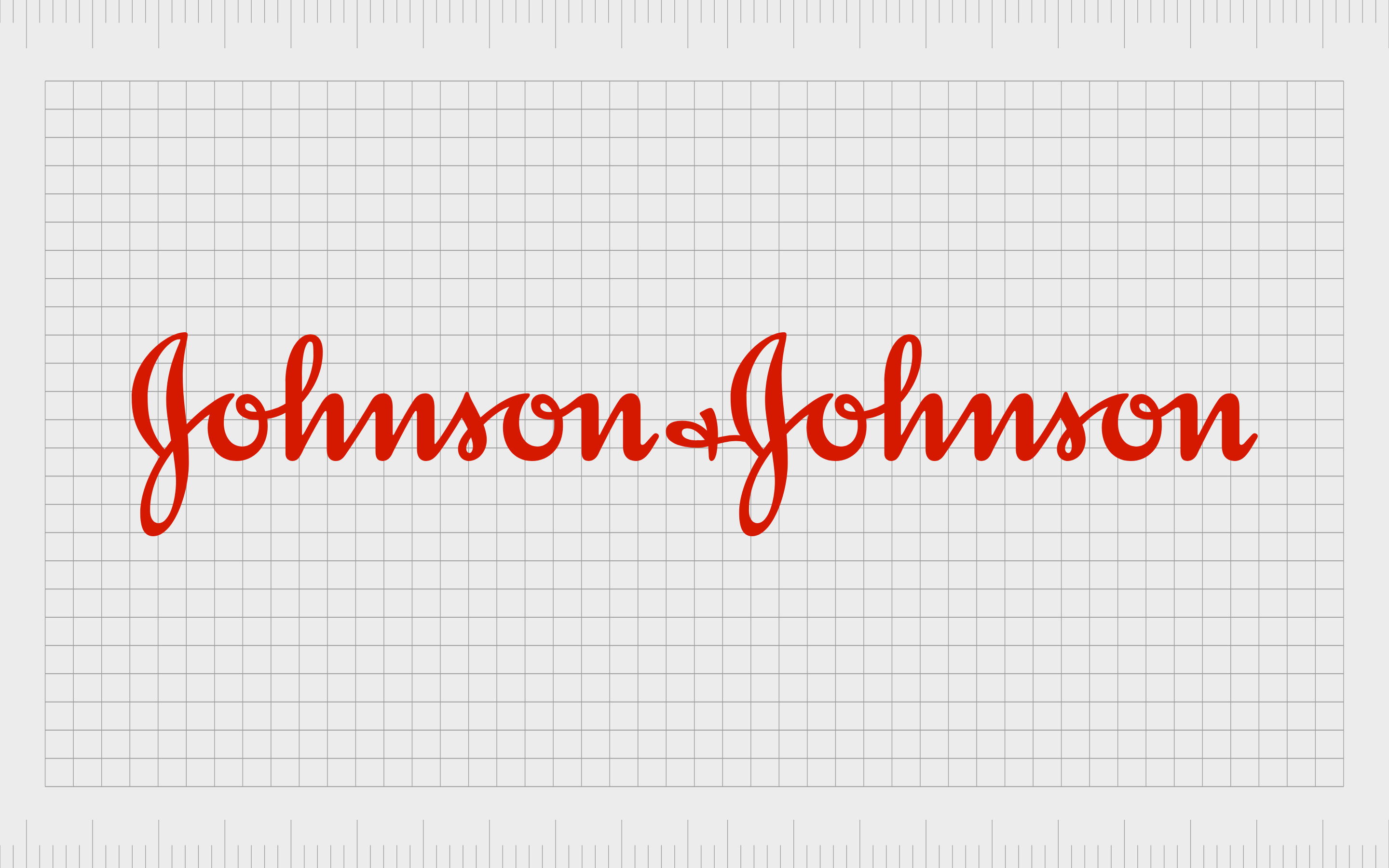
J&J
Better-known to some as Johnson & Johnson, J&J is a multinational corporation founded more than 130 years ago in 1886. The company develops a host of medical devices, consumer packaged goods and pharmaceutical.
It’s also number 36 on the Fortune 500 2021 list of largest companies in the US.
Headquartered in New Jersey, this company also contributed significantly to the Covid-19 response. The Johnson & Johnson logo is depicted in red, a color commonly linked to healthcare.
The font is quite different to many other pharma logos – looking similar to a cursive kind of handwriting. This hand-written approach makes the brand seem more personable and human.
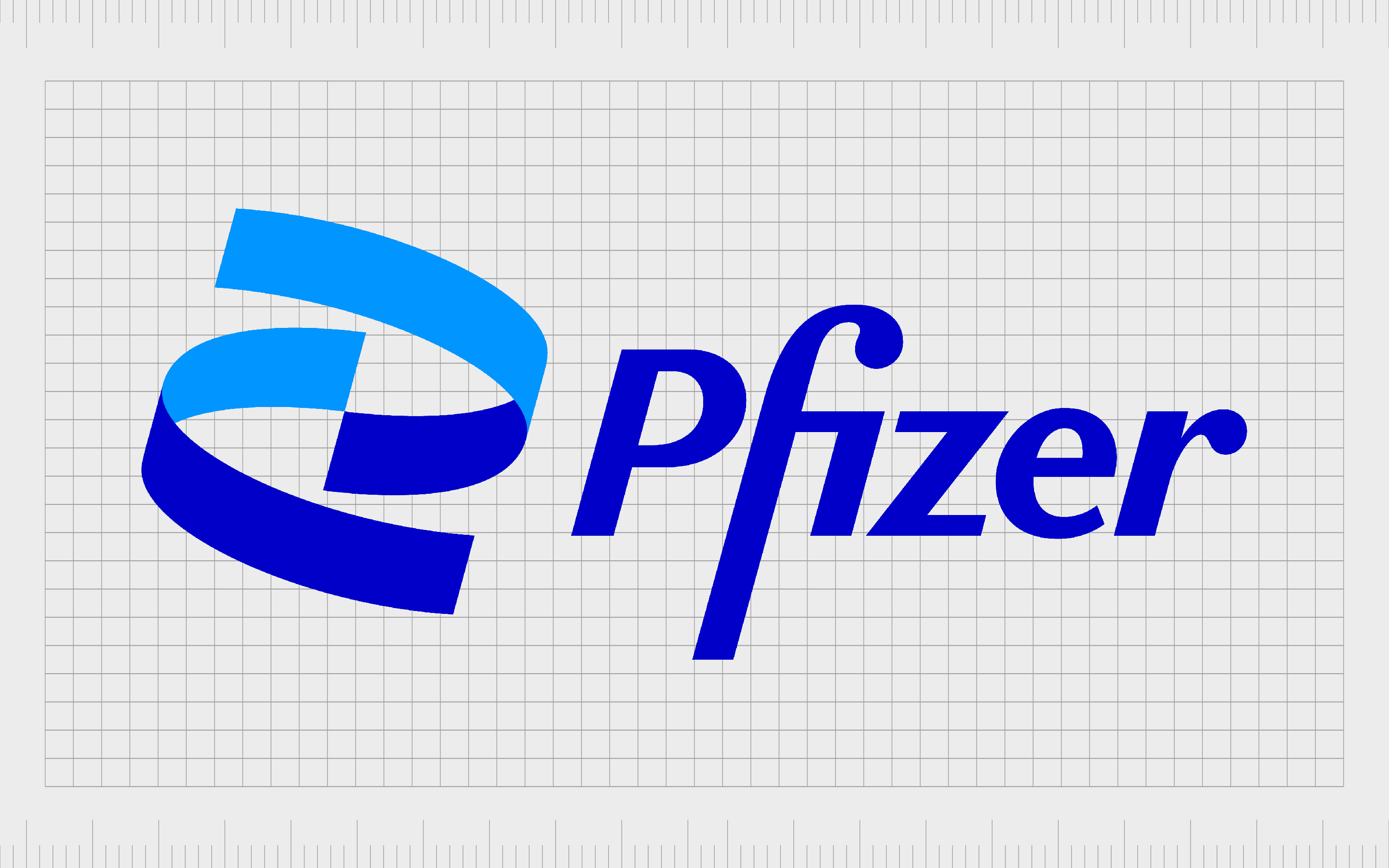
Pfizer
An American multinational biotechnology and pharmaceutical company, Pfizer is one of the oldest companies on this list. The brand was launched more than 170 years ago, in 1849, and produces a huge range of vaccines and medicines for oncology, immunology, cardiology, neurology, and more.
Pfizer is currently one of the biggest pharmaceutical brands in the world, and its logo is an excellent insight into its personality. The logo features two swirling marks in different shades of blue to create depth. The symbol looks similar to a swirl of DNA.
Pfizer’s eye-catching wordmark also draws attention in a deep shade of blue, written in title case.

Bristol Myers Squibb (BMS)
A leading American pharmaceutical company located in New York City, BMS, or Bristol Myers Squibb was first launched in 1887.
The company, created by Edward Robinson Squibb produces a host of prescription pharmaceuticals in various areas, from cancer and diabetes to rheumatoid arthritis. It also serves countries worldwide.
One of the most interesting logos of pharmaceutical companies on this list, the Bristol Myers Squibb combination mark features a sans-serif wordmark in grey, accompanied by an image of a purple hand.
According to the company, the purple hand is intended to convey compassion.
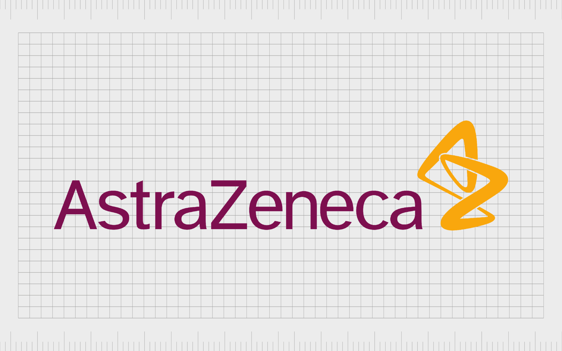
AztraZeneca
One of the top British companies mentioned here, AstraZeneca is an excellent insight into the logos of pharma companies, and the impact they can make. The company was launched in 1999, and has a range of products for diseases in cardiovascular, oncology, infection, and neuroscience.
AstraZeneca has also been involved with Covid vaccination development.
The AstraZeneca Company features a highly approachable wordmark, written in a sans-serif font similar to Calibri. The design is modern and bold, in a deep shade of professional red.
The symbol next to the wordmark looks like a chemical reaction, depicted in gold, and it also shows the letters “A” and “Z” on closer inspection.
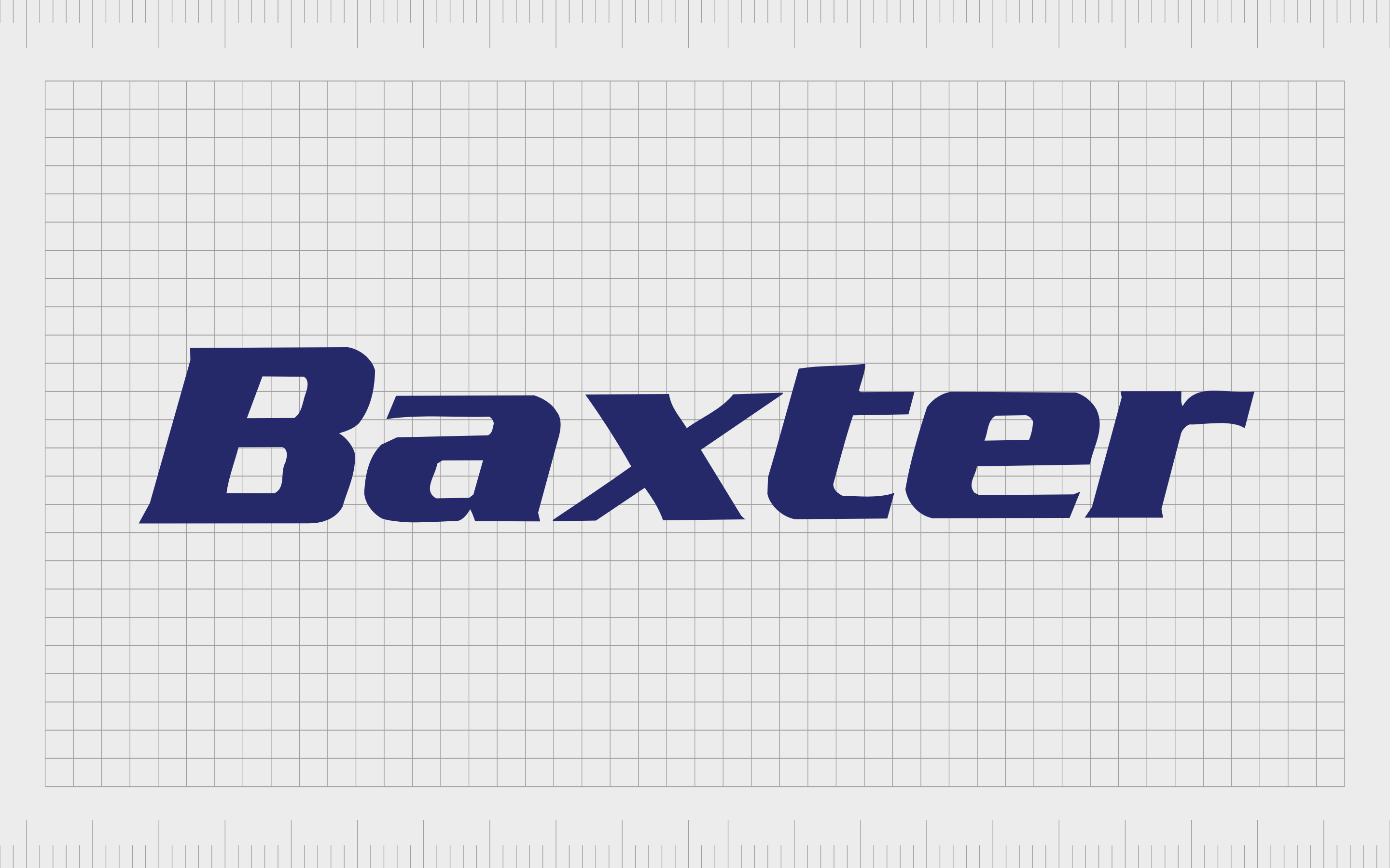
Baxter
Baxter International is a leading multinational health company, launched in 1931. The company primarily focuses on the creation of products to manage chronic and acute medical conditions, like kidney disease.
Baxter’s Bioscience business also produces a host of products to assist with immune deficiencies and bleeding disorders.
The Baxter logo is bold and modern. Like many pharmaceutical company logos, the brand uses a wordmark, in bold, blue type. The typography seems strong and powerful, perhaps to highlight the stability of the company.
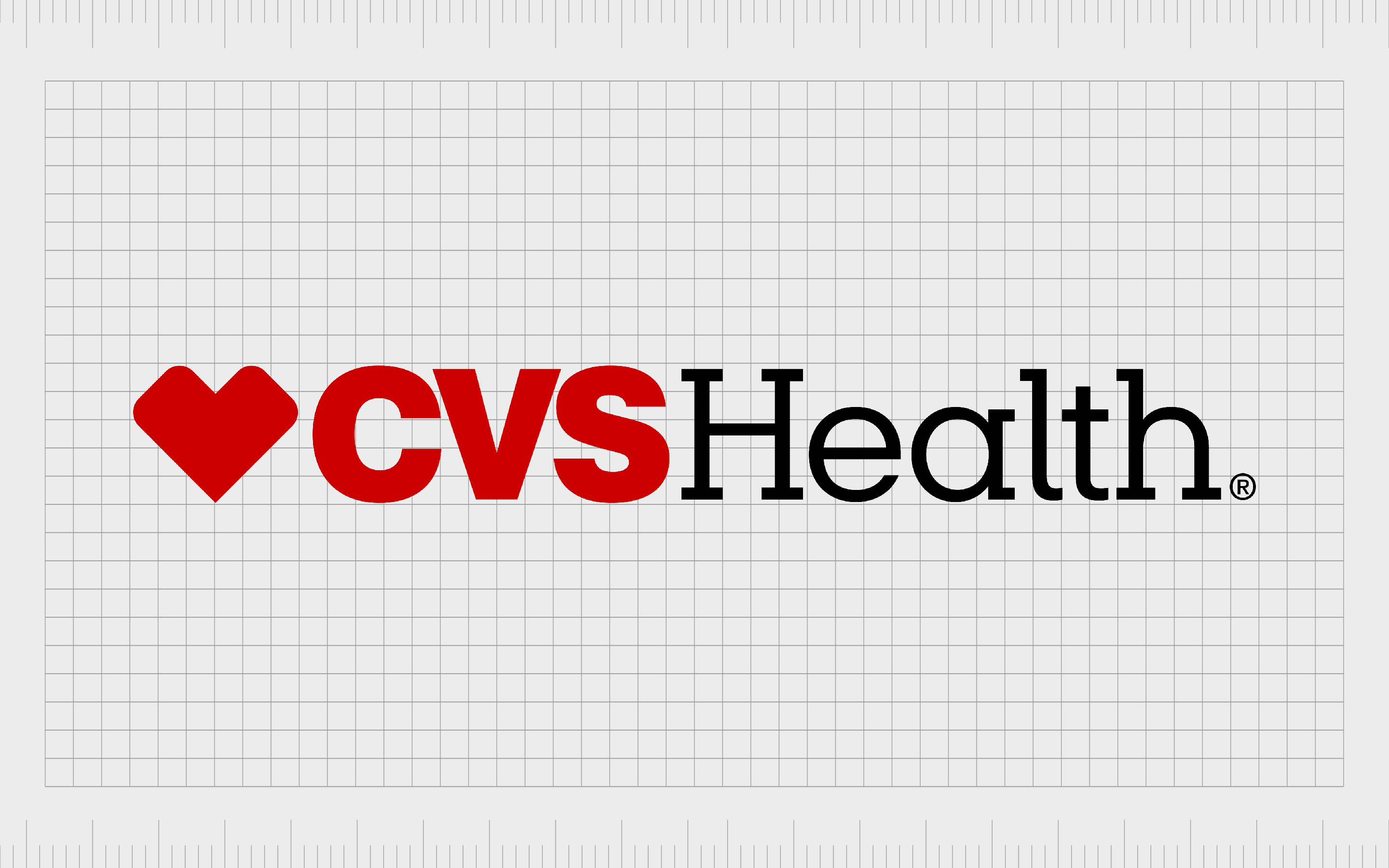
CVS Health
CVS Health is an American healthcare company with its own CVS pharmacy chain. The company is well-known all over the world for producing and selling a variety of drugs.
First launched in 1963, CVS Health takes its name from “Consumer Value Stores”. The brand is responsible for a range of other sub-brands, including Aetna.
A combination mark combining two different styles of font with a heart-shaped glyph, the CVS health logo immediately conveys ideas of passion and caring. The use of both a sans-serif and serif font align professionalism with friendly modernity.
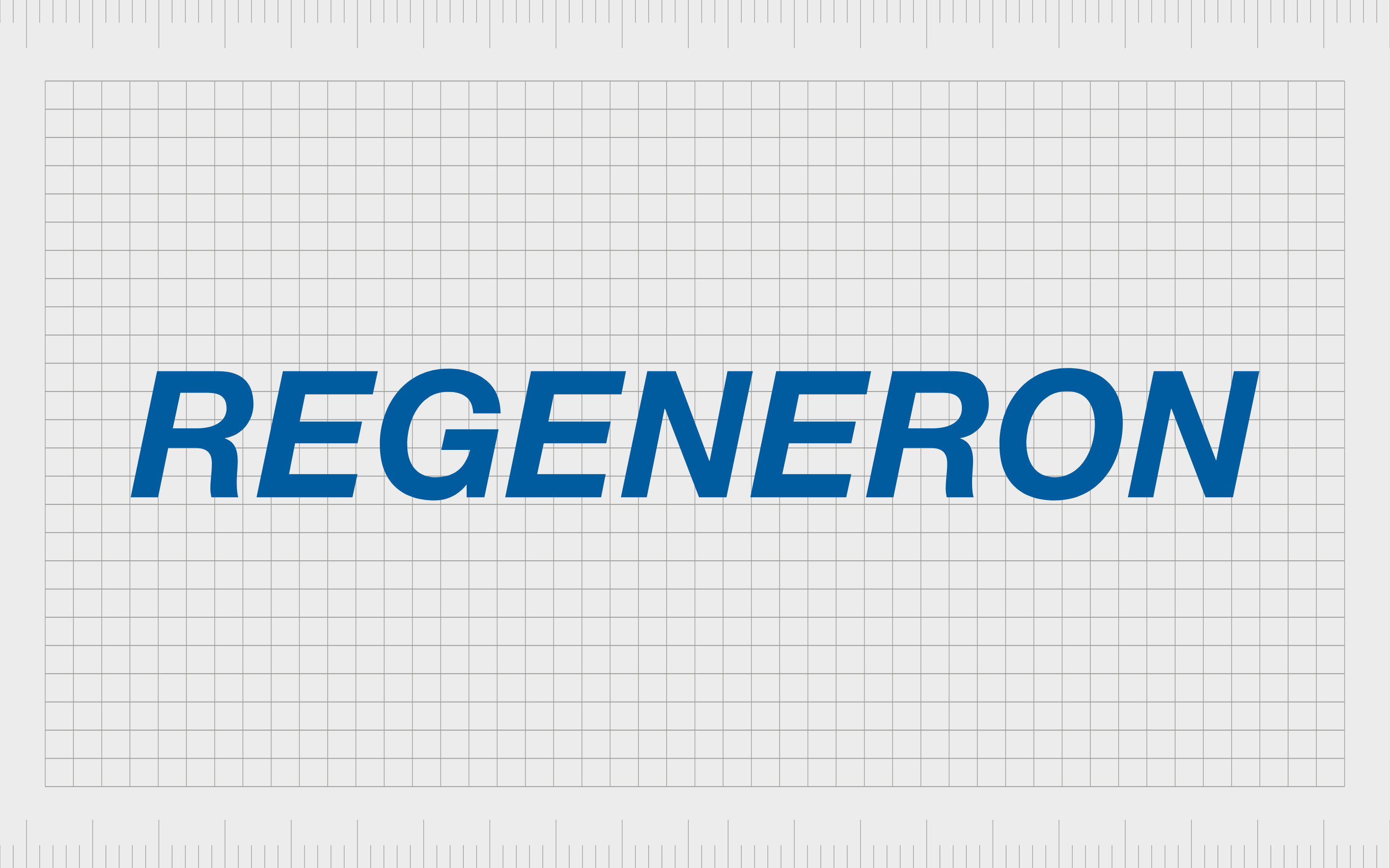
Regeneron
Launched in 1988, Regeneron Pharmaceuticals originally focused on neurotrophic factors and their abilities for regeneration, hence the choice for its name. Eventually, the company branched out to study both tyrosine kinase and cytokine receptors too.
The Regeneron logo is a bold, all-uppercase wordmark, created using a sans-serif font. The use of capital letters highlights the strength and confidence of the company, while the sans-serif and blue design convey a sense of approachability and reliability.
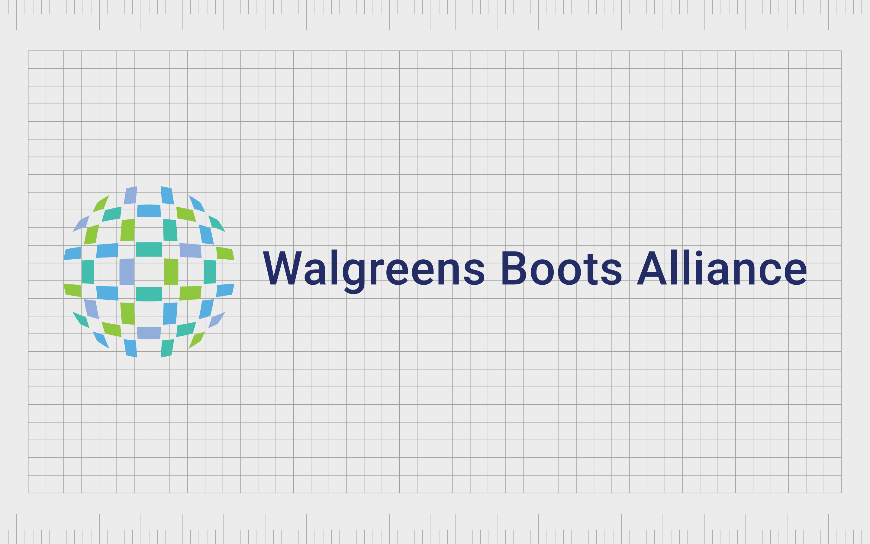
Walgreens Boots Alliance
One of the better-known corporations in the pharmaceutical world, the Walgreens Boots Alliance is a holding company responsible for a range of pharmaceutical companies, including Boots and Walgreens.
The company first launched only 7 years ago in 2014.
An excellent example of how pharmaceutical companies can sometimes use longer names in their logos, this combination mark features an extra-long sans-serif wordmark. The design is depicted in dark blue, to highlight the reliability of the company.
The design next to the wordmark looks similar to a globe, showing the universal appeal of the brand.

Biogen
Based in Cambridge, Massachusetts, Biogen launched in 1978, and focuses on the discovery, development, and delivery of various therapies for neurological diseases. The company was founded by a number of professionals, including Nobel Prize winner, Walter Gilbert.
Biogen’s logo shares many of the themes we’ve seen in other pharmaceutical company logos, including a title-case wordmark in deep blue, and a unique circular design, combining green and blue.
The design aims to highlight a global approach.
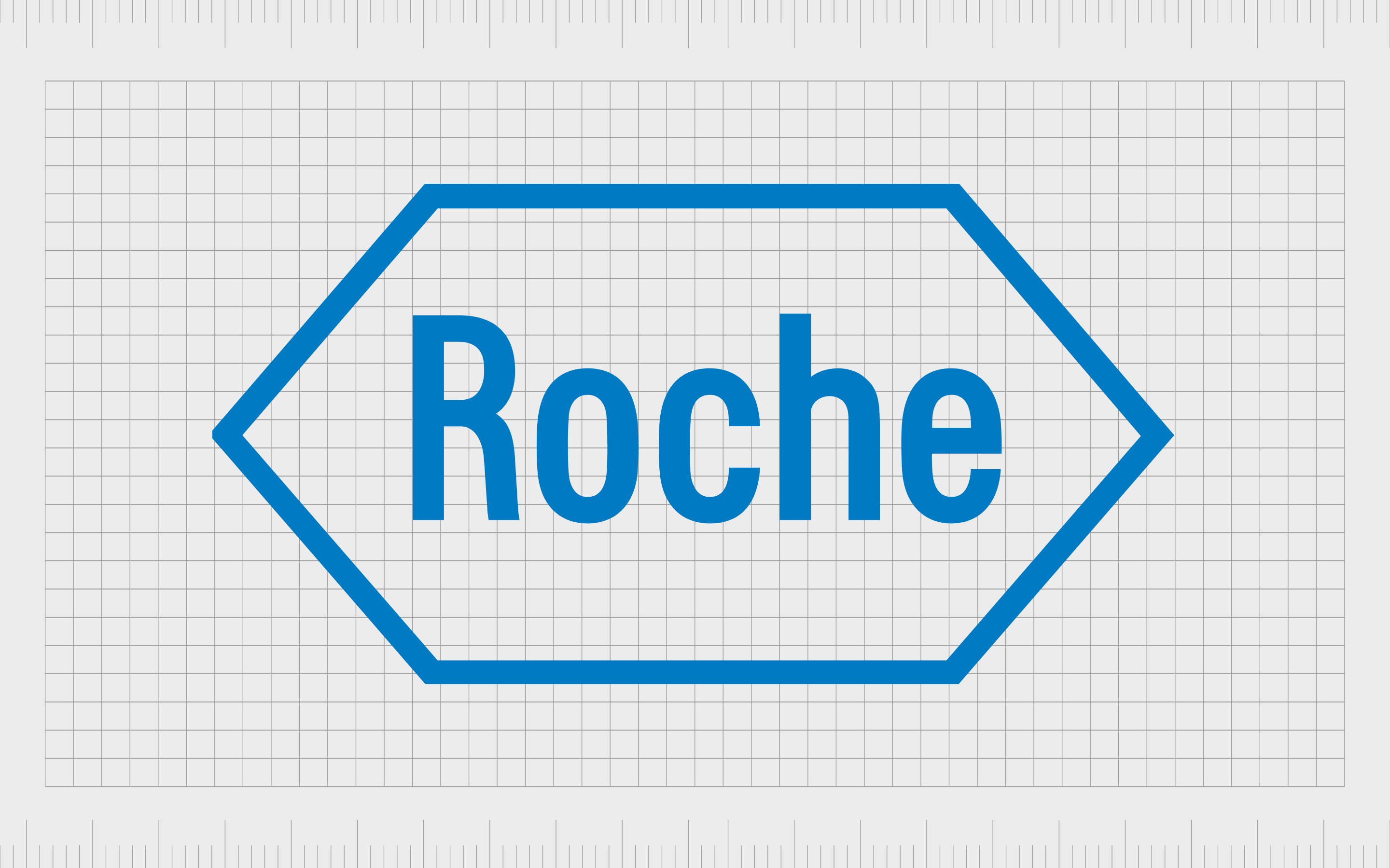
Roche
A Swiss multinational healthcare company, operating under two divisions worldwide, Roche was first launched in 1896, more than 120 years ago. This company also controls another American biotechnology company known as Genentech.
Roche has an interesting logo, featuring a trustworthy shade of blue common in the pharmaceutical landscape. The title-case wordmark is depicted in a sans-serif font to make the company appear more modern and approachable.
The hexagon design, according to the company, is intended to convey harmony and balance.
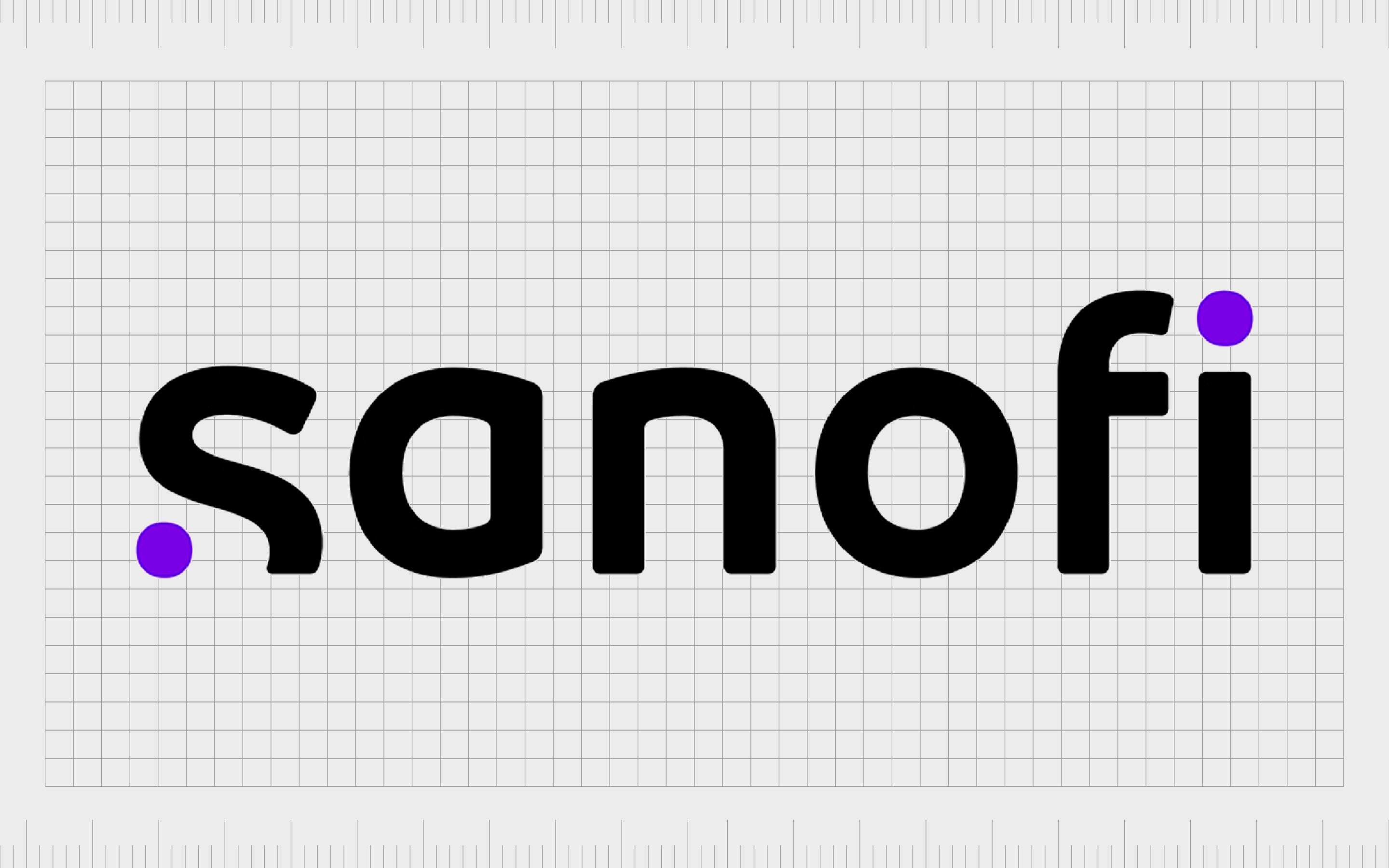
Sanofi
Based in Paris, France, Sanofi launched in 1973, and focuses on the creation, research, and marketing of pharmaceutical drugs. The company also develops a range of over-the-counter medications. First launched as a subsidiary of an oil company, Sanofi has evolved significantly over the years.
A world apart from some of the other pharma logos on this list, the Sanofi logo uses a unique wordmark, with the bottom of the “S” glyph cut off – perhaps to convey creativity.
The color black demonstrates professionalism, while purple is the color of compassion.
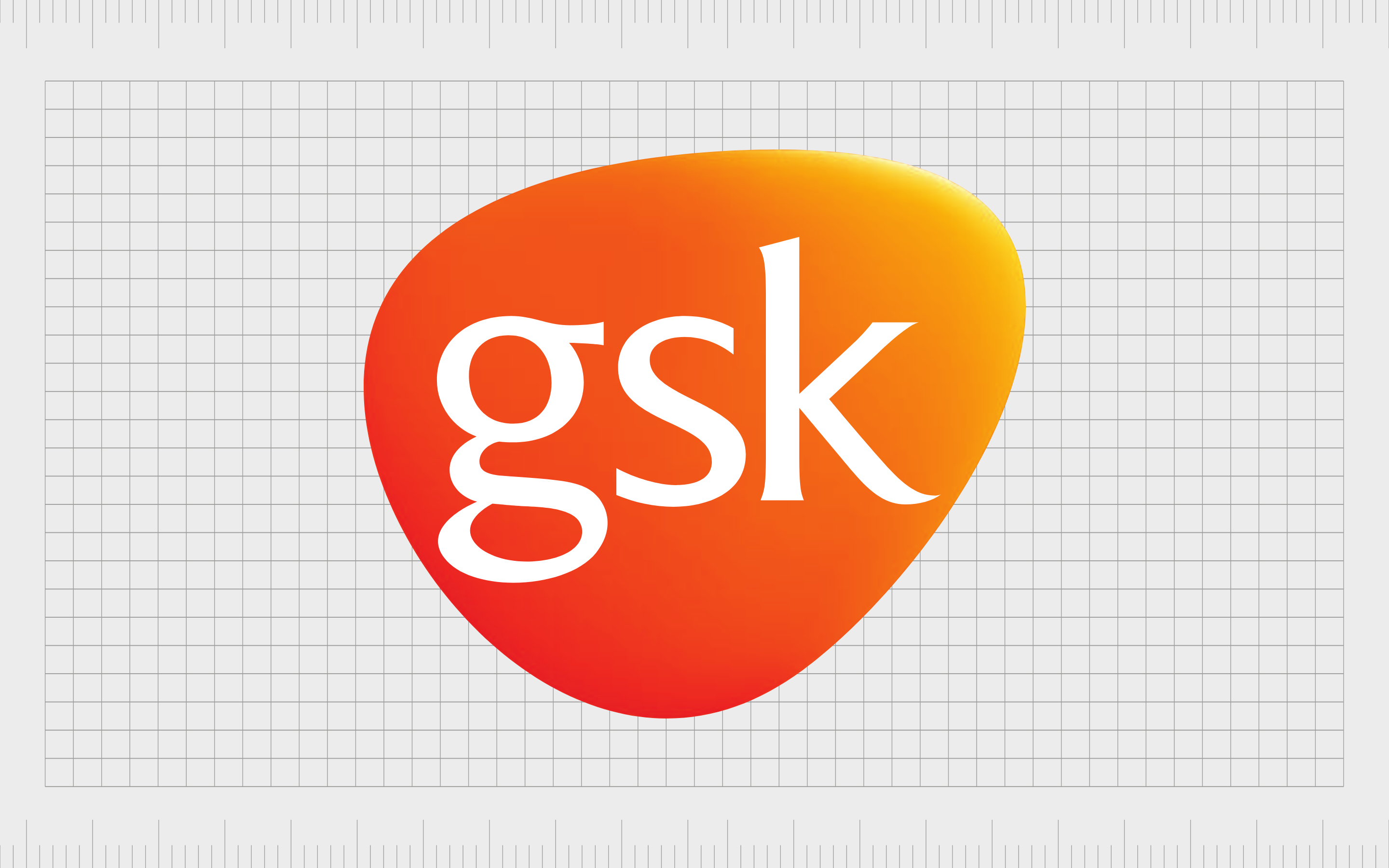
GSK
Otherwise known as GlaxoSmithKline, GSK is a world-leading pharmaceutical company launched in 2000. The company is the world’s sixth largest pharmaceutical brand, despite only being on the market for a couple of decades.
It’s also one of the company’s with the most unique pharmaceutical logos.
The pharmaceutical company logo used by GSK is a bright, eye-catching orange and yellow shape, with the letters “GSK” in lowercase, serif font inside. The design is intended to remind us of concepts like discovery and rejuvenation.
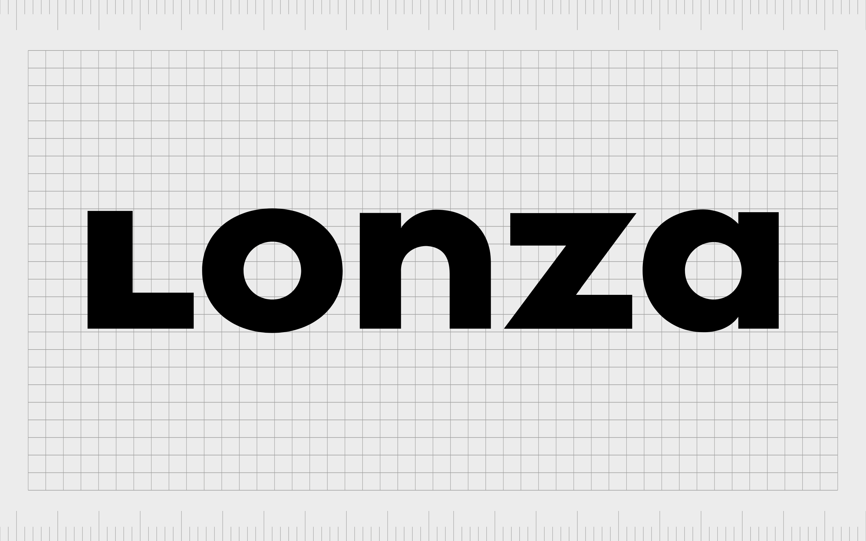
Lonza
The Lonza Group is a Swiss multinational manufacturing company in the biotechnology, nutrition, and pharmaceutical space. Headquartered in Basel, the company provides product development services to a range of biologic and pharmaceutical industries.
Lonza’s logo is a wonderfully balanced design. Although written in title case, all of the letters in the logo are exactly the same height, creating a sense of strength and stability. The use of black as the primary color for the wordmark gives it a professional impact.

Merck
Otherwise called the “Merck Group”, Merck is probably one of the oldest companies, and easily among the oldest pharmaceutical companies in the world. The brand was first launched in 1668, and has produced a huge range of pharmaceutical products across more than 350 years of operation.
Despite its incredible history, the Merck Company has a wonderfully modern logo. The wordmark design sets itself apart from that of other pharmaceutical companies with a unique creative edge to it.
The display-style font has a liquid element to it, while still retaining small serifs, as a nod to the company’s professional nature.
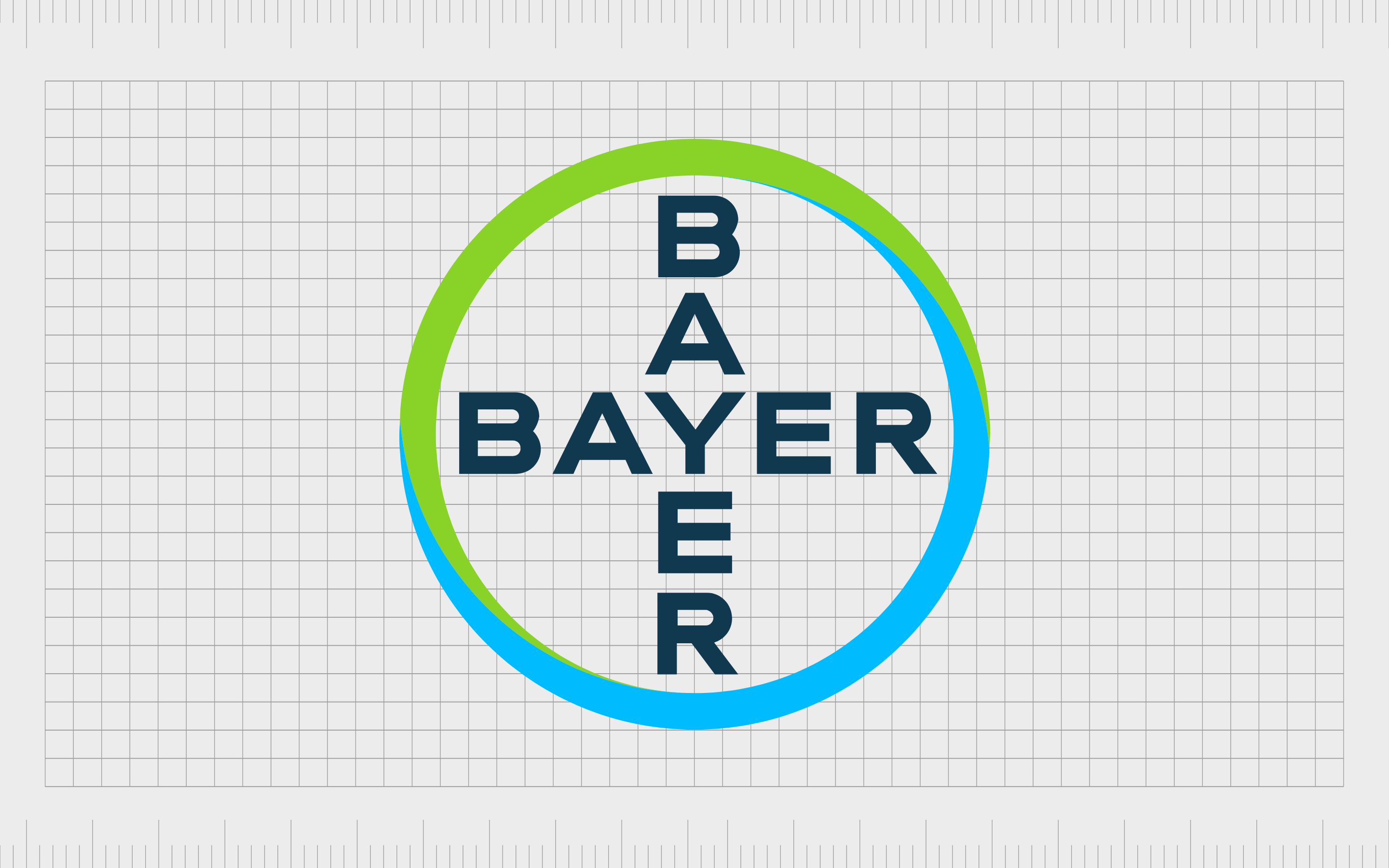
Bayer
One of the world’s leading pharmaceutical and life sciences companies, Bayer is headquartered in Leverkusen, and was first launched in 1863. The brand sells a variety of top-selling pharmaceutical products, including Kogenate, and Nexavar, as well as ciprofloxacin.
Bayer’s logo is a fun alternative to many of the pharmaceutical company logos mentioned here. Rather than using a single wordmark or basic combination mark, the company places its name twice in a cross-shape, within a blue and green circle.
The cross shape is something commonly associated with healthcare, while the green and blue circle represents the planet.

Novo Nordisk
A leading Danish pharmaceutical company, established in 1923, Novo Nordisk now operates in 150 countries around the world. The company is best-known for producing diabetes medicine, as well as a variety of devices.
The Novo Nordisk logo includes a wordmark, and a stylized image of an Egyptian Apis Bull – a sacred animal intended to represent fertility and strength.
The design has various meanings and messages hidden within it, including a graphical interpretation of night and day, to represent both life and death, growth, and rebirth.
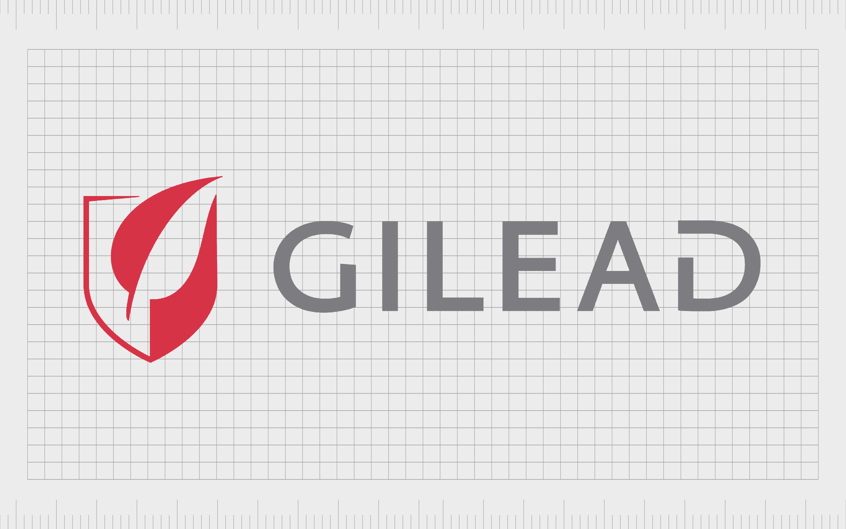
Gilead Sciences
Gilead Science is a pharmaceutical company launched in 1987 in America. The company focuses mostly on creating and researching antiviral drugs used in the treatment of influenza, hepatitis, and various other conditions.
The company has come under heavy scrutiny in recent years due to its business practices.
Gilead takes a modern approach with its logo, using a sans-serif wordmark with a disconnected “D” on the end of the glyph. The symbol of the shield with the leaf over the top symbolizes reliability, and strength, as well as a focus on natural sciences.
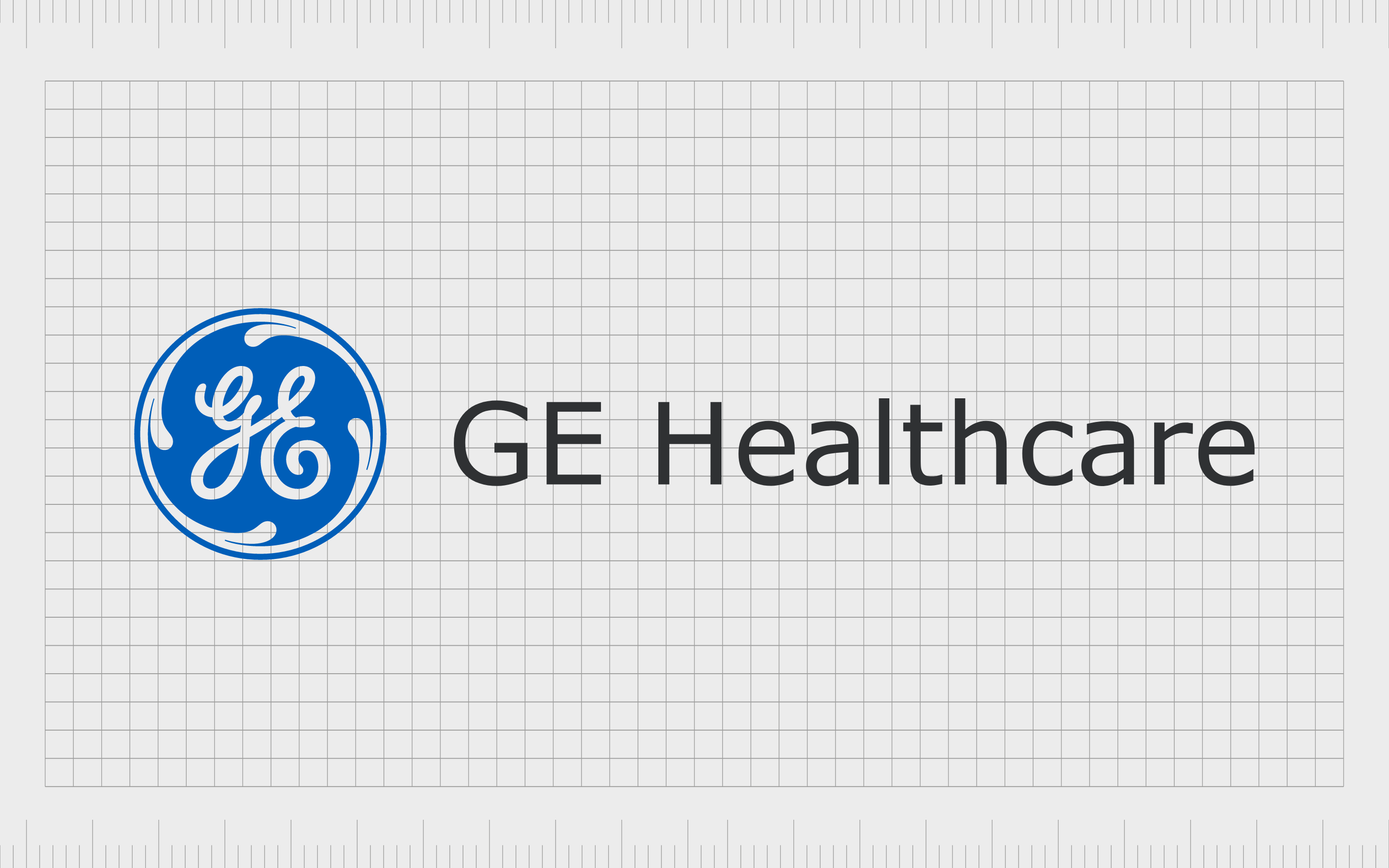
GE Healthcare
GE Healthcare was launched as a subsidiary of the huge conglomerate brand, General Electric. This manufacturer and distributor of diagnostic imaging agents and radiopharmaceuticals creates a host of CT image machines, health technologies and medical diagnostics tools.
GE Healthcare uses the same central image as the standard GE company, featuring an elegant cursive set of letters inside a circular badge. The curls and curves of the “GE” lettering showcase the sophistication of the brand, and its extensive history in its field.
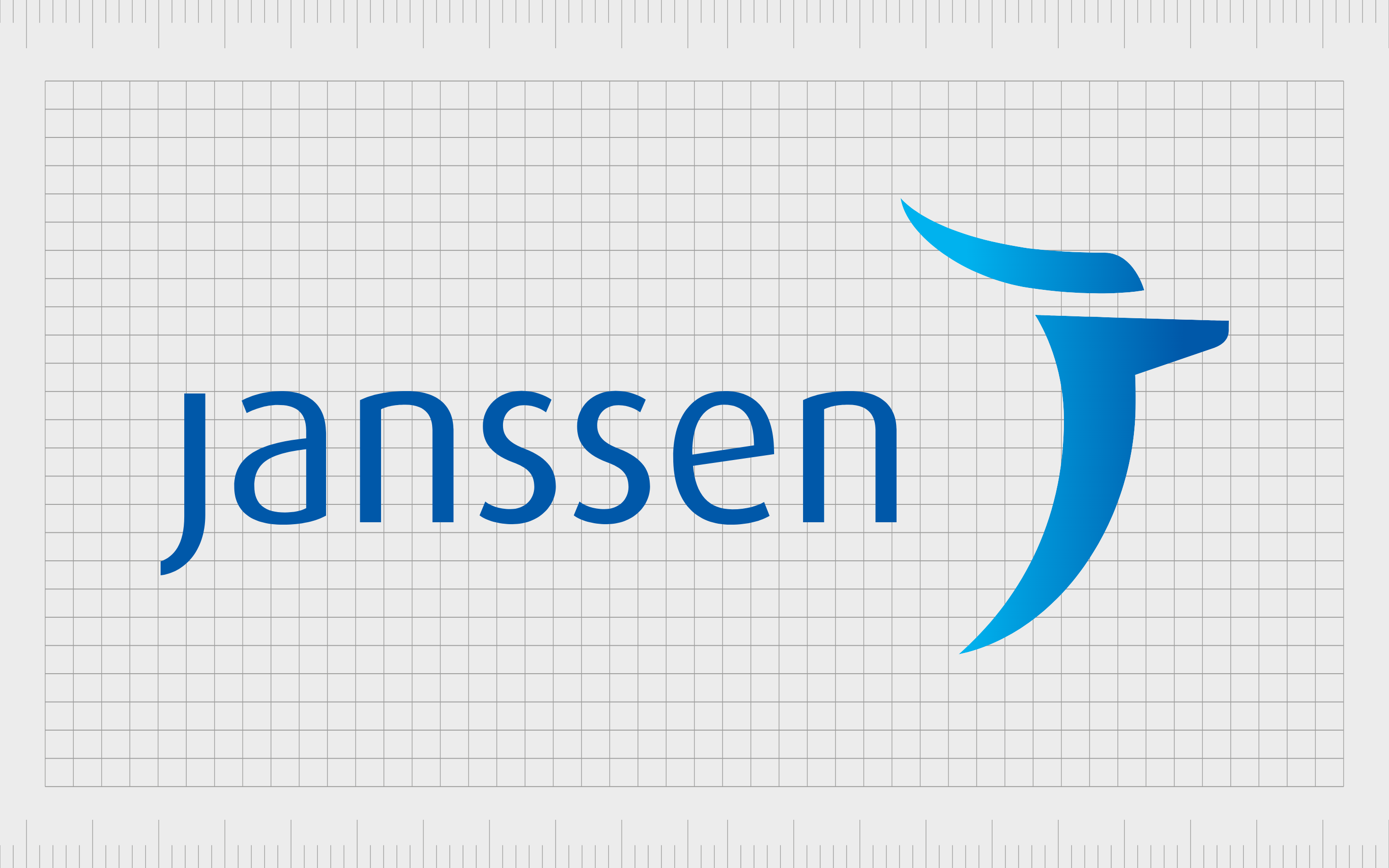
Janssen
Otherwise known as “Janssen Biotech”, and previously “Centocor Biotech”, Jenssen is a biotechnology brand located in Philadelphia, which was first launched with a goal of developing diagnostic tools using monoclonal antibodies.
Today, unfortunately, the company is defunct.
The Janssen logo features the name of the company in a sleek sans-serif blue font. The design is simple and elegant, similar to the wordmarks used in a lot of pharma company logos.
The image alongside the wordmark looks similar to a “J” but also to a torch, demonstrating life and guidance.
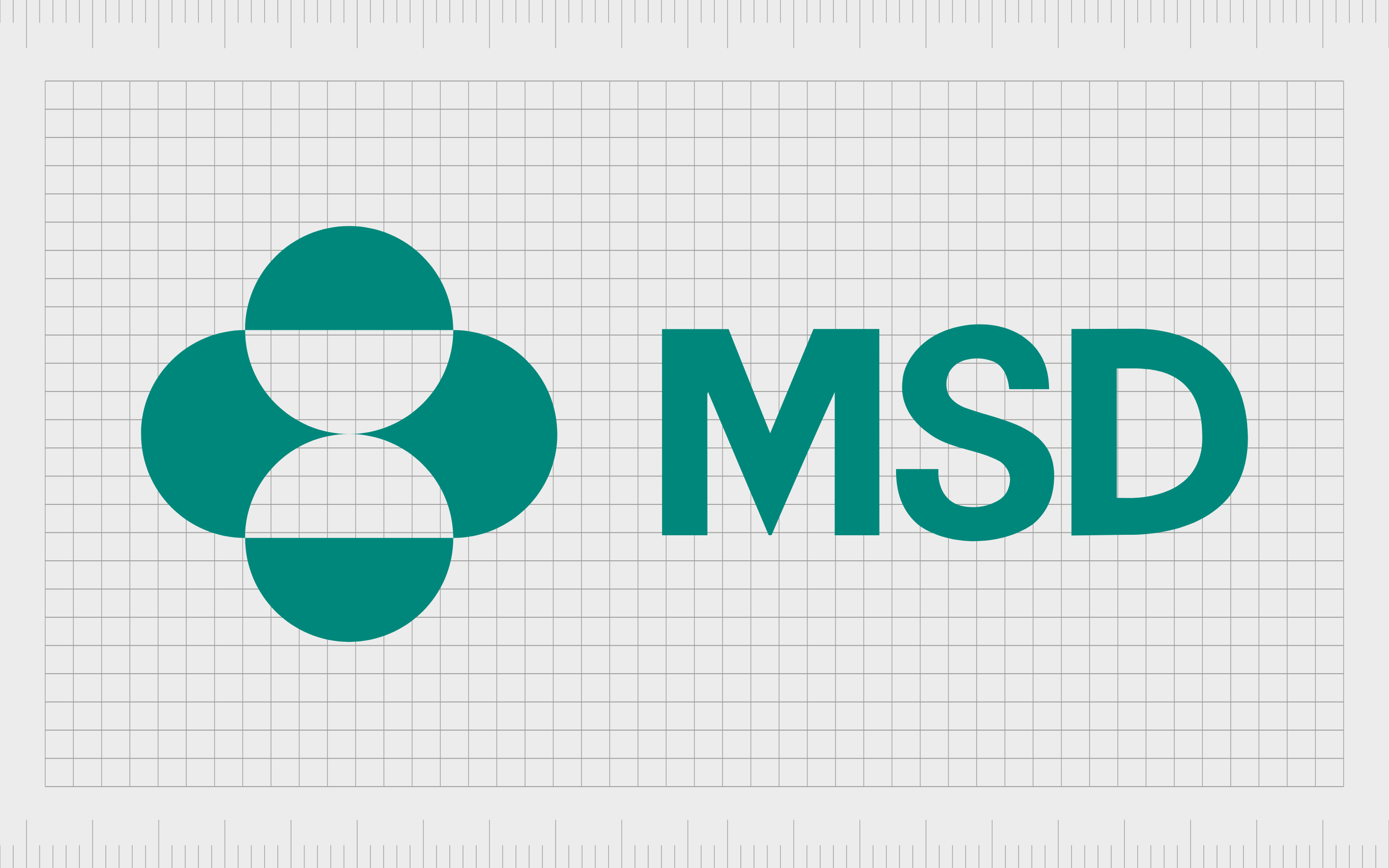
MSD
Sometimes known as “Merck & Co”, MSD stands for Merck Sharp & Dohme. The multinational pharmaceutical company is named after the Merck family, who initially established the Merck Group in 1668 in Germany. They were known for building the world’s oldest pharmaceutical brand.
The Merck logo features the name of the company, alongside a design which looks similar to a sandglass on an oval background. The image also looks a little like a selection of pills, which could provide a hint into the company’s focus area.
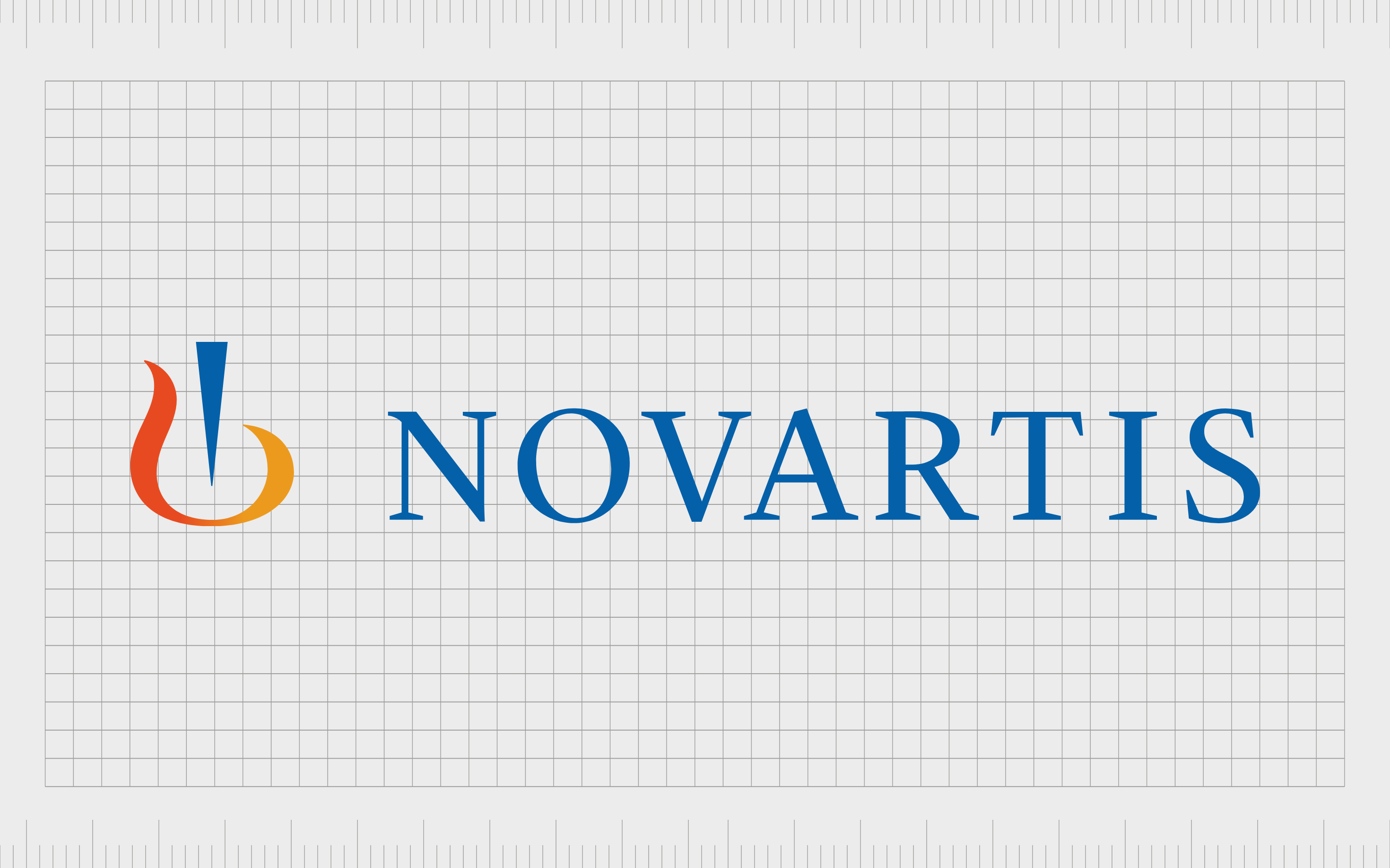
Novartis
A Swiss pharmaceutical company, Novartis has become one of the biggest brands in the industry over the years. The company is known for producing a range of well-known substances, including Clozapine and Letrozole.
As Pharma logos go, this is quite an interesting one, combining a rather traditional serif typeface in deep blue – a color commonly associated with trust – with a visual design. The image looks a little like a flame, with a blue point in the middle.
According to the company, the logo represents growth and stability.

UCB
Based in Belgium, UCB is an international pharmaceuticals company, known for conducting a significant amount of research into diseases like Crohn’s disease and Parkinson’s. The company focuses its efforts mostly on treatment for severe diseases.
A little different to the other pharmaceutical company logos we’ve looked at, the UCB logo places a lowercase wordmark in sans-serif block type, on a white circular background.
The white circle is also placed on top of a square, which looks similar to a traditional pill.

Catalent
A multinational corporation based in New Jersey, Catalent is a global provider of development, biologics, delivery technologies, gene therapies, and various other customer health products. The company was first launched in 2017.
Catalent follows in the footsteps of many other pharma company logos, keeping things simple with an elegant and attractive wordmark. The use of a simple sans-serif wordmark in sentence case, and a blue coloring makes the company appear trustworthy and professional.

West Pharmaceutical
A leading manufacturer of pharmaceutical packaging, injectable devices and delivery systems, West Pharmaceutical Services was first launched in 1923, and continues to stand out as a major provider in the industry to this day.
West has quite an old-fashioned logo compared to some alternatives, with a slightly italicized wordmark written in sans-serif bold font. The strapline “By your side for a healthier world” helps to build a sense of affinity between West and its customers.
There’s also an interesting striped diamond shape, perhaps indicating quality.

Dr. Reddy’s Laboratories
Located in India, Dr. Reddy’s Laboratories is a multinational pharmaceutical company launched in 1984. The company manufacturers and sells a wide variety of pharmaceitcals overseas and in India.
The business has also benefitted from significant growth in recent years, particularly in Europe and the US markets.
Dr Reddy’s logo combines a standard sans-serif wordmark in lowercase purple font, with a heart-shaped graphic. The hearty shape, represents caring, while the circular bubbles on one side highlight the scientific nature of the company.
Meanwhile, the color purple also links the company to ideas of compassion.
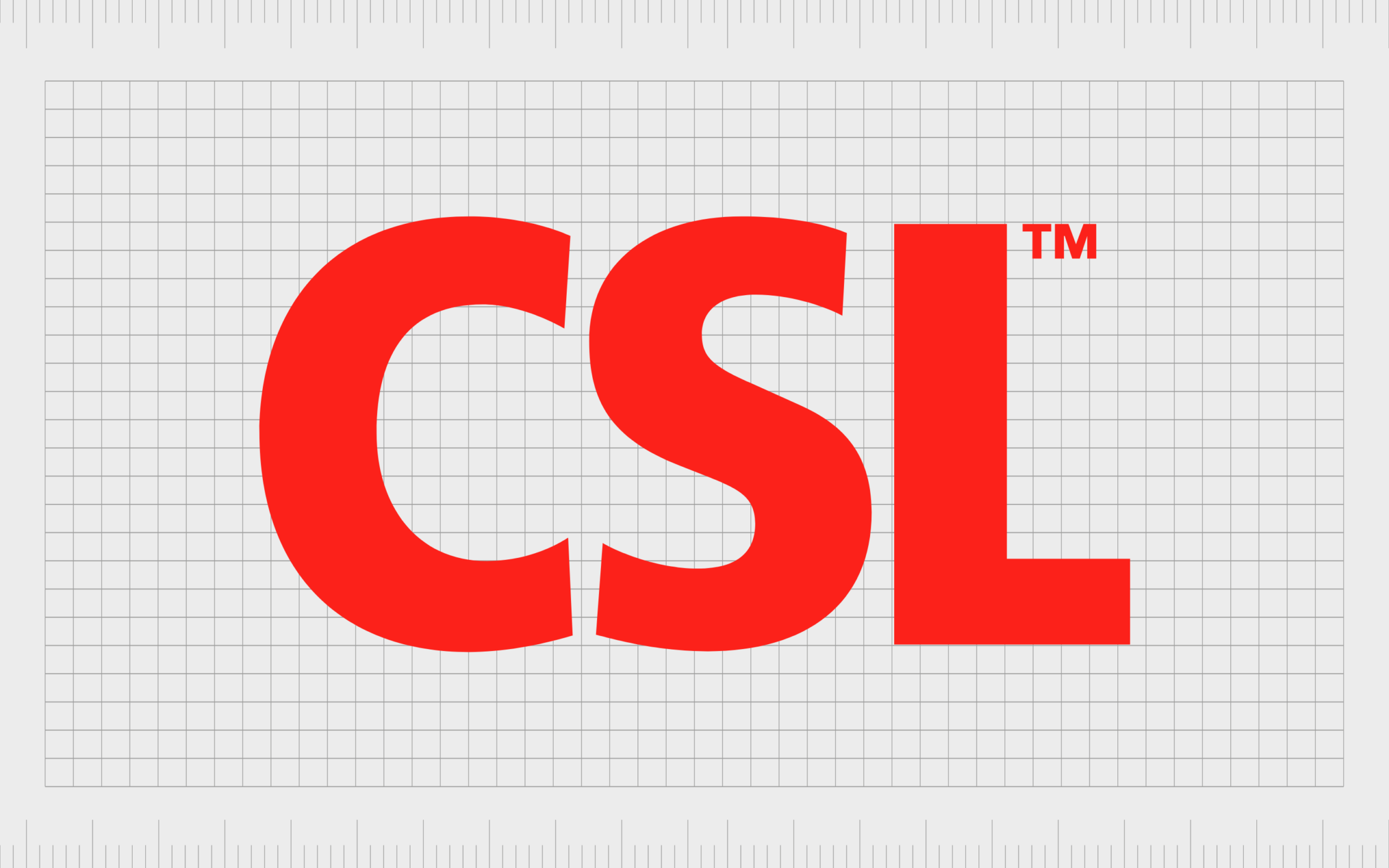
CSL
An Australian speciality biotechnology company known for developing marketing, manufacturing, and delivering products to a range of customers worldwide, CSL was first launched in 1916 by the Federal government in Australia.
The CSL logo is one of the boldest images on our list of pharma company logo designs. Featuring large capital letters in a color of eye-catching bright red, the image immediately captures attention and conveys an air of importance.
Creating the best pharma logo design
Just like any brand, pharma organizations rely on pharmaceutical company logos to make a lasting impression on their audience, and differentiate themselves from other vendors. With the best pharma logo design, it’s even possible to attract investors for helping your business grow.
As you can see about pharma company logos tend to have a few consistent themes and trends, but every design is intended to help effectively represent the company and make it stand out from the rest of a growing community of providers.
If you’re struggling to design your own pharma company logo, the best thing you can do is reach out to a leading branding agency, like Fabrik, capable of helping you to create the perfect image.
Fabrik: A branding agency for our times.
Now read these:
—Tips for naming a medical company
—The Pfizer logo and its unique history
—Our pharma startup branding services
—Ultimate list of health company logos
—Fabrik’s biotech branding services

Clarity starts with a conversation.
Thanks—we’ll get back to you shortly.
Whether you're navigating a rebrand, merger, or simply need a clearer identity—we’re here to help. No hard sell, just honest advice from people who know the sector.
Let’s start with a simple question…
Prefer to email? Drop us a line.
Fabrik’s been helping organisations rethink and reshape their brands for over 25 years. We’ve guided companies through mergers, rebrands and new launches. Whatever stage you’re at, we’ll meet you there.