


Logos with long names: The definitive list of long text logos
Logos with long names aren’t as common today as they were a couple of decades ago. As the branding world has evolved, most companies have opted for shorter, snappier naming solutions for their brand marks. But that doesn’t mean long text logos have disappeared entirely.
In general, a shorter name is always the preferred choice for the majority of companies, because succinct titles are easier to remember. Shorter names also mean you don’t have to worry about how you’re going to fit a long line of text within a compact logo.
However, there are instances where long names, and subsequently, long logos, are necessary.
If you have a longer title than most brands, this list of long word logos should offer the inspiration and guidance you need to design the ideal logo.
Logos with long company names: An introduction
Several years ago, logos with longer wordmarks weren’t as unlikely as they are today. Many companies even associated a longer name with a sign of prestige, particularly in the financial and legal worlds.
However long names and their accompanying logos are rapidly disappearing in the digital age, because it’s often much harder to fit multiple words or characters on smaller screens.
As we fully embrace the age of smartphones and online shopping, companies are adapting their logo design to suit a wider range of formats. Often, this means choosing a more compact image.

For some brands, the switch from long text logos to shorter designs has been simple enough. For instance, Price Waterhouse Coopers simply transformed its logo by displaying only the first letters from each word in of its company name.
However, for other brands, transitioning into a simpler, more compact design hasn’t been quite as simple. For brands unable to adapt their brand mark into something smaller, the question becomes how to display long word logos in the most visually appealing manner.
Today, we’re going to be looking at some examples of how companies can structure and present logos with long company names, to maintain a strong visual presence.
Horizontal logos with long names
Horizontal logos with long names are probably the most simplistic solution for companies trying to depict a longer wordmark. These logos are intended to look sleek and simple, like the headline at the top of a newspaper or the sign on a storefront.
Horizontal logos keep all of the words on a single line, often using the same weight and style of font to keep everything as slick as possible.
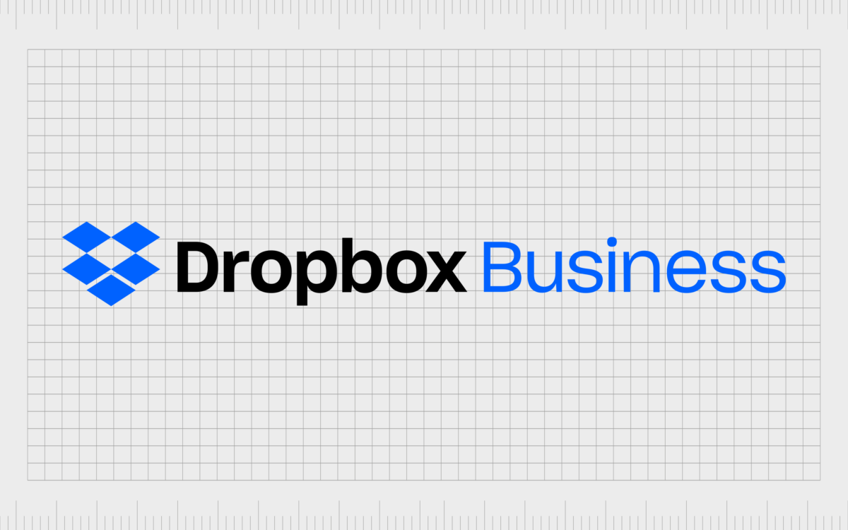
Dropbox business
Dropbox Business is the “for business” segment of the Dropbox cloud storage company. The brand focuses exclusively on enterprise and company needs.
Simple and refined, the Dropbox Business logo simply builds on the existing “Dropbox” logo by adding the “Business” definition to the end.
The color of the word “Business” matches the shade of the box-shaped image to the right of the logo, which helps to tie the design together.

Koenig and Bauer
A German company best-known for printing press development, Koenig and Bauer has been in business for more than 200 years, since 1817.
Though perhaps not the longest text-based logo in the list today, Koenig and auer still has a rather robust horizontal presence on any branding asset. The letters are decently spaced, which makes the design seem a little longer, but also ensures the font is easy to read.

This American Life
Though the weekly hour-long radio program “This American Life” recently updated its branding to feature some new styles of logo, the long text horizontal emblem is still well-known.
This American Life combined a standard serif-style wordmark with a unique flag design intended to look like a speech bubble. The long name and the styling in this logo actually convey a sense of sophistication for the brand.

First Great Western
The First Great Western Railway Company has experimented with a number of more compact logos for their branding recently, but this image is still a well-known asset of the brand.
The First Great Western logo depicts the name of the parent company “First” beside the rail line name, “Great Western” with an emblem in the middle of the first and second words.
The use of two different fonts helps to create a sense of movement in the design.
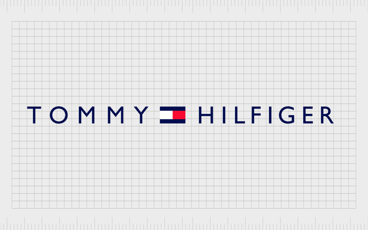
Tommy Hilfiger
World-famous fashion brand, Tommy Hilfiger actually uses a number of different variations of its logo across its branding and products. The option above is just one example, ideal for our list of long text logos.
The Tommy Hilfiger horizontal logo uses kerning to balance the weight of the first and last words in the design. The spacing in “Tommy” is much greater than the spacing in “Hilfiger”, to reduce the risk of one side of the logo looking more overwhelming than the other.
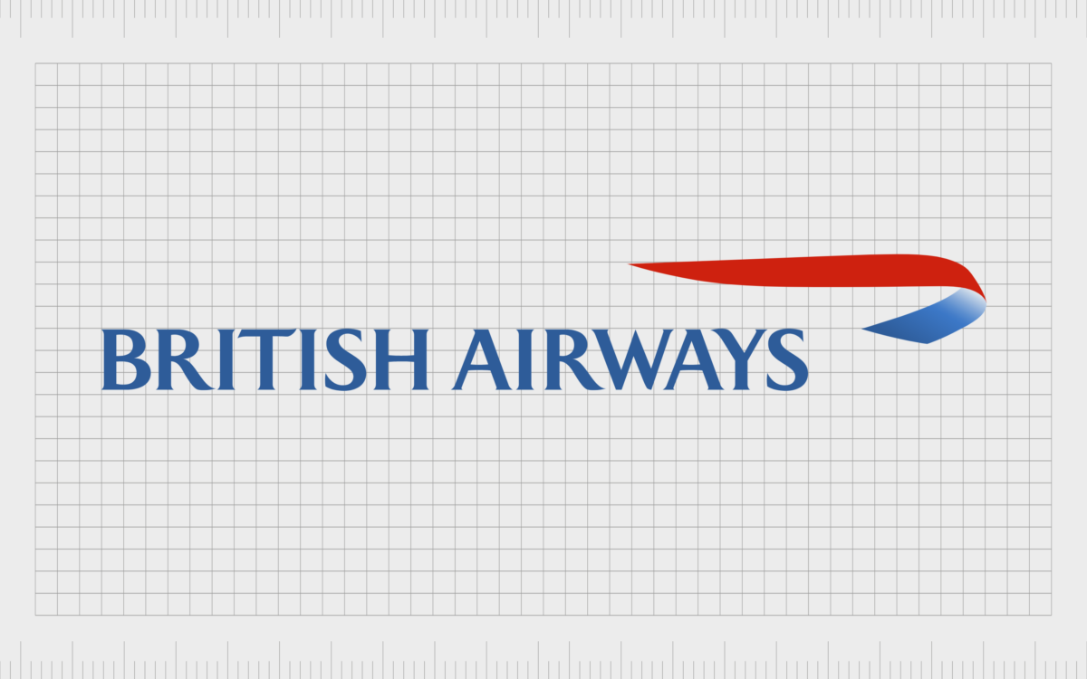
British Airways
One of a number of transportation and airline companies using longer wordmark logos, the British Airways emblem combines a sleek wordmark with tight kerning with a swooping shape which extends the design further to the right.
Though variations of this logo exist with the words stacked one above the other, the horizontal wordmark is the most common.

American Airlines
Another transportation brand using a logo with a long name to its advantage, American Airlines almost matches the design of the British Airways emblem with its logo.
This wordmark is depicted in a sans-serif font, to make the company seem friendlier and more modern. The shape to the right of the text simultaneously looks like an eagle (for America) and the wing of an airplane.

NewVoiceMedia
A cloud service company based in England, NewVoiceMedia is best known for delivering high-quality customer contact technology to companies through the cloud. The NewVoiceMedia logo is an eye-catching, but lengthy emblem.
NewVoiceMedia helps to restrict some of the length in its horizontal logo by connecting all the words together, but there is a decent amount of spacing between the wordmark and the brand’s symbol.

Pew Research Center
For companies with a scientific or educational background, a longer name and logo can often look more prestigious or authoritative. Pew Research Center builds on this fact by depicting its logo in a sleek serif font, conveying excellence and expertise.
The design of the logo, combining a compact circular symbol with a refined wordmark in black and white, creates a mature image for the brand.

Thomson Reuters
Like many of the long word logos covered so far, Thomson Reuters’s image fully embraces the length of the company’s name, by using bold, almost extended letters in the wordmark.
The use of a symbol placed alongside the Thomson Reuters wordmark, rather than above or below it, extends the horizontal impact of the emblem even further. This brand mark looks as though it would work well at the top of an article or page.
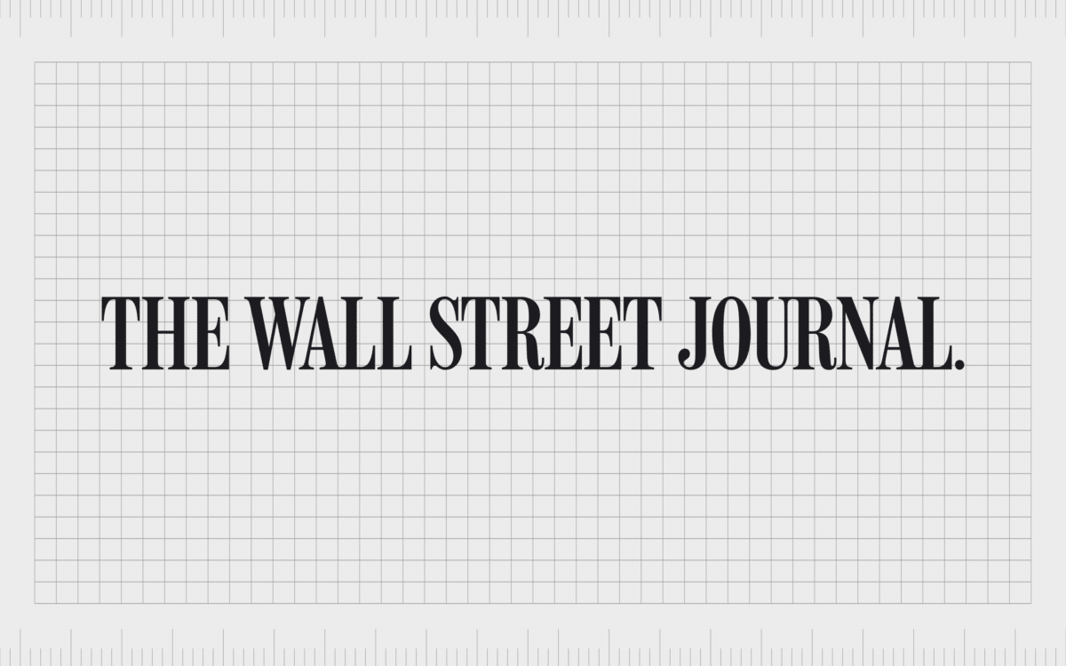
The Wall Street Journal
The long horizontal logo of the Wall Street Journal actually makes a lot of sense. This image was designed to appear at the top of a newspaper and attract reader attention.
Depicted in bold, serif letters, the Wall Street Journal’s logo has an air of sophistication and heritage to it, perfect for a business-focused newspaper.
Stacked logos with long names
Stacked logos with long names are one of the more common options for many businesses attempting to transform their lengthy moniker into something more compact and easier to read. By stacking words on top of each other, these logos can help companies to fit their image into more spaces.

Edward Hopper House Museum & Study Center
The sheer length of the name for the Edward Hopper House Museum & Study Center would make it almost impossible to fit onto a standard horizontal logo.
Stacking the various words together helps to make the logo more manageable. The use of two separate colors also helps to separate the museum and study center, from the name of the house itself.

South Western Railway
South Western Railway creates a simple but eye-catching image with its stacked long text logo. The company also has a much more compact version of its logo for digital and social media, which only uses the letters “SWR”.

Better Homes & Gardens
Better Homes & Gardens uses its stacked long word logo with a refined serif-style font to create a sense of prestige and authority for the brand. Though the company has experimented with a number of different designs for its logo, it regularly uses the stacked design.
Even the social version of the Better Homes & Gardens logo stacks the characters “BH” on top of “&G” to maintain a consistent image.

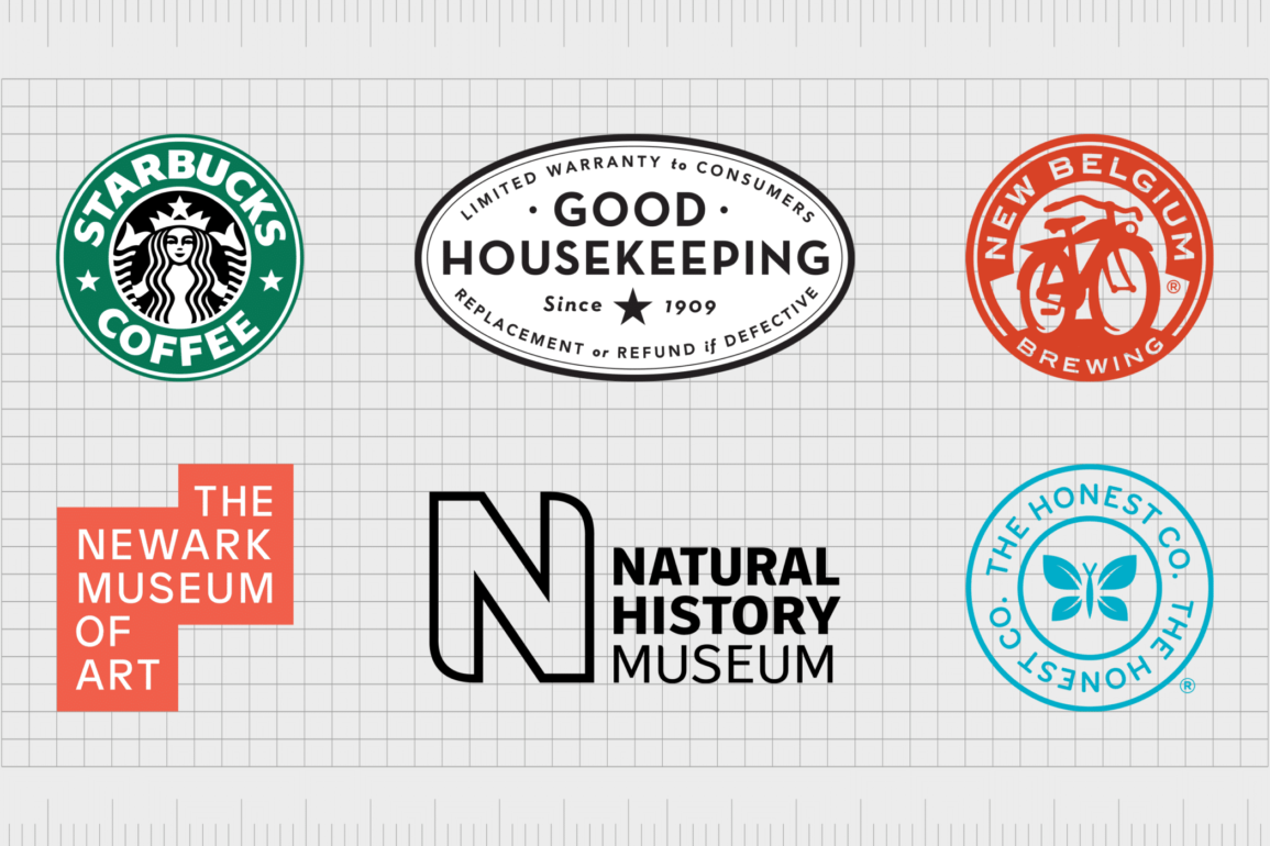
National History Museum
Easily one of the better-known and more recognizable long word logos on our list, the National History Museum combines a stacked wordmark with a large, dynamic capital “N” for its logo.
This capital “N” is also frequently used on its own as a way of refining the organisation’s rather lengthy brand image into something more compact.

Singapore Symphony Orchestra
The Singapore Symphony Orchestra is a great example of how good stacked logos with long names can look in the right circumstances.
The eye-catching image combines a modern and sleek sans-serif font with a much larger symbol to create visual balance in a range of formats.

Cold Stone Creamery
It’s hard to find an ice cream fan who isn’t familiar with the Cold Stone Creamery logo. This iconic emblem might look a little old-fashioned, but it helps to highlight the heritage and history of the brand, giving it a sense of trustworthiness.
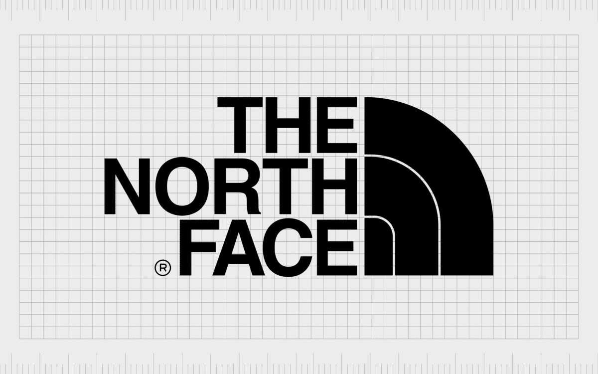
The North Face
A well-known outdoor brand demonstrating the potential of logos with long company names, The North Face uses uniquely positioned words positioned to the right alongside an interesting symbol to make its brand image stand out.

The Lincoln Motor Company
If you’re a fan of the automotive industry, you’re probably familiar with the Lincoln Motor Company. This is the luxury vehicle division of the Ford automobile brand, and it depicts its prestigious position with a longer, more authoritative logo.
The Lincoln Motor Company’s logo is sleek and serious, with a modern sans-serif font balanced alongside an eye-catching symbol.

National Geographic
The National Geographic logo might not look particularly long at first glance, but this is only because the brand uses the stacking method correctly. Imagine how long this wordmark would look if the words of the brand name were placed horizontally.
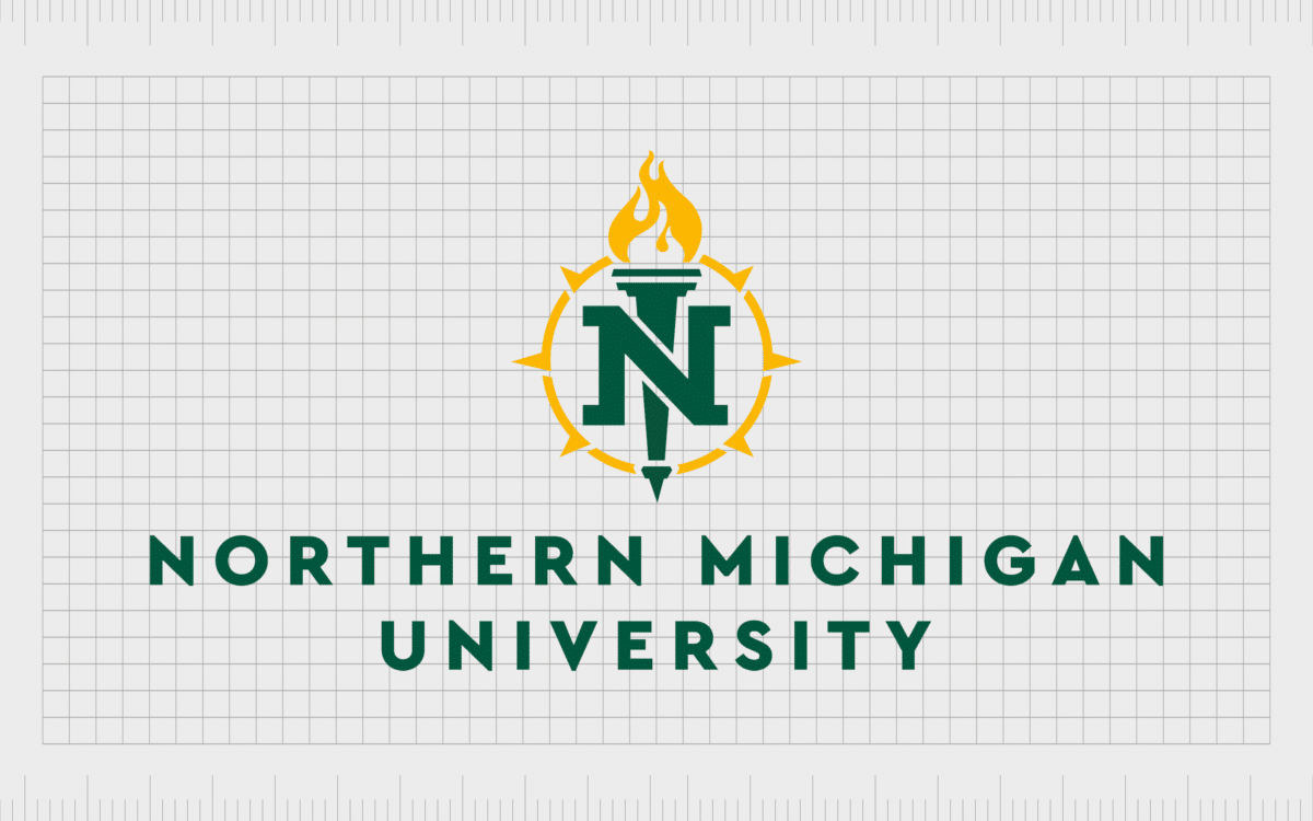
Northern Michigan University
Lengthy names are relatively common in the university and educational landscape, because it’s more common for educational institutions to use complex titles depicting their location. The Northern Michigan University logo is a great example of an attractive long logo.

The University of Chicago
The University of Chicago takes an interesting approach to stacking the words of a longer logo in its emblem. By making the word “Chicago” just as big as the combined words “The University of”, the institute creates a highly balanced design.

The Royal Bank of Scotland
Like many of the logos with long names we’ve covered so far, the Royal Bank of Scotland has different variations of its emblem available for the digital world.
The more common design seen on the company’s branding, however, stacks the words “Royal Bank” evenly on top of “of Scotland” in a sans-serif font.

Standard Chartered
Another example of a bank with a relatively lengthy logo, the Standard Chartered financial institution combines an eye-catching font specially created for the company with a compelling symbol.
Though the use of a lengthy logo makes the company seem more traditional, the design choice also helps to depict the brand as forward-thinking and modern.

The Newark Museum of Art
Bringing a creative edge to the use of stacked logos in long name logo design, the Newark Museum of Art manages to make its emblem look fun and fresh.
The positioning of the words moving from the right to the left of the visual field is unique and interesting, helping to draw the eye and make viewers think of innovation.

The Weather Channel
The logo for The Weather Channel is wonderfully compact and neat, helping to depict the authoritative and accessible nature of the company.
The use of a blue box to help keep everything tied together is particularly intelligent here, as blue also reminds us of the sky and the weather.
Round logos with long names
Round logos with long names are a popular choice when companies want to make their lengthy wordmarks seem less overwhelming. The use of a circular shape can help to tie everything in your brand image together neatly, and it’s ideal for use on digital screens.
However, this form of long name logo is only present among a handful of brands.

The Honest Co.
An American consumer goods brand founded by Jessica Alba, the Honest Company has achieved phenomenal success over the last few years. The brand’s compelling logo actually manages to use the full (lengthy) name of the brand twice in its circular design.
The mirrored image of the two long names in the circular border creates a balanced and trustworthy-looking symbol for the business.

Powerhouse Gym
Another excellent example of a company making use of the circular logo for a long brand name, the Powerhouse Gym’s emblem looks sleek and stylish with its black and white color choices.
The circle design in this example also allows the company room to showcase its tagline.

Maggie Moo’s Ice Cream and Treatery
A popular company in the US, well-known for selling all kinds of frozen treats and ice creams, the Maggie Moo’s Ice cream and treatery logo is fantastic example of a circular long text logo.
The design combines a playful font with an eye-catching mascot to appeal to a younger demographic
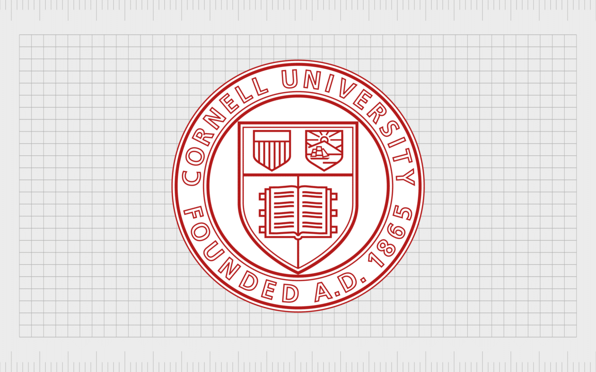
Cornell University
Usually, Cornell University places a full serif font wordmark alongside its brand emblem to showcase its full brand identity. However, there are also variations of the logo which position the name of the school and the date it was founded in a circular format.
This instance of a logo with a long name offers an insight into how the circular badge design can give an organization a sense of heritage and history.

University of Oxford
Similar to the Cornell University emblem depicted above, the University of Oxford also has a version of its logo with an accompanying wordmark. However, you can also find versions of this brand mark which rely on the circular design alone.
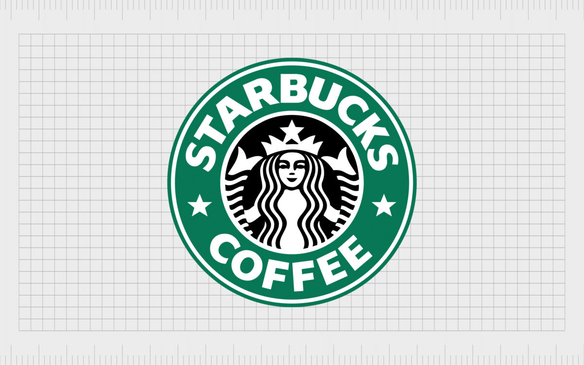
Starbucks Coffee
While the newer version of the Starbucks Coffee logo has no wordmark at all, the previous design took full advantage of the circle format to place the words “Starbucks Coffee” into a more compact image.
This is still a universally recognized version of the Starbucks logo today.

Shepherd Management
Elegant and eye-catching, this example of a round logo demonstrates how a wordmark can be used in a unique way to form a border around a company’s emblem.
The Shepherd Management logo is an innovative take in the circular design.

Camden Town Brewery
Camden Town Brewery is one of the better-known beer brands in the United Kingdom, with a highly recognizable logo.
The image features the chimney top from a home in Camden as its central image, with the words of the company’s name situated around it.

New Belgium Brewing
A popular beer brand from the United States, the New Belgium Brewing Company also places its wordmark into a circular design to help fit the emblem onto a wide range of bottles and beer mats.
The design has a traditional appeal with a modern edge.
Badges and emblems with long names
Similar to circles, badges and emblem designs can be an excellent way to confine the various words in your logo into a smaller, more compact space. Badges and emblems also have the added benefit of infusing a company with a sense of history, heritage, and prestige.
Here are some examples of emblem logos with long names…

Harley Davidson
Easily the most recognizable example of a company using a badge or emblem to convey a long name, Harley Davidson places the name of its company over the “Motorcycles” defining wordmark in a shield shape to convey a sense of strength and sophistication.
Find out more about the Harley Davidson logo here.

Good Housekeeping
Seals of approval are commonplace among companies or organizations using long names in a badge or emblem format. The Good Housekeeping “seal of approval” uses its sticker-style brand logo as a way of providing plenty of information for potential shoppers.

The Salvation Army
One of the better-known examples of badges and emblems with long names, the Salvation Army delivers a sophisticated and eye-catching image with its bold design. The elegant font on the red background builds a sense of heritage and authority.
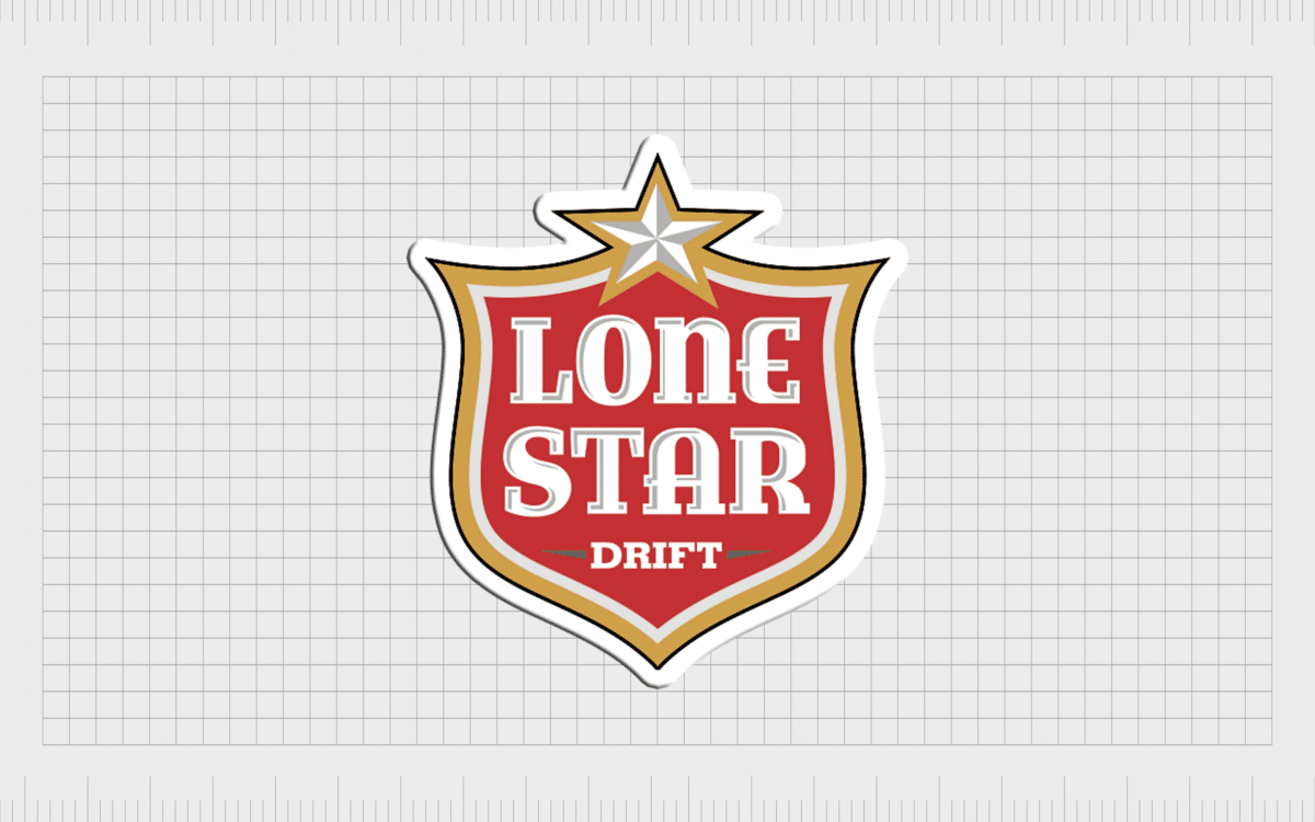
Lone Star
While the name “Lone Star” isn’t particularly long, the added tagline “The National Beer of Texas” creates quite a lengthy piece of text for an emblem. Placing everything together in a shield-style shape designates the brand as an authority in its industry.
Celebrating long text logos
Logos with long names aren’t as common these days, as companies look for ways to simplify their branding and image. However, there are still plenty of examples of long word logos out there. Some even help to add a sense of authority or heritage to a brand’s aesthetic.
If you’re thinking of designing your own long text logo, think carefully about how you can best present your name without overwhelming your audience. Often, the best strategy will be to work alongside a branding expert to explore a range of design options.
Fabrik: A branding agency for our times.

Clarity starts with a conversation.
Thanks—we’ll get back to you shortly.
Whether you're navigating a rebrand, merger, or simply need a clearer identity—we’re here to help. No hard sell, just honest advice from people who know the sector.
Let’s start with a simple question…
Prefer to email? Drop us a line.
Fabrik’s been helping organisations rethink and reshape their brands for over 25 years. We’ve guided companies through mergers, rebrands and new launches. Whatever stage you’re at, we’ll meet you there.