Pfizer logo history: A beacon of hope in the healthcare landscape

If you weren’t familiar with the Pfizer logo before 2020, the chances are you’ve been exposed to the design since. As one of the pioneering brands responsible for producing a vaccine for the Covid pandemic, Pfizer has become a leading name in the healthcare industry. Here’s everything you need to know about Pfizer logo history.
Pfizer is one of the most well-respected and impactful medical companies in the world today. Like many famous healthcare brands, the organization has refined and modernized its emblem over the years, to strengthen its connection with its audience, and differentiate itself from its competitors.
If you’ve ever wondered about the meaning behind the Pfizer logo, or you simply want to learn more about this incredible emblem developed over the years, you’re in the right place. Today, we’re taking a deep-dive look at the Pfizer brand and its visual identity.
What does the Pfizer logo mean? Introducing Pfizer
Before we dive into an exploration of Pfizer logo history, and the meaning behind the emblem, it’s worth introducing the Pfizer company itself. Pfizer is an American multinational biotechnology and pharmaceutical company, first established in 1849.
The company was brought to life by two German entrepreneurs, Charles F. Erhart, and Charles Pfizer.
When the company first launched, it produced chemical compounds, as well as an antiparasitic medication which became immediately successful in the US market.
Over the years, Pfizer continued to position itself as an innovator in its field, developing and producing medicines which changed the world forever.
Perhaps most significantly, Pfizer was one of the first brands to introduce a vaccine for the Covid-19 pandemic, earning it a significant present across the globe.
Pfizer partnered with BioNTech to study and develop vaccine candidates, taking no initial research funds from the US. Instead, the company spend more than $2 billion of its own funds on the development process, and achieved amazing success as a result.
Today, the company is one of the largest pharmaceutical brands in the world, and it was even a component on the Dow Jones Industrial stock market index for 16 years. Currently, Pfizer ranks as number 43 on the Fortune 500 list.
What are the taglines for Pfizer?
Although Pfizer has made a number of changes to its logo design over the years, the mission and tagline of the company has remained relatively consistent.
The tagline currently used by the brand is “Breakthroughs that change people’s lives”. This slogan is intended to draw attention to the company’s focus on innovation, and transformation.
Pfizer logo history: The evolving emblem
As a company with nearly 200 years of history in the pharmaceutical space, Pfizer has understandably gone through some major branding changes over the years.
Throughout Pfizer logo history, the company has consistently enhanced and updated its logo, with a focus on connecting with its target audience, and demonstrating industry authority.
1849
The very first Pfizer logo stayed with the company for almost 100 years. When the brand first opened as “Charles Pfizer and co”, it utilized a monochrome badge-style logo, with stylized initials and a unique monogram component.
The overall design was extremely traditional, placing Pfizer as an authority among various other pharmaceutical companies at the time.
Though a little complex by today’s standards, the original logo conveyed ideas of expertise, elegance, and professionalism, helping the company to stand out among its competitors.
1948
In 1948, Pfizer updated its logo for the first time, embracing an oval-shaped banner, with a simplified wordmark. The new logo was designed to reflect the updated name of the organization, which was reduced to just “Pfizer”.
This new logo inspired many of the designs used by the companies in the years to come, although the coloring and other components were altered.
Originally, the emblem featured a yellow and gold color palette, with white grid lines placed along the yellow oval behind the wordmark.
1950
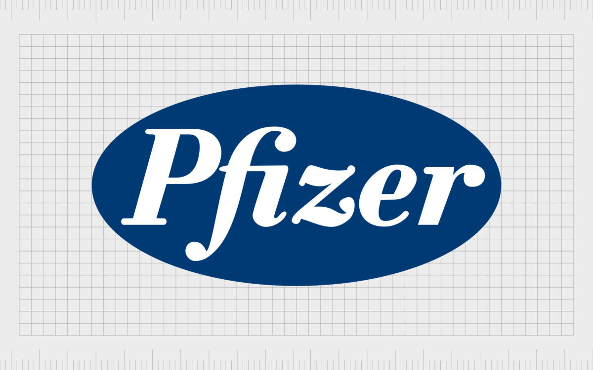
Soon after designing its first “globe logo”, Pfizer made a change to its visual identity again, choosing a new color palette of blue and white to symbolize purity, excellence, and reliability.
The lines in the previous design were removed, and the typeface was enhanced, with thicker lines on the “F” and the “Z” characters. Though minimalistic, this logo was strong and powerful.
1989
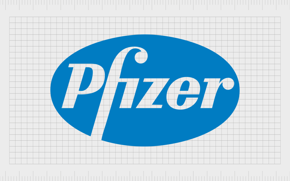
During 1989, Pfizer made a slight update to its logo, utilizing many of the same components of the previous design. The blue coloring was made a little lighter and brighter, while the white font remained the same.
The typography was altered slightly, bringing the “F” and the “I” closer together, and eliminating some of the additional curves and flourishes on the characters.
The updated logo was elegant and eye-catching, and the oval shape was elongated vertically, to give the overall image a more balanced look.
2009
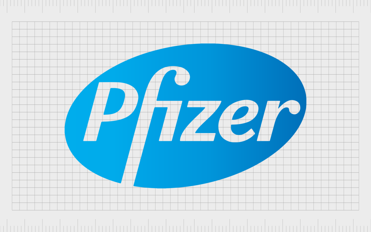
Once again, Pfizer built on its previous logo design in 2009, switching the blue coloring on the oval to a gradient, to make the emblem more energetic and dynamic. The oval was also angled slightly, to give the company’s image a sense of progress and movement.
The other core components of the design remained the same, with a consistent typeface, still depicted in a white font.
2021
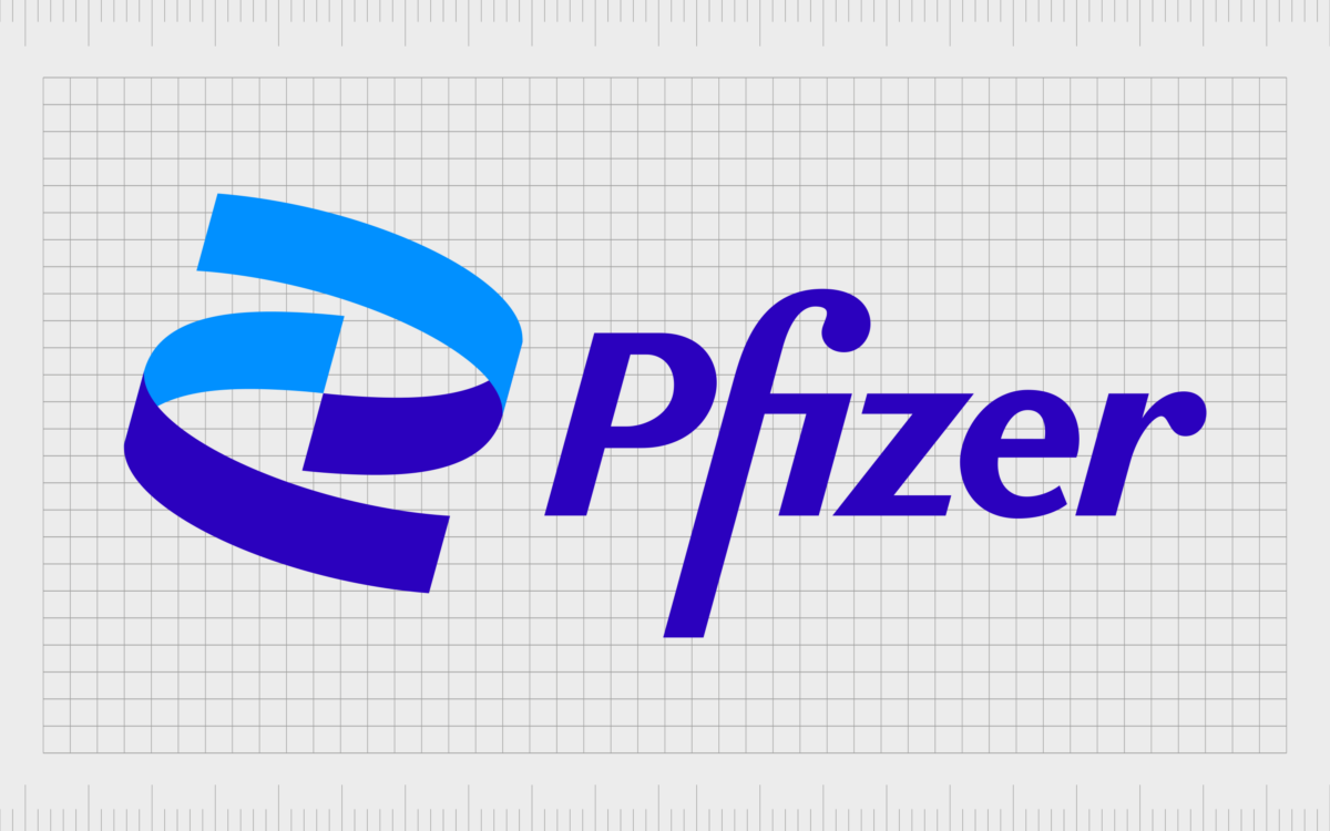
Finally, following the Covid pandemic, Pfizer made the most recent change to its logo in 2021, eliminating the oval shape entirely and switching the color palette again. A new graphic was implemented in shades of dark and light blue, intended to symbolize a DNA helix.
The helix icon also showcased the company’s commitment to forward movement and progression, as well as innovation in the biotechnology industry. The typeface used alongside the icon is very similar to the design in the previous logo, but it’s now depicted in dark blue, instead of white.
The bars are also a little thinner and sleeker in some places.
The Pfizer logo: Colors and fonts
For a long time, Pfizer stuck with a relatively consistent visual identity. After updating its traditional logo to an oval-shaped badge, the brand stuck with this imagery for several years, only making slight changes to the positioning of the shape, the color palette, and the typeface.
In 2021, when Pfizer made the most significant change to its emblem in over a century, the business focused on showcasing its commitment to innovation in the pharmaceutical and biotechnology space.
The new logo is immediately eye-catching and still takes advantage of color symbolism to highlight ideas of credibility and trust. You can find some excellent examples of the Pfizer logo as it stands today in the resources below:
What color is the Pfizer logo?
For most of Pfizer logo history, the colors used by the company have been relatively consistent. In 1950, the company adopted the Pfizer logo colors of blue and white as its primary shades. However, the exact tone used for the blue coloring has been changed numerous times.
Today, the Pfizer logo color palette is simple and meaningful. The deep shades of blue immediately capture attention, while conveying ideas of reliability and trust, thanks to color psychology. The two shades contrast perfectly against each other, without causing visual overwhelm.
The colors are similar to:
Medium Blue
Hex color: #2B01BD
RGB: 43 1 189
CMYK: 77 100 0 26
Pantone: PMS Violet C
Dodger Blue
Hex color: #0090FF
RGB: 0 144 255
CMYK: 100 44 0 0
Pantone: PMS 285 C
What font does the Pfizer logo use?
The Pfizer logo font is unique to the brand, and it’s one of the most eye-catching components of the company’s visual identity.
This typeface was created from scratch, based on sophisticated serif-style fonts, and handwritten signature scripts. The design was created in 1987 by Gene Grossman, and has only changed very slightly ever since.
Why did Pfizer change its logo?
Looking back through Pfizer logo history, we can see the company has only made a handful of changes to its logo over the years. For a long time, the company stuck with the same oval shaped badge to convey stability, strength, and commitment to the community.
However, after the Covid pandemic, Pfizer decided to update its logo to represent it’s newfound strength and confidence in the pharmaceutical landscape.
Today, the emblem used by Pfizer showcases the company’s position as one of the world’s biggest vaccine providers. The design, with its DNA helix, reminds us of the company’s focus on innovation and discovery.
Fabrik: A branding agency for our times.
Now read these:
—Tips for naming a medical company
—The essential guide to pharma logos
—Ultimate list of health company logos
—Fabrik’s biotech branding services
Clarity starts with a conversation.
Thanks—we’ll get back to you shortly.
Whether you're navigating a rebrand, merger, or simply need a clearer identity—we’re here to help. No hard sell, just honest advice from people who know the sector.
Let’s start with a simple question…
Prefer to email? Drop us a line.
Fabrik’s been helping organisations rethink and reshape their brands for over 25 years. We’ve guided companies through mergers, rebrands and new launches. Whatever stage you’re at, we’ll meet you there.


