


Why are logos so simple now? Exploring the rise of simple logos
Have you ever wondered why simple logos are so popular? For a number of years, we’ve seen an increase in simple logo design, as companies embrace more subtle, minimalist aesthetics. But, precisely why are logos so simple now?
There are several answers to this question. Simplification isn’t just a recent trend in logos; it’s something we’ve seen in some degree for a number of years. Look back at the original Starbucks logo, for instance, and you’ll see how much the design has reduced over time.
Other major car companies like Porsche have taken significant steps to simplify their image.
The minimalistic trend actually serves an important purpose. The fewer elements there are in a logo, the less we need to remember when recognizing a brand by its image.
Let’s look at the reasons why simple logos are so common.
Why are simple logos on the rise?
The most obvious reason why simple logos are becoming so common, is simple designs are infinitely more memorable. In today’s cluttered marketplace, we’re bombarded with countless logos on an almost daily basis.
Even if a company decided to place a number of unique elements into its logo, the chances are our brains would only retain so much information.
By creating simpler logos, companies give their audiences less visual information to contend with. Essentially, they remove everything which doesn’t add value to the logo, or provide specific information, to give us a simple selection of colors and shapes.
These colors and shapes are much easier to keep in mind when we’re remembering our favorite logos.
Usually, your brain will remove the details it considers unnecessary in a logo or image anyway, so it doesn’t make much sense for a brand mark to be more complex than it needs to be.
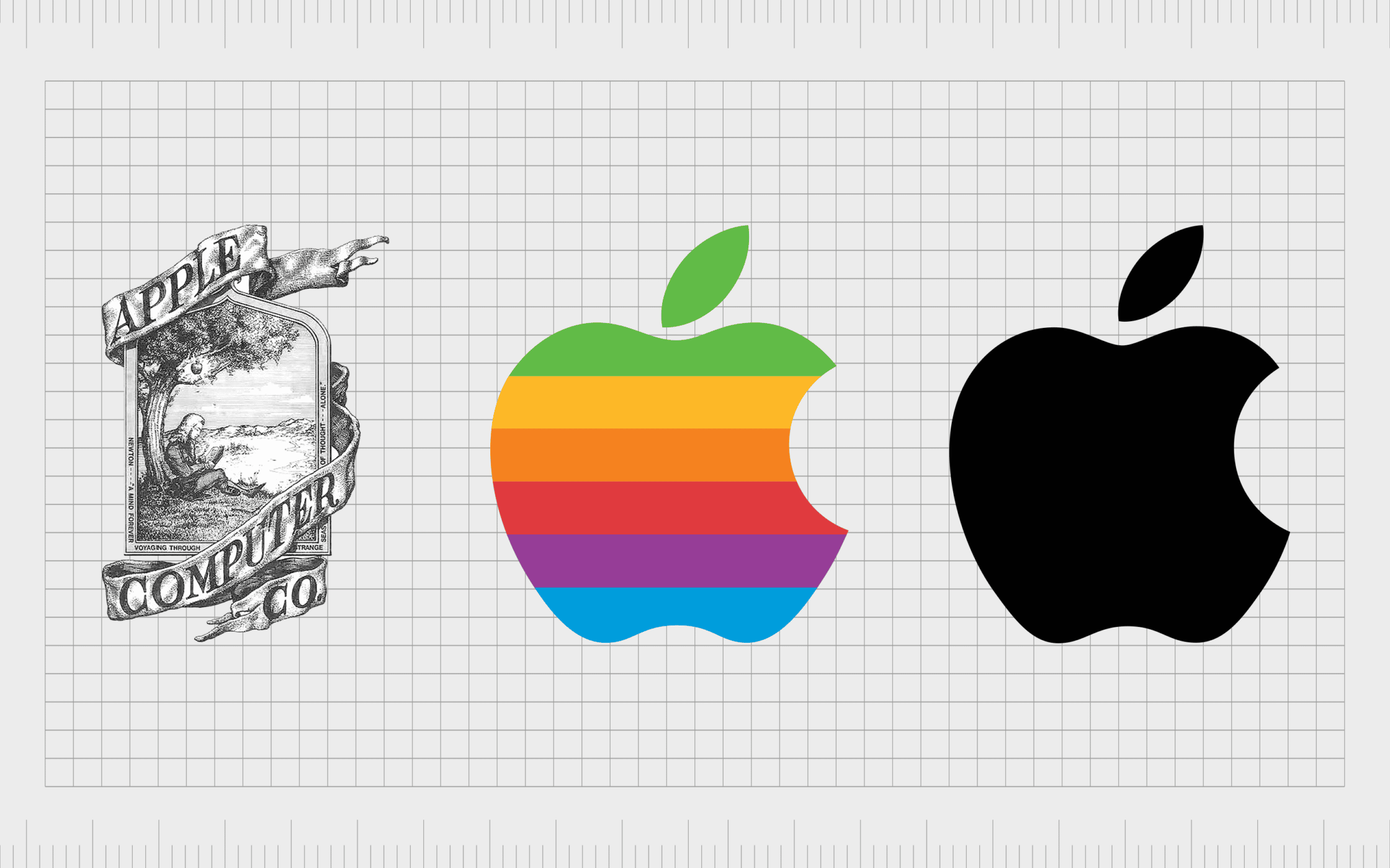
For instance, you probably couldn’t tell us off the top of your head all the elements first included in the Apple logo.
In the past, a complex logo was often a symbol of authority and prestige. The more complex the design, the more it cost to place on various shop signs and packaging. Now, complicated elements are simply a waste of time.
The benefits of simple logos
Simple logos actually have a number of distinct benefits over their more complex counterparts. While you might assume a logo with more detail will tell your customer more about your brand, the reality is most customers prefer something simple, direct, and impactful.
Some of the most significant benefits of switching to simple logos include:
Visual comfort
Complex logos might be beautiful, but they’re also overwhelming for the eye. These days, consumers are putting their vision under more strain than ever before, by constantly looking at various screens and displays.
The last thing we need is to put our eyes under more pressure, by asking them to unravel the various parts of a complex logo.
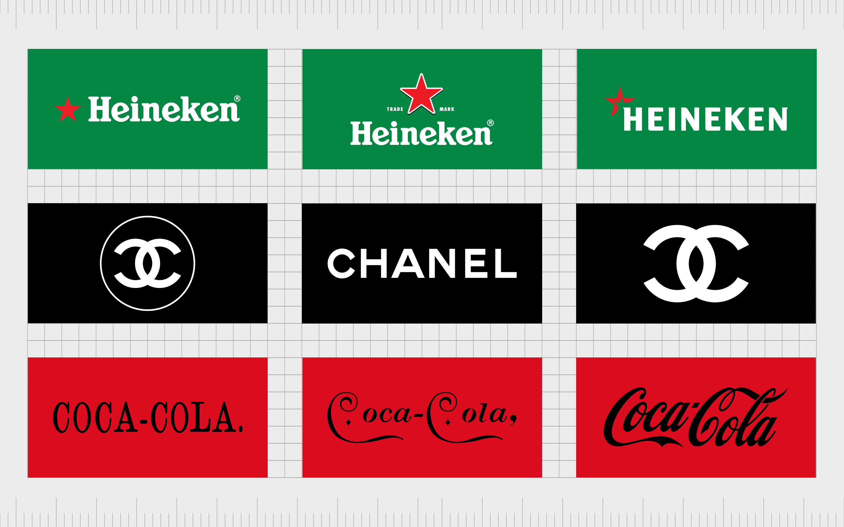
Flatter, more simplistic logos are easier to consume at a rapid pace. Think of the difference between the Heineken logos over the years, or the changes in the Chanel logo. Even Coca-Cola has taken a simpler approach to its design over the years.
In a world where consumers are generally “scanning” more content at a rapid pace, a smaller, simpler, and more subtle logo can reduce the risk of bombarding your audience with too much information.
Support for the digital landscape
The world is digitally transforming at an incredible pace. These days, most human beings spend significant amounts of time using devices like smartphones and computers. As such, companies have also evolved to create their own online presence, with social media and website assets.
In this digital landscape, it can be extremely difficult to ensure a complex logo shows up perfectly on all environments. Most social media sites have limitations on how large a company’s profile picture can be, and the thumbnails on your website can be extremely small.
Moving to a simple logo design allows companies to ensure they’re prepared for any digital environment.
A simpler logo can also work across a range of online and offline mediums more effectively. You don’t have to worry about differences to your brand design showing up between your email signature, and the image printed on your letterhead.
Suitability for smaller screens
Crucially, a simple logo is also better-suited to a world where we’re spending more time browsing from our smartphones. As screens grow increasingly small, companies need to ensure they can still convey a specific brand identity with a tiny number of pixels.

Not only does a simple logo look better on a website designed for mobile, but it also lends itself more easily to the creation of new brand assets, like apps. Many companies can use simple versions of their logo to create tiny button-style app images.
Alternatively, if your logo was packed full of too much information, it would be practically impossible to convert it into an app-friendly image.
A more modern image
While it’s important for any company to maintain its unique visual appeal and personality over the years, sticking to the same logo for too long can make you seem outdated.
As the world continues to embrace simple logos, companies who retain more complex designs can look as though they’re falling behind, rather than trying to stand out from the crowd.
Updating your logo with a focus on simplification demonstrates your commitment to staying “up-to-date” and on the cutting-edge with your target audience.
Alternatively, failure to keep up with trends can sometimes leave your customers wondering how trustworthy and knowledgeable you really are.
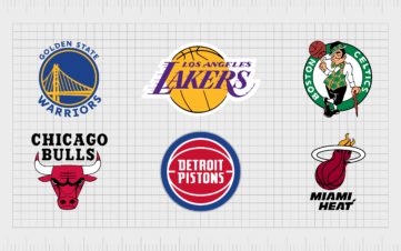
A simple logo puts you in the same arena as countless well-known companies who have made their designs more minimalistic over the years.
Simple logos: Why simple sells
Interestingly, a simple logo isn’t just a practical choice, it can also be an important way to add more depth to the meaning behind your brand image. Simplicity is something we often associate with confidence and stability.
Although in older years, a complex logo might have demonstrated a sense of authority for a brand, today it often convinces customers the company doesn’t know how to simplify its identity.
Simple logos, like minimalist design aesthetics, are associated with sleekness, and sophistication. They tell us a company doesn’t need to use endless bells and whistles to attract an audience.
A simple, clean, and distilled logo helps to cut through the noise of a cluttered retail environment and makes it easy for us to understand what the company is all about.
With fewer elements to find meaning in, consumers are more likely to end up with a clear image of what the business stands for.
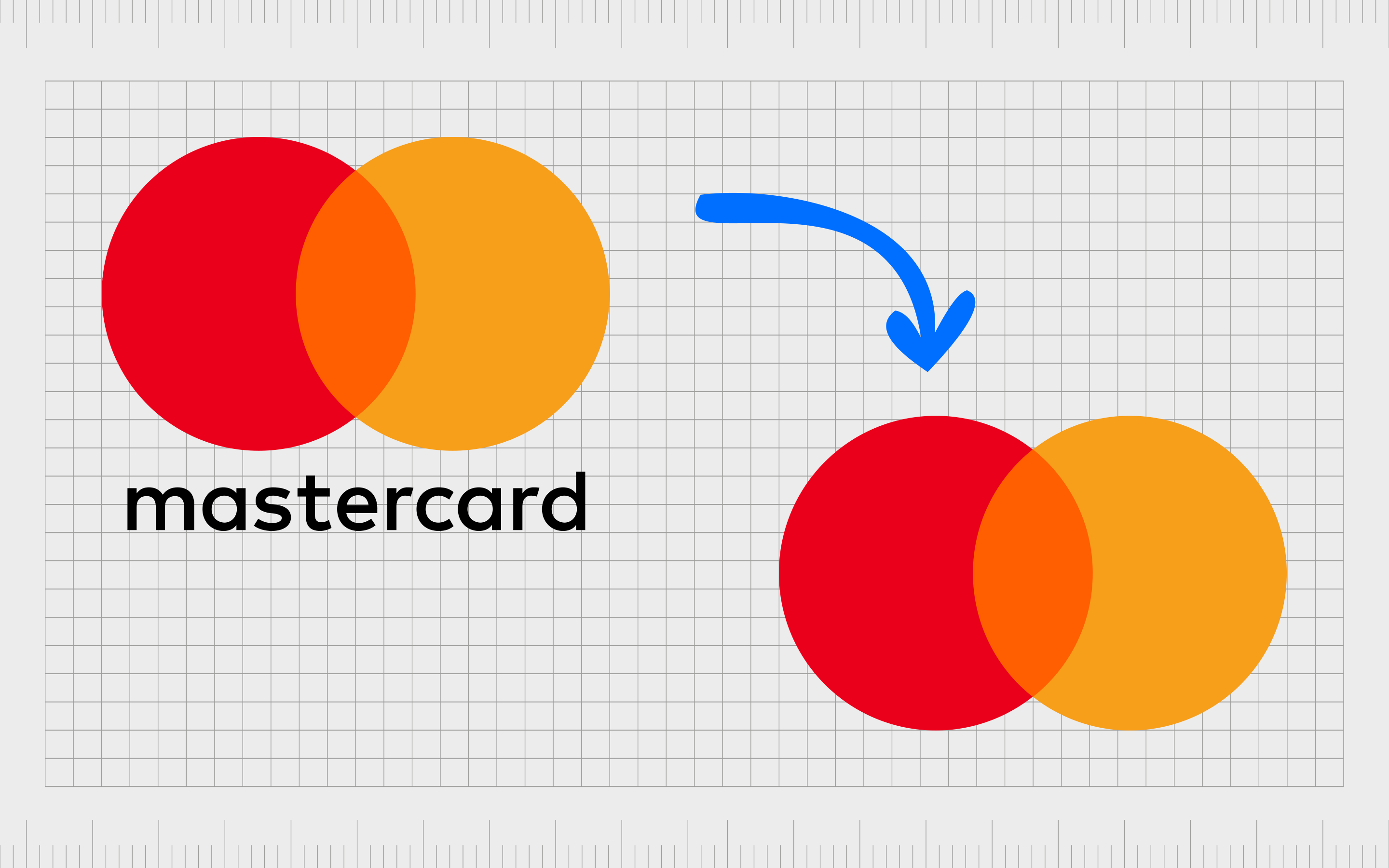
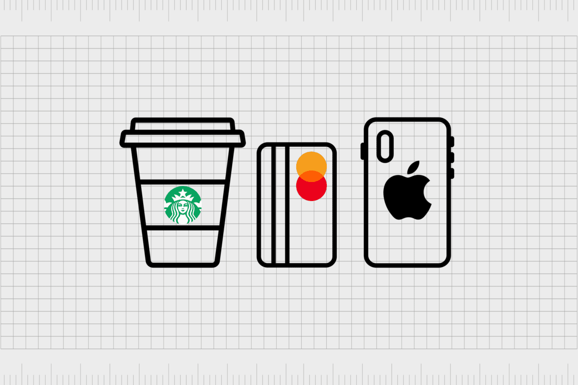
For instance, in the MasterCard logo, we don’t need the lines between the two circles to tell us the company is focused on connectedness and aligning the various parts of our lives. The blended elements of the two circles can deliver the message just as well.
The case for simple logo design
If the trends of Scandinavian interior design have taught us anything, it’s that less is often more. Today, simplicity is more likely to inspire confidence in your customer than a complex or overwhelming logo.
With a simple logo, you tell your audience you’re comfortable allowing simple shapes and colors to represent your brand, because you know your reputation speaks for itself.
Brands are beginning to look at symbols as a signature, or a seal of verification, demonstrating their ability to make a unique mark on the industry. In the past, companies relied on their logos to tell the full story of what their company could do before they ever interacted with a customer.
A logo today is a quick and convenient snapshot of your brand image, which triggers specific emotions, and memories. For this purpose, a complex design simply isn’t necessary.
Of course, this isn’t to say some companies can’t achieve a good brand image with a little extra complexity. The important thing to remember is modern logos generally shouldn’t contain anything which doesn’t provide value and useful information to your audience.
If you’re considering whether your logo design should be simpler, it’s worth examining every aspect of your current image, and asking yourself whether each component is necessary.
Logos should be simple
The answer to the question “why are logos so simple now?” is a complex one. Simple logos have a range of unique benefits, from the ability to deliver a more confident image for a brand, to a greater level of accessibility on digital devices and platforms.
While complexity has its place in some parts of brand and logo design, logos generally benefit from being simpler in today’s modern world.
Fabrik: A branding agency for our times.

Clarity starts with a conversation.
Thanks—we’ll get back to you shortly.
Whether you're navigating a rebrand, merger, or simply need a clearer identity—we’re here to help. No hard sell, just honest advice from people who know the sector.
Let’s start with a simple question…
Prefer to email? Drop us a line.
Fabrik’s been helping organisations rethink and reshape their brands for over 25 years. We’ve guided companies through mergers, rebrands and new launches. Whatever stage you’re at, we’ll meet you there.