


Pizza brand logos: The most famous pizza company logos

How many pizza brand logos can you think of right now?
If you’re a fan of melted cheese, pepperoni, and marinara sauce, you probably have a handful of your favorite go-to brands in mind. You might be drawn to famous icons like Domino’s or Pizza Hut. Or perhaps you’re most familiar with the logo of your local pizza company.
Pizza consistently appears in the list of the most popular foods in the world. Every year, experts predict people consume around 5 billion pizzas with their own variety of toppings and styles. It’s no surprise that dozens of great pizza companies are taking advantage of this fact.
Just like any industry where competition levels are high, companies in the pizza world rely on their excellent brand identity, strong image, and a powerful range of marketing tools to connect with their target audience.
Today, we will look at some of the market’s most appetizing pizza company logos to help inspire and educate you.
The most recognizable pizza brand logos today
Pizza company logos are extremely varied depending on where you are in the world and the kind of personality the business is striving to create. However, some similar themes appear in many of these images.
Bright colors are often used to attract attention and younger audiences. What’s more, many pizza companies include references to their name in their image.
Let’s take a closer look at some of the most recognizable pizza brand logos and the companies they represent.
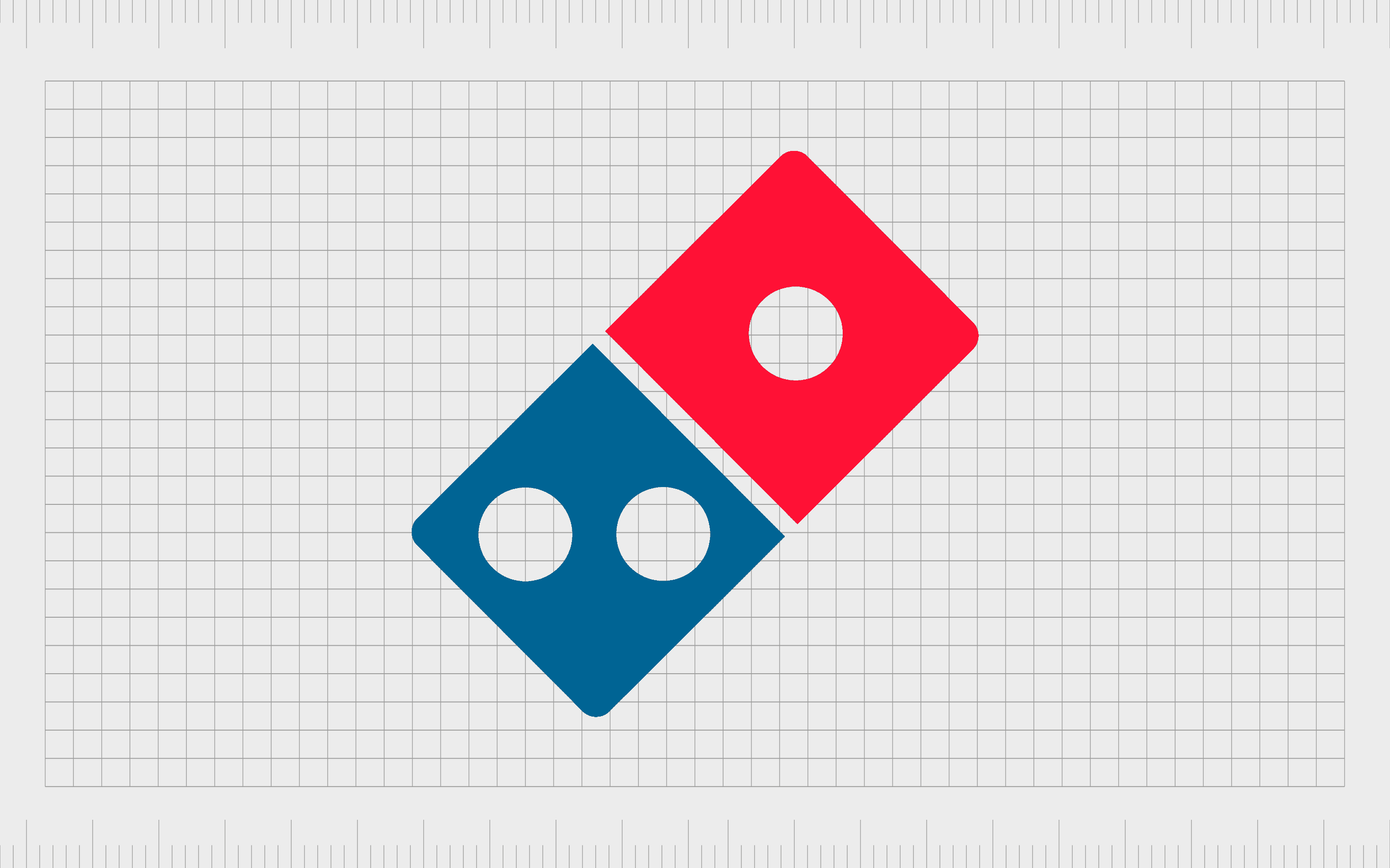
Domino’s
One of the many companies to begin taking advantage of the “minimalist logo” trend in recent years, Domino’s is perhaps one of the best-known pizza companies in the world. The multi-national restaurant chain first launched in 1960.
By 2018, the company had more than 15,000 stores located in 83 countries worldwide.
Domino’s logo is a reference to its memorable name.
The title for the company was chosen after Jim Kennedy, an employee, came up with the idea following a pizza delivery. The image features a red and blue domino, with one spot on the red block, and two on the blue block.
The image also references the boxes Domino’s pizzas arrive in.
Find out more about the Domino’s logo here.
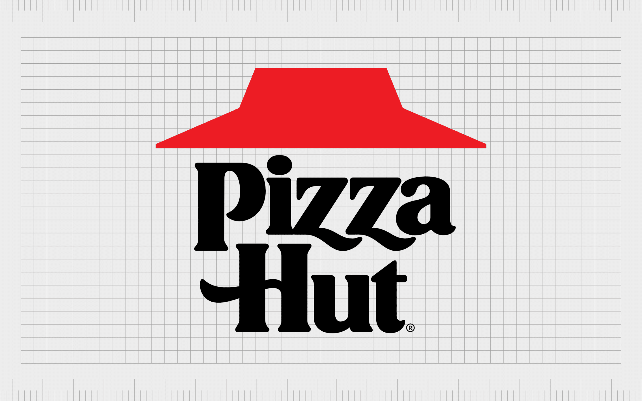
Pizza Hut
First introduced in 1958, Pizza Hut ranks alongside Domino’s as one of the most famous pizza brands of all time. The company specializes in signature pan pizzas and various other dishes, including breadsticks, desserts, and pastas.
Today, the chain has around 17,639 restaurants worldwide, making it the largest pizza chain by location number.
Here’s a fun fact: Pizza Hut has two different logos depending on where you are in the world. While the font and style of the logo change between regions, the “hut” roof remains the same on either image.
The design is intended to reference the name of the company and the design of many Pizza Hut franchise locations, which often feature a stylized roof.
Find out more about the Pizza Hut logo here.
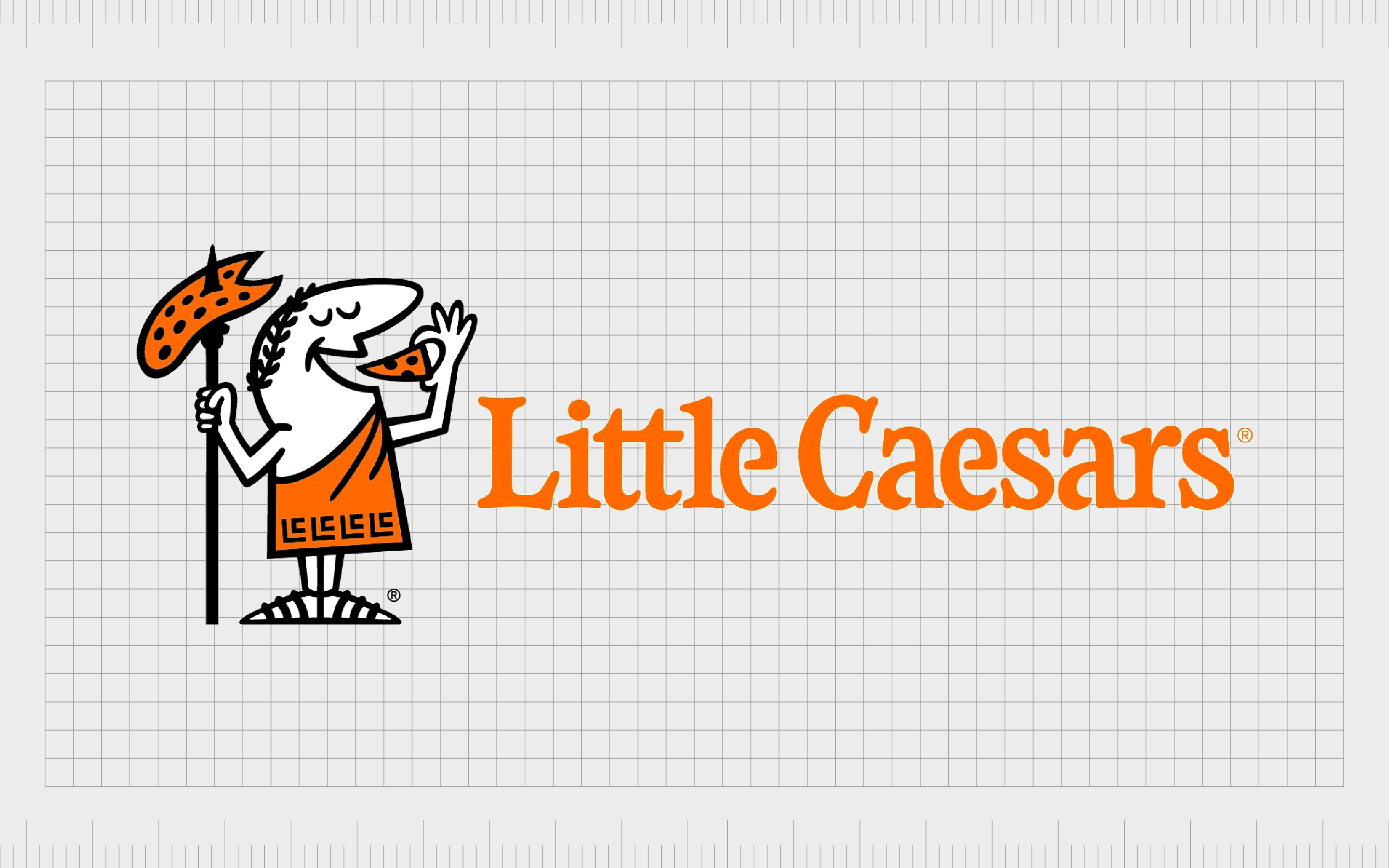
Little Caesars
An American multi-national pizza chain first launched in 1959, Little Caesars remains to be one of the top pizza brands in the world. It’s the third-largest company in the pizza market by total sales in the US, just behind Domino’s and Pizza Hut.
The company apparently chose its name because it was co-founder Marian Ilitch’s nickname for her husband, Mike.
One of the many fast food brands with its own mascot, Little Caesars uses the image of a cartoon Julius Caesar eating a pizza from the top of a spear in its image. The brightly colored orange elements and typeface help to attract a younger audience with an essence of fun and energy.
Find out more about the Little Caesars logo here.
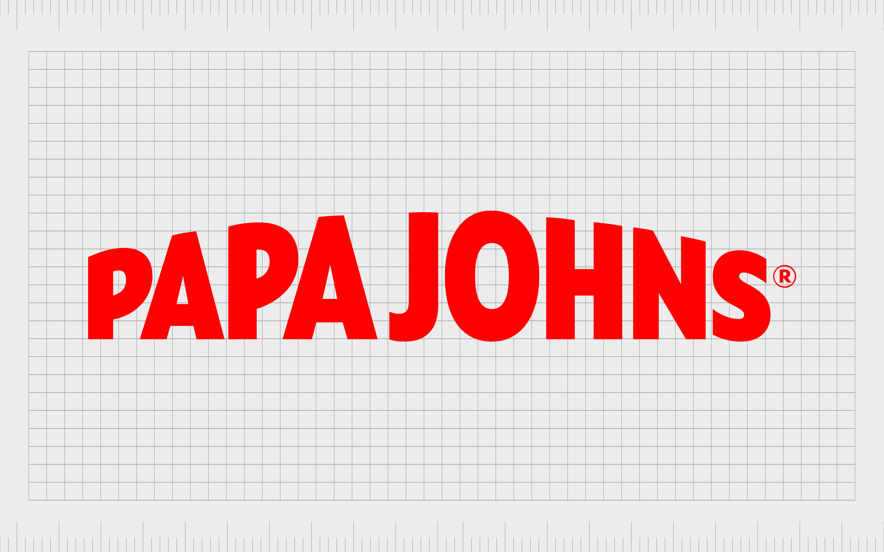
Papa John’s
An American Pizza restaurant chain, and the fourth largest delivery chain in the USA, Papa John’s was launched in 1984. The company quickly developed a global presence over the years and delivers food in around 49 countries. It’s currently the world’s third-largest pizza delivery brand.
Papa John’s was named after its founder, John Schnatter, who installed an oven in a broom closet in the back of his father’s pub.
The logo for the business is a simple word mark, but with a fun and quirky element to it. The bright red attracts attention, while the shaping of the letters makes the name appear to be popping off the page.
Find out more about the Papa John’s logo here.
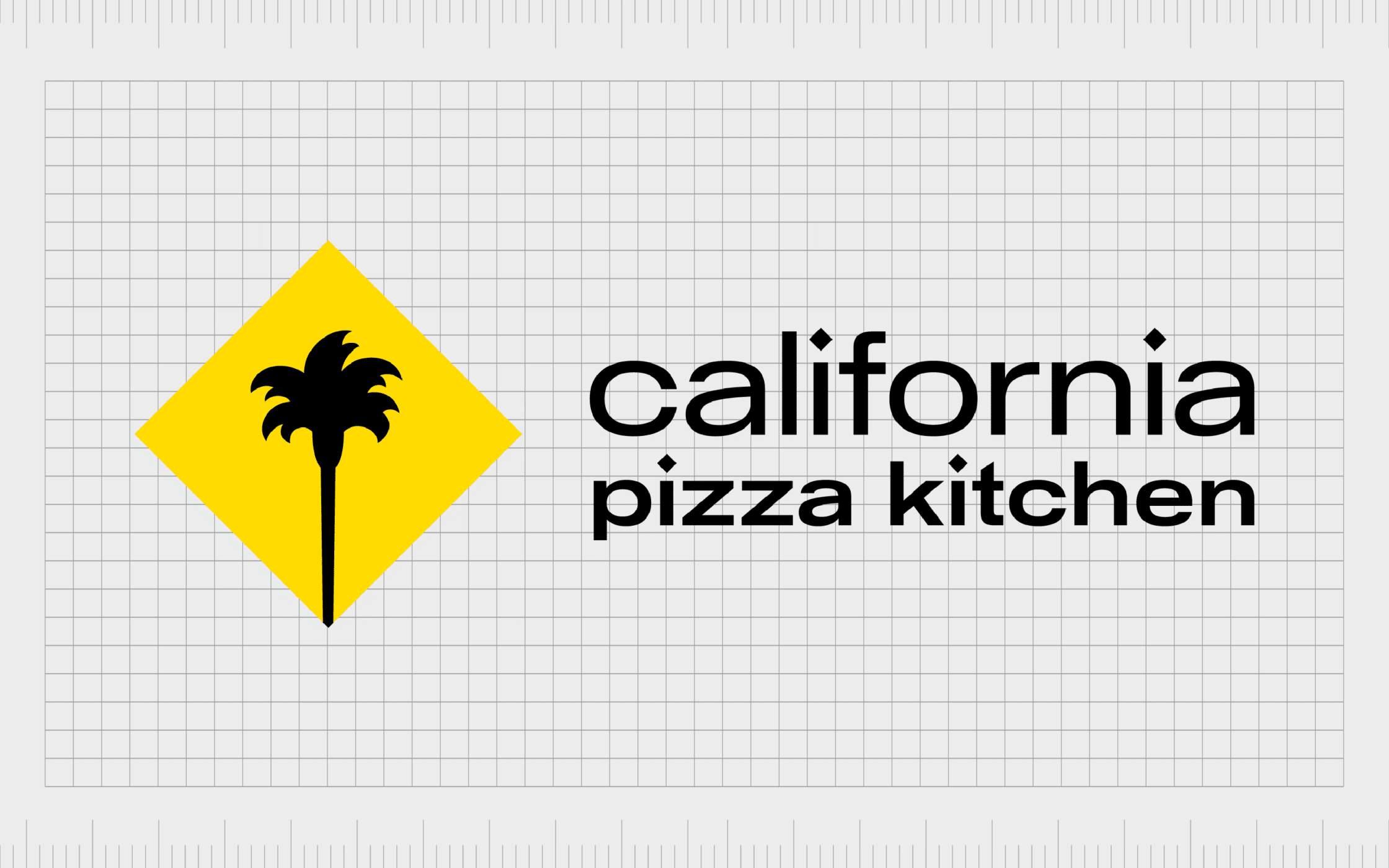
California Pizza Kitchen
A casual dining restaurant chain specializing mostly in California-style pizza, California Pizza Kitchen has one of the most recognizable pizza shop logos around. The company launched in 1985 to bring a new style of pizza to customers all over America.
The logo for California Pizza Kitchen is intended to be modern and eye-catching. The font is bold and confident, while the image is bright and interesting. The yellow diamond reminds us of the sun, while the palm tree is a reference to California.
Find out more about the California Pizza Kitchen logo here.
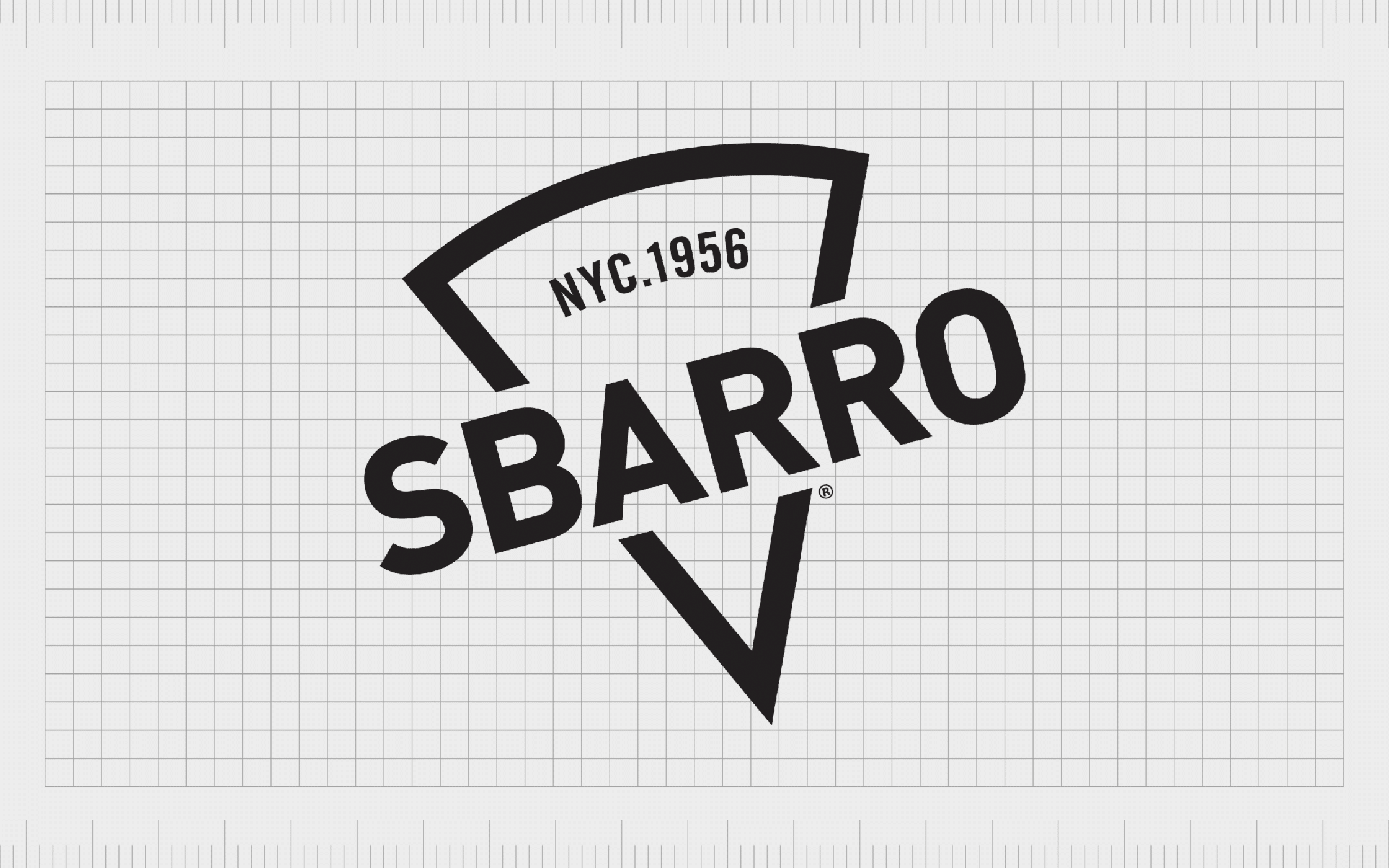
Sbarro
Offering New York-style pizza by the slice, Sbarro first launched in 1956. The organization was named after the founders, Carmela and Gennaro Sbarro. The company was ranked the number one Quick Service restaurant in the Italian landscape in 2008.
However, the business has struggled over the years, with various bankruptcies.
Sbarro’s logo is modern and simplistic. The triangle shape in the background references the company’s top-selling product (pizza by the slice). There’s also a reference to the original founding date of the brand, giving it a sense of heritage.
Sbarro’s wordmark is depicted in bold block letters in all capitals, highlighting its confident nature.
Find out more about the Sbarro logo here.
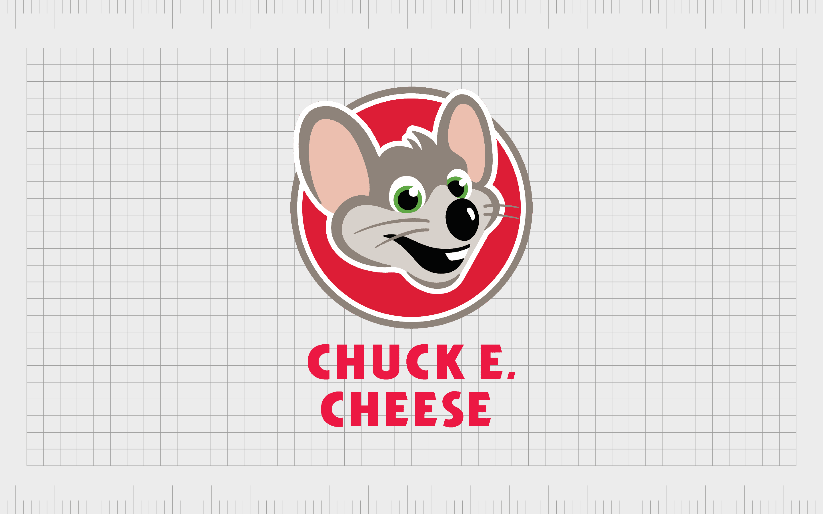
Chuck E. Cheese
When it comes to pizza brand logos, few are more recognizable in America than the logo design for Chuck E. Cheese.
One of the most memorable pizza shop logos, Chuck E. Cheese combines fun bright letters with a brand mascot. The company, launched in 1977, is both a pizza store and a family entertainment center.
Chuck E. Cheese focuses heavily on its mascot in its logo design to help attract a younger audience. The fun and playful character appears alongside a bold, sans-serif wordmark, intended to make the image more memorable and eye-catching.
Find out more about the Chuck E. Cheese logo here.
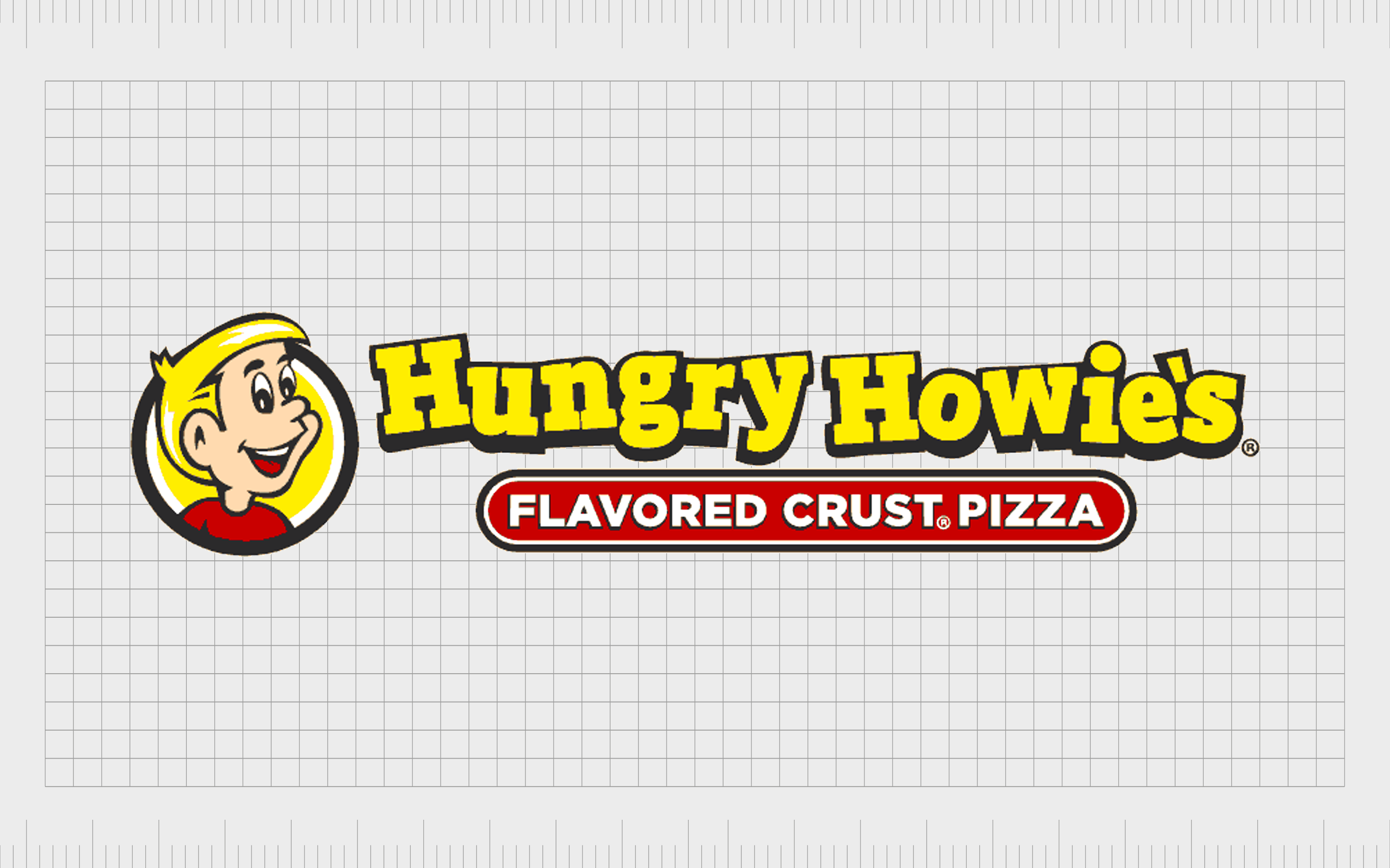
Hungry Howie’s
The 11th largest pizza chain in the United States, featuring more than 550 locations, Hungry Howie’s Pizza & Subs first launched in 1973. This company produces a wide range of specialty pizza products, including calzone-style subs and flavored crust pizza.
The flavored crust pizza is a major selling point of Hungry Howie’s and its referenced clearly in the company’s logo, underneath a playful and bouncy wordmark depicted in yellow and blue.
The colors in this logo convey fun and excitement, ideal for attracting younger diners. There’s also an eye-catching mascot in the form of a young boy intended to give children someone to relate to.
Find out more about the Hungry Howie’s logo here.
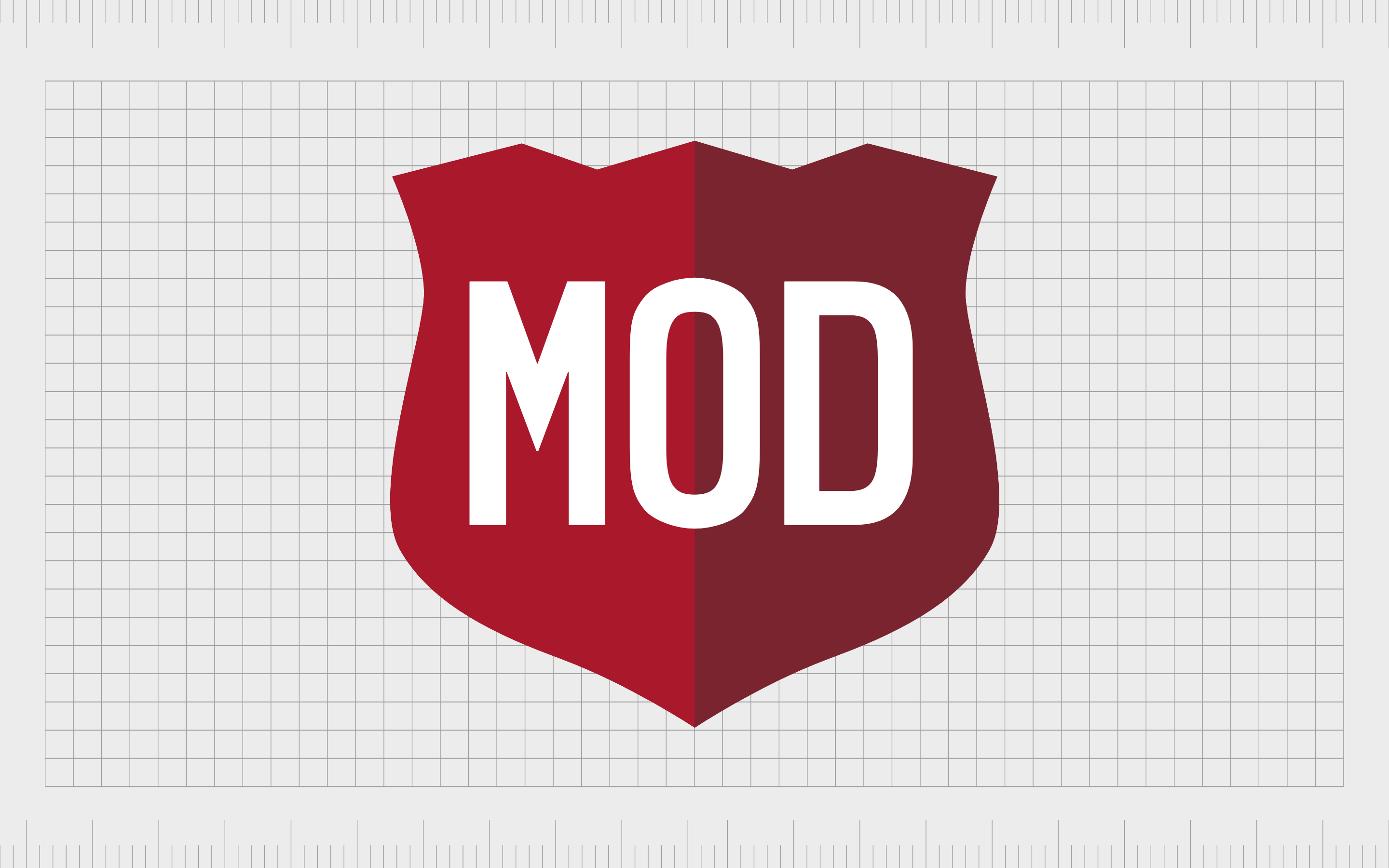
MOD Pizza
One of the younger companies in our list of famous pizza brands, MOD pizza first emerged in 2008, in Washington. Today, the organization has more than 500 locations throughout the United States and Canada.
The name “MOD” stands for “Made on Demand,” which references the USP of the business. MOD creates pizzas exactly according to the instructions of its customers. Customers can watch the preparation process and swap out different ingredients to suit their preferences.
The “MOD” logo is bold and confident, with bright white letters on a shield-style background. The shield is intended to highlight the reliability of the brand and its transparency when it comes to serving customers.
Find out more about the MOD Pizza logo here.
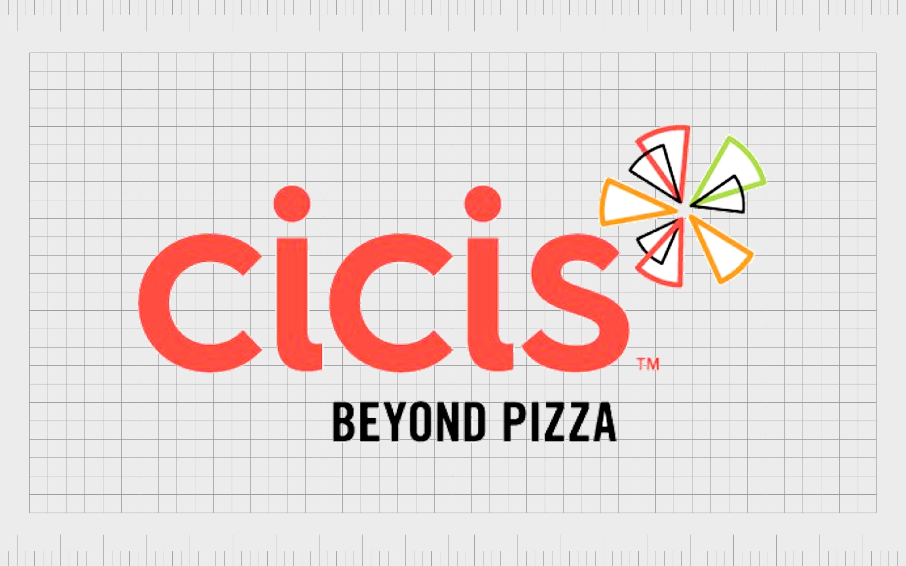
CiCi’s Pizza
Better known to most fans as simply “CiCis,” CiCi’s Pizza is an Italian American chain of buffet restaurants, specializing in pizza. The company owns restaurants in approximately 23 states.
Unlike most pizza restaurants, CiCi’s allows customers to simply choose from a pre-made selection of pizza slices after they pay their fee.
The CiCi’s logo highlights the unique nature of the brand with a creative and energetic orange wordmark and the tagline “Beyond Pizza.” The various triangular shapes combined to create the emblem for the company reference the variety of pizza types customers can select.
Find out more about the CiCi’s logo here.
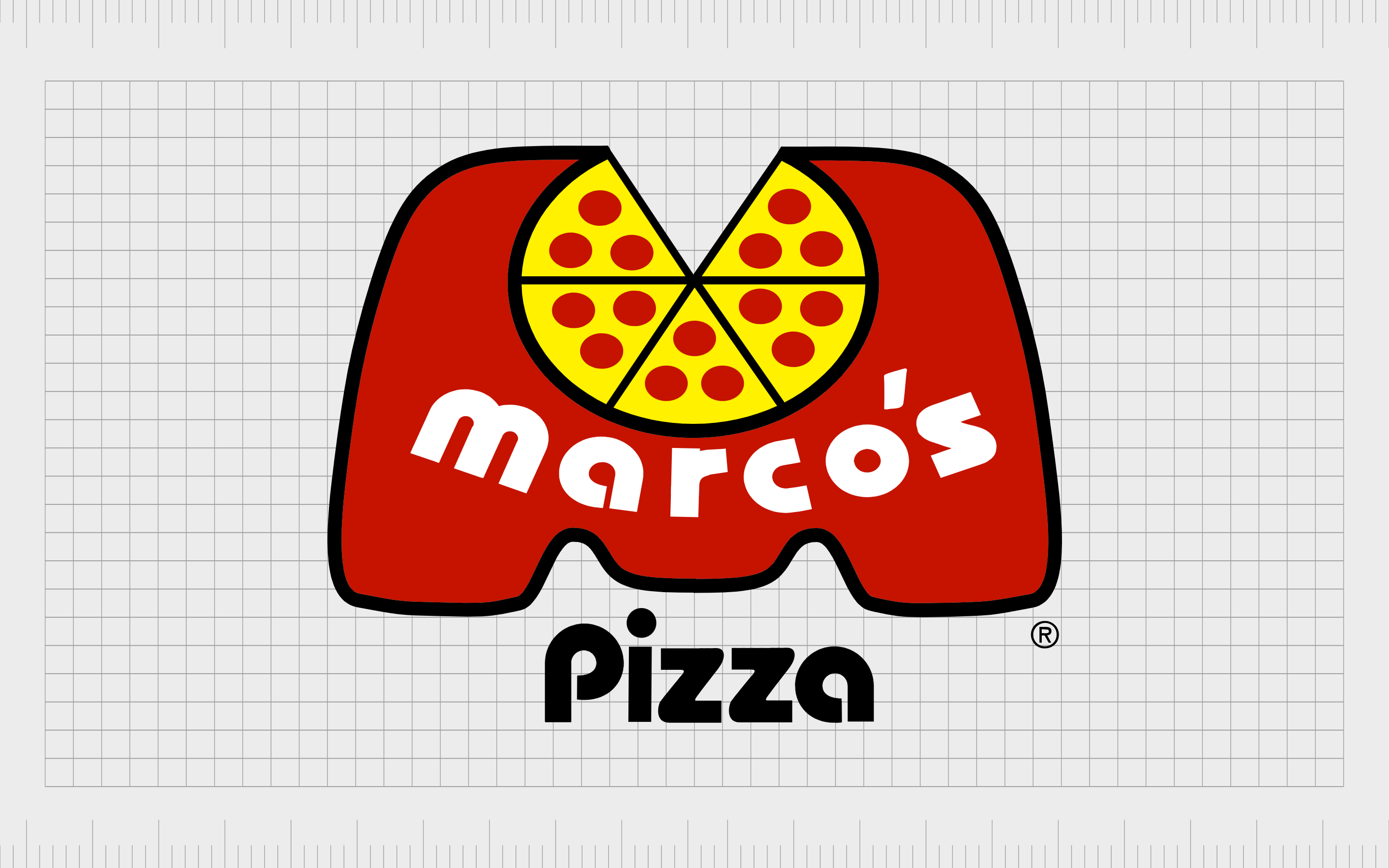
Marco’s Pizza
The name for Marco’s Pizza store comes from its founder, Pasquale Glammarco.
This American restaurant first launched in 1978 and has achieved significant acclaim over the years. Hundreds of these stores are located throughout America, and Marco’s Pizza was also ranked number 10 on the “Pizza Today” list in 2016.
The playful and friendly logo created by Marco’s Pizza is a combination mark.
A large bubbly M houses the word “Marco’s,” as well as the shape of a pizza with one slice removed. The word “pizza” appears just underneath the “M.” The modern typography and bold colors make the fast food restaurant stand out.
Find our more about the Marco’s Pizza logo here.

Papa Murphy’s
Papa Murphy’s was founded in 1995, starting with the merger of two other pizza stores, Murphy’s Pizza and Papa Aldo’s Pizza.
The organization is responsible for 1,300 outlets across the United States, UAE, and Canada. It is also the fifth-largest pizza chain in the United States and belongs to the MTY Food Group.
Simple and modern, Papa Murphy’s logo sidesteps a lot of the childish and playful visuals of many top pizza brand logos. Instead, the organization simply uses a red banner with a white background to depict the store’s name, plus the tagline “Take ‘n’ Bake Pizza.”
The stylized font combines a contemporary element with various flourishes to depict creativity.
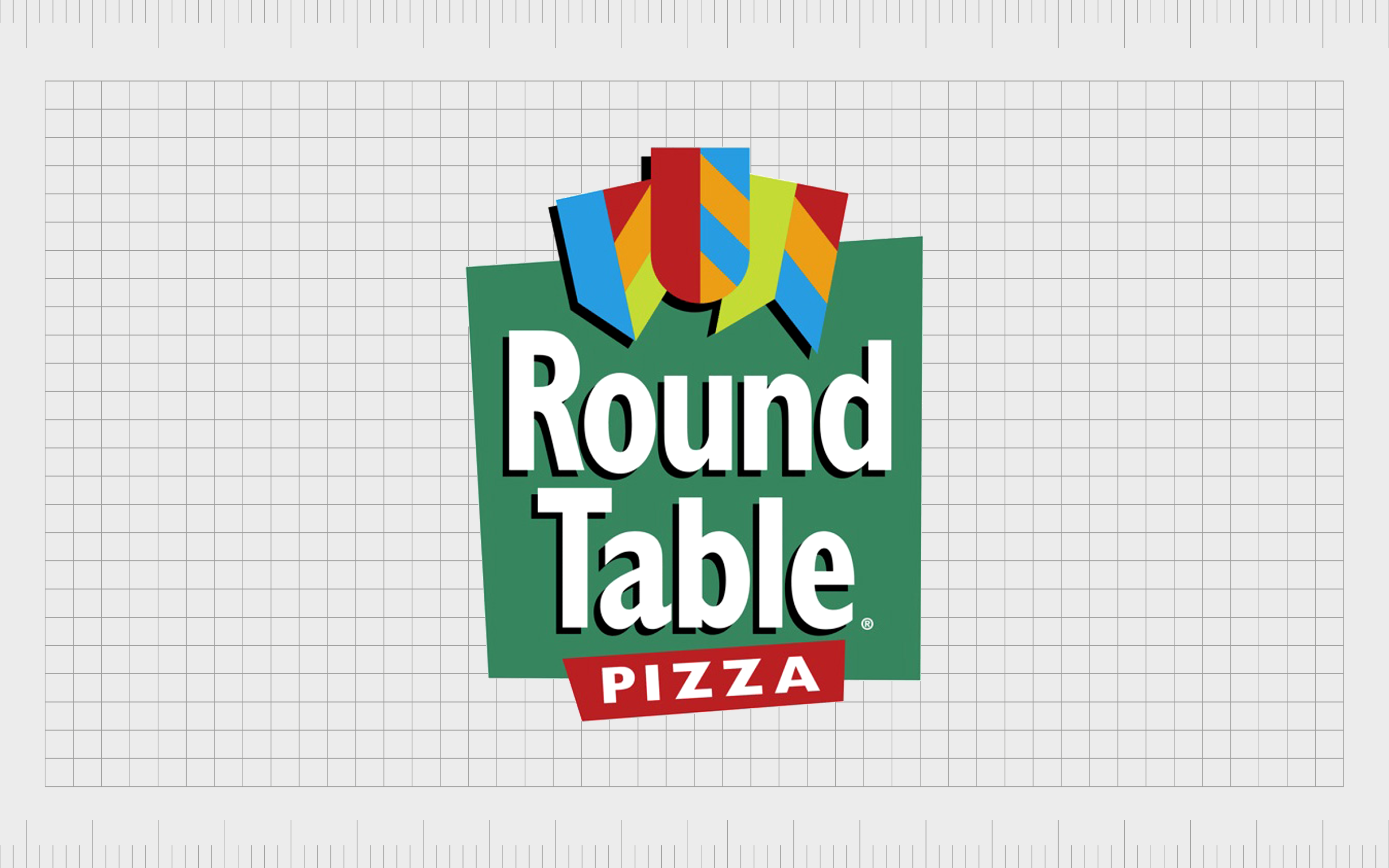
Round Table Pizza
Round Table Pizza is a famous pizza company operating mostly in the Western United States.
The organization operates in two formats. There’s a traditional series of restaurants selling pizza, salads, and beverages, and a “Clubhouse” option, with games for children, sports programming, and an expanded menu with craft beers.
Round Table officially rebranded on its 60th anniversary, adopting the motto “Pizza Royalty” and an eye-catching new logo. The image chosen by Round Table today features several colorful shields to remind us of the famous story of King Arthur and his round table.
The bright coloring and confident typography choices are excellent for grabbing customer attention.
Find out more about the Round Table Pizza logo here.
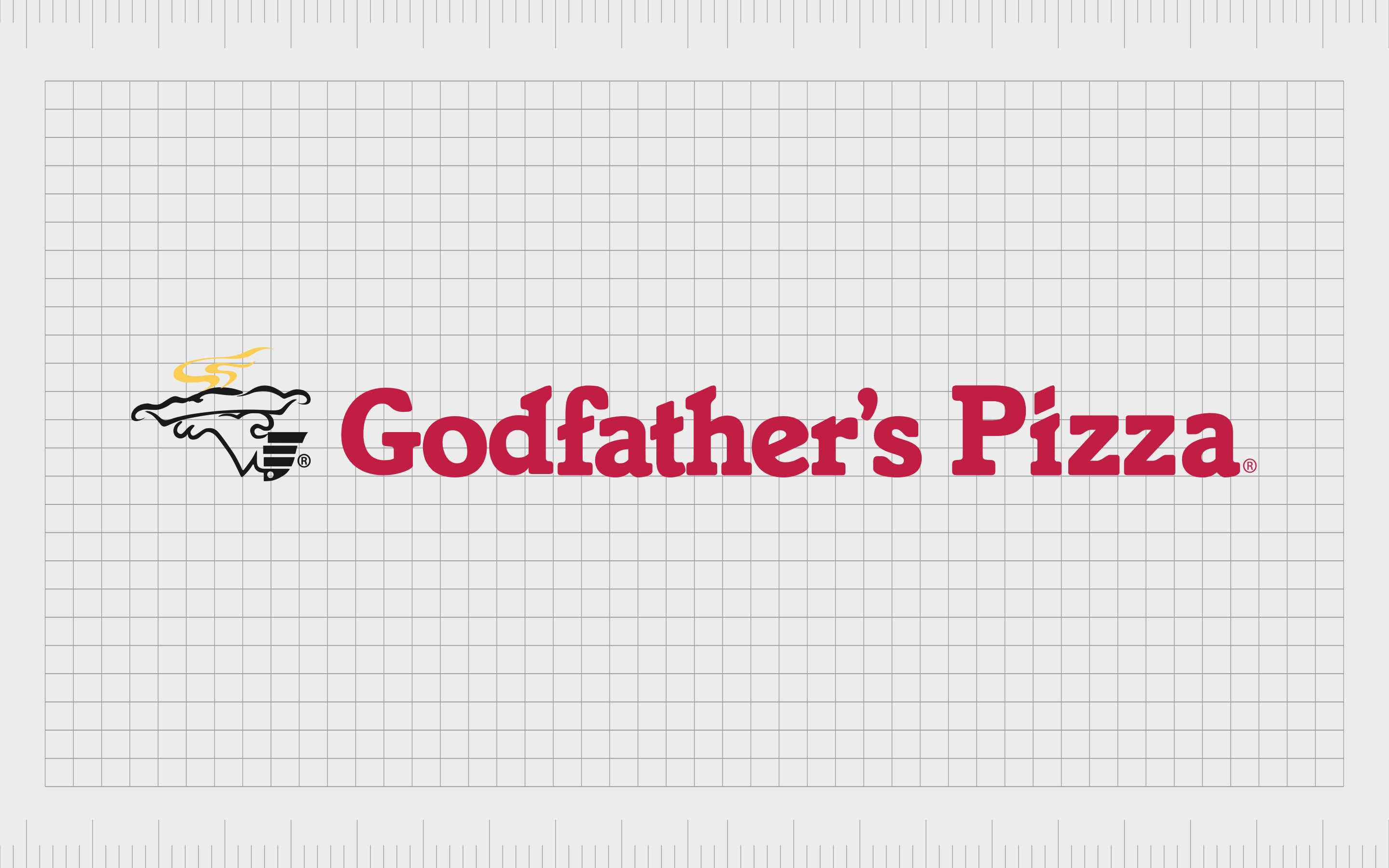
Godfather’s Pizza
A privately owned restaurant chain first launched in 1973, Godfather’s Pizza is one of the better-known organizations in the pizza world. The company has around 453 locations across the US and also operates in various Minit Mart and Speedway locations.
The logo for Godfather’s pizza is a little old-fashioned, but it still makes a statement among consumers. The combination mark features the company’s name in a bright red shade – popular among pizza brands.
There’s also a cartoon-style image of a hand holding a tray with a freshly-baked pizza on top.
Find out more about the Godfather’s Pizza logo here.
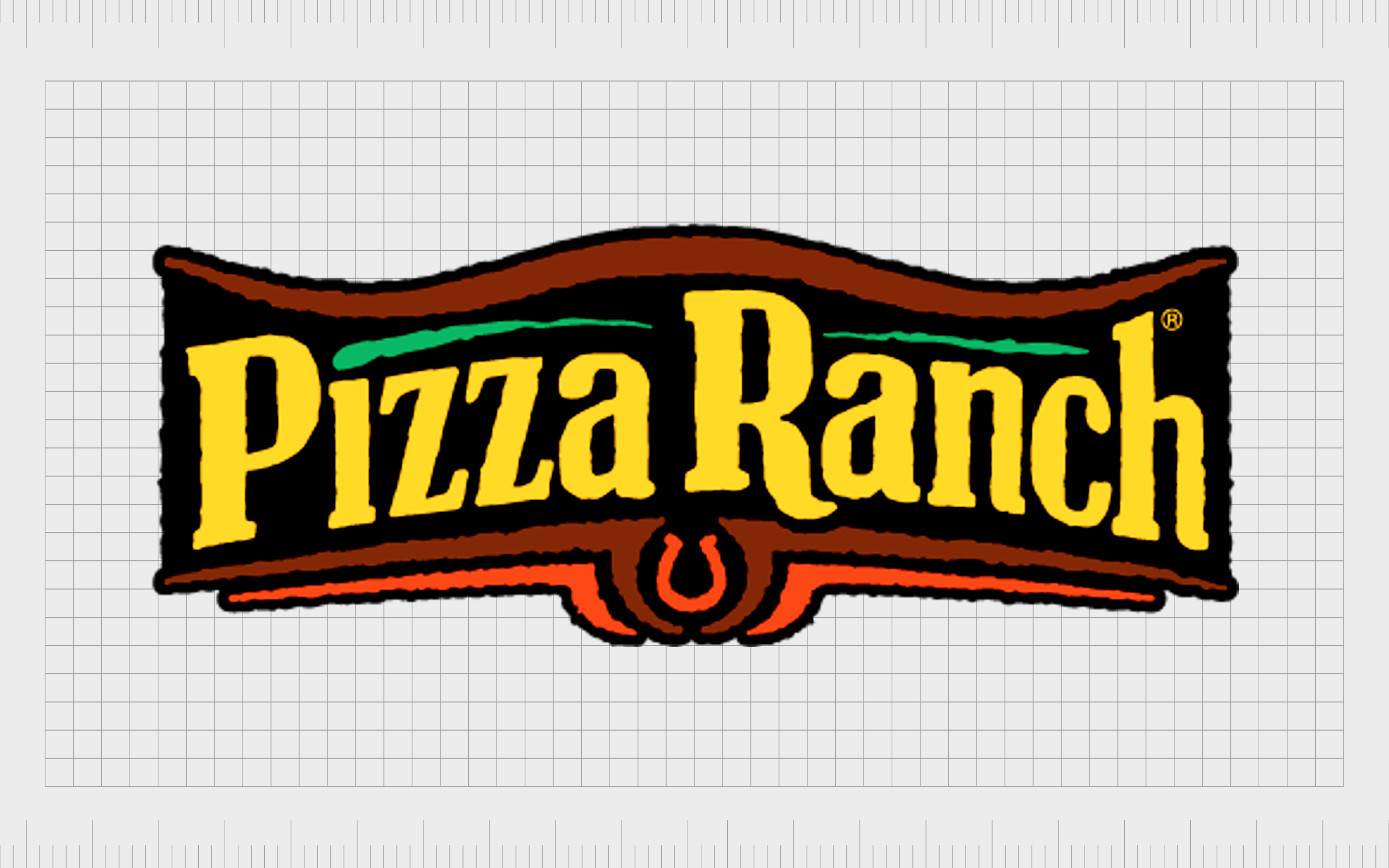
Pizza Ranch
Introduced as a Midwestern fast-casual pizza chain, Pizza Ranch launched in 1981, offering a range of pizzas, chicken dishes, and a salad bar. The company has over 200 locations throughout the United States.
Interestingly, this is a Christian-based company with a vision of “glorifying god.”
The image for Pizza Ranch is highly traditional, featuring a bright yellow wordmark on a banner-style background. The banner is in an old western style, highlighting the company’s heritage and unique visual identity. There’s also a horseshoe to remind us of the Midwestern origins.
Find out more about the Pizza Ranch logo here.
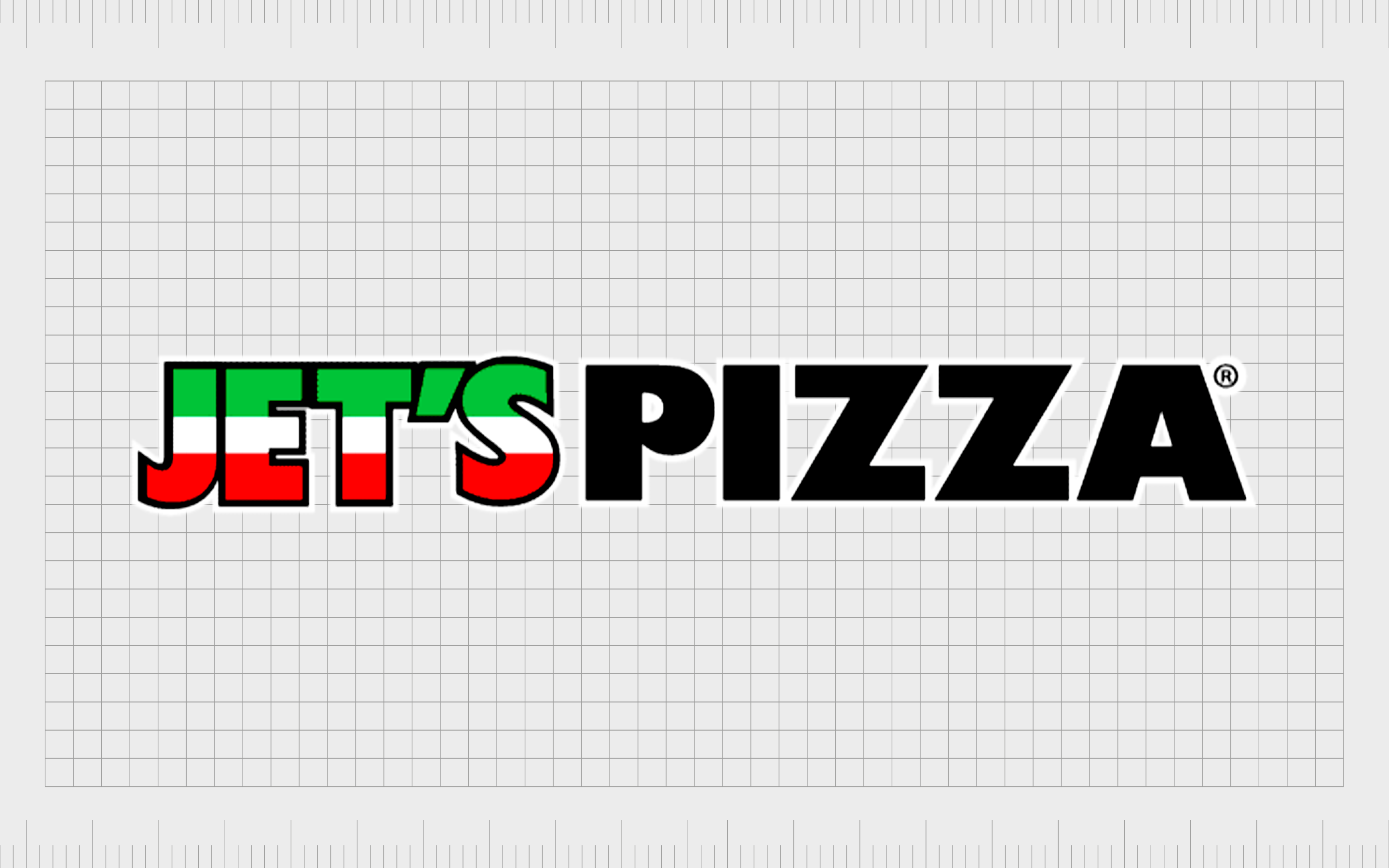
Jet’s Pizza
Another of the most popular pizza brand logos in the US today, Jet’s Pizza was introduced in 1978 in a Detroit suburb. The organization operates primarily in Michigan state. The business is named after the brothers who founded the company, John and Eugene Jetts.
Currently, this company has 390 franchises across 19 states.
Jet’s Pizza has a modern and simplistic logo updated from a previous all-red wordmark to highlight the Italian focus of the brand. The word “Jet’s” is depicted in the colors of the Italian flag, while the “Pizza” component is in bold all-black font.
Find out more about the Jet’s Pizza logo here.
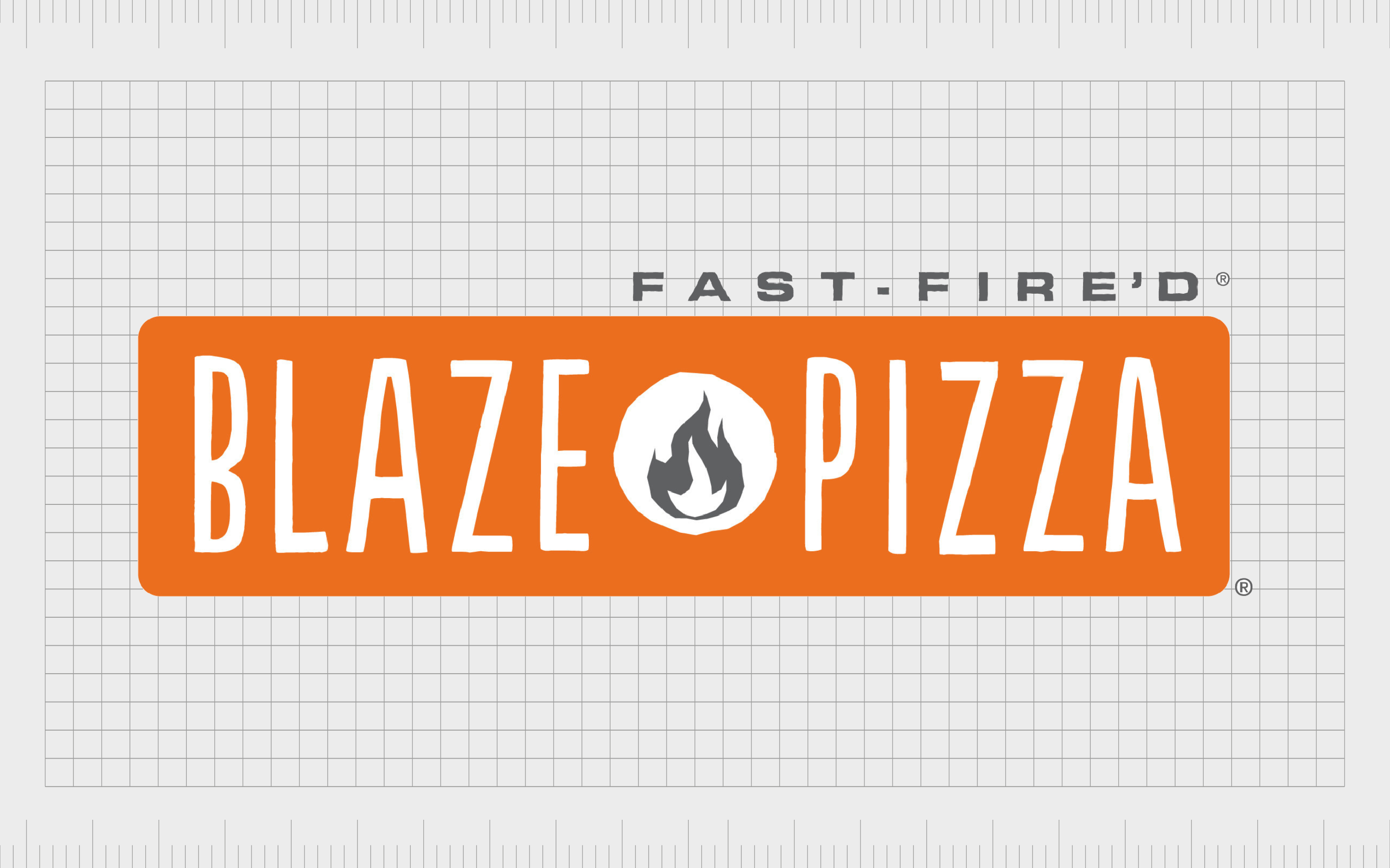
Blaze Pizza
Introduced in 2011 by Rick and Elise Wetzel from the “Wetzel’s Pretzel’s” company, Blaze Pizza was modeled after the successful made-to-order approach of Chipotle. The brand has also acquired a number of famous investors over the years, such as LeBron James.
Customers can choose all of the toppings, sauces, and cheeses they want on their pizza.
The high-powered ovens of Blaze Pizza are one of its main selling points and referenced in the company’s logo. The emblem features the business’s name in sleek sans-serif font on an orange background to demonstrate warmth and creativity.
The image of the burning fire in the middle of the emblem reminds us of the company’s fast baking techniques.
Find out more about the Blaze Pizza logo here.
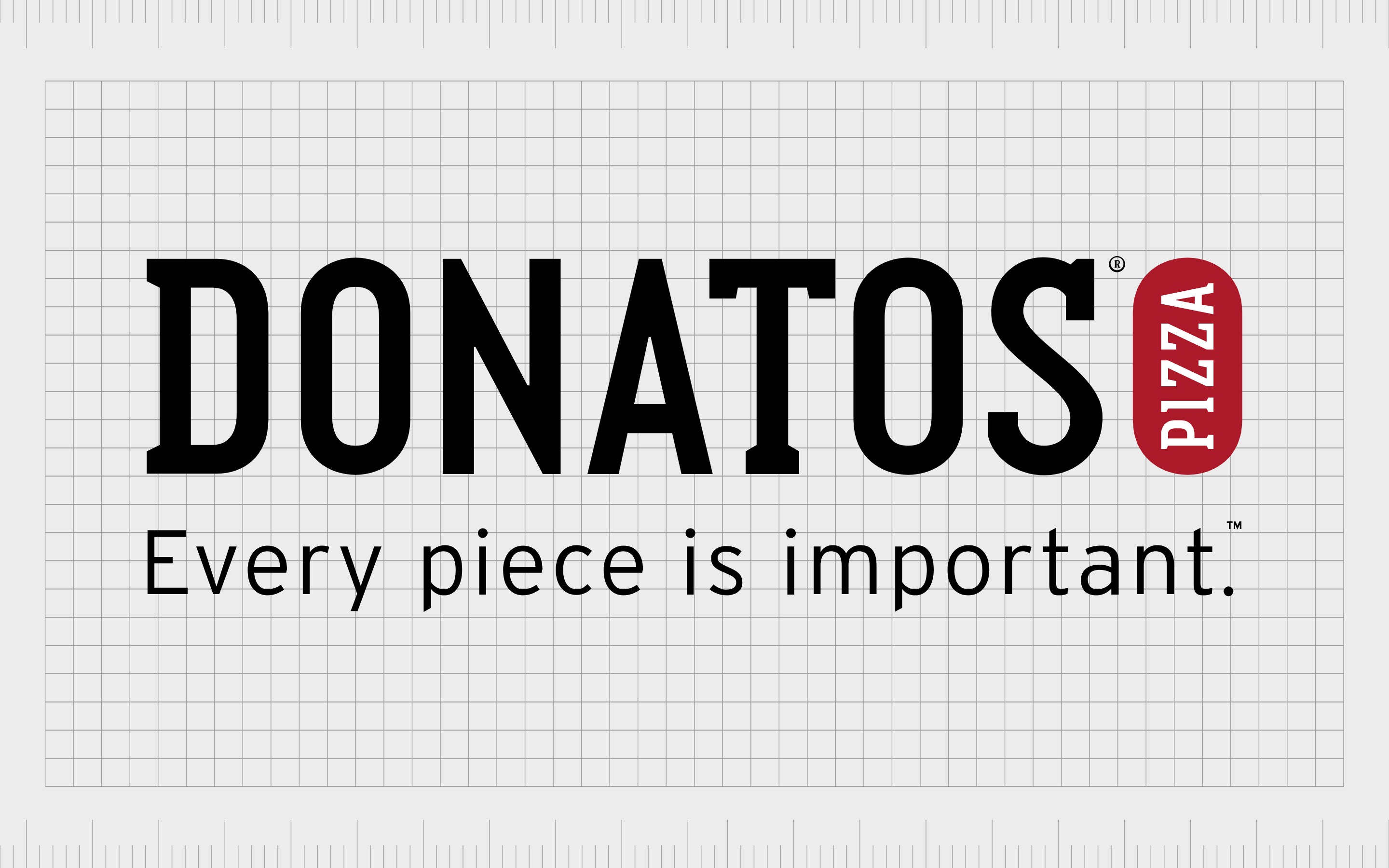
Donatos Pizza
A pizza delivery restaurant franchiser located in 11 states, Donatos Pizza was first launched in 1963 by Jim Grote.
The founder wanted to create a customer-focused pizza company committed to treating clients with the utmost respect. The brand aims to highlight this in its logo with the tagline, “Every piece is important.”
The most recent logo created by Donatos is a modern wordmark, written in simple serif font, to highlight the brand’s professionalism. The red coloring around “Pizza” helps to connect the company to the fast food landscape.
Find out more about the Donatos Pizza logo here.
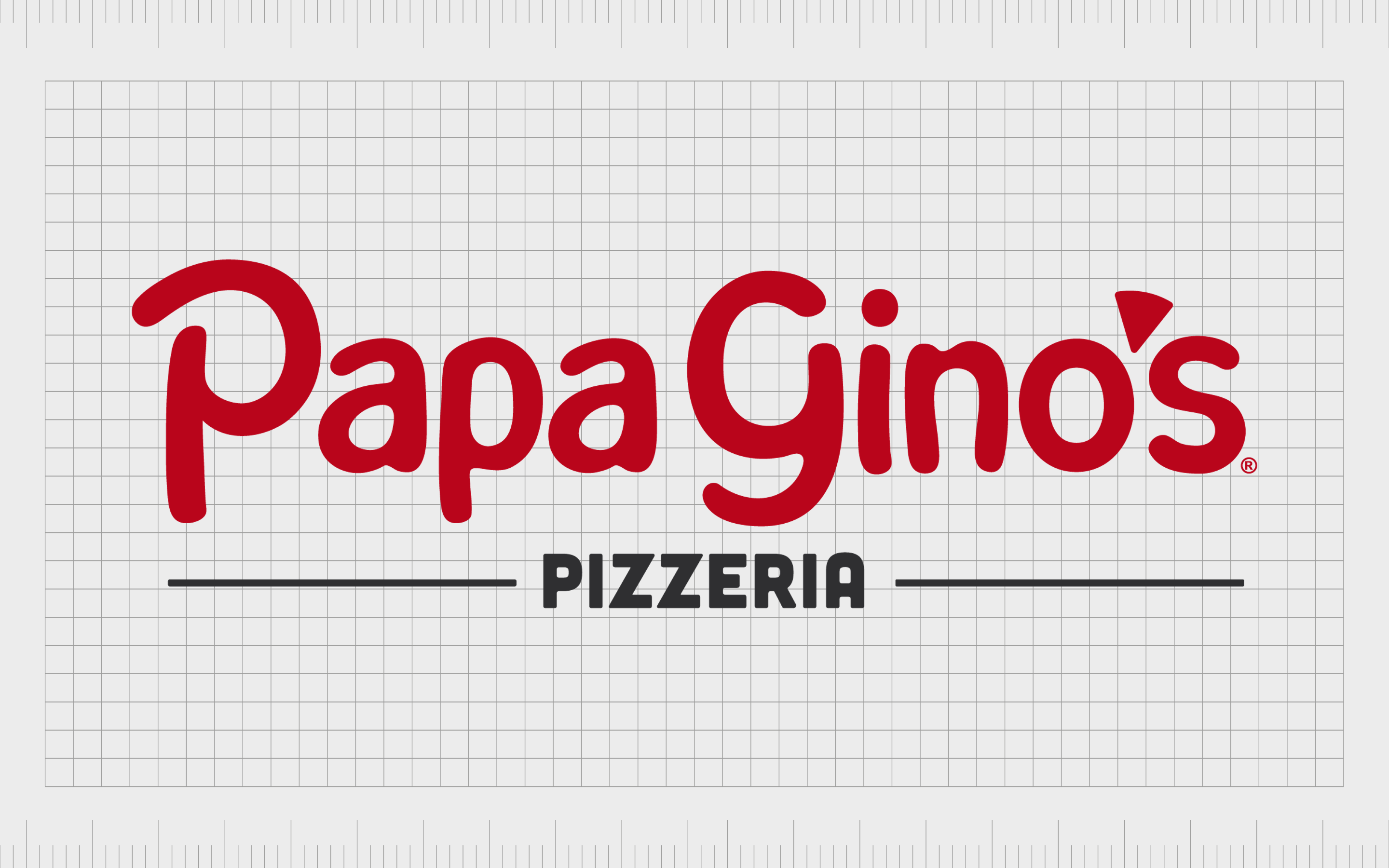
Papa Gino’s
Specializing in traditional thin-crust pizza, subs, and salads, Papa Gino’s is a slightly lesser-known pizza store within the United States. The company launched in Massachusetts in 1961 and now has around 81 locations throughout numerous regions.
The Papa Gino’s store started out as “Piece O’ Pizza,” before eventually changing its name to something the company considered to be more welcoming. The new title is the core of the company’s logo, where the apostrophe between the “o” and “s” in Gino’s is shaped to look like a slice of pizza.
The image is playful and fun with a modern twist.
Find out more about Papa Gino’s logo here.

Pizza Inn
First launched in 1958, Pizza Inn has one of the more old-fashioned pizza shop logos on this list.
The American restaurant started life in Texas, but now has more than 250 locations across the country. The company was also responsible for the “Pie Five Pizza” restaurant, famous for creating pizzas within as little as five minutes.
The pizza brand logo from Pizza Inn is simple and fun, featuring a playful wordmark with a man in a pointy red head spinning pizza dough above it. The image is designed to appeal to a younger audience thanks to its smiling mascot.
Find out more about the Pizza Inn logo here.
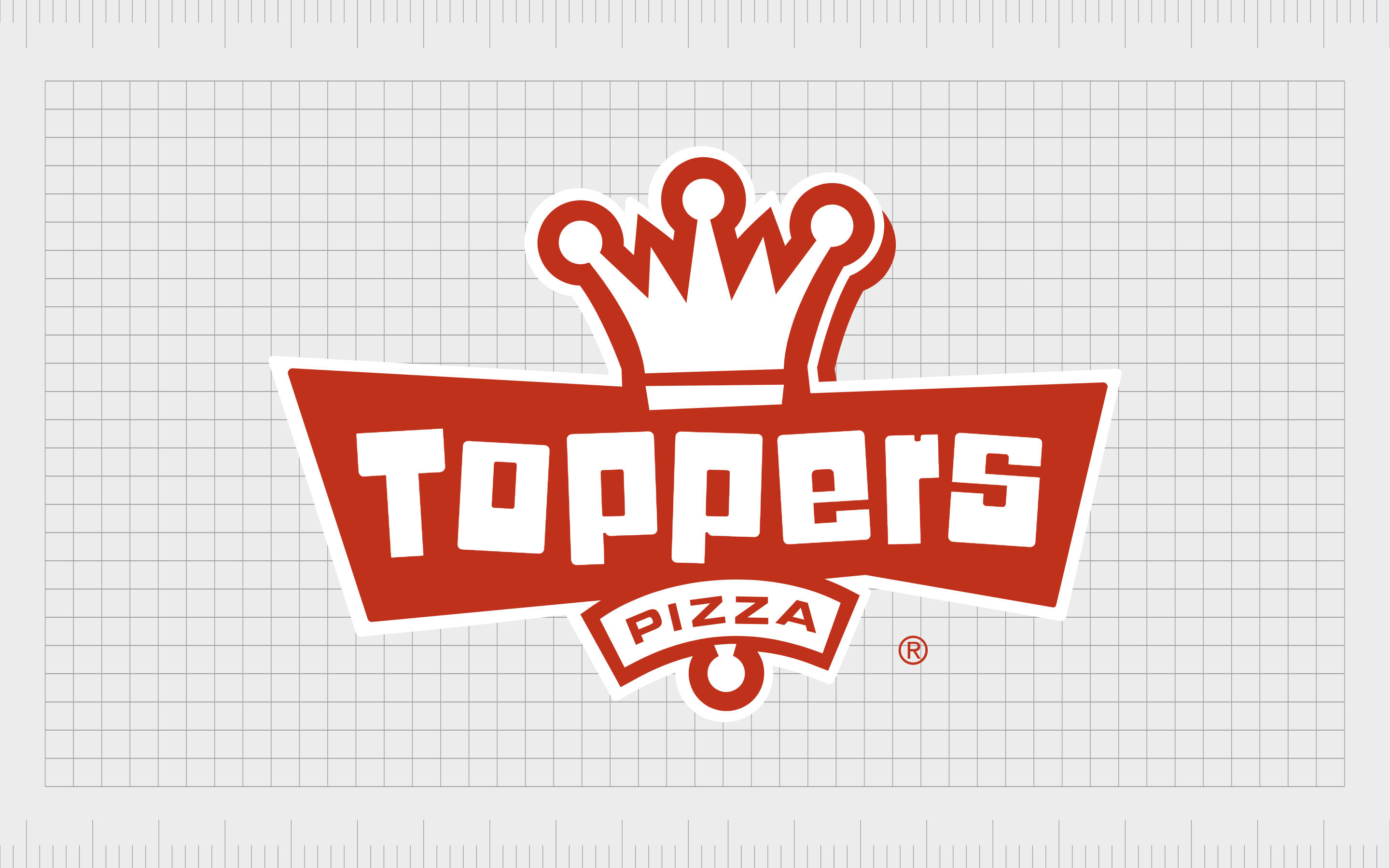
Toppers Pizza
Located in regions throughout the United States, Toppers Pizza first emerged on the market in 1991. The company’s target market is often college-aged students and young adults searching for fast and customizable pizzas.
The founder was actually once an employee at the Domino’s pizza franchise.
Topper’s Pizza has an interesting and eye-catching logo featuring the name of the company in block, bold letters, with a crown at the top of the emblem.
The pizza logo design is intended to be fun and quirky, with slightly disjointed letters seeming to jump around within the banner. The crown is a symbol many companies use to delineate exceptional service or quality.
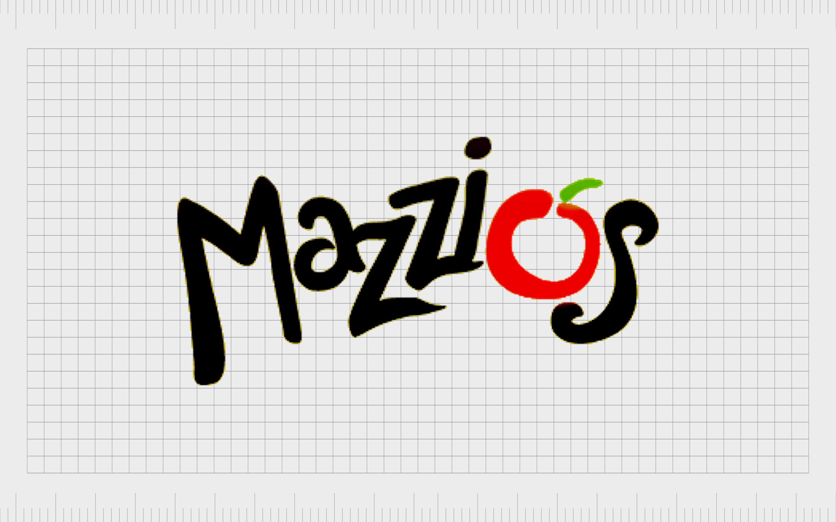
Mazzio’s
Mazzio’s is actually the name of the parent company responsible for a range of Italian eateries, including the Mazzio’s Pizza Company. The business started as a basic pizza parlor and was founded in 1961.
The organization specializes in everything from sandwiches and pasta to pizza and occasional specialty items.
Mazzio’s has quite a fun and funky logo for a pizza brand, featuring a playful wordmark with letters distributed in multiple positions to create a sense of movement. The “o” from Mazzio’s is designed in the shape of a tomato to draw attention to its pizza creations.
Find out more about the Mazzio’s Pizza logo here.

LaRosa’s Pizza
One of the most family-oriented pizza brand logos on this list, LaRosa’s pizza aims to attract a wide range of family groups across the United States.
The chain of pizzerias serves neighborhoods in various regions of the United States and was founded in 1954 by a number of partners. The company was originally called “Papa Gino’s,” but another brand purchased this name.
The LaRosa pizza logo design is a decorative banner-style image with sophisticated serif-style font featuring various eye-catching flourishes. The colors red, white, and green draw attention to the Italian routes of the food on offer.
The tagline “family pizzeria” helps the business connect with its intended target audience.
Find out more about LaRosa’s Pizza logo here.
Exploring famous pizza companies
Today, there are endless different pizza brand logos located throughout the United States, some more famous than others. Many of these logos share similar components, from fun and youthful font choices, to references to ingredients like tomatoes and cheese.
The colors green, red, and white are often common in the best pizza logos, as is the use of taglines incorporating extra information about the business into the image.
Many pizza brands also draw attention to their name with their logos, like Domino’s “domino” shape and the Pizza Hut logo with its iconic roof.
Hopefully, this guide has offered some useful insights into how pizza companies use their logos and how other food restaurants can leverage similar design practices.
Fabrik: A branding agency for our times.

Clarity starts with a conversation.
Thanks—we’ll get back to you shortly.
Whether you're navigating a rebrand, merger, or simply need a clearer identity—we’re here to help. No hard sell, just honest advice from people who know the sector.
Let’s start with a simple question…
Prefer to email? Drop us a line.
Fabrik’s been helping organisations rethink and reshape their brands for over 25 years. We’ve guided companies through mergers, rebrands and new launches. Whatever stage you’re at, we’ll meet you there.