


The changing faces of Cici’s Pizza: A look at Cici’s Pizza logo history
Most people aren’t familiar with Cici’s Pizza logo history. After all, there have been very few announcements about the company’s changing image in the media. However, like the emblems of many famous brands, the Cici’s Pizza logo has undergone a few evolutions.
Since launching in 1985, Cici’s Pizza has attempted to convey a fun yet professional identity with its image. Playing with various color palettes and font styles, the organization has used many strategies to disconnect its brand from the competitive market.
At present, Cici’s Pizza has one of the most recognizable and perhaps one of the most modern pizza logos in the market. But where did the image begin?
Today, we will be taking a closer look at the Cici’s Pizza brand and its visual identity over the years.
Did Cici’s change their name? Introducing Cici’s Pizza
Cici’s Pizza, otherwise known simply as “Cici’s,” is an American pizza restaurant known for selling buffet-style food throughout the United States. It was founded by Mike Cole and Joe Croce in 1985, and the first location opened in Texas, within the Coppell region.
By 1987, the organization had already begun to franchise, expanding out across America. By 2001, more than 363 restaurants were already in operation. During this time, the brand started investing heavily in remodeling its locations and building its brand appearance.
Cici’s never really had a “different” name, but it is better known to most people today as “Cicis” after the company dropped the apostrophe in 2015. During this time, the company went through a major rebranding process, which involved adding the modifier “Beyond Pizza” to its emblem.
What is the Cici’s Pizza slogan?
Most people know Cici’s for the “Beyond Pizza” tagline added to its logo.
The new slogan replaced the previous tagline of “Better. Believe It.” The new branding for the company in 2015 was intended to highlight the evolution of the business, which wanted to separate itself from other pizza restaurants and highlight its unique operation as a buffet-style restaurant.
Cici’s Pizza logo history: A look through time
Little information about Cici’s Pizza logo history is available on the web today. The company has invested heavily in reviving and repositioning its identity since 2015.
However, if we look a little closer at the years when Cici’s was “Cici’s Pizza,” we can see how the original imagery for the brand was relatively traditional for a pizza company.
1985
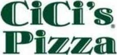
One of the earliest variations of the Cici’s Pizza logo was introduced in 1985 when the business was first launched. The design was relatively simplistic, featuring just a wordmark in a bold, serif-style font.
The typeface was executed in a dark shade of green, perhaps to remind us of herbs and fresh produce. Despite a relatively professional-looking font, the extra lines and embellishments on the glyphs said something about the brand’s fun personality.
2001
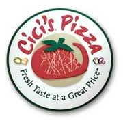
In 2001, Cici’s Pizza updated its logo with something a lot more interesting.
The standard wordmark was replaced with a round badge-style emblem featuring a tomato-shaped to look a little like a whale. In this version of the logo, the font was made a lot more fun and friendly, with a sans-serif typeface for the name of the company.
Underneath the name and the emblem, we see one of the first slogans introduced for the brand: “Fresh taste at a great price.” Small embellishments, such as outlines of peppers and mushrooms, can also be seen on the border for the design.
2006
In 2006, Cici’s simplified its badge-style logo, removing the detailed and textured tomato shape to replace it with a hand-drawn style emblem. The main image on the badge was a tomato surrounded by a green circle with three lines on either side.
The emblem was surrounded by a yellow, green, and white border. The tagline was removed, but the Cici’s Pizza wordmark remained much of its previous styling, with fun, sans-serif letters.
2015
In 2015, perhaps the most significant rebrand for the company was introduced. At this time, the word “Pizza” was dropped from the name, along with the apostrophe in “Cici’s.” Instead, the company chose to use the simple name “Cicis” on its own. This name was written in all sans-serif font.
The “Beyond Pizza” slogan was introduced beneath the wordmark, and a new graphic was positioned towards the top right of the image. This emblem featured a number of multi-colored triangles placed together to create an abstract version of a pizza.
Another version of the logo has also been introduced for some of the company’s marketing campaigns, which still includes the word “Pizza.” In this version, the emblem is a little bigger and brighter, and the font is a slightly brighter shade of red.
The Cici’s Pizza new logo: Fonts and colors
The Cici’s Pizza logo font today is perhaps one of the most modern and contemporary-looking emblems in the pizza landscape. It’s bright, colorful, and engaging, intended to appeal to a diverse audience and showcase the variety the company has to offer.
The various triangles included in the image may be a reference to the many different styles and flavors of pizza consumers can try when they visit a Cicis location.
The logo still features a lot of bright colors, chosen to attract attention and showcase its fun, youthful vibe. With its new emblem and simplified name, Cicis aims to position itself as a more forward-thinking company for a younger audience.
If you’re interested in viewing the Cicis logo in closer detail, you can find some useful resources here:
What color is the Cici’s Pizza logo?
As you can see from our exploration of Cici’s Pizza logo history above, the company has experimented with a handful of different shades over the years. Green and red, in particular, have long been core aspects of the Cici’s logo color palette.
Today, however, the Cici’s Pizza logo colors are a bright and fun collection of different shades, including bright red, green, orange, and black. There are variations of the Cicis logo, which either remove or invert some of the core colors.
The logo on the company’s website can appear in white font on a black background.
What font does the Cici’s Pizza logo use?
Like many food companies, Cici’s has experimented with a range of different font types over the years.
Today, the Cici’s Pizza logo font is a relatively simple sans-serif typeface, similar to Calibri. The main font used in the name of the company is bold and well-spaced, while the tagline typography is a little smaller and more compact.
Learning from the Cici’s Pizza logo
The Cici’s Pizza logo history outlined above shows how difficult it can sometimes be for a company to find the right brand identity.
While Cicis’ experimented with several different designs over the years, it didn’t fully commit to a long-lasting visual appearance until 2015, when the name and the majority of the branding were changed.
Today, the Cici’s Pizza logo stands as a modern, geometric emblem, ideal for setting the company apart from its competitors in the fast-food space. The design appears fun and contemporary and reminds us of the wide variety of flavors and food options the business has to offer.
Fabrik: A branding agency for our times.

Clarity starts with a conversation.
Thanks—we’ll get back to you shortly.
Whether you're navigating a rebrand, merger, or simply need a clearer identity—we’re here to help. No hard sell, just honest advice from people who know the sector.
Let’s start with a simple question…
Prefer to email? Drop us a line.
Fabrik’s been helping organisations rethink and reshape their brands for over 25 years. We’ve guided companies through mergers, rebrands and new launches. Whatever stage you’re at, we’ll meet you there.