


Donatos Pizza logo history: The story of the Donatos logo
Are you familiar with the Donatos Pizza logo? Today, this iconic image is quickly becoming one of the better-known emblems in the casual dining landscape. Fresh and modern, the design aims to capture the attention of a younger generation while demonstrating professionalism and strength.
While Donatos Pizza may not be as well-known as some other major pizza companies worldwide, the brand has generated significant interest in recent years. Growing through numerous partnerships and collaborative strategies, Donatos is quickly spreading across the US.
Despite launching more than 60 years ago, Donatos has only made a few changes to its visual identity. Today’s Donatos Pizza logo is based heavily on the company’s previous designs, though it has been simplified somewhat to correlate with new logo trends.
Today, we will examine the Donatos Pizza brand, its logo, and how it has evolved. Let’s dive in.
What is Donatos famous for? An introduction
Donatos Pizza is a restaurant franchise and pizza delivery company located in the United States. Though the headquarters for the business is located in Ohio, the group has opened numerous restaurant locations throughout 11 states in the US.
Donatos also partners with various venue outlets, such as the National Air and Space Museum and the Ohio Stadium.
In 1963, a man named Jim Grote purchased the original “Donatos” pizza brand located in Columbus for around $1,300. Grote began working on creating a pizza restaurant intended to outsell some of the most popular alternatives.
To accomplish this, he created a series of brand guidelines for his company, focused on delivering an exceptional product.
By 1991, Grote had begun offering franchise deals to other entrepreneurs throughout the US, leading to dozens of new locations opening across the country. Today, the company is best known for selling thin-crust pizzas with edge-to-edge toppings.
The large pepperoni pizza offered by the brand has 100+ slices of pepperoni.
Is Donatos owned by McDonald’s?
In 1999, Donatos was temporarily purchased by McDonald’s, as the major fast-food brand was looking for a way to get involved with the pizza landscape. However, Jim Grote and his daughter re-purchased a major share in the organization soon after, in 2003.
Donatos does still partner with a variety of businesses, however, including Red Robin.
Why is it called Donatos Pizza?
The name “Donatos” belonged to an existing pizza company in Ohio, at the time when Jim Grote was searching for an opportunity to start a new business. When the purchase was completed, Grote decided to maintain the original name to preserve the existing audience.
What is Donatos slogan?
Donatos has had a number of slogans associated with the brand over the years. Today, the best-known slogan for the brand is “Every Piece is Important.” This tagline aims to highlight the commitment of the brand to selling exceptional products.
In the past, Donatos has also used phrases such as “Go big or go home” to draw attention to their unique topping strategy.
Donatos Pizza logo history: Evolving through the years
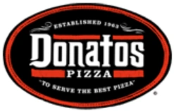
As mentioned above, there has only been a handful of changes to the Donatos Pizza logo over the years. For a significant portion of the company’s history, the team used the same badge-style logo, which included a tagline “To serve the best Pizza.”
The original, or “old,” Donatos logo was first introduced in 1963 and stayed with the brand for nearly 50 years. This emblem featured the name of the company in large, white font, with various decorative elements and sharp serifs. The name was placed in a black oval with a red and black border.
Alongside the name, we see the tagline for the business, as well as the date when it was officially established by Jim Grote.
In 2009, a new logo was introduced to draw attention to the company’s evolving menu options. This design eliminated the previous tagline, using the words “Pizza, Subs, Salads” instead. The Donatos typeface was updated to a fun sans-serif font with sharpened edges.
The “D” includes a point on the top, intended to make the design look more youthful and modern.
Alongside the change in tagline and typography, Donatos also introduced a new graphic, which included a white “D”, similar to the shape of a triangle, in a red rhombus shape. This design remained with the company for approximately eight years.
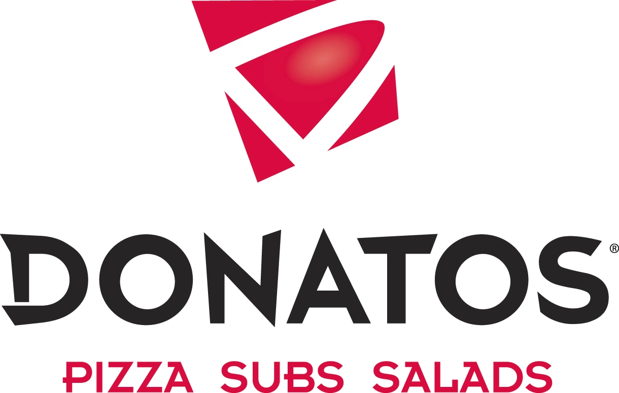
In 2018, the Donatos Pizza logo was updated for the third time in its history. The company decided to remove the “D” graphic, to create a simpler, more modernized design. In this version of the logo, the Donatos wordmark is depicted in a combination of serif and sans-serif glyphs.
The word “Pizza” has been placed alongside the word “Donatos” in a vertical oval shape. This may have been an attempt by the brand to make the visual identity more streamlined and compact. The new slogan, “Every Piece is Important,” also appears in sans-serif font at the bottom of the design.
Donatos Pizza logo: Fonts and colors
The visual identity of the Donatos Pizza logo hasn’t changed much over the years. The company has retained a lot of crucial elements, from an eye-catching wordmark to the use of red and black as the main color palette.
Today, the Donatos logo is a modern, minimalistic design intended to capture the attention of a younger audience. The use of various unique, decorative elements helps the emblem to stand out from the competition.
Using both sans-serif and serif glyphs within the font focus attention on the main wordmark, while the red “Pizza” element makes the company appear creative and modern. You can find some useful resources for the Donatos Pizza logo here:
What color is the Donatos Pizza logo?
Compared to other fast-food eateries and delivery companies, the Donatos Pizza logo colors are relatively simplistic. Throughout the years, Donatos has maintained most of the same color choices for its emblem, focusing heavily on red, white, and black.
The Donatos Pizza logo color palette today consists primarily of black for the wording on the design. The only splash of color appears in the red oval shape next to “Donatos.”
The dark red coloring is intended to showcase passion and power, while the colors of black and white demonstrate sophistication and professionalism.
What font does the Donatos Pizza logo use?
The Donatos Pizza logo font is unique to the brand. It’s an interesting typography that combines serif-style letters with simple, non-serif glyphs. The choice of font is intended to make the business appear more elegant, sophisticated, and professional.
The addition of various sans-serif components also draws attention to the company’s fun, youthful, and friendly nature.
Donatos Pizza logo: Every piece is important
Compared to other companies, the Donatos Pizza logo history is relatively short. The organization hasn’t changed its visual identity over the years. Most of the major logo changes above have focused on refining and modernizing the company’s image.
Today, the Donatos logo is a simplistic but effective design intended to grab the attention of younger audiences across the United States. Using a tagline within the logo helps make the company’s image more memorable and emotionally engaging.
Fabrik: A branding agency for our times.

Clarity starts with a conversation.
Thanks—we’ll get back to you shortly.
Whether you're navigating a rebrand, merger, or simply need a clearer identity—we’re here to help. No hard sell, just honest advice from people who know the sector.
Let’s start with a simple question…
Prefer to email? Drop us a line.
Fabrik’s been helping organisations rethink and reshape their brands for over 25 years. We’ve guided companies through mergers, rebrands and new launches. Whatever stage you’re at, we’ll meet you there.