


MOD Pizza logo: A symbol of fresh, fast, and customizable pizza
If you’re not familiar with the MOD Pizza logo yet, the company’s rapid expansion suggests you soon will be. Founded in 2008, MOD has rapidly taken the fast-casual pizza landscape by storm with its unique brand mission and visual identity.
But most people still aren’t familiar with MOD Pizza logo history or how the company got its unique brand emblem.
MOD Pizza is one of the more modern pizza brands in the world today.
It takes a unique approach to pizza production, focusing not just on customization and innovation but ethics too. As of 2021, there were more than 500 MOD pizza locations across Canada and the US, and the organization is still growing incredibly.
If you’ve ever seen the MOD Pizza emblem and wondered where it came from, or you simply want to understand the MOD Pizza brand strategy, you’re in the right place.
Today, we will look closer at the MOD brand and how it has evolved over the years.
The MOD Pizza logo: An introduction to MOD
Before we dive into our assessment of MOD Pizza logo history, it’s worth learning a little more about the pizza brand itself. Introduced in 2008 by Scott and Ally Svenson, MOD Pizza is a company that claims to be more about people than food.
The name “MOD” stands for “Made on Demand” and references the company’s commitment to creating customized foods for its audiences.
Customers can choose exactly which ingredients they want to include in their order and even watch the preparation process. However, there are recommended combinations available too. Part of what makes MOD such a competitive brand is its commitment to ethics and sustainability.
Not only does the organization focus on organic food, but it also showcases a number of key brand values.
MOD Pizza consistently pays employees living wages and donates to non-profit organizations. When the company was first launched, it was inspired by the founders’ trip to Italy, where they watched their pizza maker create custom orders for each consumer.
The Svensons saw an opportunity to bring the same experience to America, and MOD was born.
By 2013, the chain was named one of the top breakout brands in the United States. By 2014, the company had 31 locations and secured $15 million in private investment. In 2015, the business began a rapid expansion project and later began branching into the UK.
However, all MOD Pizza locations in the UK were subsequently closed in 2020.
What is MOD Pizza’s slogan?
The MOD Pizza brand is dependent on a lot more than just a logo. The MOD Pizza slogan, “The More You Eat, the More You Earn,” is a reference to the company’s people-first business model.
This mission starts with careful hiring practices, which have allowed the company to both consistently provide living wages and hire professionals from a range of different backgrounds.
MOD also focuses heavily on serving local communities. The “MOD Squad” initiative provides grants to members in crisis, as well as professional development and educational opportunities.
There are also programs in place that allow MOD to contribute to a range of non-profit organizations and causes. MOD has even delivered more than 6.2 million meals to food banks.
Mod Pizza logo history: MOD Pizza logo meaning
Unlike many relatively well-known pizza brands, MOD Pizza hasn’t made many changes to its logo over the years. The emblem used by the company in its branding today is still almost the same design introduced at the beginning of the organization’s inception.
This could be a deliberate move by the company. After all, a large part of MOD’s branding strategy revolves not around its visual image but its commitment to building an ethical identity.
The business isn’t heavily invested in visual branding or promotional efforts but instead focuses on building a strong reputation through its actions in local and global communities.
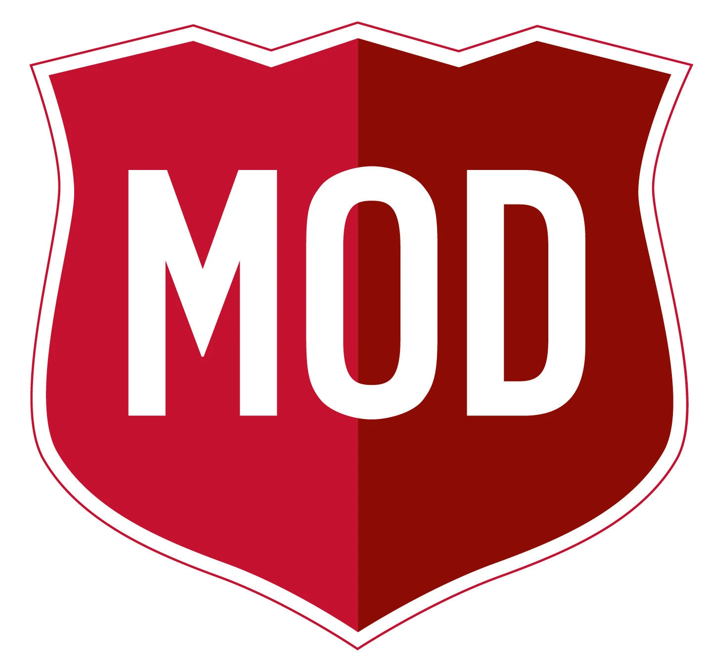
The official MOD Pizza logo, first introduced in 2008, featured the shield we know today, depicted in two shades of red, with the letters “MOD” in white, block font. This version of the logo was surrounded by a white and red border, which was later removed to create a more minimalistic image.
The current MOD Pizza logo is almost exactly the same as its predecessor, featuring the same bold colors (though a little darker) and the same style of font. Only the outline has been removed.
The shield-shaped emblem is important here. It’s the company’s way of showing its customers its commitment to not just quality but protecting the world we live in.
The design is also intended to look a little like a heart to demonstrate caring and compassion. This is enhanced by the deep red color palette, which is often associated with confidence and passion.
The decision to use the color white in the font not only offers fantastic contrast but also conveys ideas of virtue, purity, and excellence.
However, there are instances of the MOD Pizza logo which feature no white wordmark at all. In these variations, often placed on websites and apps, we see a block-color version of the two-tone shield, with the name alongside the emblem.
What does the MOD Pizza logo mean? Colors and fonts
Though the MOD Pizza logo may not have changed much through the years, it does offer an excellent insight into the company’s vision, mission, and history.
MOD has built its entire brand around a carefully cultivated purpose. The company wants to appear as more than just another fast-food company to its customers.
MOD Pizza is a business with a big heart, represented in part by its red emblem.
The organization focuses heavily on giving back, not just to its customers and employees, but to the communities it serves too. The shield and heart-shaped emblem used by the business are a sign of its commitment to protecting, serving, and supporting the world.
Everything from the color palette used by MOD Pizza to its unique approach to marketing helps to highlight the company’s cause and core values.
If you want to take a closer look at the MOD Pizza logo, you can find some useful resources here:
What color is the MOD Pizza logo?
The MOD Pizza logo colors are one of the most compelling aspects of the brand’s emblem. The color red is common in the food industry because it’s often associated with passion, confidence, and energy. It’s also a shade that many experts believe can stimulate the appetite.
However, the MOD pizza logo color also aims to send another message. It helps to link the emblem with a heart, a shape we frequently connect with love and compassion.
In most cases, MOD Pizza uses a combination of two shades of red, one slightly darker than the other, to give the shield emblem a sense of depth. However, there are instances of the logo which include one block color.
The emblem is commonly accompanied by a wordmark, depicted either in white or black.
What font does the MOD Pizza logo use?
The MOD Pizza logo font is simple but effective. Intended to be easy to read and recognize in any environment, the logo is written in a sans-serif, bold font. The letters are evenly spaced and fit perfectly into the shield emblem.
The exact typography used for the MOD pizza logo hasn’t been announced by the brand, unfortunately.
Learning from the MOD Pizza logo
Looking at MOD Pizza logo history, we can see the company hasn’t made many significant changes to its visual identity over the years. For the most part, the MOD image has remained relatively consistent.
Since its inception, MOD has been represented by a combination mark featuring the company’s name, combined with a shield-style graphic.
The shield shape is intended to represent protection and a commitment to serving communities. It’s also shaped like a heart to remind us of the company’s compassion. Overall, MOD’s logo is engaging, heartfelt, and meaningful, as well as being wonderfully modern.
Fabrik: A branding agency for our times.

Clarity starts with a conversation.
Thanks—we’ll get back to you shortly.
Whether you're navigating a rebrand, merger, or simply need a clearer identity—we’re here to help. No hard sell, just honest advice from people who know the sector.
Let’s start with a simple question…
Prefer to email? Drop us a line.
Fabrik’s been helping organisations rethink and reshape their brands for over 25 years. We’ve guided companies through mergers, rebrands and new launches. Whatever stage you’re at, we’ll meet you there.