


Hungry Howie’s logo: The history of the Hungry Howie’s Pizza logo
Are you family with the Hungry Howie’s logo? For many consumers across the United States, the emblem is an easily recognizable symbol of the fast-food landscape. However, few people have in-depth knowledge of Hungry Howie’s logo history.
Designed to attract younger audiences with a fun and playful personality, the Hungry Howie’s logo consists of several carefully chosen elements. Alongside the bright and eye-catching red, yellow, and blue colors, the sign also includes its mascot: Hungry Howie himself.
The unique Hungry Howie’s has taken to branding has helped it to stand out in an increasingly cluttered landscape brimming with quick-service restaurant options.
If you’ve ever found yourself wondering about the branding strategies used by famous pizza brands and you’d like to learn more about Hungry Howie’s visual identity, you’re in the right place.
Today, we’ll be taking a closer look at the Hungry Howie’s company, its eye-catching logo, and how it continues to differentiate itself from its market competitors.
Why is it called Hungry Howie’s? An introduction
Hungry Howie’s, otherwise known as Hungry Howie’s Pizzas & Subs, is a franchise company, as well as the 11th biggest pizza chain in the US.
Currently boasting more than 550 locations, the business specializes in flavored crust pizza, as well as various calzone-style subs, tenders, chicken wings, breads, brownies, and salads.
The first Hungry Howie’s restaurant was opened in Taylor, Michigan, in 1973.
According to the history of the company, the name “Hungry Howie’s” came from a nickname. The name was given by Steve Jackson, the delivery driver for the first restaurant, and co-founder of the business, given to Jim Hearn, the other co-founder.
The pizza restaurant quickly became a popular location for students from the Taylor Center and Taylor Junior High schools. In 1982, Hearn and Jackson eventually decided to franchise the operation. Within three years, 65 new locations had emerged. By 1990, this number had grown to 160.
Over the years, the company has built its brand reputation not just on its unique menu but also on its approach to serving communities and non-profit organizations. The company has been raising funds on behalf of the National Breast Cancer Foundation since 2009.
What is Hungry Howie’s slogan?
The slogan most people associate with Hungry Howie’s is “Home of the Flavored Crust Pizza.” This slogan is based on one of the company’s top-selling menu products. Flavored crust options currently offered by the restaurant range all the way from butter cheese and ranch to sesame and garlic herb.
The phrase “Flavored Crust Pizza” also appears on the official Hungry Howie’s logo, further adding to the unique brand identity and differentiating the company from its competition.
The Hungry Howie’s logo history
Much of the Hungry Howie’s logo history is steeped in mystery, as many of the previous designs created by the company are no longer available to view today. While aspects of the brand’s visual identity have changed over the years, there are some consistent components.
For instance, The Hungry Howie’s mascot, which features a young man or boy, has been a common part of the brand identity since its inception.
1973
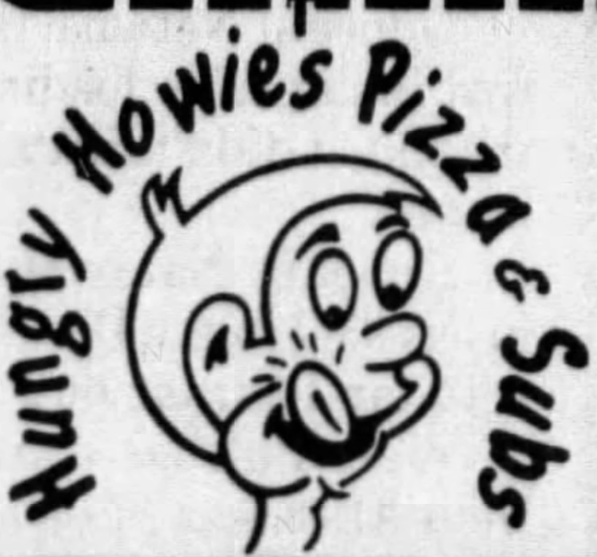
The oldest Hungry Howie’s Pizza logo still in circulation may have emerged sometime around the initial foundation of the brand. It featured the company’s mascot, appearing to lick his lips while looking down at what was probably intended to be a pizza.
The name “Hungry Howie’s Pizza & Subs” was written in a fun sans-serif font, curved around the mascot.
1985
In 1985, the Hungry Howie’s logo was updated slightly. The head of the young mascot was placed on top of a pizza image, making it appear as though he was bursting through the crust. The font was changed somewhat in this design.
The name of the company appeared in a 3-dimensional serif font, with letters that seemed to bounce off the page.
The “Pizzas & Subs” element of the design was written in a simpler, serif style font, all in one line and all in uppercase letters.
Another variation of this logo was introduced in 1988, which featured a slightly darker colored pizza and larger, bolder letters. In both instances, the sign was surrounded by a dotted black and white outline, perhaps intended to look like the lights on a diner.
1993
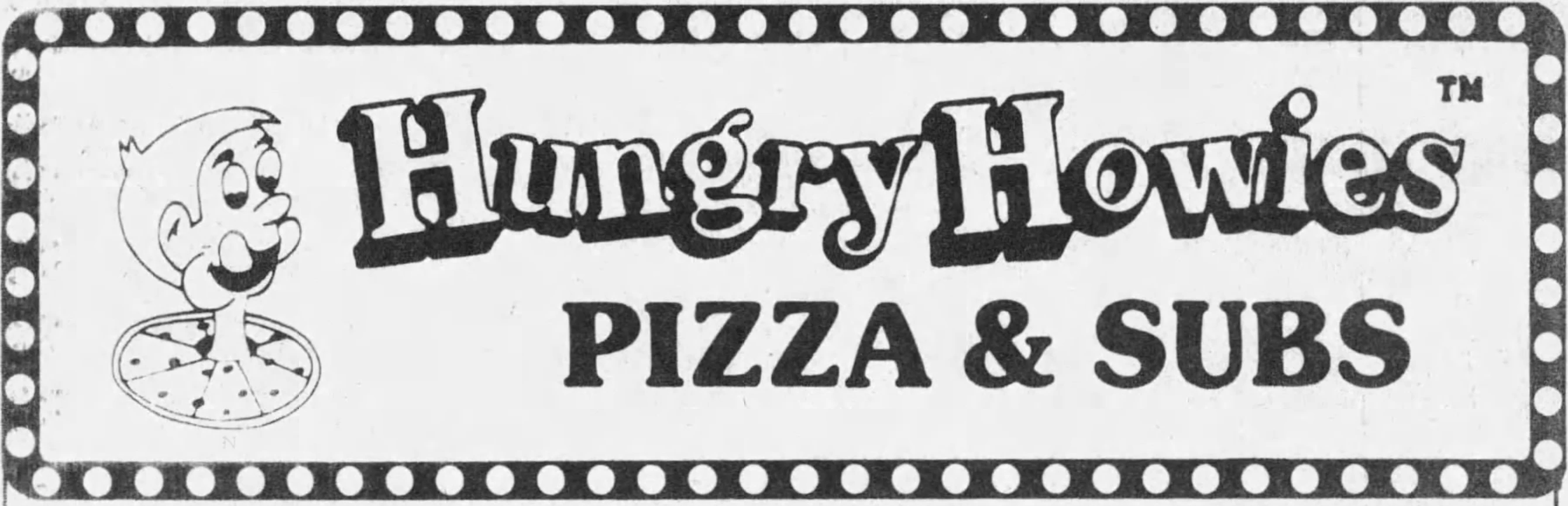
In 1993, a more complex version of the Hungry Howie’s Pizza logo emerged. There were two variations of the design, one with all of the words for “Hungry Howie’s Pizza” on one line and one which used a multi-tiered effect.
Next to the bouncy wordmark, the company placed its mascot inside of a circle badge, which featured the words “Flavored Crust Pizza.” The word “Original” was also placed over the top of the emblem in stylish, cursive font.
In this version of the logo, the core colors of the Hungry Howie’s Pizza company were introduced, featuring bright yellow and brown as the two main shades.
2010
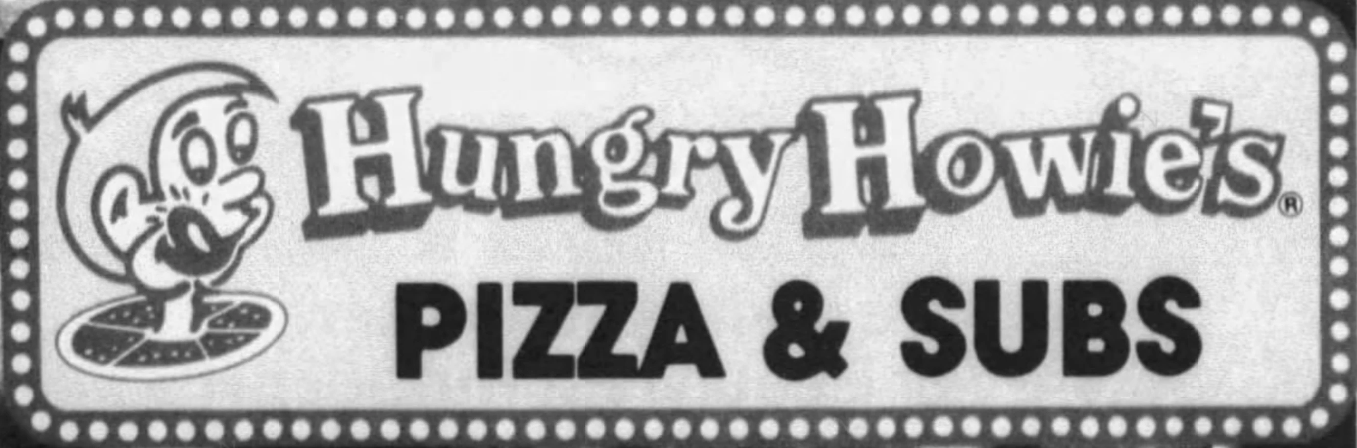
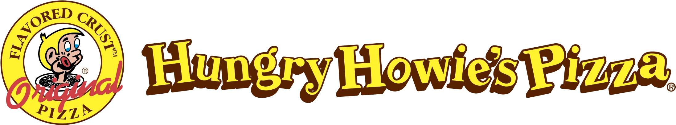
The most recent version of the Hungry Howie’s Pizza logo was introduced in 2008. Compared to many pizza logos today, this design is relatively complex and features many different elements. The mascot still appears in a circle emblem, though the pizza beneath him has been removed.
The wordmark in the design, which sometimes appears on one line and other times on two, is depicted in a bright yellow gradient. We still see the bouncy letters from previous designs, as well as the serif-style font choice.
The “Flavored crust pizza” component of the brand identity has been introduced here in a red, curved banner just beneath the wordmark.
The Hungry Howie’s logo: Fonts and colors
Today, the Hungry Howie’s logo is a compelling variation of the original design created for the company. Many of the core aspects of the visual identity remain consistent, including the bouncy font choice and the company’s mascot.
However, the mascot and the color palette for the company have been refined significantly over the years.
Today, the overall image looks a lot more professional and refined. However, it still conveys the unique personality of the company, making it appear fun and playful. One of the core selling points of the brand is also evident in this design.
If you’d like to explore the Hungry Howie’s logo in closer detail, you can find some helpful resources here:
What color is the Hungry Howie’s logo?
For a while, many of the initial Hungry Howie’s pizza logo designs were depicted in a simple black-and-white palette. However, the design was updated over time to feature more fun, eye-catching colors.
The shades of yellow and red are intended to remind us of pizza. These shades are also known for having a stimulating effect on the appetite, which has made them popular in the fast-food industry.
The Hungry Howie’s logo colors make the company seem bright and youthful. Yellow is a color we associate with happiness, while red is connected to confidence and passion. Additional shades in the Hungry Howie’s logo color palette, such as black and white, help to enhance the overall image.
What font does the Hungry Howie’s logo use?
The Hungry Howie’s logo font options consist of two different designs. The first is a heavy slab serif font, intended to look as though it’s bouncing off the page. It’s similar in style to the Vista Slab Black font and gives the company a joyful, convivial appearance.
The secondary font, used to depict the “Flavored Crust Pizza” tagline, is a simple, all-uppercase sans-serif typeface.
The playful Hungry Howie’s Pizza logo
The Hungry Howie’s logo history provides an insight into a playful, youthful, and fun-loving brand targeted at younger audiences. Over the years, many aspects of the Hungry Howie’s logo design have been refined and updated, but the overall personality remains the same.
Today, the design aims to capture audiences’ attention with compelling fonts and bright colors. Additionally, it positions Hungry Howie’s as a competitor in the fast-food space, with shades most customers are sure to recognize instantly.
Thanks to the addition of the unique mascot, Hungry Howie’s had made a powerful visual identity for itself, sure to stand the test of time.
Fabrik: A branding agency for our times.

Clarity starts with a conversation.
Thanks—we’ll get back to you shortly.
Whether you're navigating a rebrand, merger, or simply need a clearer identity—we’re here to help. No hard sell, just honest advice from people who know the sector.
Let’s start with a simple question…
Prefer to email? Drop us a line.
Fabrik’s been helping organisations rethink and reshape their brands for over 25 years. We’ve guided companies through mergers, rebrands and new launches. Whatever stage you’re at, we’ll meet you there.