


Introducing JoJo: A guide to Pizza Inn logo history
For many pizza lovers, the Pizza Inn logo is a staple of nostalgia and comfort.
First introduced in the late 50s, the brand has been growing and evolving for over 65 years. During this time, the Pizza Inn visual identity has gone through several changes intended to highlight the brand’s unique personality and character traits.
Like many famous pizza firms, Pizza Inn has spent much time crafting an image that appeals to as many consumers as possible.
Alongside its logo, the company has introduced an endearing mascot (JoJo) and some unique architectural and marketing design schemes to attract more audience attention.
If you’ve ever wondered about the JoJo Pizza Inn logo or simply want a behind-the-scenes insight into how the company’s branding has evolved over the years, you’re in the right place. Here’s your guide to Pizza Inn logo history.
Who is the founder of Pizza Inn? An introduction
Pizza Inn is a restaurant chain primarily focused on serving pizzas, headquartered within The Colony in Dallas, Texas. The company was first created in 1958, when two brothers, R.L. and F.J. Spillman, opened their first location in Dallas.
By the middle of the 80s, the chain had begun a commercial deal with the Von Erich family, which allowed for the creation of various TV commercials.
By 2011, Pizza Inn had launched its first fast-casual restaurant (Pie Five Pizza), specializing in custom pizzas made within five minutes. At the end of the year, the company had expanded across 5 locations, and by 2015, that number had grown to 31 locations.
Over the years, Pizza Inn has significantly extended its footprint, opening the first of five Chinese locations in 2011 and spreading into various states across the US.
In 2015, the parent company for Pizza Inn (Pizza Inn Holdings) rebranded to the “Rave Restaurant Group” as Pie Five locations began to increase. Despite some rocky periods during the pandemic, Pizza Inn reported increasing sales at the end of 2021.
Today, various Pizza Inn locations have been shut down. However, at its peak, the company held over 500 locations throughout 20 states in the US. Now, there are 252 stores in America, as well as 38 Pizza Inn stores located across the international landscape.
What is the Pizza Inn guy’s name? Pizza Inn JoJo
One of the core components of Pizza Inn logo history is the rise and transformation of the company’s famous mascot. The Pizza Inn JoJo mascot has been an almost consistent part of the company’s visual identity since it first launched.
Though JoJo’s appearance has changed over the years, the brand has frequently used its friendly image to make its brand feel warm and welcoming.
Most recently, Pizza Inn updated its mascot and logo in 2022 to reflect the modernization of the business. Many aspects of the design chosen today draw from previous Pizza Inn logos, presenting the mascot with a red outfit, a smile, and a mustache.
The old Pizza Inn logo: Pizza Inn logo history
As mentioned above, the Pizza Inn logo has changed quite a few times over the years. Yet, despite many significant evolutions, the emblem has almost consistently included two things: the name of the company, and the mascot, JoJo.
The fonts, styles, and graphics used within the design have become increasingly refined and modernized over time.
Let’s take a closer look.
The first Pizza Inn logo introduced the company’s mascot for the first time. JoJo was seen in full in this emblem, wearing an apron, a red jacket and hat, and a pair of black pants. He’s throwing a circle into the air, intended to represent the dough of a pizza.
Sitting alongside him is the wordmark for the business, which is depicted in a decorative, serif font.
At some point during the 90s, Pizza Inn decided to update its logo with a more abstract, modern design. The red coloring of the font remained the same, although the style was changed to a simpler italic typeface.
JoJo now appears on the left-hand side of the wordmark rather than to the right, and most of his defining features have been eliminated. He also wears a chef’s hat, and a green and blue outfit, holding a pizza in his hand.
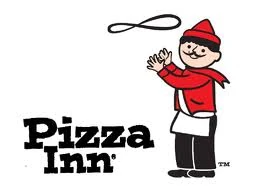
In 2008, Pizza Inn decided to revert to a version of its previous initial logo, showcasing the full JoJo mascot. The design of the character is almost exactly the same here as it was when the company was first launched.
However, the name of the company, presented to the left, has been updated to a much simpler font with blocky serifs. The color of the wording has also changed from red to black.
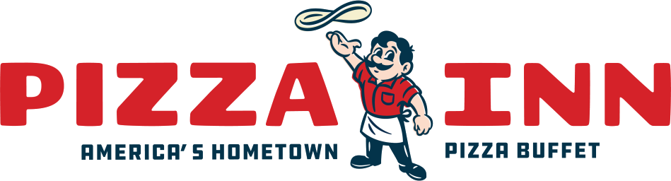
For 2022, following some challenging times during the pandemic, Pizza Inn decided to completely rework its logo with a redefined mascot and wordmark. The company worked alongside advertising company Boone Oakley and design firm Chute Gerdeman to create the new emblem.
Two versions of the design were introduced. The full logo features the name of the company on one line, with JoJo standing in the middle, now with much more defining features.
However, the core components of his outfit and posture have remained the same. This logo also features a tagline, “America’s Hometown Pizza Buffet, written in black font.
The secondary logo, used on the company’s website and some other advertising assets, only showcases the face of JoJo, next to the Pizza Inn wordmark on two lines. In both designs, the wordmark has been updated to a bold, sans-serif font in red with a blocky structure. All of the letters are presented in uppercase.
The new Pizza Inn logo: Colors and fonts
While the Pizza Inn logo has certainly grown more modern and refined over the years, it’s easy to trace the current design back to its origins. Many aspects of the company’s visual identity have been consistent, from the use of the color red to the depiction of the mascot JoJo.
The company has also always used its name in its logo, accompanying the mascot.
According to Pizza Inn, they wanted their most recent logo to connect with a younger, more modern audience while still paying homage to the legacy of the brand.
The design is intended to be friendly and welcoming, with the smiling mascot character showcasing his hard-working attitude via rolled-up sleeves. The bright coloring and playful components make this design particularly appealing to younger audiences and give the business an almost nostalgic vibe.
You can find some useful Pizza Inn logo resources here:
What color is the Pizza Inn logo
The Pizza Inn logo has maintained many of the same colors throughout its history. However, there was a brief stint when the brand introduced a new outfit for its abstract mascot. The main Pizza Inn logo color is a bright red, which appears on the wordmark, and on the shirt of JoJo, the mascot.
Other colors featured in the logo include black, a soft cream color for the pizza, and white.
What font does the Pizza Inn logo use?
The Pizza Inn logo font has gone through a number of changes throughout the years as the company has experimented with various decorative and serif styles. The most recent version of the Pizza Inn font is a sans-serif typography, written in red, uppercase letters.
Celebrating the Pizza Inn logos
Throughout the years, the various Pizza Inn logos have aimed to draw attention to the friendly and welcoming nature of the brand. With the charming mascot JoJo, and the brightly colored font choices, Pizza Inn has attracted countless fans from all over the globe.
According to the brand, they’ve always wanted to highlight that Pizza is a fun, nostalgic, American staple – something they’ve tried to convey in their marketing assets. The recently refreshed Pizza Inn logo will draw attention to the company’s history and its focus on the future.
Fabrik: A branding agency for our times.

Clarity starts with a conversation.
Thanks—we’ll get back to you shortly.
Whether you're navigating a rebrand, merger, or simply need a clearer identity—we’re here to help. No hard sell, just honest advice from people who know the sector.
Let’s start with a simple question…
Prefer to email? Drop us a line.
Fabrik’s been helping organisations rethink and reshape their brands for over 25 years. We’ve guided companies through mergers, rebrands and new launches. Whatever stage you’re at, we’ll meet you there.