


From mouse to star: The Chuck E. Cheese logo history
If you’re a fan of arcade-style pizza restaurants, you might know a little about the Chuck E. Cheese logo history. At the very least, you’re probably familiar with the evolution of the company’s iconic mascot, which has transformed over the years.
Like many famous pizza company emblems, the Chuck E. Cheese logo has undergone several evolutions over the years, attempting to attract a wider audience and increase profits.
However, while many components of the Chuck E. Cheese sign have changed, some of the core elements of the brand’s identity have remained consistent.
For instance, the mascot of Chuck E. Cheese, the famous rat (or mouse), has always been a core aspect of the company’s visual identity, even if his appearance has changed somewhat with time.
Today, we will take a closer look at the Chuck E. Cheese brand and how it has evolved over the years.
The Chuck E. Cheese pizza logo: An introduction
To fully understand the Chuck E. Cheese logo and the company’s phenomenal brand identity, we first need to take a closer look at the business itself. Chuck E. Cheese is an American pizza restaurant, and entertainment center, targeted at children.
It was originally created by the co-founder of the games console company Atari, Nolan Bushnell.
Unlike many fast-food eateries selling pizza, Chuck E. Cheese separates itself from the crowd with locations that feature amusement rides, arcade games, and musical shows.
According to the founder, the inspiration for the restaurants came from his fondness for the Disneyland Country Bear Jamboree. Initially, the founder was going to name the company “Coyote Pizza,” but he discovered that the costume he had purchased for his main character was actually a rat.
Initially, the founder considered changing the name of the business to Rick Rat’s pizza. However, he eventually settled on “Chuck E. Cheese” instead, as it seemed more family-friendly. Today, the Chuck E. Cheese mascot is still a rat, though it’s often confused with a mouse.
Although the organization has gone through some troubles in the past, including filing for bankruptcy in 1984, it’s still an extremely successful brand. As of 2022, there were more than 470 Chuck E. Cheese locations in the US, as well as multiple restaurants located around the world.
Chuck E. Cheese logo history: The Original Chuck E. Cheese logo
The Chuck E. Cheese visual identity has evolved drastically since the company was first introduced in 1977. However, if we look all the way back at the old Chuck E. Cheese logo first connected with the brand, we can still see a consistent aspect that has grown with the business: the mascot.
1981
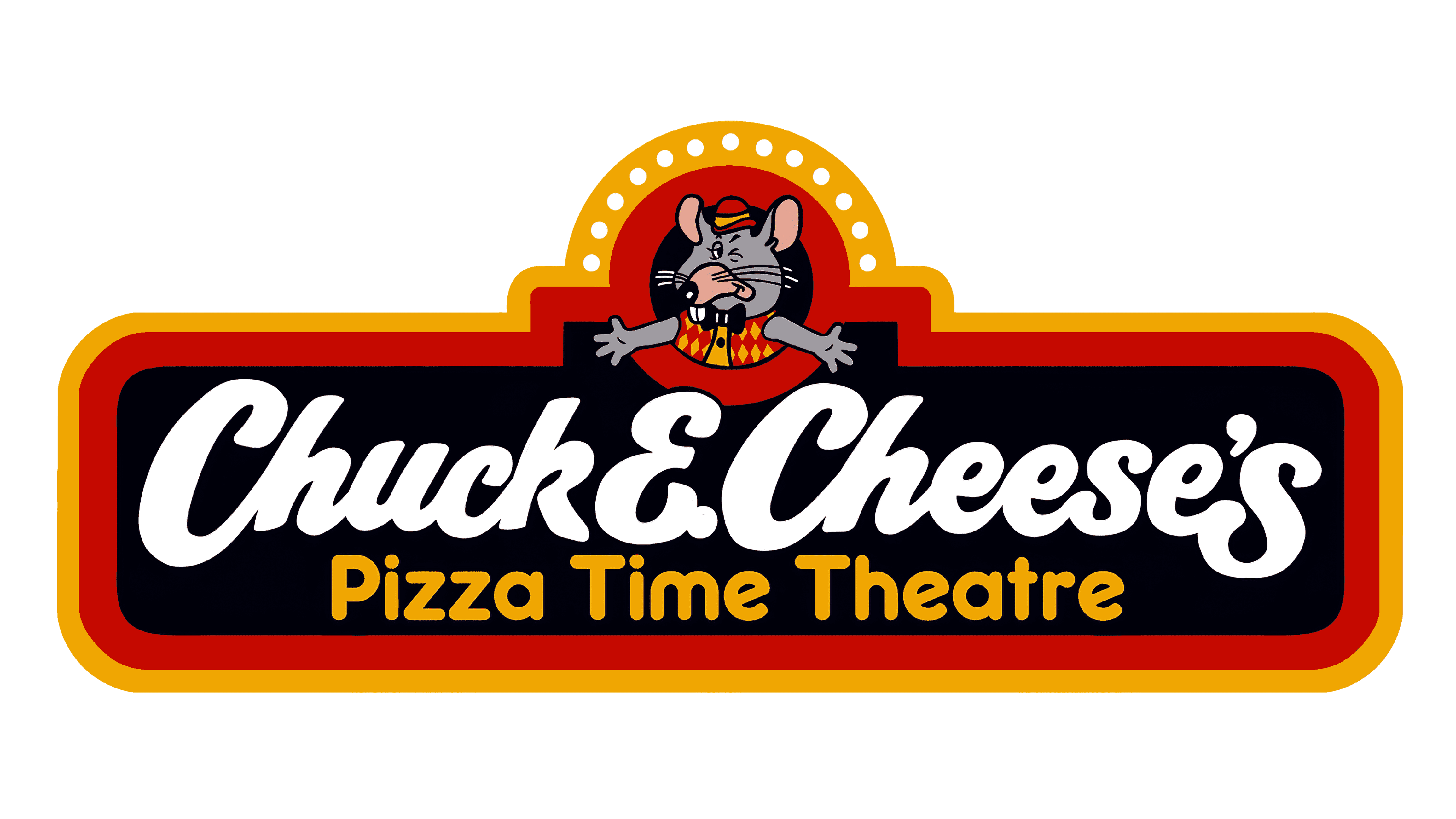
The original Chuck E. Cheese logo introduced the first instance of the Chuck E. Cheese mouse (or rat), featuring grey fur and a fun yellow and red outfit. The mascot is placed above the name of the company in a red circle, as though he’s introducing the brand.
The rest of the logo matches the color palette used within the creature, distributed through a large banner-style sign. The name “Chuck E. Cheese” is written in white, script-style font, with “Pizza Time Theatre” beneath in yellow.
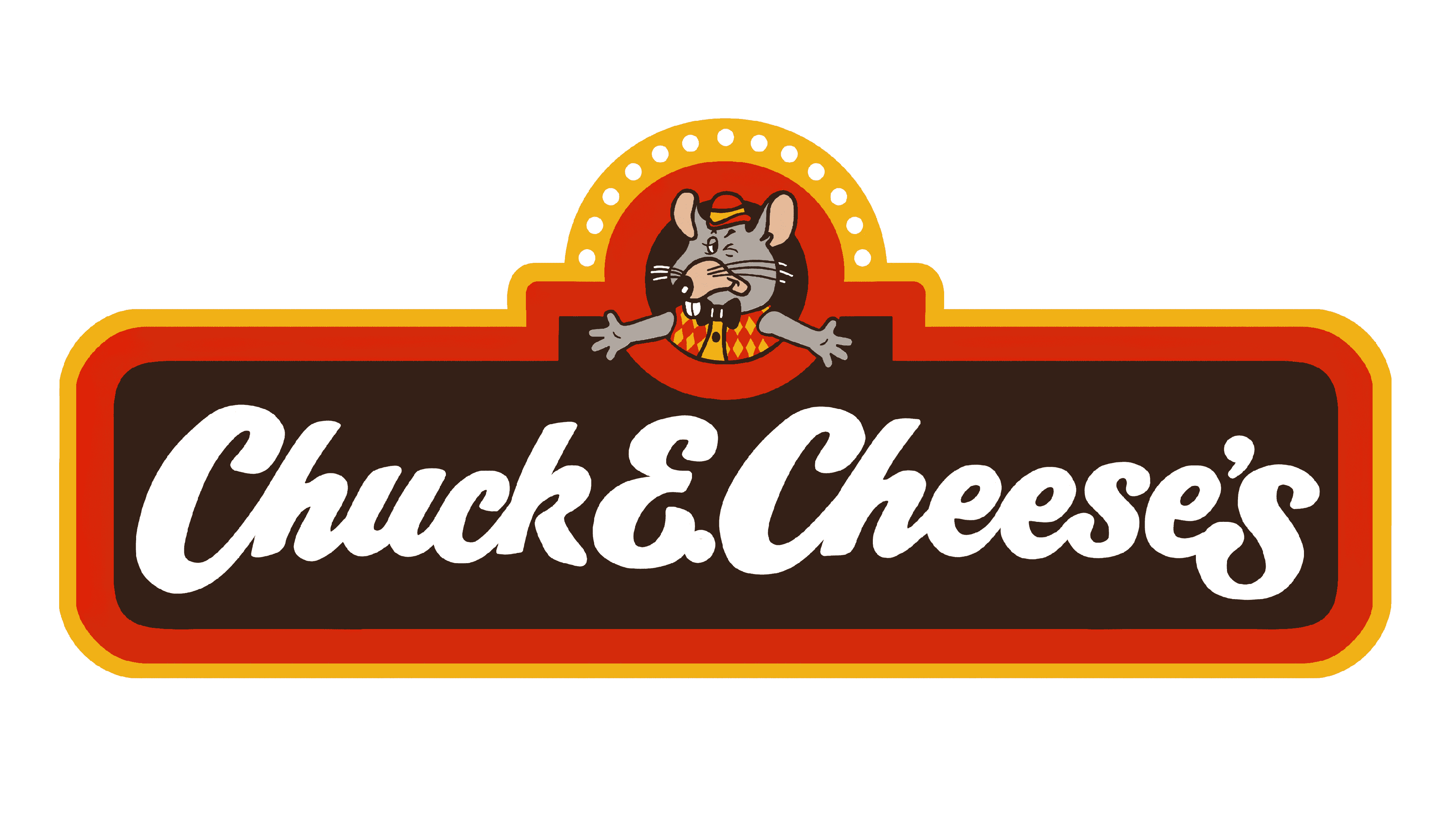
An alternative version of the logo was also introduced when the restaurant chain was purchased by the Brock Hotel Corporation. This was almost exactly the same, although it removed the “Pizza Time Theatre” tagline. The background also appeared more brown than black.
1989
In 1989, Chuck E. Cheese refined its badge again. The shape of the sign remained the same, though the font was changed drastically to appear more fun and bouncier. The coloring was updated to feature green, red, and orange as the primary colors.
The “pizza” tagline was placed underneath the name of the company instead of the “Pizza Time Theatre.” The mouse/rat emblem was almost exactly the same, but it was presented in a green outline instead of traditional colors.
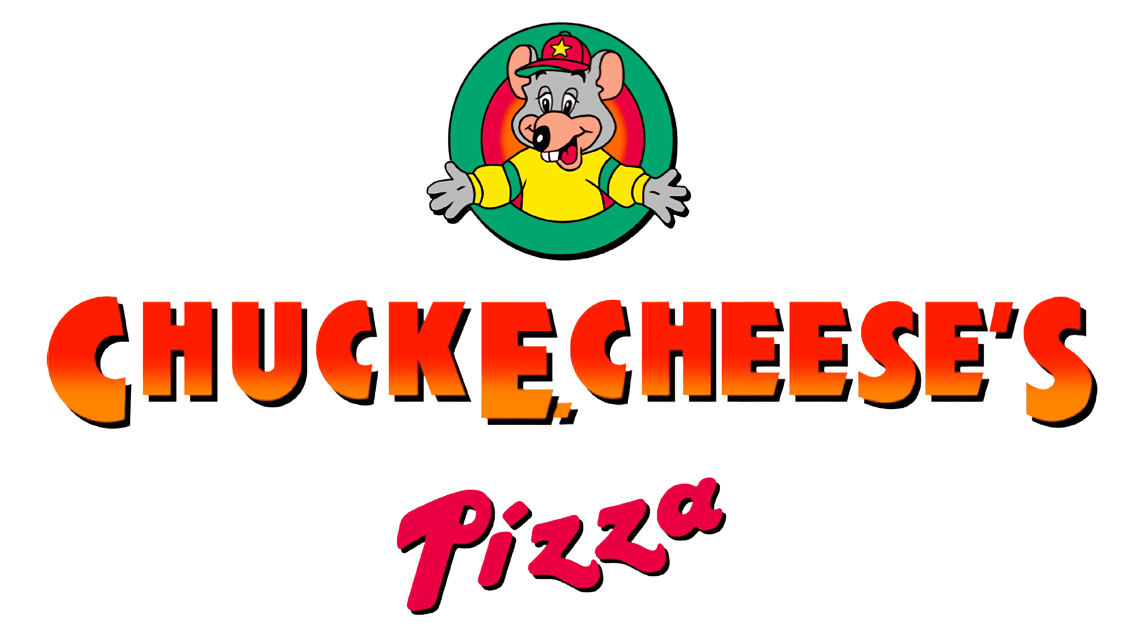
1993
In 1993, the Chuck E. Cheese logo evolved again; the mouse took on more natural coloring and was depicted in a green and yellow sweater with a red hat. The border around the sign was removed, and the coloring in the letters was updated to feature a slight gradient.
In this variation, the word “Pizza” is also depicted in a different shade than the rest of the sign and placed slightly further down in the visual.
Soon after, in 1994, Chuck E. Cheese further transformed the positioning and placement of the mouse mascot to make him look more laid back and friendly. The font style was replaced with block letters in a pink-red shade. The circle surrounding the mascot was also removed entirely.
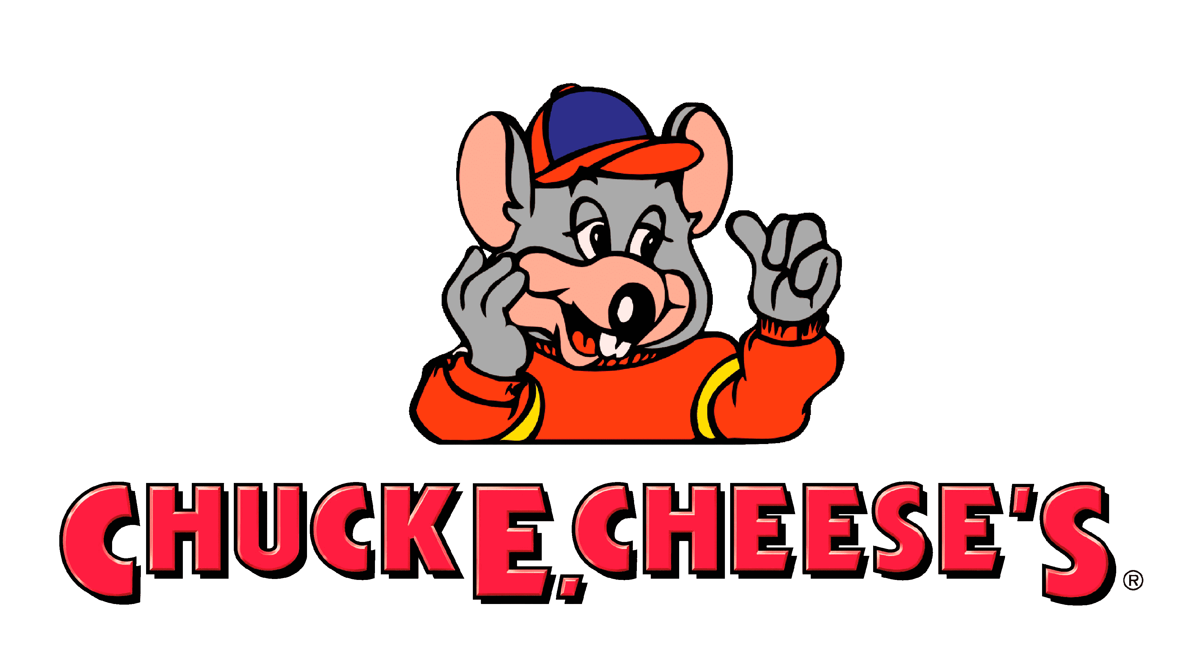
1998
The redesign in 1998 maintained most of the original elements and composition of the previous logo. The positioning of the mascot was the same, though the colors for his outfit were changed. The cap of the mouse now also featured a yell “C.”
The wordmark placed under the emblem was presented in a bright orange and pink font with a green and black shadowed outline.
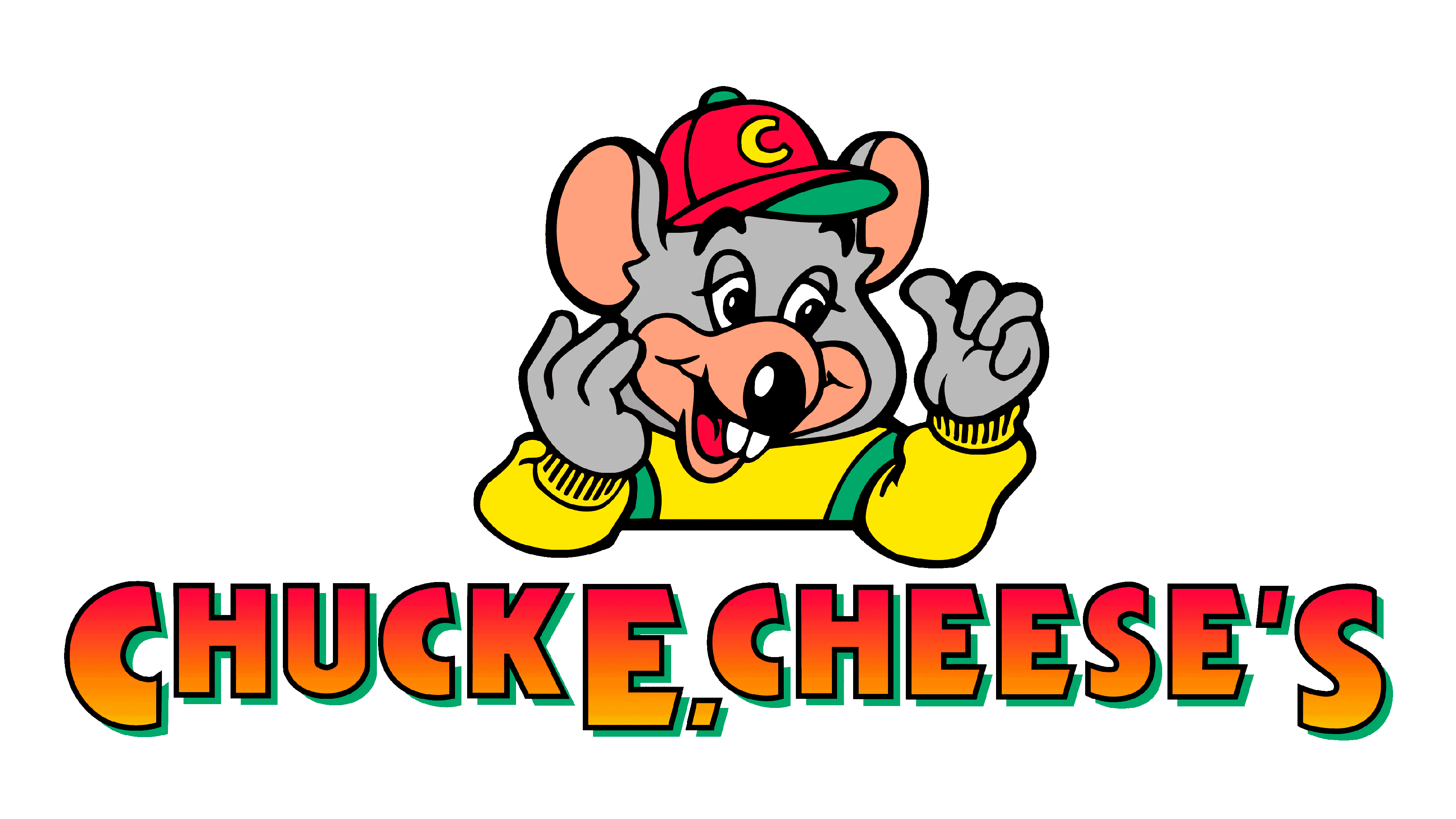
2004
Chuck E. Cheese attempted to modernize its logo in 2004 with the introduction of a far-more 3D-looking mascot. The positioning of the character changed, making it appear as though he was sharing a thumbs-up with the audience.
His outfit also evolved to feature green and purple as the primary colors. The Chuck E. Cheese font was also updated to a simple pink-red color palette.
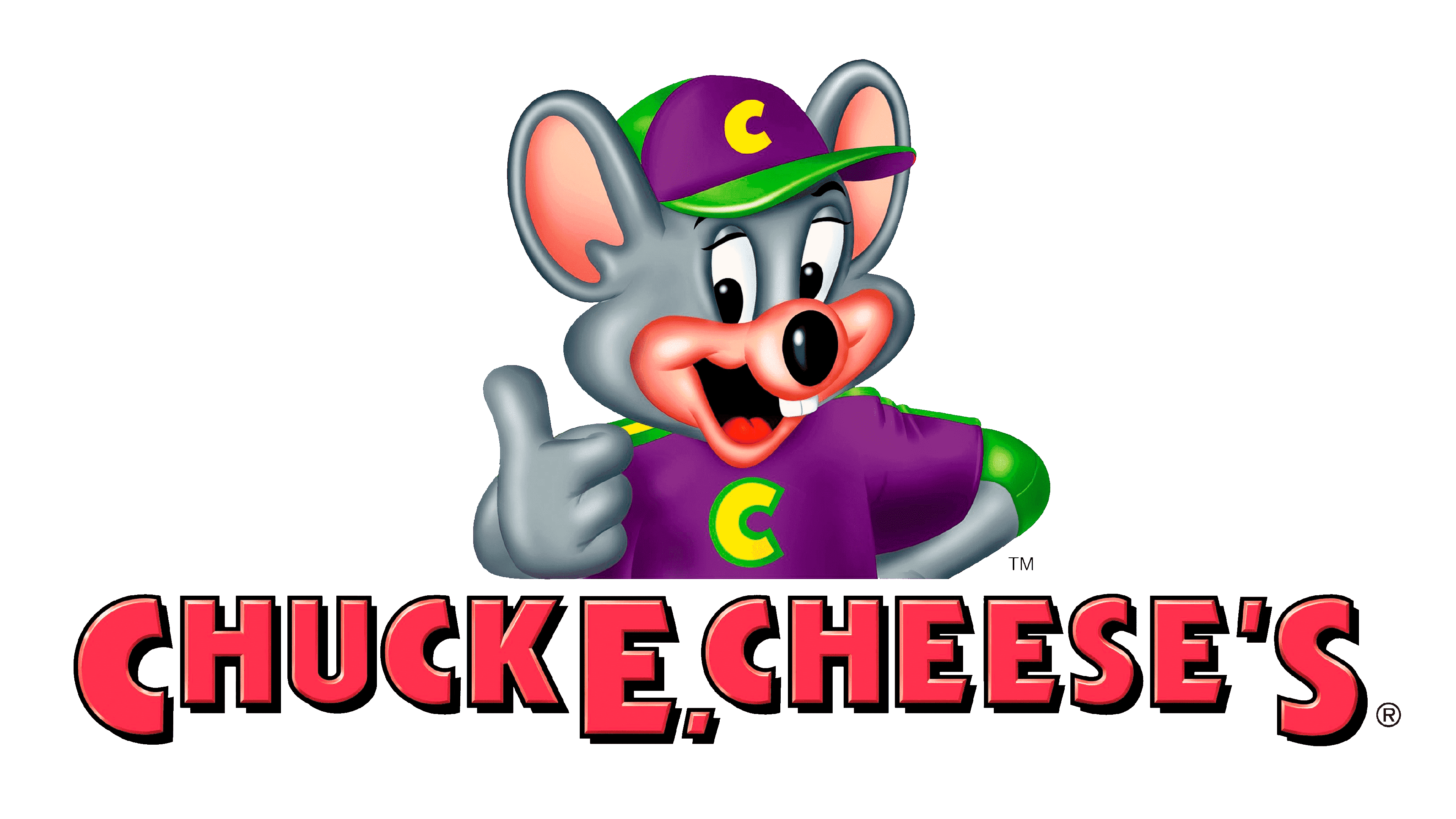
Why did they change the Chuck E. Cheese mascot?
Though the original Chuck E. Cheese logo started the love for the mouse mascot, the company has struggled with depicting the character in the right format over the years. In 2012, a radical redesign of the image of the brand completely transformed the creature.
The emblem was simplified to feature a mouse with a fluffy-looking head, bright green eyes, and a smiling face. The inscription in 2012 remained very similar to the previous designs, though it was entirely 2-dimensional, in red/pink color.
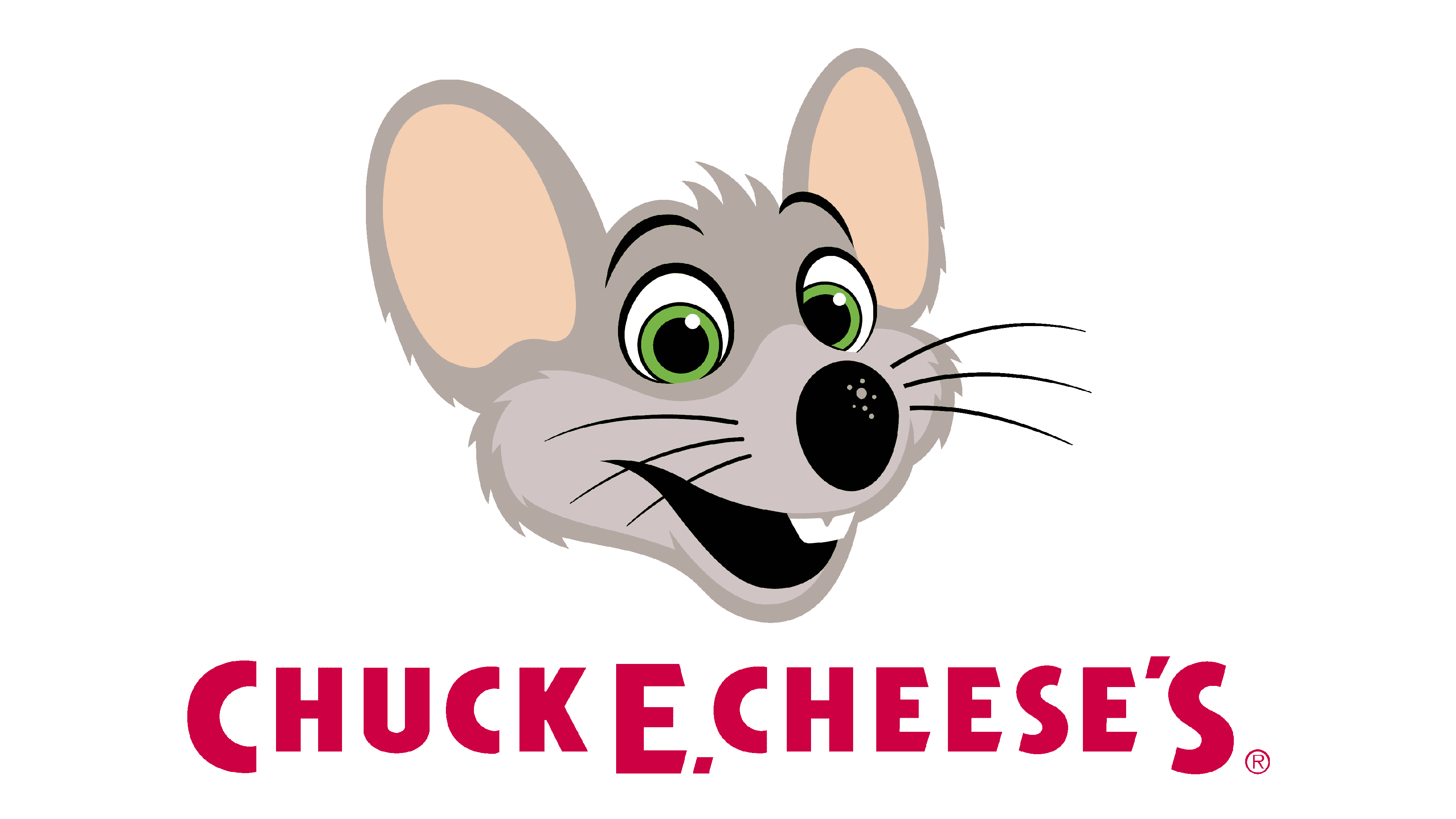
Over time, the company further updated its image, building on the image of the “new” mascot. The design was simplified slightly over the years, and the company also adjusted its typography, opting for a more decorative, script-style font in 2017.
This font style stayed with the business for a time, even as the company re-introduced the red circle around its mascot. However, eventually, the business decided to go back to a more legible, simplistic font style, depicting the name of the company in all uppercase letters.
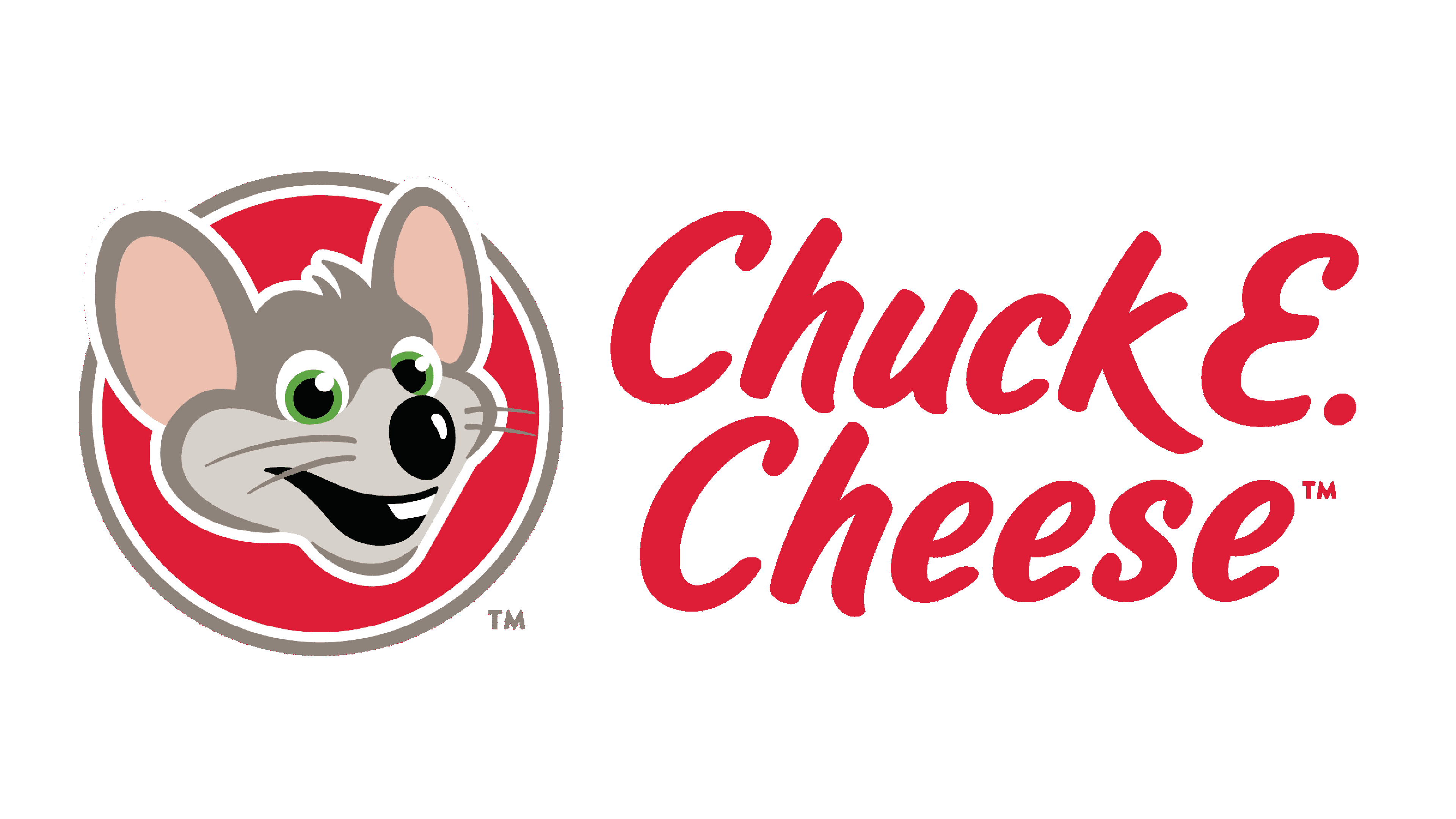
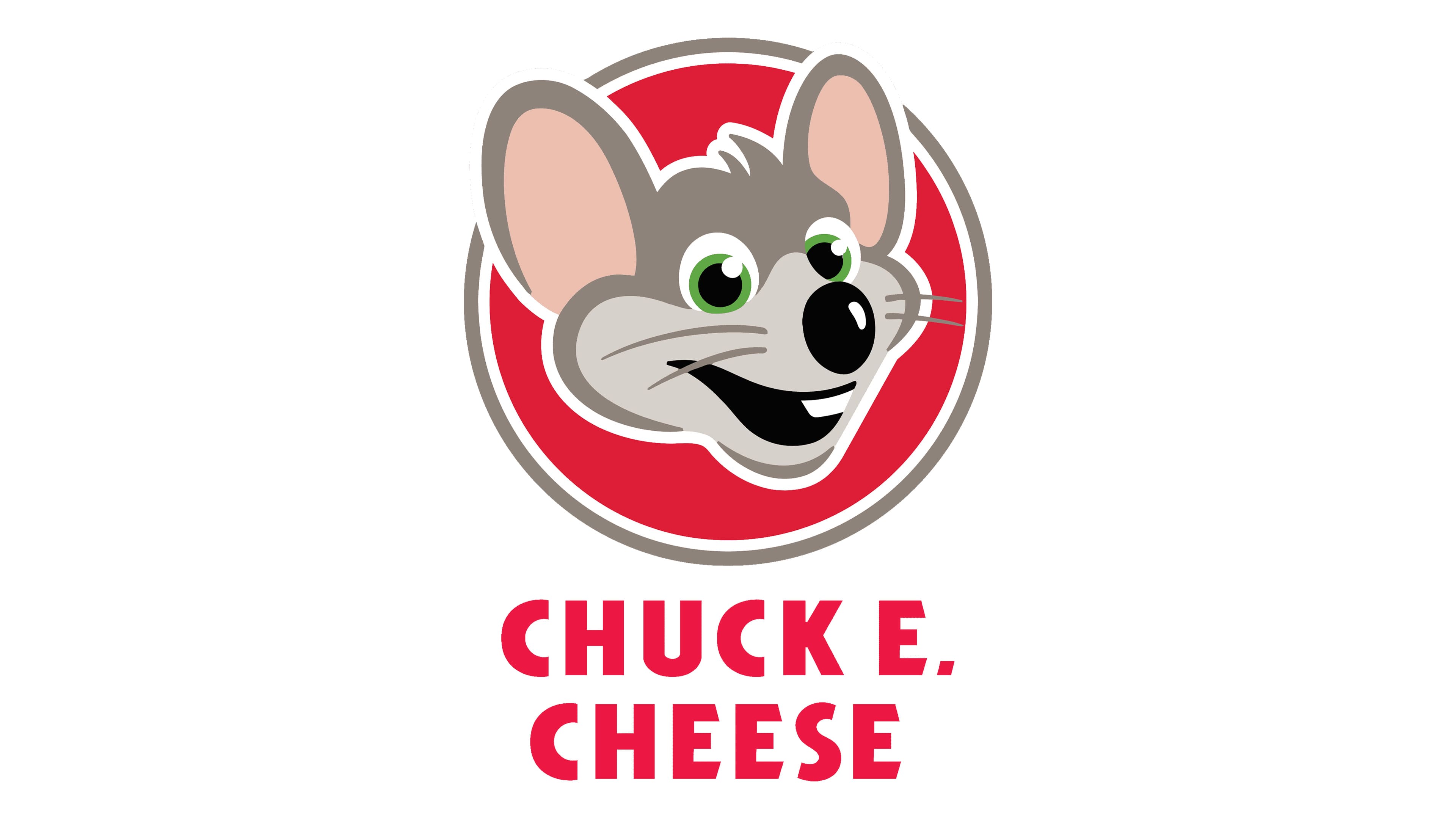
In today’s version of the new Chuck E. Cheese logo, the name of the company is also presented across two levels, making the emblem appear more compact.
The new Chuck E. Cheese logo: Colors and fonts
Though a few aspects of the Chuck E. Cheese logo have remained consistent over the year, such as the use of a mat or rat for a mascot and the introduction of the company’s name in the emblem, many other aspects have changed.
The logo we know today is a world away from the one originally created by the business when the restaurant first launched.
Today’s Chuck E. Cheese logo intends to make the company appear more sophisticated and modern, while still giving it a fun, family-friendly vibe. The reduced color palette and simplified mouse character seem to refine the overall look of the brand.
You can find some useful resources if you’re interested in the Chuck E. Cheese logo here:
What color is the Chuck E. Cheese logo?
The Chuck E. Cheese logo colors have gone through a huge number of changes over the years. Everything from the outfit worn by the mouse to the typeface has had different color palettes as the company attempted to find its ideal identity.
Today, the Chuck E. Cheese logo color palette is perhaps the simplest it’s ever been, featuring the main colors of red, grey, pink, and black. White and green elements are also present in some of the details of the mouse.
What font does the Chuck E. Cheese logo use?
The Chuck E. Cheese logo font has also gone through various changes over the years. The proprietary typography was created for the brand and is known as “Chuckster.” However, there are similar designs out there, such as Kabel Black.
The famous Chuck E. Cheese mouse
The Chuck E. Cheese logo history shows us just how significant finding the right mascot can be for a company attempting to build an attractive brand identity.
Although countless aspects of the Chuck E. Cheese logo have been altered over the years, the company has always held on to its mouse or rat creature as a core part of its identity.
Whether you love or hate the new logo, it’s safe to say the Chuck E. Cheese emblem is an unforgettable one. That little mascot has taken the pizza world by storm.
Fabrik: A branding agency for our times.

Clarity starts with a conversation.
Thanks—we’ll get back to you shortly.
Whether you're navigating a rebrand, merger, or simply need a clearer identity—we’re here to help. No hard sell, just honest advice from people who know the sector.
Let’s start with a simple question…
Prefer to email? Drop us a line.
Fabrik’s been helping organisations rethink and reshape their brands for over 25 years. We’ve guided companies through mergers, rebrands and new launches. Whatever stage you’re at, we’ll meet you there.