


How Godfather’s Pizza logo has evolved over time
Food lovers and casual dining fans across the USA will likely be familiar with the Godfather’s Pizza logo. First launched around 50 years ago at the time of writing, Godfather’s Pizza has become a staple of the pizza landscape, operating Pizza Express and fast casual operations nationwide.
Although the company may not have the same global reach as other well-known pizza brands, Godfather’s Pizza has maintained a competitive market presence.
Thanks to great food and clever branding, the organization has stood as one of the top ten most profitable pizza chains in the US over the years. Today, it has over 450 locations.
If you’re looking for inspiration to help you create your compelling Pizza brand logo, or you simply want to learn more about how brand designs evolve over time, you’re in the right place.
Here’s your behind-the-scenes insight into the Godfather’s Pizza logo history and its evolution.
Why is it called Godfather’s Pizza? An introduction
Godfather’s Pizza is a privately owned chain of restaurants in the United States, founded and headquartered in Nebraska (Omaha). The company first launched in 1973 and was created by Willy Theisen, who purchased the parlor and name from Gregg Johnson.
The restaurants are best known for serving a variety of different pizzas with four different kinds of crust. They also sell chips, breadsticks, pasta, and cookies, as well as gluten-free pizzas.
The company was named to reference the famous “Godfather” movies, and this theme has been present in many of the organization’s marketing strategies.
Commercials featuring “The Godfather,” a parody version of the character Don Fanucci, earned the venture a lot of attention during the 70s. The character has been played by J. William Koll and Dale O’Brien. In the 90s, this franchise was the fifth-largest pizza chain in the United States.
However, it ended up losing a number of restaurants, as locations were bought out by Pantera’s Pizza.
As of 2016, Godfather’s Pizza had more than 450 locations throughout the US. Additionally, the organization operates in some Minit Mart locations and Speedway locations via partnerships.
Who owns Godfather’s Pizza?
Godfather’s Pizza is a privately owned chain owned by the board of directors for the brand. The current CEO is Ronald B Gartlan, who took over from Herman Cain in 2009 after buying his shares in the organization.
What style of pizza is Godfather’s?
The Godfather’s Pizza restaurant menu is relatively diverse, with a range of different crust options and toppings to choose from. Most of the traditional pizza locations offer the original crust, which is a thick, chewy crust, with a pan style.
There’s also a light and crispy thin-crust option. There are also mozzarella stuffed crusts, and golden crusts available in some locations.
In 2010, to adhere to the changing preferences in the consumer market, Godfather’s introduced a gluten-free pizza, with a crust made from rice flour.
Godfather’s Pizza logo history
Despite a relatively long history in the casual dining landscape, the Godfather’s Pizza logo hasn’t undergone many changes. There have only been a handful of updates to the official icon and emblem. Indeed, today, the design of the image shares some similarities with previous variations.
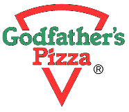
One of the original Godfather’s Pizza logos was introduced in 1973. The design was simple but effective, featuring a slice of pizza in a red outline, similar to the Sbarro pizza logo design. The name of the organization was placed in the middle of the outline, written in a stylish serif font.
The word “Godfather’s” in this emblem was green, while the “Pizza” red shade matched the coloring of the surrounding shape.
In the 1990s, the Godfather’s Pizza company updated its logo significantly, perhaps in an effort to differentiate itself from other growing brands. The new variation of the logo was more complex, featuring a person’s hand holding up a pizza, with yellow “steam” lines rising from the top.
The name of the company still appeared in this design, with a similar serif-style font. However, the word “Pizza” was much larger, written in all capital letters.
Another variation of this logo was introduced during the company’s 30th anniversary in 2003, just before the organization decided to update its branding yet again. Many of the aspects of the image remained the same, but a “30th-anniversary” wordmark was added.
In 2004, Godfather’s Pizza simplified its visual design again, returning to its previous color palette of red, white, and green. However, the image of the hand serving up the pizza pie remained, separating the two words in the logo.
The combination mark was presented on a single line, with a “TM” at the end to signify a trademark.
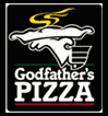
Godfather’s Pizza made its most recent change to its logo in 2009. In this version of the emblem, most of the elements of the previous design are still present.
However, the color palette has been refined, eliminating the green to focus entirely on a combination of red, white, and black, with yellow embellishments above the pizza shape.
The emblem in the logo has been repositioned to appear at the beginning of the company’s name, allowing the overall wordmark to appear more streamlined.
What is the Godfather’s Pizza logo? Fonts and colors
The Godfather’s Pizza logo today is a variation of many of the previous designs used for the company. The image features the name of the organization in a bold, serif-style font with clearly defined angles.
The main image in the design is a stylized picture of a hand with a decorated shirt cuff holding up a steaming pizza pie.
The relatively streamlined logo aims to demonstrate the sophistication of the organization while portraying key values like excellence and quality.
Red is commonly used in the food landscape to stimulate appetite and convey passion. It’s also connected with ingredients like tomato, which features prominently in most pizza recipes.
You can find some useful resources connected to the Godfather’s Pizza logo here:
What color is the Godfather’s Pizza logo?
Like many famous Pizza brand visuals, the Godfather’s Pizza logo colors have updated slightly over the years. However, while the organization has experimented with different palettes, red and black have frequently appeared in the image, alongside a small amount of yellow.
Today, the Godfather’s Pizza logo color palette consists of yellow, red, and black elements, often depicted on a white background. The yellow or golden color is intended to convey ideas of quality and heat.
The red coloring is linked to passion and love. The black-and-white elements aim to demonstrate the sophistication and professionalism of the brand.
What font does the Godfather’s Pizza logo use?
The Godfather’s Pizza logo font is a carefully chosen serif typography designed to showcase the classy, sophisticated nature of the organization. The company wanted a font with elegant vibes to help connect it to the popular Godfather movies at the time.
The design is similar to Italia Bold, with sharp blocky edges on the serifs, and a particularly eye-catching rectangular dot on the “I” for Pizza.
Food you can’t refuse: The Godfather’s Pizza logo
Although the Godfather’s Pizza logo’s history demonstrates a relatively small changes to the company’s visual identity, it’s interesting to see how the design has evolved over the years.
Today, the Godfather’s Pizza logo is an iconic, sophisticated emblem intended to showcase the professional nature of the brand and highlight its commitment to quality.
The color red, which is the primary shade used for the typeface in this logo, has not only a connection to an ingredient in pizza but also concepts like passion and power.
The interesting emblem featuring the hand holding the pizza is a long-lasting element of the company’s visual identity, which has remained relatively consistent over the years.
Fabrik: A branding agency for our times.

Clarity starts with a conversation.
Thanks—we’ll get back to you shortly.
Whether you're navigating a rebrand, merger, or simply need a clearer identity—we’re here to help. No hard sell, just honest advice from people who know the sector.
Let’s start with a simple question…
Prefer to email? Drop us a line.
Fabrik’s been helping organisations rethink and reshape their brands for over 25 years. We’ve guided companies through mergers, rebrands and new launches. Whatever stage you’re at, we’ll meet you there.