California Pizza Kitchen logo: The CPK logo history

While it might not be as well-known as some of the famous pizza emblems today, the California Pizza Kitchen logo (or the CPK logo) is still among the most memorable in the landscape. However, most people aren’t particularly familiar with the California Pizza Kitchen logo history.
The California Pizza Kitchen, otherwise known simply as “CPK,” is one of the newer additions to the pizzeria space compared to well-known alternatives like Domino’s and Pizza Hut. However, it still has a relatively rich history, starting in 1985.
The casual dining restaurant chain specializes in California-style pizza and has attempted to separate itself from the competitors in its industry in various ways. Not only does the company offer some unique pizza topping options, but it also has a very interesting visual identity.
If you’ve ever wondered about the California Pizza Kitchen logo and where it came from, or you simply want to learn more about how brands use visuals to differentiate themselves, read on for a behind-the-scenes look at the CPK logo.
What is special about California Pizza Kitchen?
Before we begin our overview of the California Pizza Kitchen logo, let’s take a closer look at the brand itself. Otherwise known as “CPK,” the California Pizza Kitchen is an American casual dining restaurant chain specializing in California-style pizza.
Launched in 1985, the organization has struggled to catch up with some major market leaders in the pizza space, but it does have a lot of dedicated fans around the world. What makes California Pizza Kitchen particularly special is its focus on serving nontraditional pizza toppings.
There are Jamaican Jerk, Thai Chicken, and Original BBQ pizza options.
The CPK company also serves a wide range of different salads, pizzas, sandwiches, soups, and desserts, as well as a range of children’s meals. CPK also has a line of gluten-free crust, crispy thin crust, and other frozen pizza options for sale in Supermarkets.
At present, the California Pizza Kitchen has around 250 locations running in 32 states throughout the United States. It is also present in 10 other countries and has 15 franchise, nontraditional, and other concepts available in universities, stadiums, and airports.
The origins of California Pizza Kitchen
California Pizza Kitchen was created by two attorneys named Rick Rosenfield and Larry Flag. The two founders pooled around $200,000 in savings and bank loans, alongside $350,000 invested from friends and family, to lease a space in Beverly Hills, California.
The team immediately started coming up with unique ways to make their business stand out, with a unique menu crafted by Ed LaDou. CPK was an immediate success in its first store, allowing the company to expand throughout Southern California.
Within seven years of the initial launch, the brand had invested in 26 CPK locations in total.
In 1992, PepsiCo paid around $100 million to take 67% ownership of the chain. PepsiCo pushed the company to expand faster, which led to a series of problems for the company.
Despite this, the organization continued to innovate and grow, introducing gluten-free pizzas, new menus, and even a Cauliflower Pizza Crust in 2018.
Unfortunately, the company did file for bankruptcy in 2020 as a result of dropping sales due to the worldwide pandemic. However, there are still locations operating around the world today.
California Pizza Kitchen logo history: The CPK logo
The core elements of the California Pizza Kitchen logo have remained relatively consistent over the years. Although the emblem has grown simpler and more modernized over the years, it has always featured the name of the company, as well as an iconic palm tree symbol.
The palm tree aims to highlight the origins of the company in California.
1985
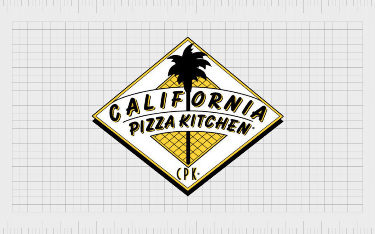
The CPK logo, first introduced by the brand in 1985, was a far more detailed version of the emblem we know today. The design featured a white diamond, with a yellow, grid-style diamond placed in the center.
In the middle of the design was the iconic palm tree, with the name “California Pizza Kitchen” positioned around it. The letters “CPK” are also at the bottom of the emblem.
This version of the CPK logo is almost three-dimensional in its design, with a black shadow around the bottom of the piece to make it appear as though it’s moving out from the page.
2005
In 2005, California Pizza Kitchen introduced a new variation of its logo. This option was a little brighter and more refined. The yellow checked element in the design expanded to cover more of the background behind the palm tree. The tree itself was also somewhat simplified.
The wordmark for the company was refined, too, with a new typography featuring sans-serif, wide letters. The word “California” appeared in lowercase black font on a yellow banner. Underneath, “Pizza Kitchen” was presented in all uppercase, in white font on a black background.
CPK still appears at the bottom of the diamond in a much smaller font.
2012
The California Pizza Kitchen logo introduced in 2012 is the most recent version we have to date. This design removed a lot of the decoration from the previous logo, focusing simply on the black palm tree outline in a bright yellow diamond.
The typography choice for the wordmark was very similar to the previous design. However, the letters in “California” appear a bit bolder. The overall wordmark is also positioned differently, appearing below the diamond rather than over the top of it.
The California Pizza Kitchen logo: Fonts and colors
The bright and bold California Pizza Kitchen logo is a world apart from the many pizza logos we can see in the fast food market today. The yellow diamond is a core part of the design.
While yellow symbolizes the warmth and joy of California, the diamond stands for excellence and expertise. The palm tree component, which is depicted as a black silhouette, also aims to remind people of the origins of the company in Beverly Hills.
Even the font choice of the CPK logo is important. Over the years, the company has refined its typography to make it more modern and legible. Today, the overall image is wonderfully contemporary and eye-catching, sure to stand out in any environment.
If you want to take a closer look at the CPK logo, you can find some useful resources here:
What color is the California Pizza Kitchen logo?
As mentioned above, one of the most important aspects of the CPK visual identity is its color choices. The California Pizza Kitchen logo colors have always been bright and eye-catching. Yellow is a color typically associated with sunlight and warmth.
It’s also a shade sometimes used in the food industry to stimulate appetite and engage customers.
The core California Pizza Kitchen logo color is bright yellow, but the black components are important too. They symbolize strength, stability, and confidence.
What font does the California Pizza Kitchen logo use?
The California Pizza Kitchen logo font is a simple, legible, sans-serif typography. It’s intended to appear modern and straightforward, similar to the company itself. The current font chosen for the latest CPK logo is Eurostyle Extended number 2. This is a square-style sans-serif font created by Aldo Novarese.
Learning from CPK logo history
Looking at the California Pizza Kitchen logo history, the company has made few significant changes to its visual identity over the years. Although the elements of the logo have been enhanced, refined, and modernized over the years, most have remained quite consistent.
Since its inception, the CPK company has chosen logos to highlight its origins and showcase its unique, sunny disposition.
Fabrik: A branding agency for our times.
Clarity starts with a conversation.
Thanks—we’ll get back to you shortly.
Whether you're navigating a rebrand, merger, or simply need a clearer identity—we’re here to help. No hard sell, just honest advice from people who know the sector.
Let’s start with a simple question…
Prefer to email? Drop us a line.
Fabrik’s been helping organisations rethink and reshape their brands for over 25 years. We’ve guided companies through mergers, rebrands and new launches. Whatever stage you’re at, we’ll meet you there.


