Sbarro logo history: From Italy to the world

How much do you know about the Sbarro logo history? If you’ve ever encountered the emblem in a shopping mall or street, the chances are it has immediately captured your attention. Colorful and modern, the Sbarro pizza logo is one of the most recognizable in the fast-food industry.
Where other famous pizza brand logos attempt to engage potential customers with fun characters and bold typography, Sbarro uses its emblem to showcase its unique history and heritage.
Though the design has changed a few times, the core focus has remained consistent since the brand launched decades ago.
If you’ve ever wondered about the background of the Sbarro logo, or you’ve found yourself searching for inspiration for your own design, you’re in the right place.
Today, we will cover everything you need to know about the Sbarro logo, and the brand’s history.
Introducing the restaurant with the Italian flag logo
Sbarro is a leading pizzeria chain, prominent mostly in the United States but with locations all across the globe. The brand specializes in New York-style pizza, which is typically sold by the slice, as well as a range of other Italian-American dishes.
In 2011, the company was ranked as the 15th best pizza company in terms of foreign sales among US-based quick-serve companies.
Sbarro has achieved numerous awards and criticisms over the years, giving it a somewhat spotty reputation, but this hasn’t stopped the company from developing a strong brand identity. The organization was first founded in 1956 by Carmela and Gennaro Sbarro.
The pair immigrated to America with their three sons from Naples, Italy.
Initially, the pair of founders launched an Italian grocery store in Brooklyn, New York, which achieved significant success and popularity over the years. The success of this business prompted the introduction of a variety of different mall-based restaurants.
Over the years, Sbarro continued to expand throughout the United States, despite a few setbacks, including declaring bankruptcy in 2011. In 2020, the company even agreed to a partnership with the EG Group in the UK to start entering the UK market.
What is Sbarro famous for?
Sbarro is best known for serving by-the-slice New York-style pizza, as well as a range of other popular food items. In 2008, it was ranked the number 1 quick service restaurant in the Italian segment, according to Entrepreneur magazine.
Though the company has recognizable Italian roots, it’s not always referred to as “authentic Italian,” as it focuses heavily on American-Italian cuisine, which blends the elements of two core cultures.
At present, the organization has more than 600 locations across 28 countries, and the stores frequently appear within shopping malls, college campuses, and airports.
Some of the hype around Sbarro over the years hasn’t been particularly positive. The food quality has been criticized by some reporters, and the brand has faced some controversy, particularly surrounding its unwillingness to leave the Russian market during the Russia-Ukraine war.
Sbarro logo history: What is the Sbarro flag?
A brief look at the Sbarro logo history shows us many of the aspects of the emblem have remained consistent throughout the company’s life.
For a long time, Sbarro focused heavily on showcasing its Italian roots with designs that featured the colors of the Italian flag. However, the company eventually settled on a more modern and simplistic logo.
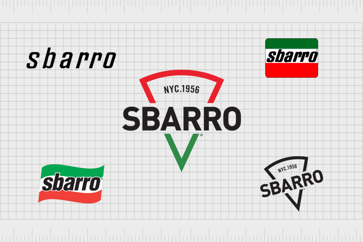
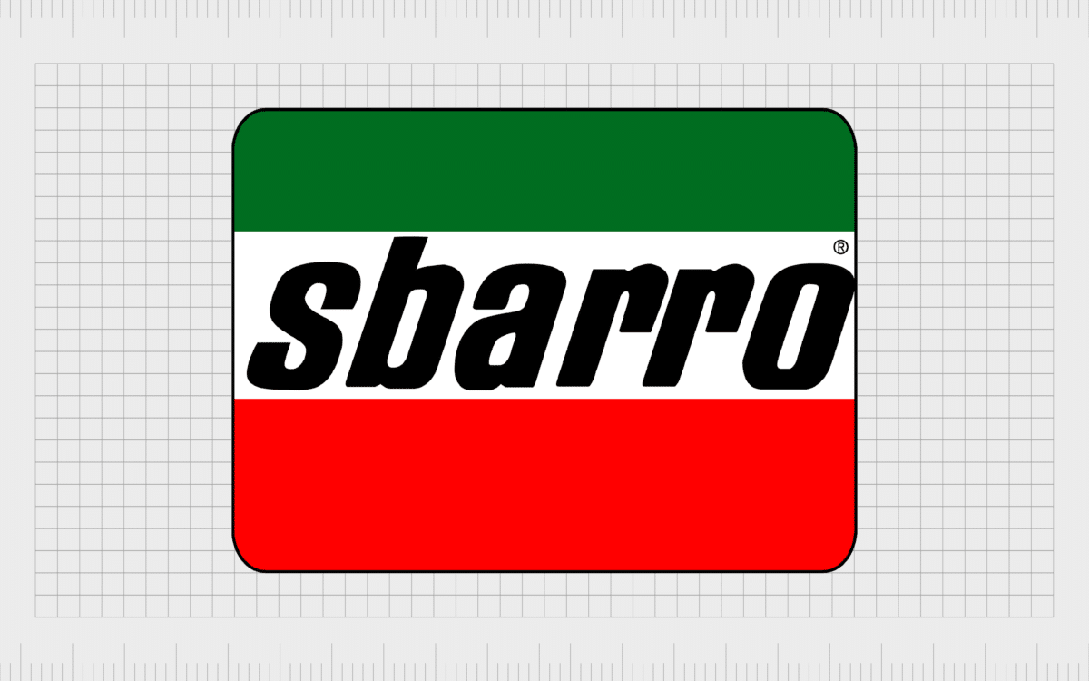
One of the earliest versions of the Sbarro logo, still recognized today, simply featured the name of the company emblazoned on top of a rectangular Italian flag. The image was intended to draw attention to the brand as one with strong Italian roots, thanks to the origins of the founders.
The name “Sbarro” written within the logo appears in all-lowercase, sans-serif font. The bold typography stands out well against the white stripe in the Italian flag. It also tilts slightly towards the right to demonstrate movement and innovation.
While the Italian flag remained the core focus of the Sbarro logo in 1997, elements of the design were updated. A subtle curve was added to the rectangle to give it an additional sense of movement and dynamism. It looks as though it’s almost waving in the wind.
The Sbarro wordmark still appears over the white section in the flag, though there are some slight overlaps over the other colors. The type is slightly simpler here and includes a white border around each letter to help make it stand out.
In 2015, Sbarro made perhaps the most significant change to its visual identity, replacing the clear Italian flag with the image of a pizza slice, to highlight its core selling point. The pizza slight still features the colors of the Italian flag, however, with the name Sbarro written in the middle.
Here, the wordmark is bigger and bolder, written in all uppercase letters. We can also see the original date of the company depicted at the top.
Another variation of this logo was introduced to some parts of the world a little later, in which the design has been tilted slightly towards one side, making the wordmark look as though it’s rising up towards the right. In this version of the Sbarro pizza logo, the Italian colors have been removed.
The black and white monochrome version of the logo not only helps the company to appear more modern, but it could also have been a way for the organization to further branch out into new geographies and environments.
The Sbarro pizza logo: colors and fonts
The Sbarro logo today is one of the more attractive and contemporary designs in the fast-food landscape. Though relatively simplistic at first, it tells us a great deal about the organization.
The pizza slice design, depicted in the form of an outline, reminds us of one of the core things that makes Sbarro unique in its industry. This is a company best known for selling pizza by the slice.
The decision to introduce the date when the company was first founded to the top of the logo is also interesting. It shows the organization’s commitment to consistently referencing its history and heritage, even if the Italian flag colors have been removed from the wider design.
If you’d like to take a closer look at the Sbarro logo in any of its formats, you can find some useful resources here:
What color is the Sbarro logo?
For some time, the Sbarro logo colors were one of the main components which helped the organization to stand out from its competitors in the fast-food pizza market. The Italian flag is commonly associated with pizza, as many believe this is where the origins of the food began.
However, the colors chosen were also a way for the company to reference its own heritage.
At present, the Sbarro logo may still feature the colors of red, white, and green in some parts of the world, while other environments showcase the black-and-white alternative. The monochrome version of the design is a little more modern and universal in some markets.
What font does the Sbarro logo use?
Though the exact typography of the Sbarro logo font might have changed slightly over the years, the overall essence of the type has been relatively consistent. Since its inception, the company has relied heavily on the use of modern, bold, and sans-serif font options.
One of the most significant changes made to the Sbarro logo over the years involved changing the all-lowercase font choice to an all-uppercase alternative.
Today, the font style is a bold sans-serif font specific to the company. The exact name of the font has not been announced by the organization.
Pizza by the slice: The Sbarro pizza logo
Sbarro logo history offers an insight into the evolution of a company committed to consistently showcasing its unique heritage in its visual design choices. For the most part, the business consistently used the Italian flag to highlight its roots.
While some versions of the Sbarro logo no longer feature the national colors of Italian, a reference to the history of the business is still present today. The company still uses the “NYC 1956” tagline at the top of its emblem.
Fabrik: A branding agency for our times.
Clarity starts with a conversation.
Thanks—we’ll get back to you shortly.
Whether you're navigating a rebrand, merger, or simply need a clearer identity—we’re here to help. No hard sell, just honest advice from people who know the sector.
Let’s start with a simple question…
Prefer to email? Drop us a line.
Fabrik’s been helping organisations rethink and reshape their brands for over 25 years. We’ve guided companies through mergers, rebrands and new launches. Whatever stage you’re at, we’ll meet you there.


