


Marco’s Pizza logo history: The Marco’s Pizza logo
If you’re a fast food and casual dining fan, you’re probably familiar with the Marco’s Pizza logo. Although Marco’s pizza logo history doesn’t go back to some similar emblems, it offers insight into how companies can modernize and update their images.
Today, the Marco’s Pizza logo positions the company in front of a new audience while retaining a clear personality.
Like many famous Pizza logos, the Marco’s Pizza emblem is intended to send a clear message to its target audience. This design is fun and playful, ideal for reaching a younger audience. It’s also brimming with bright colors, intended to stand out in any environment and engage viewers.
If you’ve ever noticed the Marco’s Pizza logo and wondered about its meaning, origins, or even just the brand’s history, you’re in the right place.
Today, we will take a closer look at the Marco’s Pizza design and the company’s evolution.
Where did Marco’s Pizza originate?
Marco’s Pizza is an American restaurant chain currently headquartered in Ohio (Toledo). The very first store introduced to the US public was launched in Oregon, Ohio, within Starr Avenue. However, many people do associate Marco’s Pizza with Italian origins, thanks to the owner.
The company, which specializes in Italian-American cuisine, was created by an Italian immigrant known as Pat Giammarco in 1978.
Giammarco originally moved to the United States from Italy when he was nine years old, and he grew up in Michigan, where he frequently worked within his family’s own pizzeria. He and his father worked together to create the unique pizza sauce recipe still used by Marco’s today.
Interestingly, it took some time for the Marco’s Pizza company to become the sensation it is today. In 2002, a restaurant industry expert saw the potential of Marco’s as a franchise company after reviewing the food in a number of different restaurants.
Butorac worked with Giammarco to build a branding and marketing strategy to help bring the food to a wider audience.
What is Marco’s Pizza known for?
Marco’s Pizza is probably best known for its unique sauce, which was created by the father and his father, and based on Italian recipes. By 2017, Marco’s Pizza had grown at an incredible rate, with 800 franchised stores across 34 states.
The company also branched out into other regions, such as India, the Bahamas, and Puerto Rico.
Marco’s Pizza says it owes its success to the incredible innovation and hard work of its franchisees. However, the company is also well-known for certain ingredients used in its food, such as a special kind of dough and a three-cheese blend.
Additionally, unlike many major pizza companies, Marco’s Pizza makes its dough from scratch each day, and the cheese used is never frozen. By 2016, the company had achieved a ranking of number 10 on the list of the top 100 companies selling Pizza in the US.
The Marco’s Pizza slogan
Currently, the best-known Marco’s Pizza slogan is “Ah! thentic Italian Pizza.”
More than just a catchy marketing message, the slogan is intended to highlight the mission statement of the company. According to Marco’s Pizza, the company is dedicated to creating authentic Italian pizza recipes which deliver satisfaction to every customer.
Marco’s Pizza logo history: An introduction
Despite a history currently spanning more than 45 years, there haven’t been many significant changes to the Marco’s Pizza logo over the years. Glancing back at Marco’s Pizza logo history, we can see two official logos used by the brand.
However, the company has also introduced various other visual assets to its stores in the form of signs with a pizza slice as the apostrophe in “Marco’s.”
1978
The first emblem, otherwise known as the old Marco’s Pizza logo, isn’t very different from the one most consumers know today. The design featured a bold, blocky “M” shape, depicted in red, with a thin black outline.
Within the middle of the M shape, we can see the name “Marco’s,” written in curved, white font with a simple sans-serif design.
The middle of the “M” also features an image of a pizza covered in red pepperoni slices, which is also outlined in black. Underneath the main icon, the word “Pizza” is written in a similar sans-serif font to the Marco’s wordmark.
This design is still present on some of the marketing assets used by the company, as well as in various franchise locations.
2018
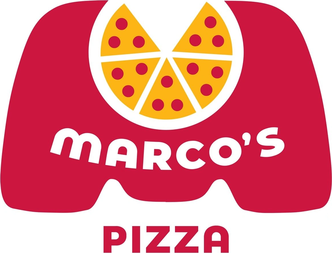
In 2018, Marco’s Pizza updated its logo only slightly, focusing on a slightly more modern and streamlined image. While the overall color palette remains largely the same, all of the black elements have been removed, including the outlines.
The shade of red in the design is also slightly softer, and the yellow has been adjusted to look more golden or orange.
The lettering in the Marco’s Pizza logo has also been updated. There’s still a bold and bubbly sans-serif font on display, with a somewhat “squashed” appearance. However, all of the glyphs are written in uppercase. This also translates to the “Pizza” aspect of the emblem below the main sign.
The pizza image included within the M on the logo has lost its black outline and now features a white background, which helps the slices to look more separated. The white gap in the M at the top of the design now looks a lot more natural and flowing.
Marco’s Pizza logo meaning, fonts, and colors
The Marco’s Pizza logo is a simple but effective emblem that has seen very few changes over the years. Eye-catching and colorful, this sign is intended to make the business stand out in virtually any setting while capturing the attention of hungry consumers.
The colors yellow and red are important here, as they’re often associated with a stimulated appetite.
The Marco’s Pizza logo draws attention to the name of the company, thanks to the large M and the use of the wordmark within it. It also highlights the core selling point of the business, drawing attention to the delicious Pizza it serves.
Today’s logo is fun and modern, with no harsh lines or black elements which might distract from the overall image.
Marco’s has effectively created a visual identity that demonstrates its playful but passionate personality while separating it from other major brands.
If you want to take a closer look at the Marco’s Pizza logo, here are some helpful resources:
What color is the Marco’s Pizza logo?
Like many fast food restaurants, Marco’s Pizza relies heavily on its color choices to send the right message to its audience.
The Marco’s Pizza logo colors today consist of red, yellow, and white. The red and yellow elements not only stimulate the appetite but also remind us of core pizza ingredients, like Marco’s famous sauce and cheese blend.
The white components make the logo appear fun, fresh, and modern. They replace some of the black elements from the previous design to update the overall brand identity.
Though the hex codes for the Marco’s Pizza logo color palette haven’t been officially released, we can see the red shade is a soft, pinkish color, while the yellow has elements of orange and gold to it.
What font does the Marco’s Pizza logo use?
The Marco’s Pizza logo font is another core element of the company’s brand identity. The organization chose a simple, sans serif font, which it upgraded to include all uppercase glyphs in recent years. The design is simple to read and eye-catching, ideal for a pizza store.
The font is unique to the company, but it shares many similarities with a number of sans-serif fonts, with short lines and a squat appearance.
Exploring the Marco’s Pizza logo
Looking at Marco’s Pizza logo history, we can see that brands don’t always need to completely rework or change their visual identity to maintain a modern appearance. The majority of the Marco’s pizza design has remained consistent over the years, with just a few simple changes.
Today, the version of the logo most people are familiar with still maintains many of the core elements introduced within the first logo. It still highlights the company’s playful identity and uses a similar color palette.
Fabrik: A branding agency for our times.

Clarity starts with a conversation.
Thanks—we’ll get back to you shortly.
Whether you're navigating a rebrand, merger, or simply need a clearer identity—we’re here to help. No hard sell, just honest advice from people who know the sector.
Let’s start with a simple question…
Prefer to email? Drop us a line.
Fabrik’s been helping organisations rethink and reshape their brands for over 25 years. We’ve guided companies through mergers, rebrands and new launches. Whatever stage you’re at, we’ll meet you there.