The history of Papa Murphy’s logo: Rise of the take-and-bake pizza giant

If you’re a fan of pizza, there’s a good chance you’re familiar with the Papa Murphy’s logo. But how much do you know about Papa Murphy’s logo history? This popular pizza company may not be as well-known as some leading brands today but still has a highly recognizable and engaging visual identity.
Like many famous pizza companies, Papa Murphy’s has updated its image and brand strategy to connect with an evolving audience over the years.
The most recent version of the company’s image revolves around a far simpler design intended to highlight the modern, straightforward nature of the organization.
While the design is somewhat minimalistic compared to previous creations, it still retains some core elements of the previous Papa Murphy’s logos.
If you’re looking for a behind-the-scenes insight into how brand essence can evolve and transform over time, you’re in the right place. Today, we will look closer at Papa Murphy’s logo history and how the company has changed over the years.
What makes Papa Murphy’s different?
Papa Murphy’s is a pizza business focused on the take-and-bake landscape, based primarily in Vancouver, Washington. What many people don’t realize is that the brand is actually the result of two previous companies which merged to reach a wider audience.
Papa Murphy’s was created by combining the Murphy’s Pizza company, founded in 1984, with the prior Papa Aldo’s pizza brand, created in 1981.
The chain traces its history back to the Oregon-based Papa Aldo’s pizza brand, which produced “take and bake” food within the Oregon region of Hillsboro. Around three years later, Murphy’s Pizza began operation in Petaluma, California.
Eventually, Terry Collins acquired and consolidated both brands to form Papa Murphy’s. The organization quickly achieved success, being voted the best pizza chain in America by Restaurants and Institutions magazine.
Over the years, Papa Murphy’s has received a number of additional rewards, including the Consumer’s First Choice award for pizza chains in 2006.
Today, the organizations and its various franchisees operate in over 1,300 stores across Canada, the US, and the UAE. Currently, the organization is the fifth-largest pizza chain in the US.
What is the Papa Murphy’s slogan?
The best-known slogan associated with Papa Murphy’s is “Take n’ Bake Pizza. Hand Made. Home baked.” This slogan was intended to provide insight into the unique business model of the company.
Another well-known tagline introduced in 2022 was “We make great pizza, so you can make the pizza great.” In both instances, the slogan reminds us of the fact that individuals can cook the pizza they purchase from Papa Murphy’s at home.
Papa Murphy’s logo history: The Papa Murphy’s logo
Despite being a relatively new pizza brand compared to some of the other well-known organizations in the industry, Papa Murphy’s has still made a handful of changes to its logo over the years. Throughout Papa Murphy’s logo history, we can see a few consistencies.
Every logo has used the color red alongside a compelling wordmark.
When Papa Murphy’s was first introduced in the mid-90s, the first logo created for the company was relatively straightforward. Like many pizza brands of the time, the company relied primarily on the use of an eye-catching wordmark depicted in a script-style font.
The typography was angled slightly towards the right and made to look a little like handwriting.
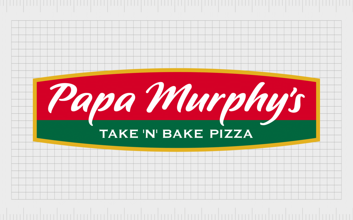
Underneath the name of the company, the brand also included the tagline “Take n’ Bake Pizza” in all uppercase, serif font. The letters on the design were written in white on top of a red and green background. The colors were intended to represent Italy’s flag – the home of pizza.
During the early 2000s, Papa Murphy’s updated its logo slightly, making a few basic changes to the overall design. While the core elements of the image remained the same, the emblem was refined and modernized in 2002 to appear a little more professional.
The company also added a golden border to its image, perhaps to demonstrate its commitment to excellence.
In 2008, this design saw a slight change, which adjusted the typography in the image. The logotype was stretched slightly, making the letters a little easier to read. The spacing between the letters increased, and the glyphs were disconnected.
2021
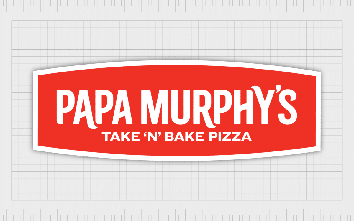
The most significant change to the Papa Murphy’s logo took place somewhat recently, in 2021. Introduced as part of a rebranding strategy, the new design appears a lot more modern and minimalistic. The gold and green elements have been removed, leaving only red and white.
The slogan “Take N’ Bake Pizza” is still evident within this image. However, the typeface has changed dramatically. The wording is mostly sans-serif, written in all capital letters, with some flourishes added to certain letters.
Why did Papa Murphy’s change their logo?
For the majority of the Papa Murphy’s logo history, most of the elements of the design remained relatively consistent. Until 2021, Papa Murphy’s consistently used stylized, script-style wordmarks in white on a red and green background.
This helped to draw attention to the Italian origins of Pizza and made the company appear sophisticated and professional.
However, during 2020 and 2021, Papa Murphy’s decided it was time to update its image due to a decline in sales.
The organization wanted to appeal to a younger, more modern audience. It was also growing particularly popular among consumers looking to cook their own restaurant-style pizzas at home during the pandemic.
The rebrand didn’t just update the company’s logo but its entire brand identity. New stores were introduced, known as the “Kitchen Delite” stores. The stores were created with an open-to-view cooking zone where people could enjoy the sites and smell of pizzas cooking.
The decision to implement the rebrand was made after a comprehensive study of the company’s target audience during the pandemic.
Papa Murphy’s wanted to present itself as a convenient, straightforward, and efficient solution for consumers during a time when the takeaway food landscape was changing.
The Papa Murphy’s pizza logo: Colors and fonts
The newest version of the Papa Murphy’s pizza logo is a simplistic but eye-catching design, often portrayed in a color known as “Papa Murphy’s Red.” The logo is evident throughout the new Kitchen Delite store remodels, as well as in corporate messaging and marketing campaigns.
According to the Senior VP of brand marketing and guest experience for the company, the logo intends to portray Papa Murphy’s as a fun, innovative brand with a focus on family friendliness.
This could be why the organization chose to switch to a more legible, modern font, which may be easier to read than its previous cursive designs.
Despite some major changes, certain elements of the new design still have a strong connection to the previous images introduced by Papa Murphy’s. The wordmark, for instance, still includes fun flourishes which remind us of the previous handwritten styles.
If you’d like to take a closer look at the Papa Murphy’s logo as it stands today, you can find some useful resources here:
What color is the Papa Murphy’s logo?
In the early years, Papa Murphy’s leveraged the colors of red, green, and white for its logos, with the occasional golden embellishment. These colors are relatively common in the pizza landscape, as they’re connected with the Italian flag and the origins of pizza.
When the organization chose to change its branding in 2021, the Papa Murphy’s logo colors became a lot simpler.
The core Papa Murphy’s logo color today is “Papa Murphy’s red,” with a white font designed to offer an excellent visual contrast. The shade of red is similar to:
RED
HEX: #EE3124
RGB: (238, 49, 36)
CMYK: (0, 94, 98, 0)
PANTONE: PMS 485 C
What font does the Papa Murphy’s logo use?
The Papa Murphy’s logo font has changed significantly over the years. For some time, the company used a script-style wordmark in all of its branding. However, the new logo opted for something much simpler.
The most recent design is specific to the company, featuring a simple sans-serif font with a few flourishes on the first A in “Papa” as well as the R and Y in “Murphy’s”.
The tagline “Take N’ Bake Pizza” is depicted in a similar sans-serif font in all uppercase letters. The overall image is simplistic and easy to read.
Taking a bite out of the Papa Murphy’s logo
Looking at Papa Murphy’s logo history, we can see how the company and its brand elements have evolved to suit an ever-changing audience. As the organization’s focus changed, it embraced a simpler, more modern logo to connect with its new customers.
Today, the Papa Murphy’s pizza logo is still a relatively eye-catching design, though it features fewer colors and fewer embellishments than previous variations. The passionate shade of red, combined with the unique font choice, helps Papa Murphy’s to stand out in an increasingly competitive space.
Fabrik: A branding agency for our times.
Clarity starts with a conversation.
Thanks—we’ll get back to you shortly.
Whether you're navigating a rebrand, merger, or simply need a clearer identity—we’re here to help. No hard sell, just honest advice from people who know the sector.
Let’s start with a simple question…
Prefer to email? Drop us a line.
Fabrik’s been helping organisations rethink and reshape their brands for over 25 years. We’ve guided companies through mergers, rebrands and new launches. Whatever stage you’re at, we’ll meet you there.


