


The Round Table Pizza logo: A tale of medieval inspiration and modern branding
For lovers of pizza and casual dining restaurants, the Round Table Pizza logo might seem familiar. The design is well known among consumers across the United States and in regions elsewhere in the world. But how much do you know about Round Table Pizza logo history?
While Round Table might not be as globally renowned as other pizza locations, such as Dominos and Pizza Hut, it has a resounding presence. The restaurant, which opened in 1959, currently has over 400 restaurants operating in two different formats.
For those interested in the branding landscape and anyone interested in building their own casual dining logo, exploring the Round Table Pizza symbol could be a great idea. Today, we will be taking a closer look at the history of the brand’s visual identity.
Let’s dive in.
What is Round Table Pizza named after?
Before we take a closer look at the visual assets of Round Table Pizza, it’s worth exploring the history of the brand in closer detail. Round Table Pizza, first launched in 1959, is a franchise and pizza chain, primarily located in the Western region of the United States.
Currently, it operates in two formats, with traditional restaurants serving pizza salads and beverages and a new “Clubhouse” entity.
The Round Table Pizza Clubhouse, otherwise known as Pizza Pub Play, features an entertainment environment with big-screen televisions for adults and arcade games for children. The newer solution also has an expanded menu, which includes a large craft beer list.
Round Table Pizza was originally created by a man named William Larson, who named the company after the redwood tables he made with his father. The name helped to create a medieval theme for the organization, based on the tale of King Arthur and his knights.
This theme prompted the creation of various logos which featured banners, shields, and other medieval emblems.
What is the Round Table Pizza slogan?
Like many Pizza restaurants, Round Table embraced a few different slogans over the years. In the early years, the slogan was “Share a little pizza with someone you love.” However, in 1961, the slogan was updated to “The Last Honest Pizza.”
In 2019, as part of the company’s rebranding campaign, the slogan was updated to simply “Pizza Royalty.”
Round Table Pizza logo history
Round Table Pizza logo history began in 1961 when a friend of the founder mocked up some drawings of the members of King Arthur’s court enjoying a pizza dinner. This was when Larson decided to adopt the medieval theme for the restaurants, building on the already evocative name.
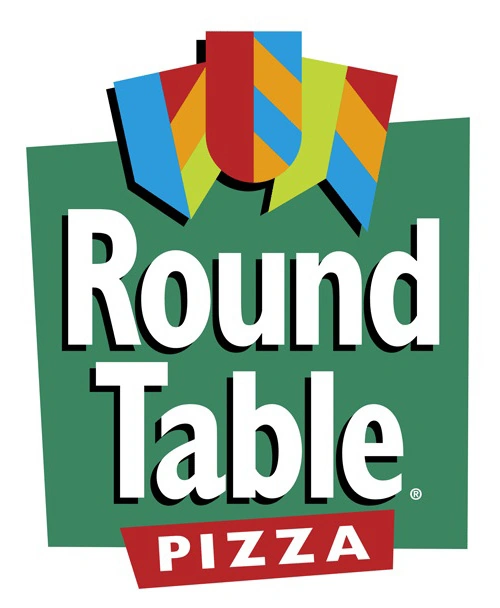
The three banners, one of which looks similar to a shield, were added in 1970.
According to the owners of the company, the banners were intended to symbolize the letters “F,” “U,” and “N” via their patterns and unique shapes.
One of the earliest versions of the official Round Table Pizza logo was introduced somewhere around the 1970s after the company embraced its medieval theme and started experimenting with the banner design. In this emblem, we see a relatively simple combination logo.
The name “Round Table” is presented in large, white sans-serif letters, with the word “Pizza” placed in the center, underneath them. Above the “Pizza” word, we see the three flags which were consistent in the logo for most of the company’s lifecycle. These were depicted in red and yellow.
The other primary color in the design was a bright shade of green, which has also been used for the company’s slogan, placed just underneath the larger sign.
In 2008, the Round Table Pizza logo was updated, making it even more colorful and modern. The banners still appear in this emblem. However, they’re depicted in shades of green, orange, red, and blue. Underneath these components, we see the “Round Table Pizza” wordmark.
The words “Round Table” are still presented in white on a green background, with a small amount of shadowing.
The “Pizza” component still appears in white on a red background, written in all uppercase letters. The components of the logo have been placed on an orange background, adding to the overall fun and creative nature of the design.
When did Round Table Pizza change its logo?
Perhaps the most significant update to the Round Table Pizza logo took place in 2019 when the company decided to invest in a rebranding strategy. During this rebrand, various aspects of the organization’s identity were updated, including its slogan, visual identity, and marketing strategy.
During 2019, Round Table Pizza also introduced a new go-to-market campaign, which involved the creation of its Pizza Pub Play locations.
The 2019 logo was introduced to celebrate the 60th anniversary of the business. In this design, the famous banners have been removed entirely. The central emblem features a lowercase “R” and a capital “T” to highlight the name of the business in a medieval-style font.
The wording has been designed to encircle the primary emblem, with some careful spacing in order to create a sense of balance. All of the letters surrounding the design are uppercase. In this variation of the logo, we also see the original founding date of the company.
According to the chief branding officer for the organization, the creation of the new signature look was intended to give the brand a sense of history while also helping it to progress into the modern world.
The combination of the rebrand and the introduction of the new restaurants also helped Round Table Pizza to differentiate itself from its competitors.
Another version of the logo has also been created, which depicts the full name of the organization and its new slogan in a similar medieval font.
The Round Table Pizza logo: Colors and fonts
Today, the Round Table Pizza logo is a world away from the emblem most people have come to know over the years. The iconic banners have been removed, and the colorful design has been pared down to a simple black-and-white color palette.
However, despite the many changes, the logo still maintains a relatively consistent theme. The font used for the central portion of the emblem still reminds us of the medieval inspiration behind the initial logos.
Additionally, the decision to implement the founding date of the organization into the logo helps the company to appear more trustworthy. It demonstrates the consistency and strength of the overall organization as it has evolved over the years.
You can find some useful resources connected to the Round Table Pizza logo here:
What color is the Round Table Pizza logo?
The Round Table Pizza logo colors have changed drastically since the initial launch of the business. In the early years, the company used a variety of colors to make it appear more fun and youthful to its target audience.
However, in 2019, as part of the rebranding strategy, the Round Table Pizza logo color palette was refined. For the most part, the logo appears in simple black and white.
However, there are instances of the emblem, which have been designed for the company’s mobile app and Reward scheme, which use the colors red and white instead.
What font does the Round Table Pizza logo use?
The most common variation of the Round Table Pizza logo uses a simple sans-serif font in the encircling words around the primary emblem.
However, the central letters in this logo, as well as the lettering used for other variations of the design, leverage a medieval-style script font with various unique embellishments.
At this time, the name for the Round Table Pizza logo font has not been revealed by the company. However, we can assume the typography is a custom solution specifically created for the pizza brand.
The history surrounding the Round Table Pizza logo
Looking at Round Table Pizza logo history, we can see only a handful of changes to the organization’s emblem. However, the updates to the design have been quite significant.
In 2019, when the company decided to invest in a rebranding strategy, many aspects of its visual identity were refined and changed.
Today, the Round Table Pizza logo still references its origins and historical theme.
However, the updated emblem is also intended to appeal to a younger, more modern audience. The simple black and white emblem conveys sophistication and quality and gives us an insight into the inspiration behind the iconic brand.
Fabrik: A branding agency for our times.

Clarity starts with a conversation.
Thanks—we’ll get back to you shortly.
Whether you're navigating a rebrand, merger, or simply need a clearer identity—we’re here to help. No hard sell, just honest advice from people who know the sector.
Let’s start with a simple question…
Prefer to email? Drop us a line.
Fabrik’s been helping organisations rethink and reshape their brands for over 25 years. We’ve guided companies through mergers, rebrands and new launches. Whatever stage you’re at, we’ll meet you there.