


The changing face of Papa Gino’s logo
Since 1961, the Papa Gino’s logo has been capturing the attention of hungry consumers across the United States. This company’s iconic emblem has evolved drastically over the years, adapting to suit a changing audience and a more modern landscape.
However, various aspects of the design have remained relatively consistent.
Looking back at Papa Gino’s logo history, we see some excellent insights into how brands can experiment with different logotypes, designs, and styles to capture the attention of their audience.
Like most famous Pizza brands, Papa Gino’s has worked to create an iconic image for itself, not just with its emblem but through its unique architecture and marketing strategies too.
If you’ve ever wondered where Papa Gino’s logo came from, whether “Gino” is a real person, or how the company has changed over the years, read on. Today, we’re going to explore the evolution of Papa Gino’s brand identity.
Introducing the Papa Gino’s Pizza logo
Launched in 1961 in Boston, Massachusetts, Papa Gino’s was founded by a couple: Michael and Helen Valerio. Initially, the team opened their store as “Piece O’ Pizza” before changing it to “Papa Gino’s” in 1968.
Following the name change, the company began expanding into multiple locations and had a total of 220 stores by the time the couple sold the brand in 1991.
In 1997, the Papa Gino’s brand purchased another Massachusetts -based food outlet, known as D’Angelo Sandwich Shops, and continued to expand. However, in 2018, dozens of locations were closed abruptly, and the holding company for the brand, PGHC, declared bankruptcy.
Today, Papa Gino’s is gradually resurfacing again, with around 80 locations situated in Rhode Island, Massachusetts, Connecticut, and New Hampshire.
Is Papa Gino a real person?
The choice to change the name of the company to Papa Gino’s was an interesting one for the couple since neither of them had the name “Gino.” There haven’t been any official announcements or reports to suggest why the couple chose this name.
However, there’s a good chance they were looking for a way to make their restaurant seem more human and family-friendly.
What company owns Papa Gino’s?
Papa Gino’s is currently owned by the Wynnchurch Capital group. The company was sold to the group after it emerged from bankruptcy protection in 2019. At present, the CEO of the brand is Tom Sterrett.
What style of pizza is Papa Gino’s?
Papa Gino’s is an American restaurant chain best known for selling pizza, subs, salads, and appetizers. The company specializes in thin-crust pizza, as well as Italian pasta dishes.
Papa Gino’s logo history
Papa Gino’s logo history dates back to 1968 when the new name for the company was first launched. Since then, the organization has experimented with a variety of different styles and color palettes for its emblem.
However, the typography choice for the brand has remained relatively consistent. The group has also always used a “pizza slice” or large triangle as the apostrophe in “Gino’s.”
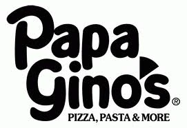
The first Papa Gino’s logo was a relatively simple and modern design, featuring the name of the brand in simple, black letters. The company chose a fun and friendly sans-serif font with plenty of curved elements to make it seem more welcoming.
A large block triangle, intended to represent a pizza slice, was used for the name’s apostrophe. Additionally, the logo included the tagline: “Pizza, Pasta & More” underneath in all uppercase letters.
More than 20 years after the introduction of the first Papa Gino’s logo, a new design was introduced in a wide range of colors. This emblem was presented in a banner style, with the name “Papa Gino’s” in one line on a red and green background.
A yellow line underneath the name separates it from the uppercase word “Pizzeria.” The font is still very much the same as the previous design, but the coloring was changed from black to white.
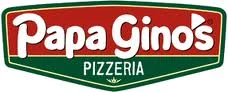
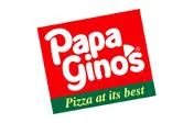
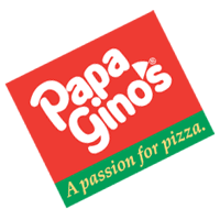
In 2008, Papa Gino’s introduced another logo, with the same color palette as the previous design, sans the yellow line. There were two versions of this logo introduced, both placed in a square, tilted slightly on their axis.
One showed the tagline “Pizza at its best,” while the other shared the slogan “A passion for Pizza.”
2010
A couple of years later, Papa Gino’s simplified its logo again, removing the blocky and banner-style backgrounds in favor of a simple wordmark. The design is very similar to the one used originally for the company, though it presents the name of the brand in dark red on a single line.
Underneath the wordmark, we see the word “Pizzeria” in all capital letters, surrounded by a line on either side. There are also variations of this logo, such as the one used on the brand’s website, which eliminate the tagline, and present the wordmark in white on a red background.
The Papa Gino’s mascot
Though not used in all of the company’s branding, Papa Gino’s does have a mascot that appears on its website and some marketing campaigns. The mascot is a simple mustached character wearing a white chef’s hat and a pair of red sunglasses.
He also has a shirt that reads “Papa Gino’s” in the company’s signature colors.
Certain advertising campaigns produced by the company have also included a reference to the mascot, who has also appeared “in character” at various stores.
The Papa Gino’s logo: Colors and fonts
Despite a relatively long history, Papa Gino’s hasn’t made too many changes to its logo over the years. The company has almost consistently used the same font style in every design, with an accompanying pizza slice apostrophe.
The color choices for the brand have also been quite consistent. Most of the time, the organization has focused on the use of red and white in its logos.
However, there have been instances where the team has ventured out into a wider color palette, implementing elements of green to bring the design color to the Italian flag.
If you want to take a closer look at some of the Papa Gino’s logos throughout the years, you can find some helpful resources here:
What color is the Papa Gino’s logo?
The Papa Gino’s logo colors have almost always been red and white. However, there have been occasional instances of green, yellow, and black introduced throughout the years.
Today, the official Papa Gino’s logo is presented in a dark red color for the company’s name on a white background. The “Pizzeria” tagline, when used, typically comes in red.
In some instances, such as on the Papa Gino’s website, the colors are inverted, placing the name of the organization in white on a red background. Red is a common color among pizza restaurants, as it’s associated with hunger, passion, and pizza sauce.
What font does the Papa Gino’s logo use?
The Papa Gino’s logo font has remained a consistent identifying factor for the brand since its inception. The custom typeface is a simple, elegant sans-serif solution depicted in large, eye-catching letters. It’s not certain what exactly this font style is called, unfortunately.
The font is playful, fun, and welcoming, with lots of large curves and soft lines, intended to appeal to a wide range of customers. The red color highlights the passionate nature of the brand and helps the emblem to stand out in a crowded market.
The evolution of the Papa Gino’s logo
Like most pizza companies, and indeed many other brands throughout the world, the Papa Gino’s brand has undergone various changes over the years. Today, the Papa Gino’s logo is intended to be eye-catching, modern, and simplistic, matching the style of many contemporary logos.
However, even with the various changes made to the design, we can see a lot of consistency throughout Papa Gino’s logo history. The font style and some of the most significant elements of the emblem have been almost exactly the same since the company’s inception.
Fabrik: A branding agency for our times.

Clarity starts with a conversation.
Thanks—we’ll get back to you shortly.
Whether you're navigating a rebrand, merger, or simply need a clearer identity—we’re here to help. No hard sell, just honest advice from people who know the sector.
Let’s start with a simple question…
Prefer to email? Drop us a line.
Fabrik’s been helping organisations rethink and reshape their brands for over 25 years. We’ve guided companies through mergers, rebrands and new launches. Whatever stage you’re at, we’ll meet you there.