


17 best rebrands ever! The most successful rebranding examples of all time

The best rebrands of all time are a great example of what a good makeover can really accomplish. In the same way an awesome new wardrobe can reignite your confidence, and a lick of paint gives your home that much-needed curb appeal, rebranding can reanimate a company.
We’re not just talking about the power of logo redesigns here either. Creating a new brand identity, infused with different personality elements, a new color palette, and some clever marketing can turbocharge a company’s profits, and attract loyal customers.
Sure, change is scary – particularly in the business world. But as you’ll see in the examples below, rebranding efforts really can pay off.
Today, we’re diving behind the scenes of some of the biggest changes made to companies in the last few years. Who knows? You might even be inspired to start your very own makeover.
Why bother rebranding a company?
We all love a good rebrand here at Fabrik. It’s a lot like watching one of those reality TV shows, or a rags to riches movie. Gawping at before and after pictures is a guilty pleasure.
But, let’s face it, rebranding ‘aint easy.
For all the successful rebrands in the world, there are plenty of epic fails too. Just look at Elon Musk deciding to transform the iconic Twitter bird into an ominous “X”. Or how about Gap’s expensive decision to change its logo for only 6 days?
Even if you have an epic rebranding strategy, building a new, dynamic brand from scratch takes work. You need to create new brand guidelines, conduct all kinds of market research, and update all of your marketing materials right down to the last email signature.
So, why bother?
The simple answer is, sometimes a good rebrand is necessary.
Trends, customers, and industries change, and no business wants to be left behind. A fresh new look can help you preserve your position at the top of the industry, or attract a younger audience.
Sometimes, it can even save you from trying to outlive a serious scandal. We’re looking at you, Facebook (Meta). A successful rebrand paves the way for a new era in your company.
Let’s dive into some of the companies that nailed the process.
The best rebrands of all time: Successful rebranding examples
As scary as rebranding is, the good news is that there are plenty of successful examples out there. The best rebrands were all carefully planned and executed with the help of knowledgeable branding and design teams. A little help really does go a long way.
With that in mind, here are some of our favorite rebranding “rags to riches” stories from throughout the ages.
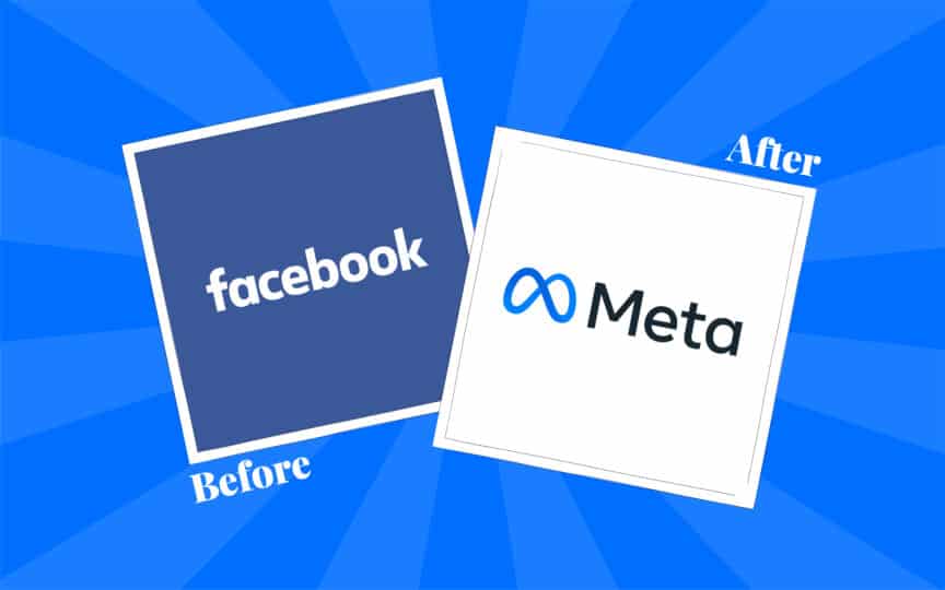
1. Facebook becomes “Meta”
Let’s start with probably one of the most memorable rebrands of the last few years. Following the Cambridge Analytica scandal, Facebook desperately needed a way to escape the media heat.
The social media giant was struggling with a huge drop in customer trust (no surprise there). So, what did they do? They didn’t just update their logo. They created a new name, a new identity, and even a new brand vision and mission.
The company switched its focus on being the top social media company, and started pursuing an identity as an innovator. They introduced us to the concept of the “Metaverse” and started plowing towards a future of new digital interactions.
While we’ve yet to see just how successful Meta’s rebrand will be in terms of cash flow and customer trust, there are plenty of reasons this move could turn out to be a success. It shows Zuckerberg’s commitment to start a new chapter for his company.
Plus, all the hype around the “Metaverse” definitely helped to drown out the noise about the Cambridge Analytica scandal.

2. Old Spice ditches the “old”
Definitely one of the best rebrands of all time, Old Spice’s image switch-up made the history books. A few years ago, the company was losing market share thanks to its old-fashioned and traditional imagery. People associated “Old Spice” with their grandparents – not very appealing.
The business needed a solution, and fast. While the company’s name didn’t change, its appearance and personality did. The organization shook off the “old man” vibes, with some clever research.
It discovered about 60% of body wash purchases were made by women, and launched a hilarious new campaign, “The man your man could smell like”. Launching on Super Bowl weekend, the new marketing campaigns got people laughing, smiling, and seeing Old Spice in a new light.
The campaign dramatically boosted sales, and Old Spice continues to build brand awareness to this day, with new social network campaigns and a fresh approach to video.
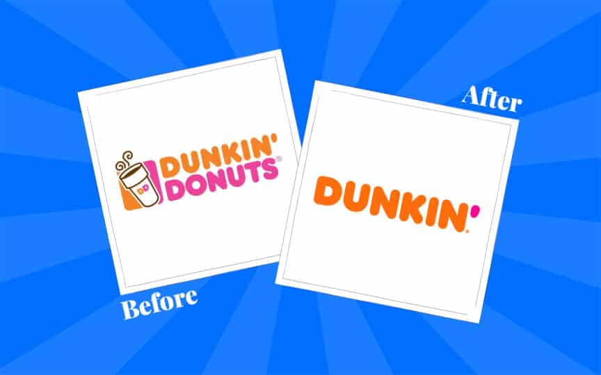
3. Dunkin’ loses “Donuts”
Ok, this one might seem a little basic, but bear with us. Dunkin’ spent years as one of the world’s most popular donut brands. But like many companies, it wanted to expand, reach new customers, and offer new products.
Customers were already familiar with the tagline “America Runs on Dunkin’” before the company decided to officially shorten its name. It ditched the “Donuts” section and created a simplified logo, intended to show its personality, rather than just highlighting the products it sold.
The rebrand involved more than just a basic logo and name change too. It influenced everything from the company’s store designs, to its packaging and brand messaging.
Dunkin’ Donuts quickly showed the world it could stay true to its heritage, while stepping boldly into the future. Nice work.
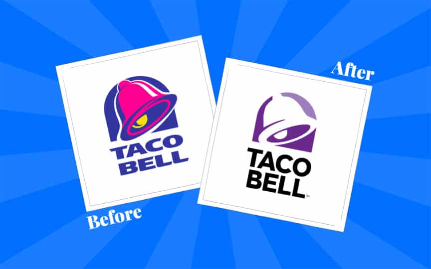
4. Taco Bell refines its image
This example is a little controversial. If you’re not a fan of minimalist design, you might think Taco Bell’s visual overhaul caused it to lose some of its charm. Personally, we like the change.
After years of chihuahuas and hacky marketing schemes, Taco Bell seriously needed to breathe new life into its brand. It was struggling to stand out in a changing market, and its image really did make it look a little old fashioned.
Updating its logo, its marketing strategy, and Taco Bell merchandise, helped propel Taco Bell into the next century. It even earned the company an 8% growth in revenue.
It wasn’t just the new symbol that helped Taco Bell either. The company started to focus on showcasing natural ingredients and healthier food options. That meant it could appeal to an audience more focused on protecting their health.
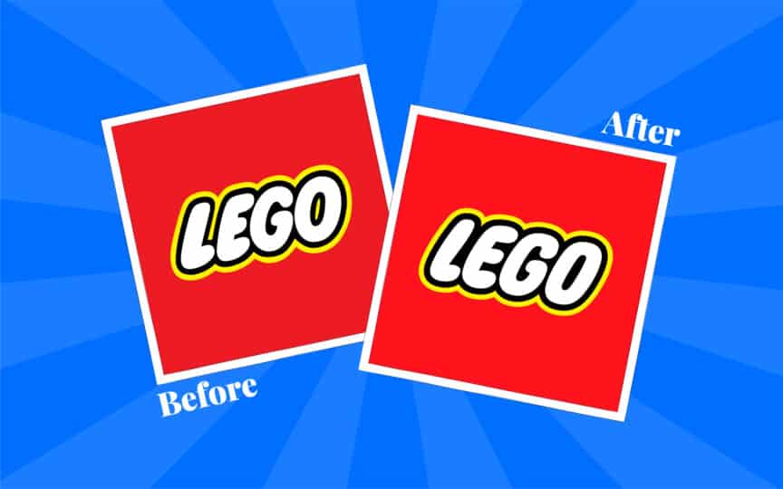
5. Lego expands its audience
The Lego rebrand is an interesting one. As you can see, the logo of the company, its color palette, and wider visual identity didn’t really change. But when building a new identity, it’s not just what’s on the outside that counts, it’s the inside too.
The famous toy company achieved one of the biggest turnarounds in history, just by recognizing its wider audience. It implemented new digital channels to engage kids and parents, establishing the brand as relevant once again.
Lego movies were created, alongside games and television shows. Plus, the company started investing in a brand-new strategy, creating unique toys for adults. After all, people of all ages love building things, right?
Sales skyrocketed as a result.
Lego even went on to create specialist digital channels, just to connect with customers interested in franchises like Star Wars and Harry Potter.
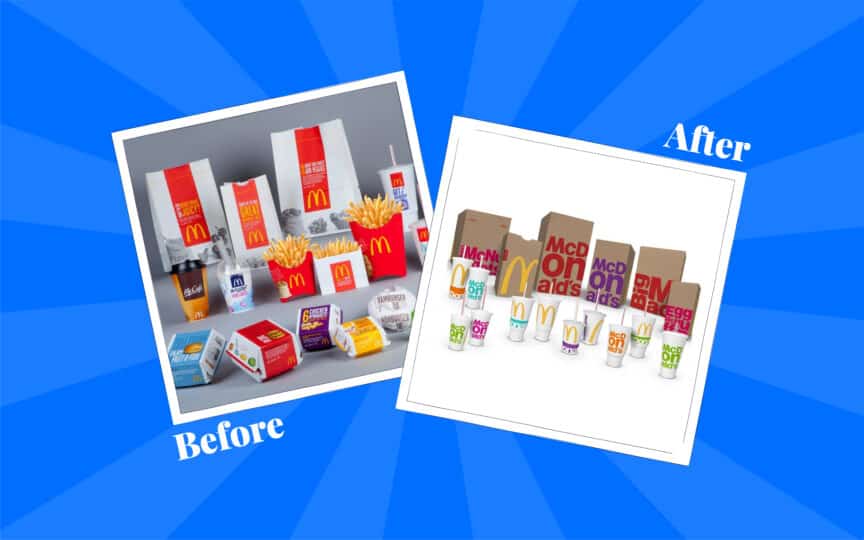
6. McDonald’s cleans up
Easily one of the most successful rebrands ever achieved by a fast food company, McDonald’s update kept it relevant in a changing landscape. After struggling with some pesky PR nightmares, McDonald’s needed a way to show its customers it cared.
We all love fast food, but no one wants to be reminded of the impact it can have on your waist. McDonald’s decided to change its messaging on a fundamental level. It started investing in ads that focused on its healthier products, and commitment to locally sourced ingredients.
Not only that, but McDonald’s seriously enhanced its image too. A fresh look was applied to all of its stores, packaging, and marketing materials.
The rebrand preserved some of the fun elements of the company’s brand image, while also giving it an opportunity to refresh its position in the minds of consumers.
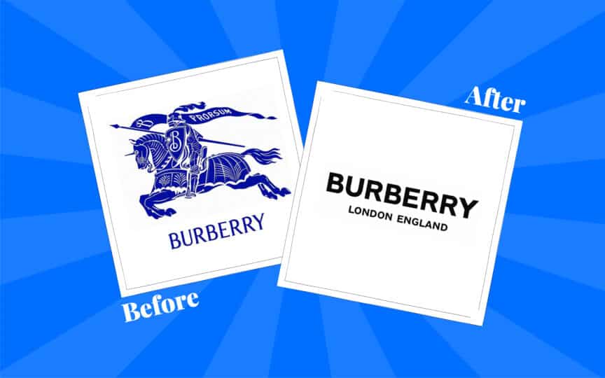
7. Burberry redefines itself
Burberry has gone through a handful of new design projects over the years, and for good reason. A couple of decades ago, the company didn’t have the best rep in the UK.
Most British consumers associated the luxury brand with “chavs” – not a good look. Plus, it didn’t help that the company’s image was seriously outdated. Burberry was struggling to reach a young audience, and sales were dropping fast.
Fortunately, the company came up with a plan. They’d start their rebranding process with the perfect spokesperson – Emma Watson.
The Harry Potter star transformed the company’s image, along with some clever marketing campaigns, and a fresh new logo. As a result, Burberry revenue jumped 21%. Customers started trusting the company again.
It’s amazing what a good endorsement can do.
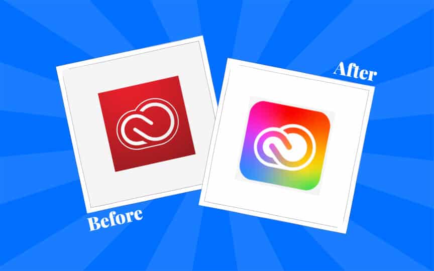
8. Adobe embraces creativity
Any designer or creative worth their salt will be familiar with Adobe. The company certainly didn’t struggle with brand recognition, even in the early years.
It created some of the most innovative and advanced products for design in the world. Things like Photoshop and Illustrator are still the industry standard today. The only problem? Adobe’s image just didn’t reflect its core purpose.
Adobe decided to infuse its creative style into its Creative Cloud catalog, changing new color schemes, fonts, and components. Adobe said the design changes weren’t just aesthetic; they were also intended to help customers navigate its products more effectively.
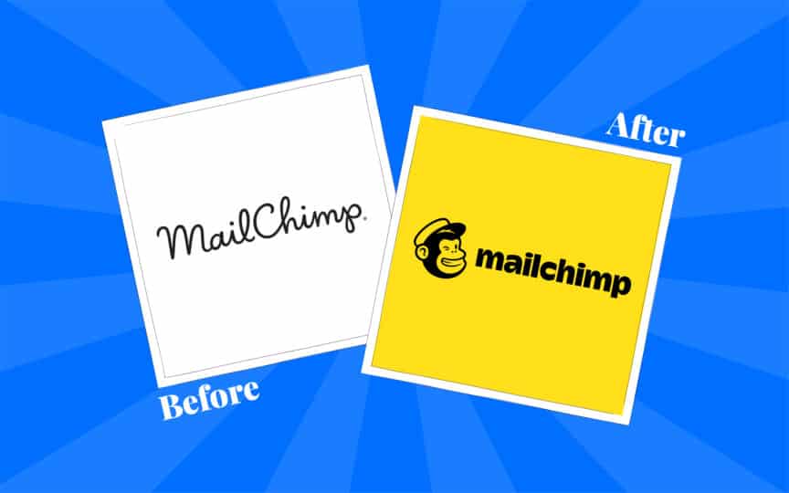
9. Mailchimp goes bananas
Designers have Adobe, marketers have Mailchimp. Created to make email advertising simpler, Mailchimp launched all the way back in 2001. Even then, the company had its own fun mascot – a monkey named “Freddie”.
However, they didn’t draw much attention to their fun and playful nature. Their logo was pretty simplistic – just a script-style wordmark. As new email platforms emerged in the market, Mailchimp was losing attention, and fast.
Fortunately, the company then invested in one of the best rebrands of all time. They updated their logo, with a new font choice, and a cheeky image of their mascot. Plus, they introduced the “banana yellow” coloring to their color palette.
Though not everyone loved the Mailchimp design change, it certainly helped the company to stand out. They started really working on not just their brand image, but their brand story too, with sponsored podcasts and marketing campaigns.
The whole thing was a gorilla success.
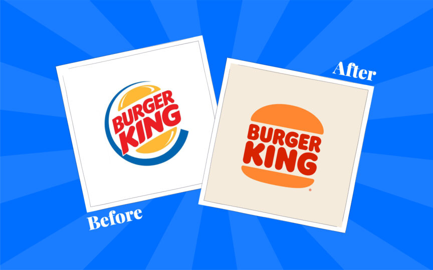
10. Burger King’s retro style
We’ve mentioned McDonald’s so it’s only fair to mention Burger King too. Struggling to compete in the fast food market, Burger King needed so much more than a glossy logo.
They invested in the help of a rebranding expert, to simplify their logo, and restore their brand equity. The design community, and Burger King’s consumers loved the change, praising its retro appeal, and its fun simplicity.
The new logo design influenced the company’s store and packaging branding, and encouraged them to start infusing new personality into their messaging. Everything about Burger King became more sophisticated, classy, and impressive.
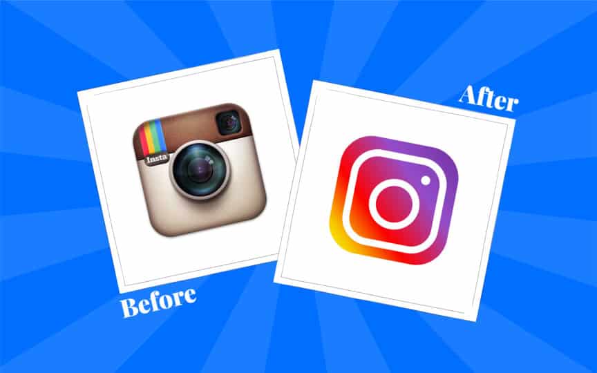
11. Instagram takes a new selfie
Instagram is probably one of the most successful social media platforms in the world. It’s also an example of one of the best rebrands ever introduced. Back when the company introduced its new logo in 2016, some people loved it, others hated it, and some were just confused.
At the time, it didn’t seem like the company really needed to rebrand. The icon used for the app wasn’t much different from the “standard” on smartphones in the day.
However, the company thought the old logo was too old-fashioned. It presented Instagram as a company committed to photo sharing – and the platform was becoming so much more.
Instagram decided to update to a more modern look, with a flat design icon, and some new layouts for its tools. The logo change reflected the company’s new vision and product portfolio. It was an amazing success for the whole design team.
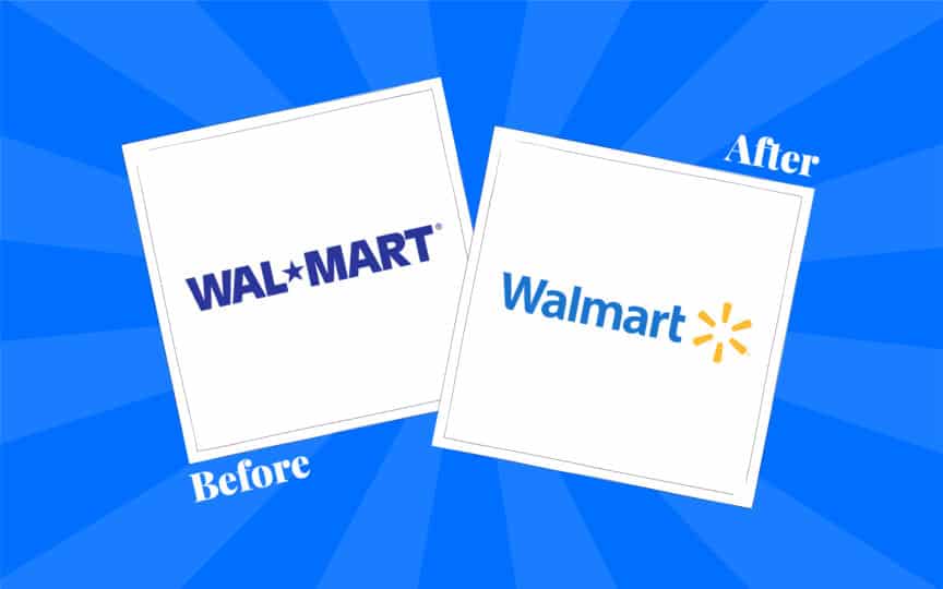
12. Walmart finds its spark
We’re really going back a few years now. Back in 2008, Walmart decided it was time to takes some bold moves with its name and visual identity. Wal-Mart became “Walmart”, but that was really the only major change – until ten years later.
In 2018, Walmart dove deeper into its rebranding strategy, creating a new logo, color palette, and messaging strategy, all designed to highlight its core values.
The “Walmart” star was replaced with a spark, and the typography changed to something more approachable and friendly. It might seem like a simple change, but this update helped the company connect with its audience on a deeper level, and eliminate its “old-fashioned” image.
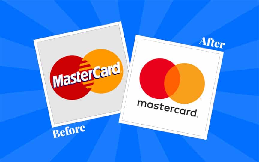
13. Mastercard champions simplicity
Mastercard somehow manages to be an example of one of the best rebrands in history, and also some of the worst. The company hasn’t always had the best time when refreshing its image and identity. In some cases, you might say they even went back a few steps.
However, the latest Mastercard brand identity is its most successful yet. Embracing the power of “simplified design”, Mastercard demonstrated just how powerful its company had become.
Working with a design agency, the brand introduced new website graphics, logos, widgets, and packaging components, all focused around its overlapping circles.
The recognizable yellow and red circles were really all customers needed to see to identify Mastercard at this point.
The company saw an opportunity to modernize, and they grabbed it.

14. GoDaddy forsake the geek
Some people might not count GoDaddy’s update as one of the most successful rebranding examples. There are plenty of people who loved GoDaddy’s nerdy mascot, and what it said about the company. However, rebranding turned out to be a good move for the business.
GoDaddy was struggling with its reputation, and its geeky mascot wasn’t helping anything. Companies were having a hard time taking the business seriously, particularly when they had such a bad reputation for customer service and support.
The brand redesign, complete with a new “heart-shaped” emblem and color palette, helped to highlight GoDaddy’s new commitment to serving their audience.
Though the new visual identity is a little plain, it was backed up by a new focus on service that helped the company to regain its loyal customer base.
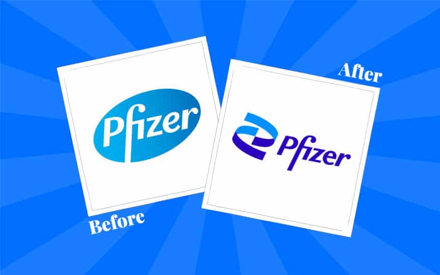
15. Pfizer cures its image problems
Sometimes, the best rebrands work because they open the door to new opportunities. That was certainly the case with Pfizer. For a long time, the company had held a reputation as one of the biggest “pill companies” in the world, and their logo seemed to corroborate this image.
However, in recent years, Pfizer proved it was capable of more than just pill production. It produced a ground-breaking vaccine for the COVID-19 pandemic, and wanted to showcase its commitment to research and innovation.
Embracing new branding, the company decided to change its logo from a pill shape to a helix, highlighting its scientific focus. Combined with a few subtle changes to the company’s color palette, the rebrand strategy turned out to be a massive success.
CEO Albert Bourla even shared an inspiring press release, telling customers that Pfizer wasn’t just about “treating diseases”, but “preventing” them too.
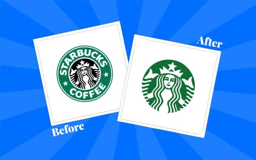
16. Starbucks goes back to basics
Another slightly controversial choice for our list of the best rebrands of all time comes from Starbucks. When the coffee giant updated its image, a lot of people were unhappy. They thought the new image was boring and simplistic.
However, the update was probably necessary. The previous logo of the Starbucks brand was restrictive. It focused only on one thing: coffee.
But Starbucks wasn’t just a coffee brand anymore. Their target audience had increased, with new beverages and foods on offer. Stripping the logo down to its bare essentials helped Starbucks shed the shackles that stopped it from expanding.
The company also built on its new logo change with a range of new updates to its messaging and products, creating loyalty schemes, and personalized experiences.
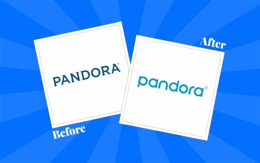
17. Pandora
Music streaming service Pandora hit the scene in 2000, with a logo that stayed exactly the same for 16 whole years. For a while, the simplistic emblem was fine. It wasn’t particularly exciting, but there was nothing aggressively wrong with it either.
Unfortunately, new tech companies began to emerge in the marketplace, and Pandora started to look and feel a lot more outdated. The company needed new ways to position itself as an innovator in a world dominated by companies like Spotify.
Pandora decided to update its brand mission and focus, concentrating on personalization. The new brand identity came with a new logo, featuring a sans-serif font and a brighter color palette. Though the change wasn’t huge, it was enough to help the company stand out.
The brand’s identity got a much-needed upgrade, and customers started paying attention to its unique services once again.
Learning from the most successful rebrands
The best rebrands of all time don’t just give us some fun makeovers to explore. They also teach us important lessons about how effective rebranding can be. Even the most successful company needs an update from time to time.
A significant rebranding effort, one that considers your audience, visual identity, and positioning carefully, can pay huge dividends in the long run. Some companies make big changes, others are more subtle, but all of the most successful rebrands have one thing in common.
They’re implemented with careful planning, and plenty of research.
Are you inspired by the rebrands above? Maybe it’s time to give your company a makeover of its own? If you’re ready to launch a new era for your company, give Fabrik Brands a call today.
Fabrik: A branding agency for our times.

Our co-founder, Stewart, is responsible for content strategy and managing Fabrik’s publishing team. It’s up to Stewart to bring Fabrik to busy marketers’ attention. As a regular contributor to Brand Fabrik, Stewart creates articles relevant to anyone in branding, marketing and creative communication.