


The biggest rebranding failures of all time: Major mistakes to learn from and avoid
The worst rebranding failures of all time are enough to make even the most seasoned brand strategist cringe. While updating a brand identity is sometimes necessary in a rapidly changing world, the slew of failed rebrands throughout the years show us just how important the right strategy is.
The rebranding process isn’t as simple as just updating a logo or choosing a new color palette. When major companies invest in a rebranding campaign, they spend millions of dollars creating a brand-new identity for their organization.
Fail to approach this process carefully and the results can be catastrophic. Not only do bad rebrands cost business leaders a fortune, but unsuccessful branding can have a serious impact on your brand equity over time. Companies have lost customers, shareholders, and investors alike.
Fortunately, every major rebranding failure has an important lesson to teach us. Today, we’re going to look at some of the worst examples of rebranding misfires, to help you avoid similar mistakes.
Examples of bad branding: What causes bad rebrands?
Failed rebrands happen more often than you’d think. It’s not just smaller companies with limited marketing and design teams that make mistakes. Some of the biggest companies in the world, from Gap to Pepsi have lost touch with their audience due to poor rebranding.
The question is, what is it that distinguishes a great rebrand, like “Dunkin’ Donuts” update, from a major branding flop? As you’ll see from the examples of bad branding below, there are numerous hurdles to overcome.
Some of the most common mistakes include:
- Lack of market awareness: A bad rebrand can easily make a company seem out of touch if it fails to research its market in advance. Understanding your industry, niche, and even your competitors is crucial to creating a successful rebranding campaign.
- Failing to research your audience: A great rebrand should always resonate with a specific target audience. Diving into a rebranding campaign without a clear view of your customers and their preferences can alienate your audience.
- Rebranding for the wrong reasons: Rebrands are expensive, complex, and time-consuming. Implementing a rebrand just to keep up with trends or copy the competition means you’re more likely to miss the mark.
- Removing valuable brand elements: Customers build relationships with specific elements of a brand over time. Eliminating the parts of your brand that make you compelling could mean you lose touch with your customers.
The worst rebranding failures of all time
Though there are many examples of successful rebranding strategies in the world today, there are almost just as many rebranding failures worth mentioning. New examples of branding blunders are appearing all the time, demonstrating the disconnect between companies and their consumers.
Here are just some of the best examples of branding gone wrong.

1. Twitter (X)
Probably the most recent example of a major rebranding failure (at the time of writing) comes from Twitter. In 2023, Elon Musk purchased Twitter and started making major changes to the platform almost instantly. Most of the updates have stirred negative responses from users.
Twitter’s original identity was long considered by experts as an incredible lesson in branding. The company’s name made us all think of short conversations and communication, the core components of the platform. The bird icon was friendly and welcoming, adding to the brand’s personality.
Even the color of the logo made Twitter seem more trustworthy and reliable. Elon’s decision to replace the iconic bird and name seems to make no sense to experts and consumers alike.
The new “X” name doesn’t appear to stand for anything, and tells us nothing about the platform. The new name seems like it’s trying too hard to be “modern” and edgy. The Twitter rebrand has done nothing to re-engage and enthuse audiences.
Critics say the rebrand is destined to fail, and likely to drive even more users away from the platform.
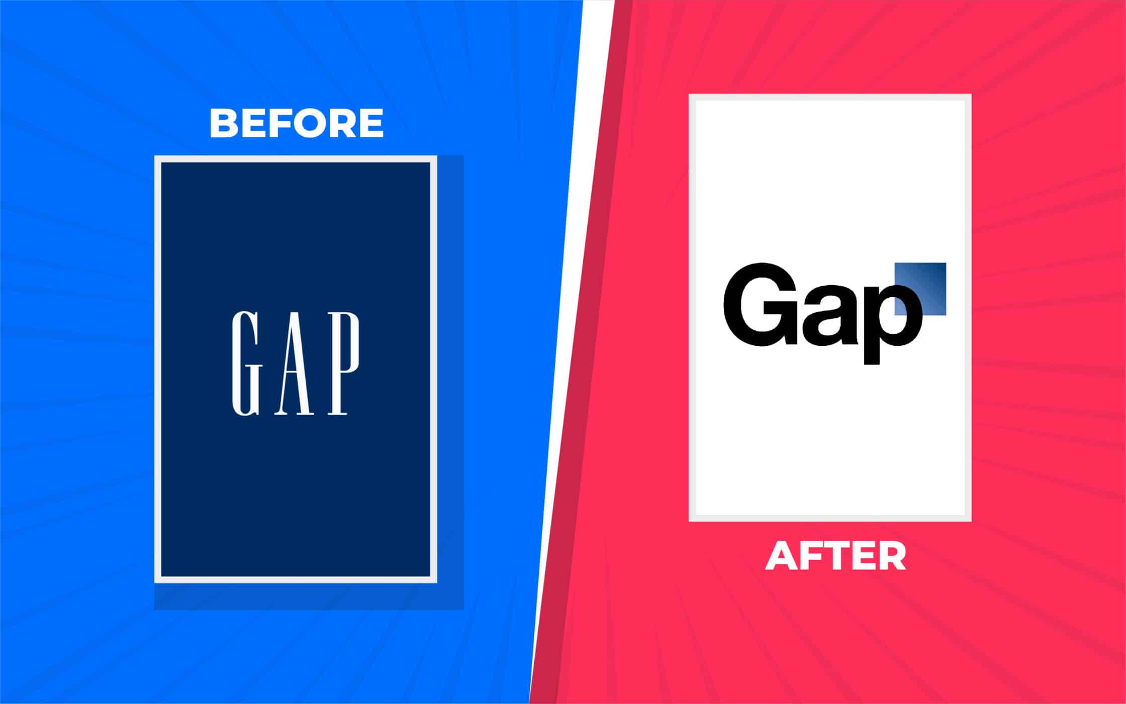
2. GAP
GAP’s logo update lands it straight on our list of the worst rebrands of all time. In 2010, the clothing company unveiled a new logo, intended to reignite sales after the 2008 recession. GAP assumed simply updating its image to something more modern would engage its audience.
Unfortunately, the rebrand just didn’t work out. The new logo was seen as bland and generic. It used the Helvetica font, like many popular brands at the time. Additionally, it seemed to present GAP as more of a technology brand than a well-known clothing company.
Perhaps the biggest mistake the business made was failing to announce the rebrand properly when it occurred. The company didn’t share any insights into the reason for its update, leaving endless consumers confused and enraged.
GAP returned to its original logo after only 6 days, but it had already lost around $100 million in rebranding costs. Ouch.
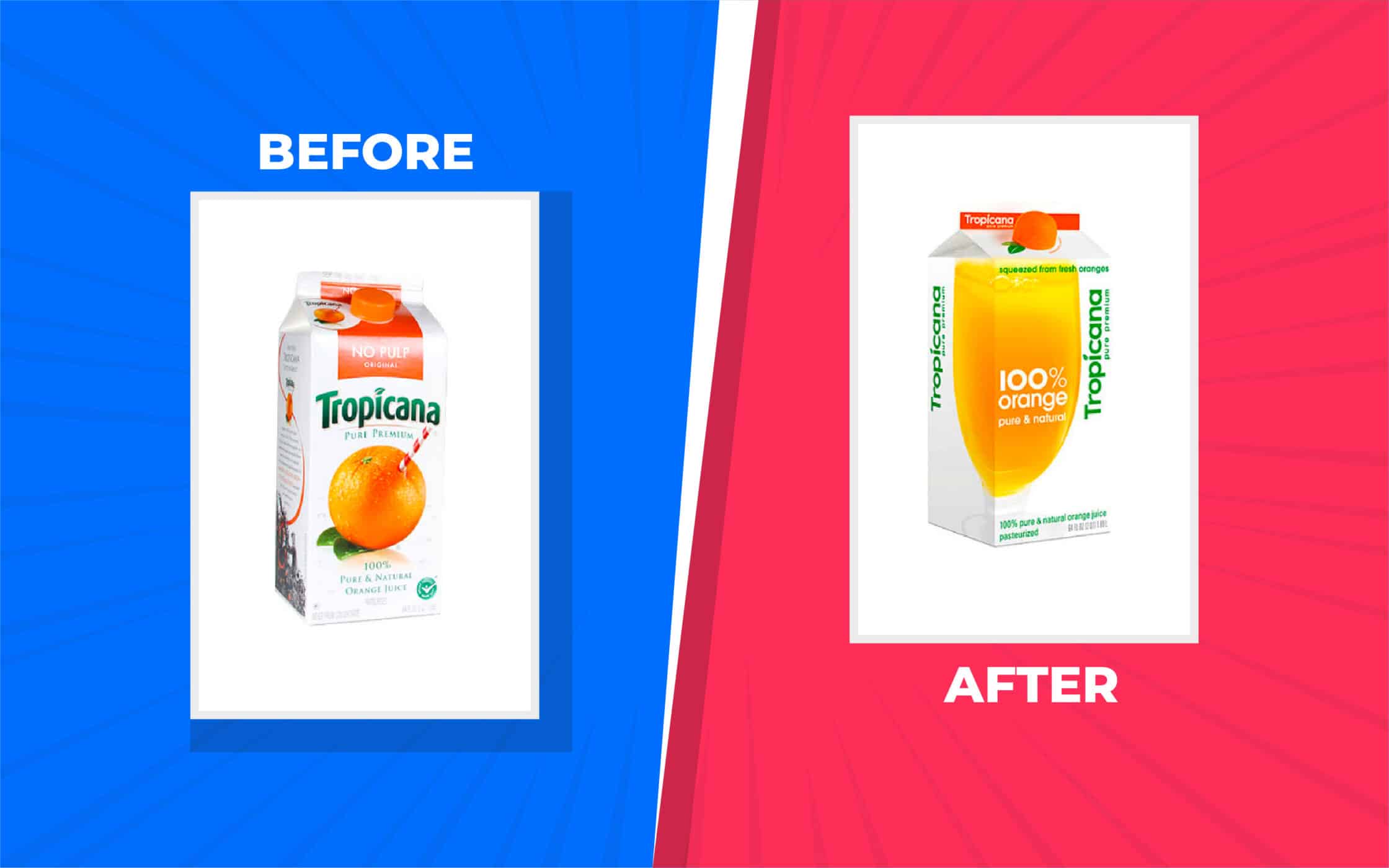
3. Tropicana
Many major companies invest in a new brand identity to keep up with market changes and trends. Sometimes, an update to an old logo and new packaging can prevent a company from seeming out of date, or old-fashioned. Unfortunately, Tropicana missed the mark with its strategy.
The juice manufacturer spent $35 million on marketing its refreshed product packaging, and worked hand-in-hand with a branding agency to boost sales. However, the new packaging actually led to a 20% loss in sales, equating to around $30 million in missed profits.
Consumers felt the new packaging, and the updated brand logo were boring and unappealing. The new design eliminated all of the fun and unique elements of the previous alternative. Most critics agreed Tropicana would have gotten better results from a simple refresh rather than a full rebrand.
There was nothing particularly wrong with the old branding to begin with, suggesting Tropicana rushed into its rebranding campaign without proper forethought.
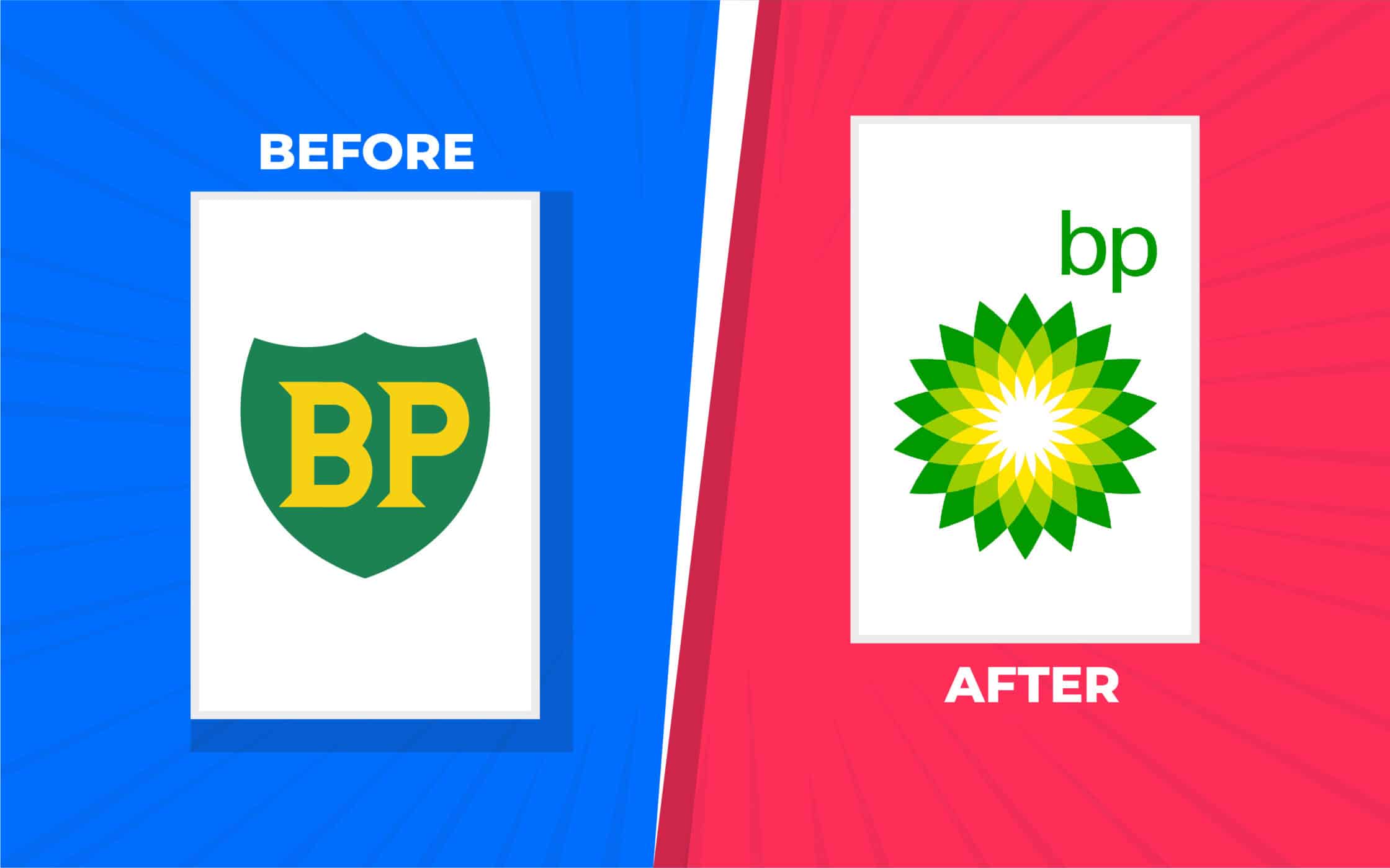
4. British Petroleum (BP)
While some people love the new brand created by British Petroleum in 2000, many feel it shows just how “out of touch” the company really is. The BP company decided to change their logo and image from a trustworthy shield to a “Helios” design.
The only part of the previous brand image retained was the yellow and green color palette. BP created its new brand image to increase its market share, by showcasing a new promise. The company wanted to show its customers that it was dedicated to preserving the environment.
Unfortunately, the new logo, which looks similar to a sun or a flower, doesn’t really resonate with the actions of the company. There’s nothing green about drilling for oil. Consumers felt BP was trying to pull the wool over their eyes, making promises they couldn’t keep.
It didn’t help that in 2010, BP were also responsible for one of the biggest marine oil spills in the history of the petroleum industry.

5. Mastercard
Many consumers are familiar with the most recent version of the Mastercard logo. The visual identity used by the brand today is actually quite successful. It’s simple, evocative, and powerful. However, Mastercard did stumble before it reached the finish line.
In 2006, the company spent around $1.5 million on a new image, intended to give them a fresh start in the financial landscape. Unfortunately, rather than distilling the core elements of its logo into something more compelling, Mastercard went in the opposite direction.
The company turned a relatively straightforward image into something cluttered, unsightly, and confusing. Although many people agreed that Mastercard was due a brand refresh at the time, the new look rubbed customers the wrong way.
Fortunately, in 2016, Mastercard did work with Pentagram to fix its rebranding mistake.
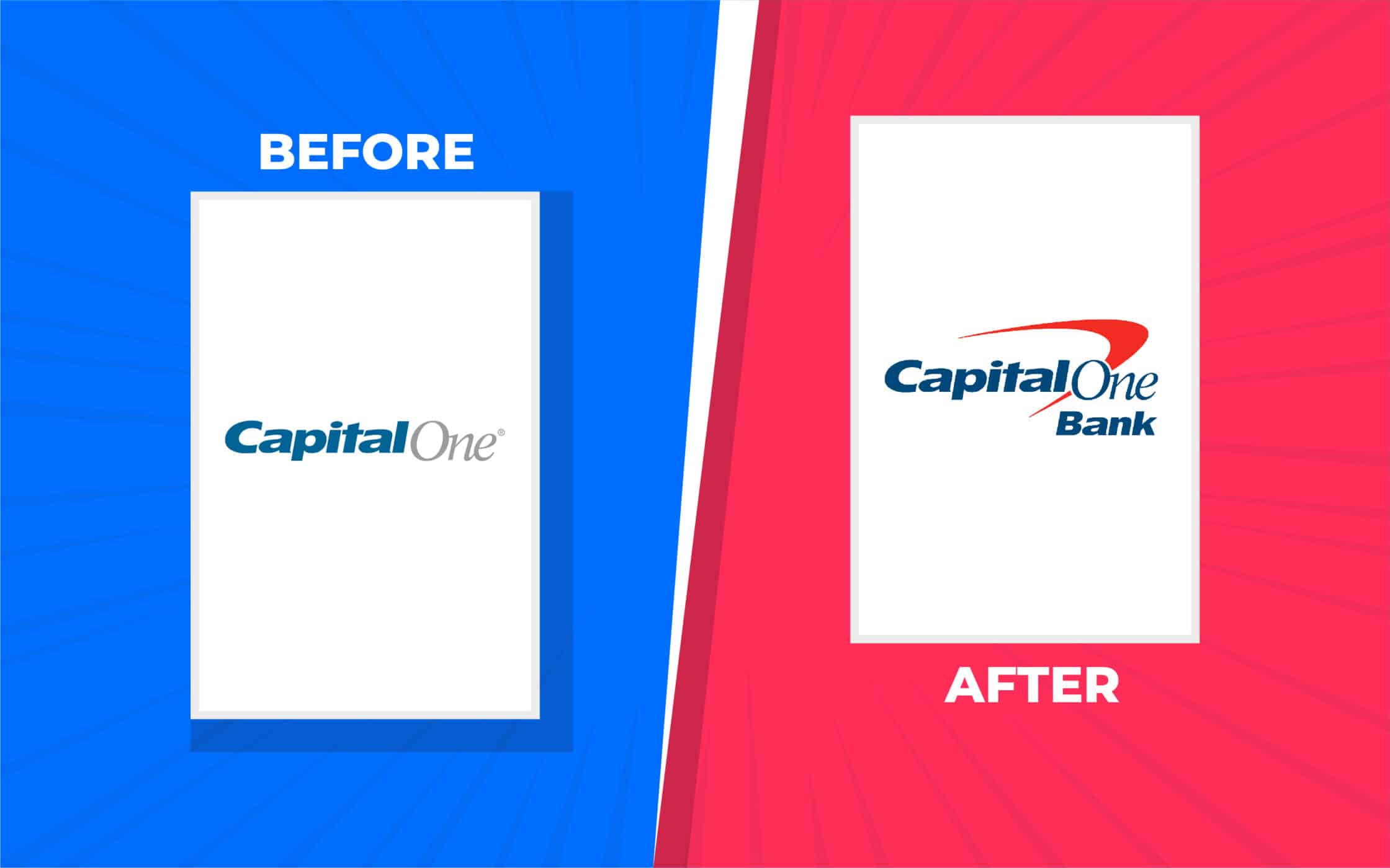
6. Capital One
Another major financial company on our list of serious rebranding failures is Capital One. Considered one of the country’s leading credit card and banking companies, Capital One decided to update its brand to reflect its authority and position.
Unfortunately, the well-known brand seemed to take a step backwards with its design choices. In place of its simple, but sophisticated logo, it created a new, cluttered emblem. The design looked dated and ugly, leaving both consumers and the graphic designer community confused.
Though many people expressed their dislike of the new logo, with its boomerang “swoosh”, Capital One held onto the new logo for a relatively long time. It wasn’t until much later that the company decided to finally simplify their logo again.

7. Pepsi
On the quest to be one of the most recognizable soft drink and soda brands in the world, Pepsi has made countless changes to its visual identity. It seems as though the company’s design team is always rolling out new versions of the brand logo.
Unfortunately, most of the company’s design changes haven’t helped it to engage its target market. In 2008, Pepsi released a new iteration of their logo, rotating the circular icon slightly, and adapting the white stripe in the center to make it look more like a “smile”.
However, the image looks a little more like a sneer than anything else. It didn’t help that the new icon was accompanied by a horrible typeface. It wasn’t until 2023 that Pepsi introduced another new logo, which seems to be more in line with the company’s identity.

8. Royal Mail
Sometimes, companies rebrand because they want to demonstrate a commitment to a new audience, industry, or collection of products. In 2001, Royal Mail, the leading UK postal operator, attempted a rebranding to show it was responsible for more than just sending and receiving parcels.
Royal Mail had evolved over the years to offer various services, including insurance and logistics services. This prompted the company to choose a new name and new logo for its identity. The new name alone “Consignia” cost the company a massive £1.5 million.
Unfortunately, customers had already fallen in love with the previous logo and name. They believed the traditional brand identity drew attention to Royal Mail’s history and commitment to tradition. After significant consumer backlash, Royal Mail reverted to its original name and design.

9. Leeds United
It’s not just commercial companies that struggle with failed rebrands. Leeds United, the popular football club, introduced one of the worst rebrands we’ve seen in 2018. The team decided to update its crest to celebrate 100 years in the football industry.
On the surface, it seemed like Leeds had done everything right. They invested in 6 months of research into customer preferences, and prepared a host of communication assets for the unveiling. However, more than 77,000 people signed a petition to boycott the rebrand.
Fans felt the new brand was a world away from the crest they had come to love and celebrate. Perhaps the football club didn’t survey the right people, or maybe they learned the wrong lessons from their fans. Either way, the club authorities eventually decided to withdraw their new crest.

10. Cardiff City
Another example of one of the worst rebrands from a football team stems from Cardiff City. Otherwise known to fans as the “Bluebirds”, Cardiff City retained a relatively consistent brand identity for many years. That is, at least, until Vincent Tan took over.
The new group owner decided he wanted to change the team’s brand identity as much as possible, choosing new imagery for the club’s crest, and a brand-new color palette. The football kit was changed from blue to red, and the blue bird was switched to a red dragon.
Although the designers were clearly trying to take inspiration from the Welsh flag, they violated a fundamental branding rule. They alienated their tribe of “Bluebird” supporters.

11. Weight Watchers
When it comes to examples of branding gone wrong, it doesn’t get much worse than the Weight Watchers rebrand introduced in 2019. Known for its commitment to helping consumers eat healthily and control their weight, Weight Watchers already had a well-known brand image.
However, the company decided it wanted to focus more on the “body positivity” movement in 2019. This prompted it to change its name from “Weight Watchers” to just “WW”, which it suggested stood for “Wellness And Wellbeing”.
A new, relatively uninspiring brand image was introduced. However, it wasn’t just the new logo that deterred customers. Consumers were confused by the loss of the iconic name that had stayed with the brand since 1963. Eventually, Weight Watchers decided to backtrack.
The full name was re-introduced, but not until after the company reported a massive loss of 600,000 members, and a huge downturn in its stock prices.

12. TGI Fridays
TGI Fridays seemed to have a great understanding of its target demographic in the early years. It appealed directly to young and rebellious hipsters, with its restaurant designs and marketing messages. However, in 2020, the company started moving in the wrong direction.
While the new logo and designs introduced by the company weren’t necessarily unattractive, they eliminated a lot of the elements that made the company compelling in the past. The rebrand didn’t really bring anything exciting or interesting to the TGI company.
In some parts of the world, TGI Fridays even removed the “TGI” from its name, leading to a relatively basic and generic brand image. While this rebranding failure might not have been as detrimental to the company as some others on this list, it probably wasn’t worth the effort.

13. Syfy
The Syfy channel, previously the “SciFi” channel, is well-known around the world for broadcasting shows specifically tailored to fans of science fiction. In 2009, the company decided it was time to refresh their brand identity for a new, more modern audience.
The team claimed they had good reasons for introducing their new branding. The company said it was introducing its new name to showcase its commitment to delivering a more diverse range of shows and entertainment assets. However, the rebrand failed to hit home.
The name change seemed almost pointless, as it was phonetically identical to the previous moniker. Additionally, SyFy’s existing customer base were more than happy with the original branding.
To make matters worse, the new logo seemed a lot more outdated and complex than the simplistic Saturn graphic and inscription used in the previous design.

14. Hershey’s
Probably one of the best-known confectionary companies in the world, Hershey’s is perhaps most famous for its chocolate kisses. That’s why the organization has long used the image of a “Hershey’s kiss” in its logo design. They retained that image when simplifying their logo for a modern audience.
According to Hershey’s, the logo update in 2009 was intended to showcase the company’s commitment to embracing their past, and the future at the same time. Like many companies at the time, Hershey’s reduced their iconic logo to a simple 2-dimensional design.
Unfortunately, the simplicity of the new logo made Hershey’s kiss a lot less recognizable. It suddenly bore a striking resemblance to a steaming pile of feces. This didn’t go unnoticed by Hershey’s target audience.

15. Radio Shack
Rebrands are intended to breath new life into an old brand, ensuring companies can connect with an evolving audience. Often, the best way to achieve success is to simplify and refine a brand identity, rather than starting again from scratch.
Unfortunately, Radio Shack didn’t get this message. When Lee Applbaum became the company’s new chief marketing officer, he decided to rename the company “The Shack”. This also led to the introduction of a new logo.
Unfortunately, many critics said the logo change was far from a good idea. It made the company look desperate to appear “hip” and cool. Most consumers agreed the updated logo and name was cringeworthy, harming the organization’s well-established identity.
It also seemed to alienate a huge part of “The Shack’s” target audience – DIY electronic enthusiasts, who had loved the previous title.
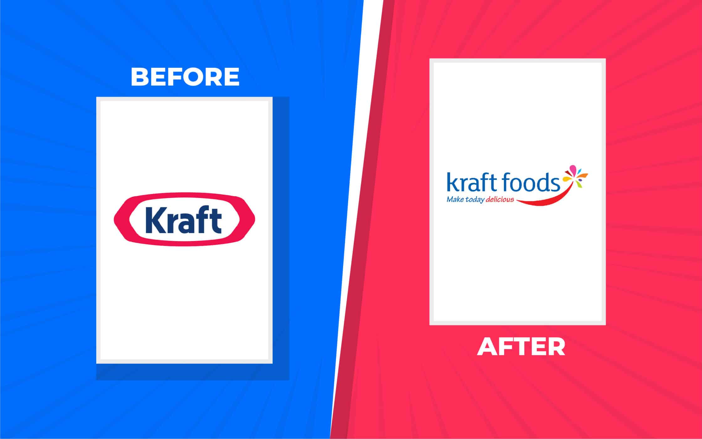
16. Kraft
Definitely one of the biggest food and beverage companies in the world, Kraft has earned phenomenal success over the years. However, this hasn’t stopped it from becoming a victim of some major rebranding failures. In 2009, the team revealed a brand new logo.
The new logo changed the name “Kraft” to “Kraft Foods” and introduced a variety of complex elements that consumers and the design community alike couldn’t fully understand. The new font was boring and generic, and the overall design seemed bland.
It didn’t take long for Kraft to realize its mistake and revoke its new branding. After 6 months, the iconic logo returned again. Clearly, Kraft didn’t do enough research before diving in here.

17. Mozilla
Like most people, you’re probably familiar with Mozilla for its web browser, Firefox. However, Mozilla is also a much wider brand, producing a variety of tech-driven products. Unfortunately, Mozilla started to lose some of its market share in 2008, as Google grew more popular.
In an attempt to make themselves seem more relevant to their evolving audience; Mozilla decided to launch a long rebranding campaign. They asked for insights from the public (usually a good idea), to help them convey their brand values more effectively.
Eventually, they decided on a new brand name and logo, which featured a portion of an URL in the place of the “ill” section of “Mozilla”. However, the public were less than impressed. Many said they felt the design was a reminder that Mozilla was falling behind in the tech world.

18. Holiday Inn
Usually, when a company chooses a rebrand over a brand refresh, we expect its new identity to be forward-thinking and exciting. However, Holiday Inn seemed to miss that fact entirely. Although the new logo introduced by the company wasn’t terrible, it wasn’t particularly inspiring.
The updated brand image seemed to say nothing new about the company. It introduced a new, rather generic font choice, and a simplistic color palette, with various shadows and gradients on the icon. The image was a lot more modern than the previous logo.
However, it also started to look outdated very quickly, thanks in large part to its three-dimensional elements. Since some people say the Holiday Inn rebrand cost around $1 billion, it seems as though the team definitely overpaid for their new identity.
Learning from the worst rebrands of all time
As you can see from the examples of rebranding failures above, updating your brand identity isn’t always as it seems. Rebranding efforts can easily go wrong, particularly when companies fail to invest enough time and energy into planning their new image and personality.
Whenever you’re thinking of making a major change to your image, it’s crucial to ensure you consider the facts carefully. Make sure you understand your target audience, and the core components of the true identity you want to convey.
If you’re struggling to update your business, and you feel a rebrand is necessary, it’s always a good idea to work with the experts. Find a branding company that can help with thorough market research and brand strategy.
Otherwise, you might end up on a list of the worst rebranding failures in history.
Fabrik: A branding agency for our times.

Clarity starts with a conversation.
Thanks—we’ll get back to you shortly.
Whether you're navigating a rebrand, merger, or simply need a clearer identity—we’re here to help. No hard sell, just honest advice from people who know the sector.
Let’s start with a simple question…
Prefer to email? Drop us a line.
Fabrik’s been helping organisations rethink and reshape their brands for over 25 years. We’ve guided companies through mergers, rebrands and new launches. Whatever stage you’re at, we’ll meet you there.