What is a generic logo? Avoiding overused logo designs
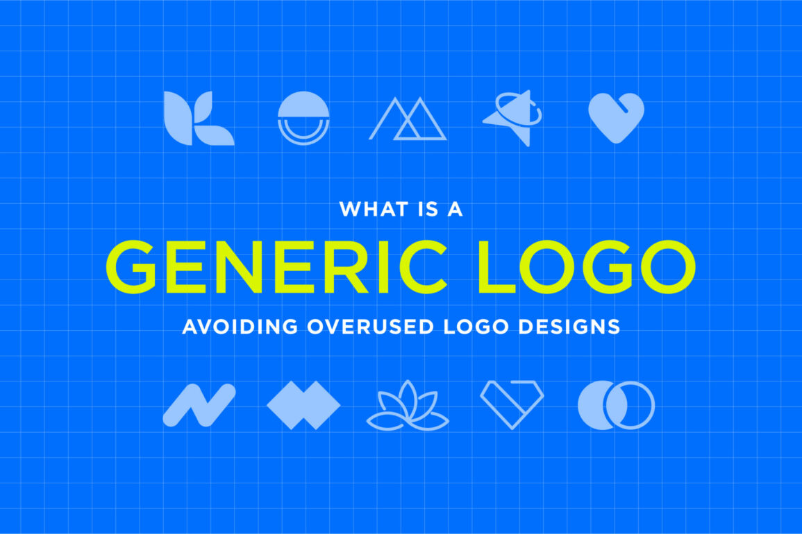
What is a generic logo? The chances are, you’ve already encountered one before. Generic and overused logo designs appear in every industry in virtually every part of the world.
If you’ve ever spotted an emblem that appears to include all of the same elements you’ve seen millions of times before, you’ve been exposed to a generic logo.
Generic logos are an unfortunately common issue in the branding world. After all, there are millions of companies in virtually every industry today, all trying to capture audience attention with meaningful shapes, typography, and color choices.
Unfortunately, business leaders investing in logo design are often influenced by what’s already present in the market.
Some design components in logo design seem like an obvious choice, depending on the type of business you’re running and your target audience. If you’re operating in the construction industry, the image of a house seems like an excellent way to show customers what you do.
If you’re in the automotive industry, you’ll naturally be drawn to images that include car components.
While generic logos may seem like an obvious and relevant choice for branding, they suffer from a major problem: they’re boring. Today, we’re going to take a closer look at the generic company logo, where it comes from, and how you can avoid it.
What is a generic logo? An introduction
So, what is a generic logo? How do you determine whether your would-be logo is meaningful and eye-catching or just a customized copy of countless other designs?
In simple terms, generic logos are repetitive, non-specific, and boring emblems. They’re overused, unoriginal designs, which have already been leveraged so many times in the branding landscape, they’ve lost their emotional appeal.
Think about how many times you’ve seen the image of a coffee cup with a plume of steam in a café logo or how often you spot logos with basic humanoid shapes.
Generic logos are uninspired. They leverage commonplace yet highly recognizable colors, imagery, and fonts without considering the specific personality of the brand or its target audience.
A generic company logo may be unoriginal in a variety of different ways. Some designs appear to use the same font choices as virtually every other brand. Others take advantage of iconography and shapes, which are common in a specific industry.
The simplest way to spot a generic logo is to ask yourself whether the image is essentially a “cliché” you’ve seen thousands of times before. There’s nothing original about using a tooth icon in a dentistry logo or a car silhouette in an automotive logo.
The problem with generic logo: Disadvantages of generic logos
So, why are generic corporate logos problematic?
On the surface, choosing a generic logo doesn’t necessarily seem like a bad thing. After all, the purpose of a logo is to convey meaning to your target audience. It makes sense to use components your customers will be familiar with, such as cliché shapes and well-loved colors.
Unfortunately, generic logos can be extremely damaging to a brand for one simple reason: they don’t form an emotional connection with your audience.
While an overly complex logo might be difficult for customers to understand, an overused logo is so boring it rarely captures the audience’s attention at all.
In today’s competitive world, consumers are exposed to so many logos on a daily basis that it’s easy to overlook designs that seem generic or cliched. To make matters worse, even if consumers see your logo, they’re unlikely to get a feel for your brand identity, personality, and values from it.
Remember, your logo is more than just a combination of imagery and text. It’s the entire face of your brand. If your logo looks the same as countless others in your industry, it’s not going to do anything to separate you from the competition.
A generic logo can:
Make your company less visible
Every day, we’re exposed to countless brands, all trying to capture our attention with their logos, branding, and marketing campaigns. It’s easy to filter out generic images and designs.
The emblems that stand out are the ones that go against the grain with unique, creative components.
Harm your reputation
A generic logo makes your business look less interesting. At its very best, your customers are likely to perceive your company as one lacking in creativity and imagination. At worst, your clients could perceive you as less professional and even lazy if you don’t have a compelling logo.
Damage your differentiation
It’s difficult to convince your customers you’re a world apart from your competitors if your logo looks the same as countless others. In any industry, a generic logo makes it harder to stand out and prove to your audience that you have something unique or special to offer.
Dilutes your branding
Although there’s more to a great brand than a good logo, your emblem will be a consistent part of your visual identity. If it doesn’t look particularly interesting, it can make it much harder to build an engaging brand.
Lead to legal problems
One of the biggest issues with using a generic logo is you may have a hard time registering the design as a trademark because it’s too similar to options that already exist. This makes it much harder to protect your visual identity. Plus, you could end up getting into legal battles with other companies.
Common components of generic corporate logos
So, what makes a logo generic? There are numerous answers to this question. Some logos are generic because they use relatively cliché shapes and patterns for their industry. Others are generic because they use common font choices.
Let’s look at some of the common components of generic logos.
1. Humanoids
Abstract human shapes are one of the most common symbols found in any logo.
Whether it’s a “V” shaped individual or a basic abstract design with human elements, humanoid symbols are everywhere. While these designs are relatively versatile, they also don’t say much about your company or the type of audience you might serve.
2. Generic fonts
A good font can make or break your logo.
However, it’s common to see many companies using the exact same font as their competitors. You may have noticed creative brands and boutique shops tend to use more hand-written style logos, while telecommunications and technology companies use bold, sans-serif wordmarks.
3. Globes and circles
Globes and circles are other examples of common shapes used in logo design for a range of reasons. The globe shape symbolizes accessibility and universal appeal. However, it can also make a company look dated and boring.
There are countless companies connected to science, health, and even technology, which use the same globe shapes.
4. Abstract shapes
Abstract shapes can sometimes be an excellent way to add something unique to a logo. However, many companies seem to use the same consistent shapes, such as crosses, arrows, and lines. An overly simplistic abstract shape can blend in with the crowd.
5. Graph and arrow logos
Graph and arrow logos are pretty common in certain industries, such as the financial landscape. However, they can be used in virtually any sector. Graph logos and arrows pointing up and to the right are usually intended to symbolize success.
However, they’ve become so common in the branding industry they’re now often overlooked.
6. Generic lettermarks and wordmarks
Wordmarks are one of the most common types of logos. They can be extremely useful for growing businesses, as they provide an insight into your company’s name, as well as your identity.
However, when choosing a wordmark, or letter mark, many companies end up creating similar designs, such as letters placed in a square or circle or a double-level wordmark logo.
7. Generic color choices
Have you ever noticed how some industries seem to be packed with logos featuring the same colors? There are even certain shades that seem to be more popular across virtually every industry.
Blue is the world’s most popular color, so there are millions of logos out there which feature blue as their primary shade.
Generic logo examples by industry
Now you know the answer to “what is a generic logo,” you can probably pinpoint a few examples from specific industries. While some shapes and design choices are fundamentally generic, others are overused in certain sectors.
Let’s take a closer look at some generic logo examples by industry.
Accounting, finance, and business logos
What’s the first thing that comes to mind when you imagine a logo for a finance company? The chances are you’ll think of a few common things, including arrows and graphs (as mentioned above), as well as wordmarks and lettermarks with generic, geometric shapes.
Many financial and business company owners try to convey sophistication, strength, stability, and growth in their logos, which leads to the use of a lot of the same iconography.
Real estate and construction logos
Generic real estate logos typically use iconography related to buildings. It’s common to see emblems featuring high-rise apartment complexes or just the roof shape from the top of a house. In the construction and architectural industry, these designs are often pretty common too.
However, you may notice the addition of some extra symbols, such as a hammer or a cement mixer.
Technology, internet, and software logos
There are some great examples of technology company logos out there which demonstrate creativity and innovation. Unfortunately, there are also plenty of generic, overused logos worth mentioning too.
Computer, internet, and software companies tend to use basic shapes in their logos, including globes, circles, and humanoid people. For cloud-based software companies, images actually featuring a cloud are often quite common too.
Communication logos
You’ve probably noticed the iconography used for a lot of messaging apps and communication tools is almost exactly the same. Look at how similar the Instagram Messenger, Facebook Messenger, and WhatsApp logos are, for example.
The basic “speech bubble” is perhaps the most common icon in the communication industry.
Retail logos
Generic retail logos tend to appear more often among supermarkets and major chain stores rather than in smaller business landscapes. Many of the most popular retail logos will include an image of a price-tag or something related to the sales landscape, such as a shopping cart.
It’s also common for these logos to use bright colors like yellow and red.
Healthcare and pharmaceutical logos
While there are some great healthcare and pharmaceutical logos out there, many seem to have a lot in common.
Simple wordmarks and acronyms are common in the pharmaceutical industry. In the healthcare landscape, certain shapes are quite popular, such as the cross shape, heart, and even a jagged line meant to represent a heart monitor.
Automotive logos
How many automotive companies have you seen that seem to have almost the exact same logo as their competitors? Emblems with the name of the company written in a circle and surrounded by wings are pretty common in the automotive landscape.
You may also see logos with elements of cars included, such as the silhouette of a car bonnet.
Photography logos
Cameras and lenses are absolutely everywhere in the photography branding landscape. Sure, it makes sense on the surface, but it also leads to a pretty boring, generic logo. There are countless examples of this generic company logo design process out there. Just look at Instagram, for instance.
Dental
Take a guess at what the most generic shape in the dentistry landscape is. That’s right, the tooth (usually a molar, to be exact). Most dental logos look as though they’ve been created with the exact same clip-art image of a tooth.
However, some companies do try to add some unique elements to make the tooth look like something else, such as people or apples.
Beauty and wellness logos
In the beauty and wellness landscape, there are some colors and components which are inherently more common. You’re likely to see more shades of pink and purple in this industry, as most companies are attempting to appeal to a more feminine audience.
Cursive and decorative fonts are pretty popular, too, alongside images of flowers, leaves, and even generic women.
Environmental logos
Want to convince your customers you care about the environment? Perhaps the easiest way is to use the image of a tree or a leaf. Trees are probably one of the most generic logo aspects of all.
You’ve probably seen countless variations which are designed to make the trunk in the center look like a person lifting their arms to the sky.
Pet care and veterinary logos
Pet care logos for companies selling dog food, cat treats, and even veterinary services tend to include pretty consistent imagery too. The most common option of all is a set of paws, often with heart shapes included to demonstrate compassion.
How to avoid creating a generic company logo
As you can see, there are plenty of generic logo designs out there in virtually every industry. Once you know what counts as a “generic company logo,” it can be a little easier to avoid falling into the same trap as your competitors.
However, staying away from overused logo designs can be harder than it seems, particularly if you don’t have a lot of graphic design experience.
So, how can you make sure you avoid generic logos?
Step 1: Know your brand
Generic logos are problematic because they can represent virtually any brand in a specific industry. A dentistry logo with a tooth in it might tell your audience what you do, but it doesn’t say anything about your unique values and identity.
With that in mind, it’s worth making sure you have a clear view of your brand’s mission and vision before you start designing.
Ask yourself what you can tell your customers about your business with your logo. What makes you special? What do you do differently from anyone else? Your logo should be a way to not only inform your audience of which industry you belong to but tell them what makes you unique too.
Step 2: Know your audience
As well as having a good understanding of your brand, you should also make sure you understand your target audience. Think about the colors, fonts, and shapes that will appeal to them directly.
Using a globe in your logo might make you seem “universal,” but it doesn’t connect you to a specific type of customer. Understanding your audience’s psychology will help you to create a better logo.
For example, the PayPal logo uses two shades of blue in overlapping “P’s” to demonstrate its commitment not just to reliable and credible service but to community and peer-to-peer sharing.
Step 3: Check the competition
Consumers aren’t the only people who suffer from logo blindness from time to time. When you’re creating your own emblem, it’s easy to overlook what’s already present in your market. If you want to ensure your design really stands out, you first need to know what’s already out there.
Take some time to research the companies in your specific industry and space, and make a list of the logo elements which frequently appear in their designs. These are the core components you’ll want to avoid when you’re building your own logo.
Step 4: Forget the cliches
Every industry has cliches connected to it. The key to avoiding generic business logo designs is making sure you’re not using the imagery and components that are “obvious” to your industry.
If you’re designing a logo for a construction brand, don’t automatically opt for the most obvious iconography, like buildings or hammers.
Think outside of the box, and look beyond the cliches. While your logo should still be relatively recognizable, it still needs to resonate with your audience. Ask yourself what will still represent what you do to your customers without making you look like a dime-a-dozen brand.
Step 5: Avoid generic logo generators
Logo generators might seem like a simple way to save money and time when you’re creating a logo, but they’re also one of the easiest ways to guarantee you’re going to end up with something generic.
These tools only give you a handful of fonts, colors, and icons to choose from, categorized by your industry, so you’re bound to get something that looks pretty common.
Rather than relying on a logo generator, work with a professional logo designer to create something entirely specific to you. A logo designer or agency will be able to research your market for you and produce a range of different solutions relevant to your company and target market.
Don’t rely on overused logo designs
By now, you should have a pretty clear answer to the question, “What is a generic logo?” In simple terms, it’s an overused, uninspired, and uninteresting logo design.
Whenever you’re coming up with a new logo for a business, it’s worth asking yourself this question: “Would this logo work just as well for another company in our industry?” If the answer is yes, you’re probably going too generic.
Unfortunately, it can be very easy for any business leader to fall into the trap of using generic logos. In every industry and part of the world, there are some logo components that appear more often than others.
When you don’t have a lot of design experience, it’s common to end up with a relatively obvious or basic logo.
If you’re struggling with the design process, the best option is to seek out some additional help. Work with a logo designer to ensure your emblem is as unique as your brand.
Fabrik: A branding agency for our times.
Clarity starts with a conversation.
Thanks—we’ll get back to you shortly.
Whether you're navigating a rebrand, merger, or simply need a clearer identity—we’re here to help. No hard sell, just honest advice from people who know the sector.
Let’s start with a simple question…
Prefer to email? Drop us a line.
Fabrik’s been helping organisations rethink and reshape their brands for over 25 years. We’ve guided companies through mergers, rebrands and new launches. Whatever stage you’re at, we’ll meet you there.


