


Premier League team logos: Top EPL logos
If you’re a fan of British football, you’re probably familiar with a handful of Premier League team logos. More than just a brand asset, EPL team logos are symbols of community and inspiration for fans of the Premier League.
Each team has its own colors, distinct symbols, and designs, intended to motivate both the players, and their supporters.
Over the years, Premier League team logos have evolved to suit modern design preferences, but many of them retain a handful of essential elements, often chosen to reference an important part of a location’s history or heritage.
Similar to university logos, English Premier League team logos have a distinct history attached to them, capable of inspiring pride and loyalty among a huge number of fans, not just in the UK, but around the world.
Today, we’re going to explore some of the top Premier League logos for the teams in the current football line-up (as of March 2022).
English Premier League team logos in 2022
Including everything from coats of arms to local references, EPL logos aren’t just a symbol of a growing football team, they’re icons of an entire community.
Just like famous brand logos, Premier League team logos are intended to not only differentiate each specific team, but also to help generate an emotional connection between players and their fans.
There are countless stories of people dying their hair to match the logo of their favorite football team, or even getting tattoos of their EPL team logos.
Here are just some of the Premier League logos you should be aware of in 2022.

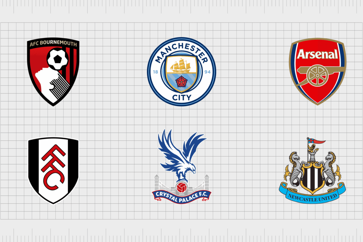
Manchester City
Created in the 1880s as the “St Mark’s” football club, Manchester City is one of the most popular teams in the premier league.
While the legendary emblem of the Manchester City football club has changed a few times over the years, the current design is a simple and effective nod to the location’s heritage, featuring the Manchester City coat of arms.
The current badge is a circular emblem with a shield in the middle. The name of the football club is depicted on a white border around the shield, while the inner shield contains a picture of a golden ship, and the red rose of Lancashire.
Find out more about the Manchester City logo here.
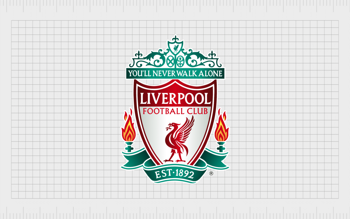
Liverpool
Perhaps one of the most recognizable Premier League team logos on this list, the Liverpool logo started off with the Liverpool coat of arms, with the Roman god Neptune, depicted on a crest.
Over time, the image was adapted to feature an elegant red liver bird placed inside of a bold shield emblem.
“Eternal flames” are placed either side of the shield, with the date when the club was first founded depicted in a banner underneath the image. The phrase “You’ll Never Walk Alone” appears at the top of the crest, for an extra dose of inspiration.
Find out more about the Liverpool logo here.

Chelsea
Another well-known pick among EPL logos, the Chelsea Football Club logo began in 1905, when the club was first founded. The club has won six league titles domestically over the years, and it’s the only English team to have won three active UEFA major trophies.
The Chelsea Football Club emblem is based on elements in the coat of arms for the Chelsea Metropolitan Borough, with the lion taken from the arms of the club president Viscount Chelsea. The staff in the lion’s hands comes from the Abbots of Westminster.
Find out more about the Chelsea logo here.

Arsenal
Arsenal has a total of 13 league titles and holds the record for longest unbeaten run at the time of writing, as well as 14 FA cups. The football club was first established more than 135 years ago as “Dial Square” in 1886.
Today, it’s the third most successful club in the English football history, and is an extremely well-known team around the globe.
The Arsenal Football Club crest features a shield-shaped emblem, with the colors of the Arsenal community depicted throughout, and the name “Arsenal” written in white lettering. The canon comes from the official coat of arms for Arsenal when it was first introduced in the 1800s.
Find out more about the Arsenal logo here.

Manchester United
Not to be confused with Manchester City, Manchester United FC is based in the Old Trafford region of Greater Manchester. Known by some as the “Red Devils”, the club was originally founded in 1878 as the Newton Health LYR football club.
Manchester United has won a joint record number of trophies in English football, including 20 league titles.
The Manchester United EPL logo comes from the Manchester City Council coat of arms. Currently, all that remains from the original logo is the ship in sail. The devil comes from the nickname for the club which was chosen over the years.

West Ham United
Based in Stratford, East London, West Ham United was originally established as Thames Ironworks in 1895, more than 125 years ago. The club has won the FA cup three times and has reached two major European finals over the years.
West Ham United’s crest is derived from the Union Flag of the Thames Ironworks Team. According to some sporting experts, the two golden hammers in the logo are inspired by the team’s nickname “The Hammers” and was derived from the hammers used by ship builders from the ironworks.
The shield shaped emblem also helps the club to maintain a sense of heritage, similar to other EPL logos.
Find out more about the West Ham United logo here.

Tottenham Hotspur
Tottenham Hotspur Football Club was founded in 1982, around 140 years ago. Based in Tottenham, London, the team’s logo features a cockerel standing on top of a football. The Tottenham Hotspur name also appears underneath the central image.
The Tottenham Hotspur logo has featured the same cockerel since 1921. According to club history, the team was named after Harry Hotspur, who was given the “Hotspur” nickname as he dug his spurs into his horse to make it go faster during battles.
Spurs are also associated with fighting cockerels, which is where the animal in the image originally came from.
Find our more about the Tottenham Hotspur logo here.

Wolverhampton Wanderers
One of the more unique English Premier League team logos on this list, the Wolverhampton Wanderers emblem looks nothing like the symbols used by other football teams.
The football team, otherwise known as “Wolves,” was founded in 1877, and currently uses the image of a wolf’s face in a hexagon shaped background as its logo.
This logo is a far cry from the coat of arms-style logos used by other leading EPL logos. The colors of gold and black in the image apparently allude to the city council motto, which is “out of darkness cometh light”.
Find out more about the Wolverhampton Wanderers logo here.

Aston Villa
Based in Aston in Birmingham, Aston Villa Football Club was founded in 1974, and has won the football league first division a total of 7 times. One of the better-known football clubs from England among fans around the world, Villa has a rivalry with the local Birmingham City club.
The Aston Villa football team logo features the letters “AVFC” and a star to represent the team’s European Cup win from the 1980s. The lion on the badge was originally introduced by the Scottish manager George Ramsay and William McGregor.
Find out more about the Aston Villa logo here.

Crystal Palace
Based in the Selhurst Borough of Croydon, South London, Crystal Palace Football Club has an unforgettable emblem, featuring a swooping Eagle. The Eagle, like many of the focal components in many English Premier League team logos, is based on the nickname for the team “The Eagles”.
The Crystal Palace logo today includes an image of a palace intended to represent the location of the football club, and the name of the team. The blue eagle is depicted above, holding a red traditional-style football in its talons.
The image is a very eye-catching and modern one compared to some of the other top EPL logos.

Brighton & Hove Albion
Founded in 1901, Bright & Hove Albion is a football club with the well-deserved nickname “The Seagulls”. The club adopts a relatively minimalist logo compared to some of the more complex Premier League team logos on this list.
The image of a flying seagull is at the heart of the emblem, referencing Brighton’s connection with the south coast of England.
For most of the club’s history, the team have played in the colors of blue and white, so it makes sense the emblem would also be depicted in these colors. Similar to many competing teams, the Brighton & Hove Albion badge also showcases the name of the club.
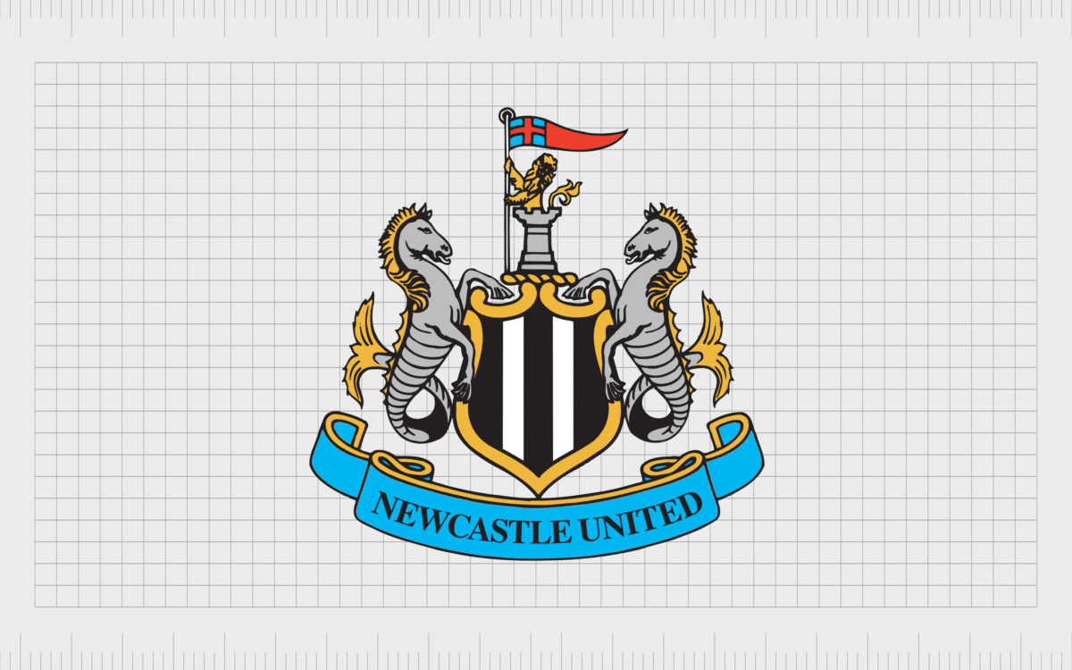
Newcastle United
Founded in 1892, Newcastle United Football Club is based in Newcastle Upon Tyne and has been a part of the Premier League for all but 3 years within the competition’s history. The team has won four league titles, and six FA cups.
The Newcastle United logo badge originates from the 14th century Newcastle coat of arms and is intended to signify the heritage of the region.
Although this is one of the more complex and detailed logos in the English Premier League today, it’s also one of the most memorable, featuring a lion with a flag, a golden shield with black and white stripes, and a pair of seahorses.

Brentford
Better-known as “The Bees” among their fans, Brentford Football Club was founded in 1889, and is situated in the Brentford region of West London in England. The group recently gained promotion into the highest tier of the Premier League during the 2020-2021 season.
Brentford Football Club’s logo features the name of the team in a red circular badge. The circle shape makes the Brentford logo similar to a number of other well-known EPL logos. The bee in the middle of the logo’s design is intended as a reference to the club’s nickname.
We can also see a reference to when the team was founded in this logo.

Everton
One of the more traditional looking emblems in our list of Premier League team logos, the Everton Football Club crest is brimming with history and prestige.
Everton Football Club was established in 1878, and the team has competed in the top division of the Football league for a record of 118 seasons. It also ranks third in all-time points rankings.
The Everton crest is a simple but effective depiction of the Everton lock-up in the middle of the Everton district – a building which has been linked to Everton since the 17000s.
The design also features the name of Everton, as well as the motto “Nothing but the best is good enough” written in Latin in a banner below the shield.

Nottingham Forest
The football club logo of Nottingham Forest, currently the oldest professional football club in the English Football League, is very different to a lot of the images we’ve seen here so far.
The team, otherwise, known as “Forest” or “The Tricky Trees” are competing in the EFL Championship today.
The Nottingham Forest Football Club logo features a simple tree, intended to represent the nickname of the team, depicted in red, with a stylistic wordmark underneath.
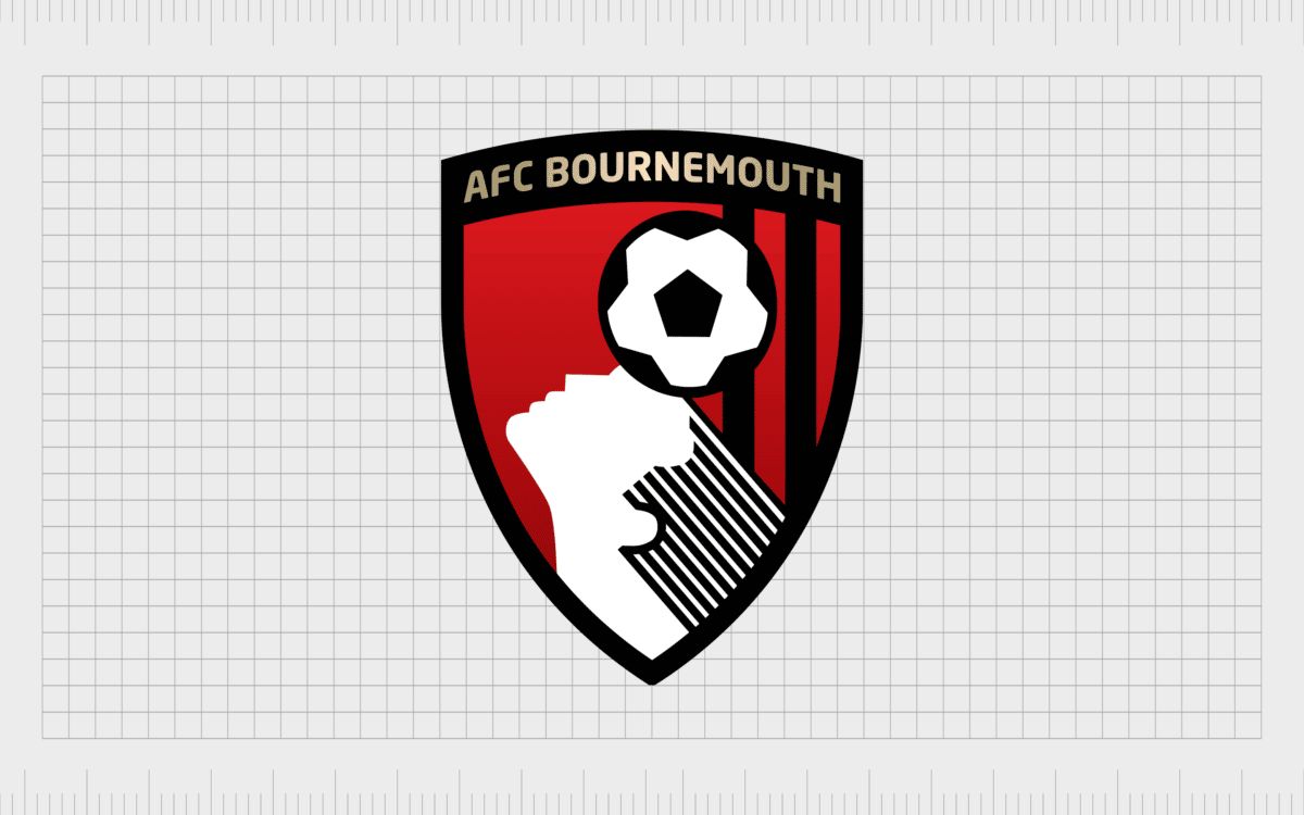
Bournemouth F.C
Currently playing in the Premier League, Bournemouth FC was first introduced to the British football landscape in 1875, as the “Bournemouth Rovers”. Today, the team is commonly referred to as the “Poppies” by their fans.
The Bournemouth Football Club logo features the home colors of the team (red and black) in a circular emblem.
In the image, we see the name of the football team, as well as various references to their nickname, in the form of a tagline, and two red and white flowers either side of the emblem.
The middle of the badge reminds many people of a poppy as well, thanks to the black circle in the center and the red and white striping behind it.

Fulham
Founded in 1879, Fulham Football Club is based in London, and is currently the oldest team from the capital to still be playing professionally. The club has spent a total of 27 divisions in the top division of football in the UK, and it now competes in the Premier League.
Fulham Football Club is otherwise known to fans as the “Cottagers” and the “Whites”. The name the “Whites” might be a reference to the large amount of white in their home colors. The logo for this team is relatively straightforward, featuring a white and black striped shield.
In the middle of the shield, on the larger white stripe are the letters corresponding to the Fulham Football Club’s acronym: FFC. These letters are depicted in red, a color which also appears in small portions on the team’s uniforms.

Sheffield United
Joining the Premier League after promotion from the 2022-2023 EFL championship, Sheffield United is better known as “The Blades”.
This nickname certainly explains a thing or two about the group’s badge, which features two sabres crossed over each other, on a black, circular background. The badge also shows a rose, one of the most common symbols of the United Kingdom.
The team’s first logo design was based on Sheffield’s coat of arms. However, it was replaced when Jimmy Sirrel took over as manager. The updated emblem, with the Yorkshire Rose, red and black badge, and the two blades, was apparently created by former player, Jimmy Hagan.
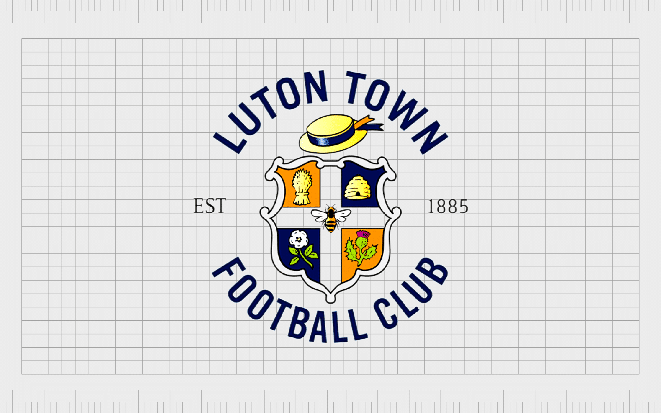
Luton Town
Perhaps one of the most colorful Premier League logos on this list belongs to Luton Town football club. Founded in 1885, the team earned the nickname “The Hatters”, and the crest used in the team’s emblem has a traditional hat of its own.
The nickname came from Luton’s historical connection with the hat making trade, and the reference to it in the group’s crest is a symbol of local pride. The overall logo is based on the official crest of Luton Town, and highlights the date when the team was first founded.
Though relatively old-fashioned in style, this delightful, and eye catching logo definitely sets Luton Town apart from competing teams in the Premier League.
Former Premier League teams
We’ve covered the primary teams in the Premier League team for 2022. Now let’s take a quick look at logos from a selection of other famous English football clubs too.

Southampton
Southampton Football Club, founded in 1885, has an eye-catching and brightly colored emblem, perfect for grabbing attention in an athletic environment.
Interestingly, the players for Southampton originally didn’t wear a badge on their shirts, and just used the Southampton coat of arms for a logo.
The logo of Southampton today is based on the original emblem for the club, which leveraged the Southampton coat of arms. There’s a football scarf placed in this logo, as well as the image of a logo, and the name of the Southampton Football Club.
The football in this emblem also has its own golden halo, representing the nickname, “The Saints”.
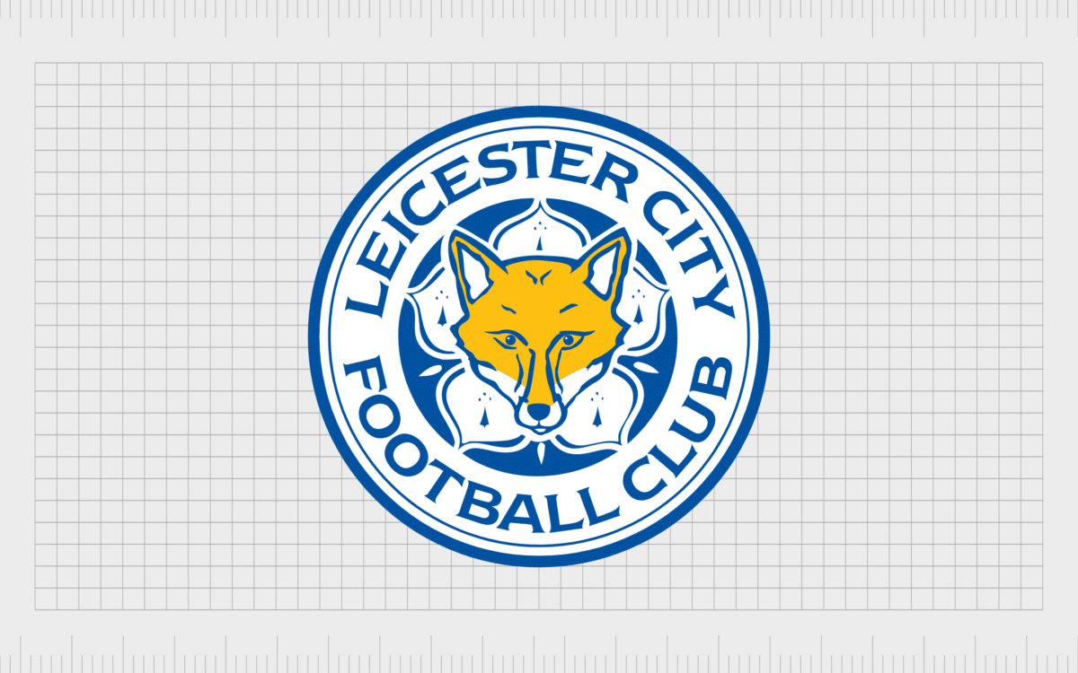
Leicester City
For most of Leicester City’s history (since the club was founded in 1946), the crest has featured the image of a fox, which is the official club mascot.
The current English Premier League logo for Leicester City is a simple and modern one, depicted in a blue circular badge, with the name of the club written in a matching shade of blue.
The club has earned the name “The Foxes” over the years, thanks to its mascot, which was chosen because Leicester was well-known for its foxes, as well as the sport of fox hunting.
The fox depicted in the current logo sits on top of a cinquefoil, similar to the one used for Leicester’s coat of arms.

Leeds United
Another example of an English Premier League team with the word “United” in its name, Leeds United was initially introduced in 1919, making it a bit younger than many of the other teams in the Premier League.
The football club is based in the city of Leeds in West Yorkshire and was promoted from the EFL Championship in the 2019-20 season.
The Leeds Football Club logo features a yellow and blue shield, with the letters “LUFC” depicted in a cursive font in the middle. The design is derived from the coat of arms for Leeds and includes a depiction of the white rose of York.

Burnley
Founded in 1882, Burnley Football Club is based in Burnley Lancashire, and was one of the first top tier football clubs to become “professional” in English history. Burnley has been champions in England twice and have won the FA cup once.
The crest of Burnley football team is based on the town’s coat of arms. The stork at the top of the crest is a reference to the Starkie family, once prominent in the Burnley area.
The stork also holds the Lacy knot in its mouth – a badge from the De Lacy family, known within Burnley in medieval times. As with many EPL badges, the Burnley FC badge also features the name of the team in a banner.

Watford
The Watford logo for the English Premier League is quite an unusual one, as it has nothing to do with the team’s nickname, “The Hornets” or “The Yellow Army”. The club was founded in 1881, and is based in Watford, Hertfordshire.
Most of the badges for Watford Football Club are inspired by the crest of the home city for the team. The current design features the head of a deer in a diamond pentagon shape, with the word “Watford” placed above in bold, sans-serif capital letters.
The design of the visual identity is intended to be modern and eye-catching, setting Watford apart from a number of EPL competitors.

Derby County FC
Competing in the Championship second tier of English football, Derby County Football Club was first established in 1884. The team is better-known as the “Rams” which explains the EPL logo choice for this club.
The emblem is very different to many of the others covered in this list, but it’s also impressively minimalistic and compelling.
The image features the outline of a ram, intended to represent the group’s primary mascot. The design is intended to look sleek and contemporary.
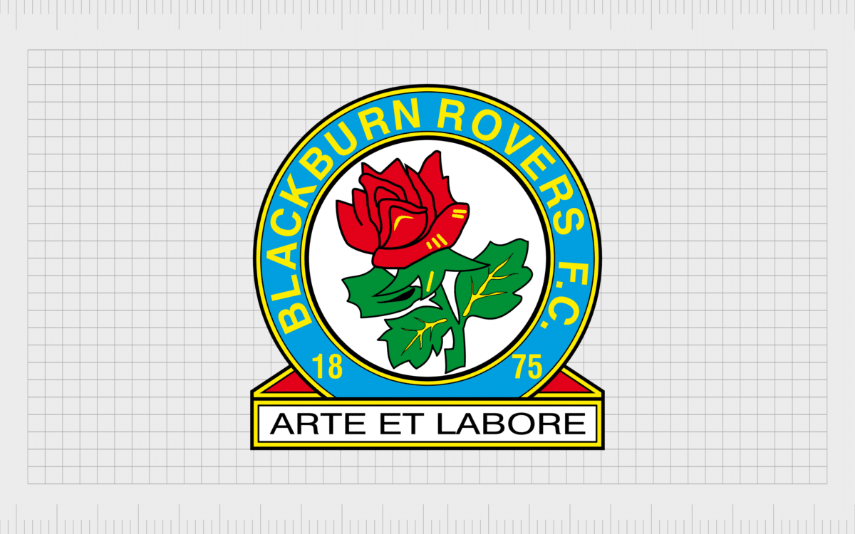
Blackburn Rovers
Embracing a far more traditional English Premier League team logo, the Blackburn Rovers Football Club competes in the EFL Championship at the time of writing. The club was established in 1875 and became a founding member of the Football League and the Premier League over the years.
The Blackburn Rovers badge features the Lancashire Rose, as well as the name of the club. The motto “By skill and by labor” is also depicted in Latin.

Sunderland
The Sunderland Association Football Club currently plays in “League One” of English football (third tier). Since the formation in 1879, the team has won a number of top-flight titles over the years, and also won the FA Charity Shield in 1936.
Sunderland’s logo is extremely traditional, looking similar to the coat of arms for the town of Sunderland itself. The official coat of arms featured a black cat, but Sunderland’s football team eventually transformed this cat into a pair of lions.

Middlesbrough
A professional football club from Middlesbrough, North Yorkshire, Middlesbrough Football Club currently competes in the second tier of the English Football League. Middlesbrough was also one of the founding members of the Premier League in 1992.
The Middlesbrough Football Club crest is a traditional image featuring a shield-shape emblem with the name of the club depicted at the top and bottom of the shape. In the middle of the emblem is an iconic red lion, similar to the lions we see on the England National Team crest.

Norwich City
Also known as “the yellows”, or “The Canaries”, the Norwich City Football Club was founded in 1902, and was recently promoted to the Premier League in the 2021-22 season. The club has won the League Cup twice and has finished third in the Premier League in the past.
The Norwich City Football Club logo comes from the nickname “The Canaries” which was given to the team because of the city’s history of breeding the birds in the area. The canary reference is also why the Norwich City official colors are green and yellow.
Celebrating Premier League team logos
Premier League team logos have captured the hearts of countless fans over the years. Today, Premier League logos are a badge of honor for everyone who follows the world of English football.
Although the groups within the English Premier League might change over the years, the meaning behind the logos they create continues to thrive.
Every year, fans continue to search for the logos of their own favorite team, and show their support by wearing the emblems and colors of the players they love.
Fabrik: A branding agency for our times.

Clarity starts with a conversation.
Thanks—we’ll get back to you shortly.
Whether you're navigating a rebrand, merger, or simply need a clearer identity—we’re here to help. No hard sell, just honest advice from people who know the sector.
Let’s start with a simple question…
Prefer to email? Drop us a line.
Fabrik’s been helping organisations rethink and reshape their brands for over 25 years. We’ve guided companies through mergers, rebrands and new launches. Whatever stage you’re at, we’ll meet you there.