


The blue lion roars: The iconic Chelsea logo history and evolution
For Premier League and British football fans, the Chelsea logo is sure to be a recognizable and compelling symbol. Chelsea FC is one of the better-known football clubs in the English landscape and one of many leading groups to hail from the capital city, London.
Like many Premier League logos, the Chelsea crest has evolved over the years, increasingly modernized and refined to appeal to a younger audience of potential fans.
However, while the current Chelsea badge is far more contemporary than many of its predecessors, it still pays homage to the group’s incredible history in the sport.
Today, the Chelsea FC logo, with its eye-catching lion and unique color scheme, is a symbol of pride and joy for countless football fans worldwide. Today, we will look closer at where this iconic crest came from and how it has evolved.
Introducing the Chelsea FC logo
The Chelsea logo is one of the core identifying elements of the Chelsea Football Club.
Founded in 1905, the team is based in Fulham, within West London, and plays home games within the Stamford Bridge arena. Competing in the top division of English football, Chelsea won its first major honor in the form of the League Championship in 1955.
The team also took home the FA Cup for the first time in 1970 and followed quickly followed up by earning the Cup Winner’s Cup in 1971. In 2022, Chelsea became the third English club to acquire the “Club World Cup.”
What’s more, Chelsea stands as one of only five football teams to have won all three of the pre-1999 European football club competitions. They’re also the only club to have won all three of these competitions twice.
While Chelsea is far from the only football team to call London home, they’re the only London-based team to win both the Club World Cup and the Champions League in their history.
Today, the Chelsea FC club is represented not just by an iconic logo but also by a unique uniform, depicted in the colors of white and blue.
Chelsea logo history: The evolution of the Chelsea FC crest
Perhaps unsurprisingly, for a club with more than 100 years of history, the Chelsea FC logo has gone through a number of changes throughout the years.
Like many football teams, the Chelsea club has updated its visual identity to adhere to the changing trends in the sport and an evolving community of fans.
Over the years, Chelsea has embraced a number of iconic “mascots” and core visual elements for their logo, intended to link the group to its history and heritage.
Let’s take a closer look at some of the most iconic crests and emblems from Chelsea logo history.
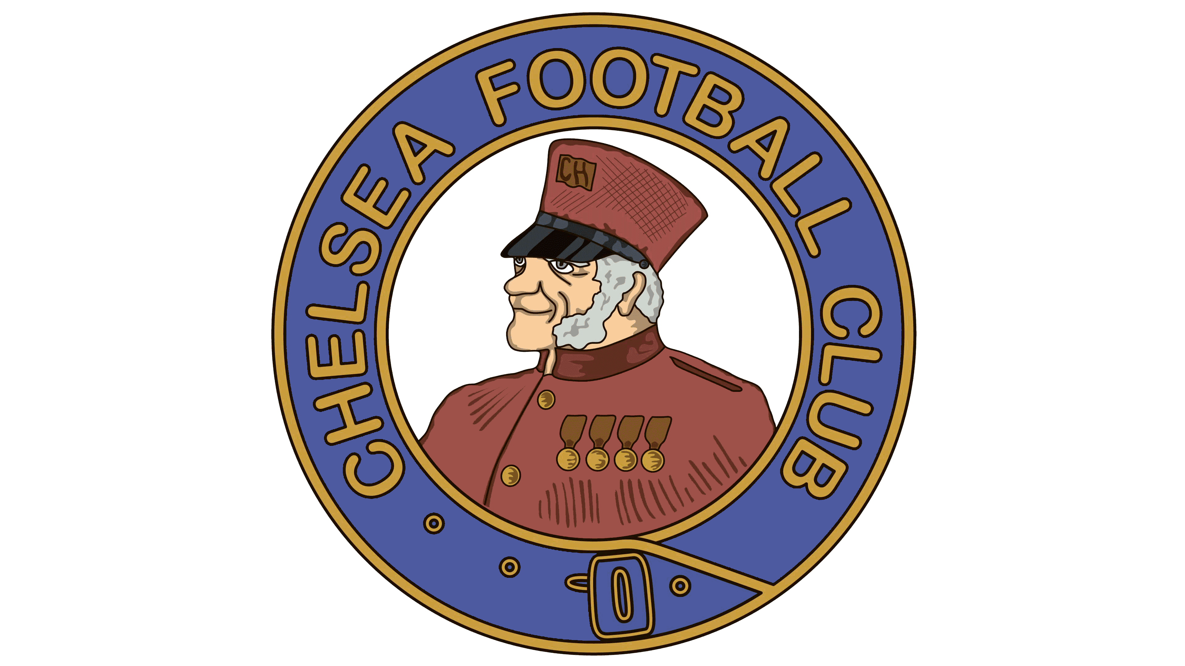
One of the original Chelsea badge designs featured the image of a Chelsea pensioner and army veteran. This unique emblem actually helped to inspire one of the first nicknames for the team, “The Chelsea Pensioners.”
The traditional logo showed an old man wearing a war uniform (in red), facing towards the left in a distinguished pose.
The design was encircled by a blue border with golden outlines. Within the blue surround, we see the full name of the team “Chelsea Football Club” in gold, sans-serif font, with a thin black outline.
Variations of this design were produced in both the club’s iconic colours (white and blue) and in a full-colour palette, as seen above.
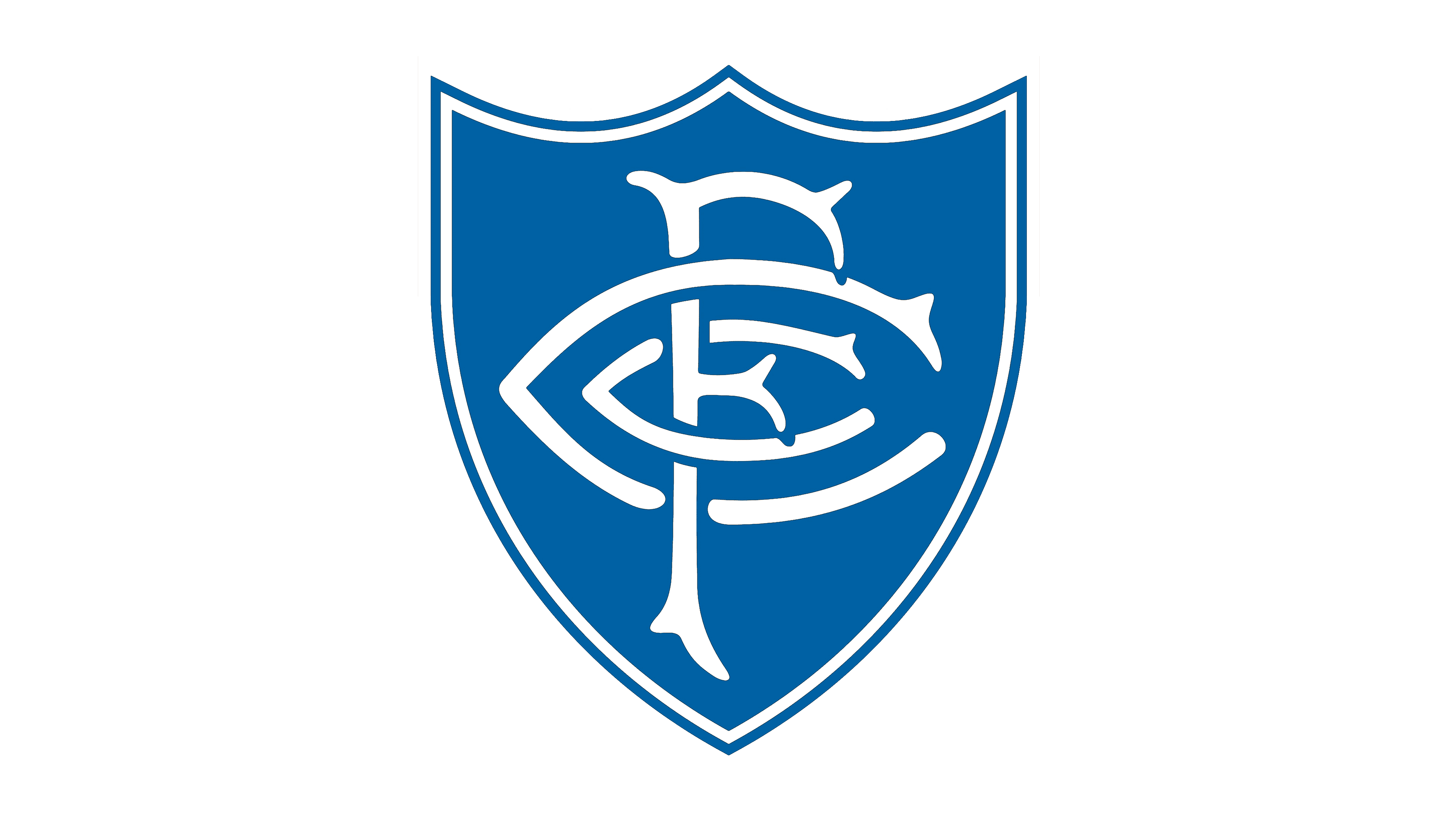
When Ted Drake took over as Chelsea’s Manager in 1952, he wanted to modernize the club and move away from the pensioner imager. A new stop-gap badge was introduced, featuring a traditional shield with pointed elements depicted in white and blue.
The letters “CFC” for Chelsea Football Club were also placed within the logo, overlapping to form a unique, stylized, and geometric design. This Chelsea crest only stayed with the team for a single year before a new emblem was introduced.
In 1953, the first version of the Chelsea FC logo featuring a blue lion was introduced. This design was based on elements from the coat of arms for the Metropolitan Borough of Chelsea. It was intended to highlight the heritage of the team and their patriotic nature.
The decision to embrace the rampant lion as a core element of the crest helped create a powerful new image for Chelsea.
The scarlet roses on the design symbolize England, while the two red footballs are symbolic of the two goals and teams taking part in any match. The main colours used here are shades of dark blue, gold, and red, with white embellishments.
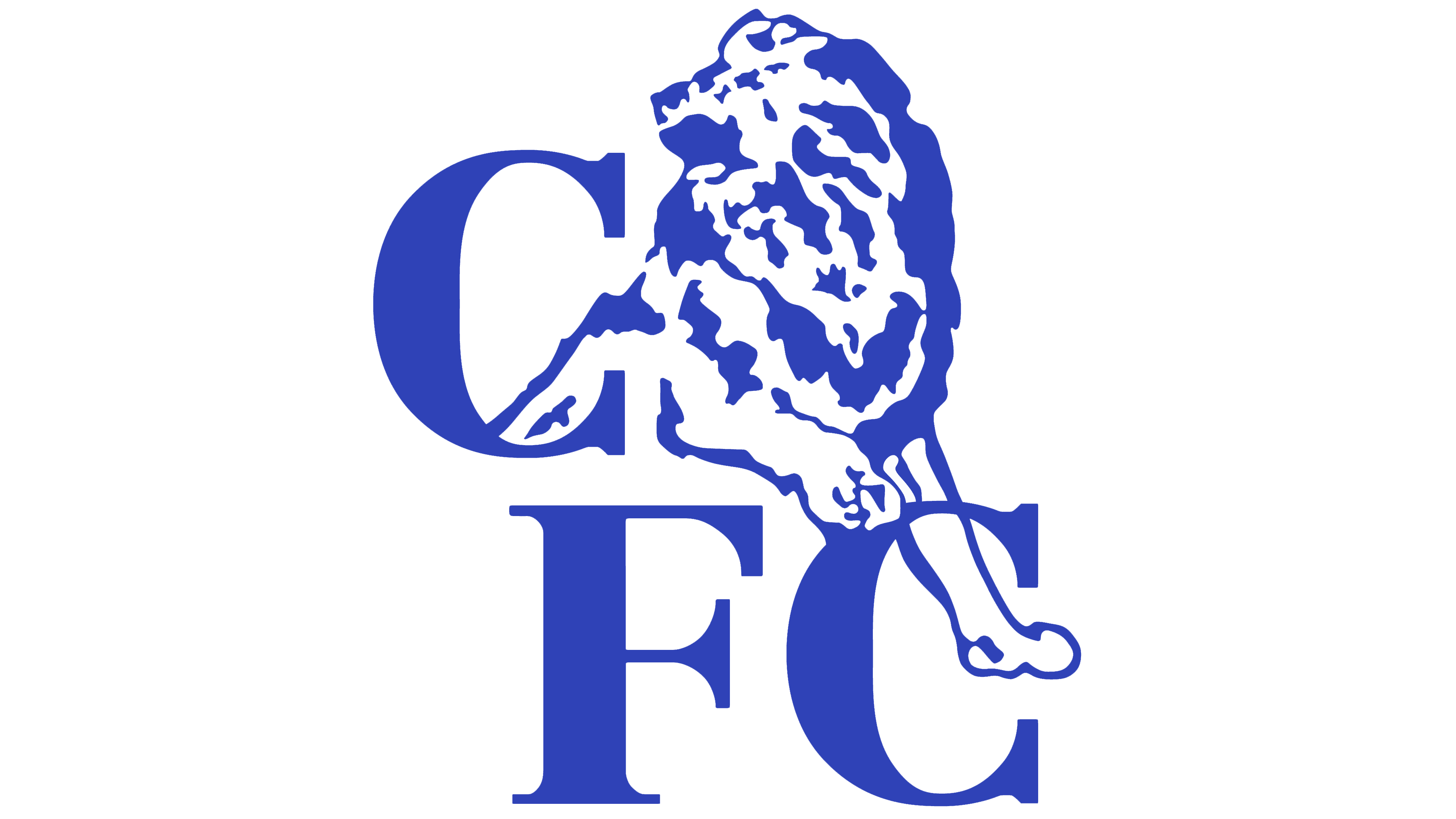
In an attempt to further modernize their brand identity, the Chelsea team introduced a new, art deco version of their logo in 1986. This featured a simplified outline of the core lion mascot alongside the letters “CFC.” The first version of the logo was depicted in blue, red, and white.
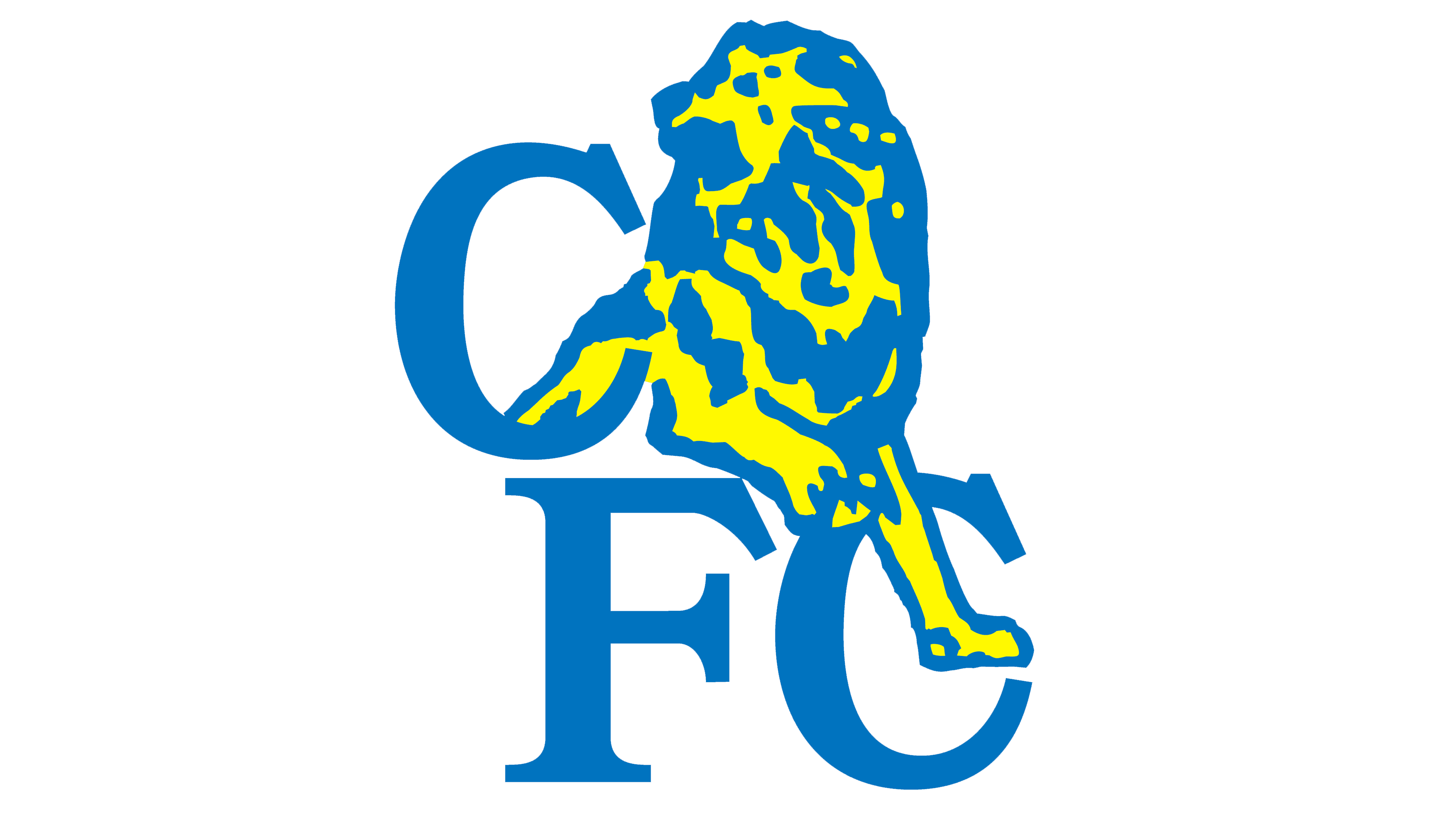
However, in 1995, another variation of the design was introduced in white, yellow, and a much lighter shade of blue. In the later version of the logo, the blue circle encompassing the Chelsea badge was removed entirely, though most of the other elements remain the same.
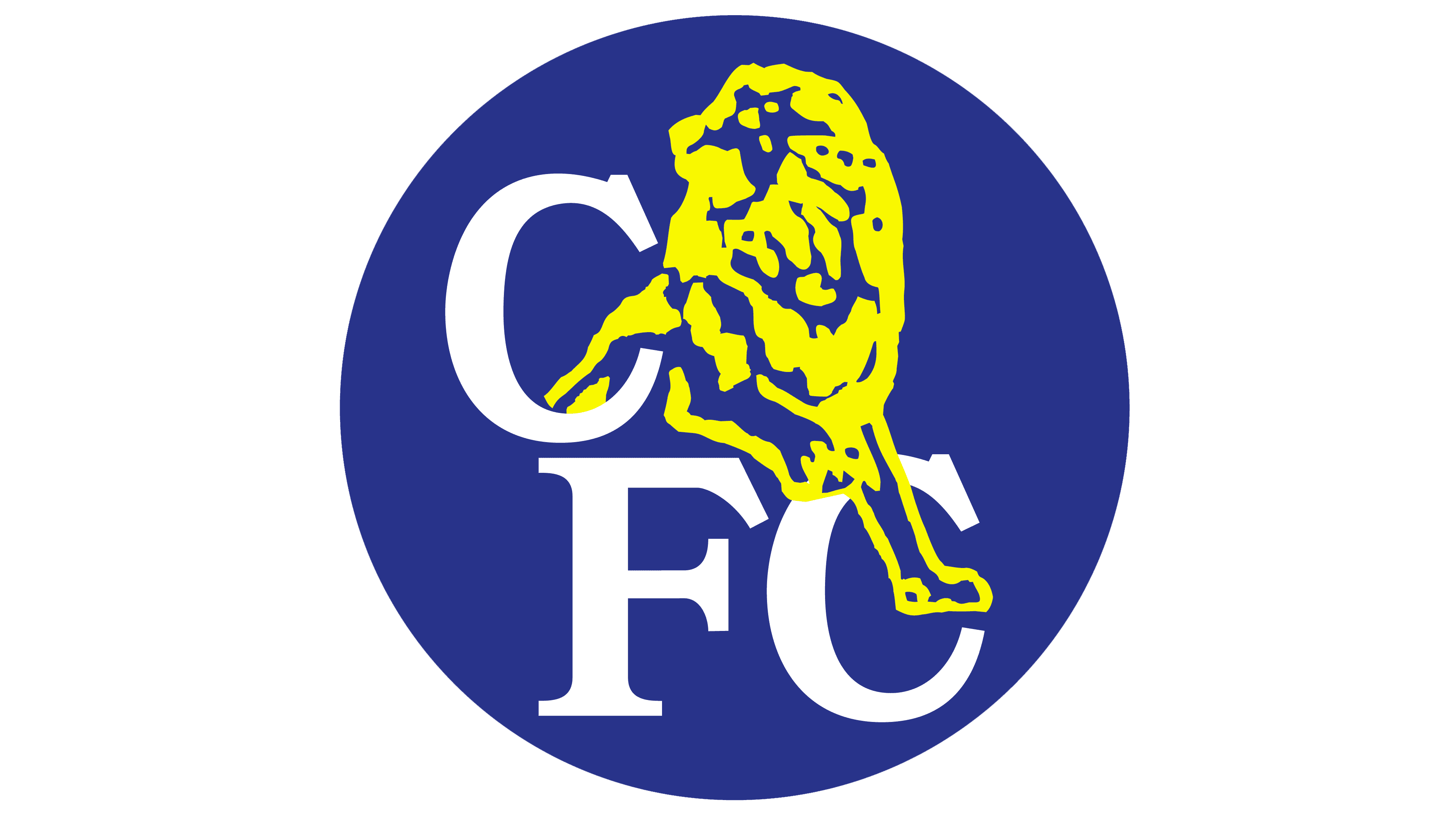
Later in the 1990s, another variation was also created using the blue circle background, with a slightly darker shade of blue in the image.
During 1999 and throughout the early 2000s, Chelsea continued to build on its new, more modernized logo, removing and replacing the circular background at different stages. In 1999, a simplified and more visually refined version of the logo was created in deep royal blue and white.
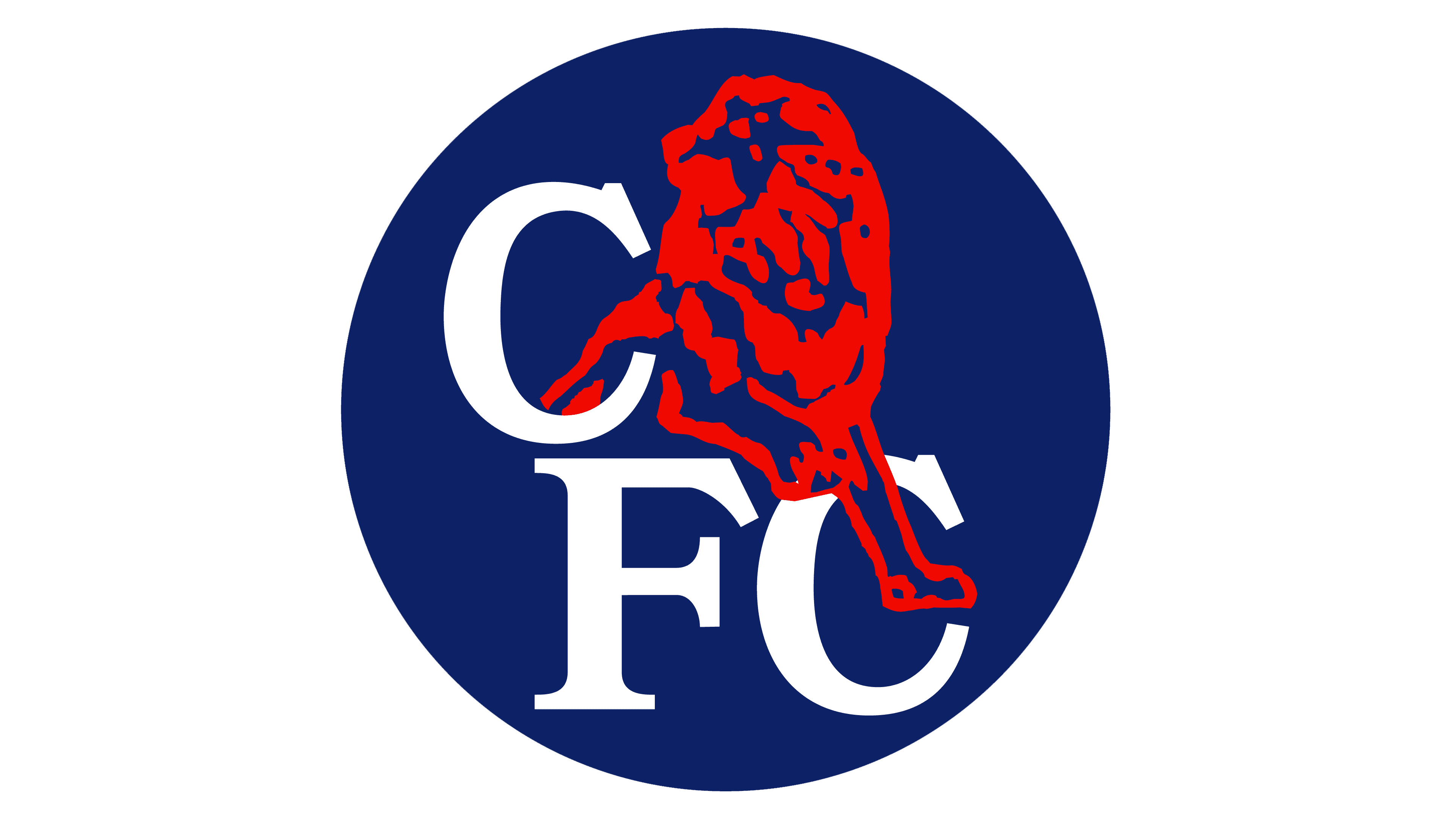
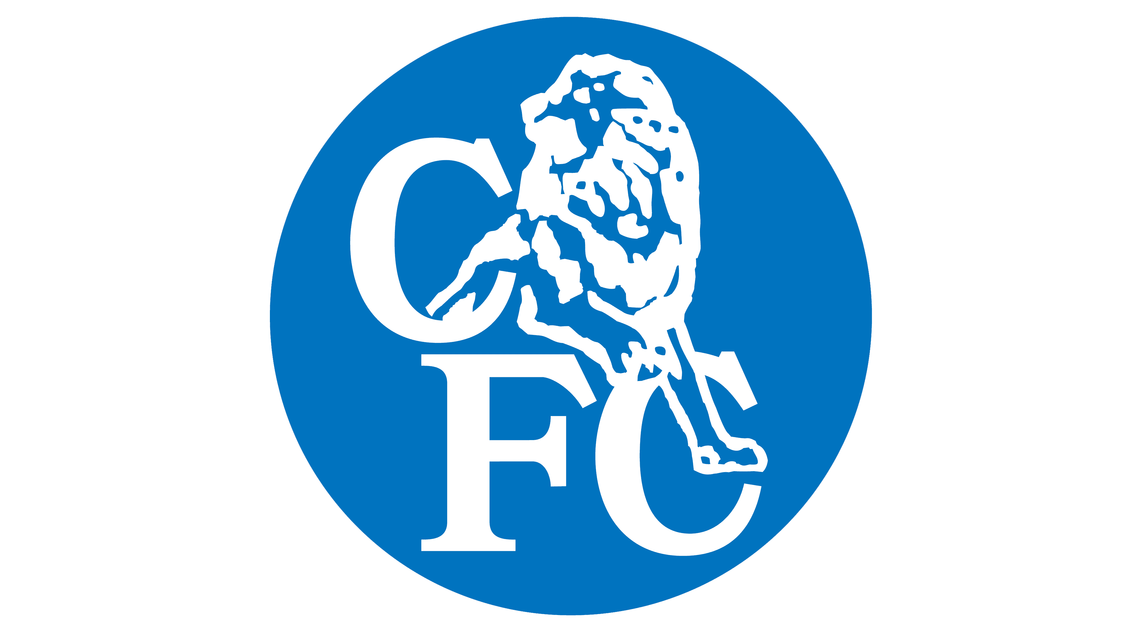
This was followed in 2003 by the introduction of the emblem depicted in white on a blue circular background. In this variation, the core details of the lion are slightly harder to pick out.
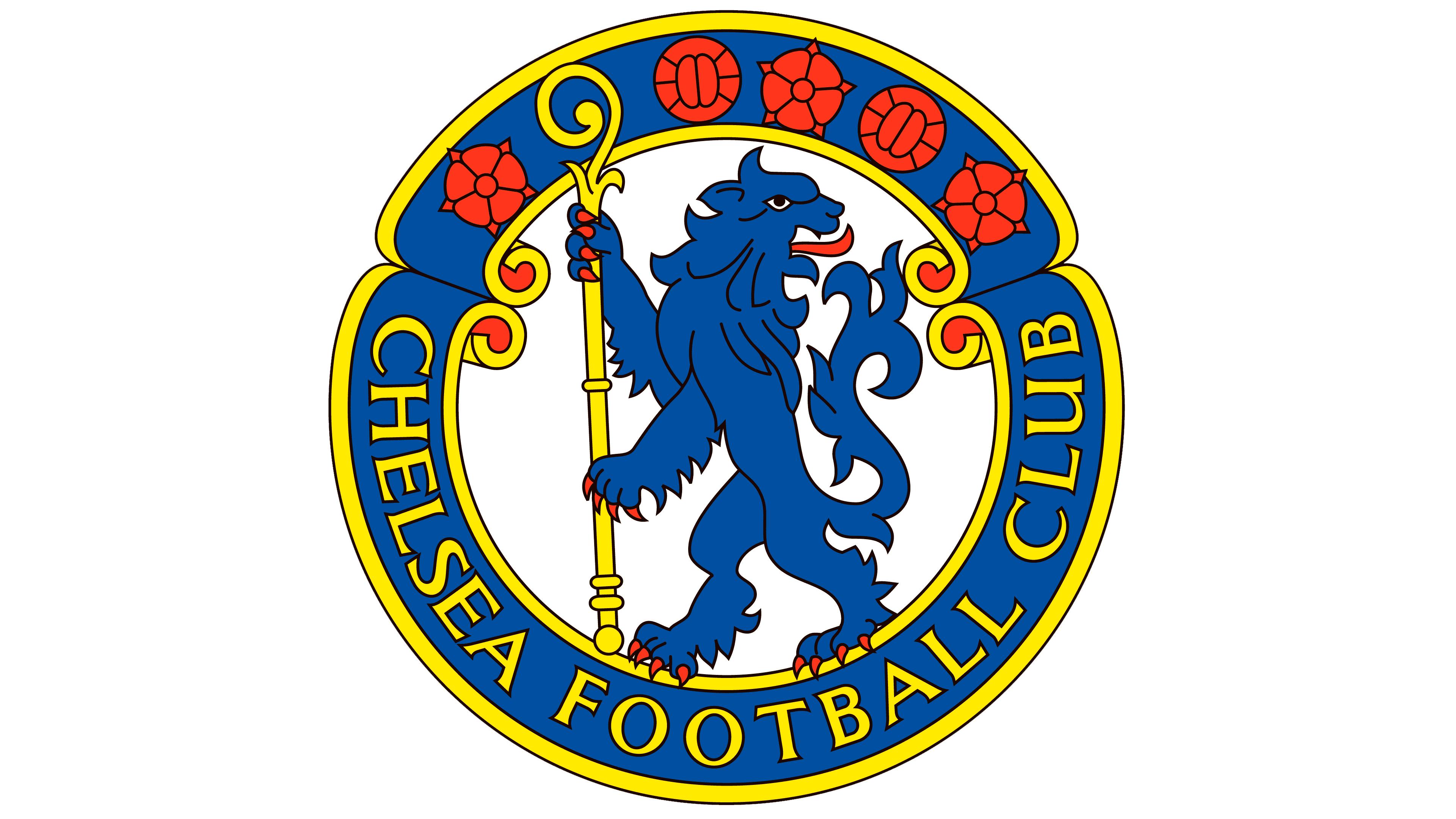
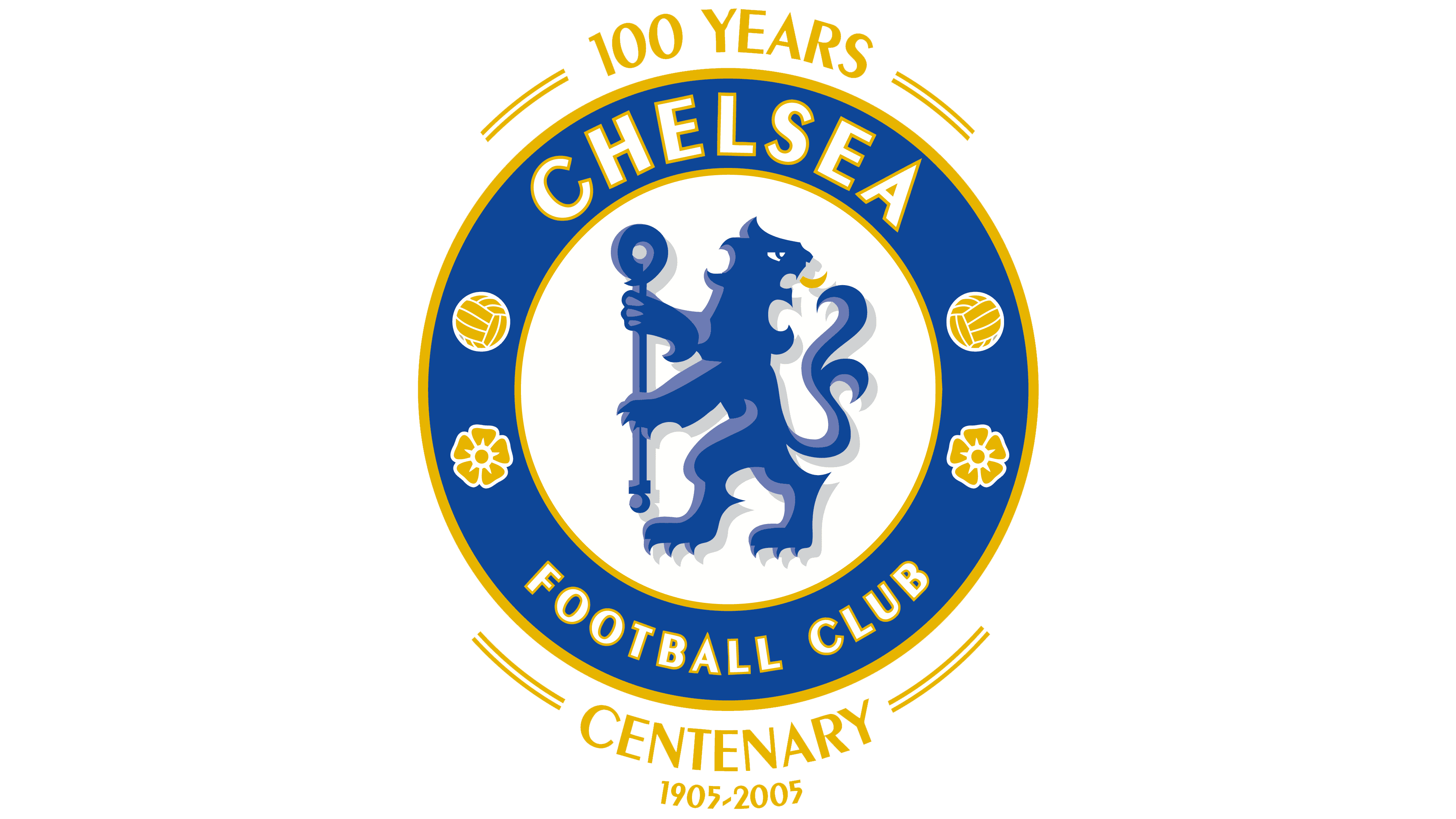
Celebrating 100 years in the football landscape, Chelsea introduced a brand-new version of its logo in 2005. The Lion Rampant was redesigned with clean, modern contours. The lion is also holding a staff again in this emblem, similar to the creature from the Chelsea coat of arms.
The circular badge shape has been retained here, with a white background sitting behind the lion and a dark blue border with golden outlines. The two roses represent England, and the two footballs have also made a reappearance, this time in gold.
The team of team also appears here in full, again, this time in a simple white sans-serif font with a golden outline.
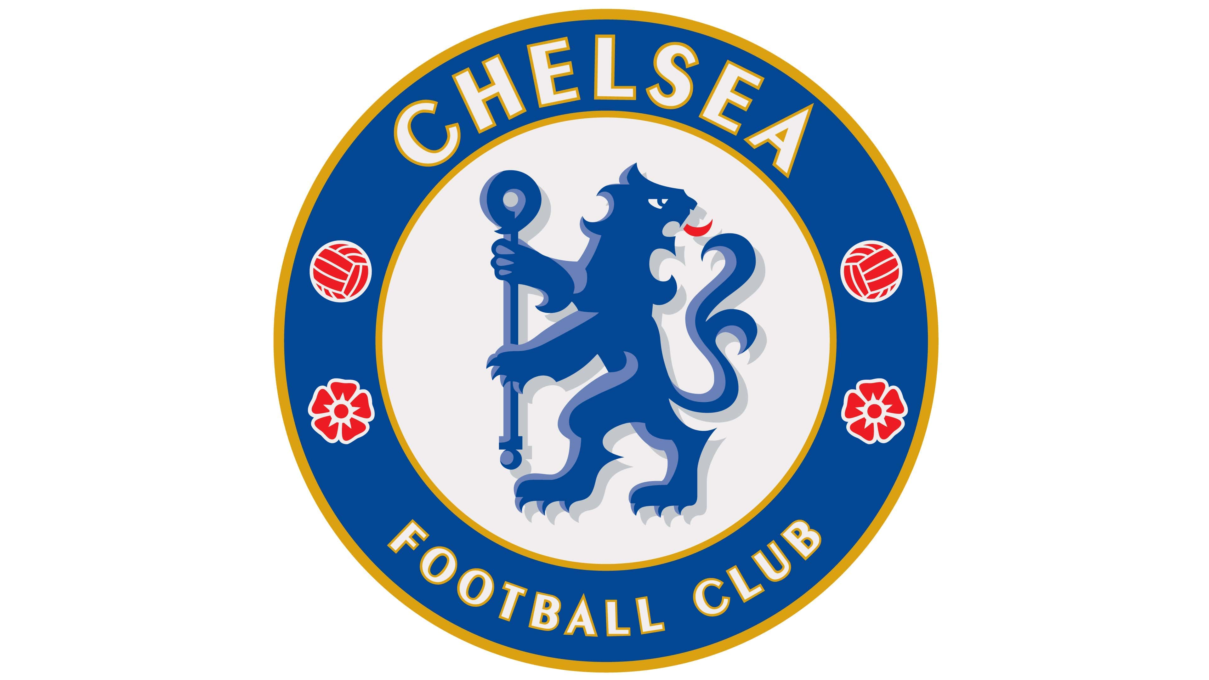
Following the celebration in 2005, Chelsea created an updated logo based on the previous design, preserving most of the core elements. The Chelsea lion appears almost exactly the same as in the former logo, but this time features a red tongue (instead of gold).
The footballs and roses have also been updated with red colouring.
The typography and the rest of the colour choices within the logo are consistent with the previous Chelsea badge. However, the gold outlines on the circle are a little darker than they were previously.
Why is the Chelsea logo a lion? The Chelsea lion
The Chelsea lion is perhaps one of the most recognizable aspects of the group’s FC logo.
It was inspired by the Chelsea Metropolitan Borough’s Coat of Arms, which featured its own rampant lion holding a staff. Chelsea decided to embrace an animal as the main mascot for their logo after a new manager for the team felt it was time to update and modernize the group’s image.
Since embracing the lion as one of their core symbols, Chelsea has made a few changes to the depiction of the creature.
For a significant time, the group used a more detailed and authentic image of a lion in most of their crests. However, since 2005, they’ve returned to a more traditional image based heavily on an English coat of arms.
The Chelsea lion introduced in 1975 was the first to appear on the group’s iconic uniforms.
Specifications of the Chelsea logo
Today, the Chelsea badge is an iconic symbol of strength, endurance, and commitment, beloved and championed by fans across the nation. The lion symbolism, combined with the careful colour choices of the team’s logo, has led to a change in the team’s nickname over the years.
Previously known as the “Pensioners,” the Chelsea team is now heavily referred to as “The Blues.”
Though significantly more refined and modern than some of the previous logos introduced by the Chelsea FC team, the current logo still pays tribute to the group’s history and origins.
You can find some useful resources if you want to take a closer look at the Chelsea FC logo here:
What colour is the Chelsea logo?
Throughout the years, the Chelsea logo colours have changed drastically. Many of the badges introduced by the brand have included various shades of blue, often depicted alongside white, gold, red, and other tones.
Today, the official Chelsea logo colours are a shade of royal blue combined with white, red, and gold.
The colour codes are:
BLUE
PANTONE: PMS 7687 C
HEX COLOR: #034694
RGB: (3, 70, 148)
CMYK: (100, 83, 10, 1)
RED
PANTONE: PMS 1788 C
HEX COLOR: #EE242C
RGB: (238, 36, 44)
CMYK: (0, 98, 91, 0)
GOLD
PANTONE: PMS 7555 C
HEX COLOR: #DBA111
RGB: (219, 161, 17)
CMYK: (15, 37, 100, 1)
LIGHT BLUE
PANTONE: PMS 2115 C
HEX COLOR: #6A7AB5
RGB: (106, 122, 181)
CMYK: (64, 51, 4, 0)
Together, the colours convey a sense of history, heritage, and reliability. The red elements are associated with passion and courage, while the blue demonstrates credibility and trust. The gold colouring links the team to luxury and royalty.
What font does the Chelsea logo use?
The Chelsea logo font was chosen specifically for the team’s badge. The sans-serif typeface works well with the Chelsea badge, making the words easy to read in almost any size. Currently, the logotype in use is similar to Peignot bold, with a few simple alterations and changes.
The unforgettable Chelsea badge
Today’s Chelsea logo is one of Premier League’s most instantly recognizable and iconic logos. Within the Chelsea FC crest, we see a strong reference to the group’s history and heritage and a patriotic sense of love for England and the borough of Chelsea.
Perhaps the most memorable component of the Chelsea badge is the famous blue lion, which has remained a core part of the brand’s visual identity for decades.
It will be interesting to see whether Chelsea decides to update its logo again in the years to come and whether the Chelsea lion will remain with the group going forward.
Fabrik: A branding agency for our times.

Clarity starts with a conversation.
Thanks—we’ll get back to you shortly.
Whether you're navigating a rebrand, merger, or simply need a clearer identity—we’re here to help. No hard sell, just honest advice from people who know the sector.
Let’s start with a simple question…
Prefer to email? Drop us a line.
Fabrik’s been helping organisations rethink and reshape their brands for over 25 years. We’ve guided companies through mergers, rebrands and new launches. Whatever stage you’re at, we’ll meet you there.