


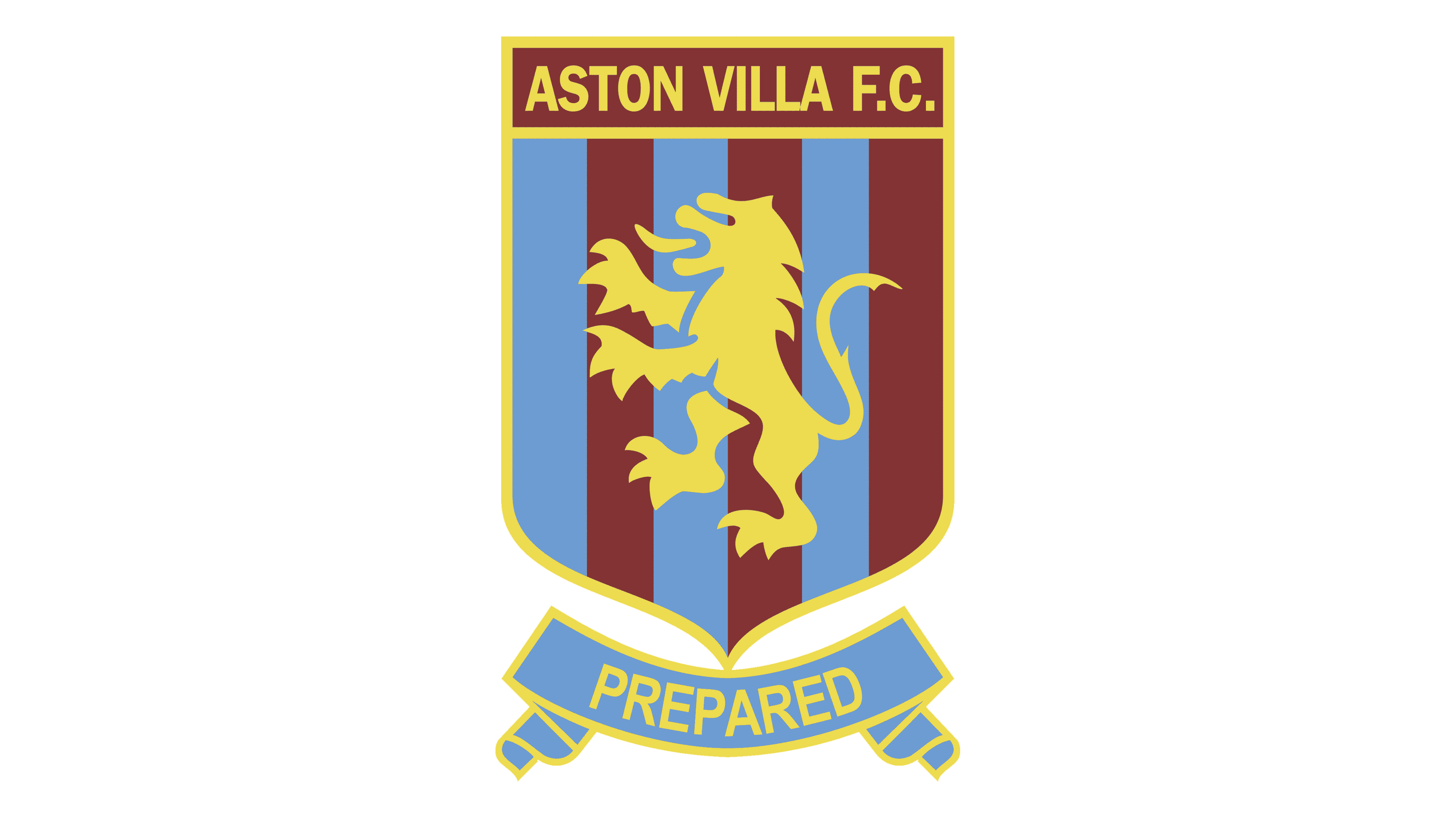
Aston Villa logo history: A roaring tale of the iconic lion
For English football fans, few emblems have the same impact as the Aston Villa logo. One of the best-known icons in the Premier League, the Aston Villa crest is a symbol of strength, patriotism, and power.
However, like many team logos, this design has undergone several changes, experimenting with styles, colours, and graphics.
Take a glance at Aston Villa logo history, and you’ll discover various emblems chosen to highlight the history and heritage of the team. Most of these designs have one important thing in common: an animal mascot taken from an official coat of arms.
If you’ve ever wondered about the evolution of famous Premier League logos, you’re in the right place. Today, we will be taking a closer look at the Aston Villa badge, the phenomenal lion mascot, and the history behind the emblem.
Why is Aston Villa called the Lions?
Introducing Aston Villa
The Aston Villa Football Club (Aston Villa FC) is a professional football team located in the Aston region of Birmingham, England. Originally founded in 1874, Aston Villa is both one of the oldest teams in the UK football league and one of the most successful.
The club has won the First Division title for the Football League seven times, as well as the FA Cup seven times and the League Cup five times.
Since the 1880s, Aston Villa has maintained its position as one of the top English clubs in the sport, with fans all over the country and even the world.
George Ramsey, one of the world’s first professional football managers, helped to inspire the creation of the Football League as we know it today. In fact, Aston Villa was one of the founding members of the official Premier League when it emerged in 1992.
Throughout its history, Aston Villa has spent 109 seasons competing in the top flight of the Premier League – the second most seasons in history. Additionally, it’s the 7th most successful team in English football, according to competitive honours.
The Aston Villa logo history
The Aston Villa logo history dates back further than most Premier League emblems. The team, known by many as the “Lions,” has almost consistently used an official lion from the Scottish coat of arms since its inception.
The Scottish Lion Rampant has appeared on virtually every design chosen from the team since the 1800s, making it a core part of the team’s visual identity.
One of the earliest versions of the Aston Villa FC logo was introduced in the 1800s, with the initial founding of the group. The red lion was plucked directly from the Scottish coat of arms, featuring numerous unique details and components.
The design was relatively traditional but initially didn’t feature any extra components, such as shields and banners, typically associated with early football team logos.
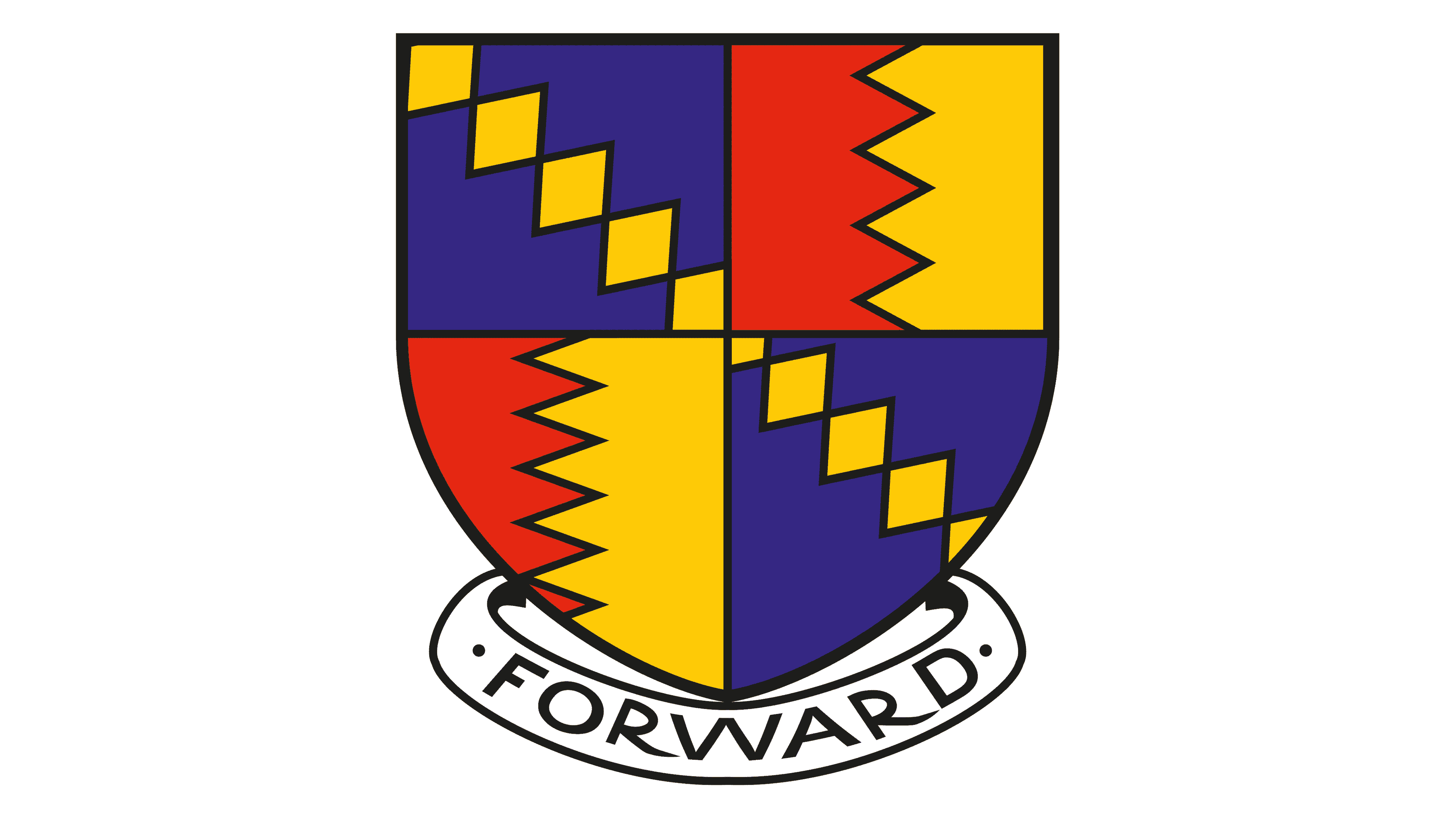
The only Aston Villa logo ever to go without the Lion Rampant was introduced in 1886, just a few years after the team started competing professionally. It featured a classic crest with the colours red, yellow, and blue in various compositions.
The vibrant crest had a banner underneath which simply read “Forward,” indicating growth and ambition.
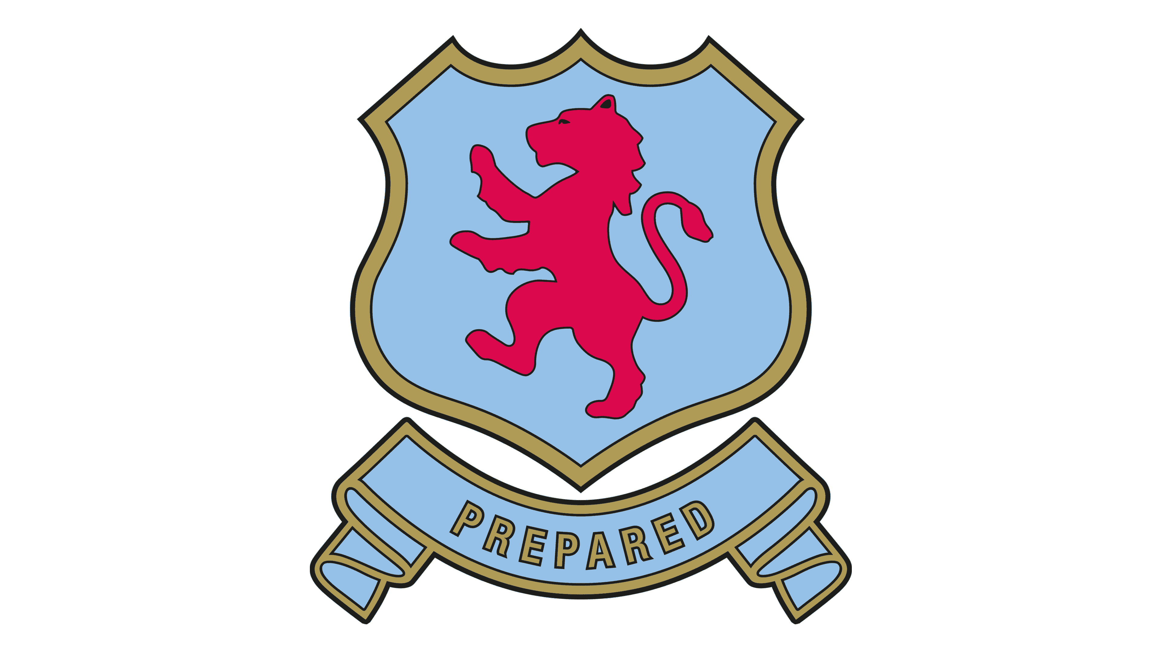
In 1956, the lion returned, though this time, it was much simpler and facing the opposite direction. The animal was placed within a blue and gold shield emblem, still depicted in red. Beneath the crest, a new banner was introduced featuring the word “Prepared” in gold.
This new banner stayed with the Aston Villa team for a little longer than the “Forward” inscription.
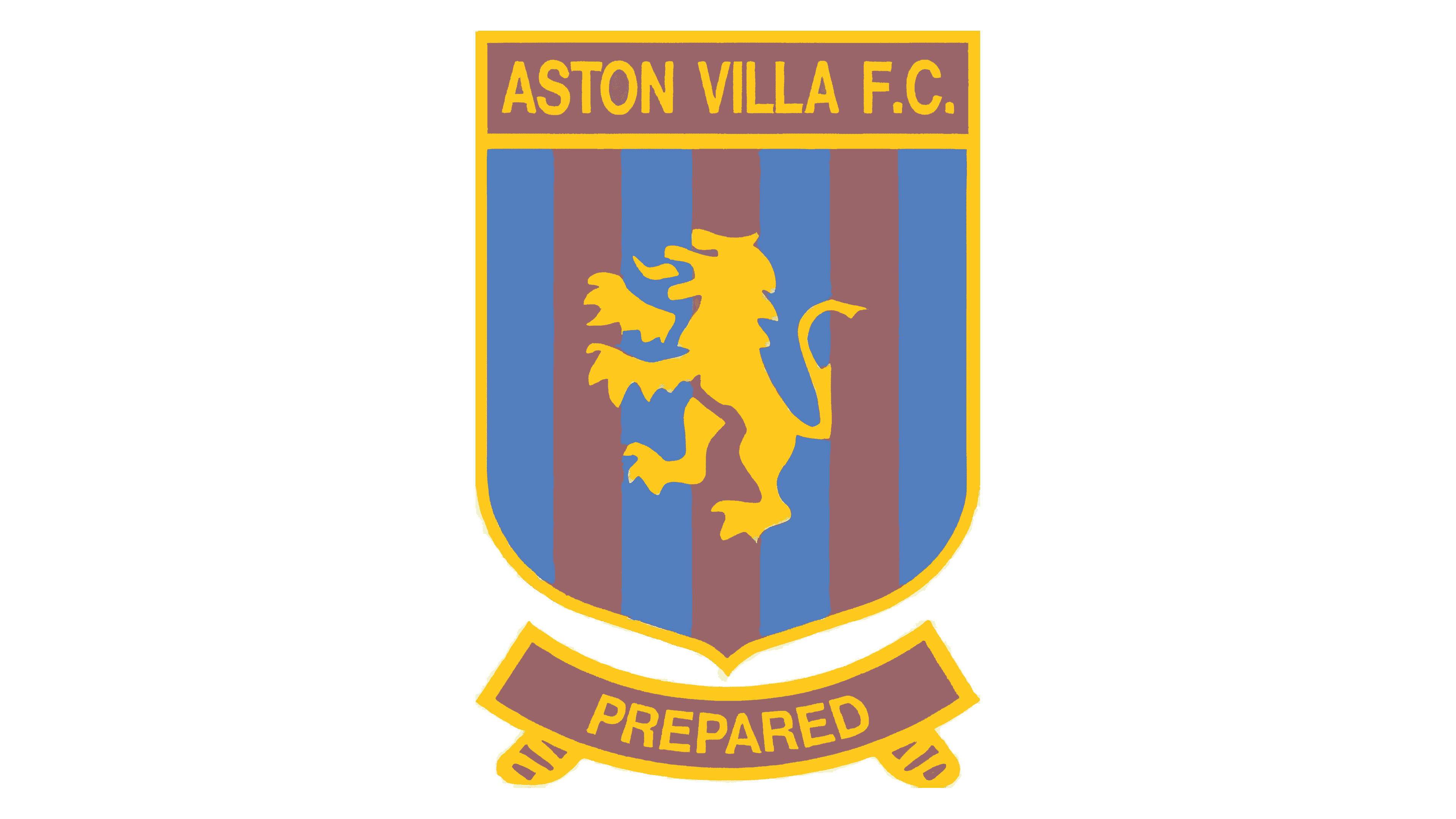
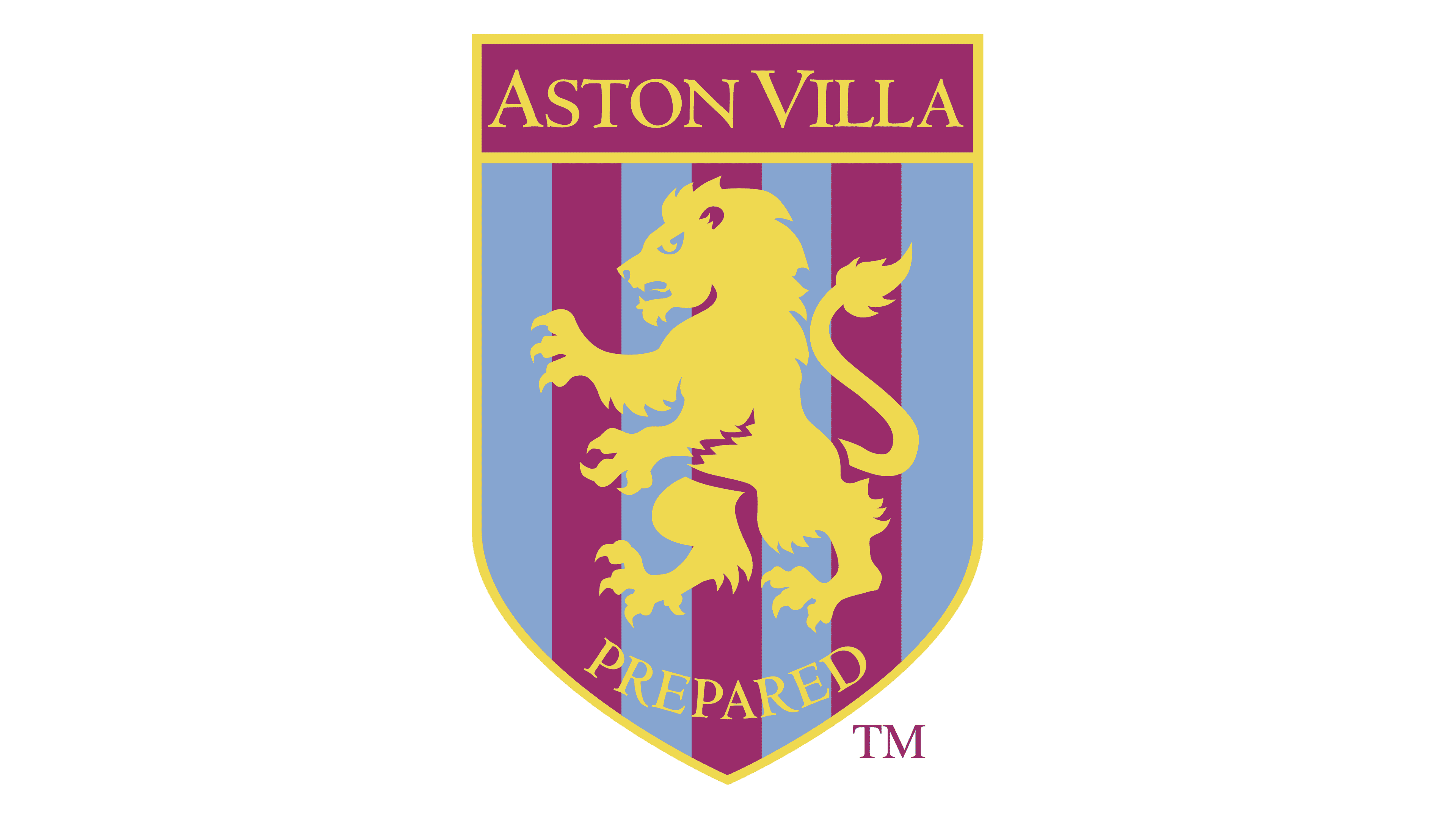
In the 1970s, Aston Villa updated its colour palette to feature a darker shade of red alongside the golden and light blue tones. The shield was simplified but still featured its golden outline, as well as the Lion Rampant, now in yellow/gold.
The background of the shield included red and blue stripes, while at the top, the name of the team was presented in an uppercase sans-serif font.
The “Prepared” banner appeared here again, but it was shortened slightly to keep the attention of the viewers on the primary crest.
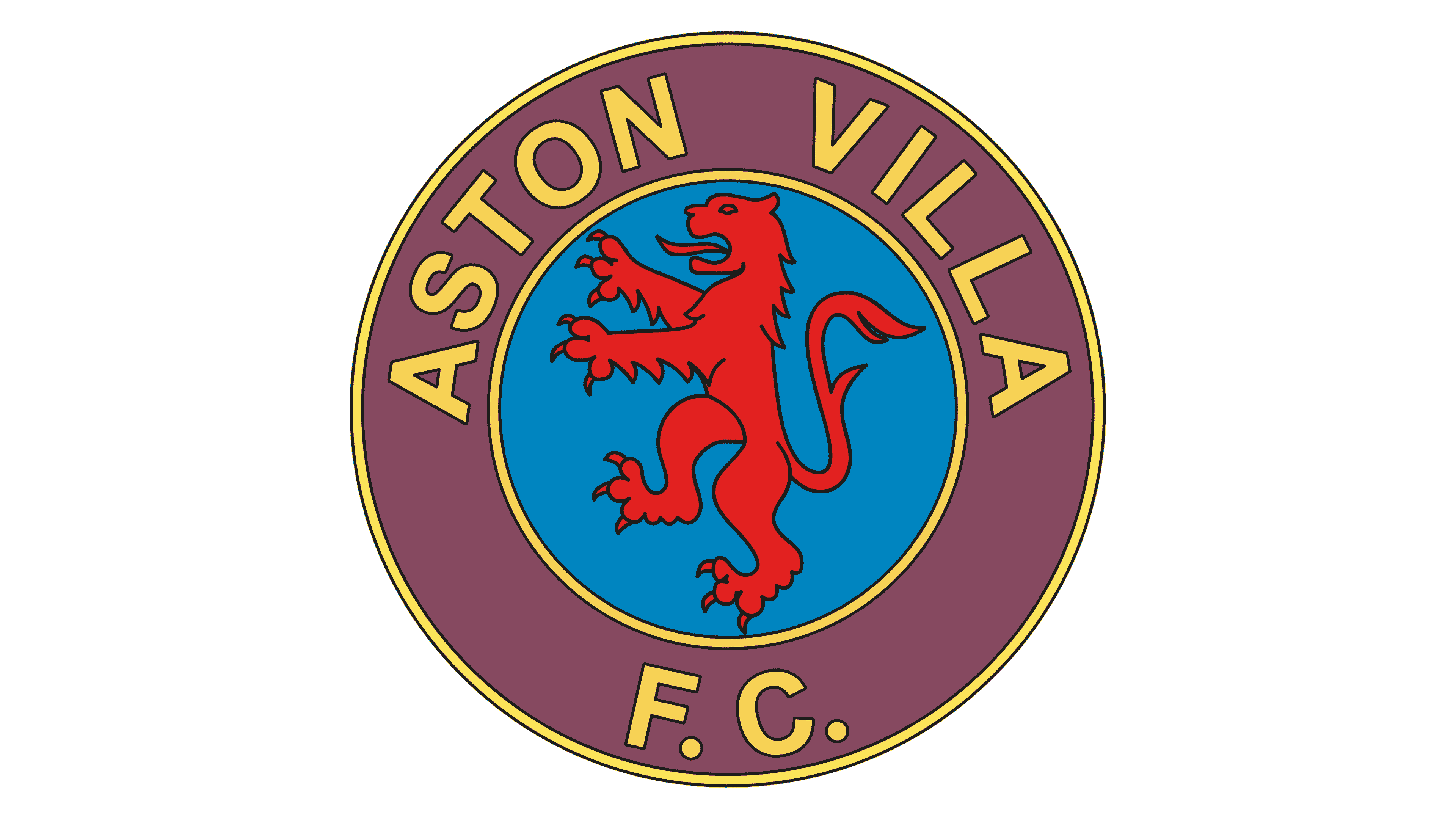
Another badge was introduced during the 1970s, which replaced the shield with a circular emblem. This design removed the “Prepared” element and focused on highlighting the name of the team in yellow on a purple-red background.
The lion was depicted in bright red on a circular blue background. The design here was intended to be a little more modern than the previous iterations.
In the 80s, Aston Villa updated its badge to honour its new sponsor, Mita. The badge colours changed drastically, though many of the components of the previous design remained. The pink and white palette simplified the logo somewhat while drawing extra attention to the Mita inscription.
At the same time this Aston Villa badge was introduced, another design was also in circulation, which was built in the previous design from the 1970s. This badge featured the lion and the name of the team in the same circular shape. The colours here were yellow, brown, and sky blue.
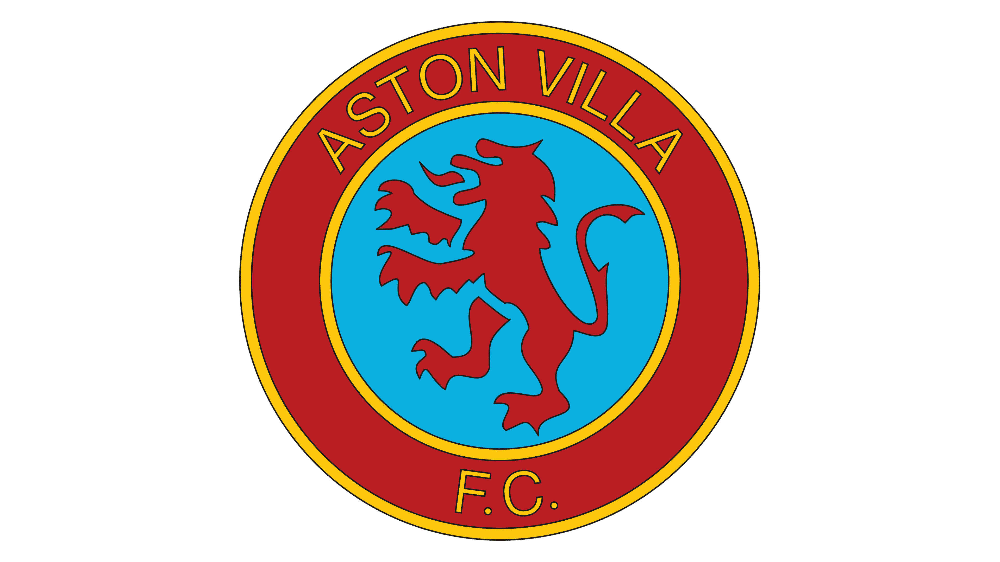
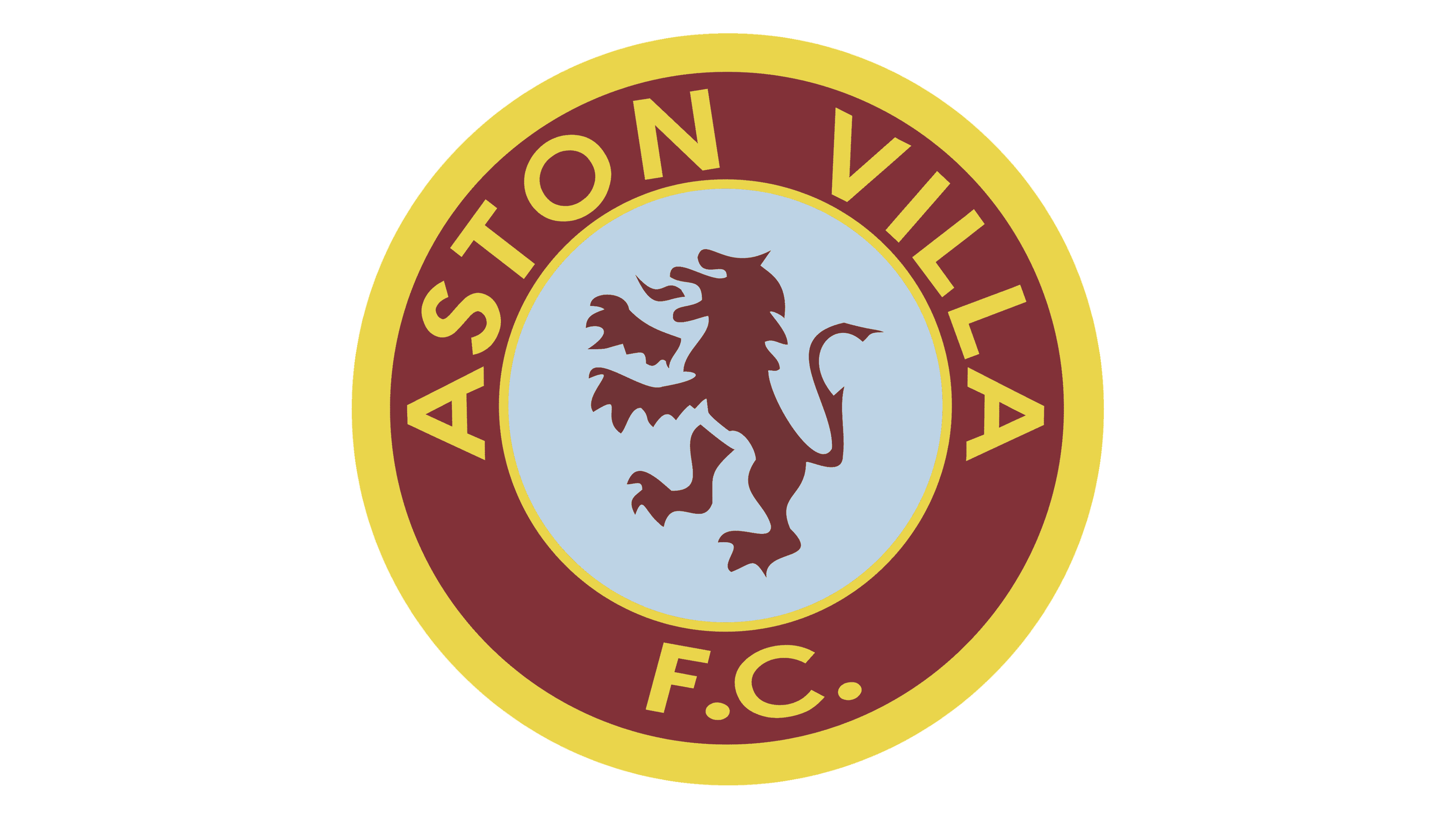
In the 90s, a version of the previous logo was introduced in the colours of yellow/gold, red, and light blue. Once again, most of the components of the previous design were retained. The biggest differences here were the new colour palette and a slightly softer, more streamlined choice of font.
During the 90s, the Aston Villa team also used a version of its previous shield-style crest from the 70s, once again featuring the striped background and the “Prepared” banner. This variation had a slightly softer colour palette, with a far lighter colour of purple/brown.
In 1992, there was also a slightly different version of the shield-style emblem in use, which used a much brighter shade of yellow, and a serif-style font for “Aston Villa.” In this design, the “Prepared” inscription was placed within the shield itself.
The lion is also a lot more detailed and slightly more aggressive looking, with sharp claws.
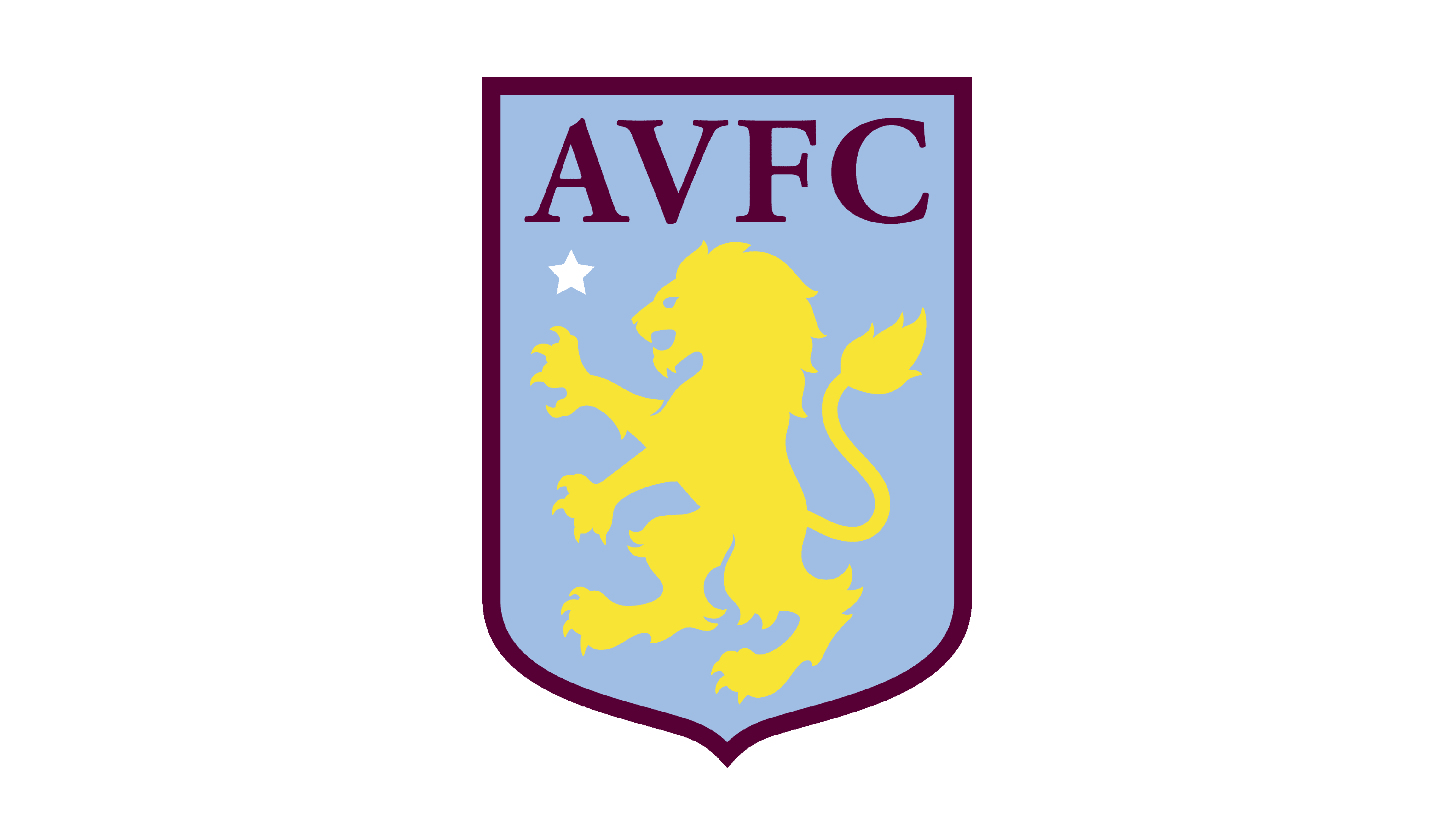
The Aston Villa FC logo maintained its updated lion image during the 2000s, though new colours were introduced. The striped background was replaced with a solid, bright blue design. A white star was added to represent the team’s win in the European Cup.
The “Prepared” motto was once again included within the shield here. However, the full logotype for the Aston Villa football team was shortened to simply “AVFC.”
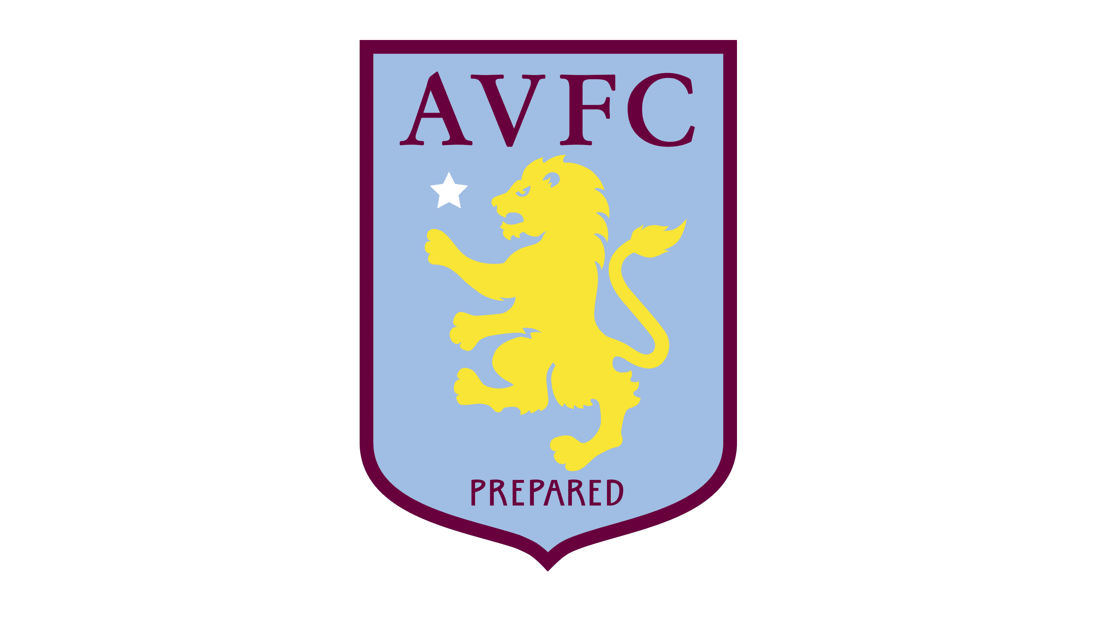
This design was refined slightly in 2008, replacing the bright blue background with a slightly more muted colour. This secondary badge inspired the creation of the logo most fans know today.
In 2016, Aston Milla refined their logo again, enlarging the lion slightly and removing the “Prepared” tagline from the bottom. The claws of the creature were also slightly enlarged to make it appear more dangerous and aggressive.
Aston Villa’s new logo: The Aston Villa crest today
The new logo for Aston Villa was introduced at the end of 2022, with several significant changes to the previous design. The updated image was decided by a fan vote, with two options to choose from.
The first featured the Aston Villa lion (with its accompanying star) in a shield shape with numerous sharp points and strong lines. The second variation featured the same lion, in a circular badge, with the founding date of the team included on the bottom.
According to the team, the new logo intends to draw attention to the triumphs of the team within the European Cup. It features a clean, modernized roundel design, with all of the important elements of the club still present, from its unique colour palette to the Lion Rampant.
Compared to the previous design, the new rounded badge (chosen by 77% of Aston Villa fans) includes much less yellow. This makes it a little easier on the eyes.
The Aston Villa Lion: Why does Villa have a lion logo?
There are many football teams throughout the UK and beyond that leverage the use of animal logos. Animals, in all of their forms, are often symbolic and can help us to form emotional connections with brands. The lion, for instance, is a symbol of power and royalty to many.
The lion is one of the most symbolic animals in the United Kingdom, often shown on numerous coats of arms and official banners. The Aston Villa lion is based on the Scottish coat of arms and was inspired largely by the first president of the club, William McGregor.
This Scottish manager decided the logo should have Scottish elements, as it helped to connect the team with the significant Scottish community within Birmingham.
The lion was an excellent choice for the group, as it conveyed ideas of bravery and strength. However, the exact design of the creature has changed slightly over the years. Today, the lion is intended to look far more aggressive and dangerous, with sharp claws and teeth.
The Aston Villa badge: Colours and fonts
The Aston Villa badge today is one of the best-known emblems in the Premier League landscape. Today, fans refer to the group as the “lions” in reference to their unique mascot.
The lion emblem, as well as the unique colours of the Aston Villa crest, help the team to separate itself from the other competitors in its space.
If you’re interested in the Aston Villa logo, you can find some useful resources here:
What colour is the Aston Villa logo?
The Aston Villa logo colours have undergone a number of changes over the years as the team has experimented with its visual identity. The current logo features a handful of common Aston Villa logo colour choices, including bright yellow, light blue, and claret (purple/red).
The shades are intended to demonstrate passion, courage, and reliability, as well as royalty (thanks to the golden/yellow shade).
What font does the Aston Villa logo use?
The Aston Villa logo font was previously Stempel Garamond Bold. However, recently, the team updated its typography to a more simplistic sans-serif option. The typeface update is intended to make the letters and characters used in the logo more legible.
The incredible Aston Villa logo
Looking at the Aston Villa logo history, we can see the team has undergone several stylistic changes over the years. Everything from the shape and colours of the badge to the typography choices and the design of the lion have been altered and refined.
However, the consistency of the lion mascot has helped Aston Villa to maintain a relatively powerful identity, despite all of its visual changes.
Today, the Aston Villa logo symbolizes strength, courage, and heritage, designed to capture the hearts of fans everywhere.
Fabrik: A branding agency for our times.

Clarity starts with a conversation.
Thanks—we’ll get back to you shortly.
Whether you're navigating a rebrand, merger, or simply need a clearer identity—we’re here to help. No hard sell, just honest advice from people who know the sector.
Let’s start with a simple question…
Prefer to email? Drop us a line.
Fabrik’s been helping organisations rethink and reshape their brands for over 25 years. We’ve guided companies through mergers, rebrands and new launches. Whatever stage you’re at, we’ll meet you there.