


West Ham United logo history: Exploring the West Ham crest and hammers
You might also know the West Ham United logo if you’re familiar with the Premier League. Brimming with meaning and history, this famous crest appears not just on the uniforms for the team but also on countless other marketing and promotional assets.
You may be familiar with the golden hammers and shields of the West Ham crest today, but how much do you know about its history?
The official West Ham badge, like many EPL logos, has undergone several changes over the years. It’s little surprise when you consider West Ham’s team has been around for over 120 years.
Today, we will take a behind-the-scenes look at the West Ham United FC logo and how the crest has evolved over the decades. Read on for your complete guide to the visual identity of “The Hammers.”
An introduction to the West Ham United FC logo
Before we take a closer look at West Ham United logo history, it’s worth highlighting the unique origins of the team itself.
The West Ham United Football Club is a professional team from the United Kingdom which competes in the Premier League. Initially, the group was founded in 1895 as “Thames Ironworks” before reforming as “West Ham United in the 1900s.
In 1904, West Ham United moved to the Boleyn Ground for training and kept the location as their home field for more than a century.
Originally, West Ham competed in both the Western and Southern leagues before officially joining the Football League in 1919. The team was promoted to the number one flight in 1923, and in 1940, they claimed the Football League War Cup.
Throughout their history, West Ham has won the FA Cup a total of 3 times, in 1964, 1975, and 1980. They were also runner-up in the competition twice, in 1923 and 2006. The club has reached two major finals in the European landscape and also won the Intertoto Cup in 1999.
Interestingly, West Ham is one of only eight clubs in the English landscape to have never fallen below the second tier in the league. The group’s logo today is a reference to its history with the ironworks.
Why is West Ham called the hammers?
West Ham’s football team was originally established as “Thames Ironworks.” However, after disputes began to emerge about the management and financing of the club, the team was disbanded and almost instantly relaunched as West Ham United FC.
The nickname “The Hammers” comes from a reference to the original iron works team, as does one of the key icons on the group’s logo.
West Ham United logo history: The West Ham logo
West Ham United FC logo history began in the middle of the 1890s when the team was initially established as “Thames Ironworks FC.” Although the West Ham football team has evolved significantly since then, it has almost consistently referenced its origins in its logo.
Throughout the years, West Ham has introduced a variety of different crests and badges, often using similar iconography (such as a shield shape) and colours like maroon and blue.
1895
As mentioned above, West Ham United started as the Thames Ironworks FC group. This team didn’t use a particularly iconic logo. Typically, its visual identity included the image of the Union Jack flag, with the letters representing the group’s name placed on a blue banner above.
The letters “FC” for Football Club appeared on a similar blue banner below the flag.
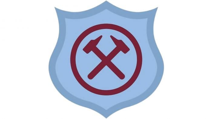
One of the badges introduced for West Ham United included a detailed image of a shield in two shades of light blue. In the middle of the emblem, we see a circle with two crossed hammers in the centre, depicted in a maroon tone.
The unique colour palette was a fantastic way for the team to ensure they stood out among their competitors, while the hammers on the logo celebrated the iron origins of the club.
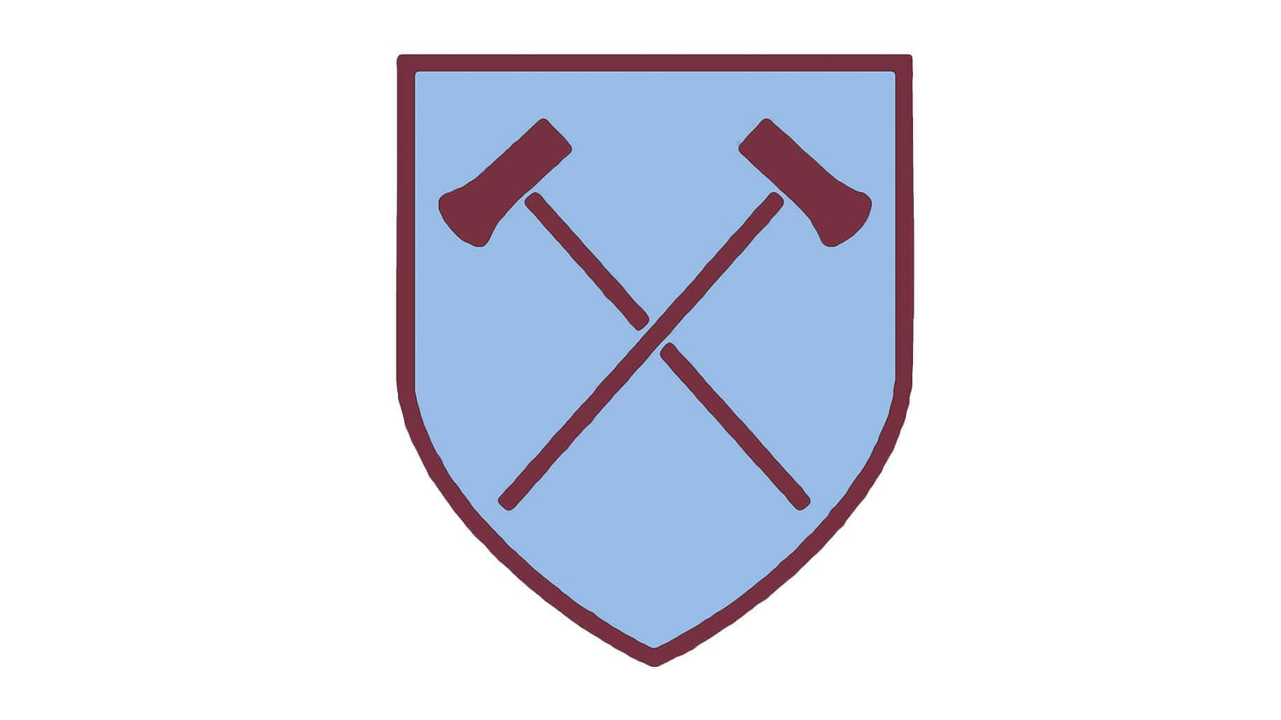
An updated version of the hammer crest was introduced in 1950. This elegant and simplified emblem introduced more delicate contours and longer, smoother-looking hammers. The circle was removed from the shield, giving the hammers more space to spread out.
The light blue colouring for the shield remained, with a maroon line on the outside.
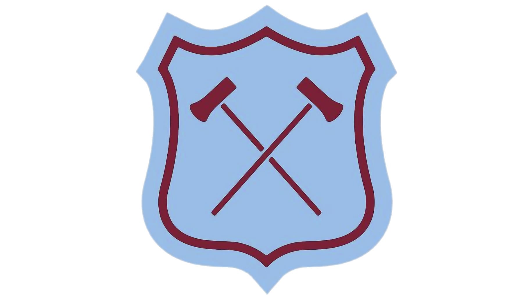
Soon after introducing the simplified logo in 1950, West Ham United changed its design again, creating a more decorative shield with the same maroon outline, now surrounded by another light blue line. The hammers in this emblem are very similar to the ones in the version above.
This design stayed with the team for about five years before they reverted to a version of the previous design from 1950. The blue border around the maroon outline has been preserved in this variation.
1963
In the 60s, West Ham made an interesting change to its colour palette, removing most of the light blue and focusing instead on the burgundy shade. Aside from the removal of the blue colouring, the logo appears very similar in style to the one introduced in both 1950 and 1958.
1964
In 1964, for the FA Cup Final, West Ham United began experimenting with a more complex version of its logo. This image still featured the crossed hammers and the maroon and light blue colour palette seen in previous designs.
However, a castle graphic was added alongside the words “Wembley 1964”. Another version of this design was introduced for the 1965 final.
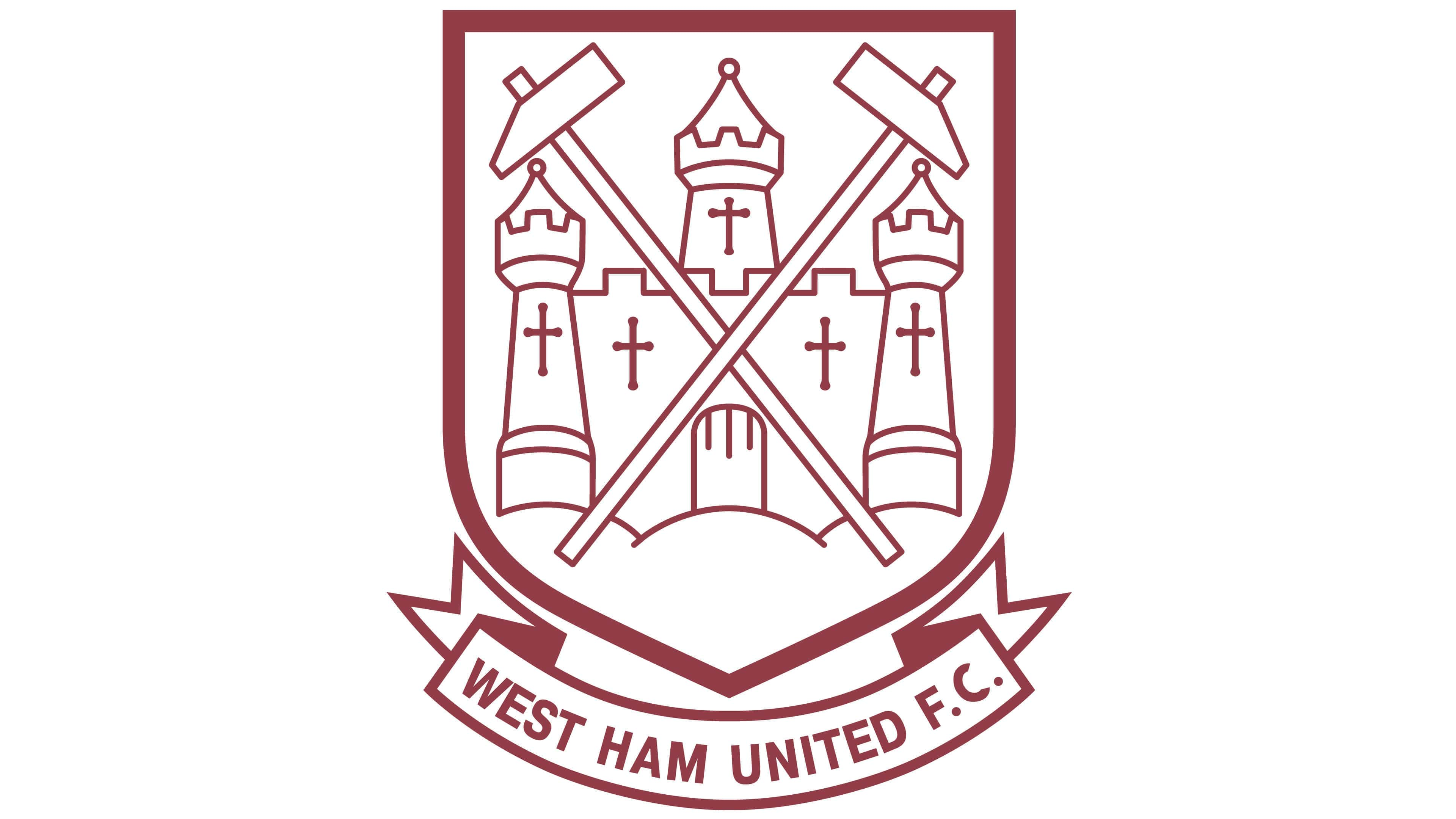
In 1968, the football club simplified its logo again, removing the blue colour palette entirely. For the most part, many of the components of the previous logo are still present. The hammers have been made slightly larger here, and the elements of the castle seem sharper and more refined.
Underneath the West Ham United Crest, we see a banner showcasing the name of the company, with the letters “FC” inscribed at the end.
The 1975 West Ham badge saw the removal of the shield-style crest and the introduction of a simple circular design, mostly depicted in burgundy. The hammers on the design were showcased in light blue, while the castle was presented in white.
The same logo was used after the team won the Cup in 1975, though it was placed on a square instead of a circle.
1980
In the 1980s, West Ham introduced an entirely new colour palette, eliminating almost all of the tones used in previous designs. The majority of the components in the logo were consistent, with the hammers, castle, shield, and even banner aspects all present.
However, this design was introduced in colours of bright blue and gold. This emblem was reintroduced at a later date, too, between 1985 and 1987.
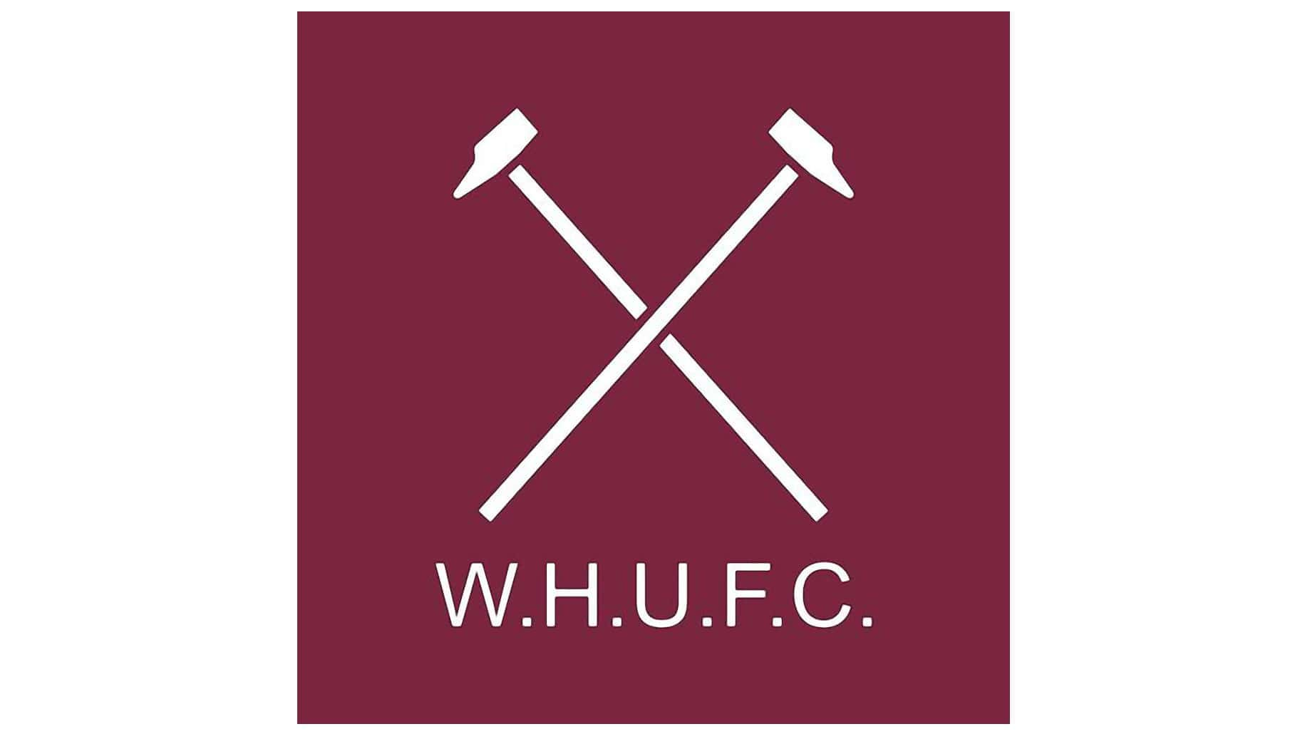
For a brief period between 1983 and 1985, West Ham reverted to their roots with a simple set of crossed hammers in white placed on a burgundy background. The letters “WHUFC” appeared underneath the design in place of the team’s full name.
After reverting to the previous logo from 1980 for a short time, 1987 made an update and changed the background in their shield to the colour red. The banner tone was updated slightly to a slightly lighter shade of blue, closer to what most West Ham fans would be familiar with today.
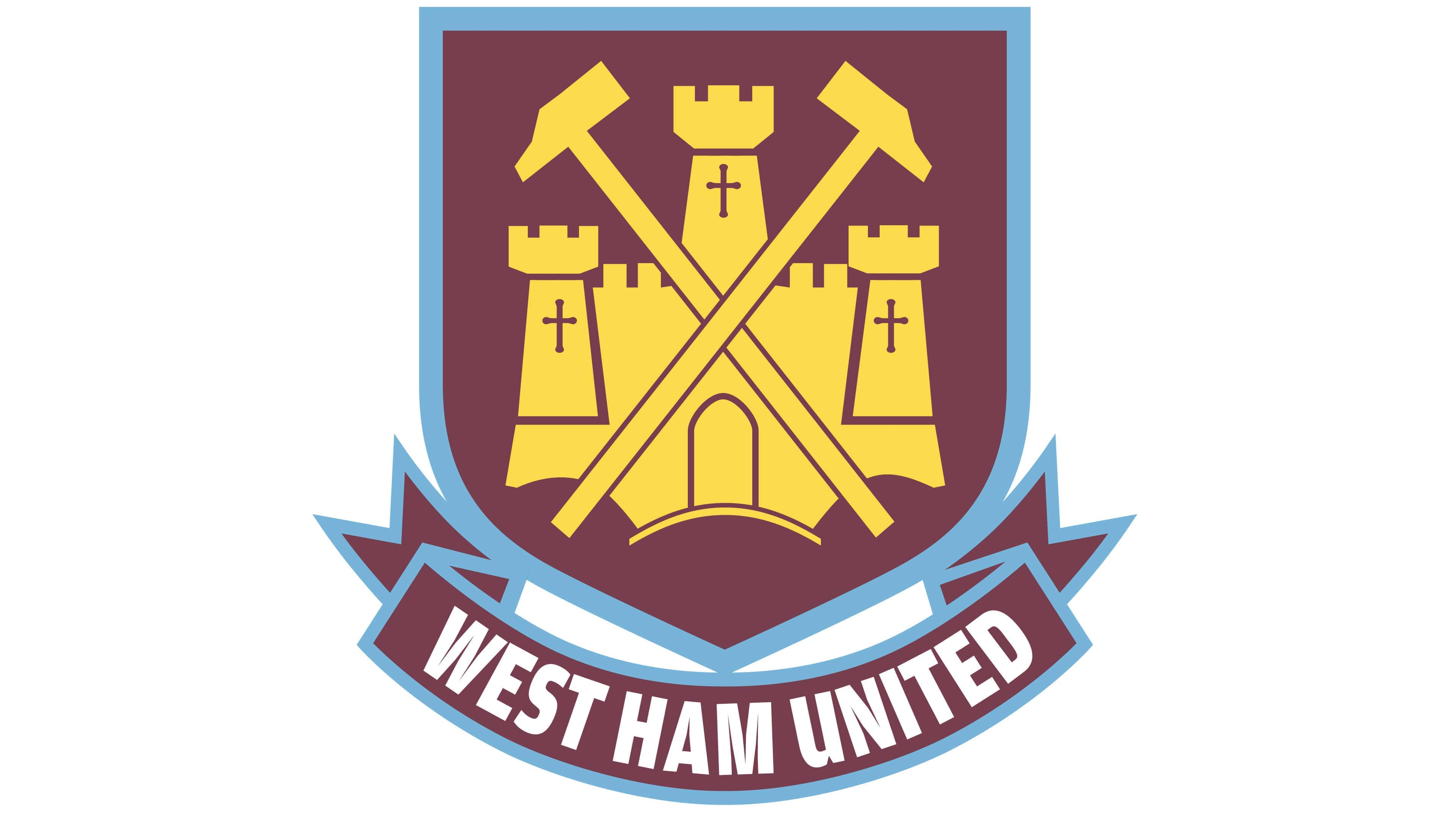
In 1999, an updated version of the previous West Ham logo was introduced, with a new colour palette of burgundy purple, yellow, white, and light blue. Variations of this logo were used in a host of different colours throughout the years from 1999 to 2016.
In this design, the banner has been simplified slightly, removing the “FC” component.
What does the West Ham logo mean?
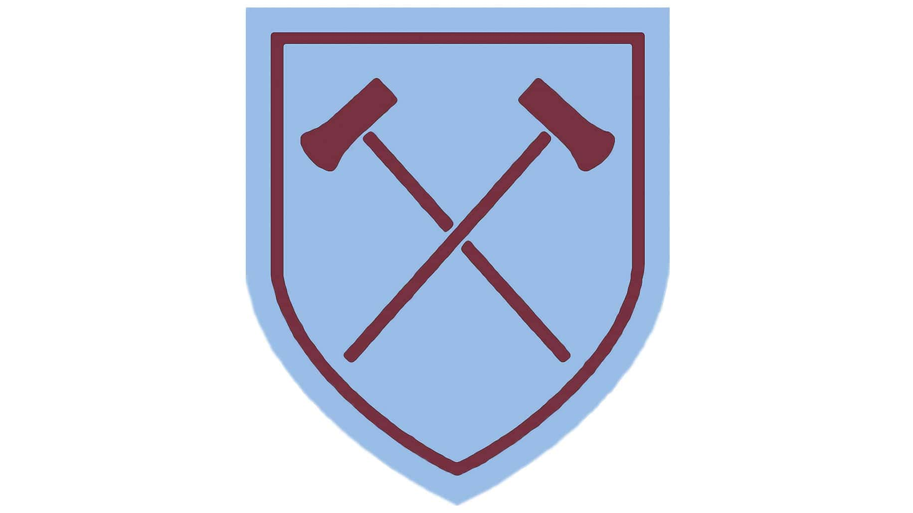
The West Ham badge today
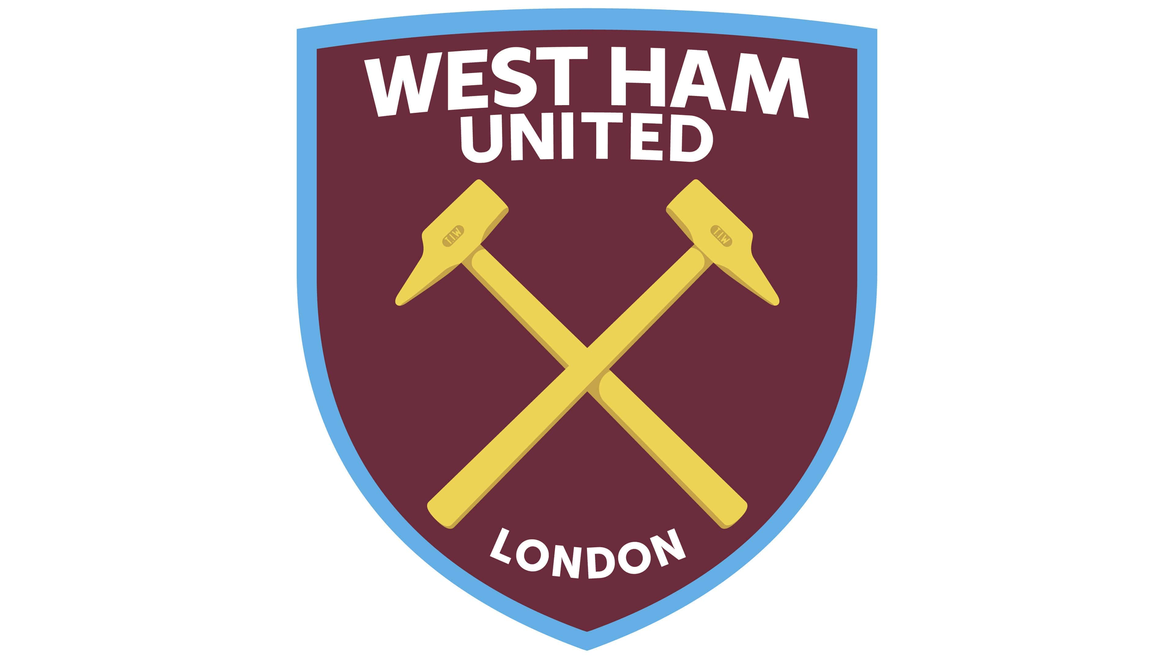
Today, the West Ham Hammers logo is a simple variation of the designs we’ve seen introduced by the team across the decades. Once again, we see the hammers referencing the Ironworks, which started the group’s long history.
In this design, however, they’re more textured, detailed, and three-dimensional.
The shield long associated with the company is back, demonstrating ideas of protection, excellence, and strength. Additionally, the group has also reintroduced the light blue and burgundy colours commonly associated with West Ham throughout the years.
In the current variation of the logo, West Ham is showing a commitment to their roots and origins with a simplified and modernized badge. The crest includes the name “West Ham United” on the top, as well as the word “London” at the bottom, highlighting the location of the team.
The West Ham logo: Colours and fonts
The West Ham United FC logo today is a modern, eye-catching, and unique emblem designed to capture the hearts and minds of football fans everywhere. The badge consists of numerous key elements which have been developed over the decades by the group.
The two golden hammers connect to the team’s history and origins, while the colour palette helps to differentiate it from its competition.
If you want to take a closer look at the West Ham badge, you can find some useful resources here:
What colour is the West Ham United logo?
The West Ham United logo colour palette is perhaps one of the most interesting things about the emblem. The colour maroon conveys ideas of sophistication and passion, while blue is commonly associated with tranquillity and reliability.
The golden colour used in the hammer is perfect for showcasing luxury and excellence.
The official West Ham United logo colour hex codes include the following:
MAROON
PANTONE: PMS 7638 C
HEX COLOR: #7A263A
RGB: (122, 38, 58)
HSL: (344, 68, 47)
CMYK: (36, 92, 63, 35)
BLUE
PANTONE: PMS 306 C
HEX COLOR: #1BB1E7
RGB: (27, 177, 231)
HSL: (194, 88, 90)
CMYK: (69, 11, 0, 0)
YELLOW
PANTONE: PMS 121 C
HEX COLOR: #F3D459
RGB: (243, 212, 89)
HSL: (46, 63, 95)
CMYK: (5, 13, 78, 0)
What font does the West Ham United logo use?
The West Ham United logo font is very similar in style to typography options such as Futura Bold Condensed and Captura Now Bold. The choice of font is relatively simple and straightforward, intended to capture attention without impairing legibility.
Celebrating the West Ham Hammers
Looking at West Ham United logo history, the emblem has come quite a long way. Various versions of the West Ham United FC logo have existed over the years. However, many have included consistent elements, such as crossed hammers and a unique colour palette.
Today, the West Ham logo symbolizes strength, power, and reliability, loved by fans nationwide. It manages to be both modern and historical simultaneously, connecting the team to its storied past and its bright future.
Fabrik: A branding agency for our times.

Clarity starts with a conversation.
Thanks—we’ll get back to you shortly.
Whether you're navigating a rebrand, merger, or simply need a clearer identity—we’re here to help. No hard sell, just honest advice from people who know the sector.
Let’s start with a simple question…
Prefer to email? Drop us a line.
Fabrik’s been helping organisations rethink and reshape their brands for over 25 years. We’ve guided companies through mergers, rebrands and new launches. Whatever stage you’re at, we’ll meet you there.