


Tottenham Hotspur logo history: The cockerel that rules North London
Football fans in London will surely be familiar with the Tottenham Hotspur logo. The iconic cockerel has been a part of the London sports landscape for around 140 years, inspiring and engaging fans from all over the country and the world.
But how much do you know about Tottenham Hotspur logo history?
As one of the world’s best-known Premier League team logos, the Tottenham Hotspur crest is difficult to ignore. Though relatively simple compared to other famous sporting badges, the “Spurs” emblem is modern, eye-catching, and linked to a long, impressive history.
Although many aspects of the Spurs’ logo have changed over the years, the team has retained some consistent elements, from a strong yet minimalistic colour palette, to a phenomenal team mascot. Today, we will be taking a closer look at the Tottenham FC logo and how it has evolved.
An introduction to the Tottenham FC logo
Who are the Spurs?
Tottenham Hotspur FC (Football Club), commonly known as the “Spurs,” is a professional Premier League team from Tottenham in London.
The club was first founded in 1882, making it one of the oldest professional football teams still around today. The group’s emblem, featuring a cockerel standing on a football, is sometimes accompanied by a Latin motto, which translates to “to dare is to do.”
After originally launching in 1882, Tottenham won its first FA Cup in 1901, becoming the only non-league club to do so since the League’s formation in 1888.
Tottenham was also the first group in the 20th century to win the FA and League Cup double. Plus, they were the first British team to win the European Cup and become the inaugural winners of the UEFA Cup in 1972.
Alongside many international accomplishments, the Spurs have won 8 FA cups, two league titles, four league cups, and 7 FA Community Shields.
Why are the Spurs called Spurs?
The Tottenham Hotspurs are commonly referred to by fans as the “Spurs,” in reference to the word “Hotspur.” Initially, the group was called the “Hotspur Football Club,” but it changed its title in 1884 to include the word “Tottenham” to avoid confusion with another London “Hotspur” team.
In the international landscape, the “Spurs” nickname can be a little confusing, as there’s also a group in the NBA known as the Spurs from San Antonio.
Tottenham Hotspur logo history
The Tottenham Hotspur crest
The Tottenham Hotspur logo history began all the way back in 1882. Since then, the team has introduced various different badges and crests. However, most have maintained consistent elements, such as the image of the Cockerel, Tottenham’s mascot.
Originally, between 1882 and 1884, Tottenham Hotspur players simply wore shirts with a large letter “H” on the front, often written in red. It wasn’t until 1921 that an official logo was introduced.
1921
Tottenham Hotspur FC fans were first introduced to the team’s iconic mascot, the cockerel, in 1921. After winning a second victory in the FA Cup, the team introduced this shield-style emblem in a shade of dark blue, with a relatively detailed rooster in the middle.
The logo featured no words or typography, nor did it include the name of the team.
1951
Between 1951 and the late 1960s, Tottenham introduced two different variations of its shield logo, still adhering to the dark blue colour palette. The two designs both featured a shield with three points on the top, though the design of the bird in the centre was very different between the two.
The first design featured a more traditional-looking cockerel with a lighter blue colour palette, while the second introduced a much darker shade of blue and a more elongated bird.
1972
In the 1970s, another two logos were introduced. One was quite a complex Tottenham Hotspur badge, featuring the name of the team for the first time alongside the letters “FC.” The design placed the cockerel on top of a football, with golden outlines, and in front of a larger background football.
The secondary logo was a simplified version of the design above, featuring a more stylistic cockerel standing on top of a larger ball shape. There were no wordmarks included in this secondary logo, and only the colours dark blue and white were present.
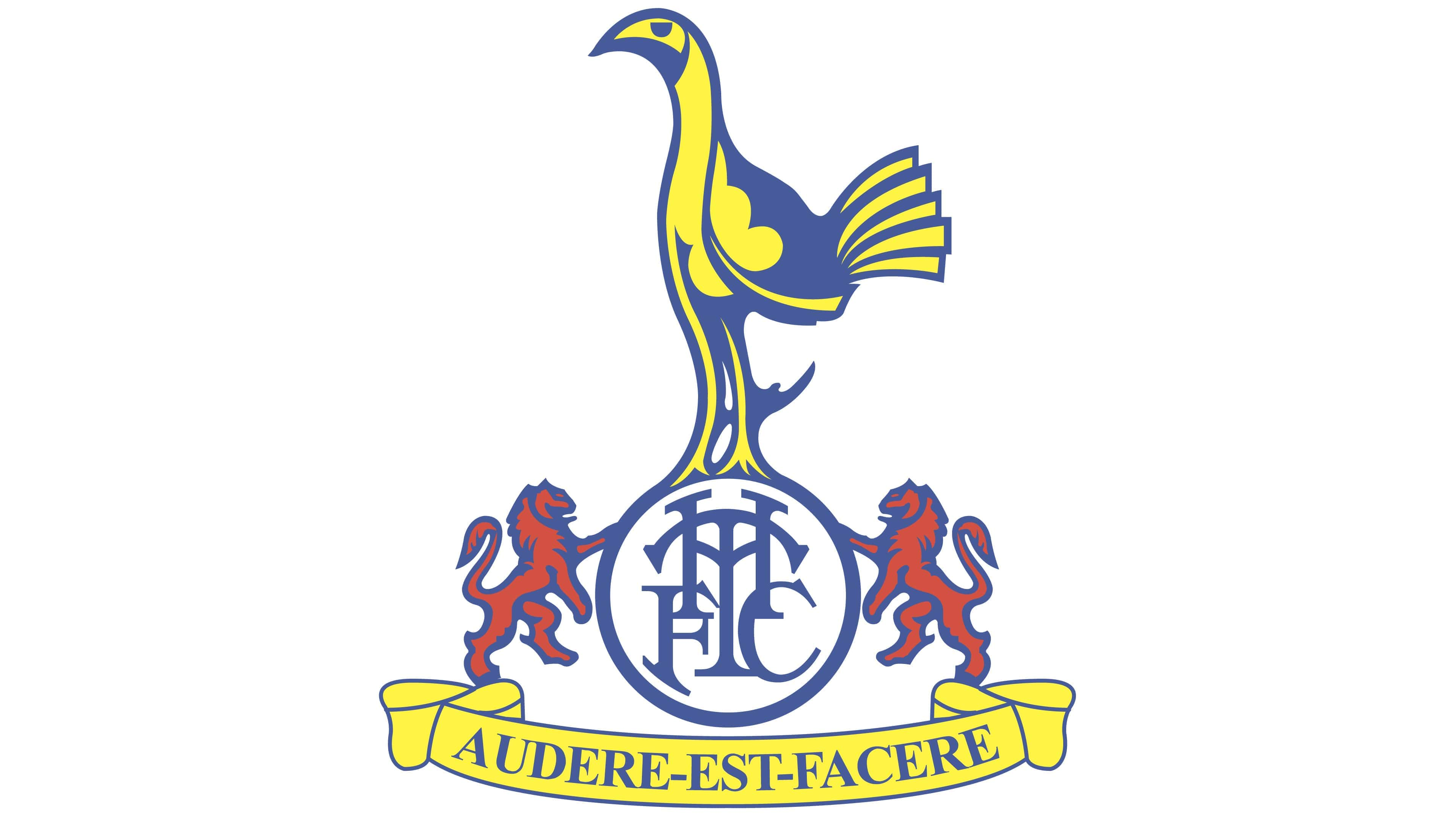
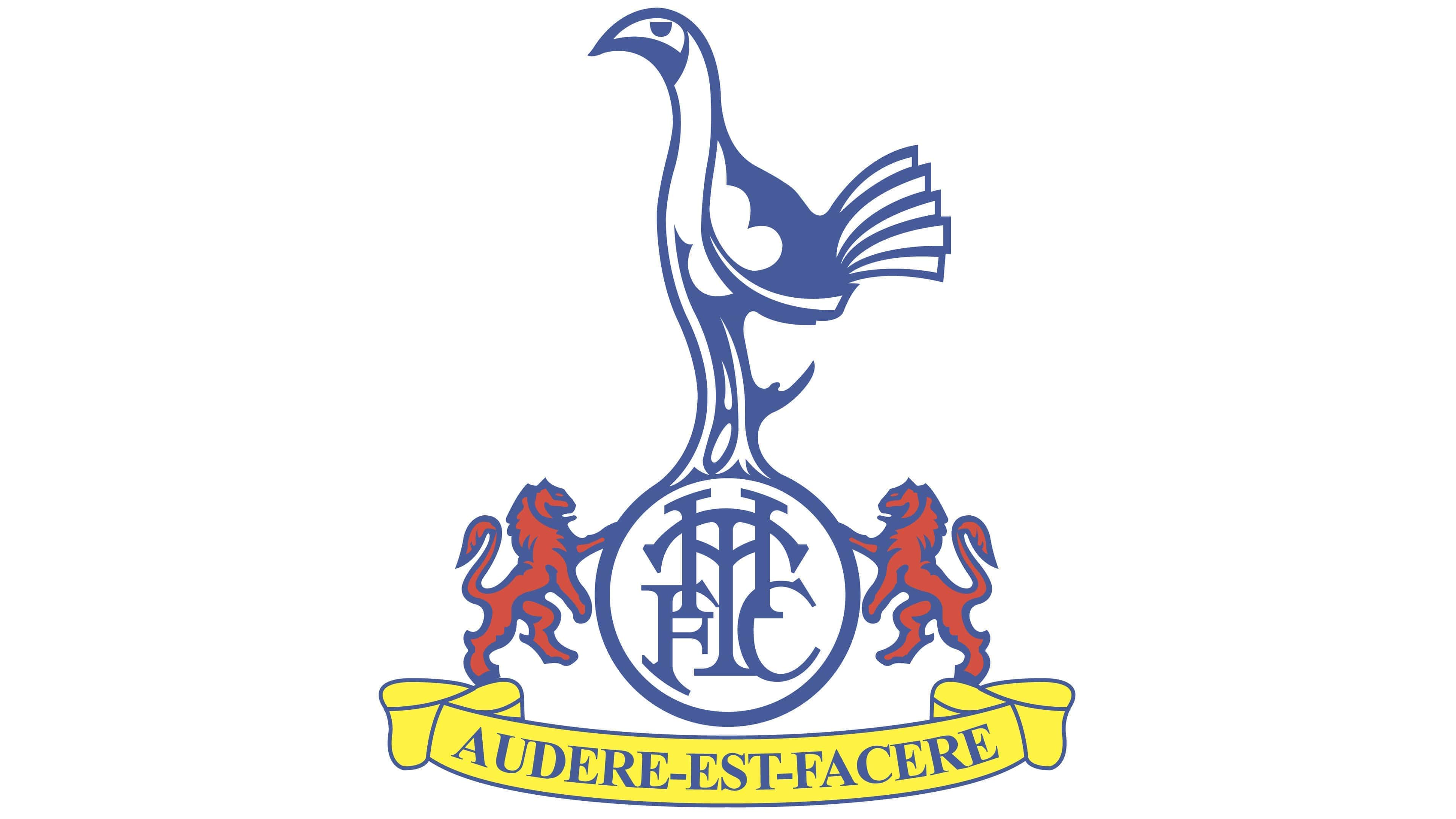
A far more traditional Tottenham Hotspur crest was created in 1983, featuring numerous ornate details, as well as references to the English flag (the red lions). The design presented the cockerel in shades of blue and yellow, which matched the inscription on the banner below.
In this emblem, the cockerel is also placed on a circle with a unique monogram in the middle.
This was the first logo to introduce the Latin motto of the Spurs, “To Dare is to Do,” written in an elegant, serif-style typeface.
Throughout the remaining years of the 80s, numerous other ornate logos were introduced with similar elements, some of which included trees and castle components placed on either side of the Rooster in the image. The Latin inscription appeared on all of these variations.
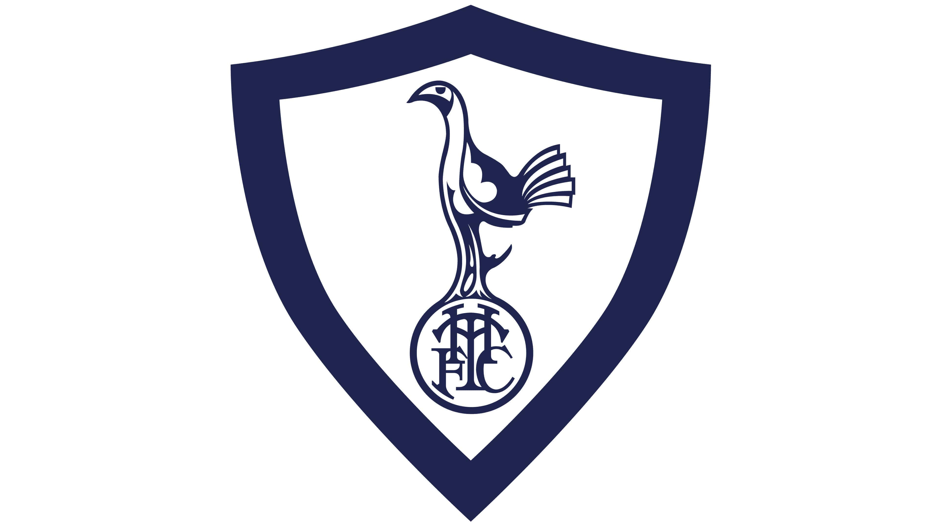
In the 90s, Tottenham Hotspur introduced a much simpler logo for a short time, featuring a triangular shield with sharp edges and a thick dark blue outline. The monogram from the emblem created in 1983 was present here, instead of the football beneath the cockerel’s feet.
This simplified logo only stayed with the team for two years before they reverted back to a more traditional crest, once again showcasing their Latin motto.
The more complex logo was intended to showcase all of the key symbols of Tottenham’s homeland while allowing it to differentiate itself from other teams in the League.
Between 1999 and 2006, Tottenham temporarily reverted back to the logo it introduced in 1983, eliminating the shield elements and focusing entirely on the central components of the cockerel, monogram, motto, and red lions.
The Tottenham Hotspur badge today
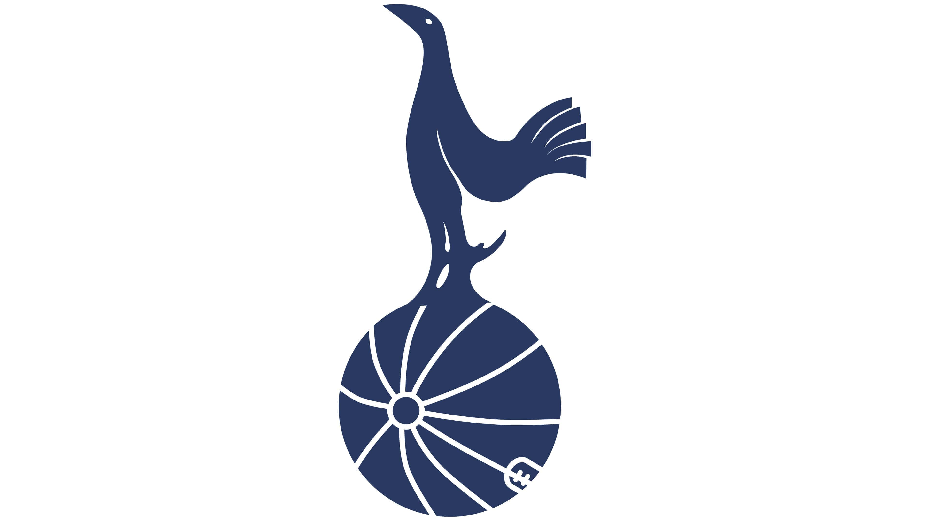
In 2006, Tottenham Hotspur’s team went through a major rebranding process intended to modernize its image for a younger audience. The relatively old-fashioned previous emblems were replaced by a far more simplistic design, similar to the one we saw briefly in the 1970s.
The cockerel, one of the core components of Tottenham Hotspur’s visual identity, was refined in this logo to appear more streamlined and elegant. Notably, the Tottenham Hotspur cockerel has always been a part of the team’s identity.
The bird is said to be inspired by nobleman Henry Percy, who had the nickname Harry Hotspur and loved cockfights.
The most recent version of the Tottenham Hotspur FC logo features the cockerel standing on top of a traditional-looking football. The words “Tottenham Hotspur” appear underneath, curving around the underside of the ball to create a sleek, stylish image.
The design, depicted in shades of dark blue and white, is sometimes used without the wordmark for certain marketing campaigns and pieces of merchandise.
The Tottenham FC logo: Colours and fonts
Today, Tottenham Hotspur’s logo is a modernized, refined version of the visual identity the team has been perfecting for a number of years.
Depicted in shades of dark blue and white, the logo reflects the history of the group and revolves around its iconic mascot. This sleek and refined badge helps to set the team apart from its competitors in the League.
If you’re looking for more insights into the Tottenham Hotspur logo, you can find some helpful resources here:
What colour is the Tottenham Hotspur logo?
Over the years, the Tottenham Hotspur logo colours have gone through a handful of changes, with various new shades being added from time to time.
However, perhaps the most significant Tottenham Hotspur logo colour has always been a shade of dark, royal blue. The blue and white colour palette highlights the reliability of the club and its loyalty to its fans, as well as the team’s courage.
The blue in the Tottenham Hotspur logo colours is:
NAVY BLUE
PANTONE: PMS 2766 C
HEX COLOR: #132257
RGB: (19, 34, 87)
CMYK: (100, 92, 32, 35)
What font does the Tottenham Hotspur logo use?
While the Tottenham Hotspur logo font doesn’t always appear in every iteration of the team’s logo, it’s an elegant and attractive inscription. The Tottenham Hotspur wordmark is typically written in all capital letters, in a custom typeface, with sharp serifs and thickened lines.
The simplistic yet eye-catching font is intended to be instantly legible across all mediums, and the colour choice matches the rest of the emblem’s design.
Celebrating the Tottenham Hotspur cockerel
The Tottenham Hotspur logo history provides an interesting insight into the evolution of this incredible team’s identity throughout the decades. While, like many sporting groups, the Spurs have made significant changes to their emblem, but various aspects have always remained the same.
The cockerel, for instance, has been a long-standing mascot for the Spurs since the team’s inception. Additionally, the use of football imagery, such as having the bird standing on a football, has been relatively consistent in most logos.
Fabrik: A branding agency for our times.

Clarity starts with a conversation.
Thanks—we’ll get back to you shortly.
Whether you're navigating a rebrand, merger, or simply need a clearer identity—we’re here to help. No hard sell, just honest advice from people who know the sector.
Let’s start with a simple question…
Prefer to email? Drop us a line.
Fabrik’s been helping organisations rethink and reshape their brands for over 25 years. We’ve guided companies through mergers, rebrands and new launches. Whatever stage you’re at, we’ll meet you there.