


American university logos: The best logos from American universities
Some of the most famous American university logos are badges of honor for the alumni who visited those hallowed halls. Many are even well-known in locations all around the world.
Just like your favorite brands, universities, and colleges across the globe leverage branding to connect with their target audience and generate loyalty among students.
The best American university logos often use a combination of colors, shapes to make an emotional impact. Think of simple impact of Stanford University’s wordmark, or the unforgettable shield of Harvard University.
Today, we’re going to be looking at some of the famous university logos you may be familiar with from throughout America, and what they mean.
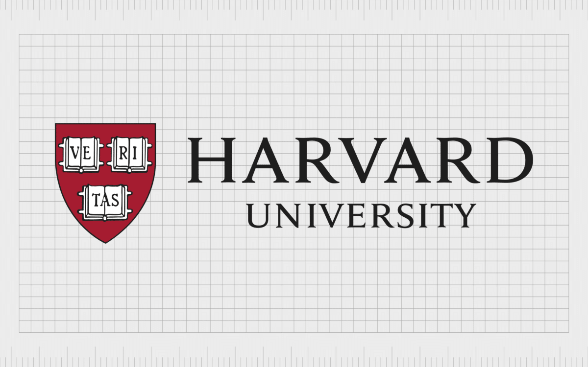
Harvard
Let’s start with perhaps one of the best-known American University logos in the world. Commonly associated with sophistication and excellence, the Harvard University logo is a simple red shield, with three books placed throughout.
Harvard University is one of America’s oldest-standing institutions of learning, founded in 1636, and the Ivy League School has also become one of the most prestigious in the world. The books in the shield of the brand’s logo help to draw attention to this heritage.
The Latin slogan “Veritas” printed across the books stands for “Truth” or “Verity”. The Harvard University logo is sometimes accompanied by the words “Harvard University” in a clean serif font.

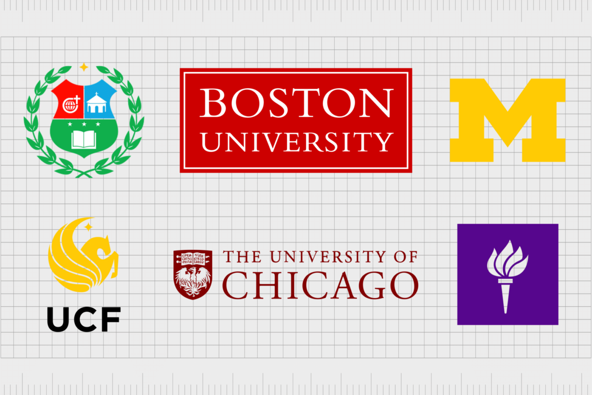
University of Michigan
Another extremely well-known university, the University of Michigan was founded in 1817 by the old Michigan Territory. The University is the oldest in Michigan and is well known for its series of nineteen colleges, and huge range of degree programs.
There are a total of four marks used by the University of Michigan. The primary logo is a simple yellow “M” on a deep blue background. The colors represent the colors of Michigan, while the design is intended to highlight the modernity of the timeless educational facility.
There’s also a university seal available for the University of Michigan, which features a golden lamp.

University of California, Berkeley
The Berkeley University of California was first established in 1868, as the University of California. It’s the first land-grant University of the state, and the first campus of the University of California.
Currently, the University is home to a total of fourteen colleges and schools, offering about 350-degree programs to more than 40,000 students.
Like most American university logos, the University of Berkeley has a number of different logo marks available, including its “shield,” which features a book on a golden background, and the motto “Let there be light”.
The official logo is quite a bit simpler, however, featuring just the wordmark, for the name of the educational facility in a serif font.

UCLA (University of LA)
The University of California, Los Angeles, better known as UCLA, is a public land-grant university in LA. The roots of the facility were first established during 1882, and the school has grown ever since.
Today, UCLA offers around 337 undergraduate and graduate degrees. Like Berkley, UCLA shares the same motto “Let there be light”.
The UCLA has a simple campus logo, featuring the letters “UCLA” in a sans-serif white font on a blue background. There are some alternative logos, too, such as the UCLA campus seal, which is only used for ceremonial purposes.
The sans serif nature of the font makes the UCLA emblem a little friendlier than some of the other American university logos on this list.

Yale University
A private Ivy League research university in Connecticut, Yale is the third-oldest institution for higher education in the United States. Today, Yale stands as one of the most prestigious universities in the world, with the motto “Light and Truth” appearing on its seal.
The Yale university is a simple deep blue wordmark on a white background. The image is in serif font, similar to Times New Roman. Though minimalist in its design, the Yale university logo is effective at conveying a sense of heritage, history, and sophistication.
Yale’s position in the educational world speaks volumes, even without a complex logo.

Princeton University
Located in New Jersey, Princeton University is another Ivy League institute in our list of American Universities. The location was originally created in 1746 as the College of New Jersey, and it’s the fourth-oldest educational facility in the US.
The University today stands as one of the most prestigious in the company and uses the motto, “Under God’s power she flourishes”.
Princeton’s University logo features a shield in black and orange, with the words “Princeton University” placed alongside in bold, serif font. The shield, like many famous university logos, features a book with the words of the school’s motto written within.
The open book is one of the best-known symbols of knowledge and learning in the educational industry.

New York University
Otherwise known as “NYU”, New York University is a private research university located in New York City and chartered in 1831 by New York State legislature. The facility was founded by a group of New Yorkers at the time.
Today, NYU is one of the most popular universities in the US, and also hosts several undergraduate schools.
The official New York University logo is a simple but modern wordmark, with a purple square placed alongside it. In the square, we see a white torch, designed to represent the torch from the Statue of Liberty.
This is a highly patriotic and memorable logo, with bright coloring intended to capture the hearts and minds of anyone who sees the emblem.

University of Chicago
One of the best university logos we’ve seen thanks to the use of its eye-catching shield, the University of Chicago’s emblem is impossible to forget. The University of Chicago is a private research university which first started life in 1890.
Today, the University has close to 30,000 students, and a range of five graduate research divisions.
The logo for the University of Chicago features a deep red wordmark in all capital letters (serif), with the official shield of the University situated alongside it. The shield features a phoenix rising from the flames, underneath a book with the motto of the University written in Latin.

Duke University
Duke University, located in North Carolina, started life as “Brown School” in 1838. Today, the University prides itself on offering a wide range of fantastic post-graduate learning opportunities for students.
Duke is ranked among the top universities in both the United States and the world.
The Duke university logo is very similar in style to the Yale logo, featuring only a serif wordmark written in deep blue. The design seems to convey sophistication, history, and professionalism.
Duke University, like many of the most famous American university logos, doesn’t use any additional shapes or graphics to represent the institution in the official brand mark, though it does have a university seal.

Cornell University
Another example of American university logos that uses both the official seal of the school, and a wordmark is Cornell University. A highly renowned educational facility, Cornell is located in Ithaca, New York, and was first founded in 1865.
Today, the university is one of the best-known in the world, attracting many notable scholars over the years.
The Cornell University logo is a deep red wordmark, written in serif font, placed next to the official Cornell University seal. Within the seal is a shield which shows an open book. Around the shield, we see a border highlighting the date the University was founded.
This is an excellent example of a logo with plenty of history.

Johns Hopkins University
A private research university located in Baltimore, Maryland, Johns Hopkins University, or JHU was founded in 1876 and named after its first benefactor, philanthropist, and entrepreneur, Johns Hopkins.
The University is often ranked among the most prestigious in the world and uses the motto, “The truth will set you free.”
Ideal for showcasing a sense of sophistication and trustworthiness, the Johns Hopkins university logo uses a serif wordmark, written in deep blue. Above the name of the University, we also see a version of the school’s coat of arms, which features a globe, a book, and the crest of Lord Baltimore.

Carnegie Mellon University
Located in Pittsburgh, Pennsylvania, Carnegie Mellon was introduced in 1900 as a result of the merger between the Mellon Institute for Industrial Research and the Carnegie Institute for Technology.
The Carnegie Melon University is classified as one of the top research and development schools in the world.
Officially, Carnegie Mellon University uses a simple serif wordmark for its logo. The design is stacked in three sections, and written in a deep shade of red. The logo is eye-catching and engaging, highlighting the passion in the school.

Brown University
Another of the most famous university logos in the world, Brown University’s emblem, has captured the attention of academics around the world. Brown was the first college in North America willing to accept students regardless of religious affiliations.
The University is also home to the oldest program for applied mathematics in the US.
The Brown University logo includes the official coat of arms for the University, which features a red cross on a white shield, with books placed into four sections throughout the shield. Atop the emblem, we also see a rising sun with a face. Next to the shield, Brown often uses a serif-style wordmark.

Boston University
Located in Boston, Massachusetts, Boston University was founded officially in 1839, making it a long-standing and prestigious school within the United States. Not only does the facility house more than 34,000 students, but it’s also one of the largest employers in Boston.
Though simple, the Boston University logo makes an impact. The design places a white serif wordmark on a red background. Red is often used to symbolize passion and power, and it’s a color that appears throughout the Boston University branding, including on the shield of the school.

University of Florida
Otherwise known as “UF”, the University of Florida is a public land-grant research school in Florida, Gainesville. A senior member of the University System of Florida, the school traces its origins back to 1853.
The University is accredited by the SA of Colleges and Schools and is currently the third largest in Florida by population.
Like many of the most famous university logos, the University of Florida uses the colors of the state in a wordmark for its logo. The name of the University is depicted in blue, while an orange light separates the monogram from the full wordmark.

Tufts University
Located in Massachusetts, Tufts first sprang to life in 1852 as Tufts College, an institute created by Christian Universalists looking to introduce a nonsectarian solution for higher learning. Tufts remained a liberal arts college until the 1970s, when it evolved into a research university.
Today, the Tufts logo features the name of the university in an engaging serif font, written in soft, reliable blue. The seal of the university sometimes appears alongside the wordmark, featuring a dove with an olive branch above a book. The seal represents the religious background of the school.

University of Virginia
One of the most eye-catching American university logos on our list comes from the University of Virginia. The UVA is a public research facility founded in 1819 by Thomas Jefferson.
This is also the flagship university of Virginia, and it is home to the UNESCO World Heritage site, the Academical Village.
The University of Virginia includes the name of the school written in an elegant serif font, in dark blue. Alongside the wordmark is an orange symbol which looks something like a building.
Apparently, the design is based on the Roman Pantheon, which may help to draw attention to the history of the unique learning institution.

University of Illinois
Found in Illinois the University of Illinois is a public research university with more than 33,000 students, and a strong presence in the medical education environment.
The UIC is one of the better-known universities in the United States and uses a range of different branded marks to represent itself in various environments.
The most common University of Illinois logo is the wordmark, written in a sans-serif dark blue font – which helps to set it apart from many of the other American university logos explored here.
There’s also a large “I” placed alongside the logo in orange, with a dark blue background. The words “Urbana-Champaign” are present here too.

George Washington University
Chartered in 1821 by the US Congress, the George Washington University is a private school, and the largest institution for higher education in the Columbian district.
The first president of the United States, George Washington, advocated for the establishment of a national university in the US capital, and continued to promote this idea throughout his life.
The George Washington University logo today is a simple wordmark written in sans-serif font, featuring the deep blue we often see in university logos. The marking generally also includes a reference to Washington DC.

University of Notre Dame
Classically stylish and sophisticated, the University of Notre Dame is a great example of how eye-catching American University logos can be.
Otherwise known simply as “Notre Dame”, the University of Notre Dame is one of the top educational facilities in the United States, and it’s well-regarded around the globe too.
Notre Dame’s logo combines the wordmark for the university in blue serif writing, similar in style to Times New Roman. Next to the wordmark is a golden shield, featuring a cross (to highlight the Catholic nature of the school), and a book.

Purdue University
Another excellent insight into US University logos, Purdue University follows a very similar style to the majority of famous university logos in the US.
Purdue university first launched in 1869, and currently stands as one of the best public universities in the US, according to major institutional rankings. The Purdue University is best-known for its engineering programs.
Purdue’s logo is simple, elegant, and eye-catching. Like most leading universities, the group uses a phenomenal wordmark to capture the attention of students. The words “Purdue University” appear in black and gold serif type, demonstrating class and sophistication.

Indiana University
When it comes to famous University logos, the Indiana University image is one of the more talked about options. Many people assume the design which lingers over the top of the wordmark in this logo is a candle holder.
However, it’s actually a combination of the letters “I” and “U”.
Depicted in black and crimson, the colors of the Indiana University are intended to convey a sense of passion and sophistication. The brand mark is intended to be simple, eye-catching, and brimming with aesthetic appeal.
Indiana’s Bloomington University is the flagship campus of the Indiana University, with more than 40,000 students.

University of San Carlos
Referred to by some as “USC”, the University of San Carlos is a higher education institution offering a range of educational experiences for budding students. The university is best known for being one of the oldest learning facilities globally, launching officially in 1783 under the name “Colegio-Seminario de San Carlos”.
The shield emblem for the University of San Carlos is one of the more unique designs on this list. The university logo features a shield divided into three sections. The lower part of the shield features the open book which is often associated with education.
On the top left of the shield is the symbol of the SVD, with a globe surrounded by a circle and topped with a cross. There’s also a simple outline of a chapel in the top right corner, representing the religious nature of the school.

University of Kentucky
Championing the Latin phrase, “United we stand, divided we fall”, the University of Kentucky is one of the better-known educational facilities in the US.
This university, which first launched in 1865, has recently begun to focus more aggressively on research and the development of new, pioneering opportunities in the social sciences, life sciences, and humanities landscapes.
Though the University of Kentucky is one of the older institutions in the educational world, it has a relatively modern logo. Like many of the famous university logos we’ve looked at so far, this design includes a serif wordmark, this time written in black.
Next to the wording are the letters “U” and “K”, to represent the name of the university, in bold blue font.
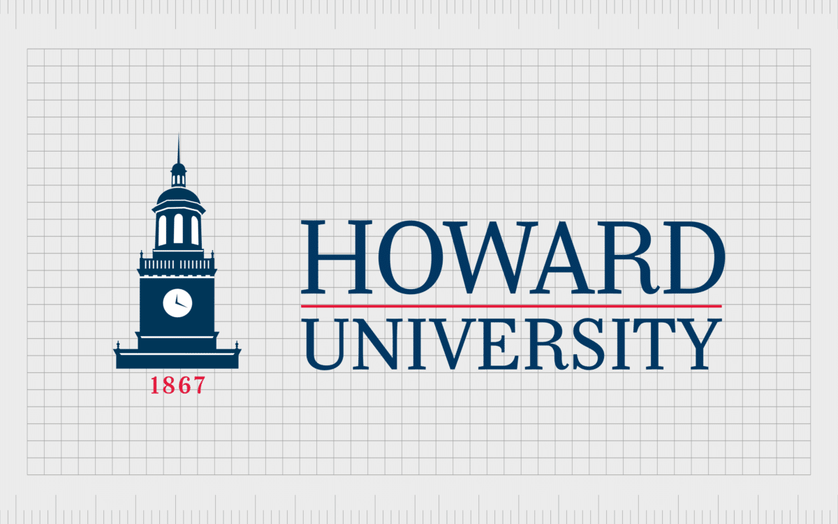
Howard University
One of the better-known universities in the US, Howard University is a private research facility located in Washington. Classified as one of the top doctoral universities in the country, Howard University traces its origins back to 1867.
Like many educational institutions, Howard University is proud of its heritage – to the point where you can see the date it was founded on the logo.
In this example of American University brands, we see the words “Howard University” written in a simple serif font in blue, with a red line separating them. Next to Howard University’s wordmark is an eye-catching image of a clocktower, with the date of the university’s founding written beneath.

Arizona State University
Created in 1885, Arizona University, or ASU is one of the largest public universities in the US, according to enrollment numbers. The location is one of the three facilities governed by the Arizona board of regents, and it’s one of the top doctoral universities around.
The ASU has around 150,000 students attending classes at present.
Arizona State University’s logo is a little different from some of the other brand marks covered in this list. The wordmark is a bold sans-serif font, which makes it a little more welcoming to some students.
The letters “ASU” also feature a yellow sun in the center, intended to represent the dawn of a new era, enlightenment, and growth.

Penn State University
Another contender for the best University logos in the US, Penn State is a public state-related research university with campuses throughout Pennsylvania. The educational facility first appeared in 1855, more than 160 years ago, and follows the motto “Making life better.”
Penn state’s University’s logo includes the name of the University written in an eye-catching, distinctive blue. There’s also the face of a “Nittany Lion,” a specific kind of mountain lion once commonly found in the area where the university was built.
The face of the lion sits within a shield shape, which highlights the strength of the facility.
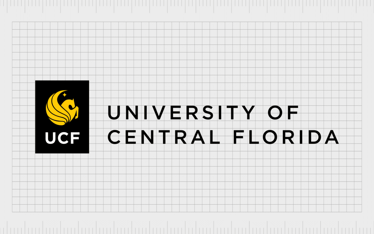
University of Central Florida
It’s hard to write an article about famous university logos without drawing attention to the emblem of the University of Central Florida. This public research university is actually quite young, launching for the first time in 1963, less than 60 years ago.
The motto of the University is “Reach for the stars.”
UCF uses the image of a flying pegasus within its brand mark, depicted in eye-catching yellow. The letters “UCF” are also evident in many brand mark versions, as well as the words “University of Central Florida.”
One of the most attractive elements of the University of Central Florida is its commitment to helping students pursue their careers as astronauts and space explorers.

Iowa State University
If you’re interested in famous university logos from institutions focused on technology and science, you can’t go wrong with the Iowa State University.
The “ISU” as it’s fondly known is one of the largest universities in the US, and one of the top locations to attend if you’re looking to pursue higher education in the scientific landscape.
Iowa State University champions the motto “Science with practice”. Often, publicized versions of the Iowa University logo include the phrase “Of science and technology” underneath the name of the institution.
The use of a deep red for the coloring of the university’s logo represents passion and dedication, while the serif font is ideal for conveying sophistication.

Ohio State University
Otherwise known as “OSU”, the Ohio State University is the official flagship university for Ohio, and a Public Ivy League facility. Widely regarded as one of the best public universities in the United States, this location was founded in 1870, with the motto “Education for Citizenship”.
The Ohio State University seal, like many educational seals today includes the open book associated with learning.
Simple but eye-catching, the Ohio State University logo showcases the name of the educational institution in bold serif letters, often depicted in either deep grey or black. There’s an emblem associated with the Ohio state University in the shape of a bold, angular “O”.
This brand mark is easily memorable, and effective for drawing the attention of Ohio would-be students.

Michigan State University
Another of the top American universities with a memorable logo, Michigan State University was originally launched in 1855. The institution, sometimes referred to as “MSU” was one of the first institutions of higher education in the United States to teach the topic of “scientific agriculture”.
Today, the facility is also one of the biggest in the world, with over 634,000 alumni worldwide.
Similar to many of the best university logos in America, the Michigan State University features a serif wordmark as part of its brand image. The green in the color relates to agriculture, while the “Spartan” helmet symbol draws attention to the famous athletic teams produced by Michigan State.

University of Pittsburgh
Founded as the Pittsburgh Academy in 1787, the Pittsburgh University can trace its origins back hundreds of years. Today, the University is composed of 17 graduate and undergraduate schools.
This University is an educational facility brimming with history and heritage, something many of the students are proud to be a part of.
The logo for the University of Pittsburgh includes the iconic colors Pitt Royal blue and Pitt gold. Like most university logos from America, the name of the institution is depicted in a serif font, in the blue coloring of the facility.
The emblem for the University of Pittsburgh is a shield with a yellow and blue checkerboard in the middle. Atop the shield is a castle, which may help to draw attention to the unique architecture of the university building.

University of Georgia
Sometimes referred to as “UGA,” the University of Georgia was originally founded in 1785, making it one of the oldest public universities to open in the United States. Currently, this University is also the flagship higher educational system for Georgia.
This University is well-known for its wide selection of student organizations and academic associations (almost 800).
Like some of the other famous American university logos we’ve mentioned on this list so far, the university of Georgia uses a shield image for the primary shape in its logo. Within this shield, we see the original date when the institution was first opened.
There’s also an image of an iron gateway at the main entrance to the North campus.

Santa Clara University
A private Jesuit University situated in California (Santa Clara), the Santa Clara University first opened its doors in 1851. The campus surrounds a historical location known as the Mission Santa Clara de Asis, which traces its origins back to 1776.
The rest of the campus architect mirrors the Mission’s style, offering an insight into ancient building techniques in the United States.
Santa Clara University highlights its religious origins with its logo, which stands apart from a wide range of other well-known university symbols. This emblem uses the Santa Clara colors of red and white to showcase a sans-serif word mark.
However, the lettering on the Santa Clara seal is in a serif font. Next to the wordmark is the picture of the Mission building which makes the facility so iconic today.

University of Utah
Sometimes referred to as the “U of U,” the University of Utah is the flagship institution for the Utah system of higher education. The location was established in 1850, making it the oldest higher education facility in the state.
However, the location didn’t receive its current name until 1892.
Like a majority of the American university logos we’ve covered so far, the Utah university doesn’t rely on complex images or shapes.
The official logo for the educational institution simply features the name of the university, with a large, bold U, written in serif font. The “U”’s angular shape conveys a sense of strength, history, and resiliency.

The University of Texas (at Austin)
The University of Texas, at Austin, is one of the many impressive public research facilities throughout the United States. Founded in 1883, the University of Texas at Austin was first introduced into the Association of American Universities in 1929.
Today, the institution has more than 50,000 graduate and undergraduate students and is best known as a major center for academic research.
The logo for the University of Texas at Austin is a noteworthy one, because the word “Texas” is larger than the name of the facility in the brand mark. This logo also features a shield similar to the University of Texas at Austin seal.
Within the seal is the open book of education, a star (for the lone star state), and a set of laurel leaves.
Exploring American University logos
Listing some of the most famous American university logos can be difficult. While we’ve tried to cover all of the best university logos we could find above, there are countless amazing educational institutions and colleges throughout America, each with a wide range of brand marks to explore.
One of the things which makes university logos so unique, is the fact that many institutions have not just an official logo, but a seal, and even a dedicated logo created specifically for their academic sports teams.
As you can see from the examples above, while many university logos have similar elements, such as the open book representing education, or a bold wordmark, each facility takes its own unique approach to branding.
To learn more about the amazing logos which make the world so diverse, make sure you check out some of our deep-dive Logofiles on the Fabrik website.
Fabrik: A branding agency for our times.
Now read these:
—Your clever guide to university branding
—University branding for international students

Clarity starts with a conversation.
Thanks—we’ll get back to you shortly.
Whether you're navigating a rebrand, merger, or simply need a clearer identity—we’re here to help. No hard sell, just honest advice from people who know the sector.
Let’s start with a simple question…
Prefer to email? Drop us a line.
Fabrik’s been helping organisations rethink and reshape their brands for over 25 years. We’ve guided companies through mergers, rebrands and new launches. Whatever stage you’re at, we’ll meet you there.