


The crest of the Reds: A look at the Liverpool logo history
Every Premier League or U.K. football fan will be familiar with the Liverpool logo. One of the sport’s most iconic and memorable crests, the Liverpool FC badge combines ornate details and traditional elements with a timelessly sophisticated aesthetic.
Even if you don’t consider yourself a “Reds” fan, you’re probably aware of Liverpool’s famous bird mascot or the group’s motto, “You’ll Never Walk Alone.”
While, like many famous Premier League logos, the Liverpool FC crest has undergone a few changes over the years, but the design today still pays tribute to the team’s heritage and history.
Indeed, compared to some Premier League emblems, the Liverpool badge could be considered one of the most traditional. Today, we will be taking a closer look at the most compelling elements of the Liverpool logo and how the badge has evolved.
The Liverpool FC crest: Why is Liverpool FC so famous?
Let’s start our exploration of the Liverpool logo with a brief insight into the football team itself. The Liverpool football club is one of the top-flight British football teams known for competing in the Premier League.
Based in Liverpool, England, the team was founded in 1892 and joined the official Football League just one year later.
Perhaps evidence of its commitment to history and heritage, Liverpool has played home games within the Anfield stadium since it was first formed more than 130 years ago.
Throughout the years, the group has won a total of 19 League titles, as well as a record 9 League cups, 8 F.A. cups, and 15 F.A. Community Shields. In addition, Liverpool has also taken home 6 European Cups, 3 UEFA Cups, and 4 UEFA Super cups, not to mention a FIFA Club World Cup.
The incredible success of the team has made it incredibly popular among sporting fans throughout both the U.K. and the world.
Though supporters of the Reds have been divided over a number of major tragedies over the years, such as the Heysel Stadium disaster and the Hillsborough Disaster, their love for the team has remained strong.
Liverpool logo history: The Liverpool badge through the years
Many sporting teams, just like major brands and companies, update their logos throughout the years in order to adhere to changing market trends and expectations. Liverpool is no exception.
For the majority of the group’s life, the most significant identifying element of the Liverpool FC crest has been the presence of the “Liverbird,” a mythical creature from taken from the official Coat of Arms for the City of Liverpool.
Let’s take a closer look at the Liverpool logo history throughout the years.
1892
Like many football clubs founded in the 1800s, Liverpool based its first crest on the Coat of Arms for the team’s city. The design is almost exactly the same as the official coat of arms, featuring everything from a man holding a trident on the left side and a merman on the right.
The two silhouettes are meant to represent the Greek gods Triton and Neptune.
The Liverbird appears on this design in the middle of a central shield. However, it’s far from the main focus of the emblem, with so much else going on around the outside.
In the 1940s, the Liverpool FC logo was simplified slightly. Various aspects from the previous design were removed, and the Liverbird mascot appeared as the central focus of the new design.
The shield shape behind the bird remained, although the overall emblem was updated to a more circular shape, with a curved banner on the top and bottom, highlighting the name of the team.
The two banners were separated by the outline of a football on either side. Though this red and white emblem was a little more straightforward than the previous ornate logo, it still featured a lot of decorative elements. We can even see the famous red and white stripes of the Liverpool uniform.
When the 1950s rolled around, Liverpool began to simplify its logo even further.
A new badge was created, which zoomed in on the Liverbird in the badge within the center of the previous crest. All of the surrounding components were removed, and the coloring was inverted to present the bird in white or silver on a red background.
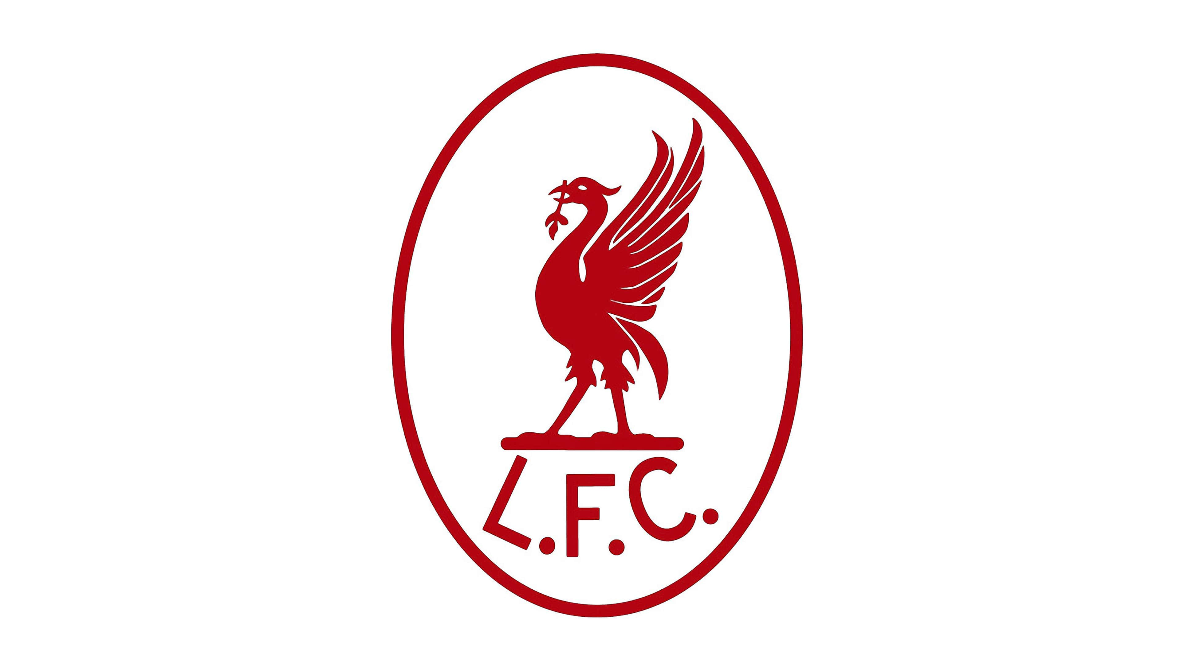
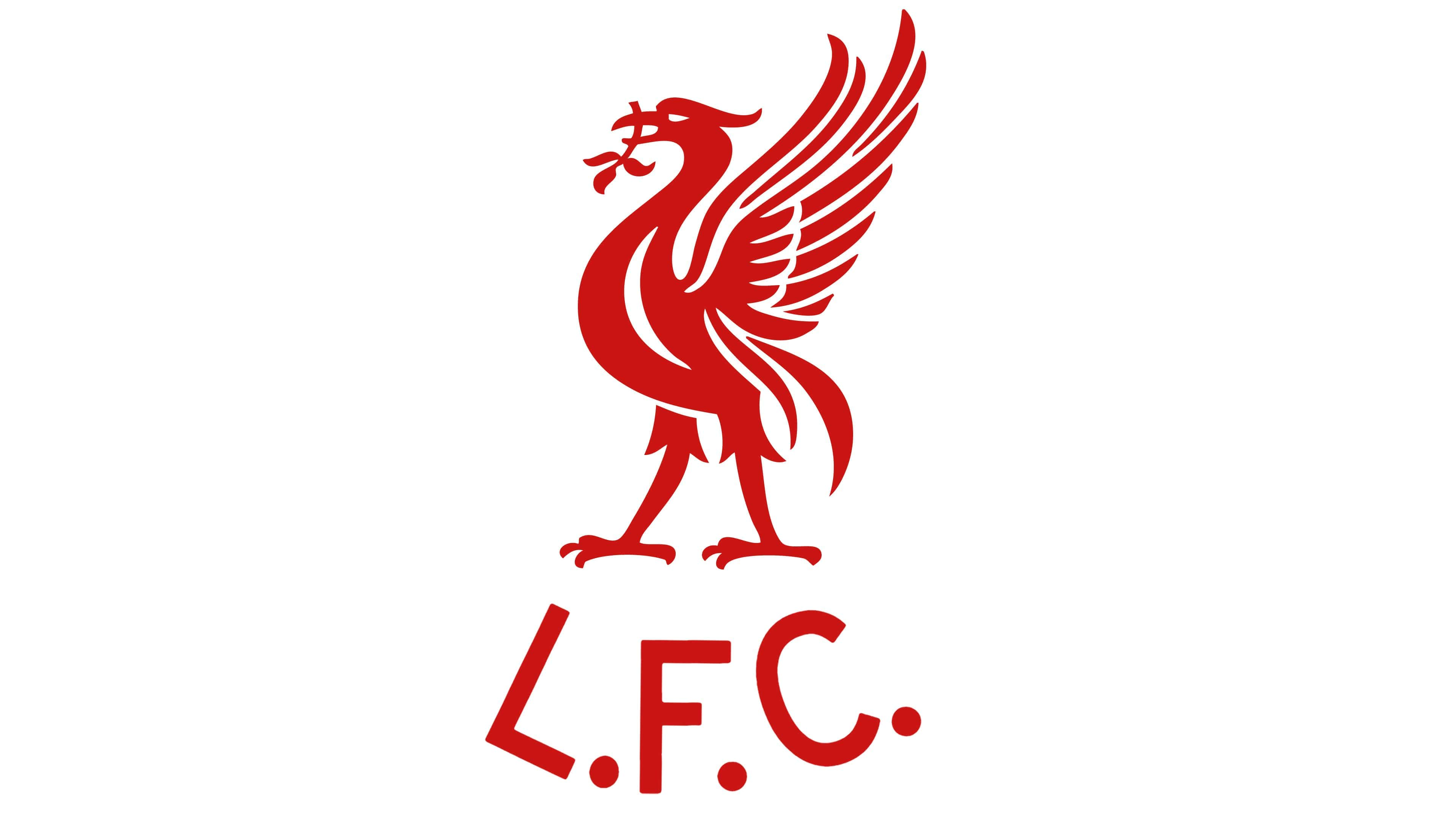
In 1955, a secondary version of this logo was introduced, presenting the outline of the bird in red on a white, oval-shaped background. In this emblem, the letters “L.F.C.” were presented in a simple sans-serif font, representing the name of the team. This new logo remained in use until 1968.
The initial Liverpool logo introduced in the late 1960s wasn’t very different from the one that came before it. The Liverbird mascot was simply made a little larger and more refined, and the oval badge outline was removed.
However, when Liverpool entered the European Cup Final, a special logo was also created in gold to commemorate the moment.
The golden logo replaced the oval border from the previous design with a golden circle, which featured the words “European Cup” as well as “Liverpool F.C.” and “Rome 1977”.
1987
During the late 1980s, Liverpool decided to retrieve some of the design elements from its logo’s history by reintroducing the shield-style emblem. The Liverbird design was also made a little simpler, while the branch in the creature’s mouth was refined and expanded.
Around the base of the shield in this logo, we see the word “Liverpool” split into two halves, with the words “Football Club” beneath. The color palette is once again red and white, the most common shades associated with the Liverpool FC crest.
1992
The 1990s introduced an era of numerous, more traditional logos from the Liverpool team. Initially, a shield design that drew attention away from the Liverbird was created for 1992, focusing instead on celebrating 100 years of football history.
A new yellow banner was introduced, showcasing the lifespan of the team, at the bottom of the shield. The motto, “You’ll never walk alone,” was presented at the top of the shield in its own yellow banner.
This celebratory logo only remained with the Liverpool FC team for a year before they switched to another classical emblem. This image was quite similar to the last, though it removed the “100 years” component, and the Liverbird was made a little larger.
The team also added two torches to the emblem in tribute to the memory of the Hillsborough stadium tragedy.
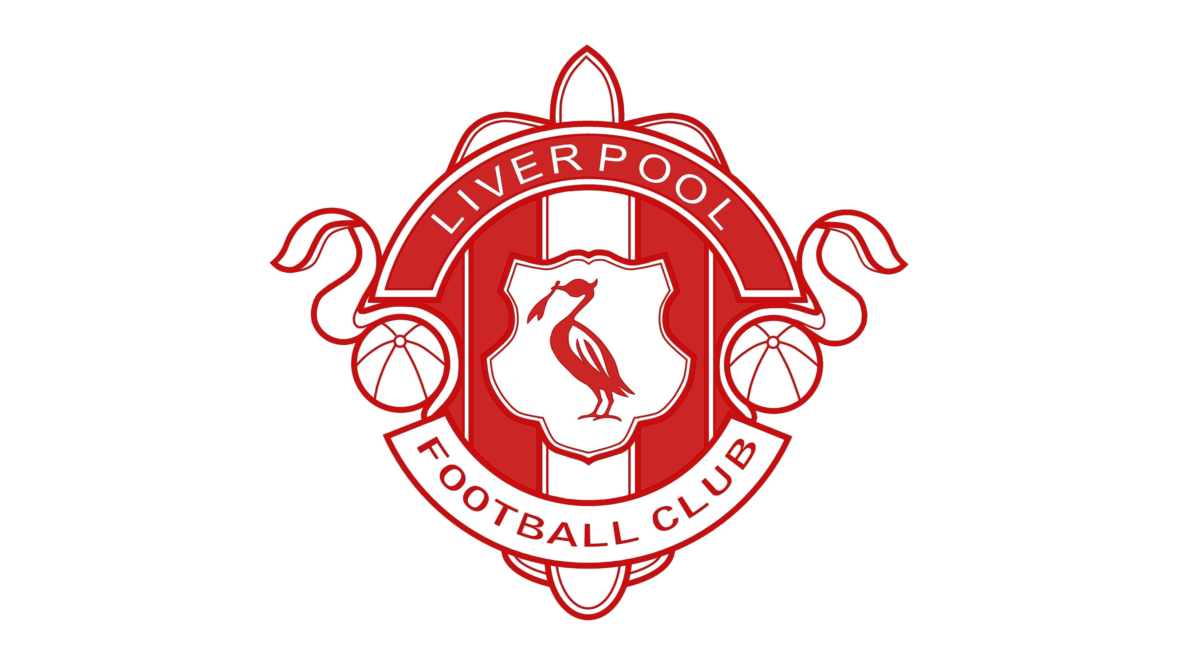
1999
In 1999, Liverpool unveiled its most recent “official” logo, and the emblem is still used by the team today. The design builds on the previous shield-style emblem with a few refinements and color changes.
The Liverbird mascot appears in full glory in the middle of the shield, and the top section of the shape has been filled with red, creating a contrasting background for “Liverpool” in white.
The two torches on either side of the shield have been enhanced with more vibrant colors. Additionally, the coloring for the ornate decoration at the top and bottom of the shield has been switched to green. In this new logo, the motto “You’ll never walk alone” is still present.
Since the introduction of this logo, various additional versions have been introduced. There’s a badge with included gradients to make the design appear more three-dimensional. A version of the logo is also available where the color palette has been scaled down to red and white only.
The Liverpool FC logo: Fonts and colors
The Liverpool FC logo might not be the sleekest or most modern crest in the football landscape, but it is one of the more unforgettable crests out there today. This ornate and eye-catching shield has evolved with the football team over the years, capturing the hearts and minds of fans throughout the world.
Today, the badge pays tribute not only to the history of Liverpool as a city but also to the fans of the football club and their enduring passion for the Premier League.
If you’d like to take a closer look at some of the details of the Liverpool FC logo, you can find some useful resources here:
What color is the Liverpool logo?
Most people associate the Liverpool football team with the colors red and white. While there have been versions of the Liverpool FC crest which only use these shades, the official Liverpool logo colors are a little more diverse.
The primary colors used in the current emblem are red, green, gold, and white. There’s also a small amount of orange visible in the burning flames of the torches.
The official hex codes for the Liverpool logo color palette are:
Red:
Hex: #C8102E
Green:
Hex: #00B2A9
Gold:
Hex: #F6EB61
What font does the Liverpool logo use?
With so many details competing for attention in the Liverpool FC logo, it’s almost easy to overlook the font choice. The simple but streamlined serif font fits perfectly with the sophisticated design of the emblem.
The official name of the Liverpool logo font is Albertus, which was published by Monotype and designed by Berthold Wolpe. You can find it online here.
What is the bird in the Liverpool logo? The Liverpool bird
The Liverpool bird, also known as the “Liverbird,” may be the most iconic aspect of the Liverpool FC logo. While there are many interesting components worth mentioning in this badge design, the
Liverbird has remained an essential part of the Liverpool team’s visual identity since the beginning. There have only been a handful of instances wherein this “mascot” character has been removed from the crest entirely.
The Liverbird is essentially a symbol of strength, rebirth, and magic. It’s a mythical creature, similar to a griffon or phoenix, taken from the Liverpool Coat of Arms.
Liverpool chose the Liverbird as the core focus of its F.C. badge for several reasons. First, they wanted to pay tribute to their home city and the history of Liverpool. However, like many logos featuring animals or mystical creatures, the Liverbird also carries additional meaning.
This mythical creature symbolizes hope and inspiration, particularly when combined with the bright coloring of the Liverpool crest and the burning flames on either side of the shield. In a sense, the Liverbird reminds us of what makes Liverpool unique.
Fabrik: A branding agency for our times.

Clarity starts with a conversation.
Thanks—we’ll get back to you shortly.
Whether you're navigating a rebrand, merger, or simply need a clearer identity—we’re here to help. No hard sell, just honest advice from people who know the sector.
Let’s start with a simple question…
Prefer to email? Drop us a line.
Fabrik’s been helping organisations rethink and reshape their brands for over 25 years. We’ve guided companies through mergers, rebrands and new launches. Whatever stage you’re at, we’ll meet you there.