


The Wolverhampton Wanderers logo history, crest, and badge
If you’re a fan of Premier League football, then there’s a good chance you’re also familiar with the Wolverhampton Wanderers logo. Better known as the Wolves, this sports team has updated its visual identity several times, embracing an ever-more modern image.
Compared to other Premier League team logos, the Wolves crest is unique. Usually, it’s displayed with no wordmark whatsoever and features several geometric shapes designed to instantly capture the attention of any crowd.
But where exactly did this phenomenal logo design begin? Where did Wolverhampton Wanderers logo history start, and how has the badge changed over the years? We will answer all those questions today with a deep dive into the Wolverhampton Wolves visual identity.
Introducing the Wolves FC logo
The Wolverhampton Wanderers
Wolverhampton Wanderers is a Premier League football club known to most as the “Wolves.” Based in Wolverhampton, England, the club was first launched in 1877, giving it quite an extensive history, despite its extremely modern badge.
Initially, the club was founded as “St. Luke’s FC” before the name changed to Wolverhampton Wanderers in 1879.
Interestingly, this team was one of the initial members of the initial Football League when it was created in 1888. They won the FA Cup for the first time in 1983 and then again in 1908 as a second-division team.
Over the years, the Wolves have been crowned the winners of the English league three times, in 1953, 19589, and 1958, all while under the management of Stan Cullis. Additionally, the team also walked away with two additional FA Cup finals in 1949 and 1960.
The Wolverhampton Wanderers were also one of the first clubs in England to install floodlights throughout its home ground in 1953. This led to the televised airing of various “floodlit friendlies” against overseas clubs and helped to launch the European Cup.
The Wolverhampton Wanderers logo history
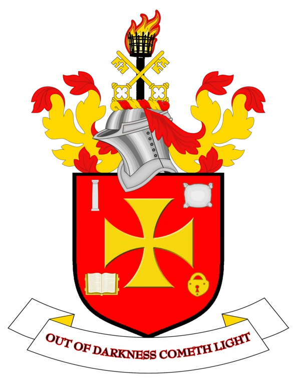
Today, the Wolverhampton Wanderers logo is one of the most contemporary and unique emblems in the landscape. However, there have been many changes to the design over the years. The Wolverhampton Wanderers logo history started in 1921 with the introduction of a traditional crest.
The first Wolverhampton Wanderers logo was a traditional crest-style emblem featuring a shield, a cross, and a number of decorative embellishments.
At the top of the shield, we can see the helmet of a night, with many red and yellow feathers stemming from it, as well as two crossed golden keys and a lit torch. Inside the shield, alongside the central cross, there are a number of other images, like a padlock and a book.
The inscription “Out of Darkness Cometh Light” is placed on a banner below.
Almost 50 years later, the Wolverhampton Wanderers updated their logo to feature two W glyphs, positioned one on top of the other in a diagonal shape. A leaping dog (or wolf) was placed above the two letters, appearing to leap over the design.
This launched the beginning of a long-standing connection between the Wolverhampton Wanderers and their wolf mascot.
Four years later, the Wanderers removed the W glyphs from their logos and replaced them with a series of three wolves, all sharing the same position as the previous design. The image was still depicted in black and white for a simplistic, minimalistic finish.
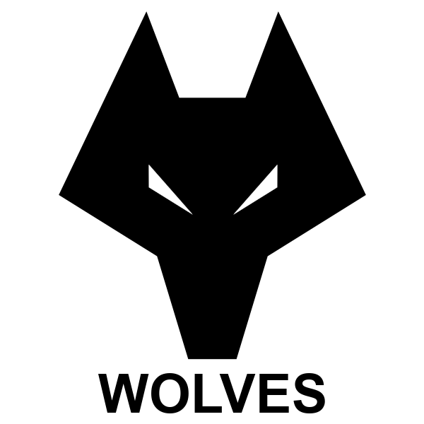
Towards the end of the 70s, the Wolverhampton Wanderers crest was updated to a much more modern design, featuring the head of a wolf, made with sharp, geometric edges and shapes. The head is mostly a blocky outline, with two white triangles for the eyes.
The word “Wolves” appears beneath in all capital letters.
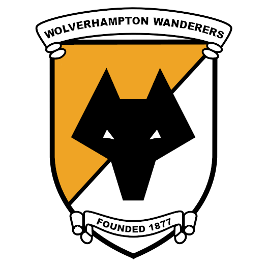
In 1988, the Wolves brought elements of traditional logo design together with their existing logo to create a new design. This image placed the wolf’s head on a yellow and white shield background. The name of the team was positioned above the shield in a white banner, written in all uppercase.
At the button of the shield, in a similar style, we see the founding date of the team. This logo was updated slightly in 1990 to replace the white and yellow background with one in an entirely bronze/ brown shade.
For a brief time in the early 1990s, the Wolverhampton Wanderers returned to their original logo, which featured all of the same elements. This period only lasted for three years before an entirely new, modernized design was introduced in 1996.
.png/revision/latest?cb=20120311220334)
The new logo once again featured the simplified wolf’s head in a unique geometric shape. The name of the team was positioned on either side of the head, in a black border. The letters “FC” were also placed on the design in a 3D-style font.
The Wolverhampton Wanderers crest today
The Wolverhampton Wanderers logo today is a variation of the previous designs introduced in the 1970s and 1990s. It features the head of a wolf, with sharp lines and edges, depicted all in black, with white, triangular eyes.
The design is placed within a golden-yellow hexagon with a thin white border, surrounded by thick black lines.
In most cases, this logo doesn’t include any typography whatsoever and has no reference to the name of the football club, which could be a testament to how iconic it truly is.
The wolf head on the Wolverhampton Wanderer’s logo has been a consistent part of the company’s identity since the late 1970s. It references the team’s nickname, “The Wolverhampton Wolves.”
Who designed the Wolves logo?
The leaders of the Wolverhampton Wanderers say the wolf motif was created by Ian Jackson, a graphic designer, in 1979 and was revamped by another designer named Jonathan Russel in 2002. However, there have been some challenges against these claims.
At one point in the team’s history, a retired building industry manager named Peter Davies claimed he had drawn the motif in school and submitted it to an art competition. He attempted to sue the football club but was unsuccessful.
The Wolverhampton Wanderers badge: Colors and fonts
The Wolverhampton Wanderer’s logo is one of the most eye-catching emblems in the Premier League today, for certain. While many other football clubs have used animal motifs in the past, few have taken the geometric approach of the Wolves.
Additionally, this club is one of the few to stray away from common shapes like shields for its emblem.
The Wolverhampton Wanderers badge features a simple hexagon shape, which blends perfectly with the geometric design of the wolf. The group’s crest seems to convey a combination of strength, creativity, and excellence, particularly when combined with the golden orange coloring.
If you want to take a closer look at the current Wolverhampton Wanderers crest, you can find some useful resources here:
What color is the Wolverhampton Wanderers logo?
The official Wolverhampton Wanderers logo colors are gold and black. These shades are often used to symbolize royalty, professionalism, strength, and luxury. There are also a few white embellishments throughout the design, which help the other components to stand out.
The official Wolverhampton Wanderers logo color codes for the iconic yellow-gold shade are:
YELLOW
HEX COLOR: #FDB913
RGB: (253,185,19)
CMYK: (1,30,99,0)
PANTONE: PMS 1235
What font does the Wolverhampton Wanderers logo use?
Unlike many other Premier League football clubs, the Wolverhampton Wolves crest doesn’t actually include any typography.
Although the group has experimented with different fonts and typefaces in the past, they currently rely exclusively on their wolf head design to differentiate them from other teams. Fortunately for the group, this strategy has worked quite well. There’s no other team with a design quite like the Wolves.
The incredible Wolverhampton Wanderers logo
The Wolverhampton Wanderers logo is one of the most interesting designs in the Premier League today. This long-standing team has transformed its visual identity significantly, going from a relatively traditional crest to something extremely unique and contemporary.
Today, the Wolverhampton Wanderer’s badge is an eye-catching yet simple crest, perfect for showcasing the powerful nature of the team.
Fabrik: A branding agency for our times.

Clarity starts with a conversation.
Thanks—we’ll get back to you shortly.
Whether you're navigating a rebrand, merger, or simply need a clearer identity—we’re here to help. No hard sell, just honest advice from people who know the sector.
Let’s start with a simple question…
Prefer to email? Drop us a line.
Fabrik’s been helping organisations rethink and reshape their brands for over 25 years. We’ve guided companies through mergers, rebrands and new launches. Whatever stage you’re at, we’ll meet you there.