


The world’s best-known soft drink and soda brand logos

Soda brand logos come in various styles, just like the drinks themselves. The world’s leading beverage companies constantly experiment with colors, typography, and even unique graphics to connect with their audience. But they all share a similar goal.
Soft drink brand logos aim to tantalize the appetites of their consumers, drawing attention to the unique flavor experiences the beverage can provide. They promise refreshment, energy, and joy, all with nothing more than a carefully crafted image.
Soda logo designs don’t just work to effectively differentiate companies in an ever-growing and vast market. They also showcase a unique brand identity, sharing a story about the missions, values, and promise of the larger brand.
Today, we’re going to examine some of the most memorable logos of leading soft drinks around the world, to determine what makes these brand marks so captivating.
What are the most famous soft drink brands?
Designed to tantalize the tastebuds with fresh flavors, carbonation, and often plenty of sugar, soft drinks are a guilty pleasure for many consumers. They can also generate phenomenal profits for their manufacturers, with many leaders earning billions in revenue.
According to some reports, the soft drinks market will reach a value of around $621.66 billion by 2030. While the soda industry is dynamic, with new players entering the landscape on a regular basis, there are some companies that seem to dominate the marketplace.
Coca-Cola, for instance, is the most well-known soft drink brand in the United States. More than 95% of consumers are familiar with the Coca-Cola brand. Other well-known industry innovators follow closely behind, such as Pepsi and Sprite, both with 94% consumer recognition.
What is the world’s best-selling soft drink?
Despite a number of popular options in the marketplace, Coca-Cola continues to rank as the world’s best-selling soft drink, valued at around $264.17 billion.
Notably, this market valuation does account for the entire Coca-Cola product portfolio, which includes not just Coke and Diet Coke, but Lilt, Fanta, Oasis, Smartwater, and many other products.
Common features of soft drink brand logos
In any industry, having a creative, memorable, and evocative logo is essential to growth. While consumers judge a company by more than just its logo, the right brand mark can be crucial to capturing customer attention in a crowded supermarket or store.
Soda brand logos are designed to captivate and engage audiences searching for something to quench their thirst, and accommodate their appetites. They generally include alluring color palettes and imagery designed to resonate with us on a psychological level.
Most soft drink brand logos highlight information about the contents of a drink, using colors like orange to represent orange flavoring, or green for lemon and lime.
However, they can also offer an insight into the brand’s personality and identity. Just look at how the Coca-Cola company uses red and white to symbolize passion and excellence.
While popular soda brand logos can vary across different countries and landscapes, their design elements almost always include a wordmark, and a strong, evocative color palette.
Unforgettable soda brand logos
Examining some of the world’s top soda brand logos is useful, whether you’re hoping to create the perfect soda logo yourself, or you simply want to learn more about the packaging design of leading companies.
Let’s take a closer look at some of the most memorable soft drink brand logos around.

1. Coca-Cola
Starting with perhaps the biggest soda brand in the world today, the Coca-Cola logo is instantly recognizable in virtually every market. Since launching in 1886, the company has adapted its logo a handful of times, often focusing on the same red and white color palette.
Coca-Cola’s products are sold in more than 200 countries worldwide, meaning the logo of the company needs to transcend geographical and cultural borders.
The simple, but effective wordmark of the international brand demonstrates passion, joy, and heritage, all core components of the Coca-Cola brand identity.

2. Pepsi
Similar to the Coca-Cola brand, Pepsi has made a number of changes to its logo over the years. The company, first introduced in 1893 as “Brad’s Drink,” has become one of the top beverage manufactures in the world over the decades.
Though Pepsi has struggled to send the right message with its logo from time to time, the emblem is still considered one of the most effective in the world.
The Pepsi logo is based on a patriotic, red, white, and blue color palette. The curved lines in the emblem remind us of water and refreshment.

3. Dr. Pepper
First introduced in the 1880s, Dr. Pepper is another major brand in the food and beverages industry. The organization takes a similar approach to Coca-Cola with its soda brand logo design. The primary focus of the logo is a unique wordmark, set across two levels.
The design aims to demonstrate fun and passion with a red-and-white color palette. However, the red shade is a little darker than Cola’s, making the aesthetic seem more sophisticated.
Dr Pepper also draws attention to its history in its logo design, with reference to the date when the company was first founded.
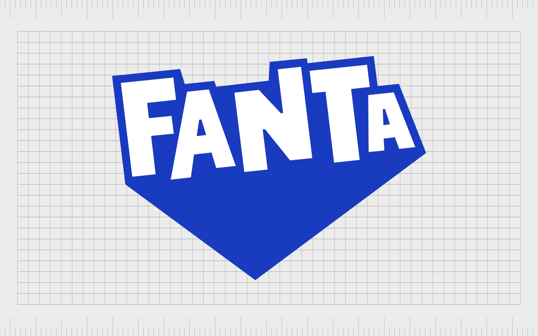
4. Fanta
The American-owned German brand, Fanta, was first introduced as a Coca-Cola alternative in 1940, though it’s now owned by the Coca-Cola company. There are more than 200 flavors of the beverage to choose from worldwide, though the brand started primarily with an orange flavor.
Like many soft drink brands, Fanta has updated its logo through the years to help unify its product portfolio and capture a wider audience.
The company moved away from orange-focused designs in recent years, choosing a bold, dynamic wordmark to demonstrate the versatility of its drinks.

5. Sprite
Another major contender in our list of the most famous soft drink logos in the world, Sprite is also owned by the Coca-Cola company. The lemon-lime soft drink was introduced in 1961 to compete against another well-known product: 7 Up.
Sprite has consistently tried to convey a sense of freshness with its logo throughout the years, experimenting with a variety of different images and color palettes.
Today, the Sprite logo is a simple stylized wordmark in green. The lettering angles slightly towards the right, demonstrating movement and energy.

6. 7 Up
Owned by the Keurig Dr. Pepper Company and distributed by PepsiCo, 7 Up was first created in 1929. The soft drink was one of the first of its kind in the beverage market, inspiring the launch of subsequent competitors.
Like many of the top soda brand logos, the 7 Up brand mark focuses on showcasing a sense of fun and dynamism. The angled wordmark tells us the company aims to “lift” our energy levels.
Interestingly, 7 Up uses two different logos on its products, one for a North American market and one for international customers.

7. Crush
Introduced in the United States in 1911, Crush is one of the world’s most popular soft drinks, crafted with fruit juices and flavors like orange, strawberry, and grape. Originally, the company produced just an orange-flavored soda, leading to its most memorable logo design.
The Crush logo has changed a few times in different regions of the world. However, it typically includes a “splash” style background, showing the flavor of the drink, and an image, such as an orange slice.
The design varies slightly for each flavor. However, every Crush logo aims to showcase the fun, playful, and even youthful nature of the brand.

8. Mountain Dew
Mountain Dew, or “Mtn Dew” in some countries, is a soft drink brand owned by PepsiCo. Originally, the first formula was produced in 1940, and the rights to the formula were eventually sold to the Tip Corporation, followed by the PepsiCo company.
Unlike other soda brand logos, Mountain Dew takes a slightly edgier, sharper approach with its logo. The wordmark used on the bottles features a lot of straight lines and sharp points.
The imagery is intended to make us think of energy and strength, relaying the caffeination within the mountain dew formula.

9. Red Bull
Perhaps one of the best-known energy drinks in the world, Red Bull has a relatively unique logo. It has a market share of around 43%, making it the most popular energy beverage worldwide, and the third most valuable soft drink behind Pepsi and Coca-Cola.
The Red Bull logo features two bulls, head-to-head, on top of a circular yellow background. The imagery also looks a little like a set of wings from a distance, drawing attention to the company’s well-known slogan, “Red Bull gives you wings”.
The emblem is powerful and energetic, perfect for a company promising to eliminate fatigue, improve concentration, and drive performance.

10. Canada Dry
Founded in 1904, Canada Dry is owned by the Keurig Dr. Pepper Company and is distributed mostly in the United States, as well as various other countries throughout the world.
Unlike other soft drink brand logos, Canada Dry takes a relatively traditional approach with its brand mark. The design looks a little like a conventional emblem, with a shield-style background depicted with a gold and green border.
The imagery also includes a crown placed on top of the shield to symbolize excellence, sophistication, and royalty, appealing to a slightly older target audience.

11. A&W Root Beer
Known to most simply as “A&W,” The A&W Root Beer brand is one of the better-known root beer companies in the United States and Canada. It was initially launched in 1919 and currently belongs to the Keurig Dr. Pepper Company.
Like many soda logos, the emblem of this company speaks to the personality and values of the brand. It’s a fun, lighthearted logo, often angled slightly to demonstrate dynamism and movement.
The image also includes a reference to the history of the company, showcasing the date when the organization was founded at the top of the badge.

12. Sunkist
Known primarily for its orange-flavored soft drinks, Sunkist is a brand owned by the Keurig Dr. Pepper Company, designed to compete with the Coca-Cola “Fanta” drink.
The brand was initially launched in 1979, after market research showed that orange-flavored drinks were the third best-selling soft drink globally. The Sunkist brand has evolved over the years, producing a range of different flavors for international audiences.
Usually, however, the current logo used in grocery stores features the name of the company, angled upwards at the end to convey energy and refreshment.

13. San Pellegrino
Designed to appeal to a more sophisticated target audience, the San Pellegrino logo is an instantly recognizable brand mark in the beverage space. Otherwise known as “S. Pellegrino,” the company was initially founded in 1899, and now belongs to Nestle.
Alongside soft drinks, San Pellegrino also produces mineral water, both in still and carbonated varieties. The logo used by the company is highly sophisticated, lacking some of the fun and bouncy elements we see on other soda brand logos.
The image features a bold blue wordmark, with a red star placed on top. The design is somewhat traditional, and ideal for capturing a wide audience.
Find out more about the San Pellegrino logo here.
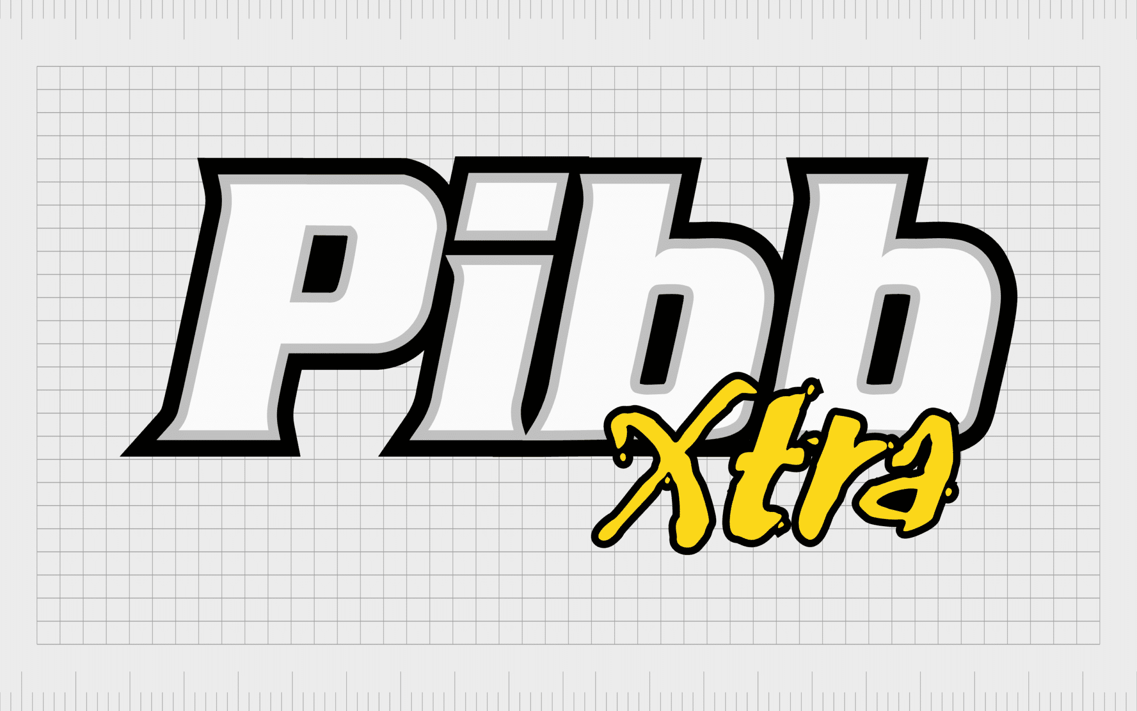
14. Pibb Xtra
A reformulation of the “Mr Pibb” classic soft drink brand, Pibb Xtra is a relatively new addition to the soda market in its current form. The product is available in a range of different variants, and is sold in bottles and cans throughout the United States.
Pibb Xtra targets a young and modern audience with its logo design. The bold wordmark used for “Pibb” is instantly eye catching when placed on the company’s packaging.
The unique “Xtra” inscription placed below includes slightly textured letters, designed to look a little like graffiti, giving the company an edgier appearance.

15. Mug Root Beer
Originally produced under the name “Belfast Root Beer”, Mug Root Beer is an American brand, made by the PepsiCo Company. The organization first launched in 1940 with its original name, and was best known for ginger ale, root beer, and sparkling water.
The Mug Root Beer logo is one of the most complex and traditional logos on this list. It features many detailed elements, including a dog mascot, holding a mug of root beer.
The mascot has remained a core component of the company’s branding over the years, helping to differentiate it from a wide variety of other competitors.
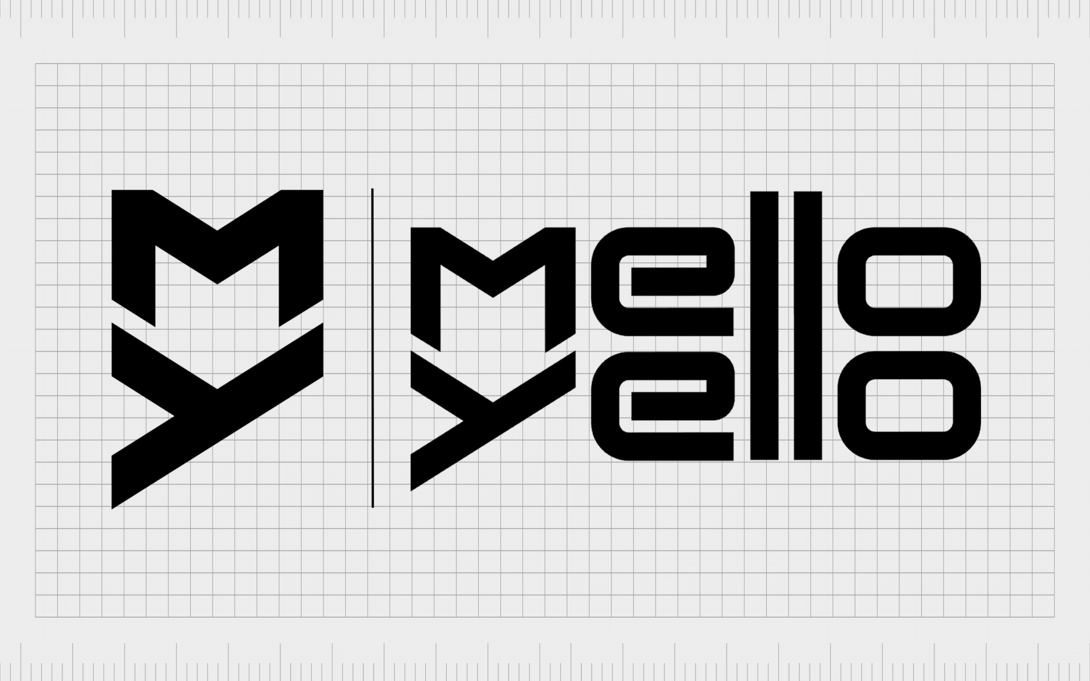
16. Mello Yello
Another company belonging to the Coca-Cola Corporation, Mello Yello, was introduced to the beverage market in 1979. It’s a highly caffeinated citrus-flavored drink created to compete with the Mountain Dew beverage from PepsiCo.
Like many energy drink and sports drink brands, Mello Yello has a relatively modern, edgy logo intended to appeal to an audience of teenagers and young adults.
The design features both a monogram and a wordmark. Notably, the “l” characters in Mello Yello are connected, creating an interesting sense of balance.
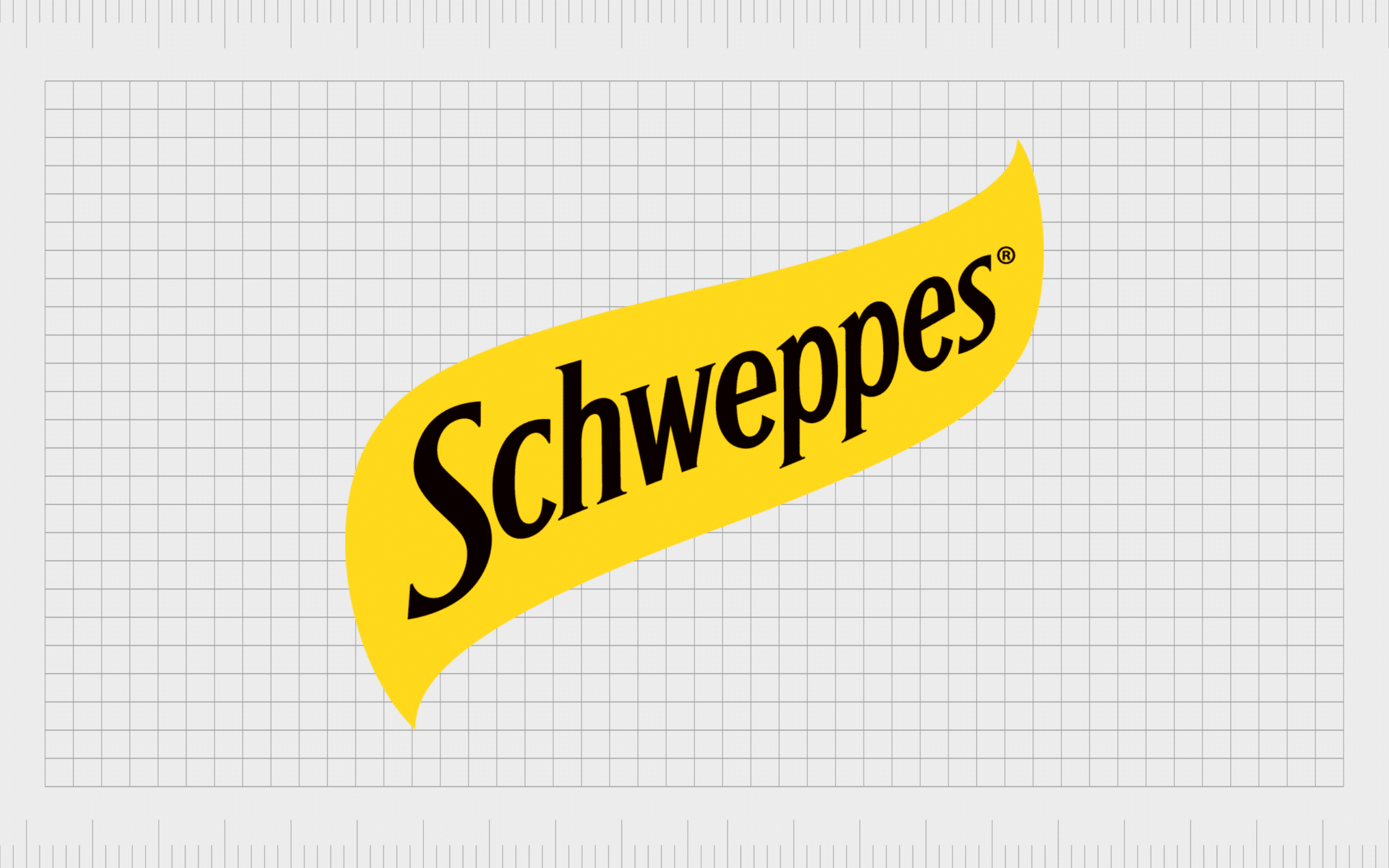
17. Schweppes
Bottled and distributed worldwide, Schweppes is a well-known soda brand which started life as one of the earliest “soft drink” options in the world. The company was the first to produce a soda water beverage in 1783.
Schweppes produces a variety of different types of beverages, and its relatively versatile logo attests to its diverse product collection. The image features a simple wordmark, in a sophisticated serif font, placed on top of a yellow, curved banner.
Though this soft drink brand logo has a few things in common with other soda company marks, it’s a little more refined, appealing to an older audience.

18. Minute Maid
First introduced in 1945, Minute Maid is a leading beverage company, often associated with lemonade, orange juice, and various soft drinks, such as “Hi-C.”
Compared to some of the other soda brand logos on this list, Minute Maid has a relatively simple brand mark. It lacks much of the coloring and bouncy imagery we see on other designs. However, this also means the logo can work well in various formats.
The image includes a wordmark set across two levels on a curved black-and-white background. Often, the logo is adapted to suit different styles of packaging.
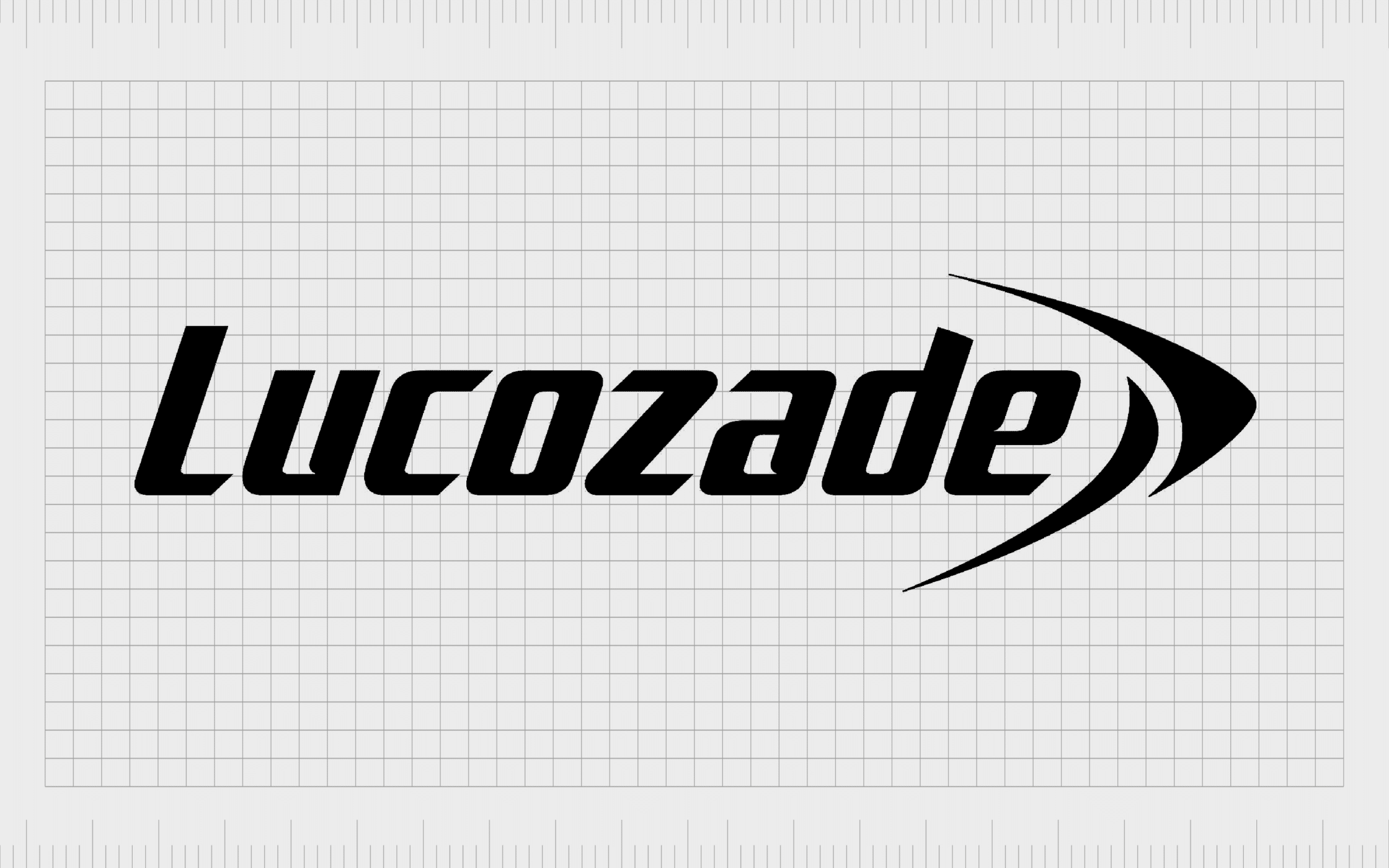
19. Lucozade
Best-known in the UK, Lucozade is a British brand of soft drink marketed and manufactured by a Japanese company named Suntory. It was first introduced to the market as “Glucozade” in 1927 and was intended to be a sports and hydration-focused beverage.
The glucose and water solution has been rebranded and transformed a number of times over the years, branching out into new flavors and markets.
The Lucozade logo, however, remains relatively simple, featuring a slightly italicized wordmark, in black, or yellow, on a transparent background.
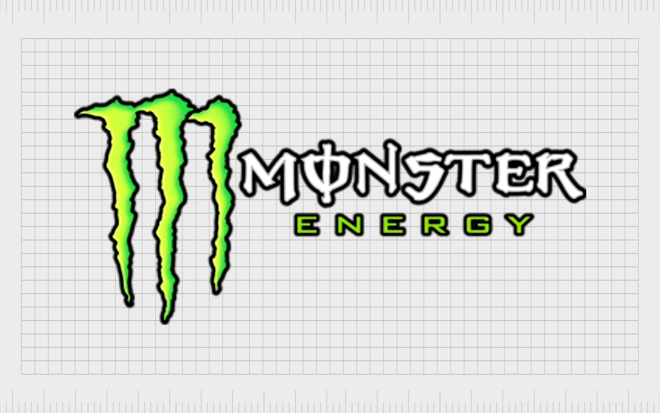
20. Monster Energy
Slightly more outdated than some of the soft drink brand logos on this list, Monster Energy’s emblem is brimming with detail. The energy drink company was first created in 2002, and by 2022, it had a 30.1% share of the American energy drink market.
Like many energy drink companies, Monster Energy is well known for sponsoring extreme sports events. The company uses its sponsorship strategy and its branding to demonstrate a powerful, edgy, and somewhat aggressive brand personality.
The Monster Energy logo includes a wordmark set on two levels alongside a stylized “M,” designed to look like three claw marks.
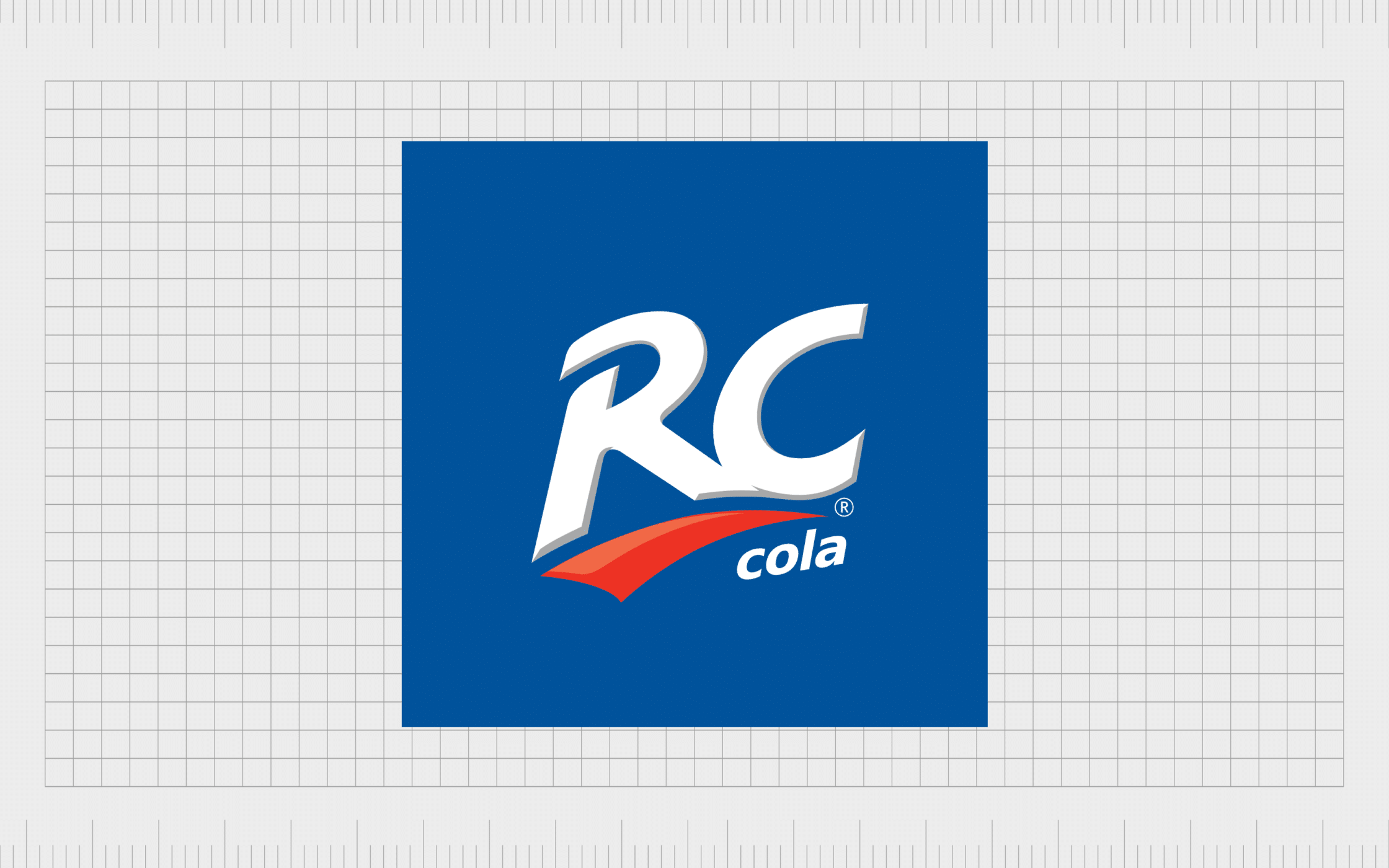
21. RC Cola
Short for “Royal Crown Cola,” RC Cola is an American brand of soft drink owned by Keurig Dr. Pepper and launched in 1905. Initially, the Royal Crown Company was best known for its ginger ale products before it began experimenting with new flavors.
During the 1950s, Royal Crown was also leading the beverage industry as the first company to sell canned soft drinks and caffeine-free cola.
RC Cola’s logo is a relatively simple emblem featuring the letters “RC” in large, block font, with a red line underneath, and a much smaller “cola” inscription.

22. Fresca
Named after the Italian, Spanish and Portuguese word for “fresh,” Fresca is a grapefruit-flavored soft drink manufactured by the Coca-Cola Company. It was initially introduced into the United States in 1966 and offered consumers a zero-sugar beverage.
Although Fresca has a smaller target market than some of the competitors on this list, it has gathered quite a significant following throughout America and North America.
The Fresca logo features a simple wordmark with a curved bottom line designed to “lift” the letters up and demonstrate refreshment and revitalization.
Learning from soda drink logos
The world’s most famous soda brand logos offer a unique insight into how the right combination of color, imagery, and typography can connect with a huge audience. These compelling brand marks don’t just differentiate the companies they represent from their competitors.
They’re also designed to send an important message about the personality of the companies to the specific markets they target. Each logo has its own unique elements, but most convey ideas of refreshment, joy, and energy.
If you need help creating your own compelling soda brand logo, reach out to the Fabrik Brands team today for support from a professional designer.
Fabrik: A branding agency for our times.

Clarity starts with a conversation.
Thanks—we’ll get back to you shortly.
Whether you're navigating a rebrand, merger, or simply need a clearer identity—we’re here to help. No hard sell, just honest advice from people who know the sector.
Let’s start with a simple question…
Prefer to email? Drop us a line.
Fabrik’s been helping organisations rethink and reshape their brands for over 25 years. We’ve guided companies through mergers, rebrands and new launches. Whatever stage you’re at, we’ll meet you there.