


Oracle Red Bull Racing logo: A symbol of speed and power
You don’t need to be much of an F1 fan to be familiar with the Oracle Red Bull Racing logo. Over the years, Red Bull Racing, otherwise known as “RBR,” has become one of the better-known F1 entities in the world. Currently, it races under an Austrian license but is based in the United Kingdom.
Red Bull Racing is one of the two Formula 1 teams owned by Red Bull (the other is Scuderia AlphaTauri). Like many famous F1 teams, RBR has updated its logo several times to coincide with introducing new sponsors and market strategies.
The company is currently associated with Oracle, but it has previously held connections with many leading organizations, including Aston Martin and Ferrari.
Today, we will be taking a closer look at the Oracle Red Bull Racing logo as it has evolved over the years and how the branding has changed to suit an evolving audience.
Introducing Red Bull Racing
Red Bull Racing, or RBR, traces its history all the back to the Stewart Grand Prix outfit, which was introduced in 1997. Stewart eventually sold his team in 1999 to the Ford Motor Company, and Ford rebranded the team as “Jaguar Racing.”
It wasn’t until 2005 that Red Bull started to build its own official racing team.
The owner of the company at the time, Dietrich Mateschitz, attempted to recruit the previous Formula One driver, Gerhard Berger, to guide his team. However, nothing ever came of the intended partnership.
The first car driven by RBR in the new era was David Coulthard, who drove a Cosworth engine vehicle similar to those in the previous Jaguar Racing cars.
Is Red Bull owned by Ferrari?
Despite a rocky start, Red Bull’s initial year in Formula One was considered a massive success. They came 6 in the Constructor’s Championship for the majority of the season. In 2006, the team announced a deal to use customer Ferrari engines in their new vehicles.
Adrian Newey was hired as a new driver, and the team’s second car hit the track for its debut.
With Ferrari engines, Red Bull achieved a number of successes, but the company eventually decided to explore other partnerships. In 2007, they partnered with Renault, and in 2010, they began winning championship titles as the first Austrian team to do so.
In 2019, the team began using Honda engines.
The Red Bull Racing logo: A brief history
Over the years, the majority of the branding used in Red Bull Racing logo history has remained relatively consistent. In virtually all cases, the Red Bull logo, known for its presence on the company’s drinks, is present on every car.
However, there have also been other branding elements included in each emblem, often representative of the main sponsor for the team.
2005
One of the first Red Bull Racing logos to emerge in the market was introduced in 2005 and stayed with the company for approximately seven years. This design featured no branding from sponsorship companies, but it did highlight Red Bull’s position as a Formula 1 team.
The “Racing” element underneath the standard Red Bull logo featured a checkered flag alongside red, silver, and blue stripes. The tagline “Formula One Team” was also introduced.
2013
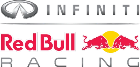
In 2012, Red Bull announced the car manufacturer Infiniti as their current core sponsor for the title in 2013. A new logo was created, with the Infiniti branding added on top of the Red Bull logo. The “Racing” aspect of the design was simplified.
The word appeared in a simple, sans-serif font, with significant spacing between each silver letter.
The checkered flag and other decorative elements were removed to create a balanced emblem which seemed to work well with the coloring of the Infiniti logo.
2016
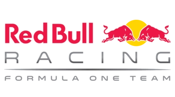
After Infiniti ended its sponsorship of Red Bull, the company removed the brand’s logo and returned to a simpler design. The “Racing” typography on this image remained the same as in the previous variation.
However, the words “Formula One Team” were added under a sleek silver line. The letters of the tagline were presented in a similar font to the “Racing” script.
The Aston Martin Red Bull Racing logo
In 2017, Red Bull announced the arrival of a new sponsor for its racing team. This prompted the company to once again update its branding, with a focus on drawing attention to its new partner brand. The Aston Martin variation of the logo was quite simplistic.
In this version of the emblem, introduced in 2018, the name “Aston Martin” is presented in a similar font to the original Aston Martin logo, without any embellishments. The colors of the Red Bull logo in this design also appear a little brighter than in previous iterations.
.png/revision/latest?cb=20210119234733)
After Aston Martin rejoined the F1 landscape as a constructor and withdrew sponsorship, Red Bull maintained its newly created logo but removed the “Aston Martin” branding. The word “Racing” was also separated from the Red Bull emblem by a silver line.
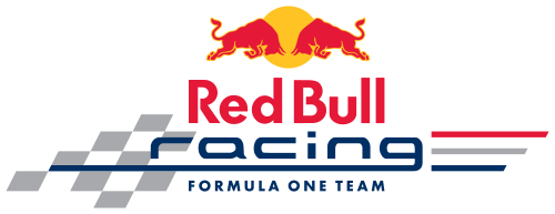
The Oracle Red Bull Racing logo
The most recent version of the Red Bull Racing logo is what inspired the shift to the name “Oracle Red Bull Racing,” which is commonly used in branding for the company today. In 2021, Red Bull announced the technology team Oracle would be joining them as a sponsor.
.png/revision/latest?cb=20220222142202)
After Honda abandoned the company, Oracle became the main season sponsor for Red Bull, and their logo was placed above the Red Bull emblem, similar to in previous designs.
Once again, the colors seem particularly bright here, and the “Racing” wordmark has been given a gradient to match the appearance of the Oracle logo.
The Red Bull Racing F1 logo: Colors and fonts
The core elements of the Red Bull Racing logo have remained very consistent over the years. Like many Formula One companies, the organization has made few changes to its core design, simply adding extra elements to refer to its sponsors or partners.
However, as the team embraced new sponsorship deals, they also updated their branding in order to match the company they were working with.
The letters of the word “Racing” are often colored to correspond with the style of the sponsorship brand. If you want to take a closer look at the Oracle Red Bull Racing logo, you can find some useful resources here:
What color is the Red Bull Racing logo?
Few aspects of the Red Bull Racing logo color palette have changed over the years. For the most part, the company has consistently used shades of silver, red, and yellow. However, the exact tones used throughout the emblem have had some refinement.
In today’s Red Bull Racing logo, we see brighter shades of red and yellow in the core emblem. The “Racing” wordmark has been updated to match the color palette of the “Oracle” simple, with a slight gradient. The design looks modern and sleek, ideal for the racing industry.
What font does the Red Bull Racing logo use?
Red Bull uses a number of different fonts in its racing logos. The Red Bull part of the design is in a Futura-style font, in bold, bright red letters. The Oracle emblem matches the logo typeface for the Oracle brand with a modern, sans-serif font.
The word “Racing” is depicted in a simple sans-serif typeface, with a significant amount of spacing between each letter. The spacing is used to give the overall emblem a sense of balance, as it matches the positioning of the “Oracle” and “Red Bull” components.
Learning from the Red Bull F1 logo
The Red Bull Racing logo has quickly emerged as a well-known emblem in motorsports. Simple but effective, the design builds on the existing image of the Red Bull brand, adding a few distinctive elements to the mix.
Most of the time, the design includes the word “Racing,” designed to match the style of the sponsorship brand’s logo.
In some instances, Red Bull added the words “Formula One Racing” into the mix, typically when they didn’t have a set sponsor. Today, the Red Bull F1 logo is a highly balanced and modern emblem intended to draw attention to the brand and its current sponsor.
Fabrik: A branding agency for our times.
Now read these:
—Which car companies own which car brand?
—The Mercedes F1 logo, the silver arrows
—Exploring the revered Scuderia Ferrari logo
—Branding a winner, the Williams F1 logo history
—A guide to the iconic McLaren logo and symbol
—What you need to know about the Haas F1 logo
—The Alfa Romeo F1 logo, history and meaning
—From Scuderia Toro Rosso to the AlphaTauri logo
—A look back at the iconic Aston Martin F1 logo
—Racing through time, the Apline F1 logo story

Clarity starts with a conversation.
Thanks—we’ll get back to you shortly.
Whether you're navigating a rebrand, merger, or simply need a clearer identity—we’re here to help. No hard sell, just honest advice from people who know the sector.
Let’s start with a simple question…
Prefer to email? Drop us a line.
Fabrik’s been helping organisations rethink and reshape their brands for over 25 years. We’ve guided companies through mergers, rebrands and new launches. Whatever stage you’re at, we’ll meet you there.