


The McLaren F1 logo history: A guide to the iconic McLaren symbol
How much do you know about McLaren logo history?
If you’re a fan of Formula One racing, you probably have a basic knowledge of the McLaren logo. After all, it’s one of the best-known symbols in the current landscape. However, you may not know this design has undergone many changes and evolutions.
McLaren is considered one of the most significant competitors in the F1 landscape.
The racing team has focused heavily on innovation, speed, and quality since its inception. Over the years, McLaren has established quite a reputation as one of the oldest active teams and a successful institution, having won around 183 races.
If you’ve ever wondered about the origins of famous F1 team logos, you’re in the right place. Today, we will look closer at the McLaren F1 logo, exploring how the symbol has evolved over the years.
The McLaren racing logo: An introduction
McLaren Racing, sometimes simply referred to as McLaren, is a British motorsports team. Best known as a Formula One constructor, McLaren is the second most successful team of all time, following shortly after Ferrari.
The organization also has a history of competing in various American and Canadian racing challenges over the years.
Originally, McLaren’s F1 racing team was founded in 1963 by Bruce McLaren.
The team achieved its first Grand Prix win in 1968 and continued to achieve incredible results for the years following. After Bruce died, Teddy Mayer took over the team and led them to their first Constructor’s Championship win in 1974, with James Hunt and Emerson Fittipaldi.
In 1981, the company merged with Ron Dennis’ Project Four Racing, and Dennis took over the team, organizing a buyout of existing shareholders. This started the most successful era for the team, with Honda and Porsche’s engines helping to deliver wins across a number of championships.
Dennis retired in 2009, and Martin Whitemarsh took over, before being ousted in 2014, following a series of losses. McLaren began using Honda engines to replace Mercedes Benz and later agreed on an engine supply with Renault before returning to Mercedes Benz in 2021.
The McLaren Kiwi logo
The first McLaren F1 racing logo was a world apart from the design we know today. For a number of years, the brand featured emblems with the silhouette of a kiwi bird, intended to reference the company’s origins in New Zealand.
Interestingly, this design helped to pave the way for a number of reiterations, which eventually led to the swoosh we know today.
1963
The first McLaren logo was designed following the creation of the racing team.
The designer for the emblem, Michael Turner, created a crest-style emblem in the colors red, green, and white. A silhouette of a Formula 1 car was placed toward the top of the emblem. In the middle, we see the silhouette of the Kiwi, the New Zealand national bird.
Though extremely eye-catching, this logo was considered quite complex for the Formula One industry at the time, which may have inspired the transition to a more simplified design in 1966.
1966
In 1966, the Kiwi logo was updated to feature a more abstract image of a Kiwi, intended to modernize the brand’s image. The logo got the nickname the “Speedy Kiwi” and became the core symbol of the McLaren racing team.
The design was straightforward, with the abstract shape printed on a white background, with no additional colors or typography.
Some people believe this logo eventually inspired the creation of the swoosh-style mark present on the McLaren Racing logo today.
McLaren logo history: The evolution of the McLaren F1 logo
The 1980s marked a new era for the McLaren logo. The company began moving away from its New Zealand heritage, leaving the Kiwi symbol behind. Instead, they embraced a more modern, streamlined design and focused heavily on the name of the company.
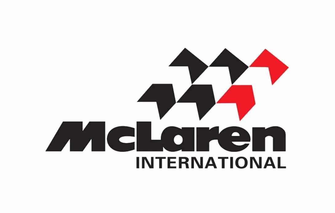
1981
In 1981, McLaren introduced a bold wordmark logo with a font similar to the design we know today. The new emblem was designed by Raymond Loewy and attempted to align McLaren with the competing Formula 1 companies at the time.
The bold logo is composed of a thick black wordmark for the name of the business, with the word “International” written beneath.
There’s also a stylized red and black checkered flag above the design. Some people believe this was a reference to the Marlboro cigarette sponsorship, which uses a similar geometric shape and coloring in its logo.
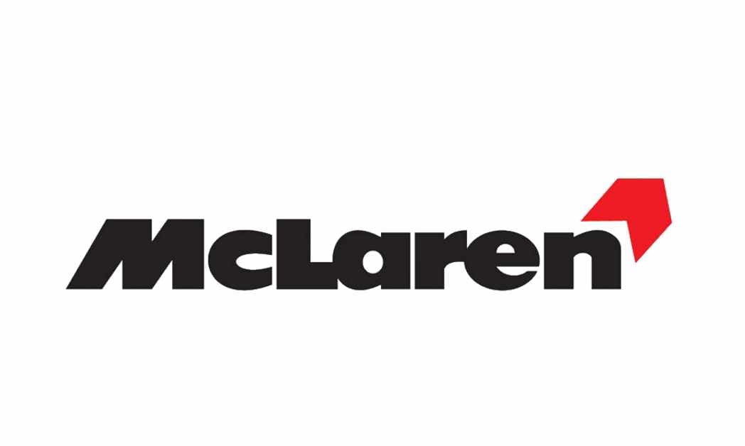
1991
In 1991, the McLaren logo was further simplified, replacing the red and black checkered flag with a simple red chevron. The image made the design look more balanced and modern and eliminated a lot of the extra components introduced in previous years. The color palette remained the same.
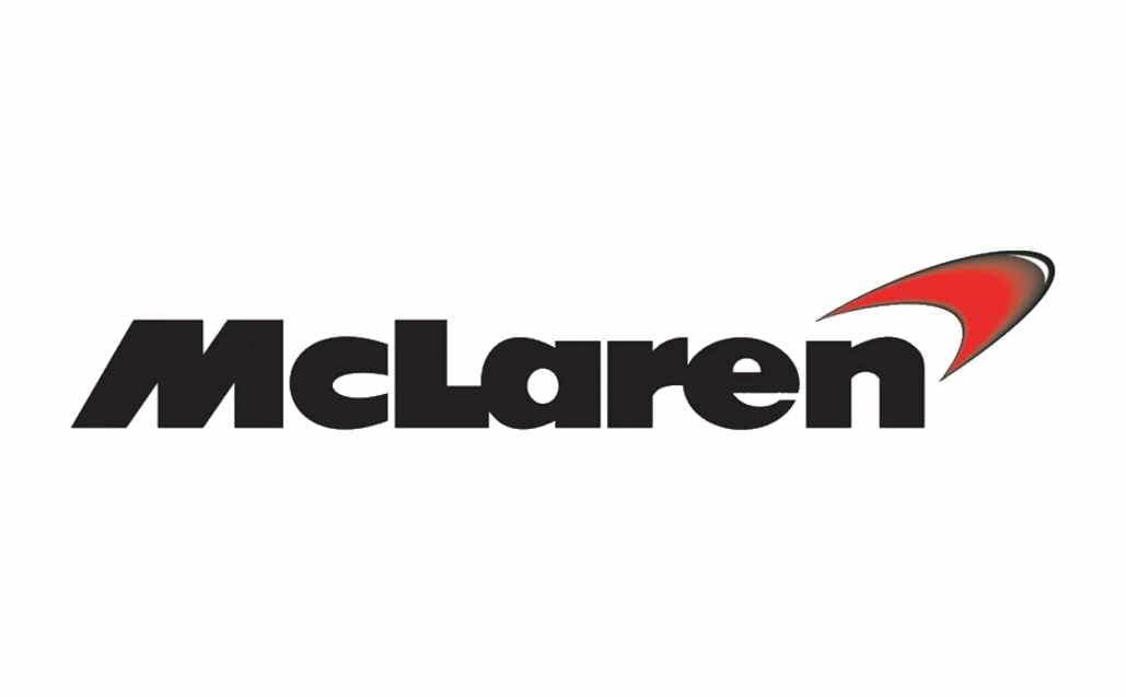
This logo was updated yet again in 1997 to give the chevron design a more three-dimensional and curved appearance. The swooshing shape helped to disconnect McLaren from the Marlboro brand slightly, giving it a more distinctive visual identity.
The logo looked far more harmonized and streamlined.
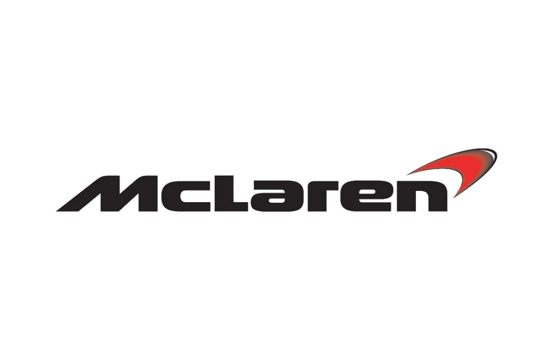
In 2002, this logo was updated very slightly, with a somewhat more delicate font choice. The overall typography seemed very similar to the previous option, with some significant changes in the spacing of the letters and the Italicized M.
Today
The McLaren Formula 1 team logo is a variation of the previous design introduced in 2002, with an updated color scheme.
The 3D swoosh has been replaced with a two-dimensional orange element. The phrase “Formula 1 Team” has also been placed underneath the primary wordmark in simple, well-spaced letters.
What does the McLaren badge mean?
The McLaren racing logo has certainly gone through a number of changes over the years. Starting with an iconic Kiwi bird, the company has gradually moved towards a more modern, streamlined image intended to convey speed and power.
Today, the most recognizable McLaren logo on cars is the swoosh design. According to the company, this swoosh is intended to represent the swirling dust that comes from the tail of a vehicle when it’s in a wind tunnel.
However, some people have challenged this story, suggesting there may be another reason for the swoosh.
The design seems to stem from the chevron-style image, which was introduced during the company’s relationship with the Marlboro brand. However, it could also be connected somewhat to the abstract “Speedy Kiwi” design, which looked a little like a swoosh itself.
McLaren symbol fonts and colors
The McLaren F1 logo today is a symbol of strength, speed, and innovation. Despite numerous changes over the years, the company has remained a strong visual presence in its chosen industry, focused on highlighting its unique personality.
The black coloring of the wordmark has been a consistent element in the McLaren logo, along with its stylized font, which places the “M” in italics.
The color choices have changed slightly, branching away from the passionate shade of red into a more creative, vibrant orange. If you’d like to take a closer look at the McLaren racing logo, you can find some useful resources here:
What color is the McLaren logo?
Throughout the decades, the McLaren logo colors have changed significantly, from a green, red, and white design, to an emblem featuring mainly black and red.
Variations of the McLaren emblem today still include the red swoosh, although the official design has been updated to feature black and orange.
The bright orange coloring of the swoosh matches some of the shades on the outfits worn by the drivers. The McLaren logo color combination aims to present the company as one dedicated to innovation and strength.
What font does the McLaren logo use?
The McLaren logo font is unique to the brand and is known as “Moki Lean,” created by Marcus Sterz.
The typography is intended to look speedy and modern, with a modern sans-serif air. Some of the most eye-catching elements of the font include the unique “a” glyph and the shape of the “M,” which appears to be leaning toward the right.
Exploring the McLaren emblem
Looking at the McLaren logo history, we can see the symbol has undergone several interesting changes over the years. Like many Formula One teams, the McLaren company has sometimes adjusted its emblem to reference some of its major sponsors, like Marlboro.
However, McLaren has maintained a relatively unique, individual emblem specific to the company and its strength in the industry. Today, the McLaren symbol exudes passion, creativity, speed, strength, and heritage.
Fabrik: A branding agency for our times.
Now read these:
—Which car companies own which car brand?
—The Red Bull racing logo, a symbol of power
—The Mercedes F1 logo, the silver arrows
—Exploring the revered Scuderia Ferrari logo
—Branding a winner, the Williams F1 logo history
—What you need to know about the Haas F1 logo
—The Alfa Romeo F1 logo, history and meaning
—From Scuderia Toro Rosso to the AlphaTauri logo
—A look back at the iconic Aston Martin F1 logo
—Racing through time, the Apline F1 logo story

Clarity starts with a conversation.
Thanks—we’ll get back to you shortly.
Whether you're navigating a rebrand, merger, or simply need a clearer identity—we’re here to help. No hard sell, just honest advice from people who know the sector.
Let’s start with a simple question…
Prefer to email? Drop us a line.
Fabrik’s been helping organisations rethink and reshape their brands for over 25 years. We’ve guided companies through mergers, rebrands and new launches. Whatever stage you’re at, we’ll meet you there.