


The Ferrari F1 logo: Exploring the Scuderia Ferrari logo
If you’re a fan of Formula One racing, you might know a little about the Ferrari F1 logo history. Similar to the traditional Ferrari logo, the Scuderia emblem has transformed several times over the years.
Changes have occurred as a result of the input of sponsors, as well as the team’s quest to create a modern image.
For many, the Scuderia Ferrari logo will be one of the most recognizable emblems among Formula 1 teams. After all, the racing division of the Ferrari company, known by the nickname “The prancing horse,” is the oldest surviving Formula One team and the most successful.
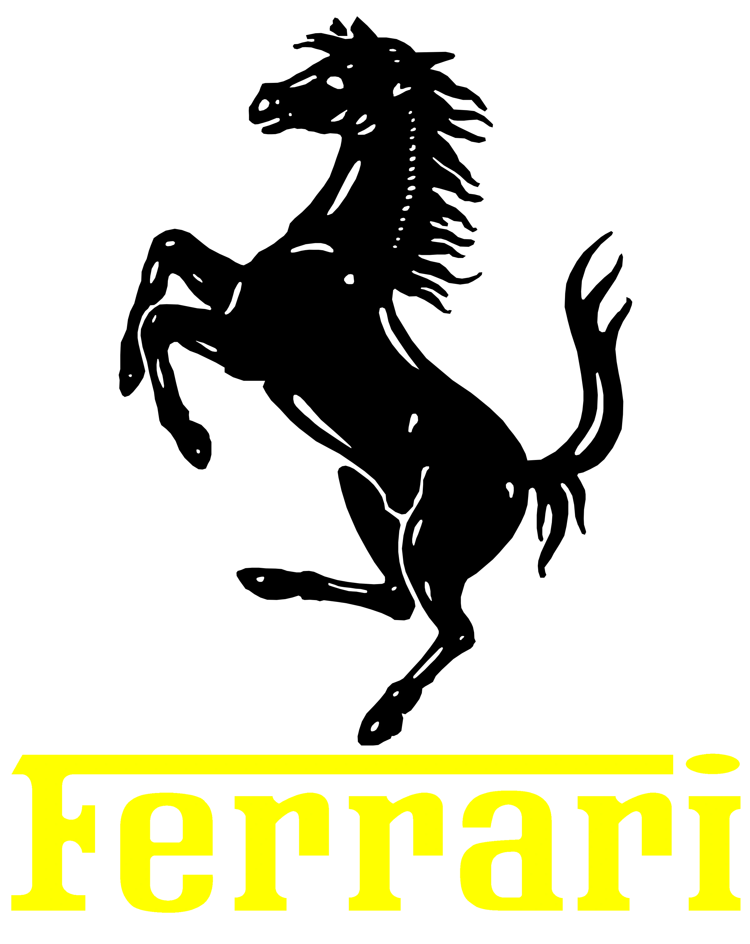
For the most part, the Scuderia logo shares a lot of similarities with Ferrari’s primary brand logo. It includes the same prancing horse and the core colors of yellow, white, green, and red.
Today, we will be taking a closer look at the Ferrari F1 logo in all of its glory, exploring the history of the emblem and how it has evolved over the years.
Is Scuderia Ferrari the same as Ferrari?
First, it’s worth noting that Scuderia Ferrari and Ferrari aren’t exactly the same entity, although they’re owned by the same company. Scuderia is the Italian word for “stable”, which may be a reference to Ferrari’s well-known animal mascot – the prancing horse.
Scuderia Ferrari is the racing division of the Ferrari luxury automotive company. Like the larger Ferrari brand, it was founded by Enzo Ferrari, although the company planned on racing in cars purchased by Alfa Romeo, to begin with.
By 1947, however, Ferrari had begun building its own cars, specifically for the motorsports environment.
Over the years, Scuderia Ferrari has won a number of titles, including the World Sportscar Championship. It also has a record number of Constructor’s championships (16) and holds the record for the most driver’s championships, too (15).
The various driver’s championships were won by a selection of 9 different drivers over the years, including Michael Schumacher.
Ferrari F1 logo history: The Ferrari F1 Team logo
For the most part, throughout Ferrari F1 logo history, the team has used a variation of the logo used by the larger Ferrari brand. In almost all instances of the emblem over the years, we can see a depiction of the famous prancing horse.
However, there have been some notable changes to the layout, positioning, and components of the emblems over time.
1950
During the 1950s, Ferrari introduced its very first Scuderia Ferrari logo, based on the well-known horse emblem. This design featured a large serif-style wordmark, where the top line of the “F” stretched all the way across the other letters to meet the dot of the “I”.
The horse was positioned below the second “R” in Ferrari, in a small form factor.
1965
In 1965, Ferrari updated its logo, this time making the horse the core focus of the emblem. It was far larger and more detailed, though it maintained the same positioning as the previous horse. The Ferrari wordmark kept the same typography but was written in a bright shade of yellow.
1983
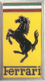
In the 1980s, Scuderia Ferrari began using the exact same emblem as the one used on the Ferrari cars of the time. This design featured a black horse on a yellow background, with the colors of the Italian flag placed in stripes at the top of the rectangle.
The Ferrari wordmark also appeared in its signature font, this time in a much more legible black color.
1997
When the 1990s rolled around, Ferrari entered into a sponsorship deal with Marlboro. Like many other Formula One teams, the company began implementing the branding of their sponsor into their team’s design.
The Ferrari logo still appeared in full form on the left-hand side of the image, with the prancing horse now placed in a yellow shield.
On the left, we see the Marlboro logo, depicted with a black wordmark on a white triangle, positioned on a red square. Various instances of this logo were introduced over the years, some with accompanying “Scuderia Ferrari Marlboro” taglines.
2007
.svg/revision/latest?cb=20220313004036)
Following the tobacco sponsorship ban in the sporting landscape, Ferrari lost its Marlboro support and updated its logo accordingly. The image introduced featured a lot of the same components as it did in the previous design.
The red coloring was still present, but the Marlboro logo was replaced with a barcode, still associated with the cigarette brand.
The large letters “SF” also appeared alongside the main emblem, standing for “Scuderia Ferrari.” This wordmark was also placed underneath the two components of the design.
2011
In 2011, Ferrari introduced a new logo for the Scuderia Ferrari brand, which removed the controversial barcode. However, many fans still noted the logo bore a huge resemblance to the Marlboro brand image, particularly with the white and red geometric shapes.
The Ferrari shield and horse were still present in the image, located towards the top left of the design. On the bottom left, the words “Scuderia Ferrari” were written in uppercase, italic font. Red lines were placed on either side of the words to create a sense of balance.
Today
The Ferrari logo as it stands today is very similar to the standard Ferrari emblem.
It features the classic black horse on a yellow shield background. The colors of the Italian flag are placed at the top of the shield, and the letters “S” and “F” appear around the horse’s legs. These letters simply stand for “Scuderia Ferrari.”
The Scuderia Ferrari logo: Colors and fonts
Over the decades, the Scuderia Ferrari logo has faced some controversy. For the most part, the team built its branding around the core elements of the Ferrari brand identity. However, following the sponsorship deal with Marlboro, a number of problems emerged.
Even after tobacco sponsorships were banned in motorsports, Ferrari continued to make references to Marlboro in its logo.
Most recently, the latest version of the Ferrari logo has removed these controversies, allowing the brand to focus entirely on its unique image. The main difference between the Scuderia Ferrari logo and the standard emblem for Ferrari today is the use of the letters “S” and “F.”
If you want to take a closer look at the Scuderia Ferrari logo, you can find some useful resources here:
What color is the Scuderia Ferrari logo?
The Scuderia Ferrari logo colors are very similar to the shades used in the standard Ferrari emblem. The yellow background of the shield, the black horse, and even the Italian flag remain consistent between both designs. The hex codes for the colors include:
Yellow:
Hex: #FFF200
Black:
Hex: #000000
White:
Hex: #FFFFFF
Green:
Hex: #00A551
Red:
Hex: #EF1A2D
Perhaps the most eye-catching Scuderia Ferrari logo color is the bright shade of yellow, which seems to overwhelm all the other shades while differentiating the brand from its competitors.
What font does the Scuderia Ferrari logo use?
The Ferrari logo font is consistent between the traditional Ferrari brand and the Scuderia Ferrari team. It’s also the same typography the company has used for several decades.
The name of the font is Ferro Rosso, and it’s used not just in the logo but in all of the merchandise created for the team too. This font was created by Michael Hagemann, according to some sources. It’s a slab-style serif font with a uniquely elongated F element.
From horse to shield: The evolving Ferrari F1 logo
As you can see from the Ferrari F1 logo history outlined above, many of the designs created for the Scuderia Ferrari brand have remained consistent with the Ferrari brand identity. For the most part, the team has used the same font, colors, and even the iconic Ferrari horse.
However, there have been some interesting changes to the Ferrari logo worth mentioning over the years. For instance, the Marlboro branding elements raised a lot of controversy over the years.
Today, however, Scuderia uses a traditional, eye-catching, and compelling logo without any references to sponsors.
Fabrik: A branding agency for our times.
Now read these:
—Which car companies own which car brand?
—The Red Bull racing logo, a symbol of power
—The Mercedes F1 logo, the silver arrows
—Branding a winner, the Williams F1 logo history
—A guide to the iconic McLaren logo and symbol
—What you need to know about the Haas F1 logo
—The Alfa Romeo F1 logo, history and meaning
—From Scuderia Toro Rosso to the AlphaTauri logo
—A look back at the iconic Aston Martin F1 logo
—Racing through time, the Apline F1 logo story

Clarity starts with a conversation.
Thanks—we’ll get back to you shortly.
Whether you're navigating a rebrand, merger, or simply need a clearer identity—we’re here to help. No hard sell, just honest advice from people who know the sector.
Let’s start with a simple question…
Prefer to email? Drop us a line.
Fabrik’s been helping organisations rethink and reshape their brands for over 25 years. We’ve guided companies through mergers, rebrands and new launches. Whatever stage you’re at, we’ll meet you there.