What is flat logo design? A concise guide to flat logos

What is flat logo design? If you pay attention to logo design trends, you might have noticed a lot of companies opting for simpler designs these days. In an oversaturated commercial world, with countless companies competing for the same attention, brands are deciding less is more.
A flat minimalist logo removes all of the elements of depth, texture, and dimension from a logo, to refine the image into its simplest shapes. Though it may seem basic at a glance, this kind of two-dimensional logo design can be an excellent way to strengthen your brand’s appeal.
Flat logos, used correctly, can make a company appear modern and creative. After all, some of the biggest brands in the world have adopted this trend, from Netflix and Apple to Spotify. Plus, flat logos can be far more memorable and easier to understand.
Let’s take a closer look at the nature of flat logo design.
What is flat logo design?
So what is flat logo design?
Flat logo design is the art of creating a two-dimensional logo, with no overly complex design elements. It’s an alternative to logo designs featuring gradient and dimension.
If you look at something like the Lamborghini logo you’ll notice a number of examples of texture and depth, designed to add an element of luxury to the image. Alternatively, look at something like the BMW logo, and you see nothing but clean, block colors and shapes.

Flat logo design takes a more minimalist approach to logo creation, reducing the features a user needs to take in when checking out a brand image. Flat design uses straightforward typography, shapes, and clear colors to make an immediate impact.
The origins of flat design date back further than you’d think. Swiss Style and the Bauhaus movements in the 1900s marked a significant turning point towards minimalist designs, with a focus on combining aesthetics and function.
While the beginning of the digital age prompted a lot of companies to experiment with 3D design possibilities, this trend didn’t last forever. During the rise of Windows 8 and iOS 7, flat design became increasingly intwined with modernity.
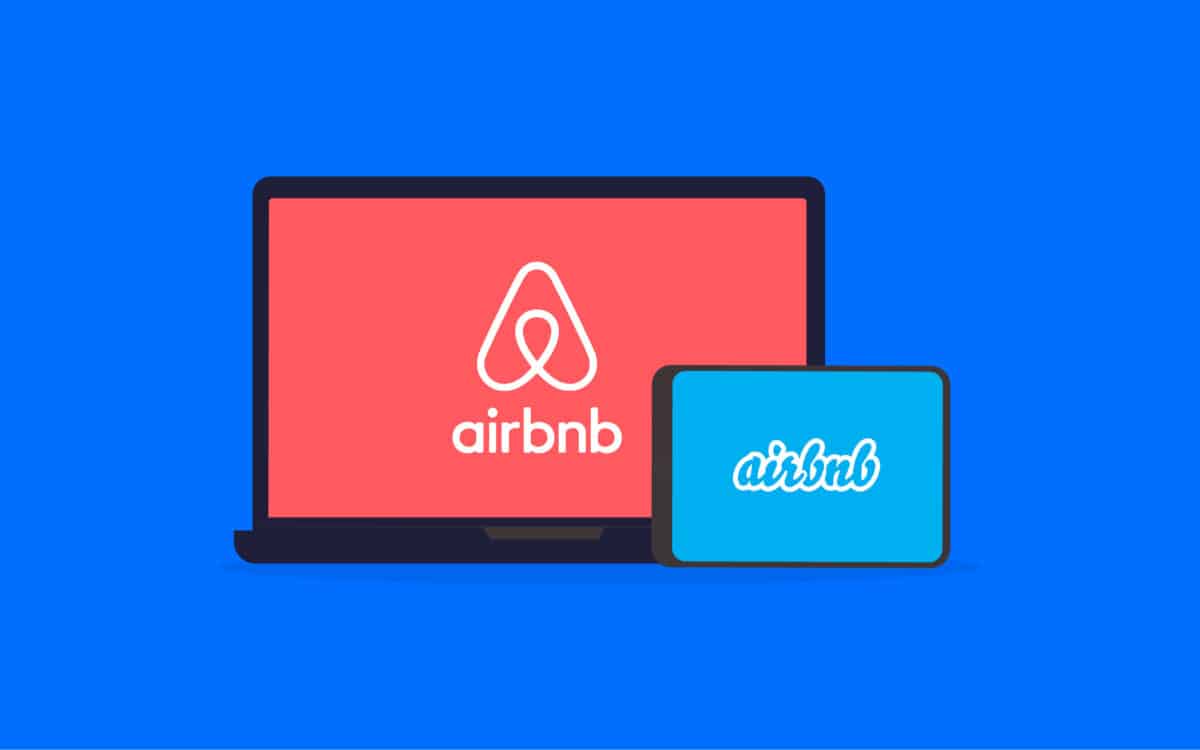
Now, companies all the way from Netflix to Airbnb have their own flat designs.
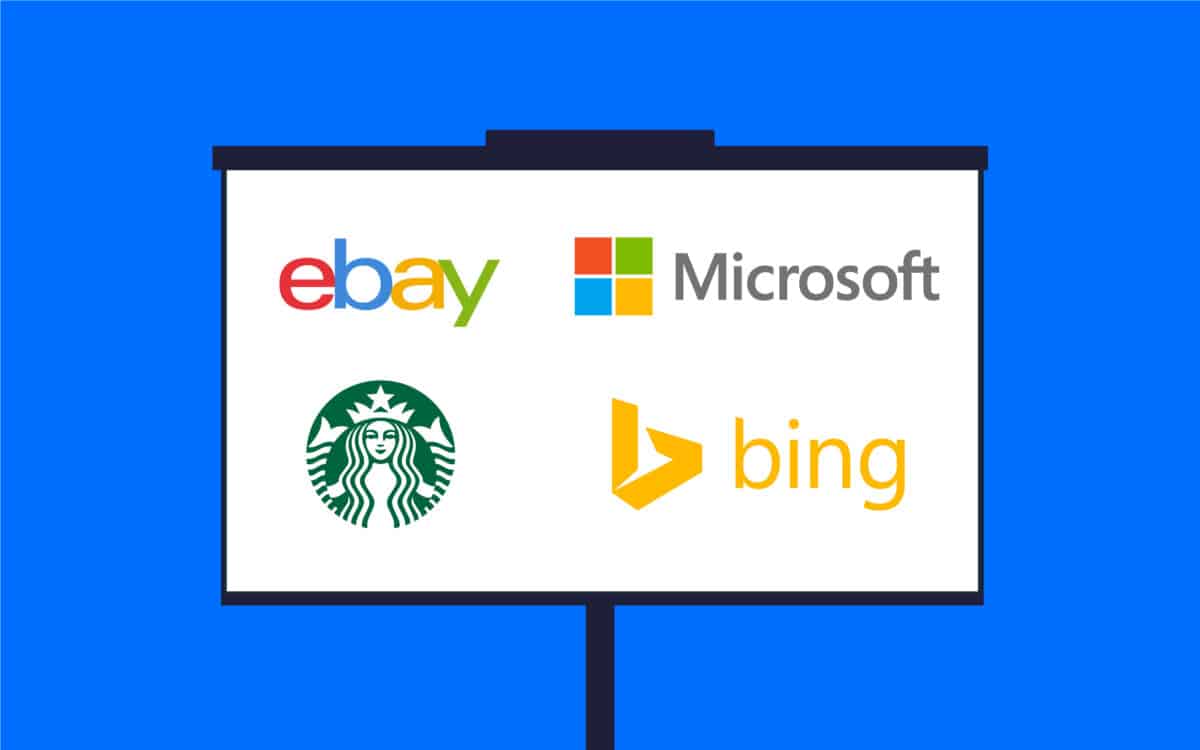
Principles of a flat minimalist logo
To answer the question “what is flat logo design?” we need to dive a little deeper into the principles guiding designers when they construct a “flat” logo. Designers follow very specific principles to ensure a flat design makes the right impression.
Some of the most common components of flat minimalist logos include:
Strong shapes
Geometric shapes are very common in flat logo design. Like with minimalist logos, designers use distinctive shapes to create a bold silhouette without unnecessary detail.
Flat symbols like circles, squares, and diamonds can still make a significant impact on an audience when used with the right strategy.
Simple typography
Flat logos are generally paired with simplistic fonts. It’s very rare to see any display fonts or complex typefaces in a flat logo design. Elaborate fonts detract from the overall image you’re trying to achieve.
Stick with a crisp, simple, and attractive typeface. Sans-serif fonts are the most common choice, and it’s best to keep text to a minimum.
Color and contrast
Flat logo designs skip the intricate details in a design as much as possible, emphasizing contrast and bold colors instead. Without gradients and texture, you’ll need to make sure you’re using contrast effectively to stop components of your design from blending together.
Keep your color palette as simple as possible too, so you can maintain a clean look. Any logo will also need to look good in grey scale, so think about this when choosing your contrasting shades.

The benefits of flat minamilist logos
While not every company will benefit from flat logo design, many brands find it’s easier to make a lasting impact when they choose a simplified logo.
A minimalist approach can make your company look more modern and professional, particularly at a time when more companies are embracing flatter, simpler images.
The key to success is making sure your flat minimalist logo still conveys they most important facts about your business.
If you can do this, the benefits of flat logos include:
Legibility
No matter what type of logo design you invest in, you should be focusing on making a memorable impact on your target audience as quickly as possible. You need to communicate fast, so your logo should be as easy to understand and readable as possible.
A flat logo has less information to take in, so it can be easier for your audience to consume.
Memorability
Because there are fewer elements to memorize in a flat logo design, it’s also easier to achieve a good level of memorability. A good image with the right shapes, typography, and contrast will stick in your customer’s mind for longer.
You might also find it evokes meaning a lot easier too, which allows your audience to form a deeper understanding of your company at a faster rate.
Flexibility
Simplicity in flat logo design also means it’s easy to scale your designs up or down. Remember, a good company logo should look fantastic on everything from letterheads to business cards and mobile app icons.
With fewer elements to scale, flat logo designs are suitable for moving easily between media of all sizes.
Modernity
As mentioned above, the rise of leading global companies around the world embracing flat logo design has made the trend appear more modern. Increasingly, buyers and investors are associating this kind of design with cutting-edge brand imagery.
You can set yourself apart as being ahead of the curve with this design.
Affordability
It can sometimes be more cost-effective to reproduce flat logo designs. You might not need to spend as much on printing when you’re producing packaging, for example.
Plus, you might not have to invest as much time on adding detail to your logo.
How to make flat logos
The easiest way to create your own flat logo design is to work with a specialist. Branding experts can help you to identify your brand essence, so you can convey the right message in a minimalist design.
They’ll also be able to work with you on choosing everything from colors to shapes.
If you’re going to be working with a designer, or trying to sketch ideas on your own, the first thing you should do is commit to good research. Start by getting to know the service or goods you want to promote as thoroughly as possible.
You can:
Create brand guidelines
A set of brand guidelines will highlight your values and missions, so you know what kind of message you need to convey with your flat logo design. You can share these guidelines with any designers you work with too.
Gather inspiration
Check out the competition and browse through the logo designs of leading companies around the world. This will give you a good insight into how a flat logo design should look.
Edit extensively
Successful flat logo design often means going back over your creation and looking for anything to omit. If an outline, or an extra color is unnecessary in your logo, remove it and see if the result is a simpler image.
Designing flat logos effectively is often something of a balancing act. Designers need to know how to showcase the right amount of meaning in a logo, without using too many additional elements.
Mastering flat logo design
Now you know the answer to the question “what is flat logo design?” you can see why it’s become such an important concept for many business owners and design agencies alike.
In industries all over the world, companies are rapidly embracing minimalist logo designs to appear modern and sleek.
Flat designs can grab a lot of attention fast, and they can help you to align your company with a range of cutting edge businesses around the world.
Of course, it’s important to ensure you’re leveraging the benefits of flat design carefully. Work with a professional to ensure you’re getting the right results.
Fabrik: A branding agency for our times.
Clarity starts with a conversation.
Thanks—we’ll get back to you shortly.
Whether you're navigating a rebrand, merger, or simply need a clearer identity—we’re here to help. No hard sell, just honest advice from people who know the sector.
Let’s start with a simple question…
Prefer to email? Drop us a line.
Fabrik’s been helping organisations rethink and reshape their brands for over 25 years. We’ve guided companies through mergers, rebrands and new launches. Whatever stage you’re at, we’ll meet you there.

