


The ultimate list of American grocery stores and supermarket logos

American supermarket logos are probably some of the most recognizable emblems in the USA. In every city and town, there are a handful of American grocery stores to explore. Some have become major household names, like Kroger and Publix, while others have emerged as regional treasures.
Like all companies, American food stores and grocery companies use their brand image as a way of connecting with their target audience. With the right visual identity, and some careful marketing, grocery store brands can transform one-time shoppers into lifelong advocates for their company.
The best food store logos combine color psychology and meaningful imagery with carefully chosen typography to speak to a specific audience, and send a memorable message.
When you see “Whole Foods”, you instantly think of organic and natural foods. When you spot the Trader Joe’s logo, you’re struck with a sense of family values and homeliness.
Today, we’re going to look at just some of the biggest American supermarket logos and brands.
Exploring major American supermarket logos
American grocery stores come in a range of shapes and sizes throughout the USA. Some focus specifically on selling certain kinds of products. For instance, Whole Foods is committed to organic, natural, and fresh produce.
Others provide a more comprehensive shopping experience, selling everything from electronics and clothing to frozen foods, like Walmart.
The wide variety of supermarket and grocery store options is evident in the versatile selection of American supermarket logos we see distributed across the landscape.
Similar to companies from any industry, supermarkets often aim to highlight their unique selling proposition and values to customers through their choice of emblem.
Walmart, currently the largest American grocery store by revenue, uses starburst imagery, sans-serif font, and the colors of blue and yellow to depict happiness and trustworthiness.
Costco, the brand best-known for selling private-label grocery products in bulk, captures attention with a bright red logo, designed with a focus on movement and speed.
The most popular American grocery stores and their logos
American supermarket logos are versatile and eye-catching images, designed to differentiate a growing number of food retailers across the US.
As consumer preferences have evolved over the years, many grocery store brands, and supermarket brands have updated their images to match customer expectations.
Today, we’re looking only at the most recent logos created by leading companies, and what they say to their audience.
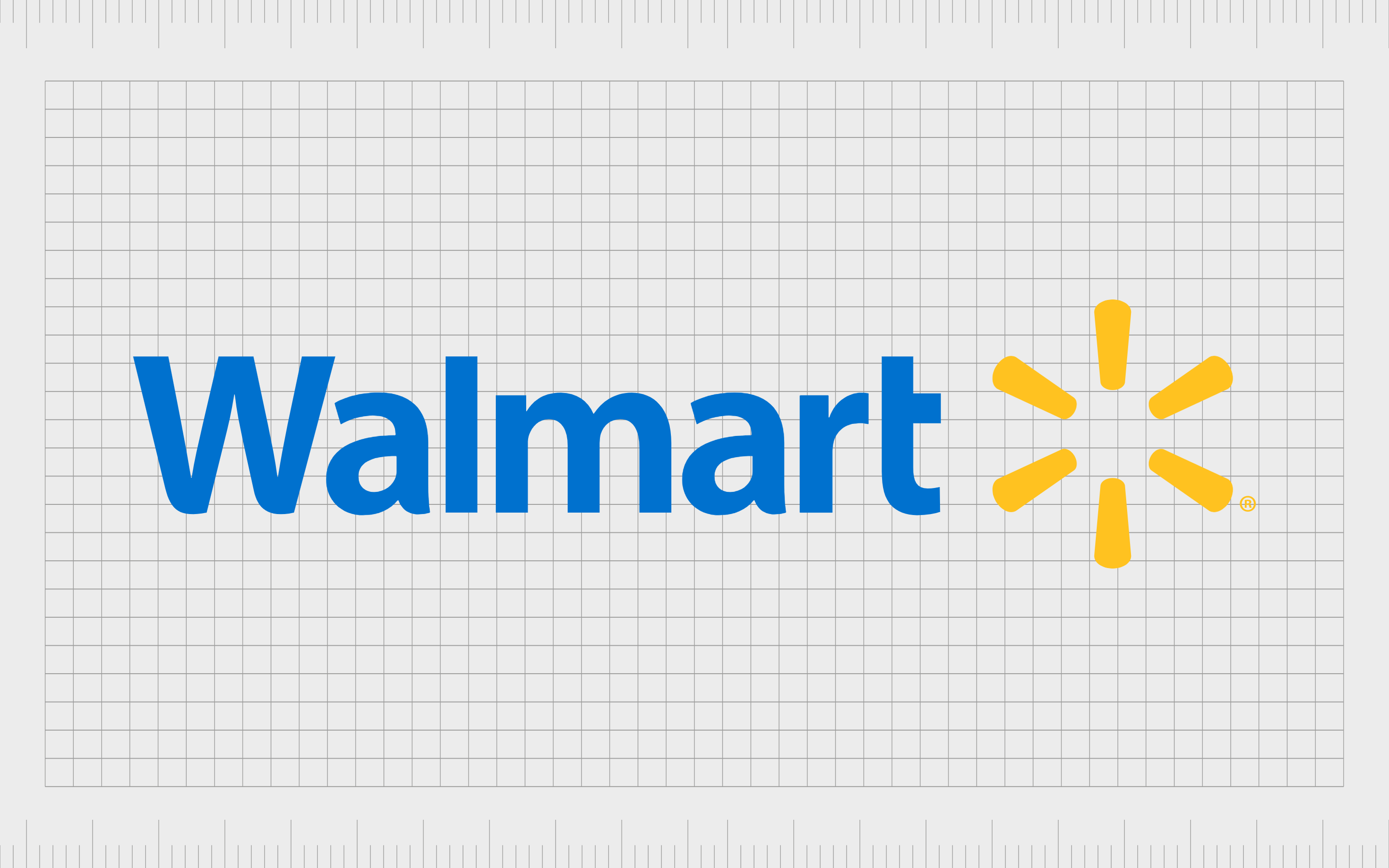
Walmart
Walmart is currently the biggest supermarket brand in America, responsible for selling dozens of different household items and goods from different categories. The company was first founded in 1962, and is now worth more than $328 billion.
The organization has also given birth to various sub-brands over the years, such as “Bare Necessities”.
Walmart’s logo has evolved significantly over the years, starting with a simple wordmark, and gradually implementing various shapes, like the famous star.
Today, The Walmart logo is a symbol of trustworthiness, accessibility, and community.
The light blue sans-serif font is ideal for highlighting the reputable nature of the brand, while the sun-burst symbol is intended to represent joy.
Find out more about the Walmart logo here.
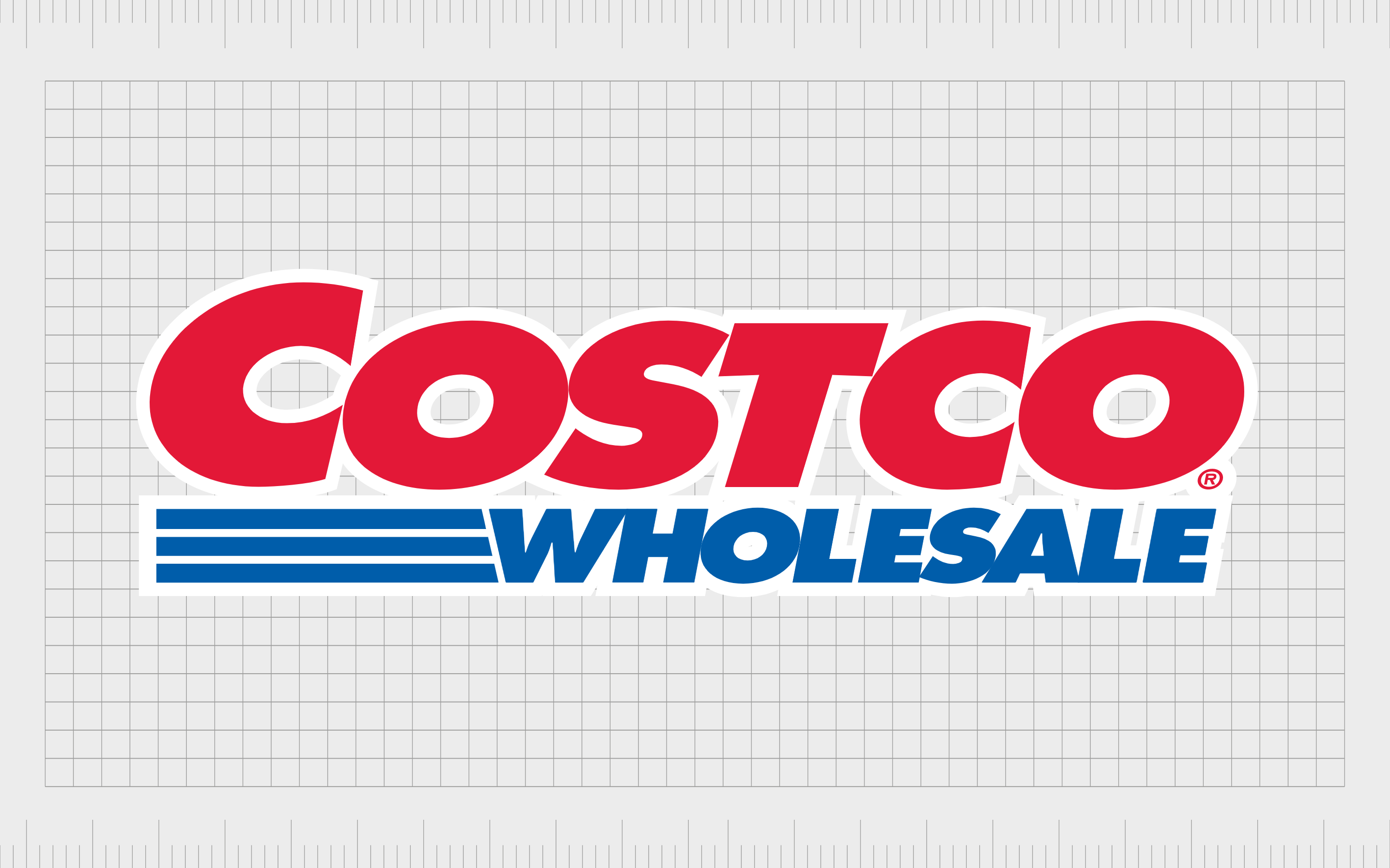
Costco
Popular in regions all over the world, Costco is a wholesale company best-known for selling low-cost, bulk items to individuals who join its membership club. The company first launched in 1983, to help business owners and professionals access the low-cost products they needed.
The original Costco logo has evolved a few times over the years, though the colors of red and blue have remained largely consistent within the company’s imagery.
Today, the Costco supermarket logo is an eye-catching image in bright red and blue. The red coloring reminds shoppers of sales and discounts, while the blue underlines and the “wholesale” word beneath the brand name reminds users of the company’s unique selling point.
The entire logo is slightly slanted to the right, indicating speed and forward motion.
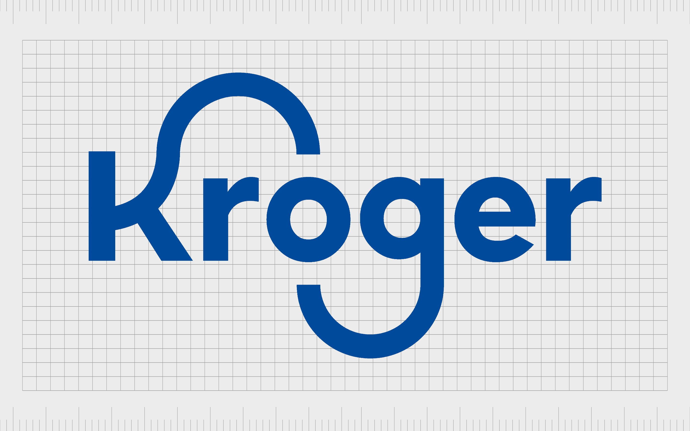
Kroger
Kroger is one of the top grocery store brands in the United States. First opened by Bernard Kroger in 1882, the company has now evolved to operate 2,723 different stores across 35 states.
Like many supermarkets over the years, Kroger has experimented with its brand imagery to develop stronger connections to its target audience.
The current Kroger logo is a combination image, featuring a stylized wordmark, and a symbol in the shape of a shopping cart, with segments to represent fruit.
According to Kroger, the symbol highlights the “fresh” focus of the store, both in its choice of products, and its approach to exploring new ideas.
The curved line on the “K” connecting with the “G”, is intended to highlight Kroger’s consistent path towards growth and innovation.
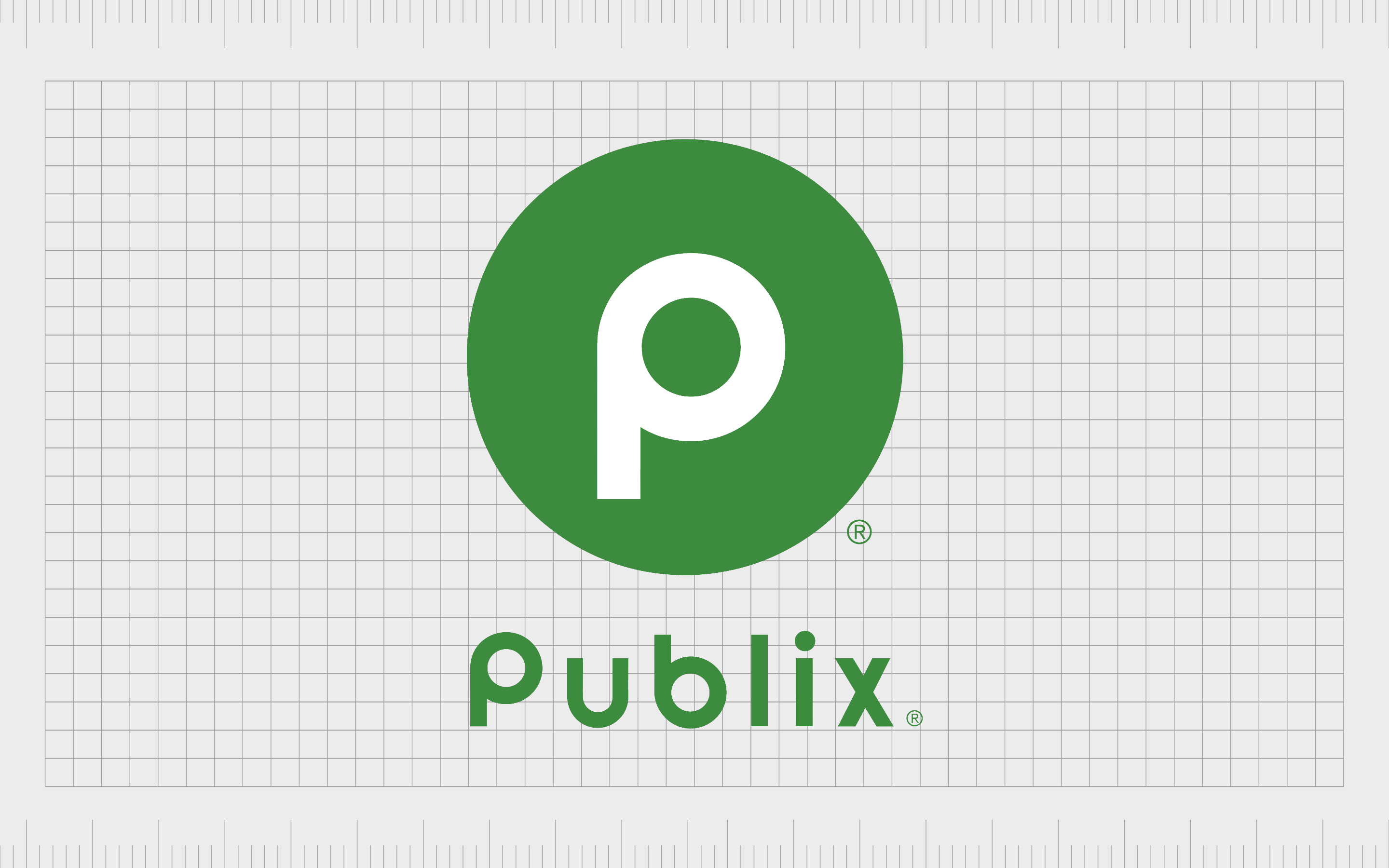
Publix
An employee-owned American supermarket chain, first founded in 1930, Publix operates throughout a range of Southeastern states in the US. The location is particularly popular in Florida, with around 853 stores located throughout the region.
The Publix logo, depicted in a soft shade of green, aims to pull attention to the natural focus of the company, and its commitment to delivering fresh and wholesome foods to customers.
The color green is one we regularly associate with nature and growth. While the gentle sans-serif font is also an excellent choice by the company, as it makes the brand appear welcoming and friendly.
Publix also has a variation of its emblem which features only a lower case “P” in white on a green circular background.
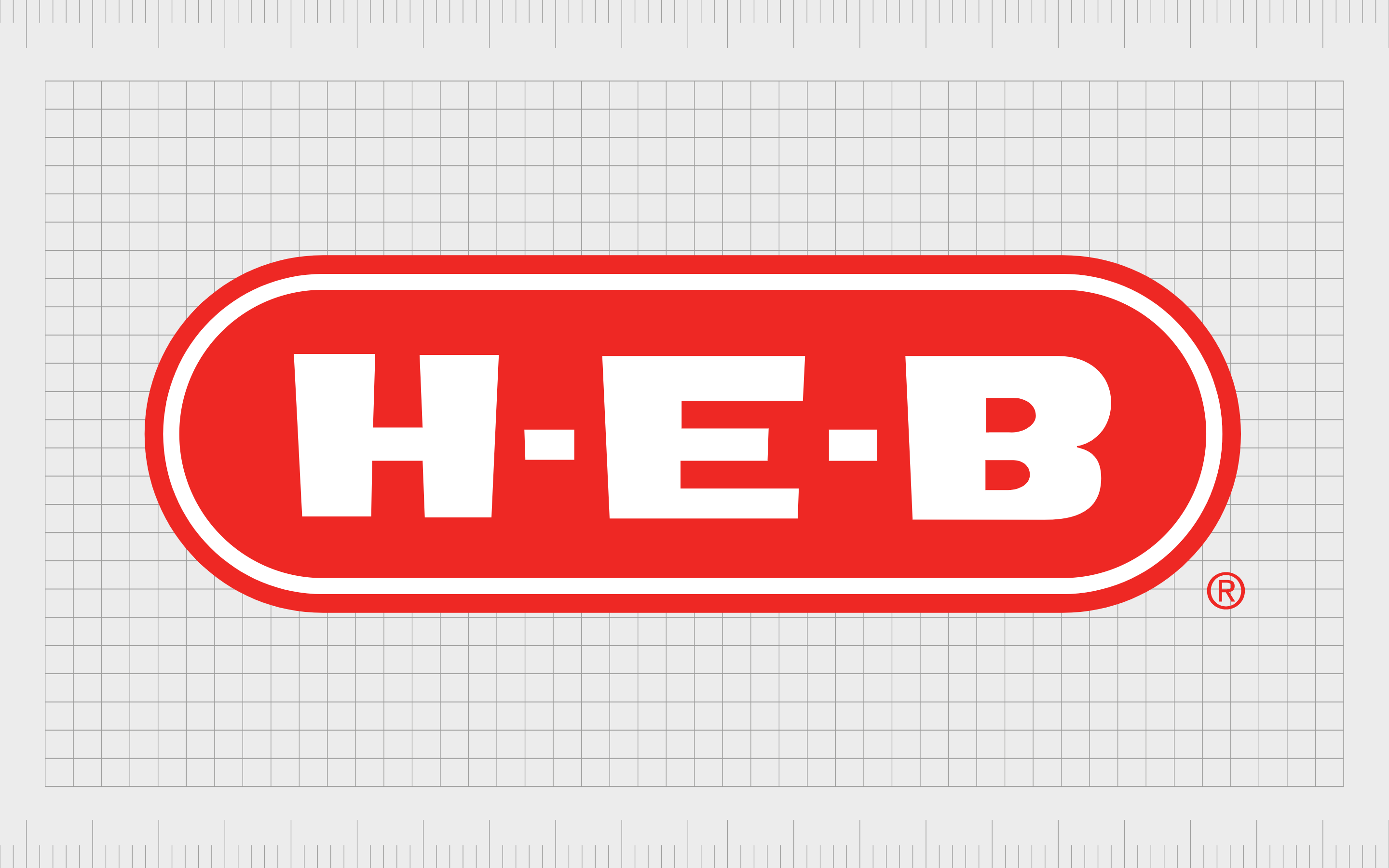
H-E-B
When it comes to grocery store brands and logos, few are more recognizable than H-E-B. This privately-held supermarket chain has more than 340 stores in Texas alone.
The company is also responsible for “Central Market”, an organic food retailer.
The H-E-B logo is bold and playful. The bright shade of red, combined with the white elements is excellent for grabbing attention. It also reminds shoppers of sales and discounts, as these are the most common colors used to announce most promotions.
H-E-B’s bubbly font choice provides an insight into the friendly nature of the brand.
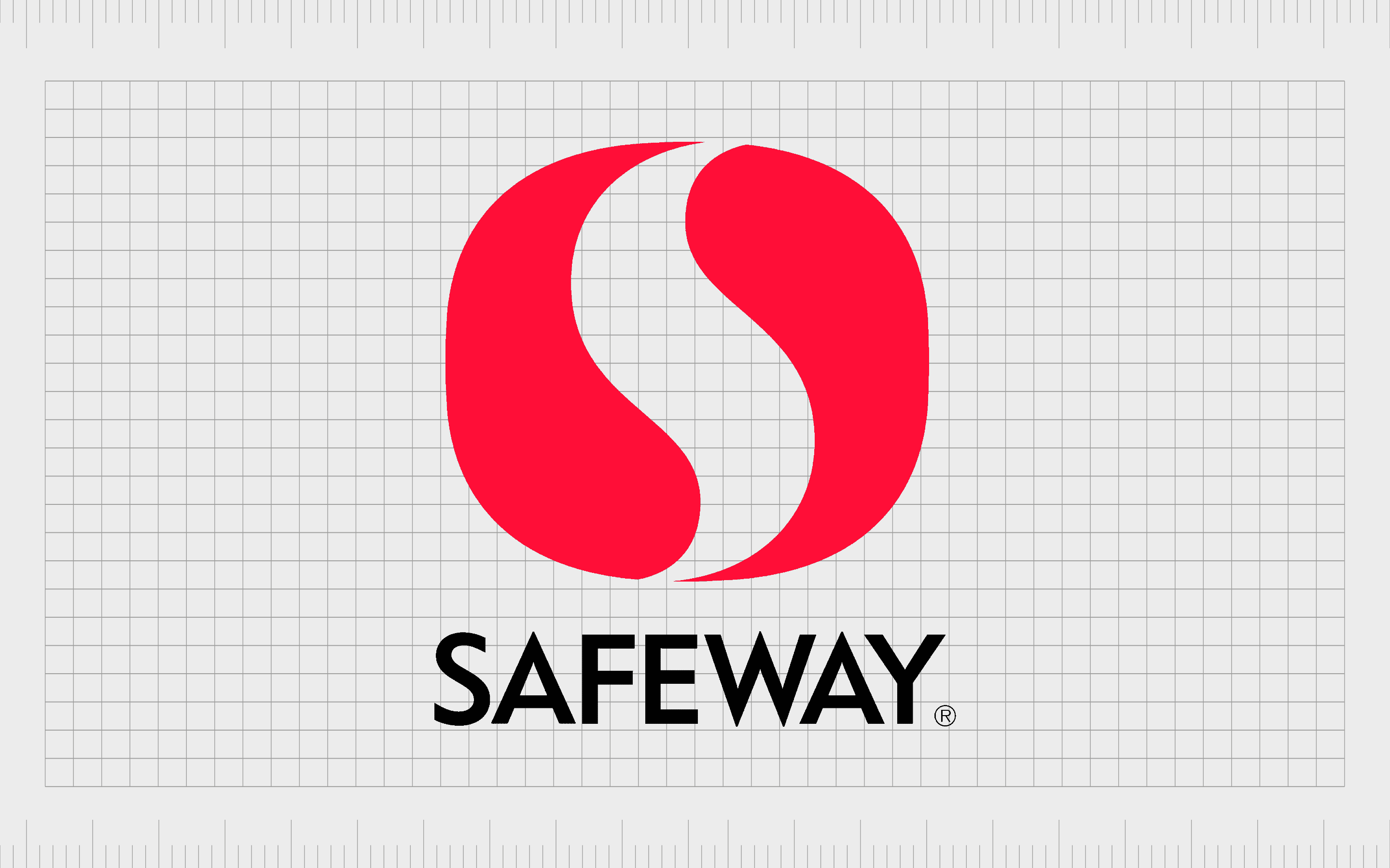
Safeway
Founded in 1915, Safeway has one of the better-known American supermarket logos in the market today. The chain sells everything from food and grocery items to general merchandise and flowers.
This brand also frequently partners with Starbucks to place cafes within its supermarket buildings.
The Safeway logo comes in two variations. One is a combination mark, which features the word “Safeway” in black capital letters.
Alongside the wordmark is the Safeway emblem, which also stands alone as an identifying asset of the business. The emblem is a stylized white “S” inside a curved red rectangle.
The image is intended to be modern and engaging, but it also shares some similarities with the symbol of “yin and yang”, used to showcase harmony.

Target
Another of the most identifiable supermarket logos both in America, and around the world, Target’s image immediately captures the attention of its intended audience.
The company, first launched in 1902 as “Goodfellow Dry Goods”, has evolved drastically over the years, altering its imagery several times in the process.
Target’s logo is simple but memorable. The red and white “bullseye” symbol aims to let customers know they can find whatever they need within the store. It’s also an excellent way to draw attention to the location of Target supermarkets for travelers on the road.
The sans-serif wordmark in lowercase letters conveys a friendly and welcoming identity.
Find out more about the Target logo here.
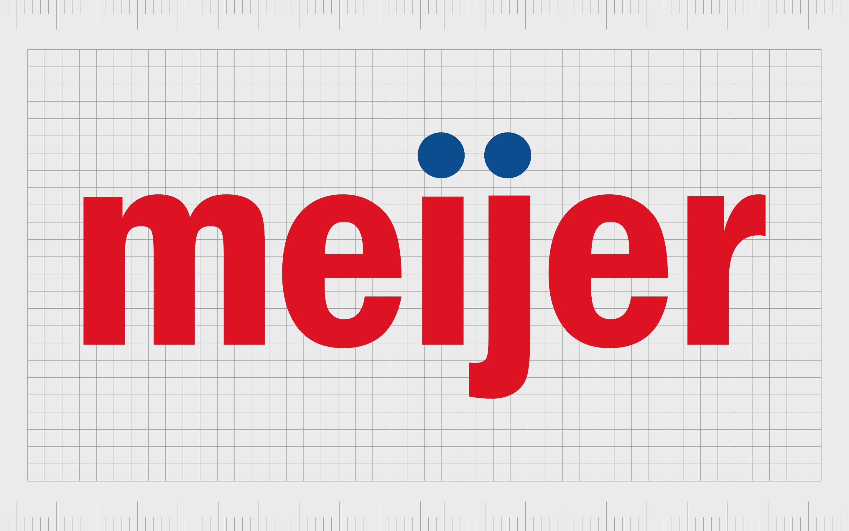
Meijer
Operating primarily throughout the Midwest, Meijer was first introduced to American shoppers in 1934. The company sells a range of different products, including groceries and fuel.
Meijer is also one of the main brands pioneering the vision of the “modern supermarket”, with self-service checkouts and new technology introduced on a regular basis.
Meijer’s logo has a similar visual appeal to many modern American grocery stores. The company uses a combination of red to capture attention, and blue to convey trustworthiness.
The use of a lower-case sans-serif font also makes the company appear approachable and friendly.
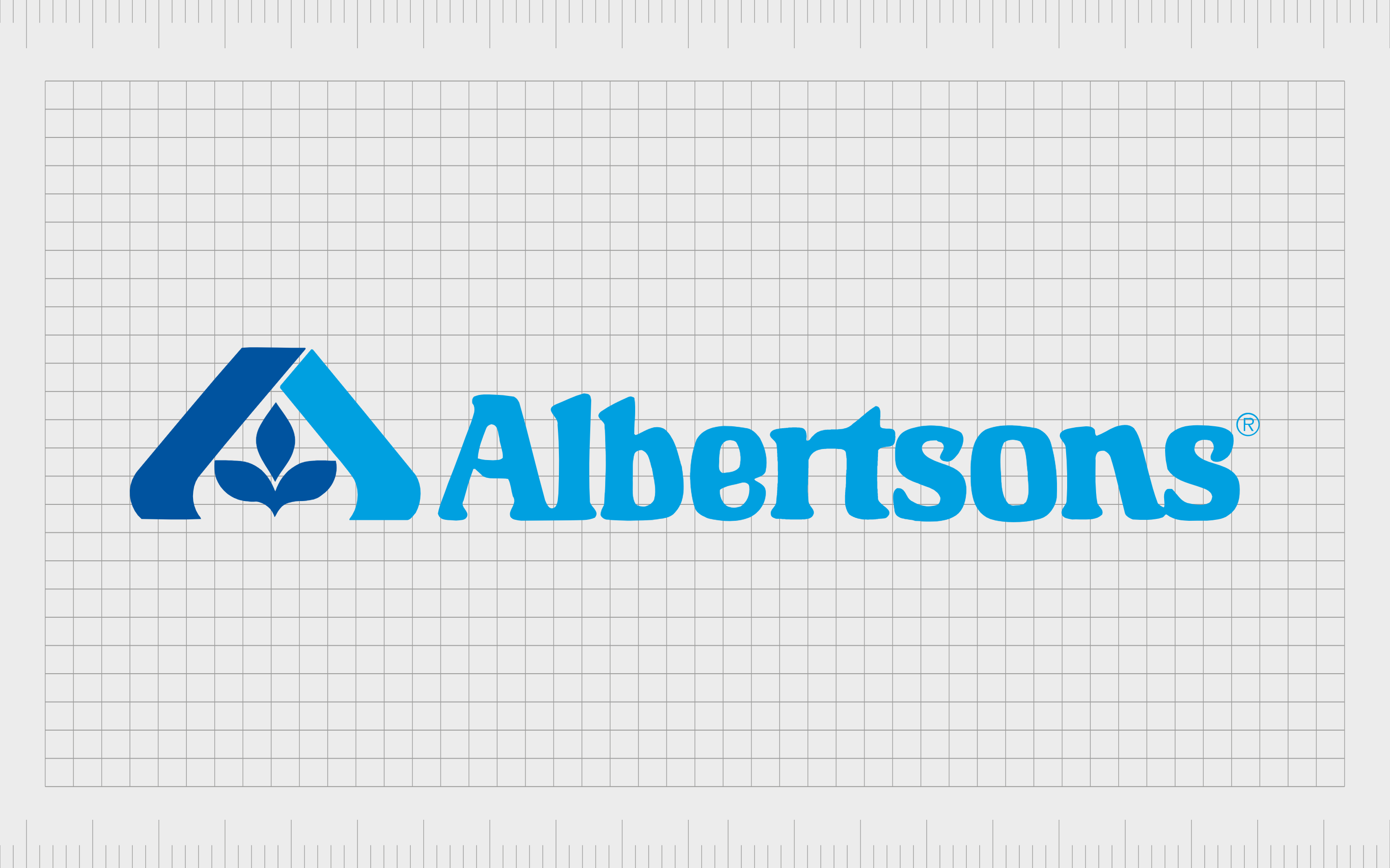
Albertsons
Introduced in 1939, Albertsons is the second-largest supermarket chain in North America, just after Kroger. The company is also one of the largest corporations by total revenue in the USA.
In the past, Albertsons had a very similar logo style to some of the older “Target” emblems, using a western-style typography for its wordmark.
Today, The Albertsons image is a lot more unique. The company relies heavily on color psychology to convey a sense of safety and credibility through two shades of blue.
The emblem in the Albertson’s logo features a plant, to highlight the natural produce sold by the store, the two lines also look a little like a roof, to remind us of the concept of home.
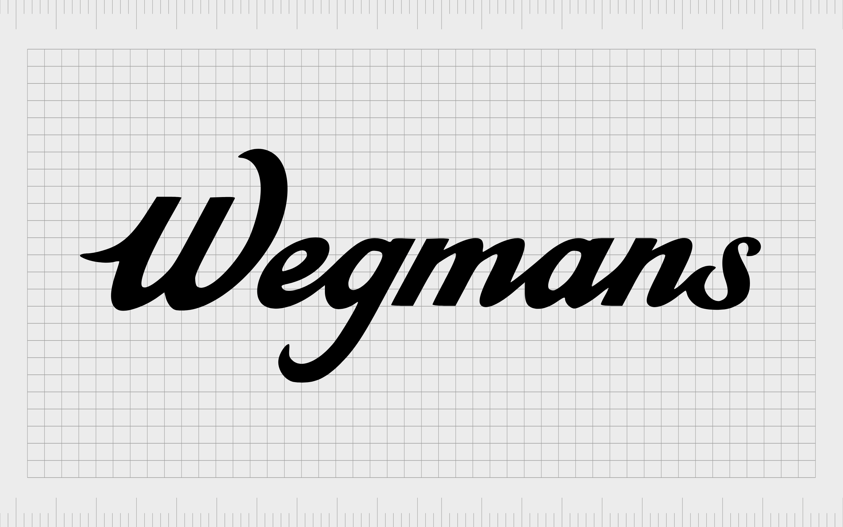
Wegmans
One of the better-known American grocery store brands and logos comes from Wegmans Food Markets. Introduced in 1916, Wegmans started selling mainly fresh produce, like fruits and vegetables.
Today, it offers a huge range of different products, from general merchandise to meat and organic produce.
The Wegmans logo is one of the simplest on our list from the top American supermarkets. There’s no accompanying design placed alongside the wordmark here. Instead, we just get a script-style depiction of the company’s name, written in black, to indicate confidence and heritage.
The decorative font highlights a sense of sophistication and luxury less common among supermarket organizations.
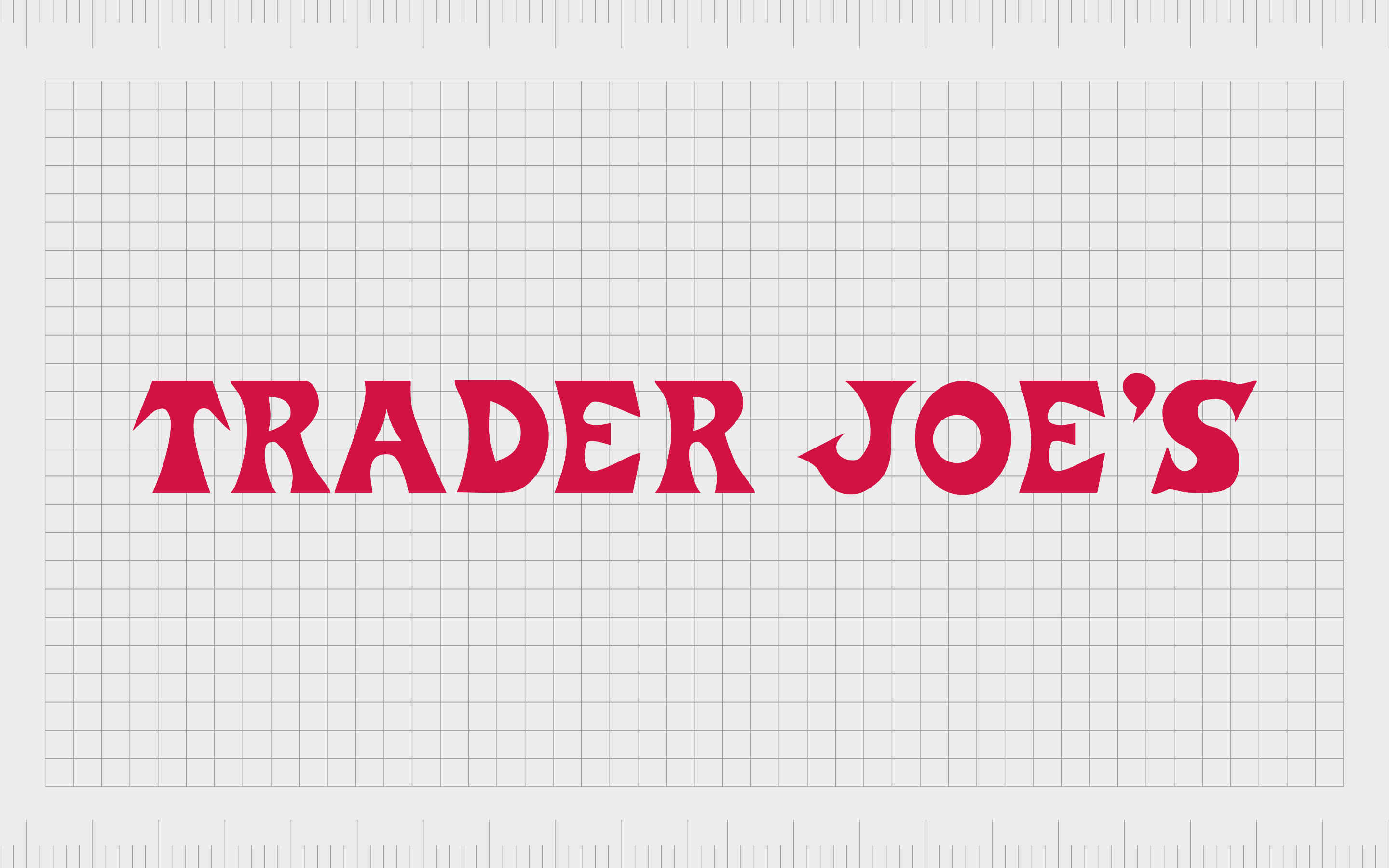
Trader Joe’s
First founded in 1958, Trader Joe’s is a supermarket brand with an image which might make it appear older than it really is. The company is best-known for selling private label foods, organic products, and specialty items in regions across the United States.
Compared to other American supermarket logos, Trader Joe’s emblem seems a little more old-fashioned. This is a deliberate move by the company to give the brand a sense of heritage and simplicity.
Trader Joe’s wants to give customers the feeling they’re shopping with a family-owned mom-and-pop store, rather than a huge corporation.
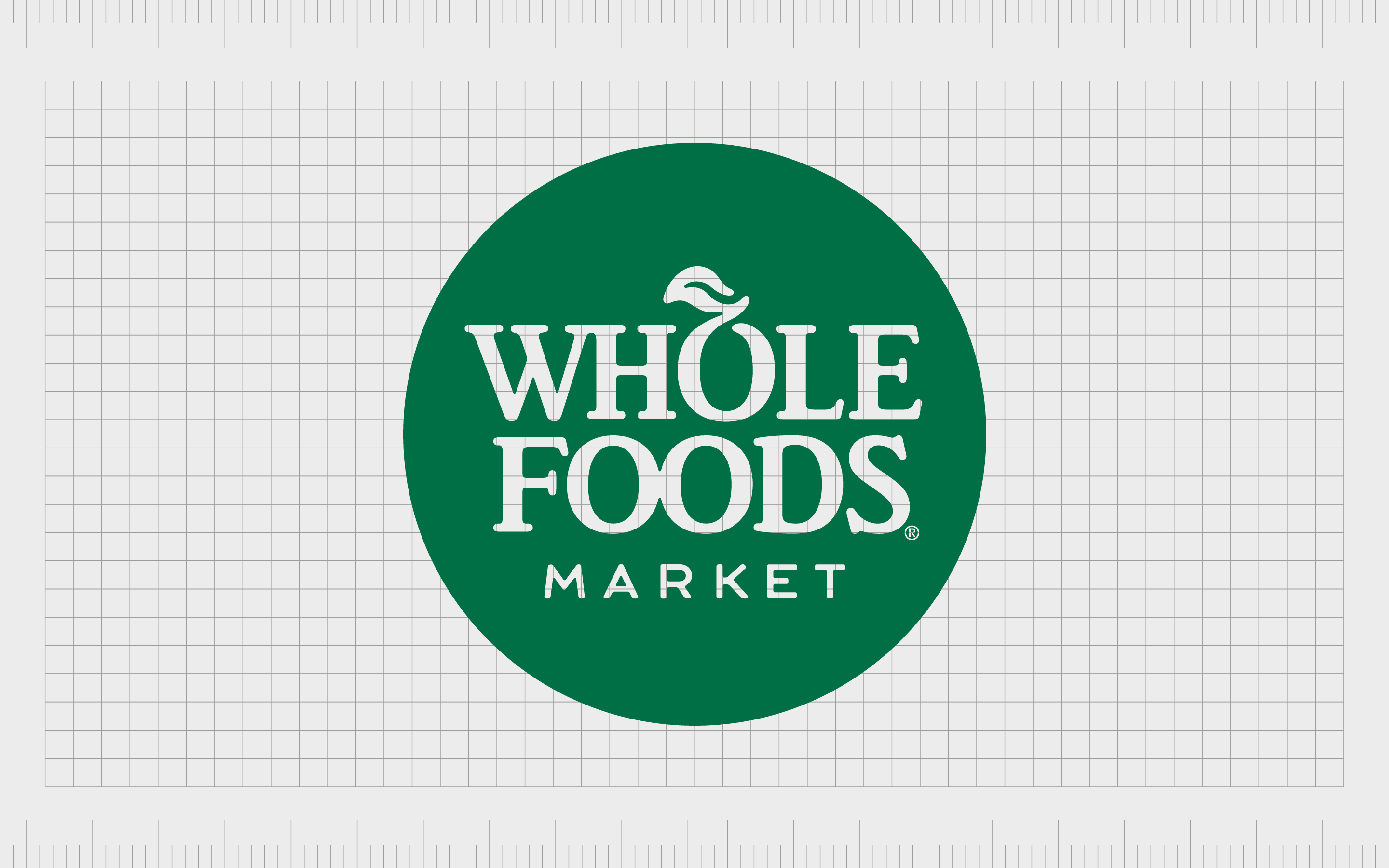
Whole Foods
Whole Foods, or “Whole Foods Market” is a subsidiary of the world-leading Amazon brand. The company specializes in selling high-quality organic foods, free from various fats, artificial colors, preservatives, and flavors.
The chain is best-known for its focus on healthy foods.
Leveraging the power of the color green to connect to nature, Whole Foods uses its logo to immediately remind customers of what makes the business different. The “O” in the word “Whole” is also designed to look like a fruit, with a leaf stemming from the top.
The image, with its excellent color choice and serif font, is perfect for giving the business a sense of credibility.
Other well-known grocery store brands
We’ve already looked at some of the most popular American supermarket logos from across the country. However, you may be aware of a handful of other names and images depending on where you are in the US.
Here are some of the other great food store logos worth mentioning in the US…
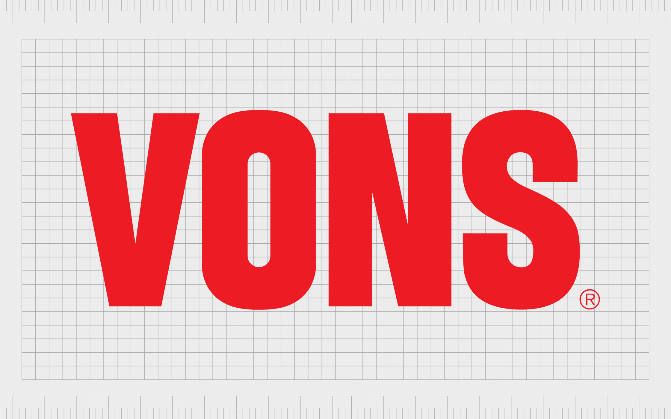
Vons
A South California and Southern Nevada supermarket chain, owned by the “Albertsons” company, Vons operates under both the Vons name, and the “Pavilions” banner.
Previously, the company was owned by Safeway, before the organization was purchased and incorporated into Albertsons.
Vons has a straightforward and simple logo, perfect for grabbing the attention of shoppers. The company uses a large red wordmark in block capital letters to signify strength, confidence, and excitement.
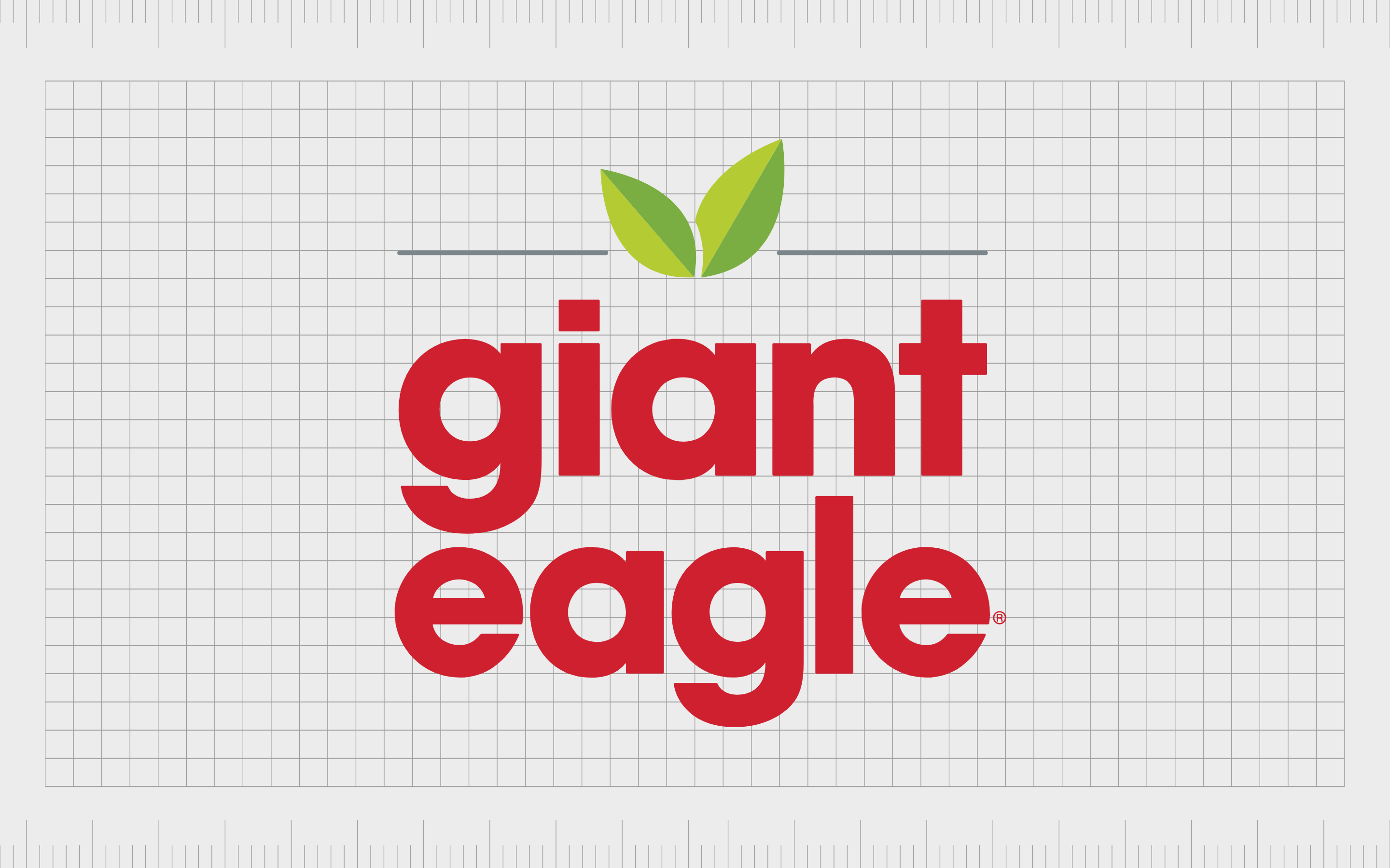
Giant Eagle
Another of the top American supermarket logos you may be familiar with comes from “Giant Eagle”. This company first launched in 1931, and has stores across various regions, including Pennsylvania, Indiana, and Maryland.
The company is one of the top North American food retailers today.
The Giant Eagle logo might seem a little unusual at first, as it doesn’t have any connection to the brand’s name. The combination mark features two leaves, intended to symbolize the availability of fresh produce and natural goods.
The typography, though written in bold red font, is constructed out of lower-case characters, to give the company a friendly vibe.
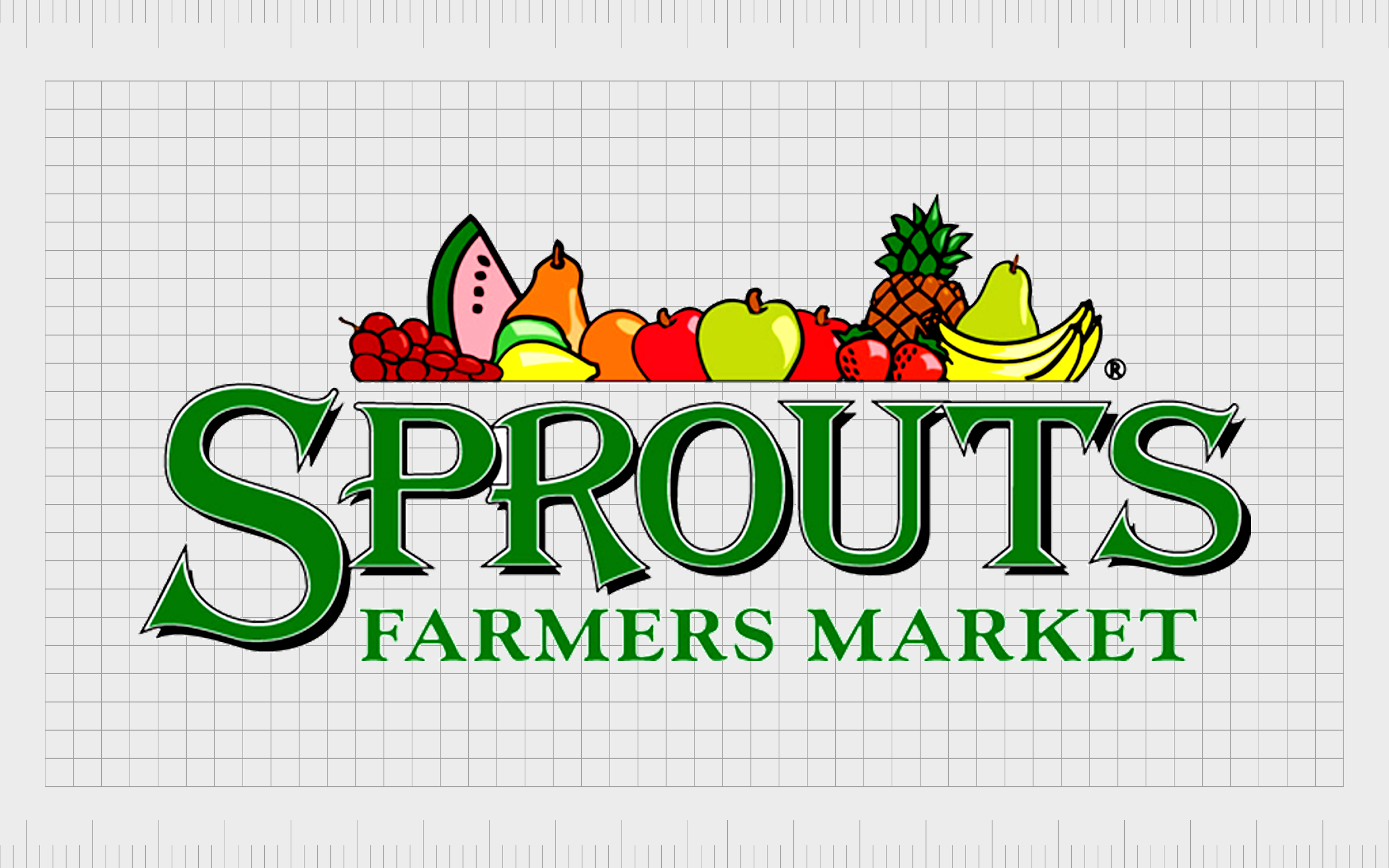
Sprouts Farmers Market
Sprouts Farmers Market is similar to Whole Foods in many ways, with its focus on selling fresh and organic produce. The company offers a huge range of natural and organic foods, as well as vitamins and supplements, and various household items.
Focusing heavily on their ability to deliver natural and fresh produce to shoppers across America, Sprouts uses various shades of green in its logo.
Like Whole Foods, it also takes advantage of the letter “O” in Sprouts to create the shape of a curving vine, or a type of fruit.
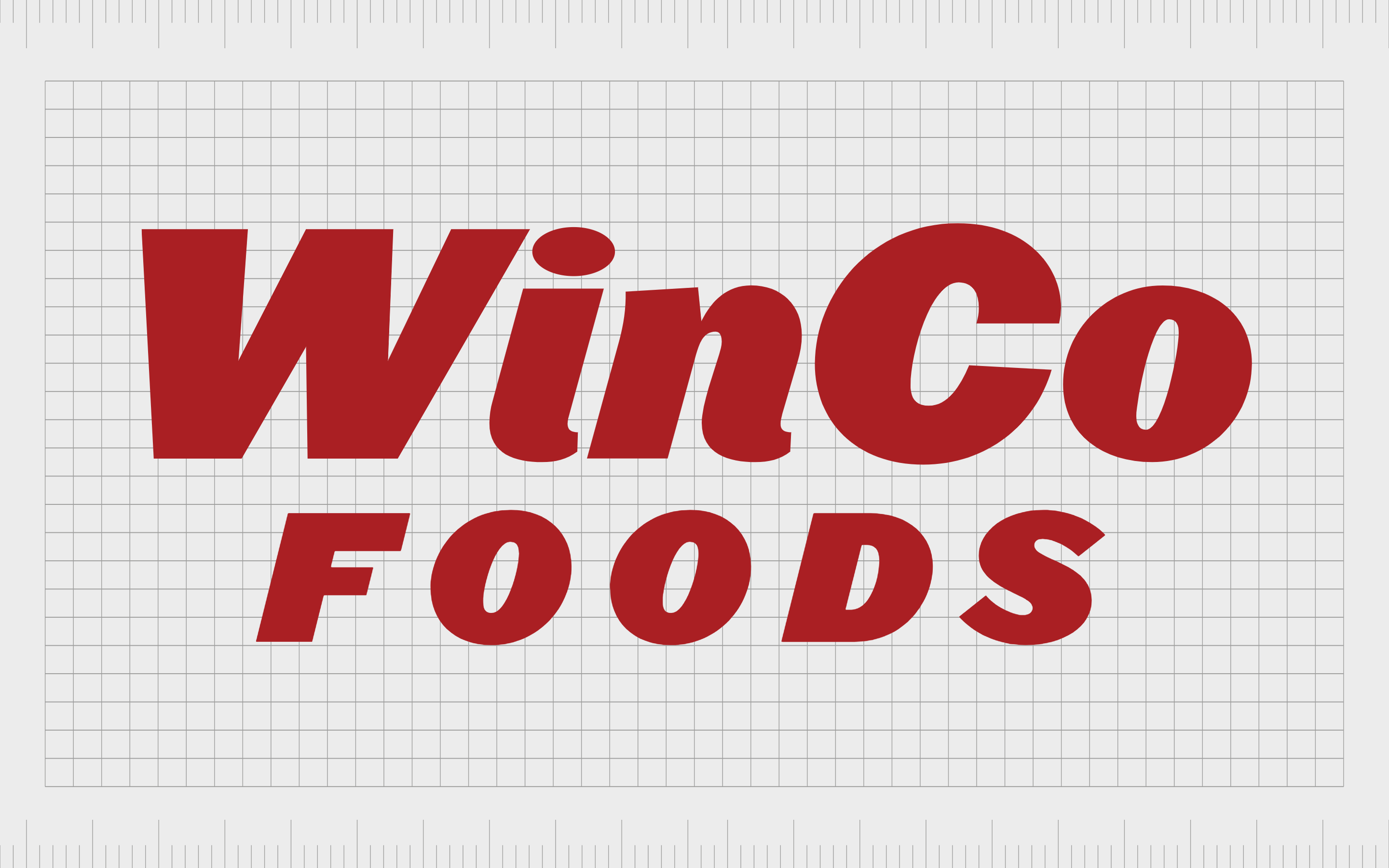
WinCo Foods
A lesser-known, but successful grocery store brand in the United States, WinCo Foods is a majority employee-owned store with locations across California, Texas, Arizona, and a handful of other states.
The company was designed as a no-frills warehouse-style store, selling bulk products at low prices.
The WinCo Foods logo draws attention to the no-nonsense personality of the company. The image is a simple and easy-to-read wordmark, in a dark red font. The letters are slightly slanted towards the right, however, which may be a method of indicating speed and convenience.
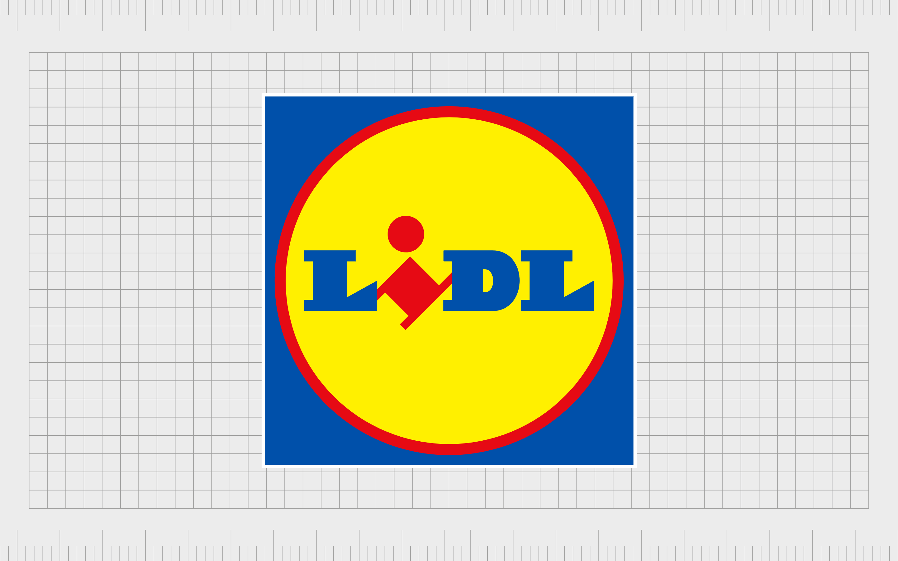
Lidl
Technically, Lidl is a German supermarket and grocery retailer. However, the organization has developed quite a strong presence throughout the United States and other parts of the world.
The company is also the biggest competitor of another German discount chain, named “Aldi”.
Lidl’s supermarket logo is a world apart from the majority of the images we see throughout the American landscape – drawing attention to its exotic origins. The image features a serif-style “I” turned on its side to indicate the quirky personality of the brand.
Lidl’s emblem also includes a bright yellow circle, to highlight happiness and joy.

New Seasons
Operating across Washington, California, Oregon, and Portland, New Seasons, or New Seasons Market is a chain of grocery stores selling organic produce. Although the company focuses heavily on selling local and sustainable food, it also offers a range of other conventional goods.
The New Seasons Market logo is an insight into the modernity of the brand, which launched in 1999. The image is bright and well-defined, with bold block letters and geometric elements.
The color black draws attention to the future-focused and professional nature of the company, while the green reminds us of the company’s connection to natural produce.
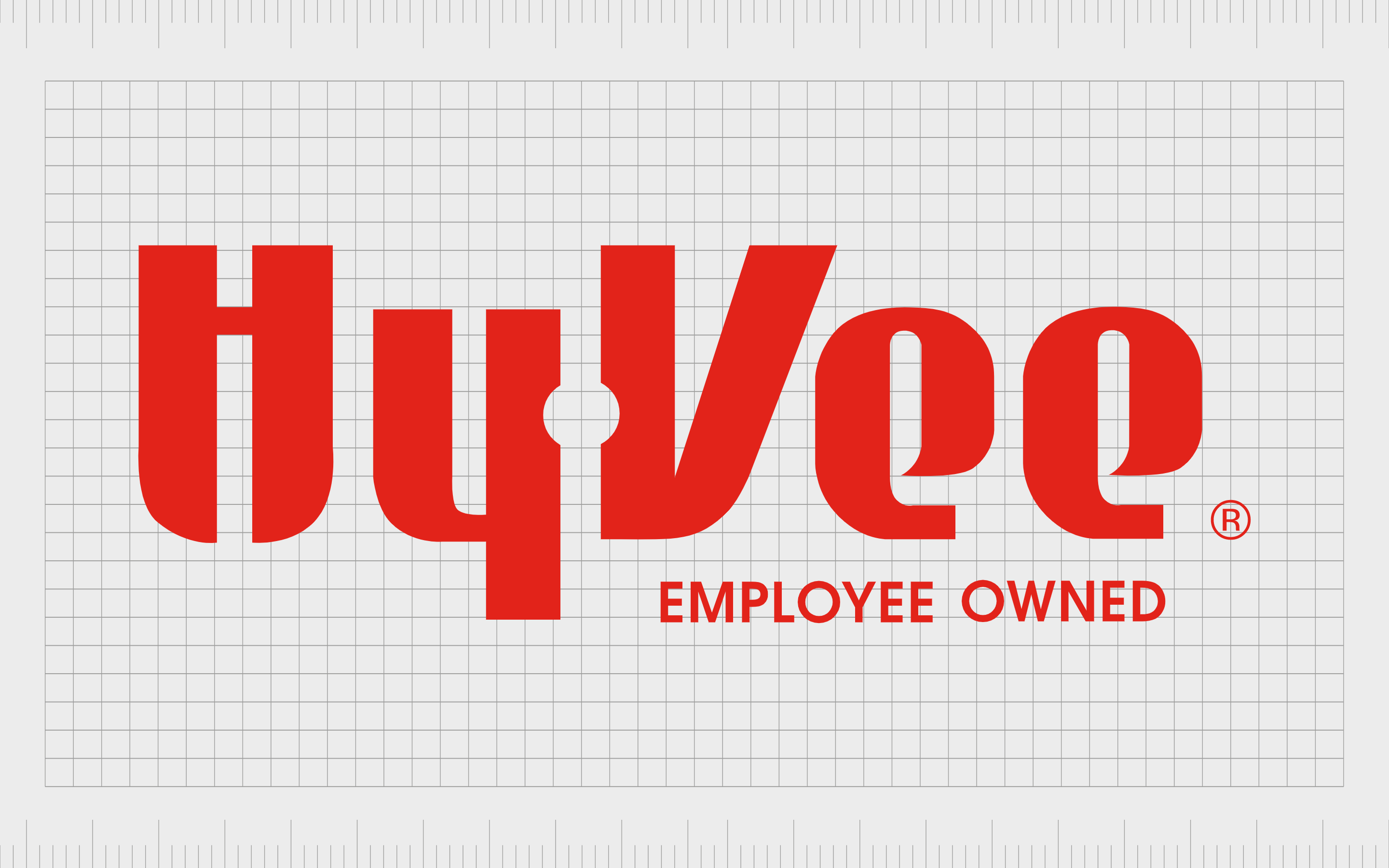
Hy-Vee
Responsible for around 280 locations across various regions in the Midwestern and Southern United States, Hy-Vee is a relatively well-known supermarket chain. The company sells a variety of products not typically found in some grocery stores, like Asian foods, hibachi, and garden goods.
Launched in 1930, Hy-Vee is a company with a lot of history, but the organization’s logo has helped it to maintain a modern and up-to-date image. The stylized font is bold and eye-catching, particularly when combined with the bright red coloring.
The company also draws attention to its structure as an “employee-owned” supermarket chain.

Market Basket
Market Basket was first launched in 1917, and now has around 90 locations throughout certain regions of the United States. The company has undergone a few controversies over the years, and is currently in the process of rebuilding its brand identity.
The Market Basket logo is similar in style to the Wegmans emblem. Unlike many supermarket chains, the company has chosen a script-style font to depict luxury and class.
However, it still uses the color red in an attempt to capture attention and convey value, like many grocery leaders.
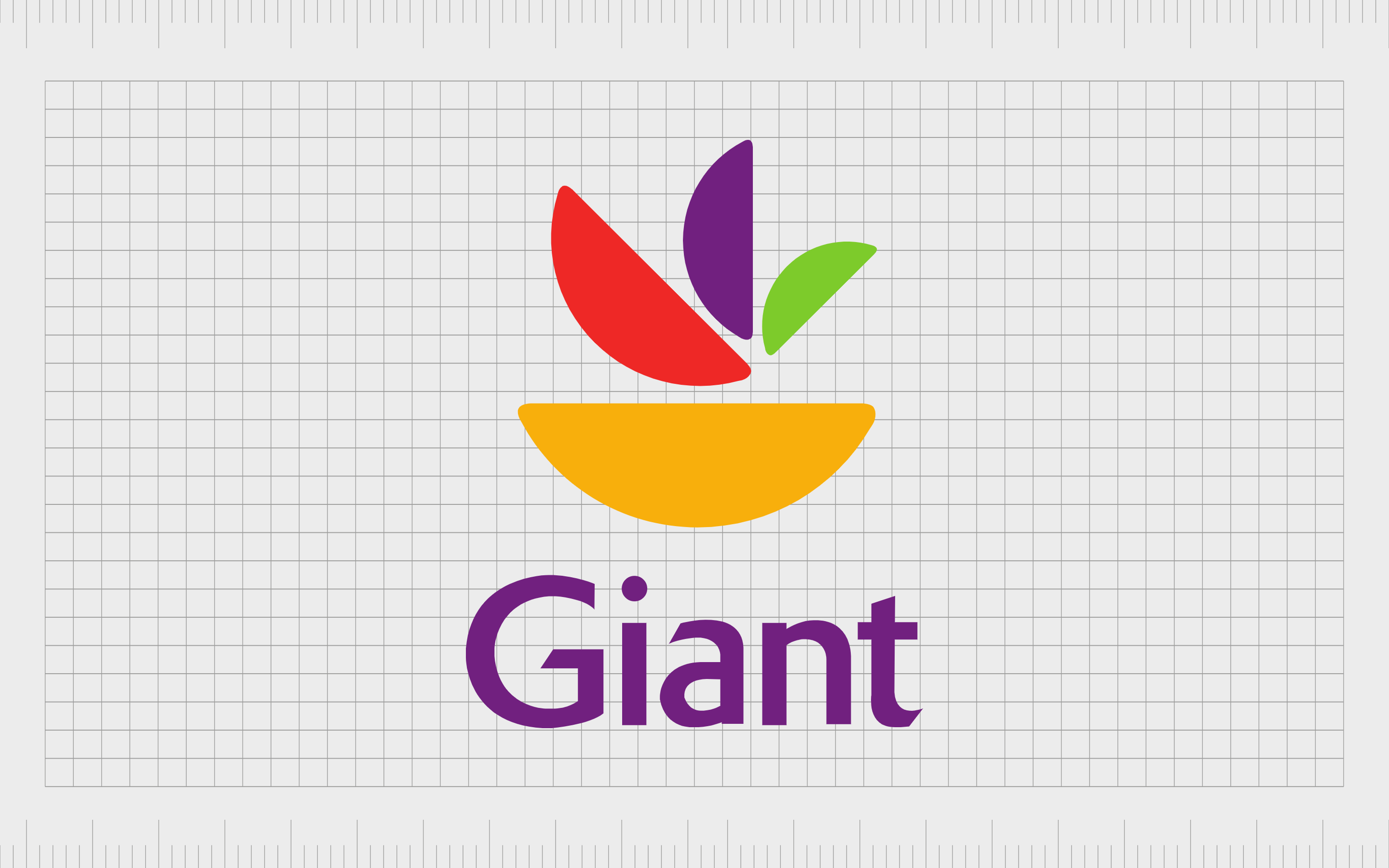
Giant Food
Introduced in 1936, Giant Food of Maryland is an American Supermarket brand with approximately 169 stores throughout the District of Columbia, Delaware, Maryland, and Virginia.
The company is sometimes referred to as Giant-Landover to avoid confusion with the sibling brand: The Giant Company.
Giant’s logo is quite unique compared to the other grocery store logos we’ve seen so far, with a wide range of different colors incorporated into the image. One of the primary colors used here is purple, which is often associated with royalty and luxury.
The image also features an unusual emblem, which looks a little like various segments of fruit.
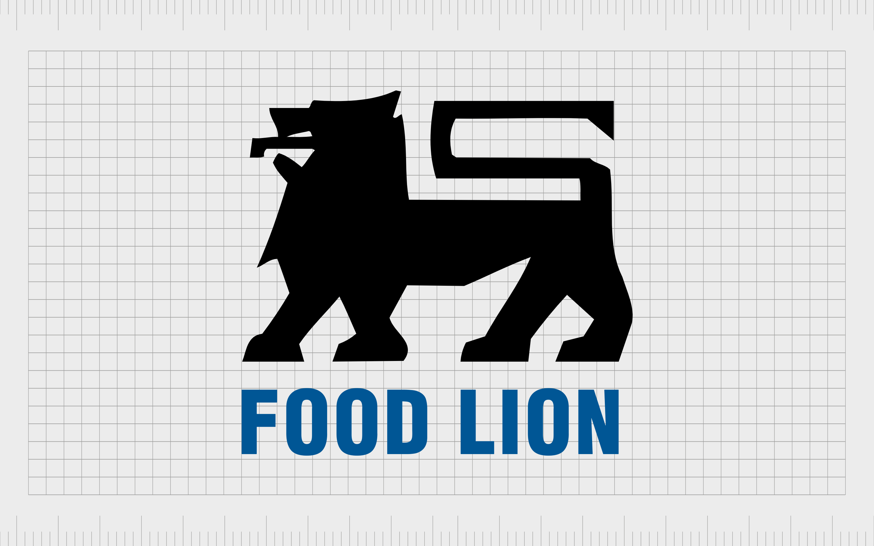
Food Lion
Food Lion is a fantastic grocery store chain in the United States, operating around 1100 stores across 10 states in America. The company was first launched as “Food Town” in 1957, but changed its name as it begun to expand to different regions throughout the country.
The Food Lion logo is an interesting one among grocery brands, as its one of the few to have its own “mascot” character. The Lion image is very similar to some of the designs we’d see from companies in the United Kingdom.
The simple but eye-catching wordmark used to accompany the emblem is depicted in a trustworthy shade of blue.
Learning from grocery store brands and logos
There is no shortage of supermarket logos and grocery store brands to explore across the United States. Each company has its own distinctive identity and personality, often referenced by its use of an engaging and compelling logo.
Hopefully, this guide to American supermarket logos has given you a better idea of how even some of the biggest, and most versatile brands can use an image to connect with their audience.
You can find even more insights into some of the biggest logos from around the world here on the Fabrik Logofile.
Fabrik: A branding agency for our times.

Clarity starts with a conversation.
Thanks—we’ll get back to you shortly.
Whether you're navigating a rebrand, merger, or simply need a clearer identity—we’re here to help. No hard sell, just honest advice from people who know the sector.
Let’s start with a simple question…
Prefer to email? Drop us a line.
Fabrik’s been helping organisations rethink and reshape their brands for over 25 years. We’ve guided companies through mergers, rebrands and new launches. Whatever stage you’re at, we’ll meet you there.