


Tech logos: The most famous technology company logos and names
Technology company logos are everywhere in today’s digitally transforming landscape. As pioneers continue to innovate and new startups emerge, we see countless trendy examples of eye-catching, engaging, and evocative logos and names.
After all, just like most ventures, technology companies are reliant on their brand essence to engage customers, shareholders, and future employees.
In any industry, the right name and logo can instantly strengthen your chances of success. Not only do these assets help to differentiate your business from other existing brands, but they can also send important messages to your audience about your values, personality, and identity.
A good name and logo for tech companies can be particularly important, simply because the current marketplace is so cluttered. Research suggests around 305 million tech startups are introduced each year.
Capturing the attention of potential investors and customers in this space requires an outstanding brand identity.
Today, we will look at some of the most famous technology company logos and names to help inspire budding startups and educate brand experts.
Let’s dive in.
An introduction to tech company logos
How many technology company logos and names can you think of right now? Even if you’re not an enormous tech enthusiast, the chances are a few well-known options come to mind. For example, almost everyone knows the Amazon logo, the Google emblem, and the Apple icon.
While all of these designs are unique to the company they represent, you may notice a few consistencies in the technology landscape. Specifically, most tech company logos are intended to be as modern and streamlined as possible.
Technology companies use their names and logos to connect emotionally with their target audience, highlight the spirit of their brand, and convey a specific personality.
However, they also need their brand identity to tell shareholders, employers, and consumers that they’re on the cutting edge of the industry. As a result, many tech logos have evolved several times over the years, becoming ever more refined and tailored to the tastes of specific audiences.
In the technology space, names are often relatively consistent, but logos are dynamic concepts, capable of growing and evolving alongside the organization.
Some other common characteristics you may notice when examining famous technology company logos include:
Shapes
Many tech company logos focus heavily on geometric shapes like squares, rectangles, triangles, and circles. This is an excellent way for the brands to maintain a simplistic, modern image while connecting emotionally with their audience.
Colors
The colors of many tech company logos are often relatively bright and eye-catching. The tech industry frequently uses colors like black, white, and silver – colors connected with power and innovation. However, brands aren’t afraid to experiment with bright shades.
Versatility
Many tech companies are aware their logos need to be legible and clear in a range of different formats. They need to work in print, digital screens, and smartphones. This is one of the reasons why companies keep logos simple.
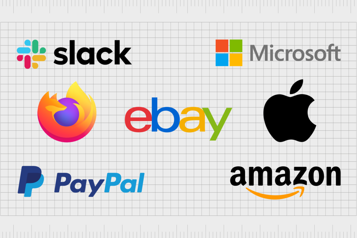
The most famous technology company logos and names
The best way to understand the most famous technology company logos and names is to take a closer look at them. While there are countless amazing tech logos worth mentioning in this list, we will focus exclusively on the most popular, well-known brands.
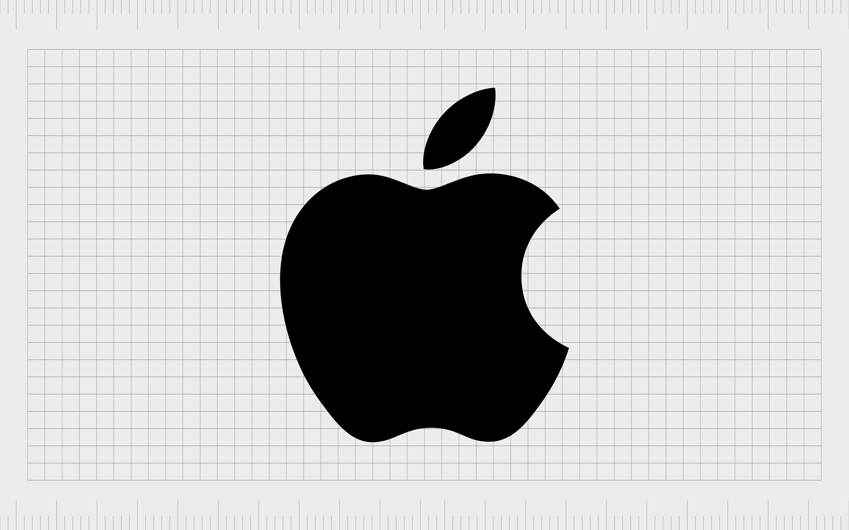
Apple
We can’t have an article talking about famous tech companies without mentioning perhaps the biggest brand of all. Apple is a multinational tech company known for transforming the computing and telecommunications landscape.
Steve Wozniak founded Apple in 1976, and the organization has been evolving ever since.
The name “Apple” is an evocative one, designed to connect the company to growth, nourishment, and innovation ideas. It even links to stories about Adam and Eve and Isaac Newton. The Apple logo, though simplistic, is instantly eye-catching.
The bite mark on the apple makes us think of getting involved and essentially taking a “bite out of life.”
Find out more about the Apple logo here.
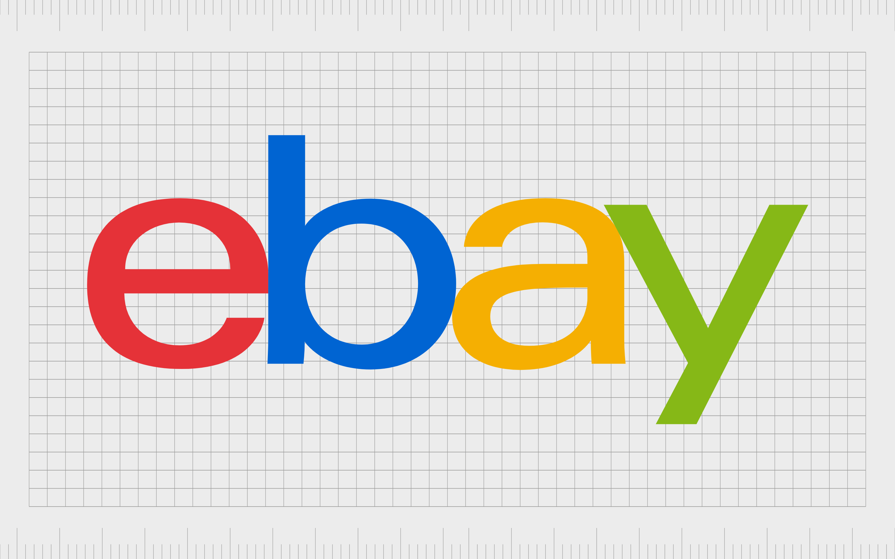
eBay
Launched originally in 1995 as “AuctionWeb,” eBay forever changed how we think about shopping online. It introduced consumers to a way of selling and purchasing items on a peer-to-peer basis, connecting people from around the globe.
Today, eBay is a multi-million-dollar business with operations in more than 32 countries worldwide.
The name eBay was taken from “Echo Bay Technology Group.” The eBay logo was chosen as a bright, eye-catching emblem intended to demonstrate the unique and innovative nature of the brand.
The colorful design reflects the diversity of the business, while the simplistic wordmark tells us the organization is modern and down to earth.
Find out more about the eBay logo here.
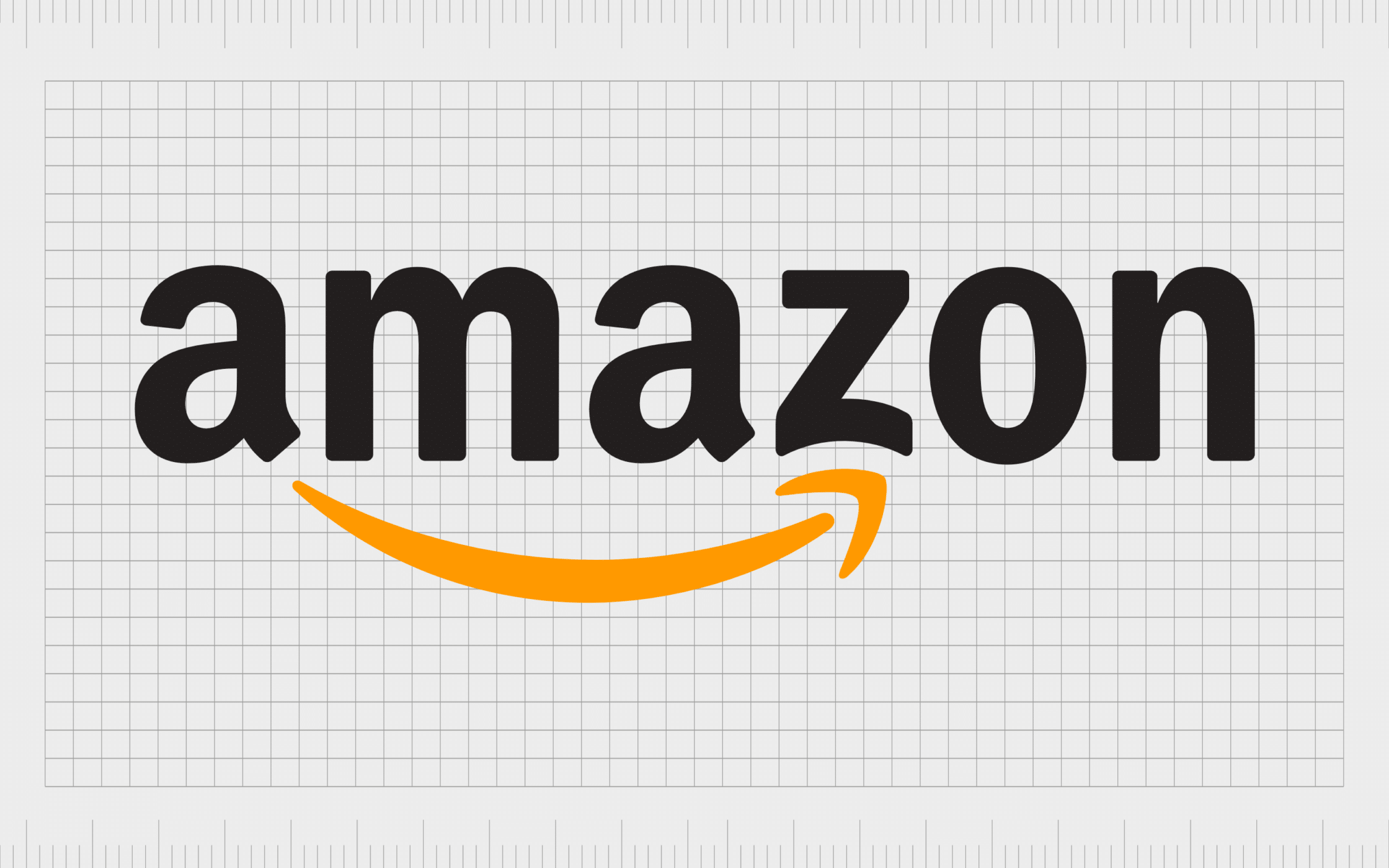
Amazon
Easily one of the best-known tech company logos around, Amazon’s image is famous across the globe. Originally introduced as “Cadabra”, Amazon has emerged as one of the world’s most influential economic and cultural brands.
The name “Amazon” was intended to represent the sheer size and scale of the company, as well as its focus on selling a wide range of products.
Amazon’s logo might seem simplistic initially, but it’s wonderfully meaningful and evocative. The arrow between the “a” and the “z” tells us the brand sells everything “From a to z.” The slightly curved bottom of the “z” also makes the design look a little like a dimpled cheek, smiling.
Find out more about the Amazon logo here.
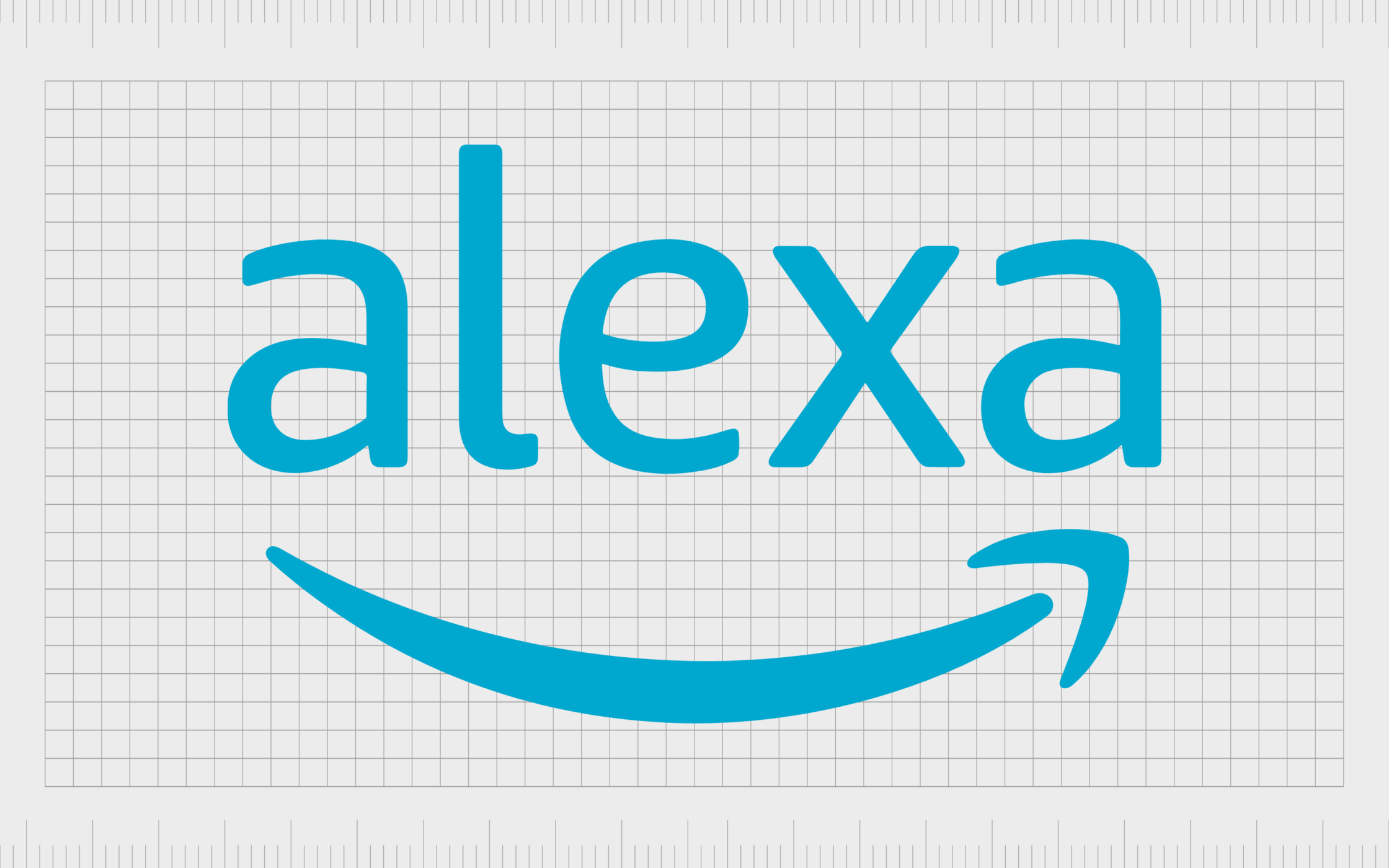
Alexa
Since we’ve already mentioned Amazon in this list, it’s only fair to reference Alexa. Amazon Alexa is a sub-brand of the Amazon company designed to help the brand enter the world of artificial intelligence and virtual assistant technology.
The Alexa algorithms were first used in the Amazon Echo smart speakers and the Echo Dot.
Amazon Alexa has a couple of different logos on display around the world today. One is based on the Amazon logo, with the word “Alexa” in place of Amazon. The other is a unique emblem that features the image of a small white speech bubble inside a blue cloud.
The design in both instances is modern and engaging. The blue coloring conveys trust and reliability.
Find out more about the Alexa logo here.
Samsung
Samsung is one of the world’s biggest technology brands, with a presence in various countries worldwide. After launching in Korea in 1938, Samsung expanded its product portfolio and target audience, becoming the eighth most valuable company worldwide.
Though relatively simple, the Samsung logo today symbolizes strength, stability, and ambition. The powerful wordmark includes unique elements, like the modified “A”, which almost looks like an arrow pointing upwards, indicating a focus on growth.
The deep blue coloring chosen for the logo highlights Samsung brand values, such as reliability and trust, while helping to align the company with the wider technology industry.
Find out more about the Samsung logo here.
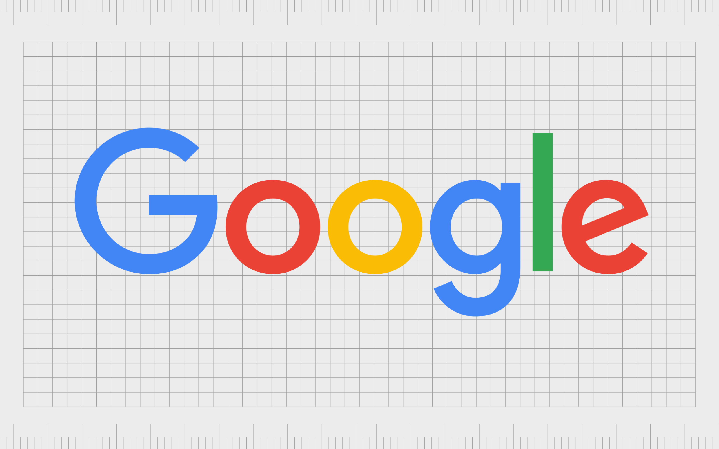
We can’t have a list of the most famous tech logos without mentioning Google. The Google logo is one of the best-known symbols in the world. Plus, it’s fair to say the name of the business is relatively well-known too.
The company chose the name “Google” after an employee’s original idea, “Googol,” was misspelled. The initial name was chosen as a mathematical reference to the scale of the company’s search engine capabilities.
The Google logo as we know it today is a powerful wordmark depicted in a simple sans-serif font. Each color in the logo represents a different aspect of the Google ecosystem.
Notably, Google also allows artists to constantly create variations of its logo about specific major events or national celebrations.
Find out more about the Google logo here.
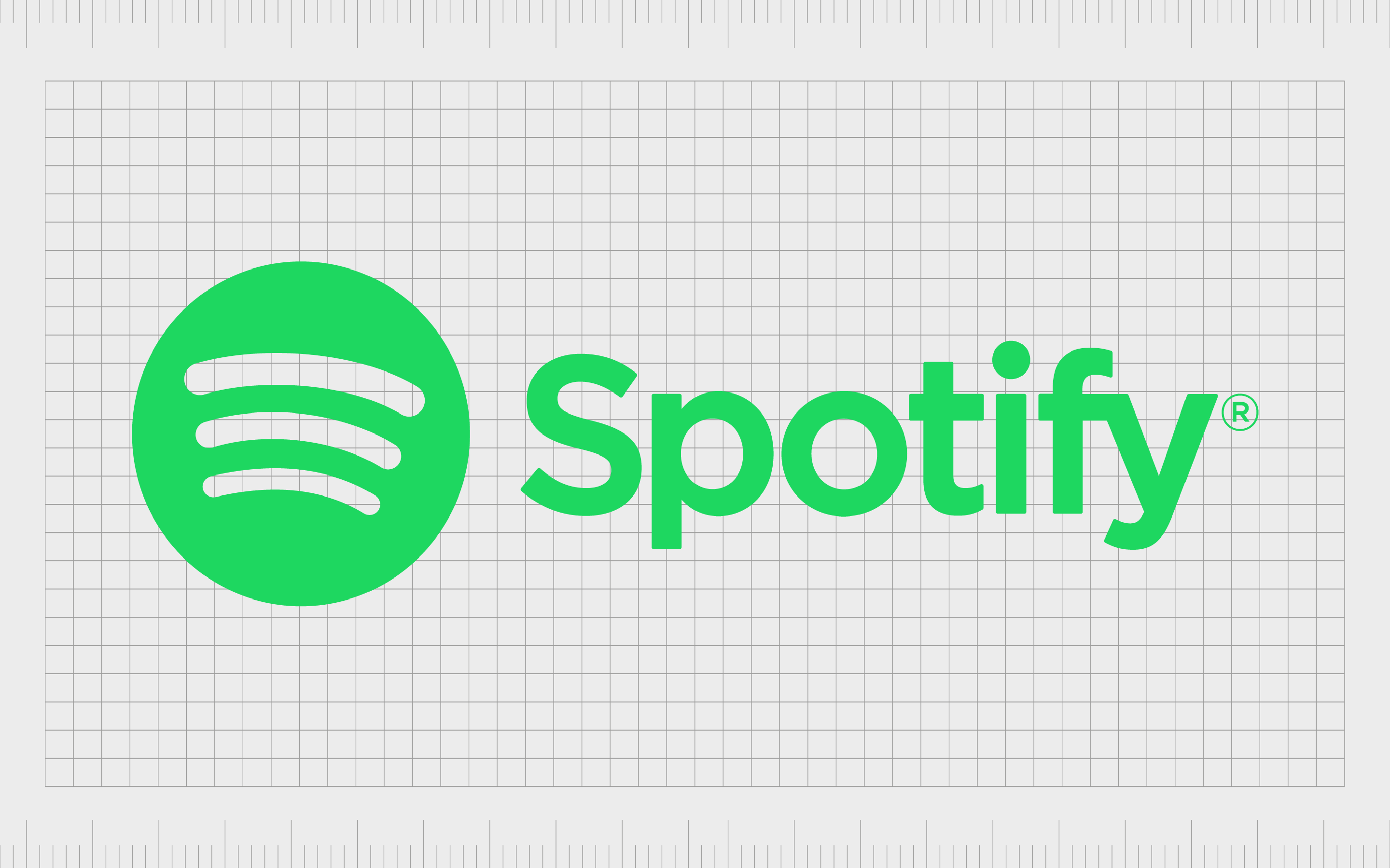
Spotify
If you’re a music lover, then you’re familiar with Spotify. The audio streaming solution was first introduced in 2006 and has been growing ever since.
Today, it’s one of the largest streaming service providers in the world, with nearly 500 million active users. The company’s name is a portmanteau of “Spot” and “Identify,” intended to reference the technology’s ability to help users find new music.
Spotify’s logo is a bright-green and eye-catching combination mark. We see the company’s name on the right-hand side, depicted in a simple sans-serif font. On the left, there’s a green circle with three white, curved lines in the middle, intended to represent sound waves.
Find out more about the Spotify logo here.
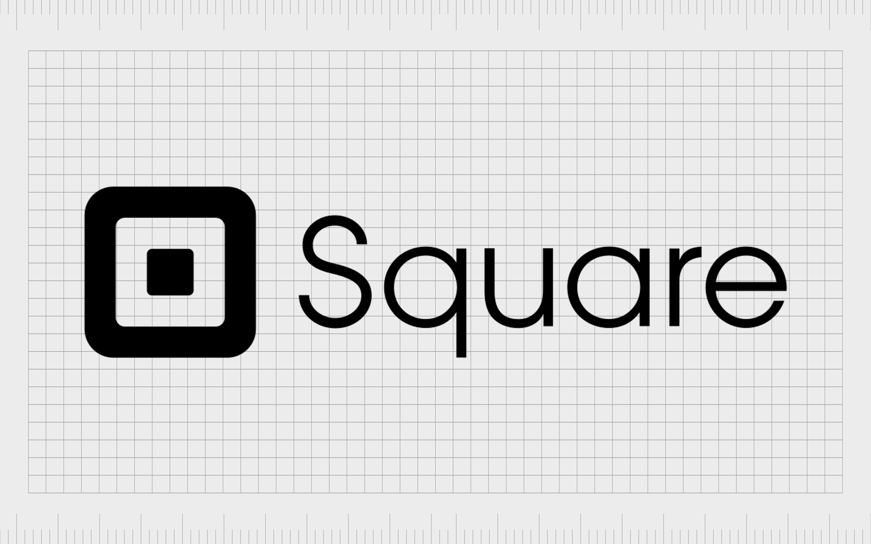
Square
Square is a financial services platform created by Block Inc company.
It was created to assist small and mid-sized businesses with managing credit card payments and other transactions. The company primarily sells point-of-sale solutions to organizations, but it also has a range of other services and software solutions available, such as a website builder.
The name “square” was chosen to associate the company with simplicity, strength, and stability. The design of the company’s logo is based on the name, featuring a multi-layered structure with three squares. The image looks a little like the chip on a credit card, too.
Find out more about the Square logo here.
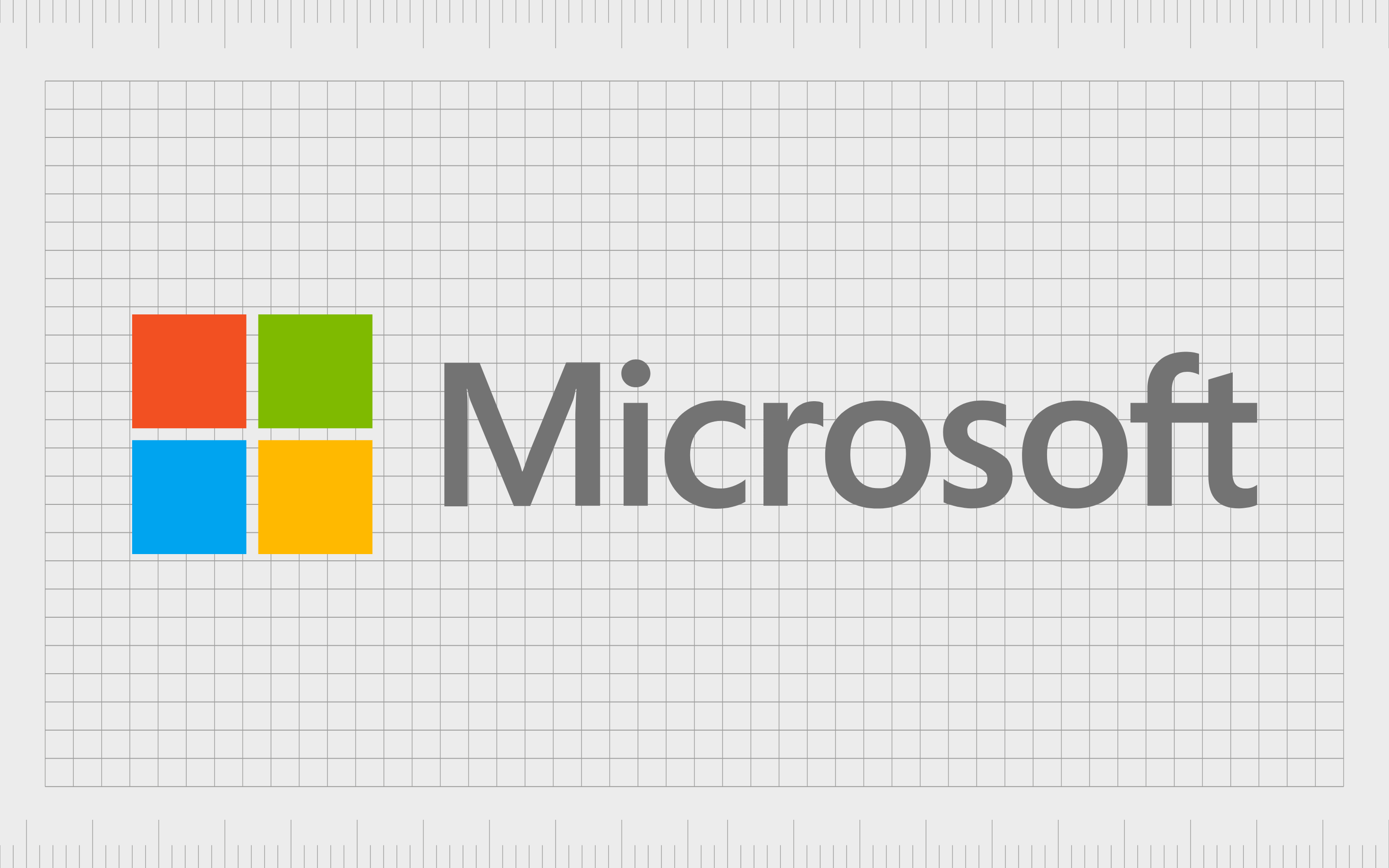
Microsoft
Like Google, Microsoft is one of the core technology companies most people are familiar with today. They’re responsible for producing some of the market’s most popular tools and technologies, from operating systems to game consoles.
The name Microsoft was taken from a letter by Bill Gates to Paul Allen (the two founders) when Gates referred to their partnership as “Micro-Soft.”
Like many tech logos, the Microsoft emblem is simple and modern, featuring a beautiful sans-serif wordmark in soft grey alongside an image of a square. The square not only references the company’s flagship product, Windows, but also the core components of its business today.
Each color stands for a different aspect of the Microsoft ecosystem.
Find out more about the Microsoft logo here.
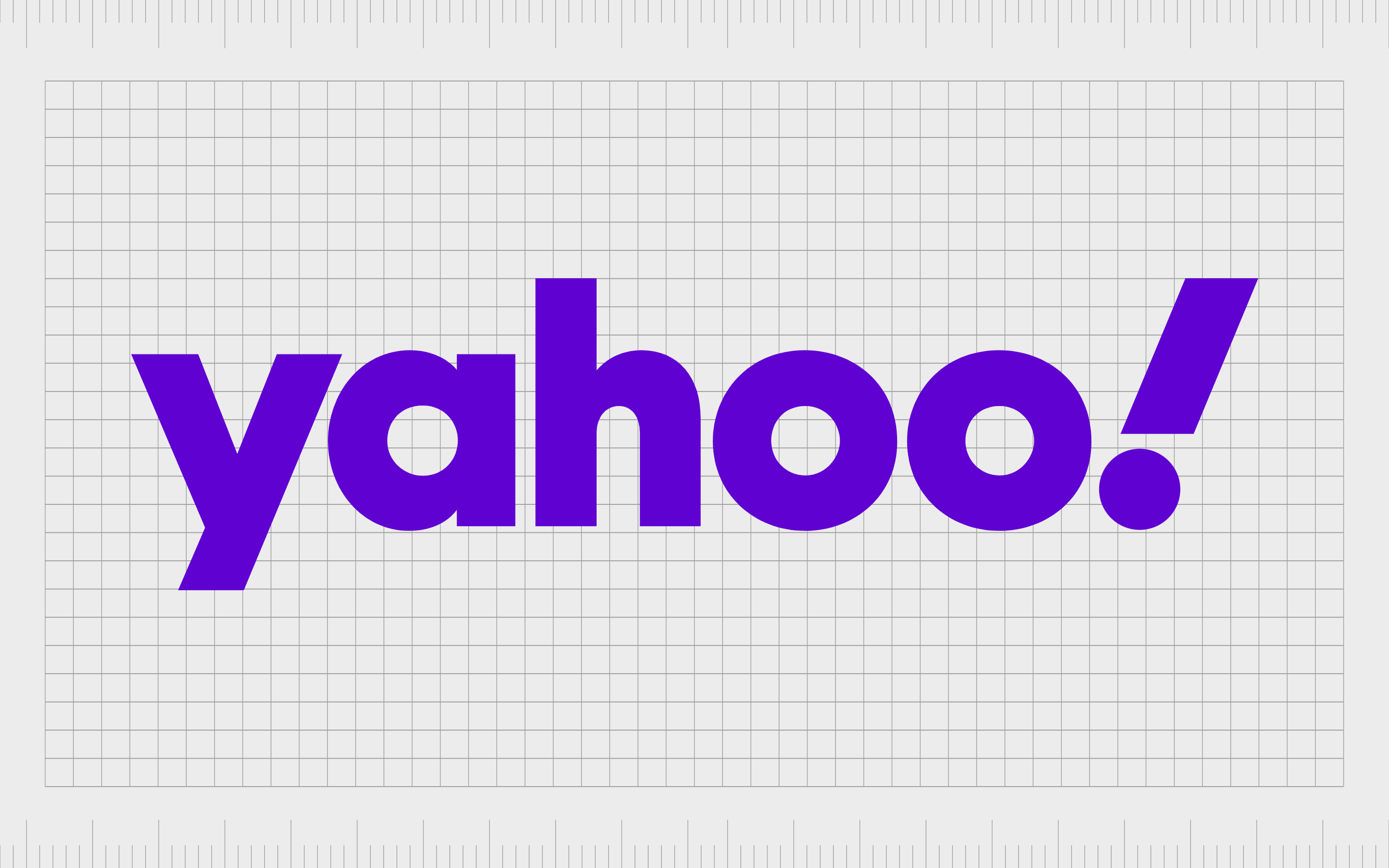
Yahoo
Like many technology company logos, the Yahoo emblem has been simplified over the years, but it still maintains many of the company’s unique personalities. The American web services company is best known for its search engine, email services, and advertising platforms.
Yahoo wanted to be considered a fun and playful brand, hence its unique name. Some people also say Yahoo is an acronym for “Yet Another Hierarchical Officious Oracle.”
The Yahoo logo today is a bright purple wordmark. The sans-serif font is meant to make the company appear fun and modern, particularly with the included exclamation mark, in italics. The color associates the brand with compassion, community, and luxury.
Find out more about the Yahoo logo here.
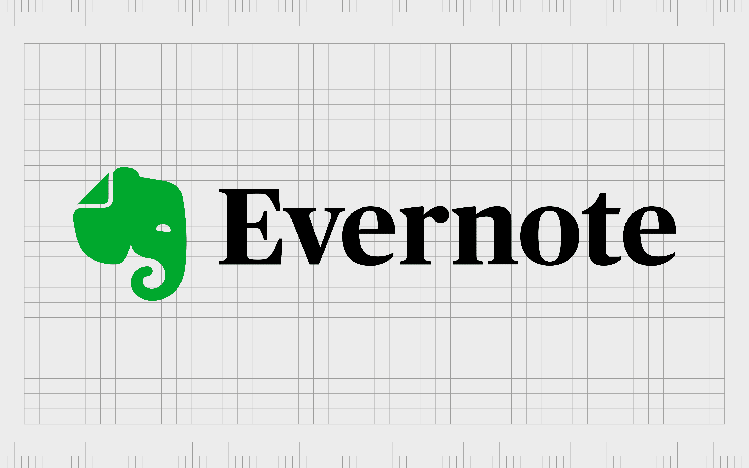
Evernote
A leading note-taking and task management application, Evernote has emerged as one of the better-known names in the technology industry in recent years. The company produces software suitable for various operating systems, making it a popular choice for all kinds of consumers.
The name “Evernote” highlights the company’s focus on helping users keep track of information.
Eye-catching and sophisticated, the Evernote logo combines an elephant image with an attractive serif-style wordmark. The serif typography shows the brand’s professionalism, while the green elephant makes us think of creativity and memory.
The elephant’s ear is also slightly creased, like a page in a book.
Find out more about the Evernote logo here.
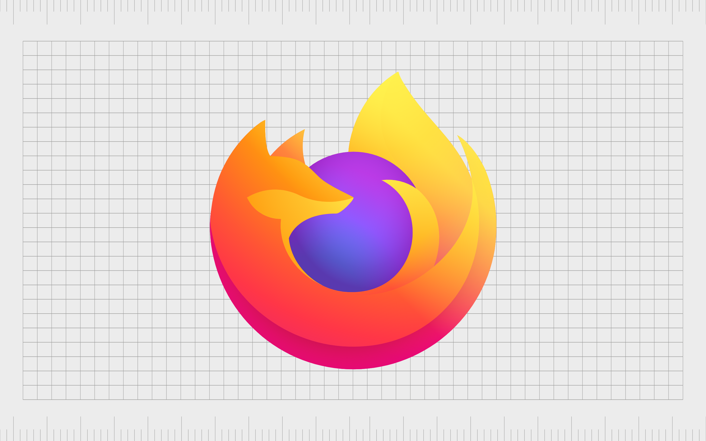
Firefox
Mozilla Firefox, otherwise known simply as “Firefox,” is an open-source web browser created by the Mozilla foundation. Introduced in 2004 as an alternative to the Windows browser, Firefox has quickly captured the attention of the technology landscape.
Initially, the company was named “Phoenix,” but this title was changed to “Firebird” after some trade name issues.
Eventually, the founders decided to opt for “Firefox” instead, referencing the Chinese name for a red panda. The logo of Firefox today combines the image of a fox with a circle, meant to represent the world.
The shape of the fox almost looks like a flame. Overall, the image is evocative, colorful, and easy to remember.
Find out more about the Firefox logo here.

IBM
Otherwise known as the International Business Machines Corporation, IBM is a multinational technology corporation operating in over 175 countries. The organization provides everything from hardware and software to hosting and consulting services.
Unsurprisingly, IBM chose to reduce its name to an acronym to make it easier to remember for today’s consumers.
The IBM logo has changed a few times over the years. Today, it’s an exciting design intended to attract attention and showcase the company’s creative prowess. The lines in the logo grab our attention and prevent the design from becoming just another wordmark.
The blue coloring connects IBM to concepts like credibility and reliability.
Find out more about the IBM logo here.
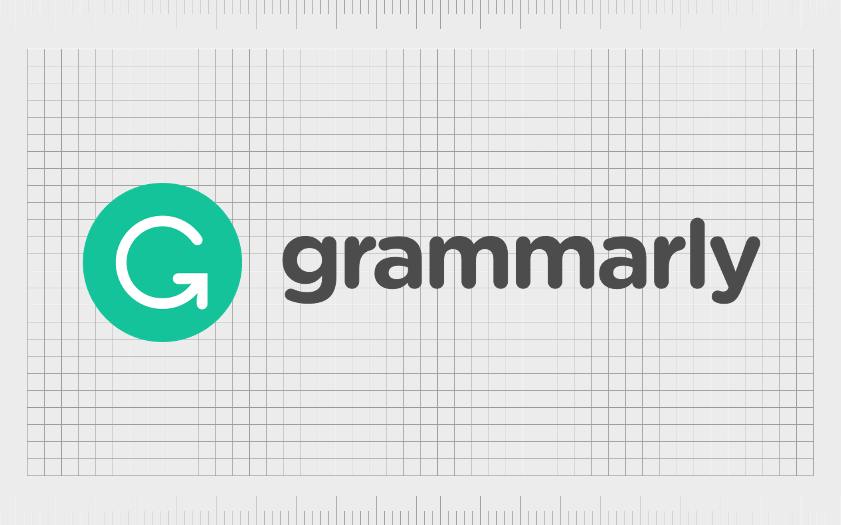
Grammarly
An American cloud-based writing assistant, Grammarly is a tool designed to review spelling, grammar, punctuation, and other writing elements for creatives. It helps to detect plagiarism in content and suggests replacements for errors identified in the text.
The name of the company was chosen to highlight its focus on making “Grammar” easier to master. The name is fun and playful, as well as instantly memorable.
The Grammarly logo is traditionally a green circle with a G in the middle. The G has an arrow pointing upwards on the bottom serif to demonstrate progression and development. Next to the green circle, we also see the company’s name written in a sans-serif font, all lowercase.
The overall image is intended to be friendly and evocative.
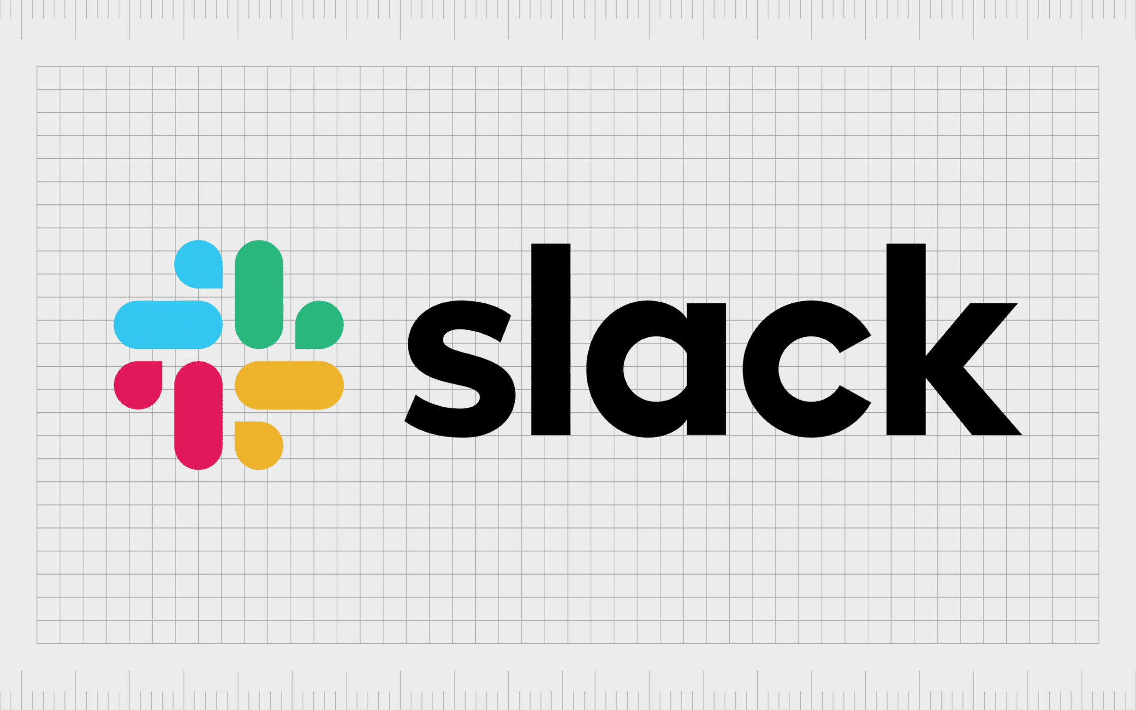
Slack
Perhaps one of the most popular project management tools on the market today, Slack has made a name for itself with its unique technology and abstract tech logo.
Launched in 2013, the name Slack was chosen for the brand as an acronym for “Searchable Log of All Conversation and Knowledge.” It’s also an easily memorably colloquial term.
Like many technology company logos, the Slack emblem is a combination mark featuring a simple sans-serif wordmark alongside a unique graphic. The geometric symbol is intended to look like dashes and quotation marks, symbolizing speech.
The various colors in the logo represent the ability of the technology to bring multiple professionals together.
Find out more about the Slack logo here.
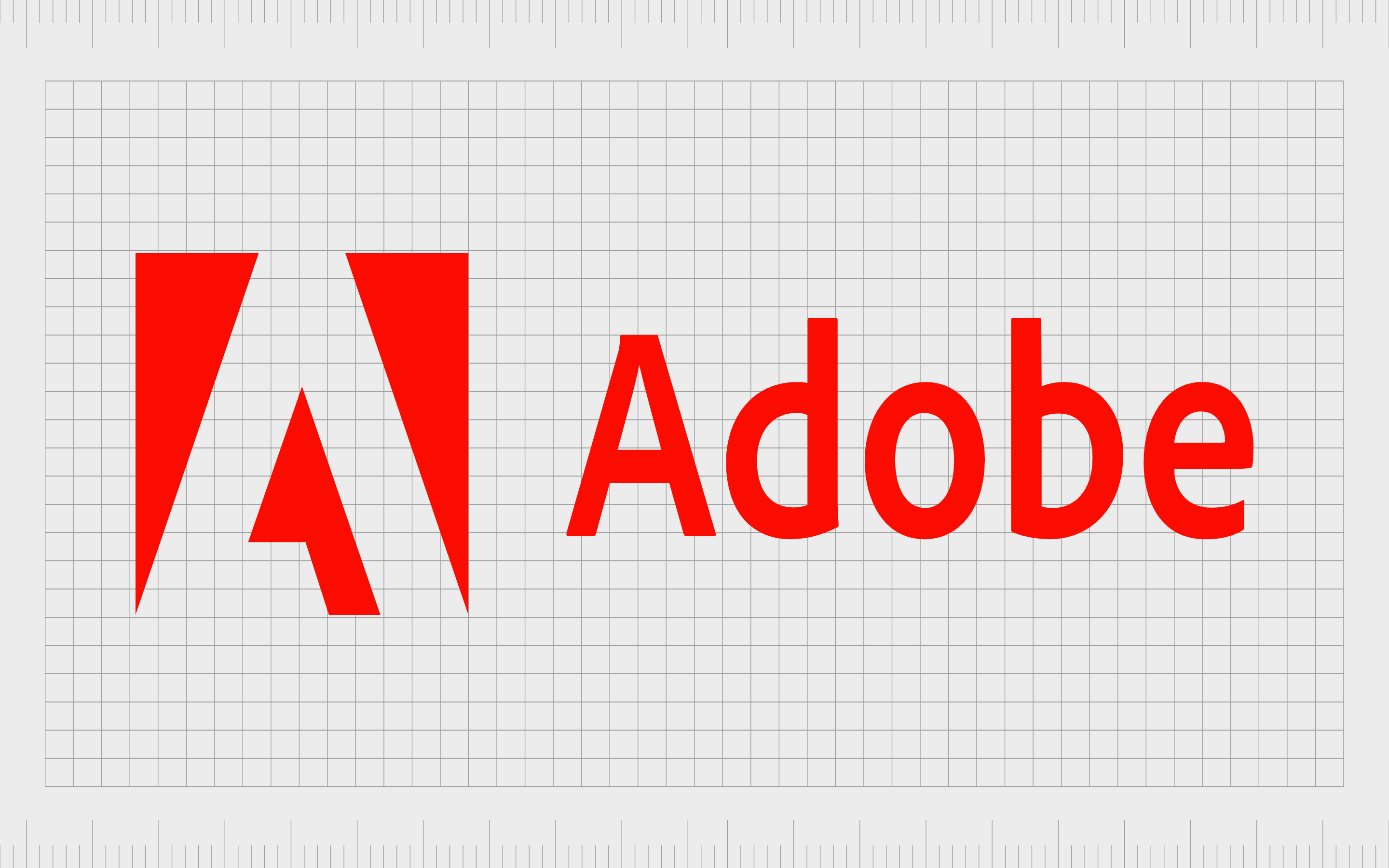
Adobe
If you’re familiar with the graphic design landscape, you’re probably aware of Adobe too. The company was first launched in 1982, as Adobe Systems Incorporated. It specializes in the development of software for the creation and publication of content.
The company’s name comes from Adobe Creek in Los Altos, which ran behind the founder’s house, John Warnock.
The Adobe logo is a bright and eye-catching image, intended to connect the brand with the concepts of passion and creativity.
Alongside a sans-serif wordmark, we can see the shape of an “A” in a red box. The design looks like the cursor on a computer screen, which may be a deliberate choice by the creators to highlight the nature of the brand.
Find out more about the Adobe logo here.

Salesforce
Another leading technology company in the software landscape, Salesforce is best known for creating some of the world’s most popular CRM tools.
The company first launched in 1999 and has since become one of the biggest technology brands in the world. In fact, it was the first cloud computing company ever to reach an annual revenue of $1 billion.
The name “Salesforce” referenced the company’s ability to support sales teams with empowering technology. The logo for the company features the name of the brand, with a slightly italicized “F” to demonstrate forward motion and growth.
The name is surrounded by a blue cloud, highlighting the organization’s focus on cloud technologies and innovation.
Find out more about the Salesforce logo here.
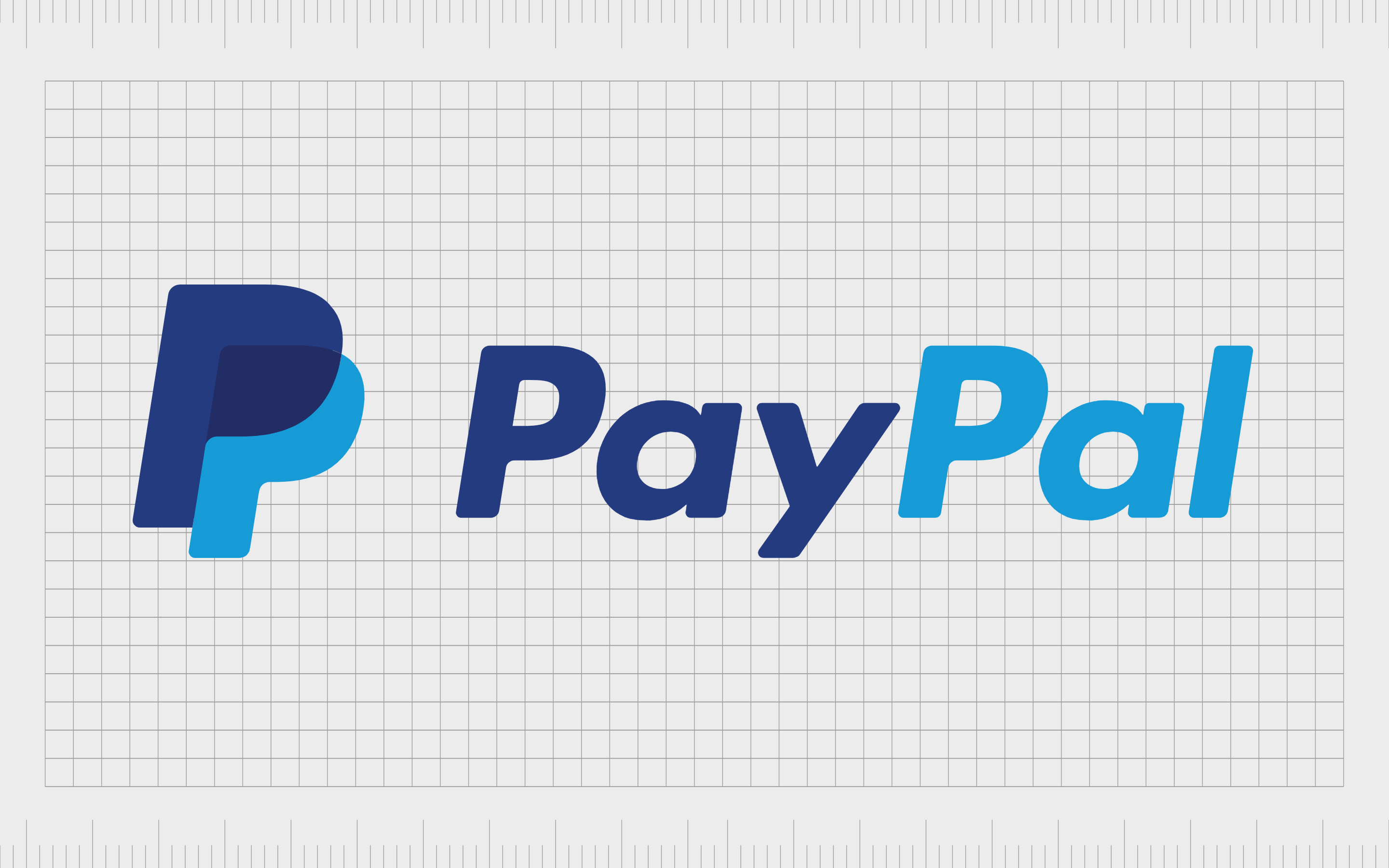
PayPal
PayPal is a financial technology company operating a leading payment system for businesses and consumers worldwide. Virtually everyone in the digital world is familiar with PayPal today.
However, the company initially started with the name Confinity before eventually choosing “PayPal” to help highlight its friendly nature and peer-to-peer payment options.
The PayPal logo is intended to convey ideas of community, reliability, and trust. The color blue is one commonly connected with authority and credibility in the world of color psychology.
The overlapping “P’s” next to the wordmark also reminds us of the company’s focus on bringing people together for simple, convenient transactions.
Find out more about the PayPal logo here.
Tips for designing a tech logo
There’s no one-size-fits-all strategy for designing the ultimate tech logo. The right solution for your business will depend on what kind of identity or personality you want to achieve.
However, by examining the examples above, we can determine some critical steps involved in creating an attractive visual identity.
When you’re designing your own tech logos, remember to:
Choose shapes carefully
Shapes and icons can significantly affect how customers view your company. Even the simplest shape can have underlying meaning in the technology landscape. Squares are often connected with stability and strength, while circles make us think of community and connectivity.
Ensure you understand the emotional impact of each shape used in your design.
Experiment with color
As you can see from the examples above, most technology companies are fearless in experimenting with color. Bright and unique colors can help you to stand out from other competing brands in your space. However, it’s important to remember that each color has its own psychological meaning.
Taking blue as an example, the color is commonly associated with reliability and trust.
Pick fonts carefully
It’s rare for most technology companies to use serif fonts. The ones that do are typically trying to convey sophistication or heritage. For the most part, many tech brands prefer using sans-serif fonts that are easy to read on any screen.
Above all else, make sure your typeface choices offer excellent legibility. Your customers need to be able to read your font no matter how small your logo might be.
Convey meaning
While it might be challenging to tell your customers exactly what your company does with the name and logo of your tech brand, you can give them valuable insight into your identity, values, and vision. Look at options like Evernote and Apple, for example.
The images used instantly tell us everything we need to know about the brand. Think about how you want your logo to make your customers feel.
Stay simple
These days, tech logos are becoming increasingly minimalistic. Part of this is that most companies need to ensure their design will scale across a range of devices and formats. Keeping your design relatively simple should mean it’s also more versatile and flexible. Try to avoid going too in-depth with detail.
Producing unforgettable tech logos
There is no shortage of fantastic technology company logos and names to explore in the world today. As the tech landscape continues to grow phenomenally, we’re constantly being exposed to unique new designs, great for anyone searching for inspiration.
If you need help finding the right technology company logo for your organization, one of the best things you can do is seek out additional help.
A professional logo designer can provide you with guidance and tips to ensure your unique personality and message shines through in the image you create. You can even find professionals capable of helping you with naming too!
Fabrik: A branding agency for our times.
Now read these:
—Top tips for marketing a tech company
—Branding essentials for tech companies
—Your guide to starting a tech business
—How to name a technology company
—Fabrik’s technology branding services

Clarity starts with a conversation.
Thanks—we’ll get back to you shortly.
Whether you're navigating a rebrand, merger, or simply need a clearer identity—we’re here to help. No hard sell, just honest advice from people who know the sector.
Let’s start with a simple question…
Prefer to email? Drop us a line.
Fabrik’s been helping organisations rethink and reshape their brands for over 25 years. We’ve guided companies through mergers, rebrands and new launches. Whatever stage you’re at, we’ll meet you there.