The Square logo history: The evolution of the Square payment logo
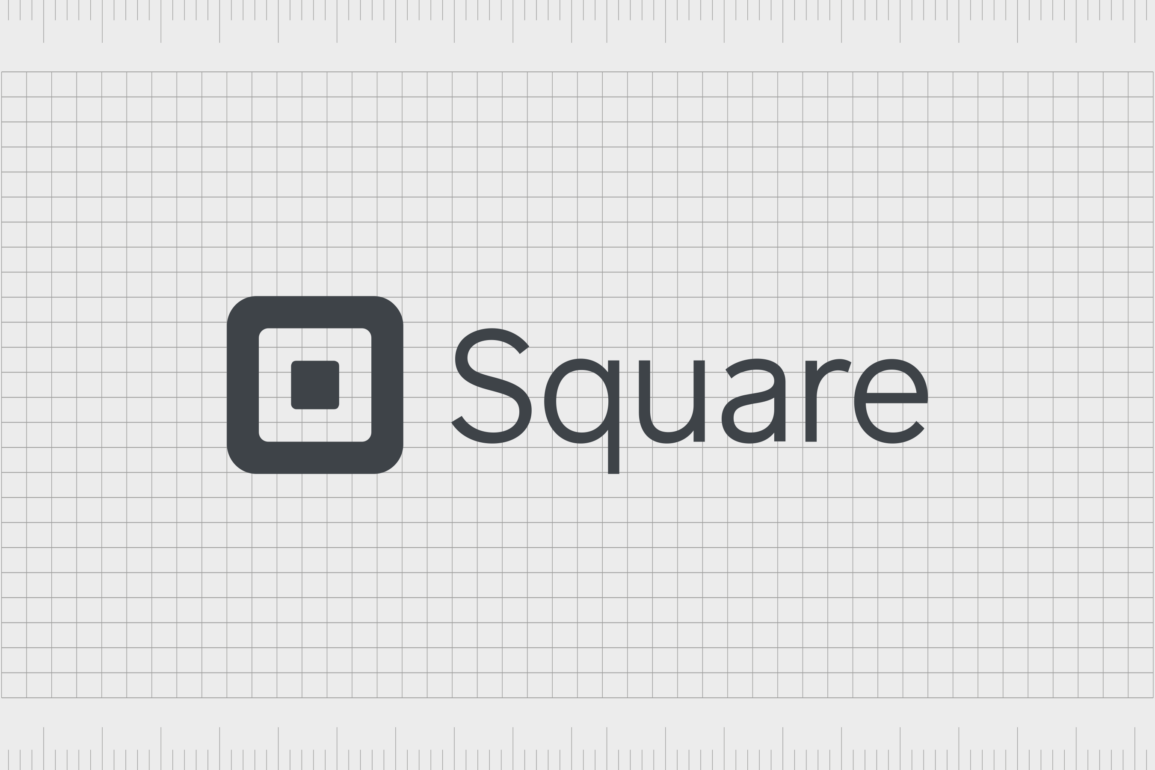
In the financial technology (Fintech) world, few symbols are more recognizable than the Square logo. An excellent example of a minimalistic, yet evocative icon, the Square logo has evolved over the years. However, if we look at Square logo history, we can see the essence of the design, and its geometric elements have remained relatively consistent.
Like many of the world’s most famous technology logos, the SquareUp logo, or Square logo, is straightforward, but eye-catching. The visual identity of the brand today consists of both an icon (the square element), and a combination mark.
If you’ve ever wondered where the unforgettable Square logo came from, or how it has changed over the years to suit the trends of the modern market, you’re in the right place. Here’s your complete guide to Square logo history.
The SquareUp logo: Introducing Square
Let’s begin with an introduction to the Square company. Square is a financial services platform, developed by the “Block, Inc” parent brand. It was created by Jack Dorsey in 2009, when his friend was unable to complete a sale because he couldn’t manage credit card payments.
During 2011, the Square brand announced the release of two tools, a Square Card Case (Square Wallet), and the Square Register. Since then, the Square organization has evolved rapidly, introducing a variety of different tools and resources for companies, including a website builder.
Square even holds partnerships with some of the biggest brands in the world, from Starbucks and the Wholefoods Market, to the Saumitomo Mitsui Card Corporation.
Today, the brand serves customers across the globe with a variety of hardware and software solutions, all focused around financial technology.
Though the organization has faced some controversy in the past, it has emerged as an incredible competitor in its industry, fighting for customer attention against the likes of PayPal.
Square logo history: The evolving Square payment logo
Since it was originally launched in 2009, Square has made a variety of changes to its logo, creating an increasingly modern visual brand. The SquareUp logo, or Square symbol as we know it today takes inspiration from the original design, as well as from the “Block Inc” parent company logo.
2009
Interestingly, Square didn’t use any kind of wordmark with its logo when the first emblem was introduced in 2009. The company kept things simple, like Apple, with a geometric icon featuring a three-dimensional square, or cube.
Though the image looks three-dimensional at a glance, it has no distinctive lines which separate each “face” of the cube.
The original Square logo was depicted in a bright shade of green, a shade commonly associated with growth and wealth. There’s also a white outline of the square in the middle, which inspired the icon for the Square symbol most people are familiar with today.
2011
Only two years after introducing its first logo, Square made a significant change to the brand emblem. The three-dimensional cube was replaced with a simple square outline, with rounded edges.
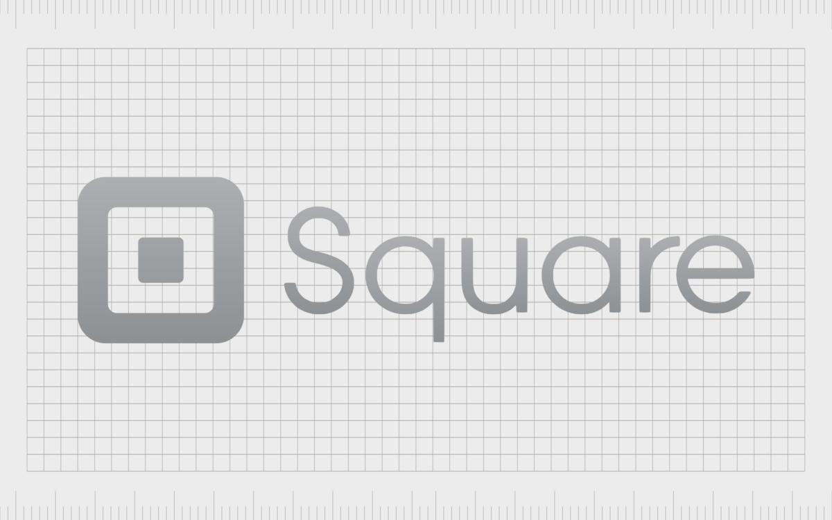
The miniature grey square, matching the surrounding outline, was placed in the center, to give the image a sense of depth, and reference the chip-based card readers used by the brand.
The color palette in this design was altered too, switching from green and white, to white and grey. The image looks somewhat more minimalistic and sophisticated, ideal for a growing technology company. For the first time in 2011, Square also introduced a wordmark to its logo.
The “Square” wordmark, depicted in a simple font with bold curves, appeared alongside the icon, often on the right of the image. The font is similar to the Seconda Soft Light or Rutan Regular font.
2016
Finally, in 2016, Square made a slight update to its secondary logo, refining the font choice and color palette. The core components of the image are still the same, however, the square icon is a little larger on the left-hand side of the image.
Additionally, the wordmark has been made a lot bolder, although the style of the font is similar to the previous design.
Two color palettes were introduced for this new logo. The official emblem uses a simple white and black combination, while other resources use a dark grey color.
The Square logo symbol: Fonts and colors
Like many technology logos, the Square logo is simple, elegant, and powerful. The design used by the brand today highlights the strength and sophistication of the company, with bold geometric shapes, and a custom typeface.
You can find some examples of the SquareUp logo in the resources below:
Officially, the Square logo includes both the icon and the wordmark inscription. However, there are instances where the company uses the Square icon as a standalone asset. For instance, the favicon for the technology brand, used on the company’s website and mobile app, features no inscription.
What color is the Square logo?
The Square logo colors were originally a lot brighter than the ones used by the company today. The brand started with a green color palette, evocative of concepts like wealth and growth. However, as the organization evolved, they decided to switch to a slightly more simplistic design.
The current Square logo color palette is officially black and white. The icon and wordmark appears in black on a white background, although occasionally these shades may be inverted. There’s also a version of the Square logo which utilizes a slightly softer shade of grey, in regions around the world.
What font does the Square logo use?
Originally, Square didn’t use any typeface for its logo at all, relying on its eye-catching geometric icon to connect with customers. However, over time, the brand began experimenting with custom typefaces, to help enhance its image.
The Square logo font hasn’t changed much over the decades, however, there have been some slight refinements to the lines and contours. Originally, the first wordmark used a typeface similar to Avalon Book.
However, today, the inscription looks more similar to Museo Sans Cyrillic 300, or the Aramis SemiLight font. Notably, the official font is unique to the brand.
What is the meaning of the Square logo?
Looking back at Square logo history, we can see the origins of the relatively simplistic, but evocative emblem. Since its inception, the Square company has utilized shape psychology, and simple icons to connect with customers.
The Square logos, both old and new, reflect the name associated with the company, as well as the shape of the company’s card reader.
At a glance, the logo not only reminds us of the Square organization, but it also makes us think of the financial landscape. The multi-layered square icon, in particular, looks like a card reader, or the chip from the back of a credit card.
Fabrik: A branding agency for our times.
Clarity starts with a conversation.
Thanks—we’ll get back to you shortly.
Whether you're navigating a rebrand, merger, or simply need a clearer identity—we’re here to help. No hard sell, just honest advice from people who know the sector.
Let’s start with a simple question…
Prefer to email? Drop us a line.
Fabrik’s been helping organisations rethink and reshape their brands for over 25 years. We’ve guided companies through mergers, rebrands and new launches. Whatever stage you’re at, we’ll meet you there.


