The Firefox logo history: A symbol of evolution

You don’t need to be a tech aficionado to be familiar with the Firefox logo. As the tech company behind one of the most popular internet browsers in the world, Firefox is an instantly recognizable brand. However, a look at Firefox logo history shows a long, ever-evolving branding process.
The Firefox logo has always been an evocative symbol. From the moment the brand first introduced its technology to the world, it has used powerful, emotional, and meaningful imagery.
However, like many technology brands, Firefox has frequently updated its logo, to adhere to new design trends and customer preferences. Over the years, the design has grown more minimalistic and refined, while still retaining it’s creative appeal.
Today, we’re taking a closer look at the transformation of the Firefox brand over the years, examining the various changes made to its distinctive logo. Here’s your guide to Firefox logo history.
The Mozilla Firefox logo: Introducing Firefox
Before we look at the many different designs throughout Firefox logo history, let’s take a moment to get to know the brand. Firefox, or “Mozilla Firefox”, is a free, open-source web browser, designed by the Mozilla Corporation, and Mozilla Foundation.
The Firefox browser began life as an experimental project, launched by Dave Hyatt, Blake Ross, and Joe Hewitt. They believed the Mozilla suite’s software was bloated, and created a standalone browser to replace it. The first version of the browser, known as Mozilla Phoenix, was launched in 2002.
Since then, the Firefox project has gone through several name changes and rebrands. Originally, the browser was named after the mythical bird, the Phoenix. However, the name was changed to “Firebird” in 2003, following a trademark claim from Phoenix Technologies.
Eventually, Firebird became “Firefox” in 2004, a name taken for the nickname of a red panda. Although the red panda became the mascot for the product, the design of the Firefox logo featured a creature closer to a traditional fox, to improve universal recognition.
By 2009, Firefox held around 32.21% of the internet browser share, with 362 million users worldwide. In 2023, its usage numbers dropped slightly, making it the fourth most popular desktop internet browser, behind Google Chrome, Safari, and Microsoft Edge.
Firefox logo history: The Firefox logo evolution
Like many famous logos, the Firefox emblem has grown increasingly simplistic over the years, eliminating unnecessary elements and details. However, it remains one of the most colorful and evocative technology symbols today.
Though components of the Firefox logo have changed, and the mascot has evolved from a bird to a fox, the underlying fiery themes of the design have stayed consistent.
Let’s take a closer look at Firefox logo history.

2002
When the first iteration of the Firefox browser was introduced in 2002, it was given the name “Phoenix”, representative of the mythical bird of rejuvenation. The original Firefox logo showcased this mascot, with bright red and orange coloring, and outspread wings.
The image was bright, friendly, and endearing, and also flexible enough to adapt when the company adjusted its browser name in 2003 to “Firebird”.

2004
In 2003, the Mozilla corporation officially chose the new name “Firefox” for its browser, in reference to the red panda. The “fox” in the accompanying logo does look a little like a panda in some cases, with soft paws, and orange fur.
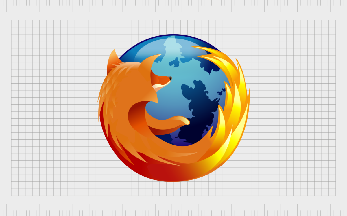
The new logo created by the brand inspired countless iterations in the years to come, featuring a detailed fox curved around a blue sphere, meant to represent the earth. The fox’s tail includes various sharp, pointed shapes, to symbolize flames.

2005
A year later, in 2005, Firefox made some slight changes to its emblem. While the overall shape and components were relatively consistent, the color palette was upgraded, and made brighter. The contrast between the blues and orange shades was a lot more evident here.
The image also appeared a little more three-dimensional, with lighter areas on the globe to symbolize the curve of the sphere.

2009
Firefox continued to make its logo more three-dimensional in 2009, using even brighter gradients in the sphere, and darker colors for the fox mascot. The tail of the fox was also refined, with more details and shadowed sections, making it look fluffier and more realistic.
The new emblem looked glossy and professional, ideal for an evolving technology company.

2013
In 2013, Firefox removed some of the shiny gradients from its emblem, to create a more muted, simplistic logo. The badge looked flatter, but still professional, and beautifully crafted. The elements on the globe, representing countries, were blended heavily into the background.
Many of the accents designed to show fur on the fox’s back were also removed, although the tail remained quite detailed.

2017
2017 marked a significant change in Firefox logo history. The design team removed almost all of the remaining accents and details from the design, focusing on bright colors and gradients to demonstrate creativity and versatility.
The globe’s color, as well as the shades chosen for the fox mascot became much brighter. The tail was also elongated, rising slightly above the fox’s head.

2019
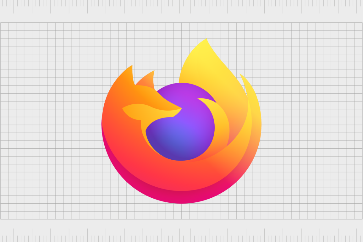
In 2019, Firefox released the most recent version of its logo, based heavily on the previous design. The globe was made slightly smaller, and its blue coloring was replaced by a bright blue and purple gradient. The fox is a lot larger, and seems to encircle the globe perfectly.
The lines of the creature have been softened, and the arm element has disappeared entirely, making the fox shape look more similar to a standard flame.
The Firefox symbol: Fonts and colors
Throughout the years, Firefox has effectively simplified and modernized its logo, to match the trends used by other technology developers. However, while the Firefox logo today has some similarities with the emblems used by other browser companies, it’s still highly distinctive.
Despite choosing the name “firefox” in reference to a red panda, the Mozilla corporation embraced the traditional red fox as the mascot for its company. According to the leaders behind the company, this was because most people didn’t know that a “firefox” was a red panda.
Today, the Firefox symbol is sleek, smooth, and modern. It demonstrates the creativity and passion of the company, and stands out perfectly on a range of devices.
You can find some examples of the Firefox logo here:
What color is the Firefox logo?
Interestingly, while the Firefox logo itself has grown simpler and more minimalistic over the years, the color palette chosen by the company has become more complex. The Firefox logo colors have always been bright and eye-catching, and that’s still the case today.
The new Firefox logo color palette, introduced in 2019, features a number of almost neon shades, and gradients, designed to make the image stand out on any platform.
Mozilla firefox logo color codes:
Electric Purple:
Hex color: #B53AE3
RGB: 181 58 227
CMYK: 20 74 0 11
Pantone: PMS Purple C
Medium Slate Blue:
Hex color: #6A62E7
RGB: 106 98 231
CMYK: 54 58 0 9
Pantone: PMS 2665 C
Royal Purple:
Hex color: #5939AF
RGB: 89 57 175
CMYK: 49 67 0 31
Pantone: PMS 266 C
Corn:
Hex color: #FFED4A
RGB: 255 237 74
CMYK: 0 7 71 0
Pantone: PMS 107 C
Selective Yellow:
Hex color: #FFBA25
RGB: 255 186 37
CMYK: 0 27 85 0
Pantone: PMS 1235 C
Dark Orange:
Hex color: #FF8717
RGB: 255 135 23
CMYK: 0 47 91 0
Pantone: PMS Bright Red C
Dogwood Rose:
Hex color: #E10E68
RGB: 225 14 104
CMYK: 0 94 54 12
Pantone: PMS 1925 C
What font does the Firefox logo use?
Since the inception of the original Firefox browser, Mozilla hasn’t focused heavily on the use of fonts and wordmarks in its logo. There are no inscriptions on the most recent design. However, on the Firefox website, the company does use a simple sans-serif font to advertise its browser.
The transformation of the Firefox icon
Looking back at Firefox logo history, we can see an interesting transformation over the years. Not only has the Mozilla corporation changed its name and logo, but it’s also altered its choice of mascot, to appeal to the widest possible audience.
Today, the Firefox symbol is friendly, colorful, and evocative. It’s a bright and engaging logo, which has also gone onto inspire the designs of logos for various other Firefox products.
With it’s vibrant color palette and memorable mascot, Firefox has effectively differentiated itself from a host of other leading companies in the technology space. While Firefox might not be the most popular web browser today, it may be the one with the most eye-catching logo.
Fabrik: A branding agency for our times.
Clarity starts with a conversation.
Thanks—we’ll get back to you shortly.
Whether you're navigating a rebrand, merger, or simply need a clearer identity—we’re here to help. No hard sell, just honest advice from people who know the sector.
Let’s start with a simple question…
Prefer to email? Drop us a line.
Fabrik’s been helping organisations rethink and reshape their brands for over 25 years. We’ve guided companies through mergers, rebrands and new launches. Whatever stage you’re at, we’ll meet you there.


