Healthcare company logos: The ultimate list of medical healthcare logos

Healthcare company logos can be extremely diverse. After all, dozens of different niche opportunities are built into the healthcare sector. The healthcare logos scattered across this landscape are all intended to serve a unique purpose.
They highlight not just the expertise and services offered by the brand but their unique personality and brand vision too.
Creating a compelling healthcare company logo can be tricky like any branding initiative. With so many competitors in this space, you may find many designs you would automatically choose have already been taken.
Additionally, it’s often challenging to create a design capable of conveying compassion and authority simultaneously.
However, healthcare brands can achieve exceptional results with the right logo design strategy. Your logo is the first thing your customers will evaluate to determine whether they can trust you to care for their wellbeing and specific needs.
Today, we will be looking at some of the most impressive logos of healthcare companies from across the medical landscape.
An introduction to healthcare company logos
Creating the right healthcare company logo is one of the most important steps you’ll take when branding your new organization. Alongside a compelling name, your logo is among the first thing your customers will interact with when encountering your brand.
It should be able to convey crucial information about your services, your personality, and your brand promise.
Although good branding and logo design are important in every industry, they can be particularly crucial for a healthcare brand.
Not only is the competition in the landscape increasing as today’s consumers get older and live longer lives, but healthcare companies are under extreme pressure to make the right impact with their logos.
You need to convince your audience they can trust you with not only delivering expertise but compassion and excellent care, too.
When we consider the fact that 60% of customers say a healthcare brand’s personality influences their purchasing decisions, it’s easy to see why so many brands prioritize logo design.
Knowing how to connect with your audience emotionally through the right image can make all the difference when it comes to generating sales.
The core components of healthcare logos
As you’ll see in the examples of healthcare company logos covered below, there are various ways to convey your identity through the right design. The diversity of the healthcare landscape means the core imagery, colors, and typography you use for your logo may vary from one sector to the next.
Some specific niches are more likely to be associated with specific imagery. For instance, a cardiovascular company may use hearts in its logo or red coloring. A brand focused on holistic health might explore natural colors like green and images from the organic landscape.
While there’s no one-size-fits-all strategy for designing logos for healthcare companies, there are some trends you might want to keep in mind. The best healthcare logos:
Show authority
Consumers want to know they can trust a brand to deliver exceptional expertise and knowledge. A logo with serif-style writing or bolder images can sometimes convey a greater level of authority, strength, and stability.
Demonstrate compassion
Alongside knowledge, your customers want to know you can deliver a personalized level of care. A healthcare logo that demonstrates a commitment to compassion, care, and collaboration can often resonate well with customers.
Share crucial information
Most healthcare companies are designed to provide insight into the nature of the brand. They may include graphics relevant to the niche of the company, or they might include a slogan or tagline for extra information.
Differentiate brands
Although some healthcare companies can share similar components with their competitors in logo design, every emblem should be unique. Examine your competitors before you start to design to ensure your logo stands out.
Reflect personality
While a logo should be informative and descriptive, it should also tell your audience something about the traits of your company. Infusing your logo with personality makes it more likely to resonate with customers emotionally.
Inspiring logos of healthcare companies
Now we’ve covered some of the core components of healthcare logos, it’s time to start exploring some of the best examples on the market. We’ve focused on collecting and evaluating logos from some of the most well-known brands in the industry, as well as some niche competitors.
CVS Health Corp
Starting with perhaps one of the best-known healthcare company logos around, CVS Health is the most profitable health organization in the US. The parent company of a leading pharmaceutical chain, CVS Health is based in America and was launched in 1963.
The company chose a relatively simple but effective design for its logo.
The image consists of the name of the company, “CVS Health,” written on one line in a combination of bold sans-serif font and serif typography. This demonstrates strength, confidence, and authority.
The color red is associated with compassion and vitality, while the heart shape next to the logo demonstrates the company’s caring nature.
Find out more about the CVS Health Corp logo here.
McKesson Corp
McKesson is another well-known healthcare company from the United States. It distributes pharmaceutical, health IT solutions, and medical supplies to care providers across the country. The brand first launched 190 years ago, in 1833, but its image is surprisingly modern.
The McKesson logo keeps things simple with a basic wordmark depicted in a shade of trustworthy, reliable blue. All of the letters are in uppercase except for the “C,” which is positioned above a yellow line. The color yellow is often associated with happiness and joy.
Find out more about the McKesson logo here.
Cardinal Health
One of the largest revenue-generating companies in the healthcare space, Cardinal Health was founded in 1971 and has been growing ever since. It’s best known for distributing medical products and pharmaceuticals across more than 100,000 locations.
Like many healthcare company logos, the Cardinal Health emblem is designed to be as simple and eye-catching as possible. The design combines a unique graphic made up of numerous interlaced red lines, which appear almost like a bird.
The company’s wordmark is depicted in a simple sans-serif font, with the first word written in a bolder weight to grab attention.
Find out more about the Cardinal Health logo here.
Elevance Health
Elevance Health is a health insurance provider from the United States. The company’s services range across medical, dental, behavioral, pharmaceutical, and long-care health support.
Launched in 2004, after the merger of various other healthcare companies, Elevance health is a relatively new addition to the healthcare space with a strong impact on the market.
The company’s compelling logo uses shades of blue to convey concepts of reliability and trustworthiness. The simple sans-serif wordmark appears welcoming and friendly, while the arrow above the “L” helps to remind us of growth and innovation.
Find out more about the Elevance Health logo here.
Bupa
One of the few eye-catching healthcare companies located in the United Kingdom, Bupa, or the British United Provident Association, launched in 1947. The company provides private healthcare and health insurance to customers across the globe.
Similar to a number of leading healthcare company logos, the Bupa design is depicted in blue, the shade we often see as calming and reliable. The name of the company appears towards the top of a blue square in white, sans-serif font.
Underneath this, we see a line intended to look like the reading from a heart monitor.
Find out more about the Bupa logo here.
Centene Corp
A publicly traded managed care company, Centene Corporation was founded in 1984 by Elizabeth Brinn. It commonly serves as an intermediary company for government and privately insured healthcare programs.
The company’s logo is designed to provide customers with peace of mind, using bold and eye-catching typography.
The word “Centene” is depicted in all uppercase, dark blue letters to grab attention and convey the reliable nature of the brand. Underneath, we see the word “Corporation” written in sophisticated, grey font, this time in a serif typeface.
The combined typography presents an image of strength, elegance, and professionalism.
Find out more about the Centene Corporation logo here.
Walgreens Boots Alliance
One of the biggest pharmaceutical companies in the world today, the Walgreens Boots Alliance owns both Walgreens and Boots, two major pharmaceutical brands. The organization was launched only in 2014, but it has become one of the most profitable groups in the healthcare landscape.
The “WBA” company has chosen a combination mark for its logo, featuring the full name of the organization written in sans-serif, blue font.
Alongside this wordmark, we see a circular geometric design made up of numerous lines, intended to represent the connected stores and care solutions delivered to customers across the globe.
Find out more about the Walgreens Boots Alliance logo here.

Johnson & Johnson
Another major multinational corporation based in the United States, Johnson & Johnson, or “J&J,” was founded in 1886 and delivers a range of health solutions to customers worldwide. It’s one of the world’s most valuable companies, with a prime credit rating higher than the US government.
The Johnson & Johnson logo sets the company apart from its competitors with a decorative, cursive font that conveys a sense of elegance and compassion. The color red is used to not only make the business stand out but invoke ideas of vitality and strength.
Find out more about the Johnson & Johnson logo here.

Boston Scientific
Founded in 1979, Boston Scientific, or BSC, is a biomedical and biotechnology engineering firm. It creates a range of medical devices used in a host of medical specialties, from radiology to cardiology and beyond.
Boston Scientific has emerged as one of the most innovative brands in the healthcare space today, and its logo conveys its heritage.
The simple wordmark, set across two lines, is perfectly balanced to demonstrate strength and stability. The serif-style font makes us think of more traditional, authoritative brands. At the same time, the color blue has been used here to demonstrate reliability and credibility.
Find out more about the Boston Scientific logo here.
WebMD
If you’ve ever searched for health information online, you’re probably familiar with WebMD. The American corporation, first launched in 1996, provides news and information online related to health and wellbeing. It’s one of the world’s most popular healthcare websites.
The WebMD logo is modern and eye-catching, despite a lack of decorative elements. The word “Web” appears in a slightly italicized blue font, intended to demonstrate forward motion and reliability. The letters “MD” appear in a bolder, black font to convey strength and security.
Find out more about the WebMD logo here.
Cigna Corp
Launched in 1982, Cigna Corp is a managed healthcare and insurance company serving customers across the United States. The Cigna team provides full-service health maintenance to its consumers and currently ranks at number 12 in the Fortune 500 list of the largest US companies.
Cigna Corp has a wonderfully unique combination mark for a logo.
Alongside a compelling blue wordmark in a sans-serif font, we see a tree design intended to demonstrate growth and vitality. The trunk of the tree with the yellow circle in the middle is also intended to look a little like a person throwing their arms into the air with joy.
Find out more about the Cigna logo here.
HCA Healthcare
Founded in 1968, HCA Healthcare has a presence throughout both the United States and the United Kingdom. The company operates around 2,000 care sites across its network and ranks as one of the biggest companies in the US by revenue. The name means “Hospital Corporation of America.”
HCA Healthcare uses a shade of dark blue in the typography of its logo to convey professionalism and credibility. Alongside the typeface, there’s a cross shape commonly associated with the medical industry. The image is created in orange to show creativity and joy.
Find out more about the HCA Healthcare logo here.
Nuffield Health
Nuffield Health is the largest healthcare charity in the United Kingdom. Launched in 1957, the company operates around 114 fitness and wellbeing centers, as well as 31 hospitals. Its objectives revolve around advancing and maintaining health for people from all walks of life.
Nuffield Health chose the color green for its logo, perhaps to represent its holistic approach to end-to-end care and support. The name of the company is depicted in a white sans-serif font, connected with purity and professionalism.
There’s also a shield emblem with a cross used in this logo to reference its origins in the United Kingdom, and it’s commitment to protecting customers.
Find out more about the Nuffield Health logo here.
Pfizer
Probably best known today for its response to the COVID-19 pandemic, Pfizer is a multinational pharmaceutical and technology company. The brand develops medicines and vaccines for a range of different health conditions and has a huge standing across the United States.
The Pfizer logo is bold and eye-catching. The bright blue coloring demonstrates both reliability and tranquility. The serif font with its rounded edges is both authoritative and welcoming at the same time.
There’s also a geometric shape in the logo made up of two ribbon-style lines intended to look like the elements of a strand of DNA.
Humana
Humana is a for-profit health insurance company based in Kentucky. Launched in 1961, the brand has become one of the most profitable healthcare organizations in the United States. Originally, the company had a different name, known as “Extendicare.”
However, the brand changed the title to Humana to convey its commitment to human-focused support.
The Humana logo is straightforward and simple. The image consists of a single wordmark, depicted in a soft green color to convey health and wellness. The lettering has been carefully balanced to ensure every glyph looks well-aligned.
Find out more about the Humana logo here.
BetterHelp
A leading company in the mental wellness landscape, BetterHelp is an online platform providing mental health services to customers. Online therapy services are offered through phone, text, and web-based messaging.
BetterHelp has one of the most interesting healthcare company logos on our list. The design shown alongside the wordmark features two hands on top of a set of green leaves. This is intended to show an approach to holistic health and community-based care and support.
The green coloring reminds us of growth and vitality, thanks to its link to the natural world.
Quest Diagnostics
An American clinical laboratory from the US, Quest Diagnostics was launched in 1967 and operates across the globe today. The brand maintains collaborative agreements with various clinics and hospitals around the world, offering diagnostic services for a range of chronic and acute diseases.
One of the more modern medical healthcare logos around, the Quest Diagnostic emblem features a large white Q in a green circle. The wordmark for the company is also depicted in green, using a sans-serif font to demonstrate accessibility and friendliness.
Find out more about the Quest Diagnostics logo here.
Eli Lilly
Eli Lilly and Company, known commonly as just “Lilly,” is a pharmaceutical company in the United States, with products sold across 125 countries.
Known most for the development of clinical depression and antipsychotic drugs, the company has become a massive competitor among healthcare companies in recent years.
Lilly’s logo is different from many of the healthcare company logos we’ve looked at so far. It uses a decorative, handwritten-style font to make the company appear more empathetic and compassionate. The color red is also significant here, as it demonstrates a commitment to vitality.
Find out more about the Eli Lilly logo here.
Headspace
Another competitor in the mental wellness landscape, Healthcare is a subsidiary of Headspace Health, launched in 2010. The company mainly operates through an online platform that offers guided meditation support. Headspace was actually founded by a Buddhist Monk.
In the Headspace logo, we see a simple wordmark depicted in a soft grey color to convey professionalism. There are no capital letters used here, which creates a calmer, more welcoming design. Additionally, the use of a bright orange circle reminds us of creativity and joy.
Find out more about the Headspace logo here.
Viatris
Introduced only a short time ago in 2020, Viatris is one of the fastest-growing healthcare companies in the current market. The global pharmaceutical and healthcare company was formed through a merger of two prior companies, Upjohn and Mylan.
The name comes from the Latin word “via,” which means path, and “tris,” which means three.
The Viatris logo, depicted in purple, demonstrates compassion and commitment to community values. The three colors surrounding the globe shape in the design are intended to represent the three core values of the organization.
Find out more about the Viatris logo here.
Danaher
The Danaher Corporation is a globally diversified company responsible for designing, manufacturing, and marketing various medical products. The brand primarily focuses on environmental, life sciences, and diagnostics solutions. The organization is named after Danaher Creek in Montana.
Powerful and effective, the Danaher logo uses all uppercase letters in black to demonstrate strength, stability, and sophistication. Alongside the wordmark, we see a blue shape, intended to look like a “D”, reflected on both sides.
Find out more about the Danaher logo here.
Spire Healthcare
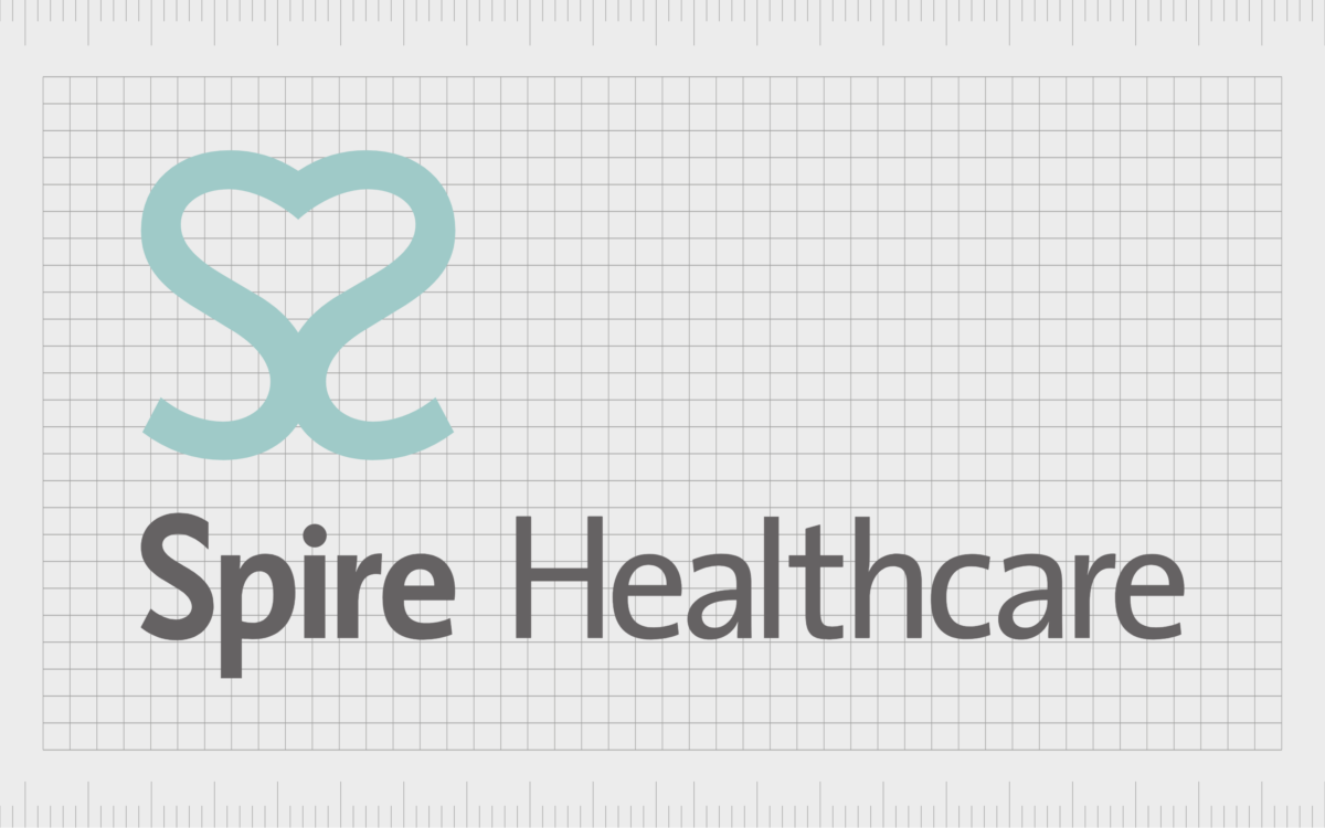
The second largest provider of private health solutions in the United Kingdom, Spire was formed from the sale of Bupa Hospitals to the Cinven brand in 2007. The company is listed on the London Stock Exchange and offers 38 private hospitals throughout the UK.
Spire designed its logo to appear as compassionate and welcoming as possible.
The image in the logo is a heart made up of two light blue “S” shapes connected together. Underneath this image, we see the wordmark for the company, depicted in a sans-serif font, with a slightly bolder typeface used for the word “Spire.”
Find out more about the Spire Healthcare logo here.
Creating your own medical healthcare logos
As you can see from the huge variety of healthcare company logos covered above, there’s no single “right” way to design a medical logo. There are countless amazing designs out there if you’re looking for inspiration, although most focus on conveying core characteristics of authority and compassion.
Through an effective healthcare logo, businesses can ensure they can connect with their audience on an emotional level and generate brand loyalty. If you’re struggling to create your compelling healthcare logo, it might be worth seeking additional support.
A professional branding and logo design company will be able to guide you through choosing the most impactful emblem for your organization.
Fabrik: A branding agency for our times.
Now read these:
—Your guide to starting a healthcare business
—The essential guide to healthcare marketing
—Top healthcare company naming strategies
—Discover Fabrik’s biotech branding services
—Examining the role of branding in healthcare
—Discover our strategic HealthTech services
—How to design a healthcare company logo
—Developing a healthcare marketing strategy
—Explore Fabrik’s healthcare branding services
Clarity starts with a conversation.
Thanks—we’ll get back to you shortly.
Whether you're navigating a rebrand, merger, or simply need a clearer identity—we’re here to help. No hard sell, just honest advice from people who know the sector.
Let’s start with a simple question…
Prefer to email? Drop us a line.
Fabrik’s been helping organisations rethink and reshape their brands for over 25 years. We’ve guided companies through mergers, rebrands and new launches. Whatever stage you’re at, we’ll meet you there.


