WebMD logo history: From health portal to icon

If you’ve ever used Google to search for symptoms of an unknown illness or ailment, you’re probably familiar with the WebMD logo. This icon has become synonymous with the healthcare industry over the years, representing a company that allows consumers to learn more about everything from common conditions to pharmaceuticals. But where did WebMD logo history begin?
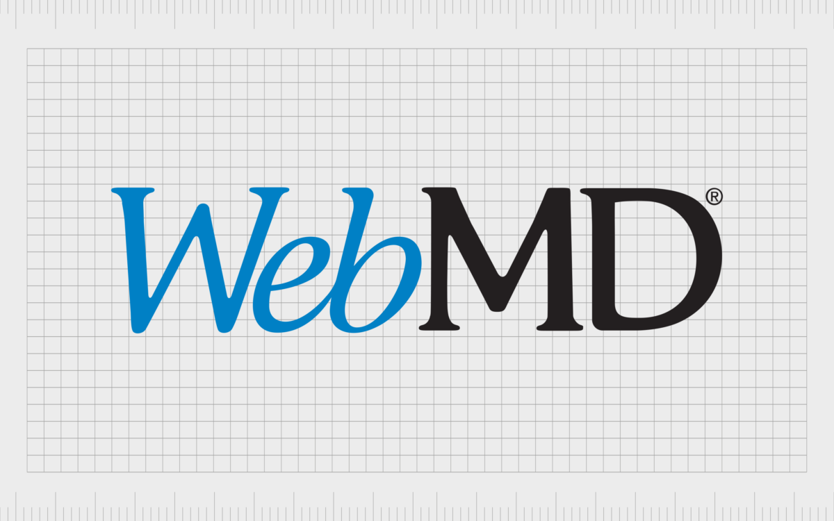
Today, the WebMD logo is probably one of the most recognizable emblems in the online healthcare space. Simple, but effective, this emblem aims to convey the trustworthy nature of the healthcare brand, showcasing reliability, authority, and professionalism.
While there haven’t been many major changes to the WebMD logo over the years, the company has made some slight refinements to its image in the last couple of decades. Today, we’re going to take a closer look at the history and evolution of the WebMD logo, and explore the origins of the brand.
What is WebMD known for? An introduction
Before we begin exploring WebMD logo history, let’s start with an insight into the company itself. WebMD is an American company, primarily known for publishing news and information related to wellbeing, health, and pharmaceuticals.
It’s one of the most popular healthcare websites in the world, with its own symptom checker, and various forms of useful content.
The site was initially founded in 1998, by entrepreneur Jeff Arnold, who built his company as part of a three-way merger between the Healthscape business, Sapient Health Network, and Direct Medical Knowledge.
By 2020, WebMD had developed an entire network of websites, including WebMD Health Services, and WebMD Health Heroes.
At the time, the sites were reaching more unique visitors every month than any other government-funded healthcare website. WebMD became the most popular source of healthcare information in the world, with 229 million page views every month.
Due to its reliance on sponsorship deals, WebMD has faced criticism in the past for directing customers towards certain products.
However, the company remains a popular service provider for consumers around the world today. Alongside the website, WebMD has its own magazine, as well as a professional portal for physicians, known as “Medscape”.
WebMD logo history: The WebMD symbol
Very little information still remains about the WebMD logos that existed on the site before today. The company doesn’t showcase any of its old designs online. However, with a little digging, we can see that the WebMD logo today is slightly different from the one originally introduced in 1999.

The original WebMD logo featured the same basic elements as the emblem we know today, with some slight differences.
For instance, the “W” in “Web” on the wordmark appears to be formed with two overlapping V’s, similar to the style of the “Wikipedia” font. This may have been an intentional decision by the WebMD brand to connect with another well-known source of knowledge.
The “MD” letters are slightly different too, featuring stronger, longer serifs than the characters today, and slightly sharper lines. WebMD still used the blue and black color palette most fans are familiar with now in 1999, but the blue coloring was slightly darker.
In the years that followed, WebMD updated its primary logo, and also utilized a variety of different taglines throughout the years, switching from the “Health has a Homepage” slogan to experiment with other catchy messages.
While the slogan messaging changed frequently, the company introduced a new design for the core logo that would remain consistent for the years to come.

The current official logo features the blue and black color palette of the original design, with a slightly brighter shade of blue. The “Web” typeface has been adapted to a more streamlined serif style font, without the same connotations with the Wikipedia wordmark.
Additionally, the “MD” element has been refined with softer serifs and slightly bolder lines.

Based on this new logo, WebMD produced a variety of additional emblems for its subsidiary sites and services, such as WebMD Health Services, and WebMD Health Heroes. Both of these emblems feature the same primary logo design, in different sizes.
The “Health Heroes” emblem makes the “WebMD” component much smaller, drawing the core focus of the viewer to the name of the service, depicted in all uppercase sans-serif letters.
On the other hand, the “Health Services” logo balances the “WebMD” and “Health Services” almost evenly, side-by-side.
In 2023, WebMD also introduced a brand-new service, called “WebMD Ignite”, which offers a range of healthcare solutions to healthcare organizations. The brand combines services from a range of providers within the WebMD Health Network.

This new service has perhaps the most interesting logo of all. While the style of the “WebMD” component is consistent, it’s now depicted in a single shade of dark blue.
The “Ignite” logo underneath features the same shade of blue, as well as an orange dot above the “I”. On the right-hand side of the emblem, we see a starburst shape, consisting of purple, blue, and green hues.
The WebMD logo: Fonts and colors
The official WebMD logo may not have changed much over the years, but it has gone through some significant refinements, helping the company to enhance and optimize its brand identity.
Like many tech-focused brands, WebMD has focused on modernizing its logo over the years, while ensuring it can be used in a range of formats and sizes on subsidiary solutions.
Today, the WebMD logo is a symbol of reliability and trust. The color palette of blue and white showcases the company’s commitment to building a credible, professional service.
The italics used for “Web” demonstrate forward motion and progression, while the bold letters of “MD” give the emblem a sense of confidence.
You can find some interesting examples of the WebMD logo in the resources here:
What color is the WebMD logo?
The core WebMD logo colors have remained consistent since the inception of the brand. However, there have been slight changes to the shade of blue used by the company over the years. Initially, the brand utilized a relatively deep shade of blue, before switching to something fresh and bright.
The current WebMD logo color palette consists of a bright shade of blue, intended to convey ideas of credibility, trust, and reliability. The black component in the inscription demonstrates the professionalism, and sophistication of the brand.
Nice Blue
Hex: #0070AF
What font does the WebMD logo use?
Initially, the WebMD logo font seemed quite similar in some ways to the typeface used for the current Wikipedia logo. Fortunately, the company chose to differentiate its image by updating its typography in later years.
The font looks a little like Adobe Garamond, with some slight editing to the serifs on the “MD” section to make them look more refined and modern.
The word “Web” is depicted in italic, while the “MD” is potentially conveyed in either regular or bold font. The overall image is sophisticated and somewhat traditional in nature, intended to help build trust with the company’s audience.
A Refreshing emblem: The WebMD icon
Though there haven’t been many significant changes throughout WebMD logo history, looking back through the decades we can see how the company has refined its image to separate itself from the competition.
Today, the WebMD logo stands as an instantly recognizable emblem, capable of working well in a variety of settings and platforms.
With its memorable logo, WebMD tells its audience it’s a trustworthy, credible, and authentic brand, committed to sharing valuable information and insights.
WebMD logo FAQ:
Is WebMD a medical website?
WebMD is technically a health information services website, committed to producing content related to a variety of pharmaceutical, wellbeing, and health-related topics. The site includes access to pharmacy and drug information, symptom checklists, and blogs from physicians.
What source is WebMD?
WebMD is regularly considered to be a source of credible and authoritative information, with news and blog posts based on insightful input from real physicians. However, the company has come under speculation in the past, thanks to its use of sponsorships.
What is the meaning of WebMD?
In the medical world, “MD” simply stands for “Doctor of Medicine”. This suggests the name “WebMD” was chosen to describe the company as a kind of “online doctor” where customers could go to find valuable information, approved by physicians.
Fabrik: A branding agency for our times.
Clarity starts with a conversation.
Thanks—we’ll get back to you shortly.
Whether you're navigating a rebrand, merger, or simply need a clearer identity—we’re here to help. No hard sell, just honest advice from people who know the sector.
Let’s start with a simple question…
Prefer to email? Drop us a line.
Fabrik’s been helping organisations rethink and reshape their brands for over 25 years. We’ve guided companies through mergers, rebrands and new launches. Whatever stage you’re at, we’ll meet you there.


