From the 1940s to today: A guide to Bupa logo history

In the British healthcare landscape, few images are more recognisable the famous Bupa logo. A symbol of care, compassion, and authority, this design has developed over the years, to capture the attention of countless individuals and families worldwide.
Looking back at Bupa logo history, we can garner some interesting insights on the importance of emblem evolution. Today, the Bupa company ranks as one of the best-known and most profitable companies in the healthcare sector, specifically within the UK market.
Like other well-known brands in this industry, the Bupa company has cultivated a strong industry presence, through the use of careful messaging, a compelling visual identity, and exceptional customer care.
To inspire and guide business owners searching for logo inspiration, and to offer behind-the-scenes insights to those interested in design, we’re going to be taking a closer look at the Bupa logo today. Here’s everything you need to know about the company’s origins, and its iconic symbol.
What does Bupa stand for? An introduction
Before we look at Bupa logo history throughout the years, let’s begin with an introduction to the brand. Bupa is a British multinational health insurance and healthcare organization, currently supporting more than 43 million customers worldwide.
If you’ve ever wondered about the name of the company, it’s actually an acronym. Bupa stands for “British United Provident Association”, but the company has always used the shortened version of its name, to create a more memorable identity.
Bupa’s origins began in the UK, where its global headquarters still resides today. However, the organization has evolved drastically since it was first founded in 1947.
The company serves customers in the UK, the United States, Australia, Spain, and many other countries worldwide. Health insurance services currently make up about 71% of Bupa’s revenue, but the company also offers a number of private care facilities, from outpatient clinics to dental services.
The organization was ranked as number 83 on Forbes’ list of the best employers in the world.
Today, the company has focused on building its brand around a dedication to excellent care, promising consumers a level of support and compassion they can rely on.
Bupa logo history: The evolving Bupa symbol
Many aspects of the Bupa visual identity have remained consistent over the years. Exploring Bupa logo history, we can see some recurring themes, such as the use of a blue and white colour palette to symbolize excellence, reliability, and trust.
Additionally, the Bupa company has always used a combination mark as its symbol.
Alongside the name “Bupa”, the brand has consistently utilized a line shape in its logos, intended to represent the heart monitors used in the healthcare space.

1947
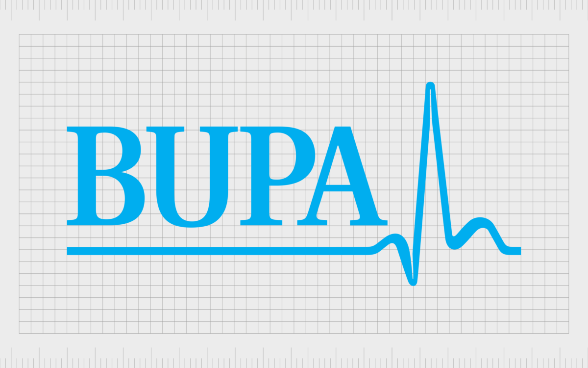
For more than 60 years, Bupa used the same consistent logo in all of its branding. The image featured a light blue wordmark, depicted in all uppercase characters, with a bold, traditional typeface. The serif type was chosen to reflect responsibility and trustworthiness.
The modern emblem also included the famous Bupa heart-rate line symbol, executed in the same shade as the wordmark. The line stretched underneath the inscription, before peaking at the end of the letter “A”.
The design fully reflects the essence and purpose of the company, and its commitment to healthcare, vitality, and wellness.

2009
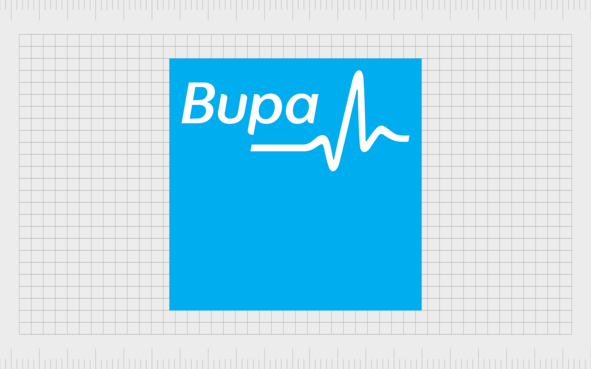
In 2009, Bupa updated its logo for the first time, but retained many of the same elements. The most significant change was to the wordmark, which now appeared in a sans-serif font, in sentence type.
The letters were far friendlier and more modern than those used in the previous inscription, perhaps intended to show Bupa’s compassionate nature.
The wordmark and the accompanying heart-rate line symbol were also switched to a white colour, placed on a large square background. This square featured the light blue colouring most people already associated with the Bupa brand.
Additionally, the heart monitor line in the emblem was made shorter and more dynamic, symbolizing growth and energy.

2022
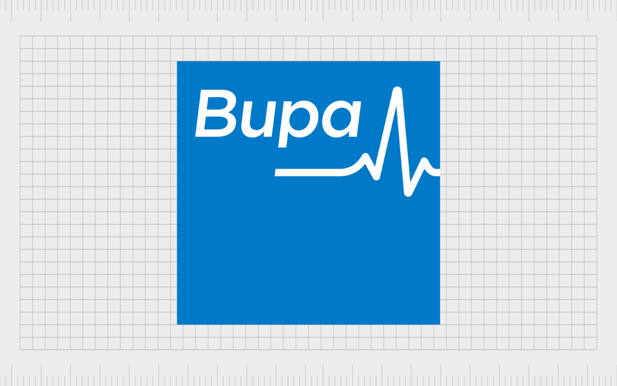
Most recently, in 2022, Bupa made another subtle change to its logo. At a glance, all of the elements of the Bupa symbol remain relatively consistent. The wordmark still appears in a sans-serif font in white, with a sentence case design.
The shorter heart-rate line is still present, although slightly more refined than in the previous instance.
The most significant change to this logo was in the colour palette chosen. Though blue and white still remain the primary colours of the emblem, the tone of blue has been darkened. This may have been a decision made by the Bupa brand to demonstrate sophistication.
The Bupa logo: Fonts and colours
Today, the Bupa logo stands as an instantly recognisable and meaningful emblem in the healthcare industry. Over the years, Bupa’s image has retained a lot of its core elements, from it’s sophisticated and trustworthy colour palette, to the heart-rate line symbol.
However, the design has become somewhat friendlier and more modern with recent refinements.
The blue square component of the Bupa logo is particularly interesting, as it makes the badge a lot blockier and more space-consuming than most healthcare logos. However, a square can also by a symbolic shape in logo design, meant to demonstrate stability and strength.
If you want to see the Bupa logo yourself in closer detail, you can find some useful resources here:
What colour is the Bupa logo?
Although The exact Bupa logo colour palette has evolved somewhat over the years, the company has always retained the same two core shades in its visual identity: white and blue.
White represents the professionalism and authority of the company, as well as a commitment to excellence and purity. On the other hand, blue is often associated with reliability and trust.
The fresh and crisp Bupa logo colours demonstrate the core values of the brand, and were chosen to put the minds of consumers at ease in the healthcare space.
The slightly darker shade of blue used by the company today may have been chosen to make the company’s image seem more authoritative, as darker shades are more commonly connected with professionalism.
What font does the Bupa logo use?
For the majority of the Bupa logo history, the font used by the brand was a serif typeface, featuring all capital letters. However, in recent years, the Bupa logo font has been updated to reflect a friendlier, more approachable identity.
The sleek sans-serif typeface is similar in style to the Volkswagen family of fonts, with distinctive, playful elements within the letters.
The clean lines and rounded shapes of the Bupa custom typeface portray a confident and contemporary company, committed to growth and development. The sentence-case structure also makes the word seem less daunting and domineering.
The powerful Bupa logo today
Though the Bupa logo might seem relatively simple at a glance, it’s an excellent insight into the impact the right colours, shapes, and font choices can have in the logo design world.
The square background of the Bupa symbol symbolizes strength and stability, helping Bupa to earn the trust of its target audience. The sleek sans-serif font is friendly and modern, with playful elements that make the company appear more approachable and innovative.
Finally, the blue and white colour palette used by Bupa throughout the years helps to convey a range of core values for the firm. Blue is associated with trustworthiness, freshness, and reliability, while white is often seen as a colour steeped in authority and elegance.
Fabrik: A branding agency for our times.
Clarity starts with a conversation.
Thanks—we’ll get back to you shortly.
Whether you're navigating a rebrand, merger, or simply need a clearer identity—we’re here to help. No hard sell, just honest advice from people who know the sector.
Let’s start with a simple question…
Prefer to email? Drop us a line.
Fabrik’s been helping organisations rethink and reshape their brands for over 25 years. We’ve guided companies through mergers, rebrands and new launches. Whatever stage you’re at, we’ll meet you there.


