How the BetterHelp logo has shaped its healthcare identity

As people around the world continue to pay closer attention to their mental health and wellbeing, the BetterHelp logo has emerged as a symbol of self-care. Designed to show the compassion of the company, and its commitment to supporting others, the BetterHelp emblem is a modern, yet evocative symbol, packed with deeper meaning. But how much do you know about BetterHelp logo history?
At a glance, it may seem like the BetterHelp company has never really updated its logo. After all, the company is still relatively new, only boasting around 10 years of history in the Psychotherapy space.
However, like many well-known healthcare brands, BetterHelp has refined its visual identity over the years, albeit in a somewhat subtle manner.
Today, we’re going to be providing a behind-the-scenes look at the history of the BetterHelp logo, and how the unique emblem has helped to shape the company’s identity in its industry. Read on for a complete guide to the visual branding of BetterHelp.
What is the meaning of BetterHelp? Introducing BetterHelp
Before we begin looking at BetterHelp logo history, let’s learn a little more about the company, its purpose, and origins. Designed for the digital era, BetterHelp is a modern mental health platform, created to provide online psychotherapy, counselling, and therapeutic support worldwide.
The company specializes in helping people who may otherwise not have access to therapy to seek out counsellors capable of addressing their specific needs.
BetterHelp was initially founded by Danny Bragonier and Alon Matas in 2013, and acquired by Teladoc two years later in 2015. Despite the acquisition, BetterHelp maintained its brand name, and only made a slight change to its logo.
The name “BetterHelp” was intended to be a descriptive moniker for the brand, highlighting not just the company’s therapeutic focus, but its commitment to delivering a more personalized, effective level of care than alternative providers.
What are the BetterHelp allegations?
Although BetterHelp has achieved significant success in the healthcare industry over the last decade, thanks to its innovative approach to counselling, it has become embroiled in a few controversies.
In 2018, for instance, concerns were raised about the company’s “unfair pricing”, and the use of paid reviews from actors for promotion.
BetterHelp also received some backlash after it was suggested the company had shared some personal information about customers with Facebook. In 2023, however, the FTC issued an order preventing BetterHelp from sharing customer data with third parties.
BetterHelp logo history: The evolution of the emblem
Though controversies surrounding the BetterHelp brand have caused issues with its growth in the last couple of years, the company’s branding has helped it to retain a relatively strong reputation.
The visual identity of the company is based on its core mission to make professional therapy more accessible, affordable, and convenient to those who need it.
BetterHelp describes itself as helpful, passionate, and compassionate, concepts which have clearly influenced the design of the company’s emblem throughout BetterHelp logo history.
Notably, there has only been one change to the BetterHelp company’s logo design in the last ten years. Let’s take a closer look at the update.

2013
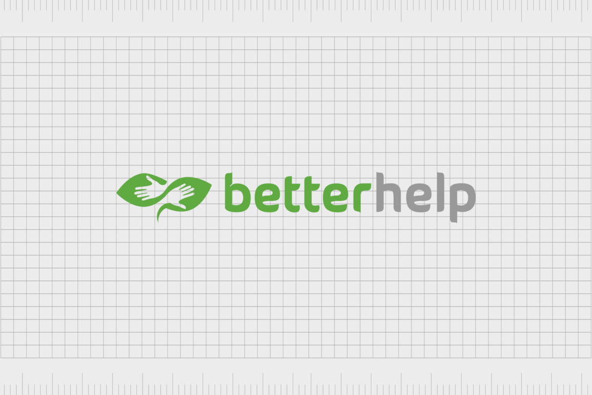
When BetterHelp was first founded in 2013, it utilized evocative imagery and color psychology to create a compelling combination mark. The logo design is split into two distinctive sections: a memorable graphic, and a simple, sans-serif wordmark.
On the top level of the logo, we see the BetterHelp icon, also used as the favicon for the company’s website and mobile app.
The design features an image of two leaves, placed side by side, with human hands formed out of the white space within each shape. The image is intended to convey ideas of community, connectivity, and compassion.
The hand and leaf design not only looks like two people reaching out for help, but the positioning of the leaves and the lines around the hands also creates the image of an embrace.
Underneath this design, we see the BetterHelp inscription, depicted in all lowercase letters, to give the company a friendly and modern appearance.
The word “better” is written in a green shade similar to that on the leaf design, while “help” appears in a dark grey font. The letters are evenly spaced and depicted in a sans-serif typeface, to demonstrate stability, strength, and balance.
2015
While the BetterHelp company retained its name after the sale to Teladoc in 2015, certain elements of the logo were refined and updated. Most of the core components of the design have remained here, from the dual colors in the wordmark, to the leaf and hand design.
However, in this variation of the logo, the leaves in the icon have been made more two-dimensional. The gradients in the previous image have been replaced with a simple block color, in a slightly lighter shade of green.
The typography, which seems almost exactly the same in many ways, has also gone through a couple of changes.
The letters here are a little closer together, making them look more aligned and connected. The color of the word “help” has also been lightened to a softer, silvery grey.
The BetterHelp logo: Fonts and colors
The initial logo created by the BetterHelp team was evocative enough that the new owners in 2015 didn’t see the need to make many significant changes.
BetterHelp already had a memorable visual identity, with its easily recognizable leaf and hand icon, and a unique typography choice. However, the refinements made in 2015 did help the emblem to appear more modern and professional.
Today, the BetterHelp logo more effectively conveys the core values of the company, from compassion and care to connectivity. The color choices symbolize professionalism, purity, and authenticity in the use of white and grey, while the green shade reminds us of nature, growth, health, and generosity.
You can take a closer look at the BetterHelp logo in detail using the resources linked here:
What color is the BetterHelp logo?
Both the BetterHelp logo color palette, and the font choices used by the brand have remained relatively consistent over the years. However, the official shades used in the emblem were simplified when the branding was updated in 2015.
Today, the BetterHelp logo colors feature a combination of white, for excellence, green for health, and grey for sophistication and professionalism.
The shades are deliberately soft and pale, to make the company appear more approachable and friendly. Notably, there are variations of the BetterHelp logo which utilize other colors.
The company’s press kit includes logo variations in black and white, and in a comprehensive dark green shade, intended for different media uses.
What font does the BetterHelp logo use?
The BetterHelp logo font has always been a relatively simplistic sans-serif typeface. The letters of the logo, formed with a unique lowercase humanist typeface, feature soft curves and strong lines, intended to convey ideas of confidence and security.
The exact font is unique to the BetterHelp brand, but it’s similar to the Overpass ExtraBold font, with slightly altered spacing between the letters, and a small flourish on the “b” character.
The growth of the BetterHelp logo
Looking back at BetterHelp logo history, we can see the emblem has only gone through relatively basic and subtle changes in the last ten years.
However, the evocative and emotional nature of the logo when it was originally designed meant the company really didn’t need to make any changes to its visual identity when it changed ownership in 2015.
The subtle changes that were made to the logo simply made the emblem more refined, modern, and powerful, bringing the letters closer together, and simplifying the color palette. Today, the BetterHelp logo is an iconic symbol of compassion, vitality, and generosity in the healthcare space.
Fabrik: A branding agency for our times.
Clarity starts with a conversation.
Thanks—we’ll get back to you shortly.
Whether you're navigating a rebrand, merger, or simply need a clearer identity—we’re here to help. No hard sell, just honest advice from people who know the sector.
Let’s start with a simple question…
Prefer to email? Drop us a line.
Fabrik’s been helping organisations rethink and reshape their brands for over 25 years. We’ve guided companies through mergers, rebrands and new launches. Whatever stage you’re at, we’ll meet you there.


