Picturing care: The history and evolution of the HCA Healthcare logo

The HCA Healthcare logo has become one of the most recognized emblems in the United States over the last few decades. Throughout HCA Healthcare logo history, there have been virtually no changes to the visual identity of the brand. However, variations of the emblem do appear throughout the United States, highlighting the location of each HCA branch.
Like many famous healthcare and medical companies, the HCA brand has effectively expanded its footprint over the years, branching out beyond the US, into locations such as the United Kingdom.
Today, the company runs more than 2,000 sites, promising exceptional care and support to people in need of physician and urgent care.
If you’ve ever wondered about the meaning of the HCA Healthcare logo, or wanted to learn more about the evolution of the brand, you’re in the right place. Today, we’re going to explore the origins, brand identity, and transformation of the HCA Healthcare company.
What does HCA stand for? An introduction to HCA Healthcare
Let’s start with an introduction to the HCA brand, before we dive into HCA Healthcare logo history. Known to many simply as “HCA”, HCA Healthcare is an American healthcare facility operator, first founded in 1968. Its headquarters is based in Nashville, Tennessee.
However, as of 2022, HCA was running more than 186 hospitals, and 2,000 care sites throughout both the US, and the UK.
The name “HCA” stands for “Hospital Corporation of America”. This institution was created in 1968, by a group of founders, including Jack C. Massey, Thomas F. Frist Junior, and Thomas F. Frist Senior.
The founders wanted to create a company that would unify hospitals, helping leading healthcare providers to deliver an exceptional standard of patient-focused care.
During the 70s, HCA went through a period of rapid growth and innovation, investing in a number of mergers and acquisitions, as well as consolidation. By 1981, the company had earned operating revenues of more than $2.4 billion, and this number almost doubled by the end of the decade.
Today, the company is ranked number 62 on the Fortune 500 list of the largest corporations in the United States by revenue.
What is the HCA Healthcare slogan?
Although HCA Healthcare doesn’t use a specific slogan or tagline in its logo, it does have a “motto” driven by its mission and values. According to the company’s website, HCA Healthcare believes “actions speak louder than words.”
The company was built to be patient-focused, and concentrates on delivering a standard of care that highlights the value of human life.
The brand also holds itself to a number of specific value statements, including:
- Ensuring all patients are served with kindness and compassion.
- Affirming the unique and intrinsic worth of each individual.
- Trusting colleagues as valuable members of the healthcare team.
- Acting with honesty, fairness, and integrity.

HCA Healthcare logo history: The enduring logo
Unlike many healthcare companies, HCA Healthcare hasn’t made any significant changes to its logo over the years. Throughout HCA Healthcare logo history, the brand has retained the same core image, color palette, and overall appearance.
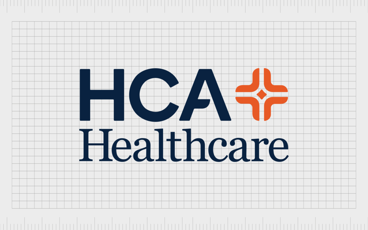
The official logo of the HCA Healthcare brand is similar to many traditional medical logos. The combination mark features two lines of text, as well as a unique “plus sign” icon on the right-hand side. In the logo, we see the name “HCA Healthcare” positioned on the left.
The term “HCA” appears on the top of the emblem, in bold, sans-serif letters. Interestingly, rather than just using a simple sans-serif font in this part of the design, the company has chosen to stylize the “A” in their wordmark.
The horizontal bar has an interesting gap, which helps to make the overall design more memorable and eye-catching.
The second line of the wordmark is dedicated entirely to the word “Healthcare”, written in a contrasting serif-style typeface.
The letters are well-balanced and sophisticated, giving the design a professional, authoritative appearance. The bold serifs demonstrate a commitment to tradition and heritage while almost underlining the elements on the top line of the logo.
Perhaps the most interesting component of the HCA Healthcare logo, however, is the orange “plus” emblem. This showcases the company’s commitment to a higher standard of care, and a focus on unity, inclusion, and patient-focused support.
The orange coloring contrasts well with the dark blue font in the logo, while also highlighting ideas of warmth and creativity.

Interestingly, while HCA hasn’t altered its logo over the years, it has created variations of the design for different parts of the world. In the US, the logo variations tend to include the name of the location for the service provider.
Occasionally, the elements of the logo are also repositioned, placing the orange icon on the left, instead of the right.
In the UK, the HCA company occasionally uses a very different logo, with the letters “HCA” depicted in a serif font, and the “Healthcare UK” component in sans-serif. In the UK, the coloring is also altered, and the orange plus symbol may be removed entirely.
The HCA Healthcare logo: Fonts and colors
Though there haven’t been any major changes to the visual identity of the company throughout HCA Healthcare logo history, examining the organization’s approach to branding offers some unique insights.
The HCA Healthcare team clearly understands how to connect with its audience using the right combination of typography and colors in emblems throughout the world.
Additionally, the organization does an excellent job of differentiating itself from other well-known healthcare providers, while still leveraging universal symbols of authority and professionalism.
Through an adaptable logo, HCA Healthcare has ensured it can reach its audience on an emotional level, building trust, and showcasing its focus on compassionate care.
You can find some great examples of the HCA Healthcare logo in these resources:
What color is the HCA Healthcare logo?
The HCA Healthcare logo colors can vary depending on the location of the company. In the United Kingdom, the brand occasionally utilizes a different color palette, focusing on two different shades of blue.
Throughout the United States, on the other hand, the HCA Healthcare logo color palette consists of a dark blue wordmark, and a contrasting orange icon.
The specific colors include:
HCA Healthcare Orange
HEX: #E05929
RGB: 224, 89, 41
CMYK: 5, 80, 100, 0
Pantone: 7579 C
HCA Healthcare Navy
HEX: #03173E
RGB: 3, 23, 62
CMYK: 100, 85, 45, 50
Pantone: 289 C
What font does the HCA Healthcare logo use?
As noted above, the HCA Healthcare logo font choices are distinctive to the brand. The upper portion of the logo utilizes a sans-serif font, with a stylized “A” featuring a disconnected horizontal bar.
The lower part of the logo, featuring the “Healthcare” component, is depicted in a bold serif font. Both typefaces are specific to the brand.
What is the meaning of the HCA logo?
The HCA Healthcare logo may seem simple at a glance, but it aims to convey significant meaning through the careful use of typography and color.
The color palette symbolizes professionalism and trust with the dark navy coloring in the words. The orange “plus” symbol, with the diamond in the center is intended to highlight ideas of warmth and creativity.
The plus symbol demonstrates a commitment to excellent care, particularly when combined with the diamond shape in the center – a symbol often associated with opulence and luxury.
The typography, which combines a friendly sans-serif font with a traditional serif typeface, demonstrates both sophistication and accessibility at the same time.
Together, all of the components of the HCA Healthcare logo tell us the brand is committed to a higher standard of care, and a patient-centric approach to service.
Fabrik: A branding agency for our times.
Clarity starts with a conversation.
Thanks—we’ll get back to you shortly.
Whether you're navigating a rebrand, merger, or simply need a clearer identity—we’re here to help. No hard sell, just honest advice from people who know the sector.
Let’s start with a simple question…
Prefer to email? Drop us a line.
Fabrik’s been helping organisations rethink and reshape their brands for over 25 years. We’ve guided companies through mergers, rebrands and new launches. Whatever stage you’re at, we’ll meet you there.


