


The ultimate list of famous software company logos and names
There is no shortage of famous software company logos and names to explore in today’s digital market. In recent years, the number of software start-ups and leading brands have skyrocketed, and new players are constantly entering the landscape with ever more innovative tools.
By 2030, the market size of the software landscape is expected to reach around $1,153.75 billion, driven by digital transformation and the acceleration of cloud technologies.
While this growing marketplace presents many opportunities for tech innovators, it also comes with the challenge of increased competition. If you want to stand out, you need the right brand.
While there’s more to great branding than a name and logo, these assets can make a massive difference to your ability to engage and convert customers. After all, your software name and logo are probably the first things your audience will encounter when they look for your solutions.
Today, we will look at some of the most famous software company names and logos to help inspire and educate you for your branding journey.
Software logos: An Introduction to software company logos
There are many great options to explore if you want inspiration to help you name or brand your software company. Most people today will already be familiar with various software brands, ranging from Adobe for graphic design to Zendesk for customer support.
You should notice in the software landscape that both names and logos can be highly versatile. From a naming perspective, companies have experimented with everything from made-up titles like Google to descriptive names (Salesforce) and evocative monikers like Zoom.
On the logo side, software company emblems are often sleek, modern, and stylish. Countless brands have experimented with evocative shapes, geometric components, and mascots; just look at Mailchimp.
While software company logos tend to be relatively straightforward, they can come in a range of different colors and styles.
Perhaps the essential factor for any software company to consider when choosing a logo is versatility. The best emblems need to work well across all devices and platforms. This means most logos won’t be highly detailed or complex.
The top software company logos and names
Just like in any industry, the right software company logos and names are an opportunity for organizations to differentiate themselves from their competitors and connect with audiences on an emotional level.
However, the approach each business takes to branding can be very different. Let’s look at some of the software’s most well-known names and logos.

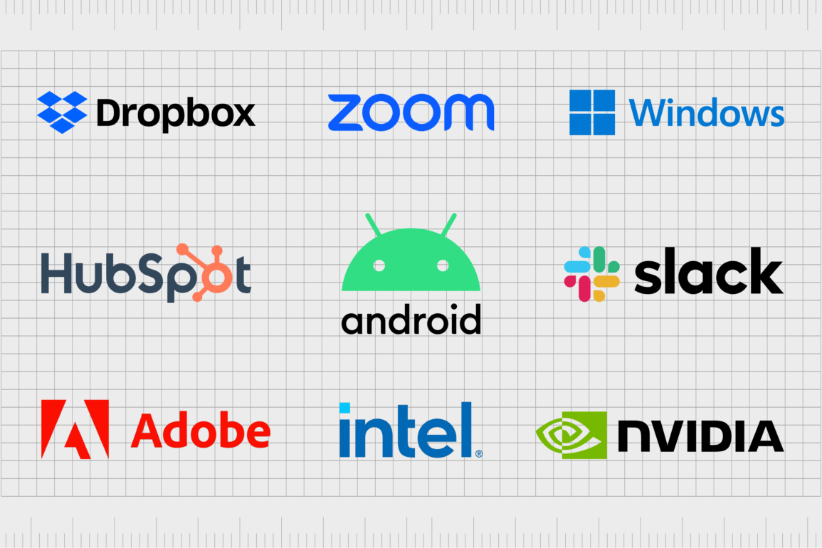
Android
Android is one of the best-known software companies in the world today.
The mobile operating system is based on an open-source platform and the Linux kernel. Founded in 2003, Android chose its name not just as a reference to its futuristic technology but also in a reference to its founder, Andy Rubin, who was given the nickname “Android”.
The Android logo today is an engaging, playful design. On the top of the image, we see the face of the company’s Android mascot peeking out above the company’s name. The simplistic shapes make the company appear more friendly and approachable.
The sans-serif, lowercase font also adds to this personality, highlighting the customer-focused nature of the brand.
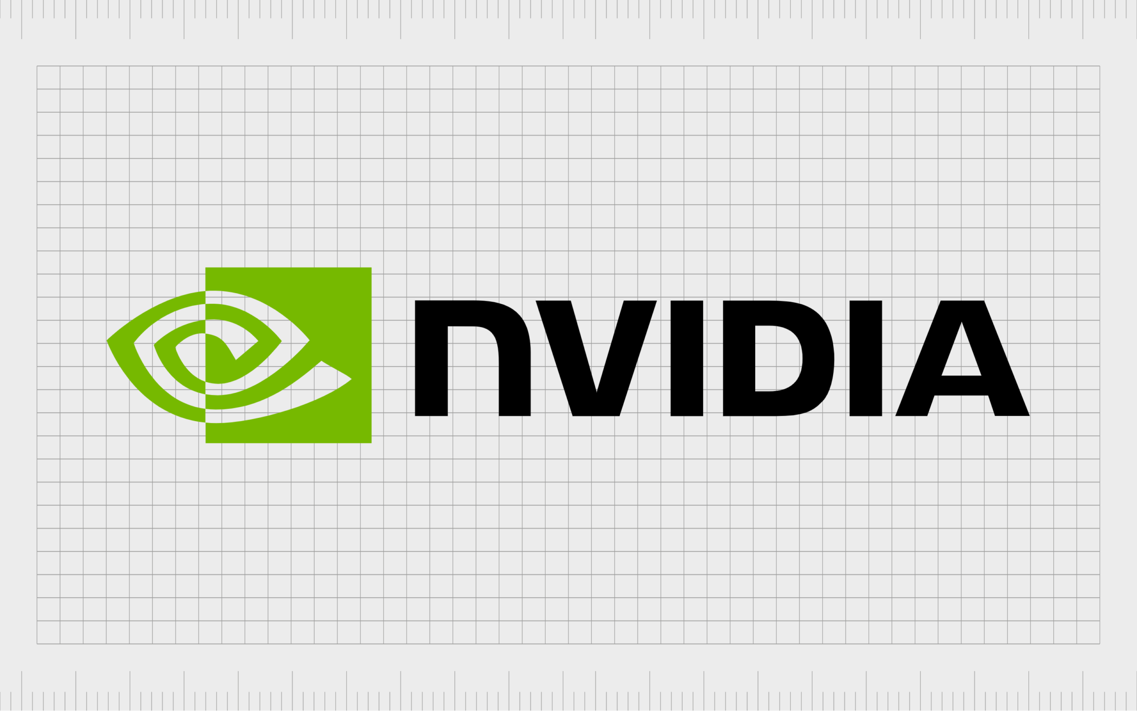
Nvidia
Nvidia is a technology and software company first launched in 1993 by Jensen Huang. The company focuses heavily on the graphics landscape, creating compelling tools that help organizations produce games and other software.
Nvidia’s name has an interesting back story. In part, it’s linked to the fact that all the software developers named their files “NV” for the next version.
The name also comes from the Latin word for envy, “Invidia.” The Nvidia logo is a streamlined and sophisticated green, white, and black emblem. According to the company, the symbol is meant to look like an eye, demonstrating the visual focus of the brand.
The Nvidia wordmark is depicted in all lowercase letters, giving the image a great sense of balance.
Find out more about the Nvidia logo here.

Intuit
If you know anything about the financial landscape, you’re familiar with Intuit. The American software company was launched in 1983 and focused on delivering a range of valuable accounting systems, such as QuickBooks and TurboTax.
It’s also responsible for Credit Karma, Mailchimp, and even Mint, the personal finance app.
The name “Intuit” comes from the word “Intuition,” which tells us the company is focused on helping us to understand our finances and make intelligent decisions. The Intuit logo is a simple wordmark featuring all lowercase blue letters.
While the lowercase font demonstrates accessibility, the blue coloring highlights the reliability and trustworthiness of the brand.
Learn more about he Intuit logo here.

Microsoft Windows
Otherwise known simply as “Windows,” the Microsoft Windows operating system is perhaps the most well-known OS in the world. Windows has a range of different services for customers, servers, and embedded systems, as well as tools for the mobile landscape.
The name “Windows” was chosen to highlight the software’s visibility into technology and tools.
The Microsoft Windows logo is similar to the Microsoft logo, with the same font and overall design. It features a blue block resembling a windowpane and a simple sans-serif wordmark. The blue block in the Microsoft Windows logo can also be found in a section of the Microsoft emblem.
Find out more about the Microsoft Windows logo here.

Norton
A leader in the antivirus and security space, Norton was developed in 1990 by Peter Norton, hence the name. Today, the company produces a line of computer security products, including phishing protection tools and advanced digital security systems.
Initially, the company was named Peter Norton Computing Inc before the title was shortened.
The Norton logo is compelling. Like most software company logos, the design is simple but evocative.
The lowercase sans-serif font makes the company seem friendly and accessible. The symbol of the checkmark in the yellow circle is intended to remind us of safety and preparedness. The yellow coloring also conveys joy and happiness.

SAP
Currently one of the largest software brands in the world, SAP SE is a European multinational brand first launched in 1972. The company develops enterprise software designed to manage customer relations and business operations. In fact, SAP is the world’s largest ERP vendor.
The name SAP stands for “System Analysis and Software Development.” The company shortened the title to make it more streamlined and memorable.
The sap logo features the company’s acronym in bright white letters, all in uppercase, to symbolize strength and credibility. The wordmark is placed on a blue background with a sharp cut to the right-hand side.
Blue is associated with trustworthiness, while the unique shape helps remind us of the brand’s innovative nature.

PayPal
It’s hard to find anyone unfamiliar with the PayPal brand today. The financial technology company was launched in 1998 and provided access to tools for transferring and collecting money online.
Initially, the company’s name was “Confinity” before it was switched to PayPal, a more descriptive and evocative title, which lets us know what the business does.
The PayPal logo is evocative, too, with its blue coloring evoking feelings of trust and credibility.
The two “Ps” in the emblem are overlapped to showcase the peer-to-peer connection capabilities of the software. The image is also highly versatile and is sometimes used without the wordmark for the PayPal app and other brand assets.
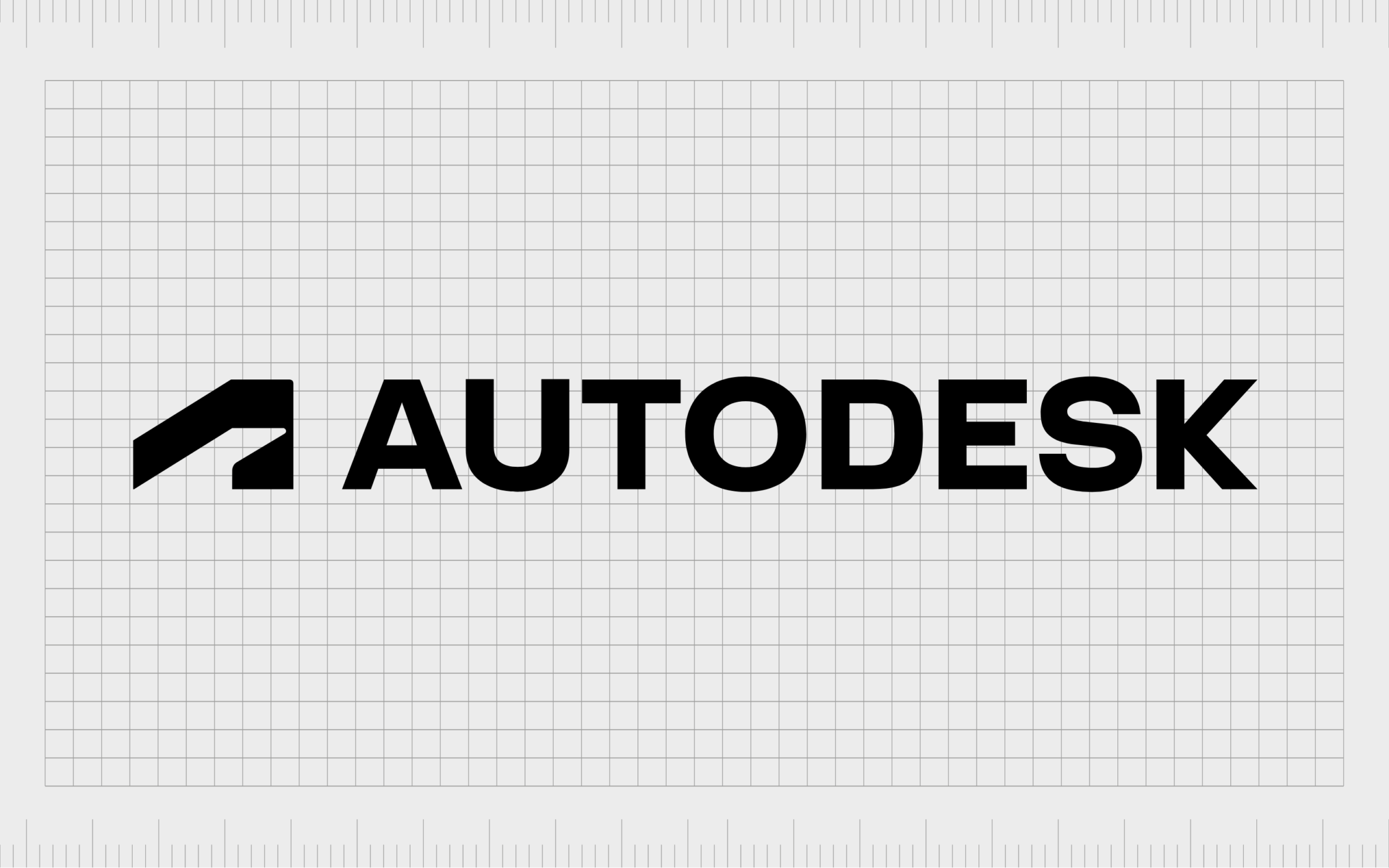
Autodesk
Autodesk is another well-known software corporation that produces services and solutions for various industries. Introduced in 1982 by John Walker, Autodesk was developed as a full brand on the back of a product named AutoCAD.
The name intends to evoke ideas of business productivity and simplicity, with the word “Auto” for automation.
Like many software companies, Autodesk uses a combination mark for its logo.
The image features a wordmark in all capital letters to highlight the strength and confidence of the brand. We also see an “A” shape for the business’s name. It also has a unique geometric shape that resembles a bird or a road.
Find out more about the Autodesk logo here.

Symantec (Gen)
Known for its security software, Symantec had one of the most expensive logos ever created. According to sources, the company spent around $1.28 billion on creating this design, including the featured “Verisign” checkmark.
When the company rebranded to “Gen,” it also changed its entire identity. Gen is meant to reference the next “generation” of software.
The Gen logo is a world apart from the traditional Symantec logo, with no checkmark at all (this was passed over to the Norton team). Instead, we see a simple wordmark, in a blue serif font, with an arrow placed in the G. The arrow tells us about the forward-thinking nature of the brand.
Find out more about the Symantec logo here.
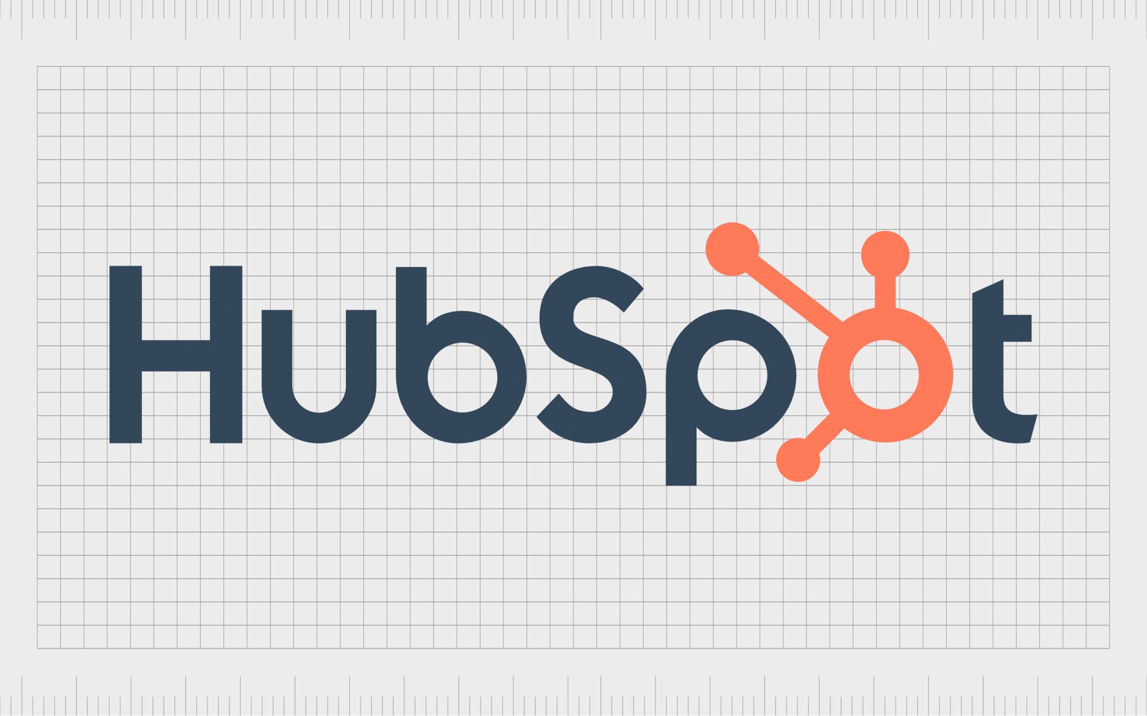
Hubspot
HubSpot is another well-known company in the software space. It has among the industry’s most recognizable software company logos and names.
The name Hubspot is an evocative title intended to remind us of “hubs” or community spaces. Hubspot tells us with its name that we can find a unified environment for all the features we need in its software.
Like many logos of software companies, HubSpot’s emblem is primarily a wordmark with a few decorative elements. The overall wordmark is depicted in grey for sophistication and orange to convey creativity.
The “O” has various branching components, showcasing how the company connects different tools in one “hub.”

Grammarly
Grammarly is a cloud-based typing assistant that helps with everything from grammar to punctuation, clarity, and spelling.
Produced in 2009, the software is one of the most popular tools in the modern world and even has dedicated applications for different desktop programs and browsers. “Grammarly” is simply a reference to the word “Grammar.”
The Grammarly logo, like many software emblems, is simple and effective. It conveys the company’s name in a sans-serif, grey font, making it appear sleek and sophisticated. The green circle with the “G” in it includes an arrow pointing upwards to symbolize progress.

Adobe
Otherwise known as Adobe Systems Inc, Adobe is among the biggest software companies in the world. It produces a range of software solutions for everything from graphics editing to photo configuration and illustration.
The core product offered by Adobe today is its Creative cloud platform. The word Adobe is taken from a building material used to construct houses.
The Adobe logo is a bright red combination mark, which combines the brand’s name with a unique emblem designed to look like a stylized “A”. The emblem also seems like an arrow pointing upwards, symbolizing the company’s focus on the future and innovation.
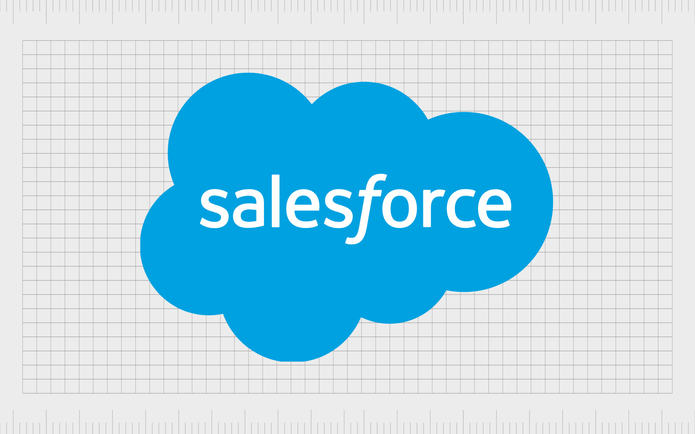
Salesforce
Considered to be the producer of the world’s most popular CRM, Salesforce has quite a reputation in the software landscape. Salesforce is the 61st largest company in the world and one of the biggest tech brands worldwide.
The name “Salesforce” is an evocative title intended to remind us of the sales professionals who use the software and the platform’s power.
Like many software company logos, the Salesforce logo is simple and clean. There’s a wordmark written in white, with an angled “F” to convey movement. The wordmark is encased in a blue cloud, demonstrating the company’s cloud focus.

VMware
Launched in 1998, VMware is a cloud computing and virtualization company with a fantastic reputation. It was the first successful brand to virtualize the x86 architecture.
Today, VMWare is owned by Broadcom, who purchased the company for $61 billion. The name “VMware” comes from the words “software” and “virtual machines.”
The VMWare logo is sleek and compelling. The grey wordmark is written in all lowercase, sans-serif font, with the front two letters in bold. These characters also blend together, drawing attention to the brand’s connectivity capabilities.
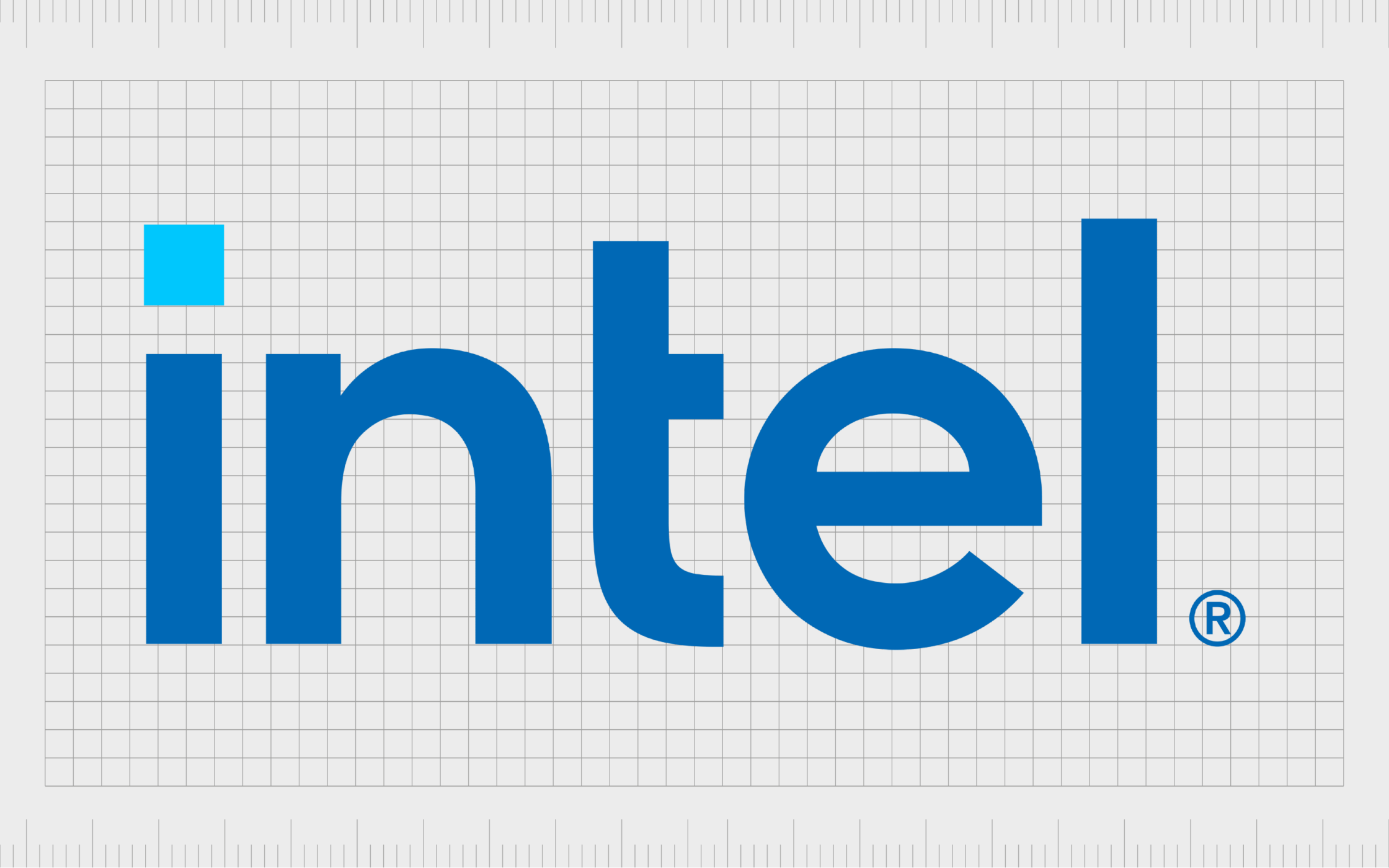
Intel
Known for producing semiconductor chips and software, the Intel corporation has dramatically impacted the technology landscape. Intel delivers various software solutions for all kinds of operating systems and critical hardware.
The name “Intel” was drawn from the word “Intelligent” or “Intellect.”
Intel has one of the most straightforward software company logos and names in the marketplace, but that doesn’t make it less compelling. The wordmark conveys the reliability and credibility of the company with shades of blue.
The light blue dot above the “I” also draws attention to the Intel chip manufacturing landscape.
Find out more about the Intel logo here.

Oracle
The Oracle corporation is another market leader in the software space, making it a great addition to our list of the top software company logos and names.
By 2020, the company was the third-largest software company in the world, best-known for its database systems, enterprise products, and cloud-engineered technology.
The name Oracle is intended to reference the name of a person capable of seeing into the future, highlighting the company’s focus on vision and innovation. The Oracle emblem is a bold wordmark written in bright red, with stretched-out and sharpened letters.
Find out more about the Oracle logo here.
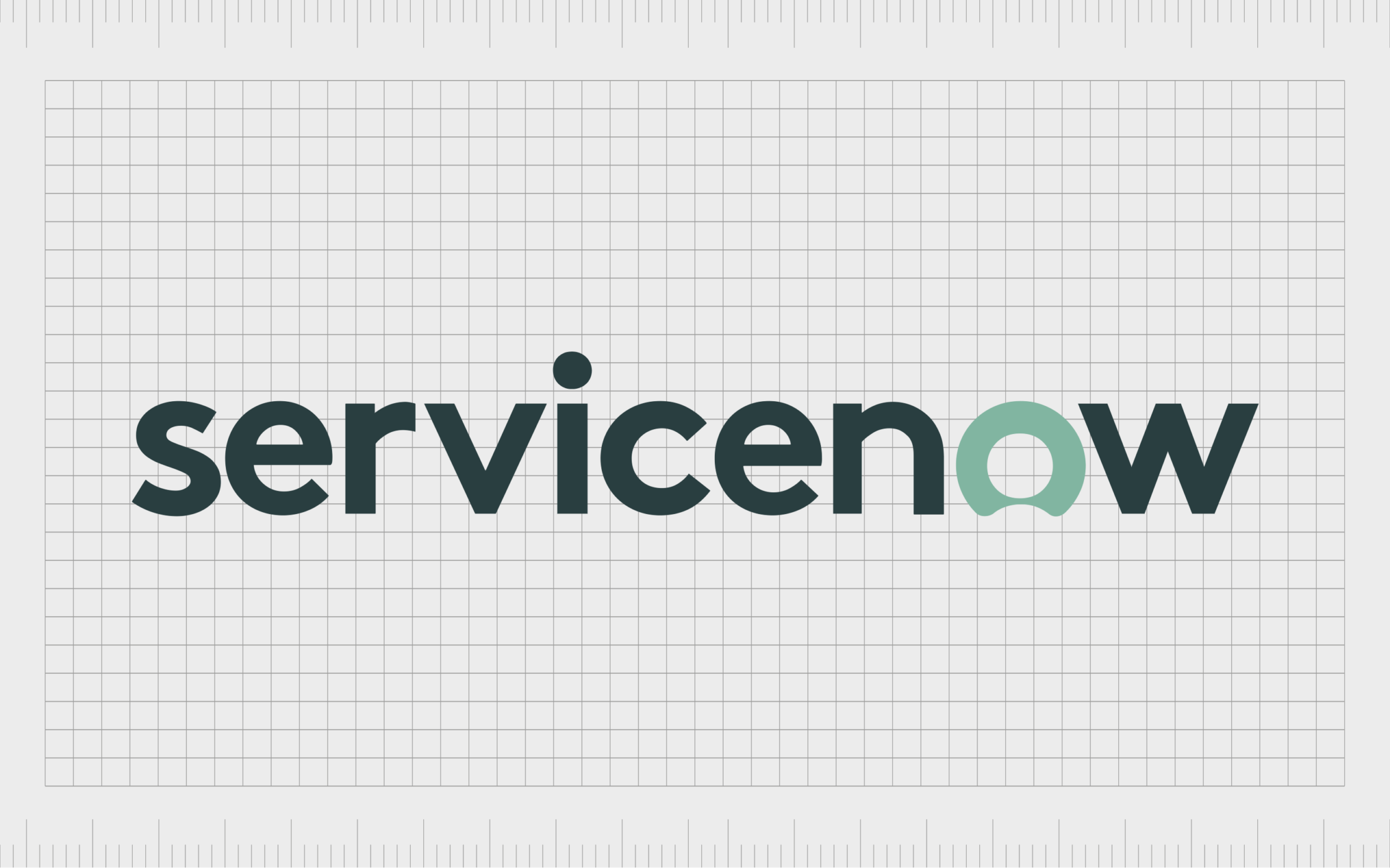
ServiceNow
Founded in 2003, ServiceNow is a software company known for producing its own cloud computing platform, where companies can manage digital workflows. It was once named the most innovative company in the world by Forbes.
The name “ServiceNow” is relatively straightforward. It describes what customers can do with the product – deliver excellent customer service instantly.
The ServiceNow logo, depicted in different shades of green and white, conveys ideas of innovation and growth. The wordmark also includes a unique design in the “O”, intended to look like a person. This reminds us of the organization’s focus on customer experience.

Zoom
In the last few years, Zoom has quickly accelerated its growth to become one of the most popular platforms in the world. Zoom is a video telephony company allowing consumers and companies to connect easily with their peers through video streaming.
The brand chose “Zoom” to highlight how speedy and straightforward its technology can be.
Zoom continues its focus on simplicity with its logo design. The image, which features a simple sans-serif wordmark in blue, is intended to highlight the credibility and accessibility of the software. The sharp edges on the characters also enhance the sense of speed connected to the word.
Find out more about the Zoom logo here.

Fortinet
Launched in 2000, Fortinet is a multinational corporation known for developing and selling cybersecurity solutions like antivirus software and firewalls. The company’s first primary product was the FortiGate firewall.
Later, the brand added new functionality to its portfolio. The name “Fortinet” comes from the words “Fortified Networks”.
The Fortinet software name helps remind us of the strength and security offered by the software and the company’s target market.
The logo, presented as a red and black wordmark, uses blocky letters to symbolize strength. The “O” is also comprised of blocks intended to represent a wall of security.
Find out more about the Fortinet logo here.

Dropbox
Dropbox is a cloud-focused software company. The file hosting service allows users to easily share and store information in the cloud by dragging and dropping documents into a browser. The name “Dropbox” was chosen to highlight this functionality.
The Dropbox logo is a fantastic geometric combination mark. It combines the organization’s name, written in a sans-serif font, with an emblem that looks similar to the shape of an opened box.
The company even experimented with various colors for the box before settling on blue as its primary shade.
Find out more about the Dropbox logo here.

Slack
One of the best-known messaging and collaboration platforms in the world, Slack was launched in 2013 and had been growing ever since.
The word “Slack” stands for Searchable Log of All Conversation and Knowledge. The name was chosen to replace “Linefeed,” previously selected for the brand.
Slack’s name also makes us think of simplicity and ease, which the organization aims to provide.
The slack combination mark features the company’s name in all lowercase letters next to a geometric emblem. The various colored apostrophes and dots are intended to make us think of different forms of communication coming together in one space.
Choosing software names and logos
Choosing the proper software names and logos can seem challenging, particularly when you’re just starting to build your first brand. As you can see from the examples above, there are plenty of different styles to choose from.
While there’s no one-size-fits-all path to success, there are a few tips you can follow to improve your results:
Convey meaning
Your name and logo should tell your customers something important about your brand. Don’t just aim to describe what you do; provide your clients insight into what makes your software brand unique. Share your values and vision.
Keep it simple
Simplicity is key for both a name and a logo. Software logos must work across various devices and look fantastic in all formats, so an easily legible logo without many details is often a good idea. Names need to be easy to spell, share, and say.
Get the right help
When you’re struggling to define your brand, it’s helpful to seek out some additional support. There are professional naming agencies and logo designers who can assist with bringing your software company to its intended audience, saving you time.
Test your choices
Get input from shareholders and stakeholders on your name and logo before you take it out for a spin. Make sure you’re conveying the right message with both assets, and avoid any unintentional misunderstandings by doing your research.
Adhere to your audience
Every aspect of your brand should be built around your understanding of your target audience. If your knowledge of your market changes or customer preferences evolve, you may need to consider a rebrand.
Learning from software company logos and names
As you can see from the software company logos and names showcased above, there are plenty of ways to make your unique brand identity stand out in today’s competitive landscape.
While many of the most famous logos and titles have a few things in common, such as simplicity, and a focus on modernity, they’re all unique in their own way.
If you need help choosing your brand’s name and logo, feel free to seek extra support from a brand strategist with the right expertise.
Fabrik: A branding agency for our times.
Now read these:
—Top marketing tips for software companies
—Branding software and mobile applications
—The essentials of software company naming
—Your guide to starting a software business
—The basics of software company branding
—How to approach software product naming
—Explore Fabrik’s software branding services

Clarity starts with a conversation.
Thanks—we’ll get back to you shortly.
Whether you're navigating a rebrand, merger, or simply need a clearer identity—we’re here to help. No hard sell, just honest advice from people who know the sector.
Let’s start with a simple question…
Prefer to email? Drop us a line.
Fabrik’s been helping organisations rethink and reshape their brands for over 25 years. We’ve guided companies through mergers, rebrands and new launches. Whatever stage you’re at, we’ll meet you there.