Zoom logo history: A symbol of global leadership in video conferencing

Virtually everyone is familiar with the Zoom logo today. Rising to fame during the pandemic, Zoom took the world by storm, introducing a new way for people to connect and collaborate. But, how much do you know about Zoom logo history?
Like many of the world’s major software companies, Zoom has updated and refined its image over the years, experimenting with typography, iconography, and even color. As the Zoom symbol became more simplified, the company itself grew more recognizable and powerful.
So, what is the meaning of the Zoom logo? How has it changed over the years to become more appealing and professional, and where did it come from? Today, we’re taking a closer look at everything you need to know about Zoom logo history.
The Zoom symbol: Introducing Zoom
Before we begin discussing Zoom logo history, let’s take a moment to introduce the Zoom brand. Zoom is a software company, best known for its video conferencing and collaboration tools. The “Zoom Video Communications” brand was first launched in 2011 by Eric Yuan.
Eric was previously a corporate vice president of the Cisco Webex company, another well-known communications brand. Initially, Zoom struggled to find investors, because people believed the market for videotelephony was already pretty saturated.
Interestingly, the first concept for the Zoom company was named “Saasbee”, but the brand updated its name to Zoom in 2012, before launching the beta version of its first client. Since then, Zoom has evolved to become one of the biggest communication and collaboration brands in the world.
Alongside video conferencing, the company also offers messaging tools, meeting solutions, phone systems, virtual event platforms, and video meeting rooms.
Zoom logo history: Why did Zoom change its logo?
Zoom’s logo hasn’t changed too much since the initial launch of the brand. Although various aspects of the design have been refined, some remain the same. For instance, Zoom has consistently used its name in its logo design, as well as a blue color palette.
Let’s dive into Zoom logo history.

2011
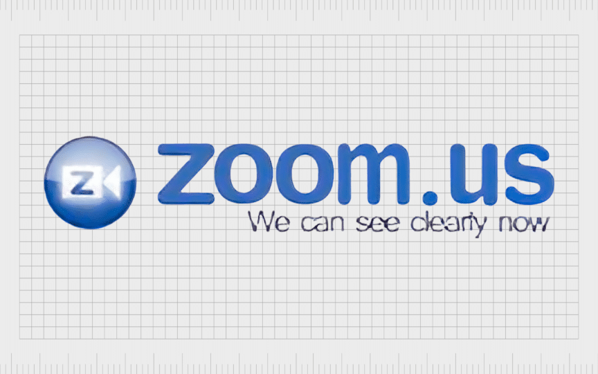
The first Zoom logo introduced in 2011 featured the full domain name of the Zoom website, “Zoom.US”. The inscription was written in large, bold letters, in a cool shade of blue. The motto, “We can see clearly now”, was placed underneath in a black font.
On the left of the logo, Zoom created a badge-style icon featuring a video camera with the letter “Z” placed inside of it. The badge featured a gradient to make it look as though it was shining.

2013
After introducing new products to the market, Zoom simplified its logo. The “.US” component of the inscription was removed, and the “Zoom” wordmark was enlarged. The bubbly typeface maintained a similar coloring to the previous design, though the slogan underneath was removed.
The icon featuring the camera image also remained with this, logo, the “Z” letter was eliminated, creating a more streamlined and balanced image.

2014
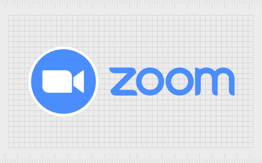
2014 marked yet another subtle update for the Zoom symbol. The font used for the Zoom inscription was changed slightly, becoming thinner, and more refined, with a sharp edge on the “M”. The coloring was also altered, becoming lighter and more approachable.
The icon accompanying the Zoom wordmark was changed rather significantly in this logo. It became larger, and cleaner, with refined edges on the camera image. The background shade was updated to match the wordmark, and the overall image became flatter, without a gradient.

2022
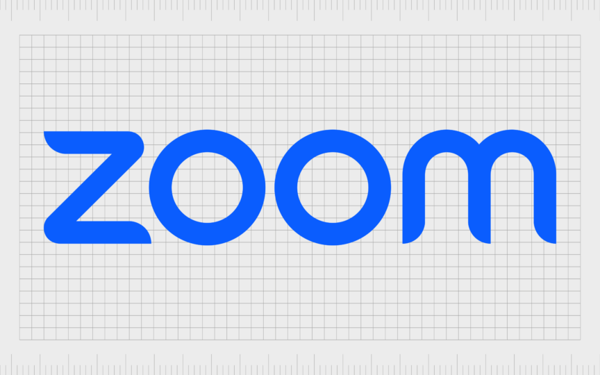
Zoom introduced the most recent, and perhaps simplest version of its logo in 2022. In this design, the typeface has been changed slightly again. The sharp point on the top of the “m” was removed, making the image look more fun and dynamic.
The color palette was also enhanced, as Zoom switched to a brighter, more vibrant shade of blue. The camera Zoom symbol was removed from the image. Zoom also introduced a new favicon, featuring just the letter “Z” in white, in a circle of blue.
What is the meaning of the Zoom logo?
The new Zoom logo might not appear to have any underlying meaning. With the graphic elements removed, the design is a lot simpler and more minimalistic than previous logos. However, there are still clear elements of design psychology in play.
For instance, the Zoom inscription is designed to look friendly and playful, with unique angles that symbolize speed and movement. The lettering communicates the basic principles and values of the brand, centralized around minimalism, simplicity, and boldness.
The blue coloring is also important. Used commonly in the technology landscape, blue is a color frequently associated with fresh ideas and innovation, as well as reliability and trust in color psychology. The use of white in the logo also highlights professionalism and purity.
The new Zoom logo: Fonts and colors
The Zoom logo today has become one of the most recognizable symbols in the technology landscape, commonly associated with the transformation of the communication landscape. Though the design seems relatively simple at a glance, it includes a lot of unique components.
The stylized Zoom font, combined with the eye-catching color palette of blue and white makes the Zoom brand seem professional and trustworthy. The memorable lettering also gives the company a fun and creative aesthetic.
You can see examples of the Zoom logo here:
What color is the Zoom logo?
The Zoom logo colors have long consisted of blue and white, though the shade of blue has evolved over the years. The company started with a relatively cool shade, before embracing lighter coloring, and finally the vibrant Zoom blue we know today.
The Zoom logo color palette highlights the companies values of simplicity, reliability, and fresh thinking. Used together, they also help to separate Zoom from some of the other major competitors in the videoconferencing space.
What font does the Zoom logo use?
While the Zoom logo font might seem like a simple sans-serif typeface, it was actually created specifically for the company. The design looks a little like the Kaleko 250 typeface, though various aspects of the characters have been adapted.
Some corners are rounded, while others are curved more aggressively in certain sections. Some components are elongated, while certain lines include harsh angled ends. The unique composition of the Zoom font helps to convey a highly creative and powerful brand.
The font is also extremely easy to read on any platform or medium, making it an excellent choice for a technology brand.
The Zoom logo: Bringing people together
Looking back through Zoom logo history, we can see plenty of examples of the company refining and enhancing its visual identity. Although the Zoom logo has always been relatively simple, the company wanted to ensure it was making the right impression on its evolving audience.
By removing certain aspects of the logo, and polishing others, Zoom ensures it can draw attention to its key focus on simplicity and accessibility. The company is committed to creating innovative products that are reliable, trustworthy, and easy to use.
These ideas shine through every aspect of the Zoom logo, from the unique typeface to the memorable color palette.
Fabrik: A branding agency for our times.
Clarity starts with a conversation.
Thanks—we’ll get back to you shortly.
Whether you're navigating a rebrand, merger, or simply need a clearer identity—we’re here to help. No hard sell, just honest advice from people who know the sector.
Let’s start with a simple question…
Prefer to email? Drop us a line.
Fabrik’s been helping organisations rethink and reshape their brands for over 25 years. We’ve guided companies through mergers, rebrands and new launches. Whatever stage you’re at, we’ll meet you there.


