Dropbox logo history: A symbol of creativity, collaboration, and security

Are you an expert in Dropbox logo history? Can you visualize how the innovative tech company’s visual identity has evolved over the years, growing more modern and streamlined? If not, don’t worry, you’re about to learn everything you need to know about the Dropbox symbol.
The Dropbox logo is an image most people will be familiar with today. If you’ve ever needed to store important documents or photos in the cloud, or share them with friends, you may have used Dropbox. Since its rise to fame in 2008, Dropbox has achieved phenomenal success.
The company has inspired the creation of multiple similar file-sharing products, and has even secured partnerships with world-leading brands like Microsoft. Today, we’re going to take a closer look at the Dropbox brand, and its unforgettable visual identity.
Dropbox meaning and identity: The Dropbox brand
Before we discuss the key stages of Dropbox logo history, let’s take a moment to identify the brand. Dropbox, if you don’t know it already, is a world-leading file-hosting service and technology company. Headquartered in California, the company specializes in cloud storage solutions.
The idea for Dropbox was introduced by two MIT students in 2007, Arash Ferdowsi and Drew Houston. Apparently, Houston came up with the idea for Dropbox after frequently forgetting to take his USB flash drive with him to university classes.
After receiving seed funding from Y Combinator in 2007, Houston founded “Evenflow”, the company that would produce the first Dropbox ecosystem. In 2008, “Dropbox” was officially launched at the TechCrunch Disrupt event.
According to Houston, Arashi Ferdowsi was so impressed by a video demo of the Dropbox software, that he pursued the current founder for a partnership. After the pair joined forces, Dropbox began growing at a steady pace, earning 1 million users within just 1 year.
Today, there are more than 700 million people using Dropbox across 180 countries, making the platform one of the biggest cloud storage and file sharing solutions around.
Dropbox logo history: The evolving Dropbox symbol
At a glance, the Dropbox logo might look similar to many of the other technology and software symbols in the world today. It shares a number of similar design components, including a flat “minimalistic” appearance, and a simple color palette.
While the Dropbox symbol hasn’t changed too much since it was first created, it has become more modern, streamlined, and refined. Here’s your quick guide to Dropbox logo history.

2008
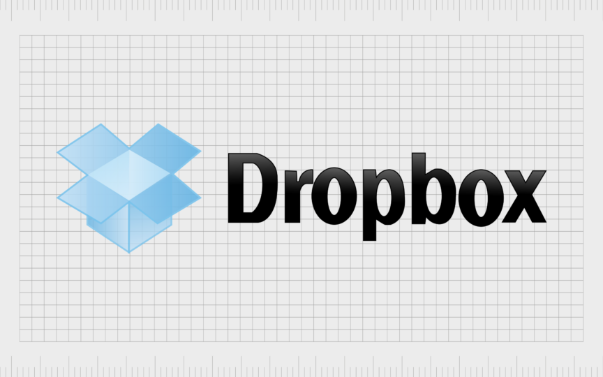
The first Dropbox logo, created in 2008, featured many of the same components of the Dropbox symbol today. On the right, we see the Dropbox wordmark, written in sentence case, with a capital “D”. The typeface is sleek and solid, featuring a black and grey gradient.
On the left, there’s the icon of a blue box, with the sections on the top opened to show the interior. The image features a significant amount of shading, giving it a more detailed appearance.

2013
In 2013, Dropbox introduced a far simpler, and more geometric version of its logo. The Dropbox symbol of the open box appeared a little more abstract, featuring just one shade of blue, and white accents. The flat rhomboid elements gave style and modernity to the image.
The box also became a little larger, balancing more effectively with the wordmark alongside it. The Dropbox inscription retained the same typeface, but the color was changed to a flat blue shade, eliminating the black and grey gradient.

2015
The update to the Dropbox logo in 2015 was so subtle, you may have missed it if you weren’t watching carefully. The box icon was made slightly smaller, though the color palette stayed the same, the typeface for the inscription, however, was completely replaced.
The characters in the new wordmark featured more rounded shapes, with additional white space in the letters, giving the image a slightly more open and fresh appearance.

2017
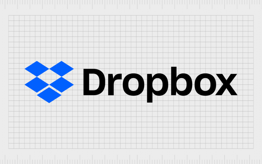
In 2017, Dropbox introduced the latest version of its logo, building on the changes it had made previously. The box symbol became even more abstract, featuring a series of squares, rather than a distinctive box shape.
Each blue rectangle used in the icon seems almost identical in shape and size, giving the image a highly modern appearance. The “Dropbox” font was refined slightly again, with subtly shorter lines, and a shift from a blue color palette, to black on white.
What is the meaning of the Dropbox logo?
Dropbox’s logo designs over the years have followed the trend of “oversimplification” in the technology industry. Many modern companies attempting to convey a focus on the future have chosen more straightforward, geometric, and 2-dimensional logos.
However, Dropbox didn’t just use this design strategy to fit in with the crowd. The company also wanted to position itself as more than just a “file sharing” service. The box image in the previous designs often led people to associate the company with deliveries and the logistics world.
The more abstract logo produced in recent years makes Dropbox seem more innovative and creative. Notably, the use of the color black, alongside the blue shade in the logo, also symbolizes the company’s focus on both professionalism and reliability.
However, it’s worth noting that Dropbox’s color palette and design choices aren’t loved by everyone. Some people feel the contrast between the colors is too harsh. That may be why Dropbox uses just a simple white icon on a blue background for its favicon.
The Dropbox logo: Fonts and colors
Though relatively simplistic from a design perspective, The Dropbox logo is an excellent example of an evocative and modern brand symbol. The design is intended to draw attention to the company’s history and unique products, as well as highlighting its creative nature.
Dropbox even created a host of different versions of its logo in unique colors, as well as an animated version, to demonstrate how flexible the design could be.
If you want to take a closer look at the elements of the Dropbox symbol, you can find some useful resources here:
What color is the Dropbox logo?
The Dropbox logo color palette has always been relatively simple. Although the company experimented with gradient shades in its early days, it quickly adopted a more straightforward, flat design, with only a single color.
The Dropbox logo colors today are white, black, and a deep shade of vibrant blue. However, variations of the logo have been produced in a variety of colors. The closest Hex shade to the color blue used by Dropbox is #0060FF.
Bright blue symbolizes the company’s focus on reliability, trust, and safety, while the black and white shades highlight power, excellence, and sophistication.
What font does the Dropbox logo use?
Though the Dropbox logo font has changed a few times over the years, the company has always used a relatively simple, and highly legible typeface. The simple and confident inscription used by the business today is a sleek, traditional sans-serif option.
It’s similar in some ways to the Neue Helvetica family of fonts, with some slight modifications. The balance and strength of the typeface helps to cement Dropbox’s image as a credible software vendor.
Unpackaging the Dropbox logo
Like many software and technology logos, the Dropbox symbol has become simpler and more abstract over time. Throughout Dropbox logo history, we’ve seen the company make a number of subtle, yet powerful changes, to refine its brand identity.
Today, the Dropbox logo is a symbol of innovation, creativity, trustworthiness, and professionalism. It aims to ensure the company can appeal to a wide range of business consumers, while remaining accessible and friendly in the eyes of everyday users.
Fabrik: A branding agency for our times.
Clarity starts with a conversation.
Thanks—we’ll get back to you shortly.
Whether you're navigating a rebrand, merger, or simply need a clearer identity—we’re here to help. No hard sell, just honest advice from people who know the sector.
Let’s start with a simple question…
Prefer to email? Drop us a line.
Fabrik’s been helping organisations rethink and reshape their brands for over 25 years. We’ve guided companies through mergers, rebrands and new launches. Whatever stage you’re at, we’ll meet you there.


