How to design an architecture firm logo: The guide to architecture logo design

Learning how to design an architecture firm logo from scratch can be challenging. Though you may have the creativity and skill to create stunning building blueprints, creating a selection of architecture company logo ideas has unique challenges.
Regarding logo design for architecture firms, there are numerous points to consider. You’ll need to decide how to convey your unique personality to your target audience with colors and fonts.
Plus, it’s important to infuse your logo with meaning without falling into the trap of using cliched icons and graphics.
There’s a reason why many companies decide to work with brand strategists and professional graphic artists on logo design. One wrong move, and you could end up with an emblem that doesn’t effectively represent your company or its values.
Today, we will look at some steps in creating compelling logos for architecture companies to help you build the right visual identity.
What makes a good architecture firm logo?
The first step in learning how to design an architecture firm logo is understanding what makes a compelling logo great in the first place. Logo design can be a somewhat subjective process, as the emblem that works perfectly for one brand and its target audience may not work for another.
Ultimately, the best logos for architecture companies are unique and specific to the brand. They convey meaning through the careful combination of clean, engaging colors, typefaces, and icons. However, they don’t just define your business as an architecture firm.
A great architecture logo should offer an insight into your personality and the values of your business.
If you examine some of the most popular architecture logos in the world today, you’ll notice many of them exhibit some consistent qualities, such as:
Simplicity
The best architecture logos are clean, precise, and focused. Through a modern, sophisticated logo, you can demonstrate your attention to detail and highlight the care you put into your work. A simple logo is also much easier to remember for customers.
Creativity
Although many of the best architecture logos are simple, they also offer insight into a company’s creative side. They might use carefully placed lines and shapes to connect with customers on an emotional level or leverage color psychology.
Uniqueness
It’s easy to fall into the trap of creating a generic architecture logo with commonplace elements like graphs or house icons. However, the best logos are unique to the brand. They demonstrate the values and vision behind the company.
Professional
Great architecture logos are rarely sketched on a napkin and brought to life with a graphic design tool. They’re carefully constructed with a deep knowledge of design guidelines, such as balance, white space, and symmetry.
How do I design my own architecture business logo?
When learning how to design an architecture firm logo, it’s tempting for creatively-minded professionals to dive straight into the sketching and brainstorming phase. However, logo design for architecture firms delivers the best results when it starts with the correct research.
Before you start experimenting with shapes and typefaces, you need to understand your company, the marketplace you serve, and your target audience.
If you haven’t already taken steps to develop a set of brand guidelines, it may be a good idea to do this before anything else. This will help you to create a more compelling and consistent set of visual assets.
Here are some useful steps to follow when starting your logo design journey.
Step 1: Define your brand
As mentioned above, the first step in designing an architecture firm logo should always be understanding and refining your brand. Having a clear view of your brand identity, mission, vision, and values will ensure you don’t end up with another generic logo.
Consider what makes your company different from the other leaders in your space.
Do you pride yourself on creating sustainable, LEED-certified buildings? Are you a customer-first company, working alongside each client every step of the way to ensure their success? Do you consider yourself to be one of the most trustworthy and reliable companies in your industry?
Step 2: Pinpoint your target audience
Your logo is perhaps one of the most important assets you’ll have for capturing the attention of your target audience. With this in mind, you need to know exactly who you’re trying to reach before you start designing. Don’t go too broad with your target market.
Find a niche specific to your values, skills, and expertise in the architecture landscape.
As you start exploring architecture company logo ideas, you should be able to step into the shoes of your target audience and visualize how they’ll respond to your image.
It can help to create a set of user personas, which outline the core characteristics, behaviors, and demographics of the audience you’re trying to serve to help with the design process.
Step 3: Know the competition
When designing an architecture logo, one of the most important things you can do is make sure your image is unique. This means you need to dedicate time to seeing what’s already out there in the current market.
Conducting competitor research will benefit your business in a range of different ways. First, you’ll be able to see what kinds of typography options, colors, and icons work well in your industry, which is great for initial inspiration.
Secondly, you’ll be able to pinpoint cliched or generic design choices so you know what to stay away from when you’re building your own unique design. You can even make a list of logos you like and dislike from other companies to help guide your design team.
Step 4: Explore logo style options
Once you have a good understanding of your brand, competitors, and your target audience, you can begin to think about the kind of logo you’re going to create. There are many different styles of logos to choose from, including graphic logos, mascots, and even simple monogram emblems.
In the architectural world, wordmark logos featuring the name of the company in a specific font and combination marks are common. There’s no one-size-fits-all rule to choosing the right logo style.
However, it’s worth noting a logo with no reference to your brand name may be harder for customers to recognize and understand at first.
Step 5: Set your budget
Finally, it’s worth making sure you have a clear idea of how much you’re willing to spend on your logo design journey.
While it is possible to create a logo for free by sketching something yourself with the right graphic design technology, you may find you don’t really have the right skill set or experience to do it alone.
Having a budget you can work with to seek out support from brand strategists, graphic designers, and other experts can be extremely useful.
Spending a little extra on your architecture logo, to begin with, could mean that you save yourself money in the long term because you won’t have to spend a fortune on rebranding and repositioning strategies.
What are the best fonts for architecture firm logos?
Depending on the type of logo you choose for your architecture firm, there are three core elements you’ll need to think about during the design process: font, color, and iconography.
Most of the time, an architecture company logo for a new or emerging form will include some form of font, regardless of whether you include a wordmark or a letter mark (for an acronym name).
While it’s easy to overlook the importance of choosing the right typography, the font choices you pick for your logo can have a huge impact on how effective your emblem actually is. Just like many other visual assets, typography can elicit an emotional response from your target audience.
Modern sans-serif fonts often portray strength and innovation, while more traditional serif fonts may make your business look more sophisticated and professional.
In general, it’s usually a good idea to stay away from overly playful or decorative fonts in the architectural landscape, as they can make your business look too youthful and unreliable.
Consider a range of popular font choices, such as Futura or Helvetica. You might even consider a geometric-style typeface such as “Architect.” Notably, depending on your style of logo, you may choose to use more than one font.
Some architecture firms display their name in one typeface, followed by a tagline in another.
When selecting architecture company fonts, focus on the following:
Legibility
When you’re promoting your architecture firm both online and offline, you’ll need to ensure people can read your logo at any size, in any environment. Check your logo is just as legible on a smartphone screen as it is printed on the side of a building or van.
Professionalism
Remember, one of the core characteristics you’ll want to convey in your architecture logo is professionalism or authority. Playful and decorative fonts not only reduce legibility but can also send the wrong message about your business.
Formatting
It’s not just the type of font you use that matters in architecture company logo design, but the way it’s positioned too. Think about kerning, spacing, and the positioning of the letters. Ask yourself exactly how much white space you need between each character.
What are the best colors for architecture firm logos?
Once you’ve chosen the best architecture company fonts for your business, the next step in learning how to design an architecture firm logo is experimenting with color. Color is perhaps one of the most important elements in any architecture company logo.
It’s one of the first things your customers will respond to emotionally, and it says a great deal about the personality of your brand.
If you’re working with a professional graphic designer or brand strategist on your logo creation, you’ll be able to dive into concepts like color psychology and color theory.
This means figuring out how people will respond to your logo on an emotional level, as well as how certain colors will work together to send a specific message.
Some colors are particularly common in the architectural industry. Shades of blue, often associated with reliability and trust, are popular.
However, it’s common to see a lot of architectural companies sticking with sleek, simple color palettes featuring shades like black, white, and grey. However, the best colors for architecture companies are subjective.
Depending on the type of business you’re building, adding a splash of a unique color can be an excellent way to make your logo stand out. For instance, green could be a phenomenal color choice for an architectural brand focused on the sustainability industry.
Red is a color often associated with passion and vitality, and yellow can be connected with energy and joy.
Remember, while experimenting with color can be helpful when coming up with architecture company logo ideas, it’s best to avoid using too many shades together. A variety of too many contrasting shades can send confusing messages about your brand.
Graphics in logos for architecture firms
After you have a good idea of what your color palette and typography choices are going to look like, it’s worth asking if you want to add any icons, shapes, or graphics to the mix. Adding geometric components to an architecture company logo can be an excellent way to make it more unique.
Simple geometric shapes are a great choice for architecture firms, as they often convey important messages about precision and professionalism. Squares, rectangles, triangles, and even straight lines all convey a sense of structure and authority.
Depending on your type of business, you could also add architectural elements to your logos, such as arches, doorways, windows, and rooftops.
However, it’s important not to go too generic with your icon choices. Keep in mind that many architectural firms use building shapes in their logo. If competitors in your industry are already using a similar design, you could end up blending in with the crowd.
Think about how you can make any shapes or graphics in your logo specific to your business.
For example, you might consider using a skyline image of the specific region you serve. You could also look at shapes relevant to the style of architecture you use. The ideal graphics will always convey the core values and strengths of your company.
Since most of the best architecture firm logos are generally clean and simple, it’s worth avoiding too much complexity in your logo. Don’t choose anything too detailed or complicated, as this could make it easier to convert your logo into different sizes for various mediums.
Should I add a tagline for my architectural company?
Sometimes, when learning how to design an architecture firm logo, you might find yourself experimenting with additional elements capable of adding more meaning to your design.
A tagline, placed underneath your logo, can say something important about your business and help to differentiate your logo from the designs of other companies.
If you do choose to add a tagline to your logo, remember you don’t necessarily have to use it in all of your branding and marketing assets. You might showcase your tagline on larger pieces of signage and offline branding assets and remove it from your website and other online components.
A tagline should always be short, simple, and straight to the point. If you don’t have any experience coming up with catchy phrases and slogans, it might be worth working with a professional on the creative process. Here are some examples of what an architectural tagline might look like:
- Building tomorrow’s foundations.
- Stunning design made simple.
- Transforming your landscape.
- There’s no place like home.
- Bringing your vision to life.
Just as it can be easy to end up with a somewhat generic logo design as an architectural firm, you can also fall into the trap of choosing a cliché tagline if you’re not careful. Look at your brand mission, vision, and values when choosing the right logo.
Should I use a free logo generator for my architecture logo?
As you’ve probably seen so far, learning how to design an architecture firm logo can be a complex and time-consuming process. Since it’s difficult to launch a memorable business without a logo, some companies try to cut corners by using online tools to help them.
Free logo generators are available all over the web today. They essentially promise a convenient way to experiment with different shapes, typographies, and color palettes, so you can create a logo with minimal support. Unfortunately, using a logo generator is rarely a good idea.
While an architecture company logo generator can give you some initial inspiration and ideas to work with, it’s worth remembering these tools are extremely limited.
They only have a restricted selection of font choices, colors, and icons to work with, which means you’re more likely to end up with a generic design.
Additionally, because a lot of smaller companies try to save money with online logo generators, there’s a good chance you’ll create something that’s very similar to an existing logo. This could lead to legal issues and may even make it harder for you to connect with your target audience.
If you’re really having trouble creating architecture company logo ideas, work with a professional.
An agency can help create the best logo design for architecture firms by guiding you through everything from color theory to icon choice.
Architecture firm logo examples
Sometimes, the best way to learn how to design an architecture firm logo, is to use some existing examples from leading companies for inspiration. While you should never use a logo too similar to an existing design, looking at the emblems already present in your industry can be helpful.
Here are some architecture firm logo examples worth checking out.
SmithGroup
American engineering and architectural firm SmithGroup chose a simple wordmark for its logo. This compelling design uses uppercase characters in a sans-serif font to convey modernity, stability, and strength.
The professional-looking logo is perfectly spaced and uses the color grey to highlight sophistication and excellence.
Gensler
Another great example of an architectural company with a compelling wordmark, the Gensler symbol, is an eye-catching and meaningful wordmark. The red coloring in the font is excellent for conveying passion and power.
The arrow shape on the “G” also helps to highlight the company’s focus on the future, development, and innovation.

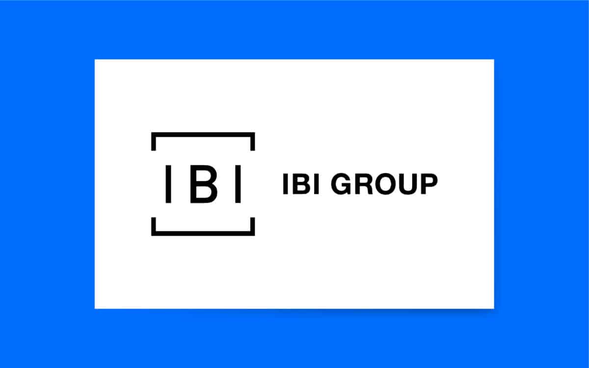
IBI Group
Sleek and sophisticated, the IBI Group logo is a fantastic example of a modern architectural logo. Featuring exceptional balance and plenty of white space, this eye-catching logo looks innovative, contemporary, and professional.
The design helps to set the company apart from its competitors and ensures the team can connect with its target audience.
Mastering logo design for architecture firms
Learning how to design an architecture firm logo can be time-consuming and complex, but no company should ever overlook it.
While there’s more to creating a compelling brand than designing the right logo, a compelling emblem can make or break your chances of connecting with your target audience. Without a great logo, your firm will blend into the background.
From day one, the best way to ensure you create a fantastic logo is to work with a professional team experienced in architecture company logo design.
The right agency will be able to create a unique logo specific to your brand and target audience without relying on generic symbols and cliches. They’ll also help you to avoid some common branding mishaps.
With help from the right company, you can ensure you choose a logo that effectively differentiates your brand from its competitors and engages your target audience.
Fabrik: A branding agency for our times.
Now read these:
—The steps to starting an architecture firm
—Essential marketing strategies for architects
—How to name an architectural company
—Branding considerations for architect firms
—The ultimate list of architecture firm logos
Clarity starts with a conversation.
Thanks—we’ll get back to you shortly.
Whether you're navigating a rebrand, merger, or simply need a clearer identity—we’re here to help. No hard sell, just honest advice from people who know the sector.
Let’s start with a simple question…
Prefer to email? Drop us a line.
Fabrik’s been helping organisations rethink and reshape their brands for over 25 years. We’ve guided companies through mergers, rebrands and new launches. Whatever stage you’re at, we’ll meet you there.


